8 Top React Chart Libraries for Data Visualization in 2026
Compare eight React chart libraries for dashboards, branding, high-volume data, accessibility, and cross-platform reuse.
If you want the short answer: Recharts is the safest starting point for most teams in 2026. But the right pick changes fast when you need more chart types, heavier data, React Native support, built-in accessibility, or tighter brand control.
I’d narrow the list like this:
Recharts: best for fast setup and common dashboard charts
Nivo: best when design control matters more
Apache ECharts for React: best for heavy data, live updates, and 50+ chart types
Victory: best for shared web + React Native chart code
Visx: best when I need to build a chart system from lower-level parts
React Chart.js 2: best for standard Canvas-based BI charts
Highcharts React: best for enterprise reporting and built-in accessibility
Tremor: best for how to build dashboards for internal use with light setup
This comparison looks at the factors that matter most in production: chart range, customization, TypeScript support, rendering approach, dataset size, accessibility, and license limits. It also keeps common warehouse setups in view, including Snowflake, BigQuery, Redshift, and Postgres, plus live dashboard cases tied to tools like Kafka.
Top 5 ReactJS chart libraries reviewed: Recharts, Victory, Visx, Nivo and React-chartjs-2
Quick Comparison
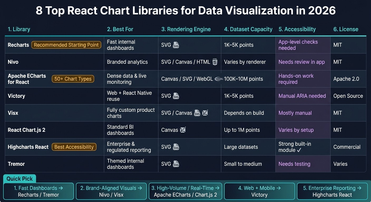
Top 8 React Chart Libraries Compared (2026)
Library | Best For | Rendering | Dataset Range | Accessibility | License |
|---|---|---|---|---|---|
Recharts | Fast internal dashboards | SVG | ~1,000–5,000 points | Needs app-level checks | MIT |
Nivo | Branded analytics | SVG / Canvas / HTML | Varies by renderer | Needs review in app | MIT |
Apache ECharts for React | Dense data and live monitoring | Canvas / SVG / WebGL | 100,000+ to 10,000,000 | Needs hands-on work | Apache 2.0 |
Victory | Web + React Native reuse | SVG | ~1,000–5,000 points | SVG helps, but manual work still needed | Open source |
Visx | Fully custom product charts | SVG / Canvas | Depends on build | Mostly manual | MIT |
React Chart.js 2 | Standard BI dashboards | Canvas | Up to ~1,000,000 points | Varies by setup | MIT |
Highcharts React | Enterprise and regulated reporting | SVG | Large datasets | Strong built-in module | Commercial |
Tremor | Themed internal dashboards | SVG | Small to medium | Needs testing | Varies by package setup |
A simple rule helps: pick the highest-level library that still fits your data and UX needs. That usually means less code, fewer edge cases, and less time spent on chart plumbing.
1. Recharts
Recharts is one of the fastest ways to build clean, warehouse-backed charts in React. It handles the chart types most teams need for dashboards connected to Snowflake, BigQuery, Redshift, and Postgres.
Chart Breadth
Recharts covers the main chart patterns used in business dashboards. That makes it a good fit for standard reporting use cases.
If you need a broader mix of chart types, Visx, Nivo, or Apache ECharts for React are the next names to look at.
Customization
Recharts uses composable components, so branding tweaks and layout changes are usually simple. That’s a big plus when you want to move fast without fighting the library.
That said, the more specific your embedded BI needs get, the more engineering work can pile up. Common chart changes stay fast with its composable API, but heavily branded embedded analytics can still take extra effort.
Performance, Accessibility, and Licensing
For standard warehouse-backed dashboard workloads, Recharts is a practical choice. Accessibility and high-frequency update needs should still be checked in your own app, since those details can change based on how you build and ship the experience.
Recharts is MIT licensed.
Use Recharts when you want speed and simplicity. If you need more chart variety, or want deeper customization, Nivo is the next benchmark. Apache ECharts is also worth a look for teams that need a broader chart set.
2. Nivo
Nivo makes sense when Recharts starts to feel a bit boxed in and you want tighter control over look and feel. It’s a strong pick for theming, branding, and a broader set of chart types. You get more room to shape the charts than with Recharts, without taking on as much build work as Visx. If you need even deeper low-level control, Apache ECharts for React is the next place to look.
Chart Breadth
Nivo covers a broad mix of chart types, which makes it handy when one library needs to support several visualization patterns inside an analytics app.
Customization
Nivo gives you solid theme control, custom tooltips, and annotations, with a moderate learning curve [1].
Performance and Licensing
Nivo supports SSR [2], which can help with initial load time in production apps.
Use Nivo when branding and customization matter more than speed to build, especially for embedding analytics in React and branded products. For teams that want more control over chart behavior and a broader chart set, the next options move away from design-first and toward flexibility-first.
3. Apache ECharts for React
If Nivo tilts more toward styling control, Apache ECharts leans toward scale and chart range. For React teams building production analytics apps, that matters a lot. It works well when you need many chart types, solid performance with heavy data, and more than the usual bar and line charts for dashboards tied to Snowflake, BigQuery, Redshift, and Postgres.
Chart Breadth
Apache ECharts supports over 50 chart types, including Sankey diagrams and 3D surfaces. That gives teams a lot more room to work with when a dashboard needs to show complex flows, relationships, or layered data instead of sticking to basic chart formats.
Customization and Performance
The library supports both Canvas and SVG rendering. Use Canvas for very large datasets. Use SVG when memory use is the bigger concern.
It also includes progressive rendering and stream loading, which helps large, real-time charts stay responsive. And if bundle size is on your mind, you can import only the modules you need from the core build instead of shipping the whole thing.
Accessibility and Licensing
TypeScript definitions are built in, which cuts down on configuration mistakes and makes life easier in React projects. The React wrapper also handles resizing and events, so there’s less glue code to write.
Accessibility still needs hands-on work, especially for high-contrast palettes and non-color cues. On licensing, Apache ECharts uses Apache 2.0, which works well for commercial SaaS products and embedded reporting use cases.
If you want a smaller, component-first API after this, Victory is the next comparison.
4. Victory
Victory is a composable charting library for teams that want reusable chart code across web and mobile analytics apps. That makes it a strong fit when you need repeatable chart patterns without giving up React-style composition. For warehouse-native data analysis tools in Snowflake, BigQuery, Redshift, or Postgres, it works well when code reuse matters most.
Chart Breadth
Victory covers the core chart types most dashboards need, including line, bar, area, pie, scatter, and stacked charts. You can build custom funnels too, but that usually means putting the pieces together yourself.
Customization
Victory gives developers a lot of direct control. You can replace default elements by passing custom React components into props like dataComponent, labelComponent, or containerComponent. Theming relies on style objects, and VictoryTheme.clean is a solid starting point for branded dashboards.
Performance
That level of control comes with an SVG-only rendering model, so scale matters. Performance holds up well on moderate datasets, but dense charts need testing before you commit.
Accessibility and Licensing
That same SVG-based model also shapes Victory’s accessibility and mobile story. SVG is easier to work with for accessibility than Canvas-based rendering, though you’ll still need to add ARIA labels and non-color cues by hand if you want full compliance. Victory Native is the main differentiator here: it keeps a nearly identical API for React Native, which makes it useful for teams shipping the same analytics experience on web and mobile.
For warehouse-backed KPI dashboards, Victory fits teams that care more about code reuse than maximum chart density. Choose Victory when code reuse and cross-platform consistency matter more than support for very large datasets.
5. Visx
If Victory gives you reusable components, Visx goes a layer deeper and gives you the raw parts. It’s a primitives-first charting library, which means you build the chart instead of mostly configuring one.
For warehouse-backed analytics in Snowflake, BigQuery, Redshift, or Postgres, Visx is a good fit when chart design is part of the product itself, not just a reporting layer.
Chart Breadth
Visx does not come with prebuilt charts. That gives your team a lot of freedom, but it also means writing more code than you would with Recharts or React Chart.js 2.
Customization and Engineering Effort
Visx gives you full control over layout, interaction, and styling. That makes it a strong pick for branded analytics and embedded BI, where chart behavior needs to line up with the rest of the product UX.
But there’s no free lunch here. Visx leaves rendering decisions to your team, so implementation takes more time. Maintenance also stays on your plate. The same goes for accessibility work, including ARIA labels and keyboard interaction.
The tradeoff is simple: more control, more engineering time. Visx takes more build effort than higher-level libraries.
Accessibility
Accessibility needs deliberate work. Your team has to implement ARIA labels and keyboard interaction by hand because Visx does not include a built-in accessibility layer.
Use Visx when visual control matters more than build speed. If Visx feels too hands-on, the next options move back toward ready-made chart components.
6. React Chart.js 2
React Chart.js 2 is a good fit for teams that need standard dashboards fast and want Canvas-based rendering for common BI charts on Snowflake, BigQuery, Redshift, or Postgres.
Chart Breadth
It covers the core chart types most BI dashboards rely on, including line, bar, pie, doughnut, and scatter. That makes it a solid choice for standard KPI dashboards and common reporting views.
Where it starts to feel tight is with highly custom visual behavior. If your dashboard needs heavy branding, custom interactions, or a more tailored product feel, React Chart.js 2 can be limiting.
Customization and Performance
Most chart setup lives inside a single options object. For simple charts, that's fast and easy. But once interactions, styling rules, and display logic start piling up, that same setup can get hard to manage.
Teams that need stronger enterprise reporting controls and a more polished presentation should look at Highcharts React next.
7. Highcharts React
If React Chart.js 2 keeps things light, Highcharts React (highcharts-react-official) leans much more toward enterprise use. It offers a bigger set of chart types and stronger accessibility support, which makes it the most enterprise-focused option in this group.
Chart Breadth
Highcharts supports more chart types than many React chart libraries. That includes stock charts, heatmaps, treemaps, drilldowns, Gantt charts, and network graphs.
Customization and Performance
Its options API gives teams a lot of control over tooltips, axes, labels, series colors, and animations. That makes it a good match for branded analytics, especially when charts sit on top of warehouse-backed data from Snowflake, BigQuery, Redshift, or Postgres.
Accessibility and Licensing
Highcharts ships with a built-in accessibility module that adds keyboard navigation, screen reader support, and data sonification. For teams building WCAG 2.1-aligned dashboards in regulated settings or customer-facing analytics, that can save a lot of work. It also comes with official TypeScript definitions and the highcharts-react-official wrapper.
The main downside is the commercial license.
8. Tremor
Tremor works well for teams building branded product analytics and embedded BI dashboards that need fast setup and simple theming. It makes sense when you want polished dashboards without putting in the extra build time that more flexible charting systems often demand.
Chart Breadth and Customization
Tremor covers the standard charts most teams need for KPI tracking and day-to-day dashboard use. But it isn't made for specialized or highly complex chart types.
Its main strength is its theme-first approach. That makes branding and layout composition easier. The tradeoff is less control when you want to fine-tune charts at the pixel level.
Performance and Accessibility
Before you ship, test Tremor against your live Snowflake, BigQuery, Redshift, or Postgres workloads. Pay close attention to refresh behavior and how responsive layouts hold up inside your app.
You’ll also want to verify:
Keyboard support
Contrast
TypeScript fit
Responsiveness
License terms
That makes Tremor a strong option for embedded analytics in your SaaS, especially when speed and theming matter more than deep chart variety.
Pros and Cons by Use Case
No library is the best fit for every job. The right pick depends on your data volume, team size, design demands, and whether you're building an internal dashboard or customer-facing analytics.
The table below turns feature differences into workload-based choices.
Library | Best Use Case | Key Strengths | Main Tradeoff | Rendering Engine | Dataset Capacity | Learning Curve |
|---|---|---|---|---|---|---|
Recharts | Fast internal dashboards | Low learning curve | Works best for low-to-moderate point counts | SVG | 1K–5K points | Low |
Nivo | Interactive / unique visuals | Multiple rendering options | More flexibility, more tuning | SVG/Canvas/HTML | Varies by engine | Medium |
Apache ECharts for React | Real-time monitoring / enterprise reporting | Handles dense data; supports 3D and maps | Moderate learning curve | Canvas/SVG/WebGL | 100K+ to 10M points | Moderate |
Victory | Cross-platform (web + React Native) | Shared codebase across web and mobile | Works best for low-to-moderate point counts | SVG | 1K–5K points | Low |
Visx | Branded / custom product analytics | Full design control | Depends on implementation | SVG/Canvas | Depends on implementation | High |
React Chart.js 2 | Standard BI dashboards | Canvas performance | Best for standard dashboard patterns | Canvas | Up to 1M points | Low |
Highcharts React | Enterprise reporting / regulated environments | Built-in accessibility; broad chart types | Commercial license required | SVG | Large datasets | Moderate |
Tremor | Tailwind-based internal dashboards | Fast setup | Best for standard dashboards | SVG | Small-to-medium dashboards | Low |
Two splits matter more than anything else.
Apache ECharts for React stands out when you're dealing with large, dense datasets pulled from Snowflake, BigQuery, Redshift, or Postgres. If your team needs charts for heavy reporting or live monitoring, that's usually where the conversation starts.
Visx makes more sense when custom visuals are the goal and the extra build time is worth it. If the chart needs to match a product's look and feel down to the smallest detail, that control can pay off.
Use these patterns to narrow your choice based on scale, customization needs, and governance.
Which Library Should You Choose?
After looking at chart range, styling control, speed, and licensing, the best pick comes down to the job at hand.
For fast internal dashboards, go with Recharts or Tremor. If you need custom visuals for a customer-facing dashboard that has to line up with your brand, Nivo or Visx make more sense. For high-volume or real-time datasets, choose Apache ECharts for React or React Chart.js 2. If you want shared code across web and mobile, Victory is the right call. And for enterprise reporting, Highcharts React fits best.
Put simply, Recharts covers most standard dashboard needs.
There’s one more layer to this. For high-volume dashboards, the next choice often comes down to performance and governance. And when metric governance matters, the chart library by itself won’t solve the whole problem.
For governed metrics, pair your chart library with a semantic layer so warehouse data stays consistent and traceable.
If you need... | Choose... |
|---|---|
Fast internal dashboards | Recharts or Tremor |
Bespoke, brand-aligned visuals | Nivo or Visx |
High-volume or real-time datasets | Apache ECharts for React or React Chart.js 2 |
Shared code across web and mobile | Victory |
Enterprise reporting | Highcharts React |
FAQs
Which React chart library should I start with?
For most React projects, Recharts is the best place to start. Its declarative, component-based API feels straightforward and handles most standard dashboard needs without much friction.
If you need high-performance rendering for large datasets or more advanced interactions, Apache ECharts for React is a stronger fit. And if you want a governed, warehouse-native setup with Snowflake, BigQuery, or Postgres, Querio’s native chart components can help you skip manual data transformation and keep metrics consistent.
How do I choose for large or real-time datasets?
For large or live datasets, pick a library with Canvas-based rendering like Apache ECharts. It handles high point counts better and helps charts stay smooth when the data starts piling up.
You can also take pressure off the browser by doing the heavy aggregation in SQL inside your warehouse. Then cut down the number of points you send to the chart with sampling or binning, and turn off animations. That combo usually makes a big difference.
For constant updates, use WebSockets. If you only need near-real-time data, React Query or SWR can handle fetching and caching well without making the setup feel heavy.
Which library is best for accessibility or compliance?
Highcharts is the strongest choice for accessibility compliance. It’s a mature, commercial-grade library with strong support for accessibility, including alignment with WCAG standards.
For enterprise applications that need accessibility, solid documentation, and steady performance, Highcharts is the recommended option.
Related Blog Posts