Mastering Dashboard Data Analytics for Actionable Insights
Unlock actionable business insights with dashboard data analytics. Learn to select KPIs, design visuals, and use AI tools to drive smarter, faster decisions.
https://www.youtube.com/watch?v=Cnbdkye0X_8
published
Outrank AI
dashboard data analytics, business intelligence, data visualization, self service analytics, kpi dashboard
1698cd7c-c792-492b-9467-5b5aafed7c7c

So, what exactly is dashboard data analytics? At its heart, it’s the art of turning raw, messy business data into a clear, interactive visual story. Think of it as your company's real-time health monitor, swapping out static spreadsheets for dynamic insights that help you make smarter decisions, faster.
What Is Dashboard Data Analytics

Imagine trying to fly a plane by staring at individual dials, gauges, and meters scattered across the cockpit, with no unified display. You'd see your altitude here, your fuel level there, but you’d have no clear picture of your speed, direction, or whether everything is working together correctly. That's a lot like running a business on disconnected spreadsheets and reports.
Dashboard data analytics brings all those scattered pieces together into one cohesive, interactive view. It’s the process of pulling data from all your different sources—your CRM, your marketing platform, your financial software—and displaying it on a single screen that anyone can make sense of. We’re not just talking about a few pretty charts; we're talking about a living, breathing picture of your business that tracks key performance indicators (KPIs) and uncovers trends as they happen.
The move away from static reporting to dynamic dashboards is happening fast. The global data analytics market is projected to grow from $28 billion in 2021 to a staggering $72.4 billion by 2025. This explosive growth is because companies now understand that real-time insights are no longer a luxury—they're essential for survival.
The Purpose of a Data Dashboard
At its core, a data dashboard does one thing exceptionally well: it empowers your team to make informed decisions without delay. Instead of waiting days for an analyst to manually compile a report, anyone on the team can find their own answers. This self-service model puts data directly into the hands of people on the front lines, from marketing and sales to finance and operations.
A great dashboard turns data from a historical record into a forward-looking guide. It stops you from asking "What happened?" and starts prompting "What should we do next?"
Dashboards achieve this by performing a few critical functions:
Monitoring: Keep an eye on your most important metrics in real time to catch issues before they become problems or spot opportunities the moment they arise.
Analysis: Dig deeper into the data to understand the "why" behind the numbers. A good dashboard lets you drill down without needing to know a single line of code.
Communication: Create a single source of truth that gets everyone on the same page, working toward the same goals with the same information.
For example, a marketing team can use a dashboard to see which campaigns are driving leads right now, while a finance team can get an instant snapshot of revenue and cash flow. For a closer look at how this works in practice, check out these 7 Top Financial Dashboard Examples. And while dashboards are incredibly powerful, it's useful to know how they fit into the bigger picture alongside traditional reports, a topic we explore in our guide to business intelligence reporting.
Choosing Metrics and KPIs That Actually Matter

A great dashboard isn't measured by how many charts you can cram onto a screen; it's measured by the quality of the metrics you choose to display. A dashboard overloaded with data that has no connection to your business goals is simply noise. The key to effective dashboard data analytics is picking Key Performance Indicators (KPIs) that tell a clear, actionable story about your company’s health.
The first step is learning to tell the difference between vanity and actionable metrics.
Vanity metrics are the ones that look impressive at a glance but don't actually inform your strategy. Think total signups, raw page views, or your social media follower count. They might give you a nice ego boost, but they can't tell you why something is happening or what you should do next.
Actionable metrics, in contrast, are tied directly to real business outcomes. They reflect how users are actually behaving and help you make concrete decisions. Metrics like daily active users, user retention rates, and customer acquisition cost (CAC) fall into this category. These numbers tell you if your product is creating real value and if your growth is sustainable.
Moving Beyond Vanity Metrics
Switching your focus from vanity to actionable metrics is all about having a solid framework. For startups and product teams, a couple of popular models offer a fantastic starting point for building a dashboard that’s truly goal-oriented. These frameworks make sure every single chart serves a purpose in your growth journey.
For example, knowing what makes a good LTV to CAC ratio is crucial for any business hoping for long-term survival. This powerful, actionable metric directly weighs a customer's lifetime value against the cost to acquire them. It's a clear signal of your business model's viability—something "total downloads" could never tell you.
Two frameworks, in particular, stand out:
Pirate Metrics (AARRR): A favorite among startups, this model uses a simple, funnel-based approach to chart the customer journey. It breaks everything down into five distinct stages, each with its own set of critical metrics.
HEART Framework: Developed by the team at Google, this model is perfect for product teams obsessed with user experience. It gives you a structured way to measure UX quality across five key dimensions.
The most effective dashboards are ruthlessly focused. They answer a small number of very important questions, rather than trying to display everything at once. This focus turns data into a tool for action, not just a source of information.
Frameworks for Selecting Actionable KPIs
Using a framework is your best defense against getting lost in a sea of data. It forces you to prioritize what truly matters for each stage of your business or product. Let's see how these two frameworks translate into real KPIs for your dashboard.
Framework | Focus Area | Example Metrics for Your Dashboard |
|---|---|---|
AARRR | Customer Lifecycle | Activation Rate, Referral Rate, Monthly Recurring Revenue (MRR) |
HEART | User Experience | Task Success Rate, User Satisfaction (NPS), Feature Adoption |
By building your dashboard around a model like AARRR or HEART, you stop just reporting numbers and start telling a coherent story about your business. Every metric has a clear purpose, helping you see exactly where you're winning and where you need to focus your efforts. To dive even deeper, you can explore what metrics really matter and how AI can surface them to make this process even smoother. This strategic approach is how you build a dashboard that doesn't just show data—it drives decisive action.
Designing Visuals That Tell a Clear Story
Once you've settled on the right metrics, the next hurdle is presenting them so they make sense at a glance. How you visualize your data can be the difference between a dashboard that inspires action and one that just causes confusion. This isn’t about being an artist; it’s about making your numbers tell a clear and compelling story.
Think of each chart on your dashboard as a sentence. If the sentences are clunky or use the wrong words, the whole story falls apart. It’s the same with your data—a poorly chosen chart can completely hide the insight you’re trying to reveal.
The goal is to match the visual to the question you need to answer. Every chart type has a specific job it’s good at, and picking the right one is the first step toward building a truly useful dashboard.
Choosing the Right Chart for the Right Job
The chart you pick should be a direct line to the insight you want to share. Using the wrong one is a fast track to misinterpretation, which is why knowing the basics of chart selection is so critical.
For Tracking Changes Over Time: A line chart is your go-to. It’s perfect for showing trends, like tracking Monthly Recurring Revenue (MRR) or website traffic over the last year. The line makes it intuitive to follow the ebbs and flows.
For Comparing Values: You can't go wrong with a bar chart. Whether you're comparing sales across product categories or the performance of different marketing channels, bar charts make it easy to see what’s bigger or smaller in an instant.
For Showing Relationships: When you need to see if two different metrics move together, a scatter plot is the tool for the job. For example, you could plot customer ad spend against their retention rate to spot a potential correlation.
For Displaying Parts of a Whole: A pie chart or stacked bar chart can work, but tread carefully. They are best for simple compositions, like the percentage of users on mobile vs. desktop, but quickly become a mess with more than a few categories.
For a deeper dive into chart selection, our data visualization guide on choosing the right charts has plenty of detailed examples. Making the right choice here is the foundation for telling a clear story with your data.
Guiding Attention with Color and Layout
With your charts selected, the next step is using smart design to direct your audience’s focus and make your main takeaways jump off the screen. A cluttered dashboard will hide even the most critical insights in plain sight.
A well-designed dashboard acts like a visual tour guide. It uses color, spacing, and placement to direct the viewer’s eyes to the most critical information first, ensuring the main message is never missed.
Start by decluttering. Get rid of anything that doesn't add real value—that means no more unnecessary borders, heavy gridlines, or flashy 3D effects. Every single pixel should serve a purpose.
Next, use color with intention, not just for decoration. Stick to a simple, consistent color palette. Use neutral tones for the bulk of your charts and save one bright, contrasting color to highlight the most important data point—like a sudden drop in user engagement or an unexpected sales spike.
Finally, think about layout and hierarchy. Put your most important KPI—the one number your CEO absolutely needs to see—in the top-left corner, which is where people naturally look first. Group related charts together to create logical sections. By making these simple design choices, you turn a confusing wall of numbers into a powerful and persuasive tool for telling your data's story.
Building a Self-Service Analytics Culture
The days of data bottlenecks are numbered. We've all been there—product, marketing, and finance teams stuck waiting for an analyst to pull a simple report. That old model just doesn't work anymore. The future is a self-service analytics culture, where anyone in your company can get the data they need to make smarter decisions, faster.
This doesn't mean you need to turn everyone into a data scientist. It's about giving your team the right tools and a solid framework so they can confidently explore data on their own. This is how you shift from having a few people guarding the data to having an entire organization driven by it.
A true self-service culture starts with a single source of truth. When everyone is working from the same trusted datasets, you can finally put an end to those frustrating meetings where teams show up with conflicting numbers. This alignment means that whether you're a product manager tracking feature adoption or a founder checking financial health, you're all speaking the same data language.
Empowering Teams with User-Friendly Platforms
The key to a successful self-service environment is picking a platform that’s both powerful and genuinely easy to use. The goal is to lower the barrier to entry so that curiosity, not coding skills, is all it takes to find answers. This is where modern business intelligence tools are completely changing the game.
Platforms like Querio are built for exactly this. They offer features like natural language querying, which lets people ask questions in plain English—"What was our customer churn rate last month by subscription tier?"—and instantly see the answer as a chart. This conversational style makes data feel less intimidating and actually encourages exploration.
This isn't just a niche feature; it's reshaping the entire industry. Leading research firms predict that by 2026, natural language will be the main way people interact with data, completely changing how non-technical users get insights. It's part of a massive investment wave, with global spending on big data and analytics projected to hit $420 billion in 2026. By choosing a platform that embraces this shift, you’re not just solving today's problems—you’re setting yourself up for the future. You can learn more by checking out these top data analytics trends for 2026.
From Questions to Insights
At its heart, a self-service culture is powered by effective data storytelling—the art of turning a simple question into a clear, visual insight that people can act on.
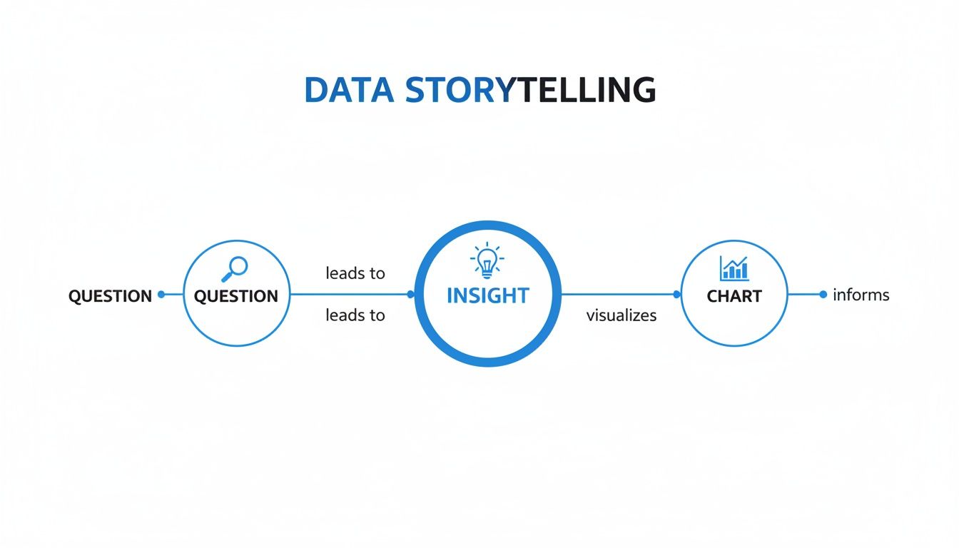
This flowchart shows the simple but powerful path from a business question to a chart that delivers an insight. This loop is the core of self-service dashboard analytics.
Establishing Governance to Prevent Chaos
Putting data in everyone's hands doesn't mean creating a free-for-all. Without the right guardrails, self-service analytics can quickly spiral into chaos, with inconsistent metrics and untrustworthy reports. This is where data governance is non-negotiable.
Think of governance not as a restriction, but as a way to ensure quality and consistency. It comes down to a few key practices:
Define a Single Source of Truth: Centralize your most important business data into one reliable place. This ensures everyone is pulling from the same well.
Create a Data Dictionary: Document what each metric means, how it's calculated, and where it comes from. This simple step eliminates so much confusion and misinterpretation down the line.
Implement Role-Based Access: Give people access only to the data they need to do their jobs. This strengthens security and cuts down on the noise.
Governance is what gives your team the freedom to explore data with confidence. It’s the framework of trust that makes self-service analytics possible, not the set of rules that holds it back.
When you combine a user-friendly tool with clear governance, you create a powerful, scalable analytics culture. To dig deeper into this cultural shift, check out our guide on building a data culture without hiring a data team. This approach not only empowers your teams but also builds an organization where data-informed decisions are the norm, not the exception.
The Future Is Conversational and AI-Powered Analytics
The static dashboard we've all grown used to is quickly becoming a relic. While they're fine for keeping an eye on metrics you already know are important, they often hit a wall the moment you have a new, unexpected question. The future of dashboard data analytics isn't just about more clicks and filters; it's about making analytics conversational, intelligent, and driven by AI.
This shift changes everything. We're moving from just looking at data to actually communicating with it. Think about it: what if you could ask your business data a question in plain English, just like you’d ask a colleague who's an expert on the topic? That's the core promise of conversational analytics, an approach that flattens the steep learning curve once required for business intelligence.
Instead of navigating a maze of drop-down menus and pre-configured reports, you can get right to the answer. This accessibility is what really sets modern BI apart from the tools of the past. It opens up deep data exploration to everyone on the team, not just the data specialists.
Talking to Your Data
The whole idea behind conversational analytics is to make interacting with data as natural as sending a text. This is all possible thanks to AI agents that can understand natural language and, crucially, the specific context of your business.
For instance, a product manager could just ask:
"Compare user churn rates for our top three subscription plans last quarter."
"Show me the daily active users from our last marketing campaign, broken down by country."
"What's the correlation between feature adoption and customer lifetime value?"
In a traditional setup, getting answers to these questions would mean writing custom SQL queries or spending hours wrangling data in spreadsheets. With an AI-powered platform like Querio, those questions get you a precise, accurate visualization in seconds. The AI already knows your data model, understands what "churn rate" means in your business, and delivers the insight immediately.
This isn't just about getting answers faster. It's about building a culture of curiosity where anyone can follow a hunch and ask the next logical question without running into a technical roadblock. This creates a powerful, continuous loop between questions and insights.
The AI Agent as Your Analytics Engineer
Behind the curtain, this smooth experience is driven by sophisticated AI that essentially acts as your personal analytics engineer. This role, which traditionally bridges the gap between raw data and business analysis, involves cleaning, transforming, and modeling data to make it usable. AI now automates a huge chunk of that meticulous work.
When you connect a tool like Querio to your data warehouse, its AI agents get to work on several critical tasks:
Learns Your Business Context: The AI scans your data schema and business logic to build a solid model of how your company operates. It figures out your key entities—like "users," "subscriptions," and "revenue"—and how they're all connected.
Translates Language to Logic: When you ask a question, the AI translates your everyday English into a precise query that can be executed against your database. This means no one on your team needs to write a single line of code.
Generates Instant Visualizations: The system doesn't just spit back a table of raw numbers. It automatically picks the best chart to display the answer, whether that’s a line chart for a trend over time or a bar chart for a comparison, telling a clear visual story.
This AI-first approach is completely changing the analytics game. In fact, it's projected that by 2027, 60% of repetitive data management tasks will be automated with AI-embedded tools. This automation frees up your analysts to focus on high-level strategy and discovery, rather than getting stuck building manual reports. The future of dashboard analytics is one where every single team member can make data-informed decisions with speed and confidence.
Common Questions About Dashboard Data Analytics
As teams dip their toes into the world of dashboard analytics, a few questions always pop up. Getting clear, straightforward answers to these early hurdles can be the difference between a project that fizzles out and one that genuinely helps your company make better decisions. Let's tackle some of the most common ones.
How Do I Know My Dashboard Data Is Accurate?
This is a big one. If your team doesn't trust the numbers, your dashboard is just a pretty picture. The whole effort hinges on accuracy, which all starts with creating a single source of truth—one centralized, reliable place where all your key business data lives.
A good business intelligence platform should connect directly to this source in a read-only mode. This is crucial because it prevents anyone from accidentally changing the raw data, keeping it clean and consistent. It's also vital to create a shared data dictionary, so when someone says "active user," everyone agrees on what that actually means. Finally, make a habit of running regular data audits to catch little inconsistencies before they snowball into bad decisions.
What's the Difference Between a Dashboard and a Report?
It’s a classic point of confusion, but the distinction is actually pretty simple once you see it.
Think of a report as a static photograph—it captures data at a specific moment in time to answer a known question, like, "What were our total sales last quarter?" A dashboard, on the other hand, is like a live video feed—it's interactive and dynamic, built for real-time monitoring and exploration.
Reports are built to inform people about something that’s already happened. Dashboards are built to let people explore the data for themselves, play with filters, and drill down to find the "why" behind the numbers. One is for reviewing the past; the other is for navigating the present.
Can Non-Technical Teams Really Use These Tools?
Absolutely. In fact, that’s the whole point of modern tools. They're specifically designed to get data into the hands of the people who need it, without them having to wait in line for an analyst.
The key is to pick a platform that makes self-service a priority. Look for a few game-changing features:
Natural Language Query: This lets users ask questions in plain English, just like they would to a colleague. Think: "Show me our top 10 customers by revenue this year."
Drag-and-Drop Builders: Intuitive interfaces that let anyone build a chart or a table without touching a single line of code.
Pre-Built Templates: Ready-to-use dashboards for common scenarios, like tracking marketing campaigns or monitoring a sales pipeline, so you aren't starting from scratch.
When you have the right tool, your product, marketing, and operations teams can find their own answers. This not only makes them faster and more autonomous but also frees up your data experts to focus on deeper, more strategic work.
How Do We Build Our First Business Dashboard?
The secret? Start small and stay focused. The biggest mistake people make is trying to build a massive, do-everything dashboard for the entire company right out of the gate. That’s a recipe for a bloated, confusing mess that nobody uses.
Instead, take a much more focused, step-by-step approach:
Pick one important business question for a single team. For example, "What's our new user activation rate?"
Identify the 3-5 key metrics that directly answer that question. No more, no less.
Connect your data source to a user-friendly BI tool.
Build a simple dashboard displaying just those essential metrics.
Share it, get feedback, and iterate.
This method delivers real value almost immediately and builds momentum. Once one team has a dashboard they love, other teams will naturally want in, creating a genuine pull for data analytics across the whole organization.
Ready to empower your teams to answer their own data questions in seconds? With Querio, you can go from raw data to actionable insights without writing a single line of code. See how our AI-powered platform can help you build a data-driven culture.

