Unlocking Insights with Data Visualisation Dashboards
A complete guide to data visualisation dashboards. Learn how to build dashboards that turn complex data into clear, actionable business insights.
https://www.youtube.com/watch?v=AWRWG831Q1w
published
Outrank AI
data visualisation dashboards, business intelligence, kpi dashboards, dashboard design, data analytics
377b3561-3963-4c9a-b389-18cb4503905b

Think of a data visualisation dashboard as the command center for your business. It takes all your most important metrics—from sales numbers to website traffic—and puts them onto a single screen, using visuals like charts and graphs to make sense of it all. Instead of getting lost in complicated spreadsheets, you get an intuitive, interactive snapshot of your company's health.
The Cockpit for Your Business
Ever tried to make sense of a business by looking at raw data tables? It’s like trying to fly a plane with thousands of disconnected dials scattered all over the place. You have no idea what’s important or what needs your immediate attention. This is where a dashboard comes in. It's the cockpit for your business.
A well-designed dashboard brings all your critical instruments—your sales pipeline, user engagement stats, operational costs, and marketing results—into one cohesive view. Suddenly, you're not drowning in a sea of numbers anymore. You're seeing the full picture, in real time.
This centralized view is a game-changer. It means founders, product managers, and ops leaders can make smart decisions on the fly without having to wait for an analyst to run a report for every little question.
From Static Reports to Dynamic Insights
Not too long ago, "data analysis" meant someone spending hours wrestling with Excel to produce a static report. By the time that report landed in your inbox, the data was already old. The whole process was slow, clunky, and completely out of sync with the pace of a modern business.
Data visualisation dashboards are a huge leap forward. They aren't static documents; they're living, breathing tools that connect directly to your databases, CRMs, and other data sources.
A great dashboard doesn't just show you numbers; it gives you the context to ask smarter questions. It turns data from something you just look at into a real-time conversation about where your business is headed.
Why Dashboards Matter for Decision-Making
The real magic of a dashboard is that it makes data accessible to everyone, not just the people with "analyst" in their job title. When anyone on the team can understand performance at a glance, you start building a culture where decisions are backed by facts, not just gut feelings.
Here’s why they’re so powerful:
Speed to Insight: You can get answers to critical questions in seconds, not days. This drastically shortens the time between spotting a trend and acting on it.
Improved Clarity: Our brains are wired to process images. Turning numbers into charts and graphs makes it incredibly easy to spot patterns, outliers, and opportunities you'd otherwise miss.
Enhanced Alignment: When the CEO and a junior marketer are looking at the same trusted numbers, everyone is on the same page about goals and progress. It cuts down on a lot of confusion.
Proactive Problem-Solving: With real-time monitoring, you can catch small issues before they blow up into big problems. Think of it as an early warning system for your business.
Modern dashboards are built on powerful data visualization tools that do all the heavy lifting in the background. This frees up your team to stop wrangling data and start focusing on what it actually means—and what they should do about it.
2. Choosing the Right Dashboard for Your Goal
Not all dashboards are created equal. Think of it like this: you wouldn't use a microscope to spot a ship on the horizon, or a telescope to examine a single cell. Each tool has a specific job, and picking the right one is everything. The same goes for dashboards—using the wrong type leads to confusion and missed opportunities.
The key is matching the dashboard's purpose to your team's actual needs. A CEO doesn’t need a minute-by-minute log of every support ticket, but the head of customer success absolutely does. This simple distinction is the foundation for the three main types of dashboards you'll encounter.
The Three Core Dashboard Types
Before you build anything, you need to answer one question: what’s the point? Are you tracking long-term strategic goals, digging into a specific trend to find out why something happened, or are you monitoring the day-to-day pulse of the business?
Each of these questions maps directly to a specific kind of dashboard:
Strategic Dashboards: These give you the "30,000-foot view" of the business. They’re all about tracking high-level Key Performance Indicators (KPIs) that show progress toward big-picture goals.
Analytical Dashboards: Built for exploration. These are the dashboards that let you slice, dice, and drill down into massive datasets to uncover the story behind the numbers.
Operational Dashboards: These are your real-time monitors. They keep a close eye on business processes as they happen, tracking granular data to make sure everything is running smoothly right now.
It’s no surprise that more and more companies are catching on. The global market for data visualization tools was valued at USD 10.92 billion in 2023 and is expected to hit USD 18.36 billion by 2030. This growth isn't just about pretty charts; it's driven by a real, urgent need for businesses to turn messy data into clear insights that actually move the needle.
This flowchart can help you figure out if you're ready to start building dashboards to organize your data and sharpen your decision-making.
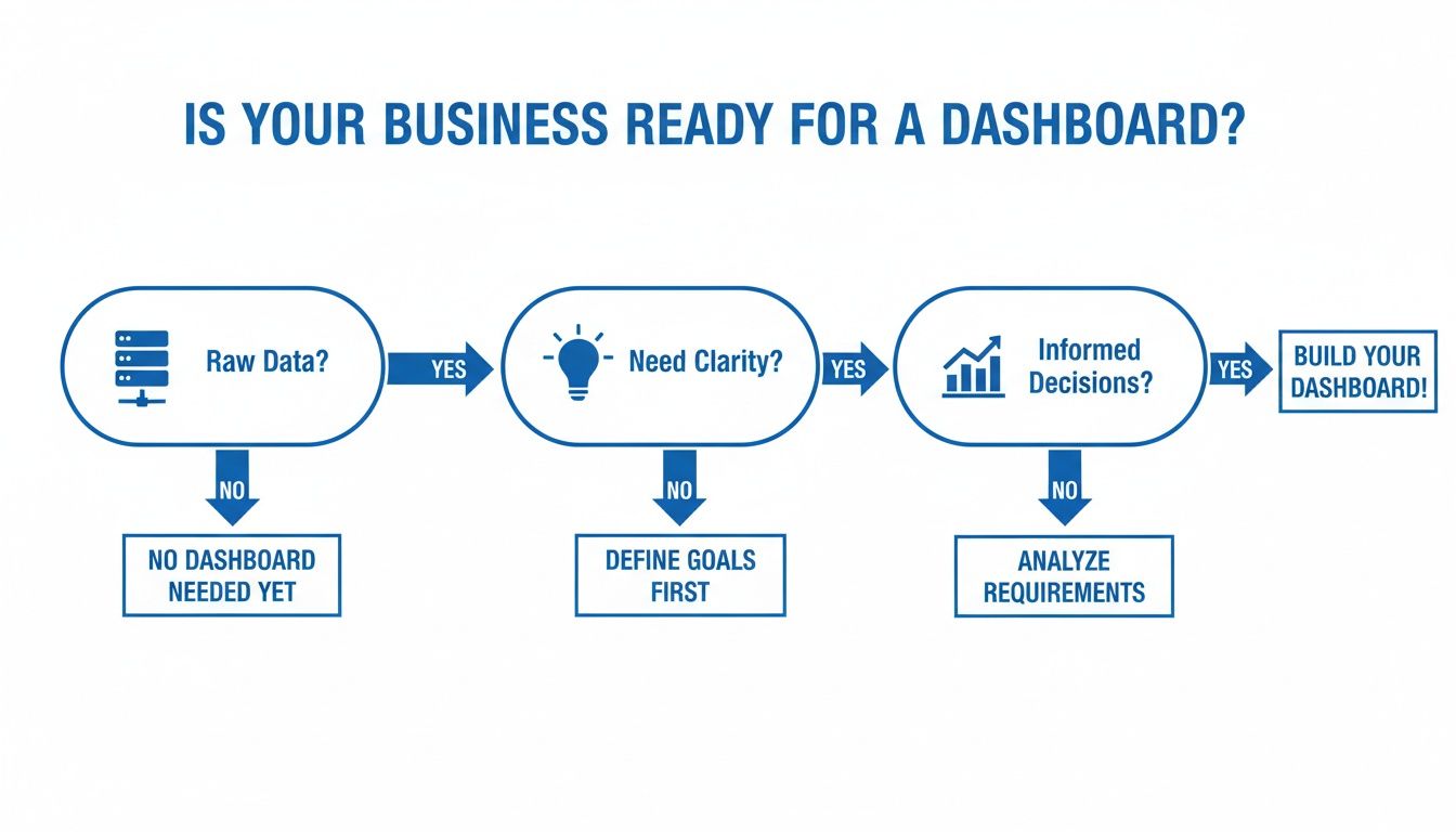
As the chart shows, if you’re sitting on raw data and need a clearer picture to make smarter calls, a dashboard is your logical next step.
Matching Dashboards to Business Needs
To help you get a better feel for this, here's a quick comparison of the three types.
Comparison of Dashboard Types
This table breaks down the core differences between strategic, analytical, and operational dashboards to help you choose the right one for your team's goals.
Dashboard Type | Primary Goal | Target Audience | Key Focus | Data Refresh Rate |
|---|---|---|---|---|
Strategic | Monitor long-term health and strategy | Executives, C-Suite | High-level KPIs, growth trends, market position | Weekly, Monthly, Quarterly |
Analytical | Investigate trends and find root causes | Data Analysts, Product Managers | Data exploration, comparisons, segmentation | Daily, Weekly |
Operational | Track real-time performance and processes | Ops teams, Support, Sales Reps | Live metrics, immediate alerts, efficiency | Real-time, every few minutes |
Seeing the differences laid out like this makes it easier to pinpoint exactly what your team needs to succeed.
Let's look at how this plays out in the real world. A CEO might use a strategic dashboard to keep an eye on quarterly revenue growth and market share. The data probably only updates weekly or monthly because the focus is on the bigger picture, not daily noise.
A data analyst, on the other hand, would live in an analytical dashboard. If user engagement suddenly drops, they need to jump in and figure out why. They’ll need to filter by user demographics, time periods, and feature usage to pinpoint the cause. These dashboards are interactive by nature, designed for deep dives.
Meanwhile, a customer support manager is glued to an operational dashboard that shows daily ticket volume and first-response times. This data has to be as close to real-time as possible. If there's a sudden spike in tickets, the dashboard flags it instantly, letting the manager shift resources on the fly.
Each dashboard type answers a fundamentally different question. Strategic asks, "Where are we going?" Analytical asks, "Why is this happening?" And operational asks, "What's happening right now?" Picking the right one ensures your team gets the right answer when they need it most.
For a deeper look into the tools that can help you build these, check out our guide on the best dashboard software to find a platform that fits your needs. Getting these distinctions right from the start is the difference between creating a dashboard that adds real value and one that just shows a bunch of numbers.
Mastering the Principles of Effective Dashboard Design
A truly powerful dashboard does more than just throw charts on a screen; it tells a clear story, fast. Get it right, and you empower your team with instant insights. Get it wrong, and you just create noise and confusion. This isn't about making things look pretty—it's a discipline that blends smart communication, a little bit of psychology, and a whole lot of simplicity.
The ultimate test is what designers call the "five-second rule." Can someone look at your dashboard and get the main takeaway in five seconds flat? If not, it’s time to go back to the drawing board. Achieving that kind of clarity means being ruthless about what you include. It’s a principle seen in other high-stakes fields, too, like medical device user interface design, where understanding information quickly is absolutely critical.

Establish a Clear Visual Hierarchy
Think about how you read a webpage. Your eyes naturally follow a path, usually a "Z" pattern—top-left to top-right, then down and across again. Smart dashboard design works with this natural tendency, not against it.
This means your single most important number, the one metric that defines success for that dashboard, belongs in the top-left corner. No exceptions. That’s prime real estate. It's the first place people look, so it needs to answer their biggest question immediately. From there, you can arrange everything else in descending order of importance, guiding their eyes through a logical narrative.
A well-designed dashboard tells a story. The top-left is the headline, the charts that follow are the key paragraphs, and the granular details are the footnotes. Each piece should logically connect to the next.
This kind of strategic layout ensures that even a quick glance delivers the most critical information, while the deeper details are there for those who need to explore further.
Choose the Right Chart for the Job
This one is fundamental. Using the wrong chart type for your data is like trying to use a hammer to turn a screw—it just doesn't work. Each visualization has a specific job, and matching the chart to the data is one of the easiest ways to bring clarity to your dashboard.
Here are a few ground rules to live by:
Line Charts for Trends: Perfect for showing how a metric changes over time. Think monthly revenue over the last year.
Bar Charts for Comparisons: The go-to for comparing distinct categories, like sales performance across different regions or marketing channels.
Pie Charts for Composition: Use these sparingly! They only work well for showing parts of a whole when you have fewer than five categories. Often, a simple bar chart is much clearer.
If you want to go deeper on picking the perfect visuals, check out our complete guide on data visualization best practices.
Emphasize Clarity and Simplicity
This last principle really ties it all together: keep it simple. Fight the temptation to cram every single metric onto one screen. A cluttered dashboard is an useless dashboard.
Every element—every chart, number, and label—has to earn its place. If it doesn't help answer the core business question the dashboard was built for, get rid of it.
This very demand for simplicity is what’s fuelling the industry. The market for data visualization tools grew from USD 5.9 billion in 2021 and is on track to hit USD 10.2 billion by 2026. That explosive growth is all about the need for tools that can cut through the complexity and deliver clear, actionable insights—something AI-driven platforms are getting better at every day.
By focusing on a clear hierarchy, choosing the right charts, and embracing a minimalist approach, you'll build dashboards that are more than just data displays. They become powerful tools for making smarter, faster decisions.
Selecting the Right KPIs for Your Team Dashboards
A dashboard is only as good as the metrics it shows. If you pack it with vanity metrics or irrelevant data, you’ve built a beautiful map of the wrong territory—it looks impressive, but it won’t get you where you need to go. The real magic happens when you choose Key Performance Indicators (KPIs) that directly track what your team is trying to achieve.
When you nail the KPIs, a dashboard shifts from being a passive screen of charts to an active tool for making decisions. It’s all about measuring what truly matters so that every number tells a story and guides your next move. This starts with a solid understanding of each team's unique goals and headaches.

Key Performance Indicators for Product Teams
Product teams live at the crossroads of user needs and business goals. Their dashboards need to give them an unfiltered view of product health, user behaviour, and engagement. Surface-level metrics like "daily active users" just don't cut it anymore; they need KPIs that dig into the why behind what users are doing.
For a product manager, a great dashboard answers critical questions like, "Is anyone actually using our new feature?" and "Are our customers sticking around for the long haul?"
Here are a few essential KPIs for any product team's dashboard:
Feature Adoption Rate: This tells you the percentage of users who are actively trying out a specific feature. If the adoption rate is low, it could be a red flag for a bad user experience, a lack of awareness, or maybe the feature just isn’t solving a real problem.
Customer Churn Rate: This is the percentage of customers who stop using your product over a given period. It's a vital health check. A high churn rate can kill growth and usually points to serious problems with the product’s value or overall satisfaction.
User Engagement Score: Instead of tracking a dozen different actions, you can create a composite score that combines things like logins, feature usage, and session length. This helps you quickly spot your power users and, more importantly, identify at-risk accounts before they leave.
Essential Metrics for Operations Teams
The operations team is the engine of the business, making sure everything runs smoothly, efficiently, and on budget. Their dashboards are often mission control, needing real-time or near-real-time data to spot bottlenecks and squash problems the moment they appear.
Here, the name of the game is speed, quality, and efficiency. Every single metric should tie back to the core operational goals: reduce waste and deliver better service.
For an operations team, a dashboard is a command centre. It doesn't just report on past performance; it provides the live data needed to manage the present moment effectively.
An Ops dashboard needs to track performance against service level agreements (SLAs) and internal efficiency targets.
Average Ticket Resolution Time: How long does it take to solve a customer issue, from the moment it's opened to the moment it's closed? This is a direct measure of your support team's efficiency and has a huge impact on customer happiness.
Order Fulfillment Accuracy: This tracks the percentage of orders shipped without any errors—no wrong items, incorrect quantities, or damage. For any e-commerce or logistics company, this KPI is crucial for building customer trust and keeping operational costs down.
First Contact Resolution (FCR): What percentage of customer issues are completely solved in a single interaction? A high FCR is a great sign that you have a knowledgeable and efficient support team.
Critical KPIs for Finance Teams
Finance teams need dashboards that offer a precise and reliable picture of the company’s financial health. Their KPIs are often more strategic, focused on top-line growth, profitability, and the overall sustainability of the business model. There's simply no room for error—accuracy and clarity are everything.
These dashboards are fundamental for forecasting, budgeting, and reporting to investors and stakeholders. They have to tell the financial story of the business, plain and simple.
Here are a few indispensable KPIs you’ll find on a finance dashboard:
Monthly Recurring Revenue (MRR): For any subscription business, MRR is the lifeblood. Tracking its growth—including new revenue, expansion from existing customers, and churn—gives you a clear picture of business momentum.
Customer Lifetime Value (CLV): This is the total revenue you can reasonably expect from a single customer over their entire relationship with you. When you compare it to your Customer Acquisition Cost (CAC), you get a powerful look at the long-term profitability of your business model.
Gross Margin: This shows you the percentage of revenue you have left after accounting for the cost of goods sold (COGS). It’s a fundamental measure of how profitable and efficient your core business is.
By carefully selecting KPIs tailored to each team's role, you can make sure your dashboards are more than just informative—they become essential tools for driving the business forward.
Embedding Dashboards for a Seamless User Experience
Why keep your most valuable insights locked up in internal tools? The real magic happens when you put data dashboards directly into the hands of your customers. This is the whole idea behind embedded analytics—making dashboards feel like a natural, built-in part of your own application.
Instead of making users jump over to another platform to see their data, you bring the insights straight to them. This creates a much stickier, more valuable experience. Your app stops being just a tool and becomes a hub for smart decisions, giving customers the information they need, right where they're already working.
This isn't just a niche feature anymore; it's becoming a standard for modern software. Interactive dashboards are fundamentally changing how people interact with business data, and it's fueling massive growth in the data visualization market. The market was already worth USD 5.8 billion in 2024 and is on track to hit USD 12.6 billion by 2033. This surge shows just how much demand there is for analytics that are seamlessly integrated. You can dig deeper into this trend by reading more on the Data Visualization Development Services Market.
Building a Secure Multi-Tenant Experience
When you open up dashboards to external users, security has to be your top priority. You're not just serving your own trusted team anymore. You're dealing with multiple customers (or "tenants"), and their data absolutely must be kept separate and secure. A couple of key technologies make this possible.
Single Sign-On (SSO): This is all about convenience and a professional feel. SSO lets your users access the embedded dashboard with the same login they already use for your application. No more juggling different usernames and passwords. It's a smooth, seamless experience.
Row-Level Security (RLS): Think of this as the technical muscle behind a secure multi-tenant system. RLS is a database feature that enforces strict rules, ensuring users only see the data that belongs to them. An employee from Company A will only ever see Company A’s data, even if all the data lives in the same database.
Building in robust security isn't just a technical checkbox. It's about earning and keeping your customers' trust. They need to be 100% confident that their sensitive information is locked down and they are only seeing their own data.
Customizing the Look and Feel with White-Labeling
For an embedded dashboard to feel like it truly belongs in your app, it has to look the part. That’s where white-labeling comes in. A great embedded analytics solution gives you the power to customize every visual detail to match your product's branding.
This typically includes things like:
Changing colors to fit your existing design system.
Using your own company fonts and logos.
Adjusting the layout so it fits perfectly within your UI.
The goal is to make the dashboard feel like it was built from scratch by your own developers, not just plugged in from a third-party tool. This kind of deep integration is what separates a clunky experience from a polished one. For a more detailed guide, check out our article on how to embed dashboards in your SaaS product.
By combining seamless embedding, airtight security, and deep customization, you can transform your data dashboards from a nice-to-have into a serious competitive advantage.
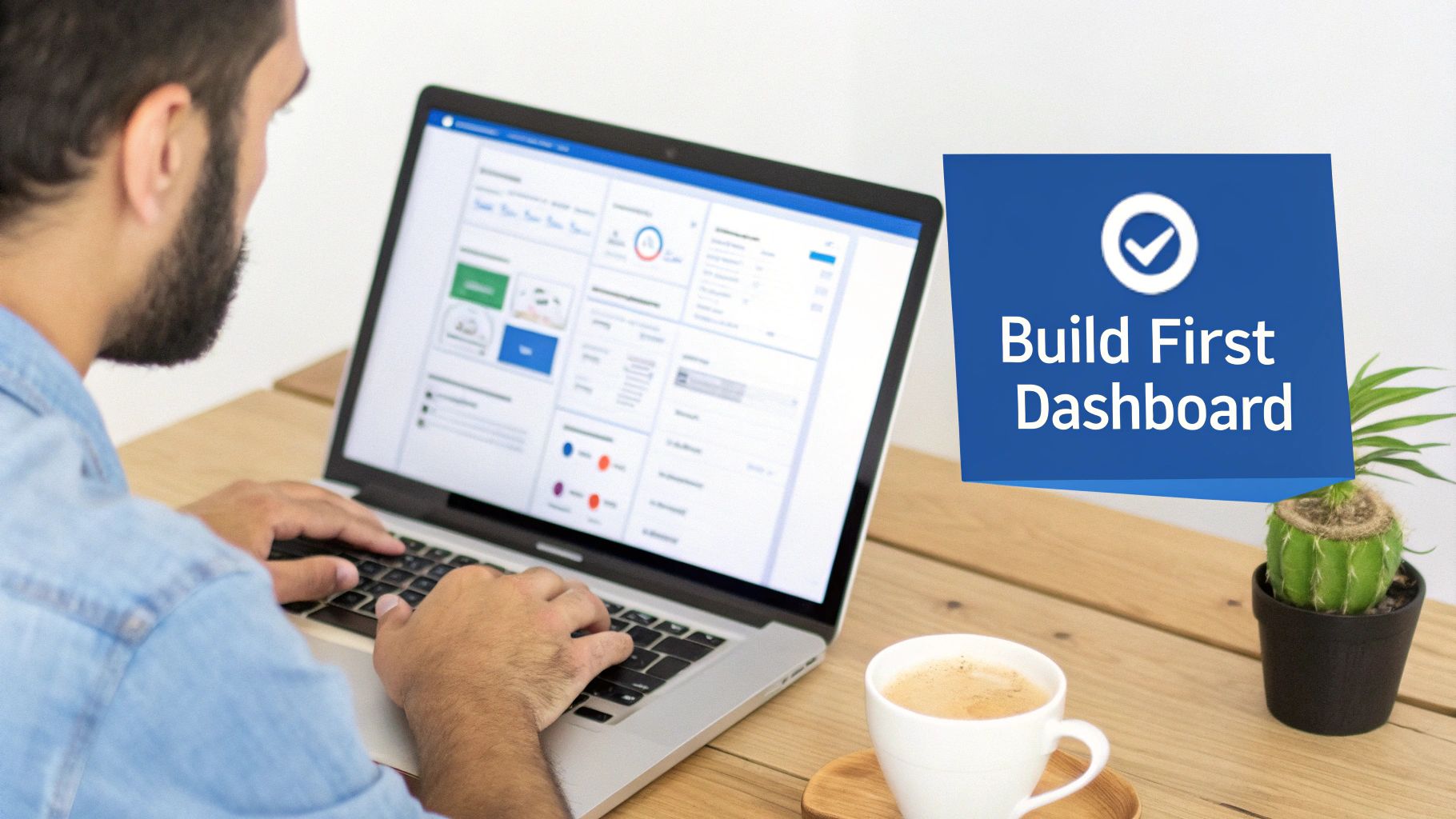
How to Build Your First Dashboard
Jumping from theory to actually building something can feel like a big leap, but creating your first data visualisation dashboard is surprisingly straightforward. Forget about complex coding or needing a data science degree. Modern BI platforms have made it all about clear, strategic thinking.
It all starts with a single, powerful question. Before you even think about connecting a data source or picking a chart type, you have to nail down the main business problem you're trying to solve. What's the one thing your team absolutely needs to know to make smarter decisions next week?
Keeping that question front and centre is your best defence against building a cluttered dashboard that shows a lot of noise but communicates nothing useful. Once you have your core question locked in, you can follow a simple, four-step framework to bring your dashboard to life.
The Four-Step Dashboard Creation Framework
Think of this as your roadmap. Following these steps in order turns what seems like a complex project into a manageable one that delivers real value, fast.
Define Your Core Question and KPIs: First things first, pinpoint the most critical business question. Maybe it's, "Which marketing channels are bringing in the most qualified leads?" or "Are we hitting our customer support response time targets?" Once you have the question, identify the 2-3 KPIs that give you a direct answer.
Connect Your Data Sources: Today's BI platforms make this part easy. You can connect directly to your databases, CRM, marketing tools, or even the spreadsheets where your data is stored. The aim here is to create a single source of truth that your dashboard can pull from automatically.
Create and Arrange Your Visualizations: This is the fun part, where your data starts telling its story. Using simple drag-and-drop tools or even plain-English queries, build a visual for each of your KPIs. A line chart is perfect for tracking lead volume over time, while a bar chart is great for comparing channel performance. Lay them out logically, always putting your most important KPI in the top-left corner where eyes go first.
Share and Iterate: A dashboard is only valuable if people see it and use it. Share your creation with key stakeholders and teammates. Ask for feedback. Is it clear? Can they take action based on it? The first version is never the final one, so use their input to keep refining it over time.
Building your first dashboard is really an exercise in focus. Fight the temptation to cram in every metric you can think of. A great dashboard isn't defined by how much it shows, but by how quickly it answers one important question.
By following this structured path, you can turn a sea of messy data into a clear, actionable dashboard in just a few hours. Any team lead can build the exact tool they need to drive informed decisions without waiting weeks for an analyst's report. That new speed completely changes how teams work, fostering a culture where data-driven agility is the norm.
Frequently Asked Questions
Even with the right tools, rolling out data dashboards can throw a few curveballs your way. Let's walk through some of the most common questions and sticking points that teams run into. Getting these right from the start can save you a world of headaches down the road.
How Do We Ensure Our Dashboard Data Is Accurate?
If people can't trust the data, the dashboard is worthless. The absolute most important step is to establish a single source of truth (SSOT) for your data. Think of it as the one official, verified well that everyone drinks from.
Without an SSOT, you get chaos. The marketing team pulls revenue from Stripe, the finance team pulls it from the data warehouse, and suddenly you have two different numbers for the same metric. This erodes trust fast. Centralizing your data ensures that when the dashboard says you made $50,000 last month, every other report and every other team sees that exact same number.
What Is the Most Common Dashboard Design Mistake?
Hands down, the biggest mistake is information overload. It’s so tempting to cram every metric you can think of onto one screen, assuming more data is always better. What you end up with is a cluttered, overwhelming mess where nothing stands out—a clear violation of the "five-second rule."
A great dashboard isn’t defined by how much information it contains, but by how little it needs to tell a powerful story. If every element is screaming for attention, no single insight can be heard.
Remember, less is more. Each dashboard should be laser-focused on answering a specific set of questions for a specific audience. Be ruthless. If a chart doesn't directly support that goal, cut it.
How Can We Encourage Our Team to Actually Use the Dashboards?
Building a beautiful dashboard is one thing; getting people to use it is another challenge entirely. If you want dashboards to become part of your company's DNA, you have to weave them directly into how your team works every single day.
Here are a few simple ways to make that happen:
Make it Part of the Routine: Kick off every weekly meeting by pulling up the team dashboard. Let the numbers on the screen guide the conversation about what's working, what's not, and what to focus on next.
Connect KPIs to Goals: Tie the metrics on the dashboard directly to team or individual performance objectives. When people see how their work moves the needle, they're instantly more engaged.
Default to Data: When someone asks a question in a meeting or on Slack, make your first instinct to say, "Great question, let's check the dashboard." This simple habit trains everyone to look to the data for answers first.
Ready to build dashboards that everyone will actually use? Querio is an AI-powered BI platform that lets your entire team get answers from your data just by asking questions in plain English. Stop the endless cycle of manual reports and give every department the power to make smarter, faster decisions. Start turning your data into insights today.

