Build a High-Performance Dashboard in React From Scratch
A practical guide to building a production-ready dashboard in React. Learn setup, data visualization, security, and deployment for high-performance apps.
published
Outrank AI
dashboard in react, react dashboard tutorial, data visualization react, react analytics, custom dashboard
11eb250d-684a-45d4-81c6-a15e0c8f9142

If you want to give your product a serious competitive edge, pull your analytics out of those clunky, third-party BI tools and build a dashboard in React directly into your application. Doing this gives you total control over the user experience, lets you pipe in real-time data, and keeps everything perfectly on-brand.
Why Build a Custom Dashboard in React?
Sooner or later, most product teams hit a wall with traditional BI tools. They're sluggish, completely disconnected from the actual application, and often force users into a jarring, iframe-based experience. The whole reporting cycle gets bogged down waiting for data teams to build or update dashboards. This friction is a killer for adoption and prevents users from actually getting value from their own data.
Building a custom dashboard in React cuts right through these problems.
When you own the front end, you can craft a user experience that feels completely native to your product, not like something that was just tacked on. This is where React’s component-based architecture really proves its worth, letting you build out reusable, interactive, and snappy data visualizations. To see the bigger picture, it's worth understanding the core benefits of custom software development and how they apply here.
This flow shows exactly what I mean—the move from a restrictive BI tool to a flexible, product-native React dashboard.

As you can see, shifting from a locked-down system to a custom React build is what really unlocks product innovation and delivers value straight to your users.
Taking Control of Your Analytics Experience
Ultimately, the choice to build a dashboard in React is about owning your product's data story. You’re not just outsourcing your analytics; you’re making them a core, indispensable feature. This move comes with some huge advantages:
A Truly Seamless User Experience: Your dashboards will match your app’s design, branding, and performance, creating a smooth, professional feel. No more weird, out-of-place iframes.
Deep, Actionable Integration: You can link analytics directly to actions within your app. Imagine a user seeing a key insight and being able to act on it with a single click, without ever leaving your platform.
Complete Customization: You're finally free from the rigid templates of BI tools. You can build the exact charts, tables, and interactive elements your users have been asking for.
Building a custom dashboard in React transforms analytics from a passive reporting tool into an active, integrated part of your product that genuinely drives user engagement and keeps them coming back.
The sheer popularity of the framework is another massive plus. By 2025, React is projected to power over 11 million websites, and it's the go-to choice for 40% of developers doing front-end work. This huge community means there’s a robust ecosystem of libraries and incredible support for just about any data-heavy interface you can dream up.
Of course, a project like this needs a solid plan from the get-go. Before you dive into the code, I highly recommend checking out our guide on how to create a proper https://querio.ai/articles/data-dashboard-planner. It'll help you map out your goals, define your metrics, and understand user needs first.
Laying the Groundwork: Project Setup and Your Data Foundation
Every great dashboard starts with a solid foundation. Before you can even think about visualizing data, you need to get your project organized and figure out how you're going to pull in all that information. Honestly, the decisions you make right now will ripple through the entire project, affecting everything from performance to how easy it is to maintain down the road.
We'll kick things off by scaffolding a modern React app with Vite. For years, Create React App was the go-to, but Vite has pretty much taken over. Its development server is incredibly fast, and its build process is just smarter, using native ES modules. This speed isn't just a nice-to-have; it genuinely makes the day-to-day coding experience better, especially when you're building a complex dashboard in react.
Getting started is surprisingly painless. Just pop open your terminal and run this:
npm create vite@latest my-react-dashboard -- --template react
This command spins up a new React project inside a my-react-dashboard folder. Once it's finished, jump into that directory (cd my-react-dashboard), install the necessary packages (npm install), and fire up the dev server (npm run dev). Within seconds, you'll have a live React app running.
Structuring Your Project to Avoid Future Headaches
Okay, you've got a running app. Now what? The absolute next step is to create a folder structure that makes sense. A messy project is a nightmare waiting to happen. I've found that a simple, clear separation of concerns within the src folder is the most effective approach.
Here’s a practical structure that I use all the time:
/components: This is home for all your reusable UI bits—charts, tables, those little stat cards, you name it. I often break this down further into subfolders like
/chartsor/layoutto keep things tidy./services: All your data-fetching logic goes here. Creating dedicated API services keeps the data stuff completely separate from your UI components, which is a massive win for clean code.
/hooks: Perfect for custom hooks that you'll reuse. Think of something like a
useFetchDatahook that neatly handles loading spinners and error messages for you./pages: If your dashboard has multiple views (like an "Overview" and a "Sales Details" page), this folder will hold the main component for each one.
This isn't just about being neat. It's about creating a clear architecture. When some data isn't loading correctly, you know immediately to check the /services folder instead of digging through a dozen different component files.
Building the Data Layer with Axios
Your dashboard in react is just a pretty shell without data. We need a reliable way to talk to our backend APIs. For this, Axios is my go-to. It's a promise-based HTTP client that makes API requests and response handling straightforward.
First, let's get it installed:
npm install axios
Next, we'll create our first API service. In your src/services folder, make a new file called apiService.js. Inside, we'll write a function to grab some sales data.
import axios from 'axios';
const API_BASE_URL = 'https://your-api-endpoint.com/api';
export const getSalesData = async (timeframe) => {
try {
const response = await axios.get(${API_BASE_URL}/sales, {
params: { timeframe } // e.g., '7d', '30d'
});
return response.data;
} catch (error) {
console.error("Error fetching sales data:", error);
// In a real app, you'd handle this error more gracefully
throw error;
}
};
This little async/await function handles fetching from a /sales endpoint and even includes some basic error logging. By putting this logic here, any component that needs sales data can just import getSalesData() without rewriting the same request code over and over. This data layer acts as the bridge between your backend and your React components.
A well-defined data layer is the unsung hero of a scalable dashboard. By abstracting away the complexities of API calls, you allow your UI components to focus solely on presentation, making the entire application easier to test, debug, and expand.
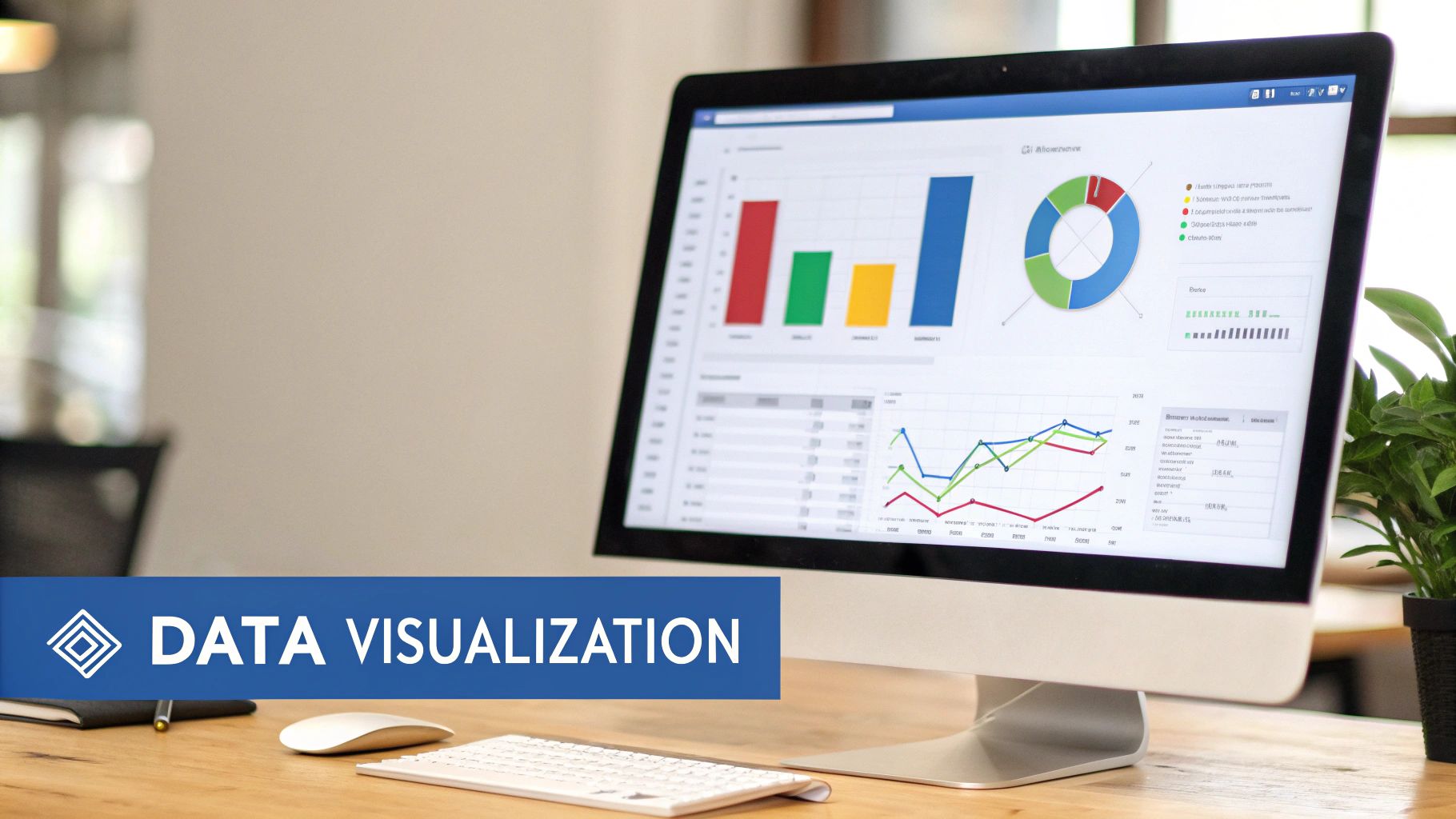
Visualizing Data with Charts, Tables, and Layouts
Alright, you've got your data layer sorted. Now for the fun part: turning all that raw data into something people can actually understand and use. This is where a dashboard truly comes to life. We're not just slapping numbers on a screen; we're crafting an interactive story that reveals trends, flags anomalies, and gives users those "aha!" moments.
A great dashboard feels intuitive. The right combination of charts, tables, and a clean layout is what makes the difference between a high-value analytics tool and a glorified spreadsheet.

Adding Charts with Recharts
First up, charts. You need a good charting library. While a tool like D3.js is incredibly powerful, it's often overkill and comes with a notoriously steep learning curve. For most projects I've worked on, Recharts hits the sweet spot. It's built for React, using a component-based approach that feels right at home.
Getting started is simple. Just install it and its dependencies:
npm install recharts
Let's say we have a SalesChart component that needs to display data from the apiService.js we built. With Recharts, you can wire up a bar chart in minutes. You simply wrap your data in declarative components like <BarChart>, <XAxis>, and <Tooltip>.
import React from 'react';
import { BarChart, Bar, XAxis, YAxis, CartesianGrid, Tooltip, Legend, ResponsiveContainer } from 'recharts';
const SalesChart = ({ data }) => {
return (
<BarChart
data={data}
margin={{ top: 20, right: 30, left: 20, bottom: 5 }}
>
);
};
export default SalesChart;
This snippet gives you a fully responsive bar chart. The real magic here is how modular it is. Need a line chart instead? Just swap <Bar> for <Line>. Want to combine them? Go for it. Of course, choosing the right visual is crucial. If you're unsure, our guide can help you decide: https://querio.ai/articles/data-visualization-guide-choosing-the-right-charts.
Choosing the Right React Charting Library
Picking a library can feel overwhelming. Recharts is a great default, but others have their own strengths. Here’s a quick breakdown to help you decide.
Library | Key Strengths | Best For | Learning Curve |
|---|---|---|---|
Recharts | Component-based, easy to learn, great for standard charts. | Developers who want a quick, React-native experience. | Low |
Chart.js (react-chartjs-2) | Lightweight, versatile, with good performance and animations. | Dashboards needing a wide variety of chart types without a heavy footprint. | Low-Medium |
Nivo | Highly customizable, built on D3, server-side rendering support. | Projects requiring unique, beautifully designed data visualizations. | Medium |
Visx | A collection of low-level D3 primitives for React. Total control. | Teams that want to build completely custom, complex visualizations from scratch. | High |
Ultimately, the best choice depends on your project's specific needs for customization, performance, and the types of charts you need to build. For most dashboards, starting with Recharts or Chart.js is a safe and productive bet.
Building Interactive Data Tables
Charts are fantastic for spotting trends, but sometimes users need to get into the weeds. That’s where tables come in. A proper dashboard table isn't just a static grid—it needs to be interactive, with features like sorting, filtering, and pagination.
My go-to for this is React Table (now TanStack Table). It’s a "headless" library, which is a brilliant concept. It handles all the complex logic for state management, sorting, and filtering but leaves the actual rendering (the JSX and CSS) entirely up to you. You get full control over the markup and styling.
Here’s the general workflow:
Define your columns: Create an array of objects that tells the table how to access the data for each column and what to render in the header.
Hook into your data: Use the
useTablehook, passing it your columns and data. It hands back all the props and state you need.Render your UI: You map over the header groups and rows from the hook to build your
<table>,<thead>, and<tbody>elements, styling them however you want.
The headless approach of React Table is its superpower. It forces a clean separation of concerns, keeping your data logic away from your presentation. You’ll never be stuck fighting a library’s opinionated styling.
To make sure your charts and tables are as effective as possible, it's always a good idea to brush up on data visualization best practices.
Crafting a Responsive Layout
The layout is the skeleton that holds your dashboard together. It needs to be organized, intuitive, and, most importantly, responsive. A dashboard that breaks on a tablet or a large monitor is a dashboard that won't get used.
Modern CSS gives us two fantastic tools for this: Flexbox and Grid.
CSS Grid is your best friend for the overall page structure. You can easily define a master layout with areas for a sidebar, a header, and a main content area to hold your widgets.
Flexbox is perfect for arranging items within those areas. Think of a row of KPI cards at the top of the dashboard or aligning the title and buttons inside a chart's header.
For instance, you could structure your main dashboard container with a few lines of CSS Grid:
.dashboard-layout {
display: grid;
grid-template-columns: 250px 1fr; /* Sidebar and main content /
grid-template-rows: auto 1fr; / Header and content area */
grid-template-areas:
"header header"
"sidebar main";
height: 100vh;
}
This defines a clear, robust, two-dimensional layout. Inside the main grid area, you can then use Flexbox to manage the alignment and flow of your charts and tables. This combination gives you a powerful and flexible system that adapts beautifully to any screen size. To speed things up and ensure consistency, consider a component library like Material-UI or Chakra UI, which provide pre-built, accessible components that play nicely with these layout techniques.
Keeping Your Dashboard Secure, Fast, and Sane
As your dashboard evolves from a simple proof-of-concept into a mission-critical tool, you’ll inevitably hit a wall. Suddenly, you're wrestling with three major growing pains: managing application state, locking down sensitive data, and keeping the whole thing from grinding to a halt.
These aren't just abstract engineering problems. They directly shape how users feel about your dashboard and whether they trust the insights it provides. A slow, buggy, or insecure dashboard is a dead dashboard—no matter how pretty the charts are. This is where we go beyond just fetching and displaying data and start thinking like architects.
Choosing the Right State Management Approach
In the beginning, just passing props down the component tree feels simple enough. But as your dashboard in react becomes more interactive—think global date range filters, user-specific settings, or data shared between multiple widgets—"prop drilling" becomes a genuine nightmare. That’s the signal that you need a real state management strategy.
You don't always have to reach for a heavy, complex library. For simpler dashboards where you just need to share a few global values (like the current user or a theme setting), React's built-in Context API is a fantastic, lightweight choice. It lets you "provide" state to a whole section of your app without manually threading props through every single component.
However, once you have complex state with frequent updates, Context can start to hurt performance by causing too many components to re-render. That's when I'd look at a tool like Zustand. It’s a tiny, hook-based library that gives you the power of a centralized store without the boilerplate that plagued older solutions like Redux. It’s a pragmatic choice for when things get complicated.
My rule of thumb? Start with the simplest thing that works. Use React Context until you feel the pain of prop drilling or see performance hits from excessive re-renders. Then, and only then, bring in a dedicated library like Zustand.
Implementing Authentication and Row-Level Security
For any dashboard handling real business data, security can't be an afterthought—it has to be baked in from day one. The first piece of the puzzle is authentication: proving a user is who they say they are. Building this from scratch is a classic mistake. It's incredibly difficult to get right and easy to mess up.
Instead, lean on a battle-tested third-party provider like Auth0 or Clerk. These services handle the entire authentication flow, from login screens and social sign-on (SSO) to multi-factor authentication. You typically wrap your app in their provider component, which gives you simple hooks like useAuth() to check a user's status and access their info anywhere in your app.
Once you know who the user is, the next step is authorization: making sure they only see the data they're supposed to. The most robust way to handle this is with Row-Level Security (RLS), a feature built into modern databases.
Here’s the typical workflow I use:
Tag API Requests: When your React app calls an API, you attach the user's authentication token (usually a JWT) to the request header.
Validate on the Backend: Your API server receives the request, validates the token, and securely identifies the user.
Let the Database Enforce Rules: The backend then queries the database. This is where RLS works its magic. You can set policies like, "For this query, only return rows where the
tenant_idcolumn matches thetenant_idassociated with this user."
This approach keeps the security logic where it belongs—in your data layer, not your front-end code. This kind of granular control is a must-have for multi-tenant apps and a key reason the global dashboard software market, valued at USD 4.5 billion in 2023, is on such a steep growth trajectory. As businesses demand secure, real-time insights compliant with standards like SOC 2 Type II, the ability to build a secure front end that connects to a hardened back end is a massive advantage. You can explore the full report on dashboard software trends to see how these requirements are shaping the industry.
Optimizing Performance with Caching and Code Splitting
Nothing kills user adoption faster than a slow dashboard. When you're dealing with lots of data and complex visualizations, performance can degrade quickly. Two of my favorite weapons against sluggishness are smart data caching and code splitting.
For data fetching, a library like React Query (now part of TanStack Query) is an absolute game-changer. It’s more than just a fetching utility; it’s a server-state management tool. It automatically handles caching, background data refetching, and de-duping requests for you.
What this means in practice is that if a user navigates away from a page and then comes right back, the data appears instantly from the cache while React Query fetches an update in the background. The UI feels incredibly fast because it's never blocked waiting on the network.
The other huge performance win comes from code splitting. By default, Create React App bundles your entire application into one big JavaScript file. For a dashboard with dozens of widgets and heavy charting libraries, this file can get huge, leading to long initial load times.
With React.lazy and Suspense, you can break that bundle apart. This lets you load the code for a specific dashboard page or a complex chart component only when the user actually needs it. This can slash your initial load time and make a massive difference in how performant your dashboard feels to a first-time user.
A Different Path: Embedded Analytics with Querio
Building a slick, high-performance dashboard in React from the ground up is a fantastic engineering challenge. It’s also a massive undertaking. You're signing up for a serious investment across the entire stack—from designing the data layer and APIs to crafting front-end components, wrestling with state management, and locking down security.
While going fully custom gives you ultimate control, it also eats up your most precious resource: your engineering team's time.
But what if you could give your users that powerful, native-feeling analytics experience without the months-long development slog? This is exactly where embedded analytics platforms like Querio come in. They offer a strategic shortcut, letting you skip the heavy lifting of the build phase and get back to focusing on what makes your product unique.
Get to Market in Days, Not Months
Think about it. Instead of building every single chart, filter, and security rule from scratch, an embedded solution hands you a toolkit of pre-built, production-ready components. With something like Querio's SDK, you can literally drop fully interactive, white-label dashboards right into your React app. This completely rewrites the project timeline. We're talking about going from concept to launch in a matter of days or weeks, not quarters.
This speed is a huge business advantage. You can test out new ideas with users faster, respond to requests for better analytics in your next sprint, and start seeing the value from your data almost instantly. Your engineers get to keep their focus on solving the hard problems in your specific domain, not reinventing the analytics wheel.
The real magic of embedded analytics is that it lets you ship enterprise-grade dashboards as a feature, not as a separate, resource-draining product. You get all the upside of in-app analytics without the technical debt and maintenance headaches that come with it.
Offload the Security and Scaling Headaches
As we've covered, building a secure, multi-tenant dashboard is a serious challenge. You need specialized expertise to properly implement authentication, manage Single Sign-On (SSO), and enforce Row-Level Security (RLS). These are precisely the kinds of complexities that embedded solutions are built to solve right out of the box.
Querio, for instance, takes these critical security concerns off your plate completely. It delivers:
Built-in Multi-Tenancy: Data is automatically and securely isolated between your customers from the start.
SSO/SAML Integration: Users get a seamless and secure login experience that plugs right into their existing identity providers.
Granular Row-Level Security: You just define the access rules, and the platform takes care of enforcing them, making sure users only ever see the data they're supposed to.
This is a massive win for your team's sanity. Instead of becoming security experts overnight, you can lean on a platform that is already SOC 2 Type II audited and designed with enterprise security as a core principle. You can see exactly how Querio handles these challenges in its embedded analytics solution.
The Real-World Business Case
The "build vs. buy" decision always comes down to resources. The demand for talented React developers is intense, and their hourly rates reflect the difficulty of building complex modern applications. Committing that talent to a custom dashboard project is a significant expense.
It's no surprise the global dashboard software market is projected to hit USD 9.8 billion by 2032, fueled by this exact need for real-time data visualization. For any executive, especially at a startup, using an embedded solution is a direct way to avoid the steep cost of custom development. You preserve cash and keep your engineers focused on the core business. To get a sense of the costs, check out these React developer rates and market trends.
Ultimately, a platform like Querio transforms a major capital expenditure into a predictable operational one—all while delivering a better analytics experience much, much faster.
Common Questions When Building a React Dashboard

As you get into the thick of building a dashboard in React, some questions always seem to come up. It's one thing to have a design, but making the right calls on libraries, data handling, and overall strategy is what separates a great dashboard from a mediocre one. Let's tackle some of the most common questions I hear from developers.
What’s the Best Library for React Charts?
Honestly, there's no single "best" library. The right tool really depends on what you're trying to accomplish. It’s the classic trade-off: do you need to get something up and running fast, or do you need deep, granular control for custom visualizations?
For most projects, I recommend starting with Recharts. Its declarative, component-based API feels incredibly intuitive inside a React app. You can get standard bar, line, and pie charts working quickly without getting bogged down in configuration. It just feels right.
But what if you need more exotic chart types or fine-grained control over animations and interactions? That's where a library like Chart.js (via its react-chartjs-2 wrapper) really shines. It's a powerhouse of versatility.
And if you're building something truly unique—think complex, interactive data art—then you'll eventually need the raw power of D3.js. Just know that you're signing up for a much steeper learning curve and a more involved development process.
My advice? Start with Recharts. It will probably cover 80% of what you need. Only move to something more complex like D3 when you hit a wall and can’t find a workaround.
How Should I Handle Real-Time Data Updates?
A dashboard with stale data is pretty useless. Keeping everything fresh is critical, and there are a few good ways to approach real-time (or near-real-time) updates.
For true, instantaneous updates, nothing beats WebSockets. This approach opens a persistent, two-way connection between your server and the client, so the server can push new data the moment it's available. Libraries like Socket.IO can make this much less painful to implement.
If "every few seconds" is good enough, you have simpler options:
Short Polling: This is the old-school
setIntervalmethod where you just refetch data on a timer. It's easy, but it's also noisy and inefficient, leading to a lot of wasted network requests.Server-State Libraries: This is often the sweet spot. Tools like React Query or SWR are fantastic for this. They manage fetching, caching, and even refetching data automatically when a user re-focuses the browser window. You get a near-real-time feel without the complexity of WebSockets.
The right choice really depends on your specific use case. If you're building a live server monitoring tool, you need WebSockets. If it's a sales dashboard that just needs to be updated every few minutes, React Query is your best friend.
When Should I Use an Embedded Solution Instead of Building from Scratch?
Ah, the classic "build vs. buy" dilemma. The answer comes down to your core business, your team's resources, and how fast you need to get this in front of users.
Build a custom dashboard when the analytics experience is your product's core, differentiating feature. If you have a dedicated engineering team ready to handle the development, security, scaling, and ongoing maintenance, and you need absolute control over every pixel, building it yourself is the way to go.
On the other hand, you should choose an embedded solution like Querio when your main goal is to add powerful, secure analytics into your app quickly. This is the best path when:
Time is a factor: You need to deliver value to customers in weeks, not the months or quarters a custom build can take.
Resources are finite: You'd rather have your engineers focused on your core application instead of reinventing the analytics wheel.
Security is non-negotiable: You need to handle complex, enterprise-grade features like SSO, multi-tenancy, and row-level security without becoming a security expert overnight.
Embedded analytics lets you ship a polished, feature-complete dashboard with a tiny fraction of the time, cost, and risk of a ground-up build.
Ready to give your users powerful, self-serve analytics without the development headache? With Querio, you can embed white-label dashboards and AI-powered data exploration directly into your product in record time.

