Business Intelligence
8 Top React Chart Libraries for Data Visualization in 2026
Compare eight React chart libraries by rendering engine, performance, customization, and bundle size to find the best fit for dashboards or real-time data.
In 2026, data visualization tools are critical for turning massive datasets into actionable insights. React chart libraries help developers create interactive, high-performance visualizations for dashboards, analytics, and real-time data streaming. Following data visualisation best practice ensures these charts remain readable and effective. Here are the 8 best React chart libraries you can use this year:
React Chart.js 2: Combines Canvas rendering with easy integration for smooth performance on datasets up to 1 million points.
Recharts: A React-first library with SVG rendering, ideal for smaller datasets and polished visuals.
Victory: Cross-platform support with SVG rendering; great for web and mobile projects.
Visx: Offers low-level primitives for custom visualizations, blending D3 and React.
Nivo: Supports SVG, Canvas, and HTML rendering with advanced interactivity and animations.
React Vis: A reliable, albeit archived, library with SVG and Canvas rendering for standard needs.
ECharts for React: Handles massive datasets (100,000+ points) with advanced 3D and real-time capabilities.
React Stockcharts: Tailored for financial visualizations like candlestick and OHLC charts.
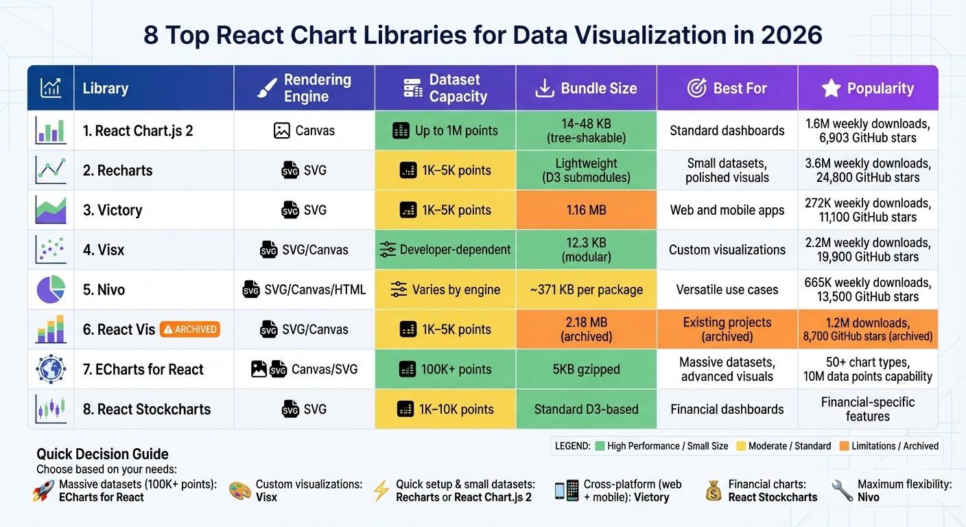
Quick Comparison
Library | Rendering Engine | Dataset Size Capacity | Key Features | Best For |
|---|---|---|---|---|
React Chart.js 2 | Canvas | Up to 1M points | Plugins, responsive, tree-shaking | Standard dashboards |
Recharts | SVG | 1K–5K points | Composable components, responsive | Small datasets, polished visuals |
Victory | SVG | 1K–5K points | Cross-platform, animations | Web and mobile apps |
Visx | SVG/Canvas | Developer-dependent | Low-level primitives, modular | Custom visualizations |
Nivo | SVG/Canvas/HTML | Varies by engine | Multi-engine, animations, interactivity | Versatile use cases |
React Vis | SVG/Canvas | 1K–5K points | Standard charts, interactivity | Existing projects (archived) |
ECharts for React | Canvas/SVG | 100K+ points | 3D, maps, drill-downs, real-time | Massive datasets, advanced visuals |
React Stockcharts | SVG | 1K–10K points | Financial-specific features | Financial dashboards |
Each library has strengths tailored to specific use cases, from lightweight solutions for small datasets to robust tools for handling millions of data points. Choose based on your project's performance, customization, and feature needs.
React Chart Libraries Comparison: Performance, Features, and Use Cases 2026
Top 5 ReactJS chart libraries reviewed: Recharts, Victory, Visx, Nivo and React-chartjs-2
1. React Chart js 2
React-chartjs-2 combines performance and flexibility, making it a go-to choice for charting in React applications. As a React wrapper for Chart.js, it leverages Canvas-based rendering to deliver efficient visualizations. With over 1.6 million weekly downloads [7] and 6,903 GitHub stars [7], it stands out as a popular option in the React ecosystem. Additionally, the robust support of Chart.js’s community, which boasts 67,089 stars [10], further enhances its appeal.
Performance
React-chartjs-2 uses HTML5 Canvas for rendering, which provides better performance than SVG-based libraries, especially for large datasets [1]. It handles up to 1 million data points efficiently with the help of the decimation plugin [11]. However, its performance can dip when dealing with highly complex charts or heavy real-time data updates [10]. For projects involving 100,000+ data points or intricate 3D visualizations, other libraries like ECharts may be a better fit [1][9]. Still, for most standard dashboards, React-chartjs-2 delivers reliable and smooth performance.
Integration Complexity
Getting started with React-chartjs-2 is simple and beginner-friendly. Developers can install it alongside Chart.js using:
Once installed, chart components like <Doughnut /> or <Bar /> can be used just like any other React component. These charts are responsive by default and automatically adjust to window resizing [11]. This ease of use makes it a practical choice for developers of all experience levels.
Customization Options
Customization is handled through a central configuration object, offering flexibility to design charts tailored to specific needs. However, for very complex charts, managing this configuration can become cumbersome [1]. The library’s plugin ecosystem, including tools like chartjs-plugin-zoom, adds advanced features without requiring additional custom code. Version 4.0 also introduced a "Colors" plugin, which provides pre-configured color palettes, reducing setup time [11].
Bundle Size
The library’s wrapper adds approximately 55.1 kB [10] to your project, with Chart.js as a peer dependency. Since version 4.0, React-chartjs-2 supports tree-shaking, which allows developers to import only the components they need - such as specific scales or controllers. This feature helps reduce bundle size and improves loading speeds [11].
2. Recharts
Recharts has made a name for itself as a React-first solution for data visualization. With over 3.6 million weekly downloads [7] and 24,800 GitHub stars [7], it stands out as a favorite among developers working with modern UI frameworks like shadcn/ui. Its composable architecture lets you create charts using familiar React components like <Line />, <XAxis />, and <Tooltip />, making it a natural fit for React's component-based structure [12]. Let’s take a closer look at its performance, integration, and other key features.
Performance
Recharts uses SVG rendering to produce clean, scalable visuals, which works well for most use cases. SVG's compatibility with CSS styling makes it a great option for polished graphics [7]. However, it can hit performance bottlenecks with very large datasets, especially when dealing with tens of thousands of data points [7]. For applications requiring real-time updates or heavy data processing, techniques like throttling, debouncing, or React hooks can help improve efficiency. Additionally, managing complex logic in selectors or within rendering components (rather than in a global store) minimizes unnecessary re-renders [7].
Integration Complexity
Setting up Recharts is straightforward - install it via npm or Yarn. The library supports React versions 16 through 19, but if you're using React 16 or 17, you might need to tweak your package.json to resolve peer dependency conflicts with packages like redux-toolkit or react-redux [15]. One key thing to note: charts aren’t responsive by default. To ensure they adapt to various screen sizes, wrap them in a ResponsiveContainer component [7]. For debugging, Recharts Devtools offers a hook inspector to track how data flows through your charts, making troubleshooting easier [14].
Customization Options
Recharts provides a highly flexible, prop-driven customization model. You can modify component props or replace default elements - such as axis ticks, tooltips, or bar shapes - with your own custom React components [12]. Its reusable components, like <CartesianGrid /> and <Tooltip />, allow for intricate visualizations. For interactive charts, Recharts supports event handling methods like onClick, onMouseEnter, onMouseMove, and onContextMenu. Additionally, the syncId prop lets you synchronize tooltips and brush events across multiple charts, creating cohesive, multi-chart experiences [13].
Bundle Size
Recharts takes an efficient approach to its bundle size by using lightweight D3 submodules instead of the entire D3 library [12][16]. This ensures you only load the essentials needed for SVG-based rendering, keeping your application streamlined without losing functionality. These design choices make Recharts an appealing option, especially for developers looking to balance performance and flexibility.
3. Victory
Victory stands out as a charting library with a strong mix of adaptability and support across platforms. Built on D3 and React, it offers sensible default settings while allowing full customization. With over 11,100 GitHub stars and 272,000 weekly downloads, Victory has gained significant traction [7]. One of its key strengths is cross-platform compatibility - Victory Native uses a nearly identical API for iOS and Android, enabling developers to reuse code between web and mobile projects [17].
Performance
Victory uses SVG rendering to create high-quality, scalable graphics. While this approach works well for most dashboards, reports, and interactive charts, it may encounter performance issues with extremely large datasets or real-time updates compared to Canvas-based libraries [7]. If your project involves tens of thousands of data points, testing performance beforehand is recommended. That said, SVG excels in delivering precise interactivity and smooth animations for standard use cases.
Integration Complexity
Installing Victory is straightforward with npm install victory or yarn add victory, but it does require React 16.3.0 or later. The library is modular, with components like VictoryChart, VictoryAxis, and VictoryLine designed to manage their own styles and behaviors. To ensure child components align properly, always use VictoryChart as the top-level wrapper. A handy feature is the default sample data rendering, which allows you to preview layouts before connecting real data streams.
Customization Options
Victory provides fine-tuned control through render props and CSS-like style objects. You can replace default elements by passing custom React components to props like dataComponent, labelComponent, or containerComponent. The events prop enables interactivity, such as click or hover effects. For consistent visuals, you can apply built-in themes like VictoryTheme.clean at the VictoryChart level, ensuring a unified style across all child components. If you're adding a VictoryLegend, adjusting the padding prop can help avoid overlapping with the chart area.
Despite its robust customization capabilities, Victory maintains a manageable package size.
Bundle Size
Victory's package size is about 1.16 MB [18], reflecting its extensive features. It’s open source under the MIT License and actively maintained by Nearform. Additionally, if your dataset doesn’t use standard x and y keys, Victory allows you to map custom data structures using accessor props, eliminating the need to transform your original data array.
4. Visx
Visx takes a different route compared to most charting libraries. Instead of offering pre-built chart components, it provides low-level visualization primitives that you can piece together to create custom visualizations. Originally developed by Airbnb to unify its visualization tools, Visx has gained significant traction, boasting over 19,900 stars on GitHub and around 2.2 million weekly downloads for its core shape package [7]. As Airbnb puts it:
"At Airbnb, we made it a goal to unify our visualization stack across the company and in the process, we created a new project that brings together the power of D3 with the joy of React" [24].
This approach lays the groundwork for its impressive performance capabilities.
Performance
Visx stands out for its performance, blending D3's mathematical power with React's efficient DOM handling. This combination eliminates the performance hiccups that often arise when mixing different update models. The library supports both SVG and Canvas rendering [7][23], making it adaptable for handling large datasets. By leveraging React's virtual DOM, Visx avoids direct DOM manipulation, which is a common bottleneck in traditional D3 implementations [21][23]. Its modular structure ensures you only install the packages you need - such as @visx/group or @visx/shape - keeping your project lean and efficient [19][20].
Integration Complexity
Using Visx requires a moderate to steep learning curve [23][7]. Unlike libraries with ready-to-use charts, Visx requires you to assemble visualizations from the ground up using its primitives. While installation is simple with npm install @visx/visx, you'll need to manually configure components like axes, scales, and chart elements. However, since it uses standard React APIs, it integrates seamlessly into any React-based project [19]. Visx doesn’t impose restrictions on state management, animations, or styling, making it easy to fit into your existing tech stack without adding unnecessary dependencies [19][20].
Customization Options
Customization is where Visx truly shines. Its primitives give you complete control over styles, interactions, and behaviors, allowing you to essentially build a charting library tailored to your needs [24]. For common use cases, high-level abstractions like @visx/xychart are available, but the library also supports advanced visualizations like Treemaps, Chords, and Dendrograms - areas where many standard libraries fall short [22]. As Airbnb highlights:
"Not a charting library. As you start using visualization primitives, you'll build your own charting library optimized for your use case" [24].
This flexibility makes Visx particularly useful for creating custom visualizations for specialized analytics.
Bundle Size
The @visx/visx package is lightweight, with a size of about 12.3 kB [23]. Thanks to its modular design, you can import only the packages you need, keeping your bundle efficient [19][7]. This is a stark contrast to larger libraries that require loading entire frameworks even if you only need a few chart types.
5. Nivo
Nivo stands out by offering three rendering engines - SVG, Canvas, and HTML - all within a single library. This flexibility allows you to choose the best option for your project's requirements [7]. Built on D3.js, Nivo simplifies the process with declarative React components that abstract much of D3's complexity. With over 13,500 stars on GitHub and more than 665,000 downloads [7], it’s clear that Nivo is a trusted tool for creating versatile visualizations. Let’s dive into its performance, integration, customization, and bundle size.
Performance
One of Nivo's strengths is its ability to handle large datasets efficiently. By switching to Canvas rendering, you can ensure smooth performance even with heavy data loads [7]. It also supports server-side and isomorphic rendering, which can improve initial page load times [25]. Animations are powered by React Motion, providing smooth transitions. Plus, its modular design - allowing you to install only specific packages like @nivo/bar or @nivo/line - helps keep your project’s bundle size under control [25].
Integration Complexity
Nivo’s modular design makes integration straightforward. Start by installing the base @nivo/core package along with the specific chart components you need [27]. Its declarative React syntax simplifies the process - just pass your data and configuration props to get started. Many components also come with responsive variants that automatically adapt to container dimensions [27]. However, if you’re using newer versions of React, you may need the --legacy-peer-deps flag during installation to resolve dependency issues [7].
Customization Options
Nivo offers a wide range of customization options right out of the box. You can tweak colors, shapes, tooltips, and even add SVG patterns and gradients. A built-in component playground allows you to test and experiment with different props in real time before implementing them in your project [26]. Beyond basic charts, Nivo supports more specialized visualizations like Choropleth maps, Sunbursts, Voronoi diagrams, and Sankey diagrams [27].
Bundle Size
Nivo’s modular approach helps keep your bundle size manageable. For example, the @nivo/line package is about 371 kB [25]. While this is slightly larger compared to some lightweight libraries, the ability to install only the packages you need ensures your overall bundle remains streamlined for your specific use case.
6. React Vis
React Vis, initially created by Uber for its internal data tools [28], has garnered over 8,700 GitHub stars and 1.2 million npm downloads [6][3]. It supports both SVG and Canvas rendering [6]. However, Uber officially archived the library in late 2022, meaning it no longer receives updates [3].
Performance
React Vis offers dual rendering options, allowing it to strike a balance between performance and visual fidelity. For moderate datasets, its rendering approach works efficiently. When handling large datasets, switching to Canvas-based rendering helps prevent performance bottlenecks, such as "layout thrashing" from an overload of DOM elements [29][6]. The library strictly follows React's lifecycle to minimize unnecessary DOM manipulations, ensuring smooth updates. Animations are handled via React Motion [6], enabling seamless transitions. For advanced use cases, React Vis includes specialized tools like Hexbin Series and Contour Series to visualize dense data distributions [28].
Integration Complexity
Integrating React Vis into a project is relatively simple. It behaves like standard React components, utilizing props, children, and callbacks [28]. To style your charts, you can either import the entire CSS file with import "~react-vis/dist/style" or selectively include specific styles to optimize your bundle size [29].
Customization Options
React Vis follows a modular design, with separate components for axes, grids, and series [29]. This setup provides precise control over chart layouts. It offers sensible defaults for quick implementation while allowing extensive customization as needed [28][29]. The library supports a variety of advanced visualizations, including Sankey diagrams, Treemaps, Sunbursts, Radar charts, Parallel Coordinates, and Hexbin heatmaps [28][29]. Additionally, it includes interaction features like brushing, dragging, and crosshairs, enhancing user engagement [28].
Bundle Size
The package size is approximately 2.18 MB and includes 17 dependencies [3][23][29]. While this may be larger compared to some lightweight alternatives, the modular CSS approach can help manage the final output size. Given its archived status, React Vis is generally not recommended for new projects. However, it remains a reliable choice for existing implementations that don't require ongoing updates or feature additions [3].
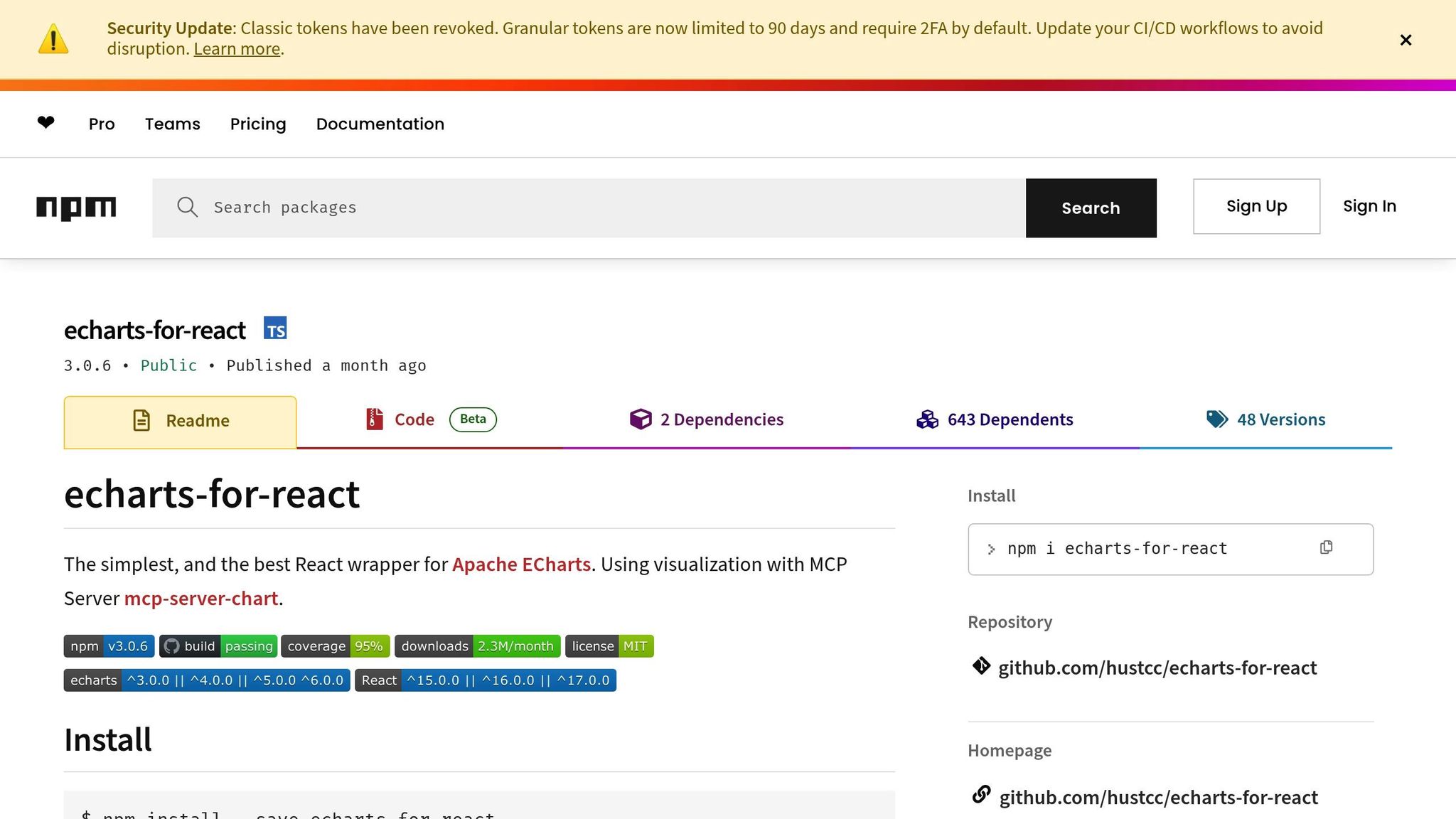
7. ECharts for React
ECharts for React stands out among React chart libraries for its ability to handle massive datasets with ease. It wraps Apache ECharts, a powerful visualization library, enabling it to render up to 10 million data points in real-time using progressive rendering and stream loading techniques [31]. With over 50 chart types available, it supports everything from basic bar and line charts to more specialized visuals like Sankey diagrams, 3D surfaces, and heatmaps [32].
Performance
When it comes to high-performance real-time applications, ECharts is a standout choice [5]. Its dual rendering engine lets you switch between Canvas and SVG, depending on your needs [31]. For datasets with more than 100,000 points, Canvas rendering ensures smooth interactivity without slowing down your browser [31]. Additionally, the ECharts GL extension leverages WebGL to handle advanced 3D visualizations [33]. With incremental rendering, the library can process tens of millions of data points efficiently [33].
Integration Complexity
The React wrapper for ECharts simplifies integration by offering a declarative API. This API handles chart resizing, event management, and provides access to all Apache ECharts configurations through a single option prop [32]. Compatible with React versions 16 through 19, the library also includes TypeScript definitions for safer configurations [32]. Despite its gzipped size being just 5KB [32], the library's robust API might present a steeper learning curve compared to simpler alternatives [7]. However, this complexity allows for deep customization.
Customization Options
ECharts gives you fine-tuned control over every chart element, optimizing performance along the way. It supports light and dark themes, custom theme registration, and third-party extensions [32][7]. The library also includes advanced data transformation options such as filtering, clustering, and regression [31]. If you need something entirely unique, the renderItem callback function lets you create custom chart types [32][33]. Interactive features like dataZoom for scaling, visualMap for multi-dimensional mapping, and brushing for data selection are all ready to use [33].
Bundle Size
To keep your bundle size manageable, you can use EChartsCore instead of the full library. This enables tree-shaking, so you only import the chart types and components you need [32]. For handling large datasets, the library supports TypedArray, which reduces memory usage and improves garbage collection [33]. On mobile devices, SVG rendering is better for memory management, while Canvas is ideal for large-scale data or effects-heavy visualizations [33].
8. React Stockcharts
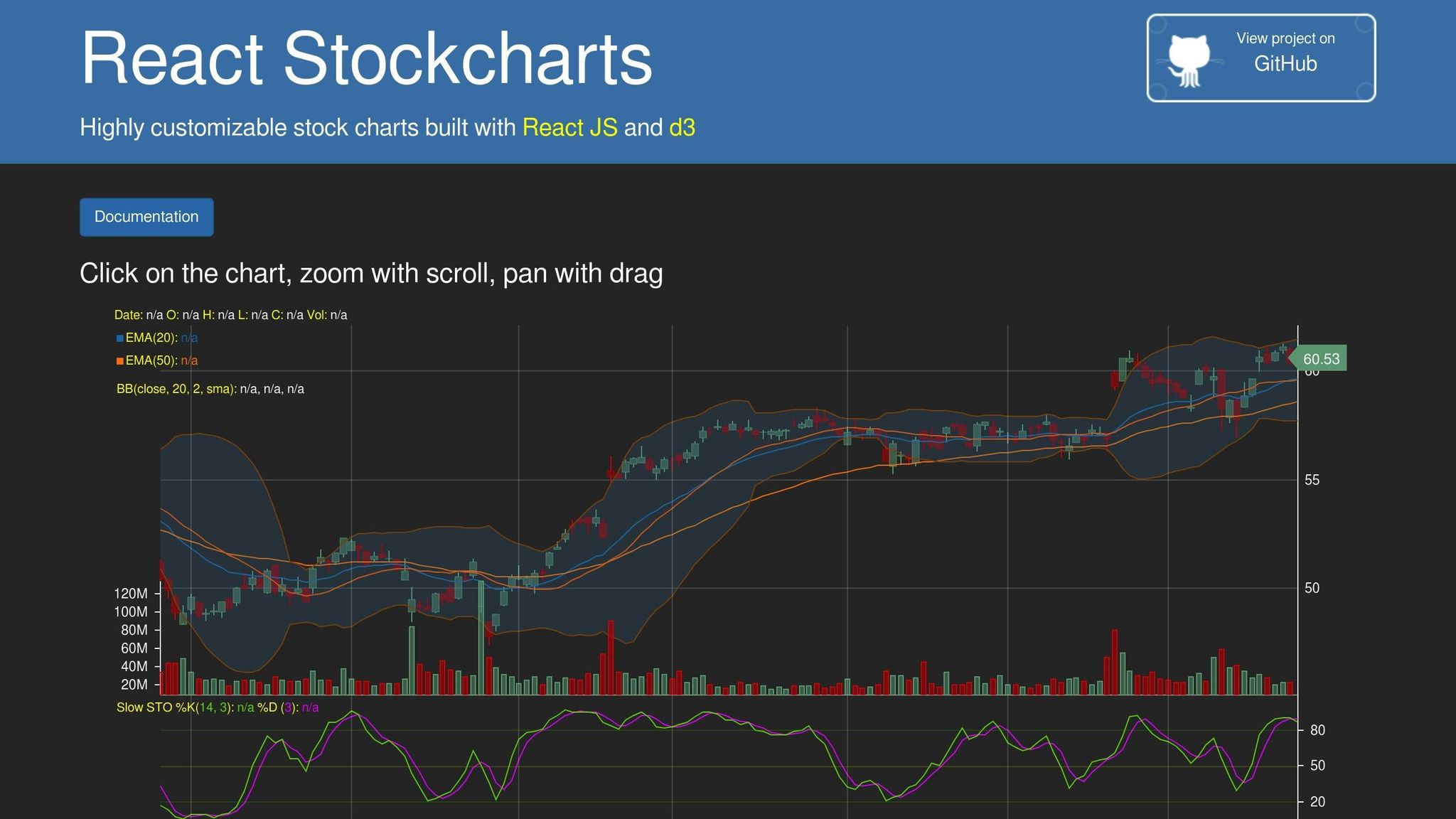
React Stockcharts is a library designed for financial visualizations like candlestick, OHLC, band, and area charts. It relies on D3.js and uses SVG rendering to create its visuals. While it performs well for many use cases, it faces challenges with extremely high-frequency data as of 2026.
Performance
The library's SVG engine can handle between 1,000 and 10,000 data points while maintaining 60 FPS [34]. This makes it suitable for daily or low-frequency charts. However, it may struggle with high-frequency trading data, as it lacks GPU acceleration [30].
Advanced Features
React Stockcharts includes several features tailored for financial dashboards. These include real-time update modes such as appending, scrolling, and sweeping. It also supports synchronized zooming and panning across multiple panes, interactive tooltips, cursors, and hit-testing APIs for precise user interactions [30].
Customization Options
Customization is a strong point of this library. It supports multiple axis scales, including linear, logarithmic, date, and category. The PaletteProvider API allows dynamic color adjustments based on data values, while the ChartModifier API lets developers create custom behaviors for zooming, panning, and selection [30].
These features make React Stockcharts a versatile choice for building financial visualization tools, rounding out the capabilities of the top eight libraries.
Comparison: Strengths and Weaknesses
Choosing the right React chart library means weighing factors like performance, ease of integration, and customization options. Each library brings its own strengths and limitations, so comparing them side by side can help you make an informed decision.
The table below outlines how eight popular libraries perform across five essential criteria. Here's what each criterion measures:
Performance: The number of data points a library can handle while maintaining smooth 60 FPS rendering.
Integration Complexity: How straightforward it is for developers to set up and use the library.
Customization Options: The level of control over visual styling and chart behavior.
Advanced Features: Support for capabilities like real-time updates, animations, and complex chart types.
Bundle Size: The impact the library has on your app's load time.
Library | Performance | Integration Complexity | Customization Options | Advanced Features | Bundle Size |
|---|---|---|---|---|---|
React Chart.js 2 | 10,000+ points (Canvas) | Low – simple API | Moderate – plugin system | Moderate – tree-shakable v4 | 14 KB–48 KB (tree-shakable) |
Recharts | 1,000–5,000 points (SVG) | Low – declarative components | High – composable React components | Moderate – responsive design | Lightweight (D3 submodules) |
Victory | 1,000–5,000 points (SVG) | Low – includes React Native support | High – fully overridable | High – cross-platform animations | 126,898 weekly downloads |
Visx | Varies (developer-controlled) | High – low-level primitives | Very High – complete control | High – modular architecture | Minimal (import only needed components) |
Nivo | Varies (SVG/Canvas/HTML) | Moderate – multiple engines | Very High – multi-engine rendering | High – motion and interactivity | Moderate (flexible rendering) |
React Vis | 1,000–5,000 points (SVG) | Low – Uber-maintained | Moderate – standard customization | Moderate – basic interactivity | Standard SVG library size |
ECharts for React | 100,000+ points (Canvas/SVG) | Moderate – configuration-heavy | High – extensive theme system | Very High – 3D, maps, drill-downs | Large (feature-rich) |
React Stockcharts | 1,000–5,000 points (SVG) | Moderate – tailored for financial use | High | High – real-time financial features | Standard D3-based size |
This breakdown provides a clear view of each library's strengths and trade-offs, helping you align your choice with your project's specific needs.
For example, React Chart.js 2 is a great option for projects where load time matters. Its version 4 update introduced tree-shaking, reducing the bundle size from 48 KB to just 14 KB [35][1].
If flexibility is your priority, Visx might be the right pick. Created by Airbnb and boasting over 14,200 GitHub stars, it offers unmatched control by providing low-level primitives instead of pre-designed charts. However, this flexibility comes with a steeper learning curve for integration [8].
When working with massive datasets, ECharts for React shines. It can handle over 100,000 data points and supports advanced features like 3D visuals, maps, and drill-downs. While powerful, it might be overkill for simpler dashboards [1][5].
On the other hand, Recharts is better suited for smaller datasets. Its performance can drop with larger data sets because each point generates an SVG node, which increases the processing load [1].
The choice of rendering engine also plays a big role. Canvas-based libraries are ideal for handling 10,000+ data points efficiently, while SVG-based solutions work well for smaller datasets (around 1,000 points) but may struggle as the number of DOM nodes grows [34][2].
Conclusion
Choosing the right React chart library hinges on your project's specific requirements. For AI-driven dashboards handling real-time data streams or enterprise analytics with intricate visualizations, ECharts for React is a standout choice. Its dual Canvas/SVG engine efficiently renders over 100,000 data points, and it offers advanced features like 3D visualizations, heatmaps, and specialized chart types. Plus, a large developer community ensures solid support and resources for implementation[1][2][7].
On the other hand, custom visualizations demand a different approach. If your project requires full creative control, Visx is an excellent option. Its modular architecture and compact bundle size (around 15KB) provide low-level D3 primitives for building unique, brand-specific components. However, be aware that Visx has a steeper learning curve compared to more user-friendly libraries[4].
For projects where speed and simplicity are key, React-chartjs-2 and Recharts are ideal for quickly prototyping functional charts. Recharts, in particular, is highly popular, with over 3.6 million weekly downloads. Both libraries feature straightforward, declarative APIs, making them perfect for datasets under 10,000 points where ease of use takes precedence over handling massive volumes of data[2][7].
FAQs
How do I choose between SVG and Canvas charts?
When deciding between SVG and Canvas, consider the type of visualization and the dataset size.
SVG works best for detailed, interactive, and scalable visualizations. It shines when precision in styling and accessibility are crucial, making it ideal for smaller datasets where quality and interactivity matter most.
On the other hand, Canvas is the go-to choice for handling large datasets or creating real-time visualizations. It offers better performance and faster rendering, though it falls short in scalability and accessibility compared to SVG.
SVG: Perfect for high-quality, interactive, and scalable graphics.
Canvas: Designed for high-performance tasks, large datasets, and real-time updates.
Each has its strengths, so the choice depends on your specific project needs.
What’s the best library for real-time data updates?
SciChart stands out as the top library for real-time data updates. Its high-performance, GPU-accelerated rendering can process millions of data points seamlessly, ensuring zero lag. This capability makes it ideal for applications where smooth, real-time visualizations are absolutely essential.
Which React chart library is easiest to customize?
Recharts stands out as a React chart library that's incredibly easy to customize. Thanks to its composable structure, it uses reusable components that let you tweak charts effortlessly - whether it's through adjusting props or adding custom elements. Built on SVG and lightweight D3 dependencies, Recharts provides a reliable and flexible way for developers to craft visualizations that align with specific design goals without much hassle.
Related Blog Posts


