How to Build Dashboards: how to build dashboards in minutes
Master how to build dashboards with a practical, data-driven approach for 2026. Learn design, interactivity, and governance to accelerate insights.
https://www.youtube.com/watch?v=cQSyWbuMcO8
published
Outrank AI
how to build dashboards, dashboard design, data visualization, business intelligence, self-service analytics
8ecb740d-719b-4c78-bda2-d98163b19629

Building a great dashboard is a process. It starts with defining what you actually need to know, followed by getting your data in order, designing an intuitive layout, and finally, getting it into the hands of your team. But the real game-changer is when you go beyond static charts and create an interactive experience that lets anyone ask their own questions and find answers.
Why Effective Dashboards Are a Business Superpower
In a world drowning in information, having data just sitting in a database is a huge missed opportunity. The ability to build a truly effective dashboard is no longer a job just for analysts—it's a critical skill for product managers, founders, and data leaders. This isn't about making pretty charts; it's about creating a direct, real-time line from your company’s data to its most important business decisions.
We're seeing a major shift away from the old model where overworked data teams were the gatekeepers of all information. Instead, smart companies are creating a culture of self-service analytics. This approach gives everyone in the organization the power to explore data, track performance, and uncover insights in minutes, not weeks.
This table shows just how transformative this can be for different people across a growing business.
Dashboard Impact Across Business Functions
Role | Primary Goal with Dashboards | Example Metric Tracked |
|---|---|---|
Product Manager | Monitor user adoption and engagement with new features. | Daily Active Users (DAU) on a specific feature. |
Marketing Lead | Track campaign performance and lead generation. | Cost Per Acquisition (CPA) by marketing channel. |
Sales Director | Analyze sales pipeline health and forecast revenue. | Sales cycle length and conversion rates by rep. |
Founder/CEO | Get a high-level view of overall business health and key metrics. | Monthly Recurring Revenue (MRR) and Customer Churn Rate. |
Ultimately, a dashboard puts the right data in front of the right person at the right time, allowing them to make faster, more confident decisions without waiting in a queue for a report.
From Reporting to Real-Time Strategy
A well-designed dashboard does more than just report on what happened last quarter. It becomes a strategic command center for navigating what's happening right now and what's coming next.
For instance, a product team can use a dashboard to:
Track user engagement in real time to see if that new feature is actually being used.
Identify growth opportunities by spotting which user segments have the highest lifetime value.
Monitor key performance indicators (KPIs) to make sure the business is hitting its targets.
This clarity is what separates the companies that react to market shifts from those that proactively steer their business toward success. You can see how this fits into a larger framework in our complete guide to business intelligence reporting.
The Accelerating Shift to Data Visualization
The move toward data-driven decisions is obvious when you look at market trends. The global Data Visualization Tools Market ballooned from $5.9 billion in 2021 and is projected to hit $10.2 billion by 2026—that’s a massive 11.6% CAGR. This growth isn't just hype; it reflects a real business need. Studies even show that companies embracing these tools see 28% higher decision accuracy.
The goal is to move from data overload to data clarity. A great dashboard doesn't just show you numbers; it tells a story and points you toward the next best action.
Modern platforms are making this shift easier than ever. With tools like Querio, which uses AI agents and natural-language querying, the technical barrier has all but disappeared. This means team members without a data science background can ask complex questions like "Show me user signups by country for the last 30 days" and get an instant, visualized answer. It’s fundamentally changing how companies operate and innovate.
It’s a story I’ve seen play out countless times: a team spends weeks building a beautiful, complex dashboard, only to find that nobody uses it. The problem almost always starts at the very beginning—before a single query is written or a chart is chosen.
They skipped the two most important questions: Who is this for? And what decision will it help them make?
Without clear answers to those questions, a dashboard is just digital noise. It might look impressive, but it provides no real value and quickly gets ignored. Let's walk through how to lay the proper groundwork to avoid that fate.
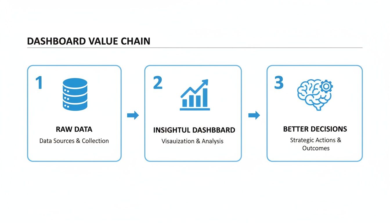
As you can see, the goal isn't just to build a dashboard. The real prize is the chain of events that follows: clear insights leading to smarter, faster decisions that move the business forward.
First, Nail Down Your Audience and Their Questions
Every great dashboard starts with a deep understanding of its audience. A one-size-fits-all approach is a recipe for a dashboard that serves no one well. You have to get specific.
Are you building for the C-suite, a product squad, or the sales team? Each group has wildly different needs.
The C-Suite: They need the 30,000-foot view. Think top-line metrics like Monthly Recurring Revenue (MRR), Customer Acquisition Cost (CAC), and overall user growth. Their questions are about the strategic health of the business.
A Product Team: They live in the trenches and need granular, tactical data. They’re obsessed with feature adoption rates, user session times, and A/B test outcomes. Their questions are all about user behavior.
A Sales Team: They need operational data to guide their day. They're tracking lead conversion rates, pipeline velocity, and progress toward their quota. Their questions are about hitting their numbers this week.
Once you know your audience, sit down with them. Your goal is to zero in on the single most important question they need to answer or the one decision they struggle with most. This focus is your best defense against "scope creep"—that endless cycle of requests for "just one more chart."
Turn Big Questions into Sharp KPIs
A vague question like, "Is our new feature successful?" is a decent starting point, but you can't build a dashboard around it. The real work is translating that business goal into a set of specific, measurable Key Performance Indicators (KPIs).
This is where you make the goal tangible. Let's break down that feature success question:
Business Question | Potential KPIs |
|---|---|
Are people even using it? | Feature-specific Daily Active Users (DAU), Feature Adoption Rate (%) |
Are they getting value from it? | Retention rate of users who engaged with the feature, Average time spent on the feature |
Is it helping the business? | Increase in conversion rate for feature users, Impact on Customer Lifetime Value (LTV) |
Now you have a concrete plan. By focusing on these specific metrics, your dashboard will tell a coherent story that directly answers the original question.
A dashboard should be an answer, not a data dump. If a chart doesn't help answer the core business question, it doesn't belong on the main view.
Get Your Data House in Order
With your goals and KPIs locked in, you can finally turn to the data itself. This is where the rubber meets the road. I can't stress this enough: even the most brilliant dashboard design is worthless if the data behind it is wrong.
Bad data is a trust killer. Once your stakeholders spot a number that doesn't add up, they'll question everything. The dashboard will be abandoned, and it's incredibly hard to win that trust back.
Often, the first hurdle is simply getting all your data in one place. It might be scattered across a production database, a CRM like Salesforce, and an event-tracking platform like Mixpanel. While modern BI tools are great at connecting to various sources, it's still on you to make sure the data is ready for analysis.
This prep work usually involves a few key tasks:
Data Cleaning: This means fixing all the messy stuff—missing values, duplicate records, and inconsistent formats (like "USA," "US," and "United States" in the same column).
Data Modeling: This is about structuring your data for efficient analysis. A classic example is joining multiple tables to create a single, unified "users" view that combines account info, subscription status, and product usage.
Ensuring Integrity: Before you go live, you have to validate your numbers. If your dashboard shows 100 new sign-ups but the marketing team's report says 150, you have a serious trust issue to resolve.
Taking stock of your company's data infrastructure is a crucial first step. If you're new to this, our guide on how to assess data readiness for AI adoption is a great place to start, as the core principles are the same.
This is an area where a platform like Querio really helps. It lets your team work directly on top of your data warehouse, using familiar tools like Python notebooks to clean, model, and prepare data collaboratively. This prevents data silos and ensures everyone is building from a single, reliable source of truth.
Designing an Intuitive Dashboard Experience
Once your goals are set and your data is clean, you get to the fun part: designing the actual dashboard. The best dashboards I've ever built—and the ones I love to use—feel completely effortless. They don't make you hunt for answers; they guide you straight to the insights you need. This isn't about making things pretty. It's about intentional design that tells a clear story at a glance.
This is where you lean heavily on visual hierarchy. It's just a fancy term for arranging elements to guide the user's eye. Your most critical numbers—the ones that are absolutely non-negotiable for your audience to see first—have to pop. We're talking big numbers, a strategic splash of color, and prime real estate on the screen.
Establish a Logical Layout
People don't scan screens randomly. In most Western cultures, our eyes naturally follow a "Z-pattern"—we look top-left, then top-right, slide down to the bottom-left, and finish at the bottom-right. You can use this to your advantage to create a dashboard that feels instantly familiar.
Think about structuring your dashboard this way:
Top-Left: This is your headline spot. Put your most important, high-level KPIs here, like Total Active Users or Monthly Recurring Revenue (MRR).
Top-Right: This space works great for secondary information or global controls. Think date range selectors or primary filters that affect the whole dashboard.
Middle: The diagonal path is where the story unfolds. Fill this area with the charts and graphs that explain why those headline numbers are what they are.
Bottom: Reserve the bottom for the granular details. This is the perfect place for tables or lists that users can dig into for specific examples, like a log of recent customer sign-ups.
Following this pattern creates a natural flow, guiding your user from the "what" (the big KPI) to the "why" (the supporting charts and tables). It's a simple framework that prevents people from feeling overwhelmed.
Choose the Right Chart for the Story
The visualizations you choose can make or break your dashboard. A chart that looks cool but doesn't clearly communicate the underlying data is worse than useless—it can be downright misleading. Your goal is to pick the visual that tells the story most effectively.
For instance, a marketing manager looking at lead sources needs to quickly see which channel is winning. A pie chart might seem intuitive, but if the slices are similarly sized, it’s tough to see the winner. A simple horizontal bar chart, sorted from highest to lowest, makes the top performer obvious in a split second.
The question should never be "what chart looks best?" It should always be "what chart answers the business question most effectively?" Every single visualization needs a purpose.
Here are a few go-to choices for common scenarios:
Comparing Values: Bar charts are your best friend for comparing distinct categories, like sales per region or feature adoption rates.
Showing Trends Over Time: Nothing beats a line chart for showing how a metric like website traffic or daily active users changes over days, weeks, or years.
Understanding Composition: When showing parts of a whole, a stacked bar chart or a treemap is often far clearer than a pie chart, especially if you have more than a few categories.
Revealing Relationships: A scatter plot is perfect for exploring the potential connection between two different variables, such as marketing spend and new customer acquisitions.
Mastering visualization is a core skill. To dig deeper into this, check out our complete data visualization guide on choosing the right charts for your data.
It's no surprise that interactive dashboards now dominate the Data Visualization Applications Market and are expected to continue leading through 2035. Unlike a static report, a well-built interactive dashboard gives product teams and engineers real-time insight from multiple sources, helping them react 25% faster to market changes. To build dashboards that are truly effective, it pays to follow established data visualization best practices.
Unlocking Deeper Insights with Interactivity and AI
A static dashboard tells you what happened. An interactive one helps you discover why. This is the crucial step where you move beyond a simple report and create a living tool for exploration—one that encourages your team to get their hands dirty and ask their own questions.
Without these interactive layers, a dashboard is just a picture. By building in ways for users to slice and dice the data themselves, you spark curiosity and give them a real sense of ownership over the insights.
Making Your Dashboard a Conversation
The whole point is to let people follow their train of thought. Let's say a product manager is looking at a user retention chart and sees a dip. Their first instinct is to wonder why. Instead of having to file a ticket and wait for an analyst, they should be able to click, filter, and see that retention data broken down by acquisition channel right then and there.
That immediate feedback is what makes a dashboard truly useful. A few key features make this possible:
Filters: These are your dashboard's primary controls. Think beyond a simple date range selector. You can build filters for user segments, product categories, marketing campaigns—anything that helps narrow the focus.
Drill-Downs: This is all about going from the big picture to the fine details. For example, a user should be able to click on "North America" in a regional sales chart and immediately see the breakdown of sales by country (USA, Canada, Mexico).
Cross-Filtering: This is where things get really powerful. When you click a segment in one chart, it instantly filters all the other charts on the dashboard. Clicking the "Mobile" bar in a "Users by Device" chart would update the "User Activity" and "Feature Adoption" charts to show data for mobile users only. It's a simple but incredibly effective way to explore relationships in the data.
When you add these features, you’re no longer just presenting information. You're building a self-service analytics environment.
The Next Frontier: AI-Powered Analytics
Interactivity is a huge leap, but the next evolution is even bigger. By bringing AI into the mix—specifically natural language querying—we're finally tearing down the last barriers to data access for everyone.
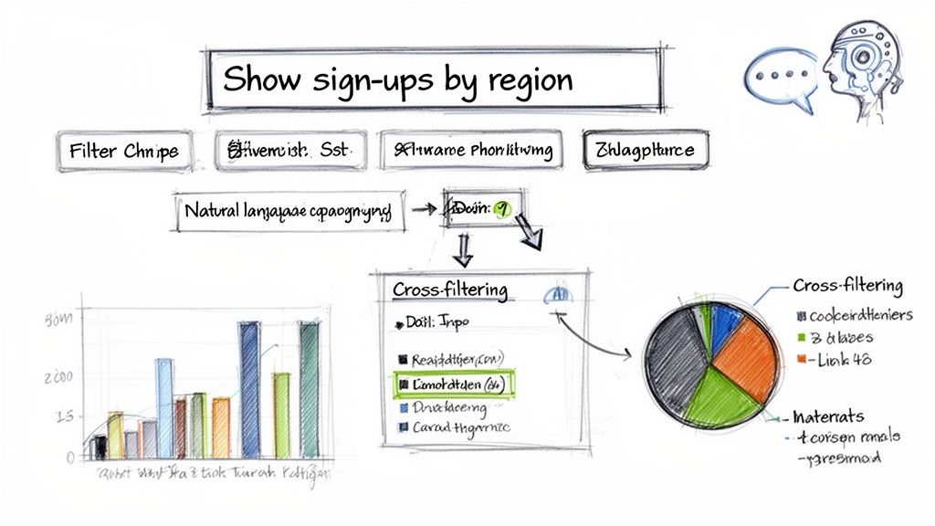
This approach lets anyone, no matter their technical skill, ask questions in plain English. A marketing lead can just type, "Show me user sign-ups in Q4 by region and compare it to Q3," and get an instant visualization. This is a world away from needing to know SQL or navigate a clunky, old-school BI interface.
AI-driven analytics isn't just another feature; it's a fundamental change in how people interact with data. It moves the focus from how you get an answer to what questions you should be asking in the first place.
You can see this shift playing out across the industry. The market for business data visualization tools is projected to explode to $21.6 billion by 2033. This growth isn't just about making more charts; it's about the democratization of analytics, with AI as the main catalyst. As you look to bring this power to your team, exploring the best AI tools can give your dashboards a serious analytical edge.
How AI Actually Works in Dashboards
Modern platforms are building this AI experience right into their foundation. With a tool like Querio, for instance, you can deploy AI agents directly on your data warehouse. When a non-technical user asks a question in plain language, the AI translates it into a precise, optimized query that runs against your trusted data sources.
The benefits here are massive for everyone involved:
For the User: They get answers immediately without having to know anything about the underlying tables or schemas. This encourages them to dig deeper and ask more questions.
For the Data Team: Analysts are finally freed from the endless queue of ad-hoc report requests. They can stop being report monkeys and start focusing on more strategic work, like data governance and building sophisticated data models.
AI can also surface insights a person might easily miss. Features like automated anomaly detection can flag unexpected spikes or dips in your metrics, turning your dashboard from a reactive tool into a proactive one that helps you anticipate what's next. If you want to dive deeper into this, check out our guide on how AI powers anomaly detection in BI dashboards.
Deploying and Governing Dashboards for Long-Term Value
You’ve built a great dashboard. That’s a huge win, but getting it over the finish line isn't just about clicking "publish." The real work begins now—turning that project into a trusted, long-term asset that people actually use.
This is where many analytics initiatives fall flat. A successful rollout involves thoughtful deployment, tight security, and a solid governance plan to keep your analytics ecosystem from spiraling into chaos.
Let's walk through how to make sure your hard work pays off for months and years to come.
Refining with User Feedback Before Rollout
Before you go live, you absolutely must road-test your dashboard with a handful of its intended users. This is your final chance to spot confusing charts, ambiguous labels, or critical gaps before they cause widespread frustration.
Get a few of your target stakeholders in a room—ideally, the same people you interviewed at the beginning. Give them control and just watch. Let them explore. See where they hesitate, what questions pop up, and where they get stuck. It’s a humbling but incredibly valuable experience.
Ask smarter questions. Instead of a generic "Do you like it?", try "What story does this chart tell you?" Their interpretation will instantly reveal if your visualization is hitting the mark.
Watch for the pause. If a user hesitates for more than a few seconds before clicking, you've found a point of friction. That's a clear signal that your navigation or layout isn't as intuitive as you thought.
Document everything. A seemingly minor tweak, like rephrasing a filter name, can have a massive impact on usability. No piece of feedback is too small.
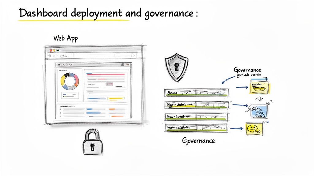
Deploying for Internal and External Users
Once you've ironed out the kinks, it's time to go live. Your deployment strategy will look different depending on who you're serving.
For internal teams, it might be as simple as sharing a link. The real trick to adoption, though, is embedding the dashboard into existing workflows. Make it the first thing your sales team opens during their Monday morning meeting. That simple habit is what keeps data from being an afterthought.
For customer-facing analytics, the gold standard is embedding the dashboard right into your product. Customers get a seamless, branded experience and can find insights without ever leaving your application. Modern platforms like Querio provide robust SDKs that simplify this, letting you embed fully interactive analytics that feel completely native to your app.
A dashboard's success isn't measured by how many people have access to it, but by how deeply it's integrated into their daily decision-making process.
Implementing Robust Security and Access Controls
Security isn't an option, especially with sensitive business or customer data on the line. You have to guarantee that people only see what they're supposed to see. Your head of North American sales shouldn't be digging into European pipeline data, and one customer should never, ever see another customer's metrics.
This is exactly what row-level security (RLS) is built for.
RLS is a powerful data governance feature that filters data based on a user's role or identity. You set the rules once—for example, "User A can only see rows where the 'Account Owner' column matches their ID"—and the system enforces it automatically for every query.
This is a must-have for any multi-tenant SaaS application. It allows you to build a single, scalable dashboard that serves all your customers, while RLS ensures each one gets a secure, personalized view of their own data. Querio’s security model is designed for this, letting you define these granular rules to protect data at its source.
Establishing Long-Term Governance
Without a plan, your beautiful analytics ecosystem will devolve into "dashboard sprawl"—a wild west of outdated reports, conflicting metrics, and eroding trust. A clear governance framework is your only defense.
Your governance plan doesn't need to be a 100-page document. It just needs to provide clear answers to a few key questions:
Data Quality & Maintenance: Who owns the upstream data sources? Who is on the hook for ensuring the data is accurate and up-to-date?
Change Management: How does someone request a change or a new feature for an existing dashboard? A simple ticketing process can prevent scope creep and random, one-off edits.
Sunsetting Old Reports: Who is responsible for periodically reviewing usage data and archiving dashboards that are no longer relevant? A clean house is a trusted house.
Good governance is the ongoing, often unglamorous work that protects your initial investment. It’s what ensures your dashboards remain a reliable source of truth and continue delivering value long after launch day.
A Few Common Questions I Hear About Building Dashboards
Even with the best game plan, you're going to have questions when you start building dashboards. Honestly, it's the little details that make the difference between a dashboard everyone uses and one that just collects digital dust. Here are some of the most common things teams ask me, along with some straight-to-the-point answers.
What Are the Most Common Mistakes People Make?
I've seen a few recurring issues pop up time and time again. The biggest one, by far, is information overload. Teams get excited about their data and try to cram every metric they can think of onto one screen. The result? A cluttered mess where nothing stands out, and users just feel overwhelmed.
Right behind that is building a dashboard with a vague purpose. If you can't clearly state who the dashboard is for and what specific questions it needs to answer, you'll end up with something that feels unfocused and isn't particularly useful to anyone.
A few other classic blunders to watch out for:
Poor Chart Choices: This one is easy to get wrong. Ever seen a pie chart with 10 different slices? It's impossible to read. You have to pick the visualization that tells the story of your data most clearly, not just the one that looks coolest.
Forgetting About the User Experience: You can have the most accurate data in the world, but if the dashboard is clunky, slow, or confusing to navigate, nobody will touch it. How the dashboard feels to use is just as important as the data it shows.
Bad Data Quality: This is the ultimate trust killer. If your team spots data that's inaccurate, incomplete, or out-of-date, they'll stop believing in the dashboard entirely. And once that trust is gone, it's almost impossible to get back.
How Often Should I Update My Dashboard's Data?
That's the million-dollar question, and the answer is: it completely depends on what the dashboard is for. There’s no single right answer here; it’s all about matching the data's freshness to the speed of the decisions it informs.
Operational dashboards that track things in real-time—like application performance or website traffic—need data that refreshes every few minutes. These are for watching what's happening right now. For tactical dashboards, maybe tracking a marketing campaign or weekly sales trends, updating every hour or once a day is usually plenty.
Then you have strategic dashboards for the C-suite, which are all about tracking long-term, high-level goals. These might only need a refresh once a week or even once a month.
Here’s a good rule of thumb: Match your data refresh rate to the speed at which people need to make decisions. Anything faster is a waste of computing resources, and anything slower makes your dashboard irrelevant.
How Do I Get My Team to Actually Use the Dashboard?
Ah, adoption. You can build the most beautiful, insightful dashboard in the world, but getting people to use it is a whole other challenge. You can't just email out a link and expect miracles.
The single most effective thing you can do is involve your end-users from the very beginning. When people feel like they helped build it—that it answers their questions and solves their problems—they have a real sense of ownership. Before you launch it to everyone, run some user testing sessions and get honest feedback to smooth out any rough edges.
Once it's ready, do a quick training session focused on how to find insights and what actions to take. But the real key is to weave the dashboard into your team's daily routines. Start every team meeting by pulling it up on the screen. When it becomes the official source of truth for tracking progress and making decisions, it stops being "just another tool" and becomes essential.
Ready to stop being the data bottleneck and empower your entire team with self-service analytics? Querio deploys AI agents directly on your data warehouse, letting anyone build the dashboards and get the insights they need in minutes. Explore Querio today.

