The 12 Best Free Data Visualization Tools for 2026
Discover the best free data visualization tools of 2026. Explore our in-depth list of freemium and open-source options for every use case.
published
Outrank AI
best free data visualization tools, data visualization, free bi tools, open source bi, dashboard software
b21cb365-2cf9-4400-8827-9f0416062b59

In a data-rich environment, the ability to translate raw numbers into clear, compelling visuals is no longer a luxury, it's a core operational need. For startups, product managers, and growing businesses, the challenge is finding powerful tools that don't come with a hefty price tag. Fortunately, the ecosystem of free data visualization software is richer and more accessible than ever. This guide cuts through the noise to bring you a detailed look at the 12 best free data visualization tools available today, helping you find the right fit for your specific needs.
We move beyond generic feature lists to provide a realistic analysis of what each tool does best, its limitations, and its ideal user. To truly transform data into clear, actionable insights and drive better decisions, developing effective Technology Dashboards that Turn Tech Spend Into Clear Decisions is key. The tools in this list are the first step in that journey.
Whether you need to build a quick marketing dashboard, explore complex geospatial data, or establish a self-service analytics culture, you'll find a solution here. Each review includes direct links and screenshots to give you a clear picture of the user experience. We'll cover everything from easy-to-use freemium platforms like Looker Studio to powerful open-source solutions like Apache Superset that you can host yourself. Our goal is to provide practical tips to get you started and clear insights on when it's time to upgrade your data stack.
1. Google Looker Studio
Best for: Quick and easy dashboards for marketing, product, and lightweight stakeholder reporting, especially for teams already in the Google ecosystem. It's the go-to for turning Google Analytics, Sheets, and BigQuery data into shareable reports with zero friction.
Google Looker Studio (formerly Data Studio) stands out for its simplicity and deep integration within the Google Cloud and Marketing Platform. If your data lives in Google Analytics, BigQuery, or even a simple Google Sheet, you can create a functional, interactive dashboard in minutes. Its drag-and-drop interface is intuitive for non-analysts, making it a favorite among startup founders and product managers who need immediate insights without a steep learning curve.

This platform is one of the best free data visualization tools because it removes nearly all cost barriers to entry. The ability to blend data from different sources, create calculated fields for custom metrics, and schedule automated email reports makes it a powerful asset for small teams. Collaboration is seamless; you can share reports just like a Google Doc.
However, its strength in simplicity is also its main limitation. Looker Studio lacks a robust data modeling layer, meaning complex data transformations should be handled in your database or a tool like dbt before the data arrives. While the core product is free, advanced governance and version control features are locked behind the paid Looker Studio Pro. To understand how these dashboards fit into a broader strategy, you can explore the principles of effective data visualization and dashboards.
Website: https://lookerstudio.google.com/
2. Microsoft Power BI Desktop
Best for: Data analysts and business intelligence professionals who need powerful, enterprise-grade modeling and report authoring capabilities on their local machine. It’s ideal for those in the Microsoft ecosystem, creating complex reports with data from diverse sources like SQL Server, Azure, and Excel.
Microsoft Power BI Desktop is a powerhouse of a tool, offering its full report authoring and data modeling features completely free for individual use. It combines the data preparation capabilities of Power Query with the advanced calculation engine of DAX (Data Analysis Expressions), allowing analysts to perform complex transformations and create sophisticated business logic directly within their reports. This makes it a top choice for professionals who need to build rich, interactive dashboards from scratch without an initial investment.
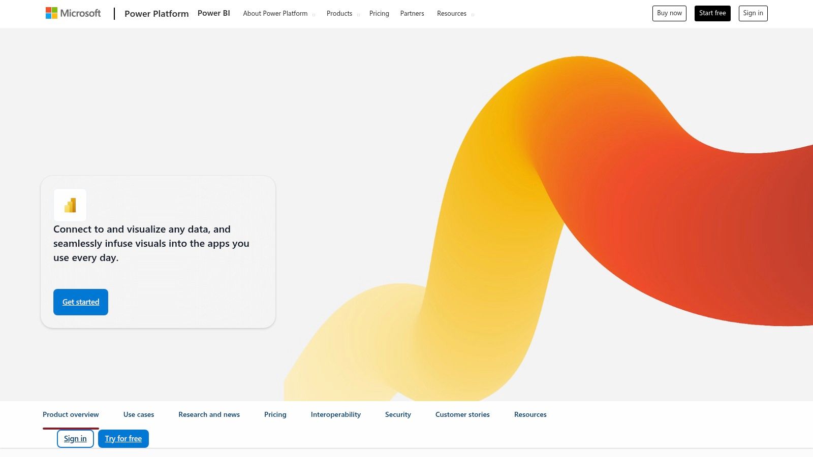
This platform earns its spot as one of the best free data visualization tools because it doesn't gatekeep its core functionality. You get access to a massive library of visuals, a deep connector ecosystem, and the same robust semantic model used in enterprise deployments. For a solo analyst or a small team prototyping reports, the free desktop version provides nearly everything needed to turn raw data into actionable insights.
The primary limitation, however, is collaboration and sharing. While you can build anything you want on the desktop version, sharing interactive reports with others typically requires a paid Power BI Pro license for both the publisher and the viewer. The authoring tool is also Windows-only, which can be a significant hurdle for Mac and Linux users. For a deeper look at how it stacks up against alternatives, you can see a direct comparison of Power BI vs. Tableau vs. Looker Studio.
Website: https://powerbi.microsoft.com/
3. Tableau Public
Best for: Data journalists, students, and analysts building a public portfolio. It’s the ideal platform for creating highly interactive, beautiful, and complex visualizations intended for public consumption and for learning the industry-standard Tableau software.
Tableau Public is the free version of the powerful Tableau platform, renowned for its best-in-class visual analytics and interactivity. It offers an unmatched drag-and-drop interface that allows for deep exploration and storytelling with data. Users can create sophisticated charts, maps, and dashboards that go far beyond basic reporting tools, making it a favorite for those who want to showcase their data skills.
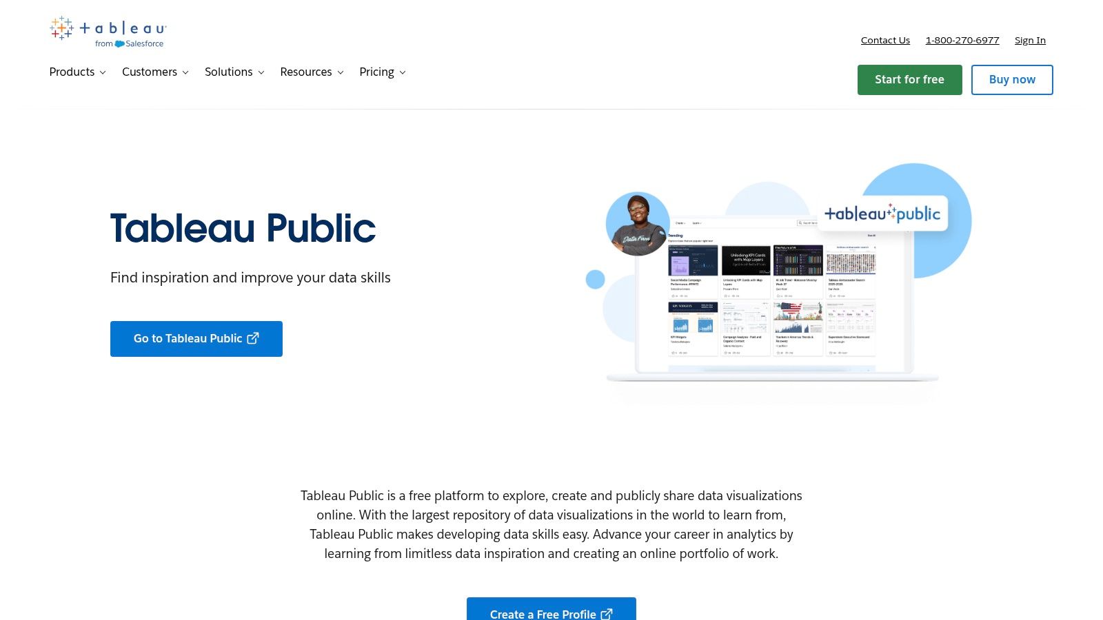
Its status as one of the best free data visualization tools comes from giving users access to the core Tableau experience without cost. The massive community gallery provides endless inspiration and practical examples, while the abundance of free training content makes the learning process very accessible. For anyone aiming for a career in data analytics, proficiency in Tableau is a key skill, and Tableau Public is the perfect place to build it.
The primary limitation is its "public" nature. All workbooks and dashboards created must be saved to the Tableau Public server, meaning they are visible to anyone on the internet. This makes it completely unsuitable for private, proprietary, or sensitive business data. The free version also has limitations on data connectors and lacks the automatic data refresh capabilities found in the paid versions, requiring manual updates for dashboards.
4. Apache Superset
Best for: SQL-savvy teams needing a scalable, open-source BI platform they can self-host. It's ideal for startups and enterprises that want to avoid vendor lock-in and license fees while connecting directly to modern data warehouses.
Apache Superset is a modern, cloud-native business intelligence tool that puts control directly in the hands of your engineering team. Born at Airbnb, it was designed for data exploration and visualization at scale. Its SQL-centric workflow, featuring a powerful visual SQL editor, empowers analysts to slice, dice, and visualize data from nearly any SQL-speaking database or data engine without moving it.
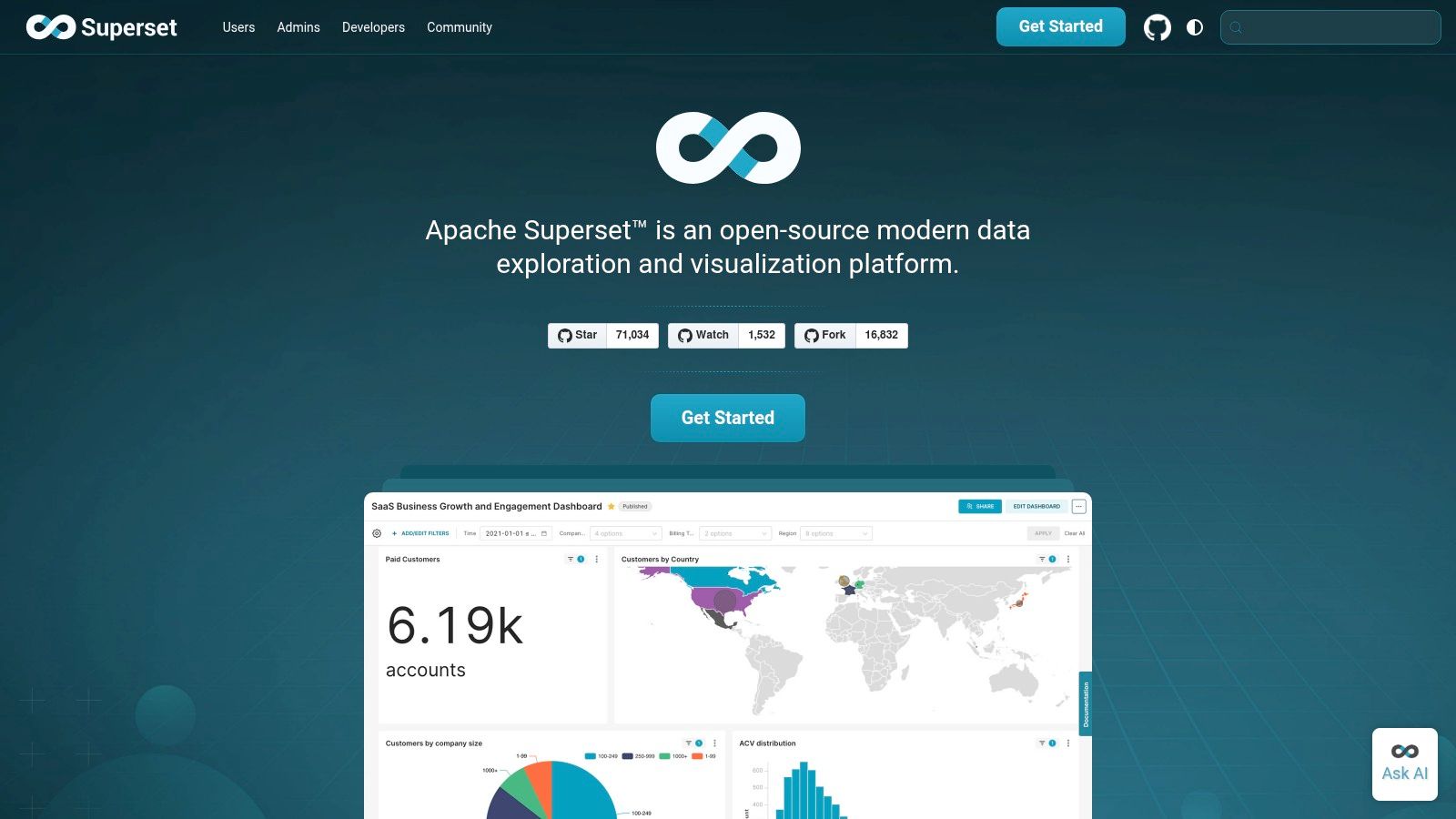
As one of the best free data visualization tools in the open-source category, Superset's primary benefit is its cost-effectiveness and flexibility. There are no licensing fees, and you maintain complete authority over your deployment, security, and infrastructure. The dashboard builder is feature-rich, offering a wide array of chart types and granular, role-based access controls. This makes it a strong contender for companies with the technical resources to manage their own BI stack.
However, this power comes with responsibility. Unlike managed SaaS tools, Superset requires DevOps or engineering expertise to deploy, maintain, and scale. The user experience, while highly functional, may feel less polished than commercial alternatives, and there are fewer out-of-the-box templates. For teams weighing the trade-offs, exploring other open-source self-service BI tools can provide additional context.
Website: https://superset.apache.org/
5. Metabase
Best for: Teams who want to enable self-serve analytics with minimal setup. Its no-code query builder and straightforward interface make it perfect for empowering non-technical users to explore data and answer their own questions without relying on an analyst.
Metabase is a standout open-source business intelligence tool designed for simplicity and speed. It allows anyone on a team, regardless of their SQL knowledge, to ask questions of their data through an intuitive graphical interface. This focus on accessibility makes it a powerful choice for startups and growth-stage companies aiming to build a data-informed culture without a steep learning curve or heavy engineering investment.
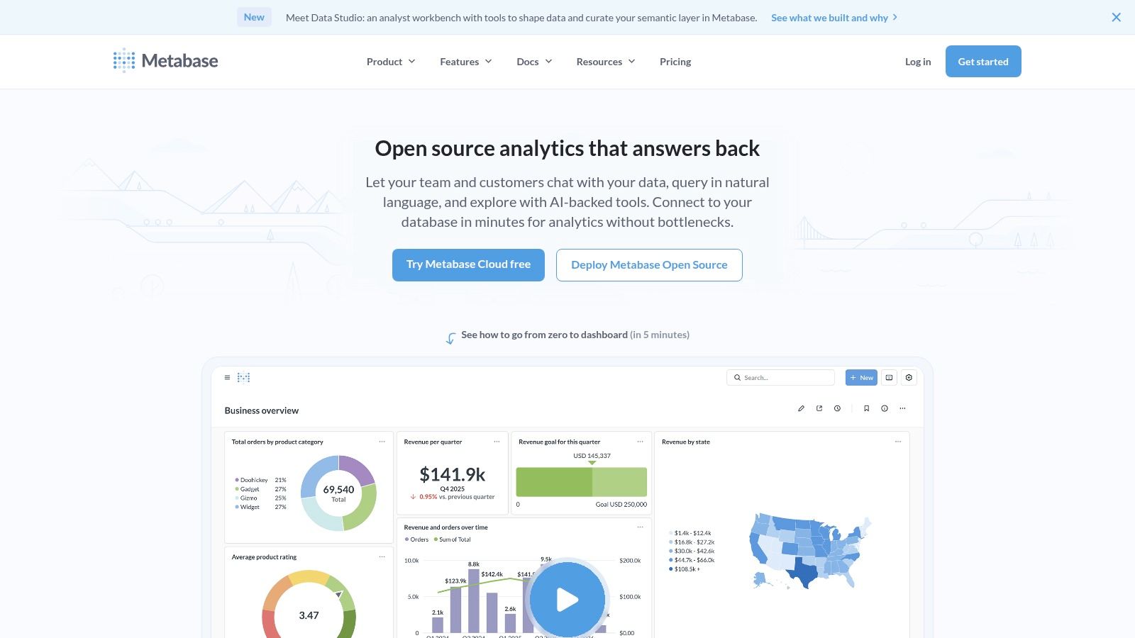
Its position as one of the best free data visualization tools comes from its generous open-source edition, which is free to self-host and includes a robust feature set. Users can create charts, assemble them into dashboards, and set up automated email "pulses" or Slack alerts for key metrics. For technical users, a full SQL editor is available, providing the flexibility to write complex queries when needed. You can see how it compares to other options by exploring the market for the best dashboard software.
The main consideration is operational. While the free version is powerful, self-hosting at scale requires technical expertise to manage deployment, security, and updates. Advanced features like granular permissions, audit logs, and AI-driven insights are reserved for the paid cloud or enterprise editions. However, for getting a self-serve BI platform off the ground quickly, Metabase offers immense value right out of the box.
Website: https://www.metabase.com/
6. Grafana
Best for: Real-time monitoring of infrastructure, application performance, and time-series data. It's the standard for DevOps and SRE teams but is also highly effective for operational dashboards tracking product and business KPIs from databases like Postgres.
Grafana is an open-source powerhouse for observability and data visualization, excelling where others falter: real-time, time-series metrics. While its origins are in monitoring server health and application logs, its flexible data source plugins make it a versatile tool for any data stored in SQL databases, Prometheus, or Elasticsearch. For a startup founder, this means you can build a single dashboard to monitor server uptime, user sign-ups, and API latency all in one place.
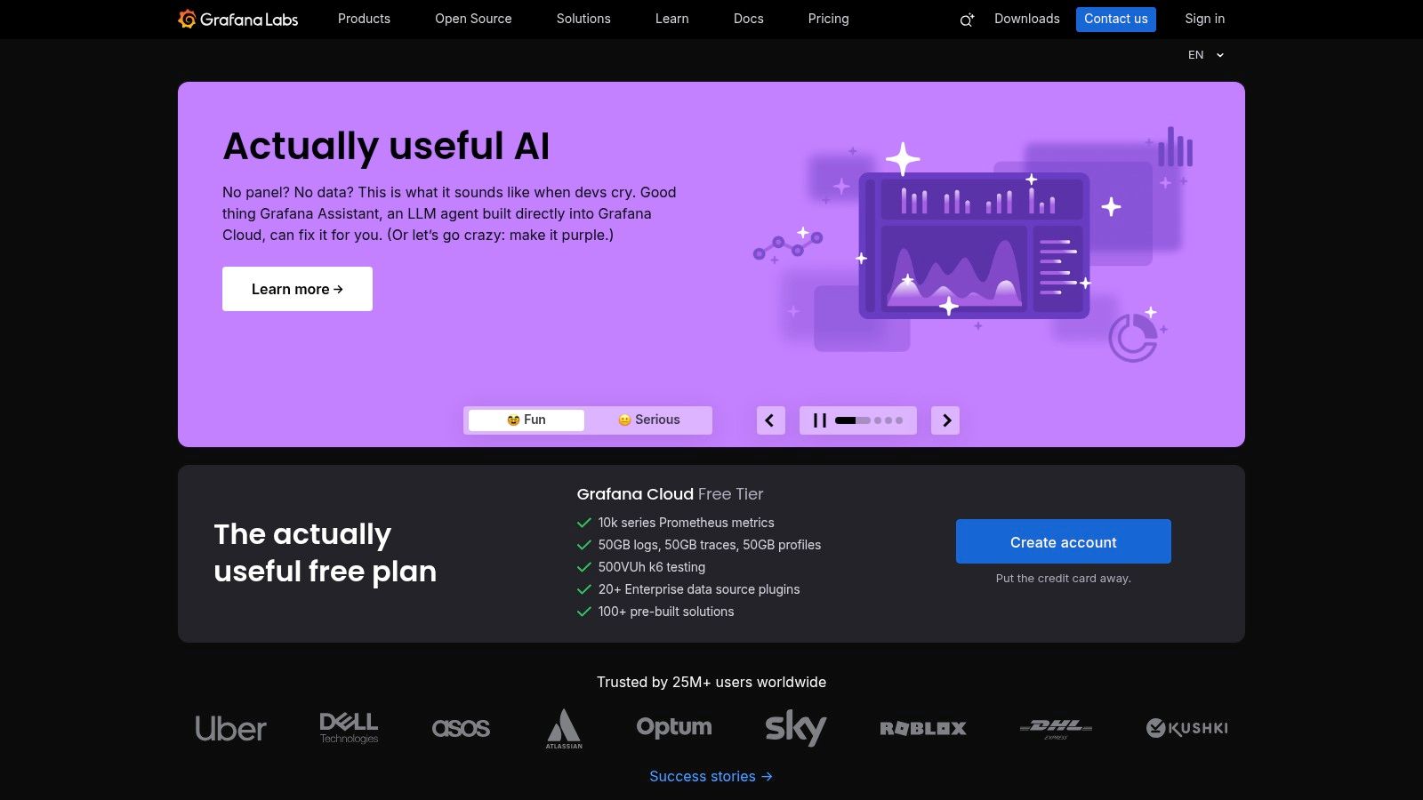
As one of the best free data visualization tools, its strength comes from its vibrant community and extensive plugin ecosystem. The core open-source version is incredibly generous and can be self-hosted for complete control. Grafana Cloud offers a free tier that is more than enough for small teams to get started with monitoring and alerting without managing infrastructure. Its alerting engine is a key feature, allowing teams to get notified of anomalies directly in Slack or PagerDuty.
However, Grafana is not a traditional business intelligence tool. It lacks the complex data modeling, semantic layers, and multi-step join capabilities found in platforms like Looker. Data preparation and complex transformations should happen before the data reaches Grafana. The open-source version also differs from the paid Cloud and Enterprise tiers, which include features like enhanced security, reporting, and enterprise plugins.
Website: https://grafana.com/
7. Datawrapper
Best for: Journalists, communications teams, and executives who need to create beautiful, publication-ready charts, maps, and tables with zero friction. It’s perfect for embedding clean, responsive visuals into articles, reports, or presentations quickly.
Datawrapper is a browser-based tool celebrated for its speed and design-first philosophy. Born from the needs of newsrooms, its entire workflow is optimized for producing clear, accessible, and aesthetically pleasing data visualizations in minutes. Users simply copy and paste data, choose a chart type from a curated catalog, and the platform guides them through a simple refinement process. The thoughtful defaults for typography, spacing, and color palettes mean even non-designers can produce professional-quality output.
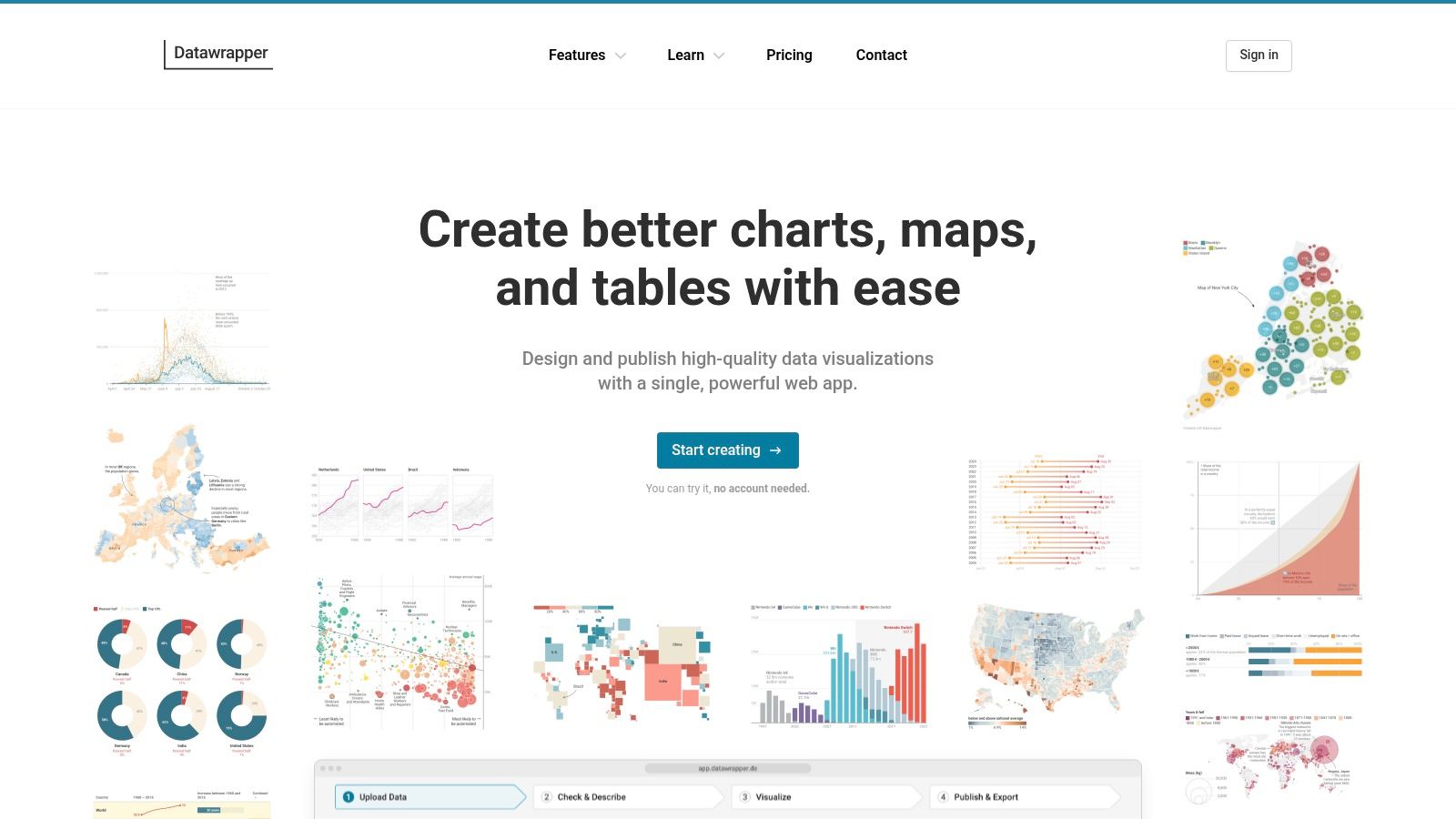
Its commitment to simplicity makes it one of the best free data visualization tools for storytelling. The charts are responsive by default, ensuring they look great on any device, and embedding them is as easy as copying an embed code. The free plan is incredibly generous, offering access to the full chart and map catalog for unlimited use.
The primary limitation is its focused scope; Datawrapper is not a business intelligence suite. It lacks the complex data modeling, joins, and dashboarding capabilities of tools like Looker Studio or Metabase. The free tier also includes a "Created with Datawrapper" attribution on all visuals. For more advanced features like custom themes, high-quality exports (SVG/PDF), or self-hosting, a paid plan is required.
Website: https://www.datawrapper.de/
8. Flourish
Best for: Journalists, marketers, and content creators who need to produce beautiful, interactive, and story-driven visualizations for public consumption. It excels at creating "scrollytelling" narratives, animated charts, and embeddable graphics with minimal technical skill.
Flourish is designed for data storytelling, not deep business intelligence. Its core strength lies in a massive library of pre-built, aesthetically pleasing templates that can be quickly populated with data from a CSV or spreadsheet. This makes it an ideal choice for turning a dataset into a compelling visual narrative for a blog post, marketing report, or online article. The focus is on communication and engagement, allowing non-technical users to create visuals that would typically require a developer.
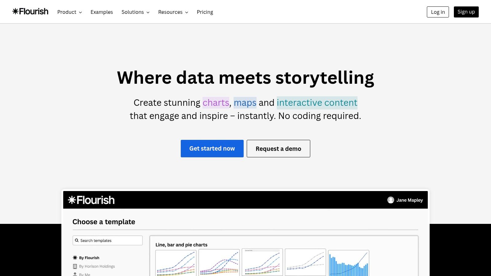
The platform is one of the best free data visualization tools for public-facing content because its free tier allows for unlimited public visualization creation and embedding. You can build everything from animated bar chart races and interactive maps to complex network graphs and photo sliders. The user experience is incredibly straightforward: pick a template, upload your data, customize colors and labels to fit your brand, and publish. Its integration with Canva further simplifies adding professional graphics to presentations.
The trade-off for this ease of use is a lack of data-handling capabilities. Flourish is not built for connecting to live databases, performing complex data transformations, or managing private, internal dashboards. The free plan requires all projects to be public and includes Flourish branding. For private projects, password protection, and advanced developer features, you must upgrade to a paid plan.
Website: https://flourish.studio/
9. kepler.gl
Best for: High-performance, large-scale geospatial analysis and visualization directly in the browser. It is the perfect tool for product teams analyzing user location data, logistics companies optimizing routes, and urban planners studying city dynamics.
Originally developed by Uber, kepler.gl is an open-source powerhouse for rendering massive geographic datasets without needing a complex backend. If your analytics involve millions of GPS coordinates, routes, or points of interest from a CSV or GeoJSON file, kepler.gl lets you drag, drop, and visualize them instantly. It excels at showing density, flow, and temporal patterns on a map.
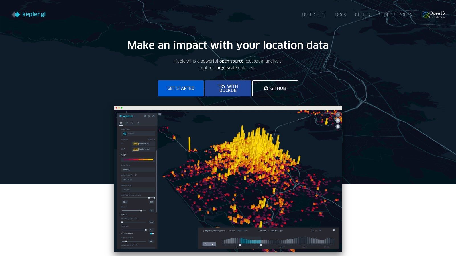
As one of the best free data visualization tools for location intelligence, its performance is remarkable. The web-based tool provides advanced features like spatial filtering, layer blending, and time-based animation right out of the box. For developers, kepler.gl can be embedded as a React component into your own web application, giving you full control over the user experience with Mapbox or MapLibre as the base map.
However, its specialization is also its primary constraint; it is not a general-purpose business intelligence tool for creating bar charts or financial reports. While it handles large files well, extremely large datasets may still tax a browser and might require preprocessing or using a tiling strategy for optimal performance. The interface is purely for exploration and doesn't include features for building structured, shareable dashboards like other tools on this list.
Website: https://kepler.gl/
10. Vega & Vega-Lite
Best for: Developers and data scientists who need programmatic control over visualization design. It's ideal for building custom, reproducible charts for web applications or creating standardized visualization components within a design system.
Vega and its simpler counterpart, Vega-Lite, offer a "grammar of graphics" approach to data visualization. Instead of a drag-and-drop interface, you define visualizations declaratively using JSON specifications. This code-driven method ensures that every chart is reproducible, version-controllable, and can be programmatically generated, making it a favorite for embedding analytics directly into applications or research publications.
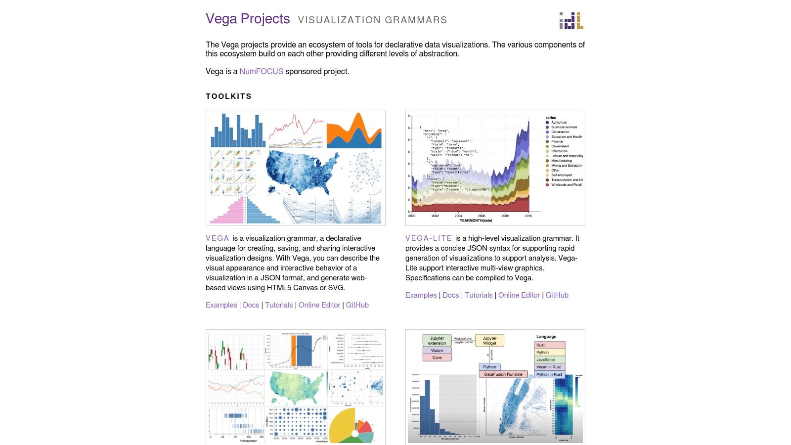
These libraries earn their spot as one of the best free data visualization tools due to their immense flexibility and strong open-source foundation. You can describe nearly any visual encoding imaginable, from simple bar charts to complex, multi-layered geospatial maps. Because it's a grammar, it provides a consistent framework for thinking about and building visuals, which is invaluable for teams aiming to maintain a coherent visual style across all their products.
The primary drawback is the learning curve. Comfort with JSON and a developer mindset are prerequisites, as there is no graphical user interface. Furthermore, Vega is a library, not a hosted platform. This means you are responsible for integrating it into your own web projects and handling the deployment. It is not a quick-and-dirty tool for a business user but a powerful engine for a technical one.
Website: https://vega.github.io/
11. Plotly
Best for: Developers and data scientists who want to build highly interactive, publication-quality charts and web-based data applications using Python, R, or JavaScript. It’s ideal for creating everything from standalone exploratory charts in a Jupyter Notebook to full-fledged internal dashboards with the Dash framework.
Plotly is a code-first powerhouse for creating rich, interactive data visualizations. Its open-source libraries are extremely popular in the data science community for their flexibility, extensive chart types, and detailed documentation. If your team is comfortable with Python, R, or JavaScript, Plotly provides a direct path to crafting custom visualizations that go far beyond the capabilities of many GUI-based tools.
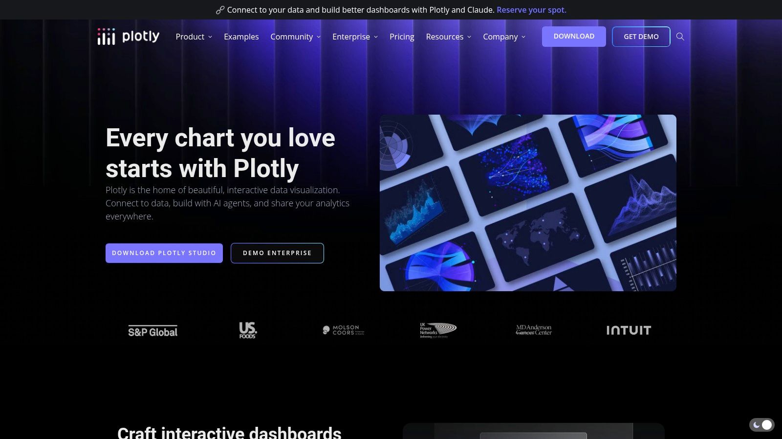
The Dash framework is what makes Plotly one of the best free data visualization tools for building complete analytical applications. You can use it to construct web apps with dropdowns, sliders, and other UI components that interact with your charts, all without writing any JavaScript. The Plotly Chart Studio Cloud offers a free tier where users can create and host public charts and Dash apps, making it a great option for portfolio projects or sharing findings openly.
However, the primary strength of Plotly is its developer-centric nature, which can be a barrier for non-coders. Building a dashboard with Dash requires Python knowledge and an understanding of its callback-based architecture. While the open-source libraries are free, features like private app hosting, collaboration, and enterprise support are part of the paid Dash Enterprise and Chart Studio offerings.
Website: https://plotly.com/
12. Observable
Best for: Data journalists, analysts, and developers who want to create interactive, shareable data narratives using JavaScript. It is ideal for exploratory data analysis and prototyping custom data apps in a collaborative, notebook-style environment.
Observable brings the concept of reactive notebooks to the world of data visualization. Instead of a linear script, every cell in an Observable notebook automatically re-evaluates when its dependencies change, making it a live, interactive document. This is perfect for exploring datasets and seeing the immediate impact of code adjustments on your charts. Its core is built around modern web standards, making it a natural fit for those comfortable with JavaScript.
This platform earns its spot as one of the best free data visualization tools through its powerful open-source library, Observable Plot. Developed by members of the original D3.js team, Plot offers a much more concise, high-level API for creating common charts, drastically reducing the boilerplate code often associated with D3. The free individual plan allows for unlimited public notebooks and publishing, making it an exceptional tool for sharing findings, teaching data concepts, or building a public portfolio.
The main limitation is its JavaScript-centric nature, which can be a hurdle for teams that work primarily in Python or R. While the free tier is generous for individual and public work, features essential for team collaboration, such as private notebooks and team workspaces, are reserved for paid plans. The platform is less of a traditional dashboarding tool and more of a flexible canvas for bespoke data exploration and storytelling.
Website: https://observablehq.com/
Top 12 Free Data Visualization Tools Comparison
Tool | Core focus & features | Target users | Unique selling point | Main limitation | Price |
|---|---|---|---|---|---|
Google Looker Studio | Browser-based dashboards, live Google connectors, calculated fields & blends | Marketers, product teams, Google Workspace users | Zero-cost, very fast to build and share dashboards | Limited complex data modeling; some connectors are third-party/paid; governance needs Pro | Free (Looker Studio Pro for enterprise features) |
Microsoft Power BI Desktop | Rich authoring: visuals, DAX, Power Query, many connectors; desktop-first | Analysts and Excel/Azure-aligned teams | Full-featured report authoring and deep Office/Excel integration | Windows-only authoring; sharing usually requires paid licenses | Free Desktop; Pro/PPU/Premium for sharing |
Tableau Public | Drag-and-drop visual analytics with public hosting and community gallery | Students, portfolio authors, public storytellers | Industry-leading interactivity and design control for public viz | All workbooks are public; limited refresh/connectivity vs paid Tableau | Free (public-only) |
Apache Superset | Open-source SQL-centric exploration, dashboards, role-based security | Data engineering teams and self-hosting orgs | No license fees; tight control over hosting and security | Requires DevOps/engineering to deploy and maintain; less polished UX | Free (self-host) |
Metabase | No-code query builder + SQL editor, dashboards, alerts, embedding | Non-technical teams starting self-serve analytics | Gentle learning curve; fast to adopt for non-technical users | Advanced enterprise features paid; scaling self-host needs ops | Open-source self-host free; paid hosted plans |
Grafana | Real-time dashboards for metrics, logs, traces; rich plugin ecosystem | SRE, infra, product ops, time-series use cases | Excellent for time-series monitoring and alerting | Limited classic BI semantics (complex joins/metrics layers) | Open-source + Grafana Cloud (free/paid tiers) |
Datawrapper | Fast charts, maps, tables with publication-ready defaults | Communications, newsrooms, PMs needing polished visuals | Quick production of clean, accessible, publish-ready charts | Not a full BI tool; free plan adds attribution | Free tier with attribution; paid for branding/export |
Flourish | Interactive storytelling templates, scrollytelling, maps | Communications, marketing, content teams | Rapid creation of engaging, on-brand interactive stories | Private publishing and brand controls require paid plans | Free public tier; paid plans for privacy/branding |
kepler.gl | High-performance browser geospatial visualization, spatial joins | Product analytics, logistics, mobility teams handling location data | Exceptional large-scale geospatial rendering with minimal code | Focused on geospatial use cases; large files need preprocessing | Free, open-source |
Vega & Vega-Lite | Declarative JSON grammars for reproducible, code-driven charts | Dev/visualization teams, design systems | Highly flexible, reproducible visual grammar for consistent patterns | Steeper learning curve; developer-centric (JSON/JS) | Free, open-source |
Plotly (Dash) | Code-first interactive charts + Dash apps (Python/JS/R), cloud hosting | Developers building interactive analytics apps | Bridges quick charts and full analytical apps; strong dev ergonomics | Requires coding; private hosting/premium features paid | Open-source libs; Plotly Cloud/Enterprise paid tiers |
Observable | Reactive, collaborative JS notebooks and Observable Plot | JS-centric analysts and prototypers, data journalists | Live, shareable reactive notebooks ideal for interactive narratives | JavaScript-focused; private team features are paid | Free individual tier; paid team features |
Beyond Free Tools: When to Upgrade Your Data Stack
You’ve just explored a dozen of the best free data visualization tools available today, from dashboarding powerhouses like Google Looker Studio and Power BI to specialized libraries like Vega-Lite and Plotly. Each offers a potent starting point for turning raw numbers into actionable insights without requiring an upfront financial investment. For a startup founder tracking early metrics, a product manager monitoring feature adoption, or an analyst building initial reports, these platforms provide immense value.
Our journey has shown that there isn't a single "best" tool, but rather the right tool for a specific job. If your goal is to publish beautiful, interactive charts for a public audience, Datawrapper or Flourish are excellent choices. For heavy-duty business intelligence and internal dashboarding on a budget, the free tiers of Power BI or open-source solutions like Metabase and Apache Superset offer deep functionality. And for developers needing granular control, libraries like Plotly or Observable provide the ultimate customization.
Recognizing the Limits of Free Tools
While these free options are fantastic for getting started, they are not a final destination. As your organization grows, so does the complexity of your data and the urgency of your business questions. You will inevitably encounter growing pains that signal it's time to re-evaluate your data stack.
These pain points often manifest in several key areas:
Performance Bottlenecks: Free desktop tools or self-hosted open-source platforms can slow to a crawl when processing millions or billions of rows. Queries time out, and dashboards become frustratingly slow to load, hindering real-time decision-making.
Governance and Security Gaps: Managing user permissions, ensuring data quality, and maintaining security become significant challenges. Free tools often lack the robust governance features needed to control who sees what data, creating compliance risks.
Operational Overhead: Self-hosting an open-source tool like Superset or Grafana means your engineering team is responsible for setup, maintenance, upgrades, and troubleshooting. This diverts valuable developer time away from core product work.
The Human Bottleneck: This is the most critical limitation. Traditional dashboards create a dependency cycle. A business user has a question, files a ticket, and waits for a data analyst to build or modify a report. This creates a queue, slows down decisions, and turns your skilled data team into a report factory instead of strategic partners.
When your product managers and executives are waiting days for answers that should take minutes, you haven't just outgrown your tool; you've outgrown the dashboard-centric workflow itself.
Moving from Visualization to Exploration
The next step in your data maturity journey is to empower your entire team with true self-service analytics. This doesn't just mean giving everyone a dashboard builder. It means providing a system where non-technical users can ask complex, ad-hoc questions and get immediate answers without writing a single line of SQL or waiting for an analyst.
This is where a new class of analytics platforms comes into play. Instead of focusing solely on visualizing pre-aggregated data, these tools enable deep, flexible exploration directly on your cloud data warehouse. They are built for a future where every team member is empowered to follow their curiosity and build on each other's work, creating a culture of proactive, data-informed decision-making. The goal shifts from building static reports to creating a dynamic, collaborative analytical environment. If you're hitting the walls of the best free data visualization tools, it's a positive sign of growth and a clear signal that it's time to explore what's next.
Ready to move beyond static dashboards and empower your entire team with true self-service analytics? Querio deploys AI coding agents on your data warehouse, allowing anyone to ask complex questions, get instant answers, and build analyses without waiting on the data team. Explore how Querio can transform your company’s relationship with data.

