Business Intelligence
Top 7 Julius AI Alternatives for Team Analytics
Compare seven Julius AI alternatives focused on governed, warehouse-native team analytics, consistent metrics, governance, and pricing.

If you need team analytics, Julius AI usually isn’t the best fit. From what I see in this piece, the better options are Querio, ThoughtSpot, Hex, Looker, Tableau, Power BI, and Sigma because they focus on shared metrics, live warehouse data, and team-wide control.
Here’s the short version:
- Querio: best for lean analytics teams that need governed self-serve on a live warehouse
- ThoughtSpot: best for search-led BI across large teams
- Hex: best for analyst-led SQL and Python notebook work
- Looker: best for teams that want one metric model across reports and AI
- Tableau: best for polished dashboard delivery and recurring reporting
- Power BI: best for Microsoft-first companies, but advanced AI can add about $6,400/month
- Sigma: best for finance and ops teams that want spreadsheet-style work on warehouse data
The main filter is simple: can the tool keep one shared version of each KPI across finance, product, marketing, and ops? If the answer is no, team reporting gets messy fast.
Quick Comparison
::: @figure 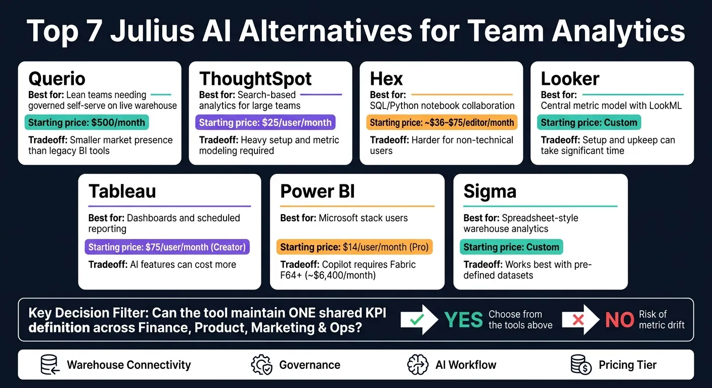 {Top 7 Julius AI Alternatives for Team Analytics: Side-by-Side Comparison}
:::
{Top 7 Julius AI Alternatives for Team Analytics: Side-by-Side Comparison}
:::
| Tool | Best for | Main tradeoff | Starting price |
|---|---|---|---|
| Querio | Lean teams that want governed self-serve | Smaller market presence than older BI tools | $500/month |
| ThoughtSpot | Search-based analytics for large teams | Heavy setup and metric modeling | $25/user/month |
| Hex | SQL/Python notebook collaboration | Harder for non-technical users | About $36–$75/editor/month |
| Looker | Central metric model with LookML | Setup and upkeep can take time | Custom |
| Tableau | Dashboards and scheduled reporting | AI features can cost more | $75/user/month for Creator |
| Power BI | Microsoft stack users | Copilot needs Fabric F64+ | $14/user/month for Pro |
| Sigma | Spreadsheet-style warehouse analytics | Works best with pre-set datasets | Custom |
My take: if you want live warehouse access, inspectable logic, and one place to manage metric rules, start with the tools above instead of chat-only options. The rest of the article breaks down each one by governance, collaboration, warehouse support, and pricing.
1. Querio
Querio is built for small analytics teams that support finance, product, marketing, and operations. The main idea is simple: help those teams keep up with growing demand without turning into the default analyst for every single department.
If your team already runs on a warehouse, Querio is a better fit than loose chat-style answers. It gives you governed, shareable answers instead of one-off replies. That makes it a strong match for small analytics teams that need self-serve access on top of a live warehouse, but still want control over definitions and outputs.
Warehouse connectivity
Querio connects live to Snowflake, BigQuery, Redshift, ClickHouse, PostgreSQL, MySQL, and MongoDB using encrypted, read-only credentials. There are no CSV exports and no extracts. Every query runs straight against your warehouse, so the team is working from current data.
That sounds good on its own. But live access only helps if the layer on top of it stays under control.
Governance and permissions
The context layer includes joins, metric definitions, and approved queries. It lives as SQL, Markdown, and Python files in GitHub alongside your dbt project. That means finance, product, and operations can all work from the same definitions instead of arguing over whose dashboard is “right.”
The agent can suggest new definitions, but a logged-in human has to approve and commit them. Role-based access control applies across the platform, and MCP and API requests inherit the caller's permissions through OAuth. Dashboards are also tagged by trust level:
- trusted
- experimental
- team-specific
Reusable metrics layer
Metric definitions stay versioned alongside dbt, which helps keep them aligned as schemas change. Querio also shows column-level lineage based on usage.
That matters in day-to-day work. When a metric shifts, teams can trace where it came from and how it's being used instead of digging through dashboards and hoping for the best.
AI workflow and delivery
Every answer Querio produces is written as inspectable SQL or Python inside a reactive notebook. When the SQL changes, charts update automatically. Dashboards are built from those notebooks, using code-based layouts that the agent can read and edit.
Business users can ask questions in Slack or Microsoft Teams, and each answer includes a notebook audit trail behind it. For internal agents or embedded analytics tools, Querio provides an MCP and API built on the same governed context layer.
On security, Querio includes SOC 2 Type II, annual third-party penetration tests, HIPAA compliance with signed BAAs, and an optional self-hosted deployment.
Pricing starts at $500/month for up to 10 users on Starter. Core costs $1,999/month, or $1,699/month when billed annually, with unlimited users and three data connections. MCP and API access starts free at 100 questions per month, with no payment details required.
2. ThoughtSpot
ThoughtSpot is a BI platform built around natural-language search. It fits cross-functional teams that have a dedicated BI owner and want business users to ask questions and get governed answers without writing SQL. Sage and Spotter turn plain-English questions into warehouse queries, and the results appear in Liveboards for sharing.
Warehouse connectivity
ThoughtSpot connects live to Snowflake, BigQuery, Redshift, and Postgres with no separate extracts. That means shared answers stay tied to the live warehouse instead of drifting away from source data.
Governance, permissions, and reusable metrics
Row- and column-level controls help protect access, while Worksheets keep metric definitions consistent. Without a governed metric or semantic layer, teams can end up with different numbers for the same KPI. That becomes a problem fast when finance, product, and operations all need to work from the same definitions.
There is a catch: the modeling work can be heavy. So if you're comparing ThoughtSpot with lighter chat-first tools, that's a key thing to weigh.
AI workflow and delivery
Spotter shows its reasoning, which helps people trust what they're seeing. SQL inspection is more limited and lives inside the query inspector. Most users stay in the app rather than working in Slack. ThoughtSpot also supports automated alerts and embedded analytics.
Pricing starts at $25 per user per month, with consumption-based cloud pricing also available [1]. It's a good fit for teams that can maintain a governed semantic layer and want natural-language search for business users. That tradeoff matters most when a team can support ongoing semantic modeling and still wants self-serve search for business users.
3. Hex
Hex is a notebook-first collaboration platform made for data teams that work in SQL and Python. For team analytics, it’s a strong fit for groups that want shared notebooks, analyses they can reuse, and polished outputs they can hand to stakeholders.
Warehouse connectivity
Hex connects live to Snowflake, BigQuery, Redshift, Postgres, and Databricks. That means teams can query data where it already lives, with no duplication and no messy CSV exports. This allows teams to get real-time answers from your warehouse without manual data movement.
Governance and permissions
Hex uses warehouse permissions, project-level access controls, SSO, and RBAC.
Reusable metrics layer
Hex integrates with dbt, which lets teams reuse dbt metric definitions inside notebook cells. It’s not a standalone governed semantic layer. But if your team already runs on dbt, this helps keep KPIs in sync across analyses.
AI workflow and delivery
Hex Magic can generate SQL or Python code at the cell level, and the output is fully editable and transparent. So you’re not stuck with a black-box result that no one wants to touch later.
Analysts can version notebooks with native Git integration. When the work is done, they can share it as Data Apps. That gives non-technical stakeholders an interactive way to use the analysis without seeing the notebook underneath.
Hex has a steeper learning curve than chat-first tools and fits teams with SQL and Python skills [3][1]. In plain English: it works best when analysts run the workflow and stakeholders use the finished output. Pricing is estimated at $36 to $75 per editor per month [1].
4. Looker
Looker centers on LookML, a semantic layer where analysts define metrics once, then use those same definitions across dashboards, reports, and Gemini answers. For cross-functional teams, that means one shared metric layer powers all three without metric drift.
Warehouse connectivity
Looker queries live data from BigQuery, Snowflake, Redshift, and Postgres. It’s a strong fit for teams that already run on Google Cloud and BigQuery [2].
That live connection matters. The model layer controls how queries are defined and governed, so teams aren’t just pulling current data - they’re pulling it through the same logic every time.
Governance and permissions
Because every metric lives in LookML, revenue means the same thing for every user, every time - whether that person is a sales analyst or a CFO. That kind of consistency can save a team from the classic “Why don’t these numbers match?” mess.
Looker’s governance framework also makes sure Gemini follows existing role-based permissions and warehouse-level security [2]. So finance, product, and operations stay aligned on the same definitions instead of each group working from its own version of the truth.
Reusable metrics layer
LookML is Looker’s main strength - and also the biggest commitment it asks from a team. Definitions are written once, then reused across every surface: dashboards, scheduled reports, and AI answers.
There’s a catch. LookML takes upfront modeling work and ongoing maintenance. But if your team needs board-ready numbers, that work can pay off [2]. And because Gemini works from LookML, the AI layer uses those same definitions instead of making up its own logic.
AI workflow and delivery
Gemini answers plain-English questions against the LookML model, which keeps metric logic steady across use cases [2]. Those answers can show up in the web UI, embedded analytics, or scheduled reports.
That makes Looker a better fit for recurring, department-wide reporting than for one-off digging.
Looker usually comes with custom pricing, which is common for AI analytics platforms [2]. Looker Studio gives teams a lower-cost starting point, but it doesn’t have the same governance depth as LookML [1][2].
5. Tableau
Tableau is a strong fit for teams that need polished dashboards, recurring reports, and controlled distribution on top of a live warehouse. The tradeoff is pretty clear: Tableau shines in governed distribution and executive reporting, but it’s not built for fast back-and-forth chat.
Warehouse connectivity
Tableau connects live to Snowflake, BigQuery, Redshift, and Postgres. That means teams can query the warehouse directly instead of exporting CSVs or relying on stale extracts.
Governance and permissions
Tableau includes governance controls like row-level security, user filters, and data policies. For regulated teams that need auditable access control, this helps make sure the right people see the right data under the right rules.
Reusable metrics layer
Tableau’s AI features work best when a semantic layer already defines core metrics once and reuses them the same way across the business.
AI workflow and delivery
Pulse delivers scheduled insights, and Tableau Agent answers questions against the existing model. Teams can send insights through Tableau Cloud, Slack, and automated email digests. Creator includes basic Pulse and Ask Data at $75 per user per month, while Tableau+ adds Agent and advanced Pulse through custom pricing [2].
That setup makes Tableau a good match for teams that already have a modeled source of truth and need broad, repeatable use of that data.
6. Power BI
For Microsoft-centered analytics teams, Power BI makes the most sense when governance, reporting, and AI all need to sit inside one controlled setup. It fits teams that want governed dashboards, certified metrics, and AI inside an existing BI stack.
Warehouse connectivity
Power BI gives you two main modes. Import copies data into Power BI, which helps dashboards load faster, but you need scheduled refreshes. DirectQuery keeps data live, though performance can slow down when usage gets heavy.
Fabric's OneLake can simplify the setup. The tradeoff is cost, because it brings capacity-based pricing into the picture.
Governance and permissions
Power BI gives data teams tight control over access and metric ownership. Workspace permissions, row-level security, certified datasets, and deployment pipelines help teams decide who can see what and which metrics count as the official source of truth.
That matters a lot in regulated fields like healthcare and finance, where audit trails aren't optional.
Reusable metrics layer
Power BI's dataset model works like a semantic layer. You define measures once in DAX, and those definitions carry through every report built on top [2].
That shared model helps stop revenue, churn, and other KPIs from being redefined by different teams. It's also a big reason Copilot can help without throwing metric consistency off course.
AI workflow and delivery
Power BI Copilot can generate DAX, build report pages, and summarize data in plain language [1]. But there's a catch: full Copilot functionality requires Microsoft Fabric capacity at the F64 tier or higher, which costs about $6,400 per month [2].
Standard Pro seats cost $14 per user per month, but that plan does not include the more advanced Fabric-based AI features [2]. So the pricing model changes in a big way. You move from per-seat spend to capacity-based spend, and for many mid-market teams, that's not a small jump.
If your team wants AI inside an established BI setup, Power BI is a strong fit. If you're looking for conversational analytics without Fabric's extra cost and setup burden, it can be a tougher sell.
Teams that want lighter self-serve modeling and simpler distribution often look next at Sigma.
7. Sigma
Sigma is a good match for teams that want governed, warehouse-native analytics in a spreadsheet-style interface. In plain English, it gives finance, ops, and leadership teams a familiar way to work with data without pulling that data out of the warehouse.
Warehouse connectivity
Sigma connects directly to Snowflake, Google BigQuery, Amazon Redshift, Databricks, PostgreSQL, MySQL, and SQL Server 2022. It does not support AWS Athena.
Governance and permissions
Sigma includes row-level, column-level, and cell-level access controls. It also supports user-attribute-based row-level security (RLS), which helps teams show the right data to the right people. Lineage views make it easier to trace how data moves across workbooks, so you can see where a number came from instead of guessing.
Reusable metrics layer
Sigma works best when datasets and metrics are governed and defined up front. If your team already uses dbt or another semantic layer, you’ll usually get more consistent results across workbooks. That matters a lot when different teams are reading from the same numbers.
AI workflow and delivery
The workflow feels familiar, but the data stays governed. Ask Sigma Agent lets users query data in plain language. Explain Charts adds trend summaries, and Sigma also supports custom AI integrations through Snowflake Cortex or Databricks Model Serving.
Pricing is quote-based. Sigma also offers unlimited users, which can help with adoption across multiple teams. It’s a strong fit for finance and business teams that want spreadsheet-like workflows on top of a real warehouse.
Where Each Platform Wins and Falls Short
No tool wins on every front. The right pick comes down to where your data lives, who will use the tool, and how much governance work your team can handle.
For team analytics, the main issue is simple: can the platform keep one shared definition for each metric across finance, product, marketing, and operations? A fast way to sort the field is to tie each platform to its main workflow: governed self-serve, notebook analysis, dashboard delivery, or search-based access.
That workflow choice matters just as much as the semantic layer. Hex is notebook-first. Power BI, Tableau, and Sigma lean more toward dashboards, reporting, and delivery.
There’s also a clear split between search-led and agent-led tools. ThoughtSpot stands out for search-based analytics and strong embedding. Querio goes in a different direction: its agent writes inspectable SQL and Python in a reactive notebook, and the context layer gets better as your team approves what the agent learns.
The table below cuts each platform down to its main fit, tradeoff, and best-use case.
| Product | Main advantages | Main limitations | Best fit |
|---|---|---|---|
| Querio | Full SQL/Python transparency; Git-backed context layer; unlimited users | Smaller ecosystem than legacy BI tools; requires a real warehouse | Mid-sized B2B teams needing governed self-serve without a large BI team |
| ThoughtSpot | Strong search-based analytics; strong embedding | High upfront modeling effort | Enterprises replacing Tableau or Looker at scale |
| Hex | Collaborative notebooks; deep Python/SQL integration | Not designed for non-technical users; steep learning curve | Analyst-heavy teams and data scientists |
| Looker | Tightly coupled LookML semantic layer; highly consistent metrics; enterprise-grade governance | High maintenance cost; LookML expertise required; most effective on Google Cloud/BigQuery | Large organizations on Google Cloud with mature data modeling |
| Tableau | Strong visual storytelling; proactive AI insights via Pulse | AI features often require expensive add-on bundles; AI is cloud-only | Teams focused on visual storytelling and governed dashboard delivery |
| Power BI | Deep Microsoft 365/Teams integration; low political cost inside Microsoft-standardized organizations | Copilot requires Fabric capacity at F64 or higher, about $6,400 per month [2] | Enterprises already committed to Microsoft/Azure |
| Sigma | Spreadsheet interface on live warehouse data; fast time-to-value | AI accuracy depends heavily on pre-defined datasets | Finance and ops teams moving from Excel to warehouse-native analytics |
Use these tradeoffs to cut down your shortlist before moving to the final recommendation.
Conclusion
Once you weigh the tradeoffs, this choice mostly comes down to how your team works and how much control your data setup needs.
For teams using Snowflake, BigQuery, Redshift, or Postgres, the biggest split is usually governance depth and day-to-day workflow. These tools aren't solving the exact same job. Pick based on workflow, governance, and your current stack, or you may end up paying for features nobody uses, or giving up control over metrics.
Hex makes sense if your team spends most of its time in Python and SQL notebooks. ThoughtSpot is a fit for large enterprises replacing Tableau or Looker across the company. Power BI works well when your org is already deep in Microsoft 365 and Fabric. Sigma is a good match if finance or operations wants a spreadsheet-like way to work with live warehouse data.
Querio is a strong option when you want governed self-serve for a cross-functional team, but don't have a large BI team to keep everything running. Its inspectable SQL and Python, Git-backed context layer, and live warehouse connections make it a solid fit for lean teams in B2B SaaS, healthcare, and finance.
Use the table below to line up each need with the right tool.
| Need | Best-fit tool |
|---|---|
| Governed self-serve for lean teams | Querio |
| Enterprise-scale search & BI replacement | ThoughtSpot |
| Collaborative SQL/Python notebooks | Hex |
| Existing Microsoft 365/Fabric ecosystem | Power BI |
| Spreadsheet-style warehouse exploration | Sigma |
| Mature BI stack already in place | Tableau or Looker |
| Solo analyst CSV/ad-hoc work | Julius AI |
If none of these tools fits cleanly, define the semantic layer first. Then pick the interface that shows it in the best way.
FAQs
::: faq
How do I choose the right tool for my team?
Match the tool to the way your team actually works. Look at whether people need plain-English questions or a notebook-style setup with SQL and Python, whether metric definitions stay the same across teams, and whether the tool queries live warehouse data instead of old exports.
It’s also worth checking how collaboration and permissions work in practice. Day to day, that stuff can make or break adoption. For many 100–500-employee B2B SaaS teams using Snowflake, BigQuery, Redshift, or Postgres, Querio is a strong fit for governed self-serve on live warehouse data. :::
::: faq
Which option is best for governed self-serve analytics?
For governed self-serve analytics, Querio is the best fit for teams that need consistent metrics, live warehouse connectivity, and inspectable code.
ThoughtSpot is a strong choice for search-led exploration in large enterprises. But Querio stands out because its centralized context layer keeps metric definitions consistent across ad hoc queries, dashboards, and notebooks. :::
::: faq
What should I check before replacing Julius AI?
Check whether your team has moved past file-based work and now needs a governed, warehouse-native setup. Look for live connections to Snowflake, BigQuery, or Postgres. Julius AI leans on static file uploads like CSVs and doesn’t support persistent metric definitions.
Also look at whether you need a semantic layer so metrics stay consistent across the team, plus full SQL or Python visibility for auditing. That matters if you want to inspect, edit, and reuse the logic instead of dealing with black-box outputs. :::