Business Intelligence
Can AI Build a Dashboard for You? Tools That Actually Work
AI drafts dashboards fast, but trusted metrics require a semantic layer and human review—compare tools and trade-offs.

Yes - AI can build a dashboard draft today. But if your metrics, joins, and access rules are not set up first, the dashboard can look right and still be wrong.
If I had to sum up the whole article in a few lines, it would be this:
- AI is good at drafting charts and reports
- AI is bad at proving the metric logic is correct on its own
- Tools work best when they sit on top of a semantic layer, dbt model, or governed metric setup
- Human review is still required for MRR, ARR, churn, NRR, pipeline, funnels, and retention
- Companies using conversational analytics report $3.70 back for every $1 spent, but that only matters if people trust the numbers
If you use Snowflake, BigQuery, Redshift, or Postgres, the main question is not, “Can AI make a chart?” It’s: “Can I trust the SQL, metric rules, and filters behind that chart?”
Here’s the short version of how the tools break down:
- Querio: best for warehouse-first, governed self-serve with visible SQL
- Power BI Copilot: best if your Microsoft semantic model is already built
- Looker with Gemini: best when LookML is mature
- ThoughtSpot Sage: strong for search-based analytics after modeling work is done
- Tableau AI: useful for speeding up work in an existing Tableau setup
- Hex and Mode: best for analyst-led notebook work, not direct exec dashboarding
- Prompt-based generators: fastest to first draft, but highest risk of metric drift
Quick Comparison
::: @figure 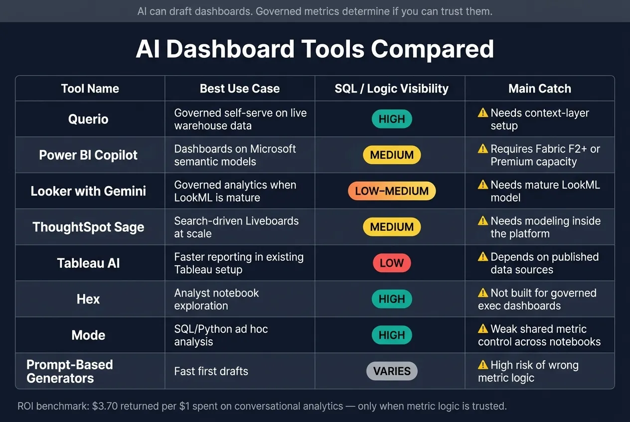 {AI Dashboard Tools Compared: Features, SQL Visibility & Best Use Cases}
:::
{AI Dashboard Tools Compared: Features, SQL Visibility & Best Use Cases}
:::
| Tool | Best Use | Main Catch | SQL / Logic Visibility |
|---|---|---|---|
| Querio vs Looker | Governed self-serve on live warehouse data | Needs context-layer setup | High |
| Power BI Copilot | Dashboards on top of Microsoft models | Needs Fabric/Premium and semantic modeling | Medium |
| Looker with Gemini | Governed analytics with LookML | Needs mature LookML | Low to medium |
| ThoughtSpot Sage | Search-driven Liveboards at scale | Needs modeling inside the platform | Medium |
| Tableau AI | Faster reporting in Tableau | Depends on published data sources | Low |
| Hex | Analyst notebook analysis | Not built for direct governed dashboard output | High |
| Mode | SQL/Python ad hoc analysis | Weak shared metric control across notebooks | High |
| Prompt-based generators | Fast first drafts | High risk of wrong metric logic | Varies |
So if I were choosing, I’d use AI for speed and keep people in the loop for review. That’s the line that runs through every tool in this piece.
sbb-itb-284a532
1. Querio
Querio is a chat-first analytics workspace that connects straight to your data warehouse - Snowflake, BigQuery, Amazon Redshift, or PostgreSQL - and turns plain-English questions into answers backed by SQL and Python. There are no extracts and no data duplication.
Prompt-to-Dashboard Output
Ask something like "Show me MRR by plan type for the last 90 days" and Querio returns a chart based on live warehouse data. The flow feels conversational: ask a question, check the result, then refine it. Querio works best for governed team analytics - repeat business questions where shared definitions matter - more than open-ended ad hoc digging [1]. It can also turn analysis into dashboards and scheduled reports tied to live data.
Metric Governance
Querio keeps metric logic in a context layer. Data teams define logic once - like MRR rules, active-user criteria, and table joins - so each answer uses the same definitions. Role-based access controls come straight from the connected warehouse, so teams don't have to set permissions again in a separate tool.
Query Transparency
Each response shows the SQL, and analysts can inspect it, edit it, and rerun it. That helps teams trust the method behind metrics like NRR or pipeline by stage, where even a small logic mistake can throw off reporting.
Setup Requirements
Querio is schema-first, but dependable self-serve still asks the data team to document the schema and build the context layer. That trade-off matters most for teams that want self-serve dashboards without giving up control over metric definitions.
Pricing starts at $400/month for 10 users, with enterprise plans in the mid-five figures per year; Querio is SOC 2 Type II certified [6].
| Feature | Querio |
|---|---|
| Primary Interface | Chat / Natural Language |
| SQL Transparency | Full SQL shown and editable |
| Metric Governance | Context layer + warehouse-inherited roles |
| Warehouse Support | Snowflake, BigQuery, Amazon Redshift, PostgreSQL |
| Setup Complexity | Medium (context layer recommended) [4] |
| Compliance | SOC 2 Type II [6] |
That covers the warehouse-native option; next, compare how BI-suite copilots handle the same workflow.
2. Microsoft Power BI Copilot
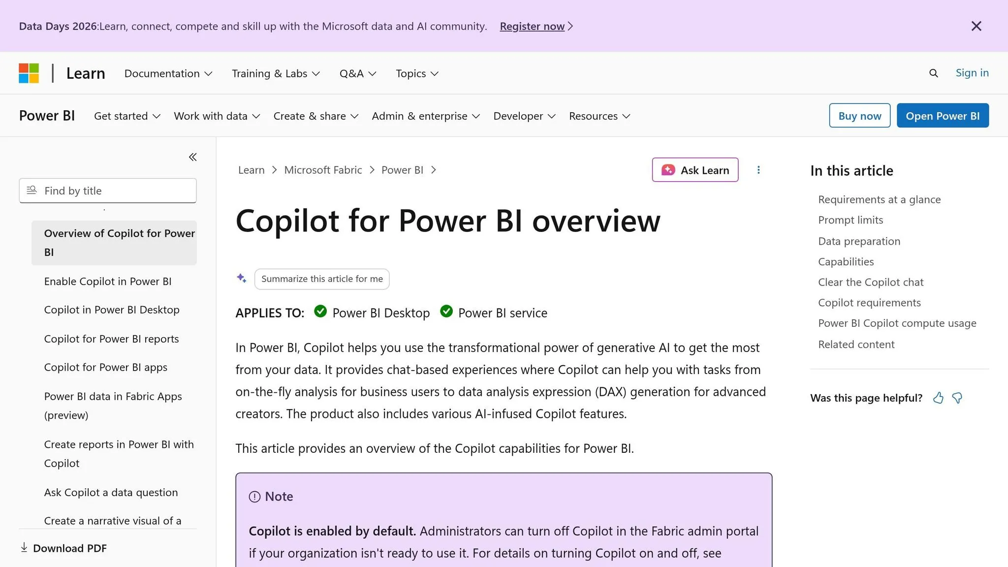
If your team already works inside the Microsoft stack, Power BI Copilot can be a solid add-on. But there's a catch: it only starts to help after your semantic model is set up.
Power BI Copilot lives inside Power BI Service. From plain-English prompts, it can generate charts, narrative summaries, and table summaries. That said, it works as an assistant built on top of the semantic layer. It is not a dashboard builder from scratch.
Prompt-to-Dashboard Output
Copilot does a good job with descriptive questions like "What was revenue last quarter?" when that metric is already defined in the semantic model.
So where does it help most? It speeds up work in dashboards you already have. What it doesn't do is replace semantic modeling. Filters and drill behavior still come from the semantic model, not from the prompt itself.
That means the main question isn't just whether Copilot can draw a chart. The main question is whether it keeps metric definitions and filter behavior intact.
Metric Governance
For metrics like MRR, churn, CAC, and retention, analysts still need to define measures and relationships in the semantic model before Copilot can answer in a dependable way.
Governance is enforced through Row-Level Security (RLS) based on DAX and Azure AD policies. In plain terms, the AI can generate a dashboard only when the metric logic already exists. That's the big limitation for SaaS teams that expect Copilot to answer messy business questions right out of the box.
Query Transparency
Copilot surfaces the DAX it generates, which means analysts can inspect it and edit it.
That's helpful, but only up to a point. While it exposes DAX, the warehouse query path stays mostly hidden. And that's where validation gets tougher. If a finance or revenue team needs to audit a number before it lands in a leadership deck, that lack of visibility can become a problem.
Setup Requirements
Copilot requires Microsoft Fabric F2+ or Power BI Premium P1+ capacity. There isn't a standalone Copilot SKU.
Teams already using Microsoft 365 and Azure AD will usually get it live with less setup friction. That's a big reason Copilot tends to fit best in governed Microsoft BI environments.
| Feature | Power BI Copilot |
|---|---|
| Primary Interface | Sidekick to existing BI dashboards |
| Schema Approach | Requires a pre-built semantic model |
| SQL Transparency | DAX is visible; warehouse query path is mostly hidden |
| Metric Governance | DAX-based RLS and Azure AD |
| AI Access Pricing | Requires Fabric F2+ or Power BI Premium P1+ capacity [2] |
3. Looker with Gemini
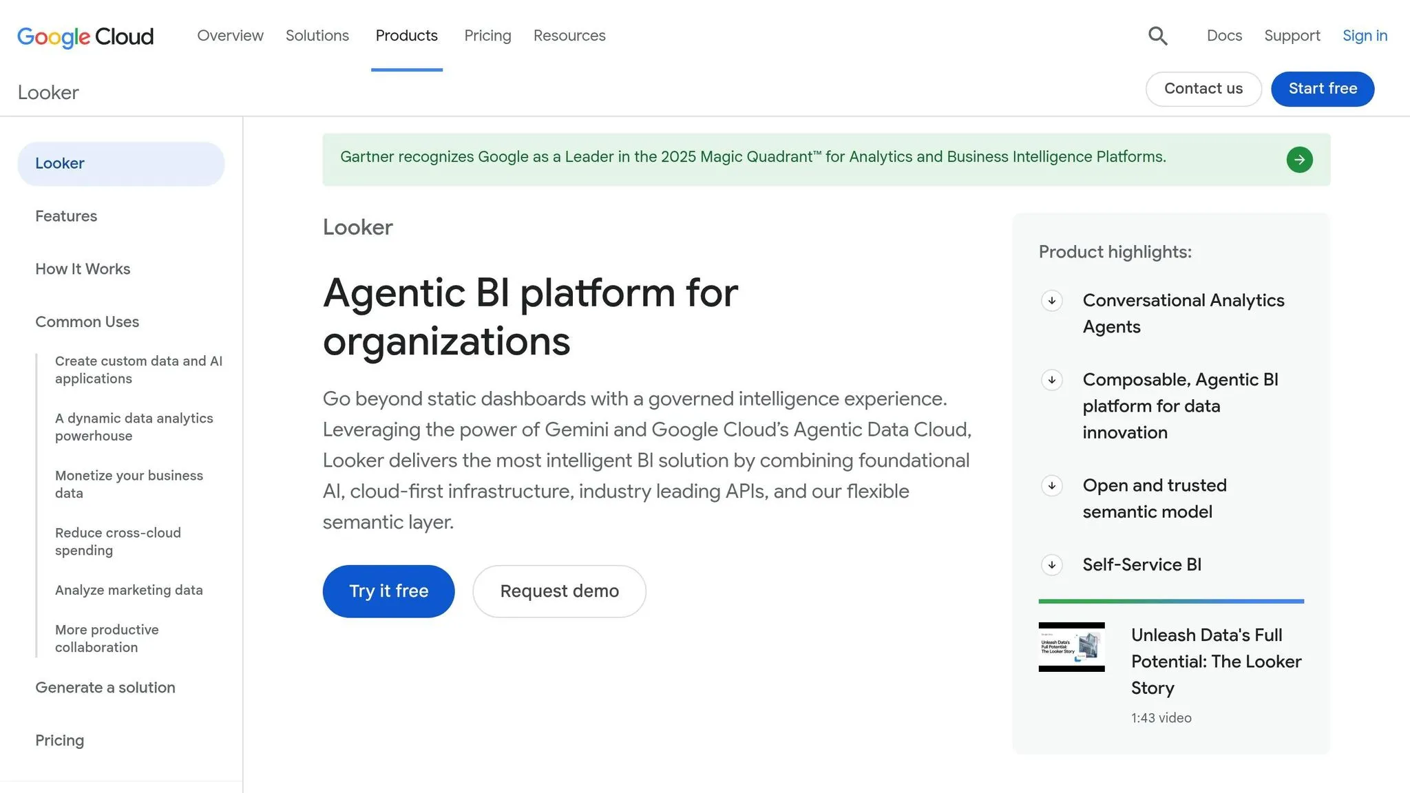
If your team already standardizes metrics in LookML, Gemini can act as a fast front end for governed analytics. It works best when LookML already defines the metrics, so users aren't starting from raw tables and trying to piece things together on the fly.
Prompt-to-Dashboard Output
Ask "What's revenue by plan tier?" and Gemini can return a useful chart because it's querying a modeled semantic layer instead of guessing from a raw warehouse schema. That's a big deal. It means the output is tied to logic your team has already set up.
Gemini can draft a chart from a question, but it won't invent new metric logic. That's where the limits show up. Funnel analysis, retention cohorts, and conversion windows all need to be defined as custom LookML measures first. If they aren't there, Gemini won't surface them.
So in day-to-day use, Gemini helps most when the dashboard logic already exists and people mainly want a faster way to get to it.
Metric Governance
Looker's main strength here is metric consistency. Every answer flows through LookML, so MRR and churn stay the same whether a business user asks in natural language or an analyst runs a direct query.
That consistency is the big reason teams trust Gemini for governed reporting. It makes reporting dependable, but only within the limits of the current model. The tradeoff isn't access speed versus accuracy. It's speed of access versus flexibility. If something isn't modeled, it's out of reach.
Query Transparency
The underlying SQL is harder to inspect unless users have advanced access. For data teams, that can slow down audit work, especially when they need to verify a number before leadership sees it.
Setup Requirements
Teams need a mature LookML model before Gemini becomes useful. Looker is priced on custom terms, with viewer seats typically running $30–$60 per month at scale [2]. Between the pricing and the modeling work, this is usually a better fit for organizations that already have a governed Looker setup than for teams starting from scratch.
| Feature | Looker with Gemini |
|---|---|
| Primary Interface | Traditional BI with AI assistance |
| Schema Approach | Requires a mature LookML semantic layer |
| SQL Transparency | Limited; SQL view is an advanced feature |
| Metric Governance | Semantic-layer-first (LookML); high consistency |
| Warehouse Support | BigQuery, Snowflake, Redshift, Postgres, and others |
| Pricing | Priced on custom terms; $30–$60 per viewer per month at scale [2] |
4. ThoughtSpot Sage
ThoughtSpot Sage adds Spotter, a conversational layer that turns plain-English questions into interactive Liveboards. In plain terms, you type a question and Sage can turn it into a dashboard you can click through. That said, the output is only as good as the model underneath.
Prompt-to-Dashboard Output
This is where Sage shines: fast, descriptive reporting. It’s less suited for making up new metric logic on the fly.
WEX Field Service Management reported 65% adoption in 90 days and cut report generation from five-minute timeouts to under three seconds [6]. So if someone asks, "What's MRR this quarter by plan?" Sage can return an interactive Liveboard fast. But if you need funnel analysis, cohort work, or conversion-window analysis, you still need modeled measures in place.
Metric Governance
ThoughtSpot supports dbt integration. You can import dbt zip files or connect straight to dbt Cloud. Teams can also add business terms and reference questions so Spotter has more context.
Still, ThoughtSpot is only reliable when it sits on top of existing dbt, LookML, or MetricFlow definitions.
Query Transparency
ThoughtSpot shows the underlying query for most outputs. That gives analysts a way to check the numbers before they go to a stakeholder.
Setup Requirements
The speed comes from the search experience. The reliability comes from the semantic layer self-service BI requires.
Before Sage becomes useful, analysts need to build the data model inside the platform by joining tables, selecting columns, and defining relationships [3]. That upfront setup can make the model closely tied to ThoughtSpot.
| Feature | ThoughtSpot Sage |
|---|---|
| Primary Interface | Natural-language search → interactive Liveboards |
| Schema Approach | Requires a modeled data layer built inside the platform |
| Query Transparency | Underlying query is surfaced and inspectable for analysts |
| Metric Governance | dbt integration plus business terms and reference questions |
| Pricing | From approximately $25/user/month; enterprise can reach around $25,000/month [2][6] |
5. Tableau AI
Tableau AI, built around Pulse and Agent, works more like an assistant than a dashboard builder. It can draft charts and summaries, but only from data that has already been modeled. So yes, it can speed up reporting. But no, it won't invent metric logic for you.
Prompt-to-Dashboard Output
Tableau AI does a good job with repeat questions like "What's MRR this quarter?" It can turn that into charts and written summaries fast, which makes it a strong match for dashboards executives check every day [2].
That said, funnel analysis, retention tracking, and conversion-window work still depend on prebuilt measures. The chart may show up in seconds. The harder part is still the model behind it.
Metric Governance
Metrics stay consistent when Tableau uses published data sources and workbook filters. It doesn't create the source of truth. It reads from one.
For SaaS teams, that's the key point. Tableau AI is at its best when the metric layer already exists in the warehouse or in dbt. And when analysts need to verify a number, the next sticking point is plain: how much they can see in the underlying calculation.
Query Transparency
Tableau AI can help build calculation fields, but it gives only a limited view of the SQL underneath. For analysts who want to check methodology before sending results to stakeholders, that's a real gap.
Setup Requirements
Tableau AI works best after a mature semantic model like Cube, Transform, or MetricFlow is already in place and data sources have been published. Without that setup, Tableau AI is more of a reporting accelerator than a tool for building new reporting from scratch.
| Feature | Tableau AI (Pulse + Agent) |
|---|---|
| Primary Interface | Questions → charts and summaries |
| Schema Approach | Requires published data sources and a mature semantic model |
| Query Transparency | Limited SQL visibility; assists with calculation fields |
| Metric Governance | Governed through published data sources and workbook filters |
| Pricing | Tableau Creator at $75/user/month [2] |
6. Hex
Hex is notebook-first. Hex Magic turns plain-English questions into SQL or Python cells for exploratory analysis, not polished dashboards. It can speed up the analysis that sits behind a dashboard, but it doesn't take the analyst out of the last mile. So Hex works well as a bridge between raw analysis and dashboard building, not as a direct dashboard generator.
Prompt-to-Dashboard Output
Hex Magic can turn a natural-language question into SQL or Python cells, and that's genuinely useful when you're trying to explore data fast. But the output still needs an analyst to review it before it's ready for a leadership review.
As István Mészáros, CEO of Mitzu, notes, these tools speed up cell authoring, but the analyst still owns the query. [5]
Each notebook is isolated, which means metric definitions don't automatically carry over from one analysis to another, highlighting the difference between metrics and semantic layers. In practice, non-technical users can usually read the result, but they can't do much editing without analyst help.
Metric Governance
Hex is schema-first, so it can move fast on raw warehouse schemas. It also supports optional dbt integration for teams using Snowflake, BigQuery, Redshift, or Postgres. That helps line up notebook output with warehouse-defined models. Without a central metric layer, though, inconsistent metric definitions across notebooks remain the main governance risk. [5]
Query Transparency
This is one area where Hex stands out. Every AI-generated cell is fully visible and editable, so analysts can inspect the SQL or Python, change it, and rerun it before anything gets in front of a stakeholder.
Setup Requirements
Hex starts light. Access is managed at the project level and inherits warehouse permissions. Teams that want more consistency can add dbt integration.
| Feature | Hex (Magic) |
|---|---|
| Primary Interface | Notebook-based (SQL & Python cells) |
| Query Transparency | Full; all AI-generated code is visible and editable |
| Metric Governance | Schema-first; optional dbt integration; no centralized metric layer |
| Setup Cost | Low to start; moderate with dbt integration |
| Ideal Use Case | Ad hoc exploration and data science workflows |
Next is a different category: tools that try to go straight from prompt to dashboard with less analyst involvement.
7. Mode
Mode feels a lot like Hex in day-to-day notebook work. The big issue isn’t whether it can help analysts move faster. It can. The issue is whether it helps a team build repeatable reporting, or mostly makes one-off analysis easier to ship.
Mode is a SQL-and-Python notebook platform built for analyst-led analysis.
Prompt-to-Dashboard Output
Mode speeds up work inside notebooks. But it does not turn a prompt into a governed dashboard on its own.
That matters more than it might seem at first. A team can move fast with ad hoc analysis and still end up without reusable dashboards for recurring reporting. So while Mode helps analysts get from idea to analysis faster, it doesn’t replace governed reporting.
Metric Governance
Mode is a code-first notebook platform where analysts write SQL and Python in cells to build bespoke analyses [5]. That setup gives analysts a lot of control, but it also creates a familiar problem: each analysis can stay local unless the team takes time to standardize it.
In plain English, retention logic in one notebook can look a little different from retention logic in another. The same goes for funnel definitions. Over time, those small gaps can pile up.
For teams working across Snowflake, BigQuery, Redshift, Postgres, and dbt, that risk grows. Mode can help analysts draft the analysis behind a dashboard, but teams still need to lock down metric definitions and move that work into reusable reporting.
Query Transparency
Mode’s AI assistant writes code directly in the notebook, which means analysts can inspect it, edit it, and decide whether it’s good enough to use.
That’s a strong fit for analyst teams that want to stay close to the SQL and Python behind the work instead of treating the output like a black box.
Here’s where Mode fits in the workflow.
| Feature | Mode |
|---|---|
| Primary Interface | SQL & Python notebook cells |
| Query Transparency | AI-generated code is visible and editable |
| Metric Governance | One-off analyses; methodologies are not shared automatically |
| Ideal Use Case | Analyst-led ad hoc analysis and reporting |
Mode works best for analyst-led teams that already live in SQL and Python notebooks.
8. Prompt-Based AI Dashboard Generators
This category covers standalone tools built on a simple pitch: type a question in plain English, get a dashboard back. The draw is easy to see. You move from question to draft in minutes.
But that speed comes with a catch. Things start to slip when the answer depends on metric rules staying consistent and the warehouse being trusted.
Prompt-to-Dashboard Output
This is the fastest path from question to first draft. It’s also one of the easiest places for metric logic to drift.
These tools can put together a dashboard fast, but they tend to struggle when the logic behind a metric has to stay exact. AI can draft a dashboard. It can’t always produce one you’d want to trust without checking it first.
LLMs generating SQL from scratch often produce plausible but wrong SQL [5]. That’s the problem in a nutshell: the output can look right while being off under the hood. A chart may seem fine while silently double-counting users [5]. In funnel and retention analysis, that’s more than a small error. It’s enough to break trust in the result.
Some tools try to avoid this by having the engine, not the model, write the SQL [5].
Metric Governance
Without a governed metrics layer, these tools can end up redefining churn, revenue, or funnel logic in ways that don’t match your source of truth. For Snowflake, BigQuery, Redshift, and Postgres teams, the main risk isn’t chart creation. It’s metric drift [2] [5].
Once definitions start to wobble, inspectable SQL becomes the only solid way to verify what the dashboard is actually doing.
Query Transparency
Transparency is all over the map. Some tools show the generated SQL and let analysts edit it before the dashboard goes live. Others make the logic hard to inspect.
For governed reporting, that line matters. SQL needs to be inspectable before the dashboard ships.
Setup Requirements
Setup costs vary, and most teams still need a validation window before putting generated dashboards in front of business users. A generated dashboard still needs analyst review before finance, sales, or leadership relies on it.
So in practice, these tools work well for drafts. They’re less suited for fully trusted reporting right out of the gate.
| Criterion | Typical Prompt-Based Generator |
|---|---|
| Prompt-to-Dashboard Speed | Fast - minutes to a first draft dashboard |
| Metric Governance | Weak without a semantic layer |
| Query Transparency | Varies; sometimes inspectable, sometimes limited |
| Setup Required | Low to start; higher for production trust |
| Best Fit | Ad hoc exploration, not standing reports |
Where Each Tool Wins and Where It Falls Short
The real test isn't whether a tool can generate a chart. It's whether that chart still makes sense when someone asks for an edge-case filter or a metric definition that has to match the warehouse. That's where the field starts to split.
Edge cases are the stress test. Some dashboards hold up. Others fall apart the moment someone asks, "What exactly does this metric include?" The difference usually comes down to one thing: does the tool inherit trusted metrics, or does it try to make them up on the fly?
Querio stands out for governed self-service analytics when teams want one metric layer and SQL they can inspect.
Power BI Copilot and Looker with Gemini both do best when the semantic model is already clean. If edge-case logic wasn't defined well at the start, that still shows up later. ThoughtSpot Sage works well at scale once modeling and indexing are in place. Tableau AI helps teams move faster inside an existing Tableau setup, but its output is only as good as the model underneath it.
Hex and Mode lean more toward analysts. They give users editable SQL and Python cells, which is great for iteration, but not ideal for locked-down executive dashboards. Prompt-based generators are the fastest way to go from question to first draft, but they also bring the biggest risk of metric drift when there's no semantic layer in place.
This isn't about chart generation. It's about whether the dashboard survives review. The table below strips each tool down to where it works best and where it runs into trouble.
| Tool | Best at | Limits |
|---|---|---|
| Querio | Governed self-serve on live Snowflake, BigQuery, Redshift, or Postgres; one consistent metric layer | Requires context layer setup before AI answers are fully trustworthy |
| Power BI Copilot | Fast dashboard assembly on a pre-built semantic model | Still depends on upfront semantic modeling |
| Looker with Gemini | Consistent metrics and filter logic when LookML is mature | Less useful without a well-maintained LookML model |
| ThoughtSpot Sage | Large-scale self-serve once semantic model and indexing are in place | Requires upfront modeling before it performs well |
| Tableau AI | Speeds up authoring for existing Tableau users | Accuracy follows the underlying data model |
| Hex | Fast analyst iteration; fully editable Python and SQL cells | Requires analyst review before results reach business users |
| Mode | Analyst-led ad hoc exploration in SQL and notebook workflows | Less suited for governed executive dashboards |
| Prompt-Based Generators | Fastest path to a first draft | Highest risk of metric drift without a semantic layer |
Pros and Cons of Each Tool
No single tool wins in every situation. The right pick comes down to three things: how much setup your team can handle, how visible the SQL is, and whether non-technical people need direct access.
AI can spin up a dashboard fast. That part is no longer the hard part. The hard part is making sure the numbers hold up when people start using that dashboard to make decisions. That’s where governed metrics matter. Use the table below to match each tool to the level of review and metric control your team needs.
| Tool | Pros | Cons | Best For |
|---|---|---|---|
| Querio | Live warehouse connections; inspectable SQL/Python; governed conversational layer; self-serve for non-technical users | Needs upfront context-layer setup before AI answers are fully reliable | Data teams at B2B SaaS companies that want governed self-serve without losing metric consistency |
| Microsoft Power BI Copilot | Familiar Microsoft ecosystem; fast dashboard drafting | Copilot requires Fabric F2+ or Premium capacity; output quality depends on a well-built semantic model | Teams already invested in Microsoft and working from a clean semantic model |
| Looker with Gemini | Strong metric consistency when LookML is mature and maintained | Requires substantial upfront modeling work; quality drops if the LookML model is not kept current | Teams with an established Looker deployment and dedicated modeling resources |
| ThoughtSpot Sage | Conversational self-serve at scale | Reliable results still depend on substantial modeling work | Larger organizations that want conversational analytics at scale |
| Tableau AI | Speeds up authoring for existing Tableau users | Accuracy is still bounded by the underlying data model | Teams already standardized on Tableau |
| Hex | Fully editable SQL and Python cells; strong for analyst iteration | Needs analyst review before results reach business users | Analysts who need a flexible notebook environment for deep, iterative analysis |
| Mode | Strong SQL and notebook workflow for ad hoc exploration; analyst-friendly | Less suited for governed reporting or direct non-technical self-serve | Analyst-led teams doing exploratory work rather than recurring KPI reporting |
| Prompt-Based AI Dashboard Generators | Fastest path to a first draft; low setup burden | Highest risk of metric drift without a semantic layer; not reliable for production dashboards | Early prototyping or one-off exploration where accuracy is not mission-critical |
The deciding factor isn’t whether AI can draw a chart. It’s whether the metric logic stays stable from query to dashboard.
That’s the split, plain and simple: fast drafts versus governed dashboards that stay consistent under review.
Conclusion
AI can absolutely build a dashboard for you today. But it still can't tell you, with confidence, whether that dashboard is telling the truth. Across these tools, the pattern is the same: AI can draft dashboards, but it can't verify them. Without human review, there's no guarantee the joins are right, the metric definitions match what your team agreed on, or the filters aren't quietly leaving out rows that matter [1].
For mid-market B2B SaaS teams, that's the real fork in the road. If your semantic layer is mature - LookML, dbt, or a governed context layer - AI dashboards can be useful. If not, speed often comes with a hit to accuracy. That lines up with the three themes running through every tool above: live warehouse access, governed metrics, and human review.
Teams with a maintained semantic layer should use AI to speed up reporting. Teams still putting that base in place should treat AI dashboards as drafts, not final deliverables. That's why fit comes down to a simple point: does the tool sit on top of governed metrics, or does it try to guess them?
A practical setup is to keep a small set of curated dashboards for executive reporting, then use AI for the long tail of ad hoc questions. That split gives you speed without putting dashboard trust at risk.
Put plainly, AI dashboarding works best when metric logic is locked down before the AI touches it.
FAQs
::: faq
What makes an AI dashboard trustworthy?
An AI dashboard earns trust when it relies on transparent, inspectable SQL, uses consistent metric definitions from a governed semantic layer, and asks clarifying questions instead of guessing.
It should also show the reasoning and data lineage behind each calculation so analysts can verify the results, while still enforcing warehouse security controls. Trust comes from governed, verifiable answers - not black-box logic. :::
::: faq
Do I need a semantic layer first?
Not necessarily. You can start with AI-native tools on a raw schema. But over time, you’ll probably want a semantic layer on top to keep metrics accurate and definitions in sync.
A lot of teams begin with a schema-first setup because it’s fast. Then, as key metrics settle down, they add governed definitions. That helps keep terms like "active user" and "MRR" consistent across agents and dashboards.
If you already have dbt models or semantic definitions in place, use them. They can save you from the classic problem where the same metric means slightly different things in different places. :::
::: faq
Which metrics need human review?
AI can help teams build dashboards faster. But for production-level accuracy, people still need to check the logic, test complex joins, and validate row counts.
Analysts should also review metrics with ambiguous definitions. Think gross vs. net revenue, or booked vs. recognized growth. Even if you have a governed semantic layer in place, the first query results still need an audit to make sure the business logic is right. :::