What Is Exploratory Data Analysis A Practical Guide
Learn what is exploratory data analysis (EDA), its core techniques, and why it's a critical skill for business and product teams to unlock data-driven insights.
https://www.youtube.com/watch?v=Cnbdkye0X_8
published
Outrank AI
what is exploratory data analysis, eda techniques, data analysis, business intelligence, data visualization
1d93b761-cd4d-4725-8c4a-40b4ac2f1b7e

Exploratory Data Analysis (EDA) is all about rolling up your sleeves and getting to know your data. Think of it as being a detective at a new crime scene. You don't walk in with a suspect already in mind; instead, you dust for prints, look for clues, and piece together the story of what happened. EDA is that initial investigation, and it’s what helps you make smart, fast decisions based on what the data is actually telling you.
Why Data Exploration Comes First

Before you can make any big pronouncements or build complex models, you need to have a conversation with your data. EDA is that conversation. Instead of jumping in to prove a theory you already have, you ask open-ended questions and just listen to what surfaces.
This is a world away from traditional, or confirmatory, analysis, which is all about validating a specific, pre-defined hypothesis. With EDA, the goal isn't to find a single, polished answer. It's to get a "feel" for the dataset—to understand its structure, spot any weird outliers or errors, and uncover hidden relationships between variables.
Skipping this step is a huge risk. Teams that jump straight to modeling often build on faulty assumptions or completely miss the game-changing insights hiding just beneath the surface.
EDA vs Traditional Analysis At a Glance
Understanding the fundamental mindset and goals that separate open-ended exploration from rigid hypothesis testing.
Aspect | Exploratory Data Analysis (EDA) | Traditional (Confirmatory) Analysis |
|---|---|---|
Primary Goal | Discover patterns, form questions | Test a specific hypothesis |
Approach | Open-ended, flexible, iterative | Structured, rigid, pre-planned |
Starting Point | An open question: "What's in the data?" | A firm hypothesis: "Is X related to Y?" |
Key Questions | "What's interesting here?" "Are there any outliers?" | "Is this statistically significant?" |
Outcome | New insights, refined hypotheses | A "yes" or "no" answer, validated findings |
Analogy | A detective looking for clues at a crime scene | A lawyer presenting a case in court |
This table shows how EDA is fundamentally a discovery process, while traditional analysis is about proving a point. Both are valuable, but EDA must come first to make sure you're even asking the right questions.
The Detective's Toolkit
This initial investigation relies on a few core activities that build on each other, gradually painting a clear picture of your data. It's a process that moves you from a fuzzy, high-level overview to sharp, actionable questions.
Here’s what’s in the toolkit:
Summarizing Data: Using basic stats like mean, median, and mode to quickly understand the dataset's center and spread.
Visualizing Patterns: Creating charts like histograms and scatter plots to see trends and relationships that raw numbers would never reveal.
Checking Data Quality: Hunting down missing values, duplicates, or strange outliers that could throw off your entire analysis.
Formulating Questions: Turning your initial findings into more specific, testable hypotheses for a deeper dive later on.
The real value of Exploratory Data Analysis is its ability to challenge your assumptions. It forces you to listen to what the data is saying, rather than just using it to confirm what you already believe.
Ultimately, EDA is both a quality control check and a discovery engine. It’s a mindset of curiosity. Understanding different analytical approaches, like the comparison between Fundamental Vs Technical Analysis in financial markets, highlights the unique, question-driven role of EDA. It ensures your big strategic decisions are grounded in the reality of your data, not just gut feelings.
The Origins of Modern Data Exploration
To really get what exploratory data analysis is all about, we need to rewind to a time before "big data" was a household phrase. For a long time, statistics was mostly about confirmation. An analyst would cook up a hypothesis, gather some data, and then run tests to see if their hunch was right.
It was a very structured way of doing things, but it had one giant flaw. It was a bit like a detective deciding who the killer is before even stepping foot in the crime scene. This old-school approach meant analysts often tried to shoehorn their data into neat little boxes they’d already built. If the numbers didn't behave as expected, they were often brushed aside as random noise. You can imagine how many incredible insights were left on the cutting room floor simply because no one thought to look for them without a specific question already in mind.
A New Philosophy of Inquiry
The tide started to turn in the 1970s, all thanks to a statistician who thought we could do better.
The whole idea of EDA was formally introduced in 1977 by John Tukey in his game-changing book, Exploratory Data Analysis. Tukey made a simple but powerful argument: analysts were spending way too much time on proving their theories and not nearly enough time just getting to know their data. He believed that at least 50% of our analytical effort should go into digging around in the data to find good questions, not just to confirm the ones we already have. Learn more about the history of exploratory data analysis from its Wikipedia entry.
Before Tukey, it was common practice for statisticians to pick their model first and then look at the data. This could completely mask the real story the numbers were trying to tell.
"The greatest value of a picture is when it forces us to notice what we never expected to see." - John Tukey
This quote gets right to the heart of his philosophy. Tukey was a huge advocate for using simple visuals—things like box plots and stem-and-leaf plots—to let the data speak for itself. It was a call to put curiosity and observation ahead of rigid confirmation. This shift in thinking was a huge influence on the development of statistical computing languages, like the S language at Bell Labs, which later inspired the R programming language so many data scientists use today.
From Manual Exploration to Modern Speed
Tukey came up with these ideas when computing power was a fraction of what it is now. Back then, exploring data was a slow, manual grind. Today, we’re dealing with the opposite problem: a firehose of data being created every single second. This information overload actually makes his vision for exploration more critical than ever.
The core principles he laid out—look before you leap, question your assumptions, and let the data be your guide—are the very foundation of modern business intelligence. The tools have certainly changed, evolving from pen and paper to powerful platforms. But the goal is exactly the same. The detective work Tukey championed is what allows business and product teams today to perform the kind of deep, rapid analysis they need to stay ahead.
A Simple Four-Step Framework for Effective EDA
Jumping into a raw dataset can feel like navigating a new city without a map. But with the right framework, Exploratory Data Analysis becomes a straightforward, even enjoyable, process. It’s less about complex statistics and more about a repeatable workflow for turning messy data into clear business questions.
Think of this as your go-to game plan. This four-step process is built for anyone on the team—from product managers to marketers—and breaks the journey down into logical stages. You’ll move from a high-level overview to specific, actionable insights.
Step 1: Frame Your Questions and Get to Know Your Variables
Before you run a single query or build one chart, you have to start with why. What’s the business problem you’re trying to solve? What do you actually want to learn from this data? Pinpointing your objective from the start is the best way to avoid getting lost in a sea of numbers.
With your goals clear, it's time to meet your building blocks: the variables in your dataset. This just means looking at the column names, understanding what kind of data they hold (text, numbers, dates), and getting a basic sense of what each one represents.
For example, a marketing manager looking at a campaign dataset would first identify variables like Campaign_Source, Cost_Per_Click, Conversions, and Customer_Region. It’s just like a chef laying out all their ingredients before they even think about turning on the stove.
Step 2: Summarize and Profile the Data
Now that you know your variables, you can generate some quick summary statistics. This isn't deep analysis yet; it’s more like getting the lay of the land. For any numerical data, this means calculating a few key metrics to understand its shape and tendencies.
Start by looking at these metrics:
Count: The total number of entries for each variable.
Mean: The average value, giving you a quick sense of the center.
Median: The middle value, which is often more useful than the mean when outliers are present.
Standard Deviation: A measure of how spread out your data is.
Min/Max: The smallest and largest values, which help you spot the range and potential oddities.
For categorical data, like Campaign_Source, you’d simply count the frequency of each category. This quick profiling step is often where the first "aha!" moments happen. You might find that 90% of your conversions come from a single source or that Cost_Per_Click has a maximum value that seems way too high.
The goal here is to establish a baseline. You're looking for anything that immediately jumps out as interesting or just plain weird, which helps you decide where to focus next.
Step 3: Visualize Patterns and Relationships
Tables full of numbers are useful, but our brains are hardwired to find patterns visually. This is where data visualization becomes your superpower in the EDA process. Good charts and graphs can reveal trends, connections, and outliers far more quickly and clearly than any spreadsheet.
You could use a histogram to see how customer ages are distributed or a scatter plot to check for a relationship between ad spend and conversions. These visuals turn abstract numbers into a story you can actually see. If you want to dive deeper into this, our guide on how to analyze data is a great place to start.
This visual timeline shows how the focus of EDA has shifted over the years, moving from overcoming bias to embracing speed.
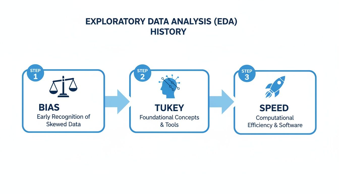
The image traces EDA's journey from a method pioneered by Tukey to combat bias to a modern process where speed and efficiency are paramount.
Step 4: Clean Up the Data and Define Next Steps
Your exploration will almost always uncover a few quirks in the data. You’ll find things like missing values, duplicate entries, or extreme outliers that just don't make sense. The final step of your initial exploration is to document these issues and decide on a plan to handle them.
Armed with everything you’ve learned, you can now form clear, data-informed hypotheses. Instead of acting on a vague hunch, you have solid evidence to guide your next moves, whether that’s launching a deeper analysis, running an A/B test, or making a confident business decision.
Essential Techniques for Visualizing Your Data
Once you’ve got your summary stats, it’s time to bring your data to life with visuals. Raw numbers in a spreadsheet can feel abstract and dense, but creating charts and graphs is like flipping a switch in a dark room. All of a sudden, patterns, relationships, and weird outliers that were hiding in plain sight become impossible to miss.
Visualization isn’t about making pretty charts for a presentation. It’s a powerful discovery tool. The key is picking the right kind of chart to answer a specific question, and most techniques fall into two buckets: univariate and bivariate analysis. Let's dig into what that means.
Understanding One Variable at a Time
Univariate analysis is just a fancy way of saying you’re looking at one variable by itself. The whole point is to get a feel for its distribution—how are the values spread out? What’s the most common value? Think of it like taking a quick headcount of a single column in your dataset.
Two of the best charts for this are histograms and box plots.
Histograms: These are your go-to for seeing the "shape" of your data. A histogram takes a continuous variable (like age or price) and groups the values into ranges, or "bins," showing you how many data points fall into each one. A product manager could use a histogram to visualize the age distribution of their users and instantly see if their user base skews young, old, or is evenly spread across the board.
Box Plots: A box plot is like a condensed, five-number summary in a picture. It clearly shows the median, the range where the middle 50% of your data lives (the "box"), and any outliers that fall way outside the norm. This is super helpful for spotting anomalies, like finding out that a handful of super-users are dragging up your average session time.
These simple, single-variable charts are often the quickest way to get a baseline understanding of your data and find the first clues for where to look next. You might discover that 80% of your customers are in a single age group, a finding that immediately shapes how you think about marketing.
Uncovering Relationships Between Two Variables
Looking at one variable is a good start, but the real "aha!" moments often come when you compare two variables against each other. This is called bivariate analysis, and it's how you start finding relationships and testing your hunches. This is where you answer questions like, "do customers who use Feature A also buy Product B?"
The most common charts for this are scatter plots and heatmaps.
By visualizing two variables together, you move from just describing your data to understanding the connections within it. This is a critical step in turning observations into actionable hypotheses.
A scatter plot is the classic choice for seeing if there's a relationship between two numeric variables. Each dot on the graph represents a single data point, placed according to its value on the X and Y axes. You could plot marketing spend on one axis and new sign-ups on the other. If the dots trend upward from left to right, you’ve got a strong signal that more spending is connected to more sign-ups.
A heatmap is fantastic for showing the relationship between two categorical variables or visualizing intensity across a grid. For example, a heatmap could show which product categories are most popular in different sales regions, with darker colors indicating higher sales volume. It makes complex relationships instantly understandable.
Choosing the right visual is half the battle. This table can serve as a quick reference guide to match your question with the most effective chart.
Matching Your Question to the Right Visualization
If You Want to Understand... | Use This Visualization | What It Reveals |
|---|---|---|
The distribution or "shape" of a single numeric variable (e.g., user age) | Histogram | How frequently different values occur and whether the data is skewed or centered. |
The summary and spread of a single numeric variable, including outliers. | Box Plot | The median, quartiles, and any unusual data points that might skew your averages. |
The relationship between two numeric variables (e.g., ad spend vs. revenue). | Scatter Plot | If there's a positive, negative, or no correlation between the two variables. |
The relationship between two categorical variables (e.g., product vs. region). | Heatmap | The strength of interaction or frequency at the intersection of two categories. |
This isn't an exhaustive list, but it covers the foundational charts that will answer a huge portion of your initial business questions.
Want to go deeper on this? Our complete data visualization guide on choosing the right charts has you covered.
Turning Raw Data Into a Winning Business Strategy

Theories and techniques are one thing, but the real magic of EDA happens when you apply it to a genuine business headache. Let's follow a product manager at an e-commerce startup who used it to transform a fuzzy concern into a concrete, data-backed strategy.
The problem was a familiar one: customer retention had dipped for the second month straight. The office was full of theories—a new competitor, a recent pricing update, a seasonal slump. But nobody really knew. Instead of falling into the guessing game, the PM decided to jump into the user activity data.
The initial dataset was a beast. It had everything from login timestamps and purchase histories to support tickets and shipping logs. It was a classic case of information overload.
From Messy Data to a Clear Picture
Her first move was to get the lay of the land with some summary stats. She calculated the average number of purchases per user, the typical time between those purchases, and the average customer lifetime value. Almost immediately, a clue emerged: the average time between a customer's first and second purchase had shot up by 15% for the specific group of users who were churning. That was the first thread to pull.
Next, she threw the purchase frequency data into a histogram. The visualization revealed a distinct pattern. Most happy customers made their second purchase within 30 days. But a small, yet meaningful, group was waiting much longer—and these were the exact users who were most likely to disappear for good.
This is EDA in its purest form. It’s not about finding a single, final answer right away. It's about uncovering the next best question to ask—the one that leads you closer to the real story.
Armed with this insight, she started to wonder what was going on around that 30-day mark. She formed a new hypothesis: something about the initial customer experience was creating friction for certain users. This pushed her to explore variables she hadn't even considered before, like shipping times and product categories.
Uncovering the Surprising Connection
To dig into this new idea, she built a simple scatter plot. She mapped the average shipping time for a customer's first order on one axis and the number of days until their second purchase on the other. The result was a lightbulb moment. A clear, positive correlation stared back at her: the longer the first delivery took, the longer the customer waited to buy again. In fact, orders taking more than seven days to arrive were directly linked to a much higher churn rate.
This discovery completely changed the conversation. The culprit wasn't a new competitor or the pricing model; it was an operational bottleneck hiding in plain sight.
The vague problem of "low retention" now had a sharp, testable hypothesis: "If we can get first-order shipping times under seven days, we will increase second-purchase rates and improve overall retention." The team finally had a clear, data-driven plan of attack. If you want to see how this process can be supercharged, check out our article on how AI turns raw data into actionable insights.
How to Accelerate Your Exploratory Data Analysis
Not too long ago, exploratory data analysis was stuck in the slow lane. If you were on a business team and had a question, you had to file a ticket and wait. A data analyst would eventually get to it, writing complex SQL or Python scripts to pull the information. This whole process created a frustrating bottleneck, turning what should have been a quick look at the data into a long, drawn-out waiting game.
Thankfully, that’s changing. Modern analytics platforms are breaking down those technical walls. Tools like Querio are built on a simple but powerful idea: what if product, marketing, and ops teams could ask questions about their data in plain English, just like they’d ask a colleague?
The Shift to Instant Answers
This new approach completely changes the pace of business. Instead of needing to know a programming language, you can just type a question like, "Show me user retention by country for the last quarter." The platform gets to work and instantly serves up a chart or graph, letting you see what's happening right away.
The real magic is in the interactivity. See an interesting spike in Germany? Just click on it to drill down. You can ask follow-up questions to uncover the "why" behind the what, turning a static report into a dynamic conversation with your data. A task that used to involve days of back-and-forth between teams can now be done in a matter of minutes.
Analysts using these modern EDA platforms have found they can uncover insights 5-10x faster than they could with traditional SQL queries. This isn't just an incremental improvement; it's a fundamental shift that allows teams to spot and act on growth opportunities in real time. You can learn more about the evolution of data analytics on nobledesktop.com.
This isn't just about doing the same work faster; it's about enabling a culture of continuous curiosity where anyone can find their own answers.
For example, this screenshot from Querio shows what happens when you ask a simple question in plain language. You get an immediate bar chart that’s ready to explore.
The visualization instantly tells a story, highlighting which acquisition channels are performing best. By removing the coding requirement, these tools open up deep data exploration to everyone in the organization, not just the data specialists. If you're weighing your options, our guide on statistical tools for data analysis can help you compare different approaches.
Still Have Questions? Here Are a Few Common Ones
Let's tackle some of the most common questions that pop up when teams first start digging into exploratory data analysis.
EDA vs. Dashboards: What’s the Real Difference?
It's a great question, and the distinction is crucial. Think of your dashboards as the speedometer in your car—they monitor known, important metrics (KPIs) in real-time. You glance at it to see if you're hitting your daily sales target.
EDA, on the other hand, is what you do when the "check engine" light comes on. It's the diagnostic process you use to discover unknown problems or opportunities. For example, you use EDA to figure out why sales unexpectedly tanked last Tuesday.
Simply put: dashboards tell you what is happening. EDA helps you understand why it's happening. One tracks performance; the other uncovers the story behind the numbers.
Do I Need a Data Science Degree to Do EDA?
In the past, the answer was pretty much yes. Diving deep into data meant you needed to be comfortable with coding languages like Python or R. That was the only way to really slice, dice, and visualize the data to find hidden patterns.
But that's changing fast. Newer, AI-driven analytics platforms are built specifically for business users, product managers, and marketers. They let you ask complex questions in plain English and provide a visual, interactive way to explore the data. No code, no complex queries—just your curiosity.
How Often Should My Team Actually Be Doing This?
The biggest mistake is treating EDA as a one-and-done task. It’s not a project you check off a list; it’s an ongoing habit for a data-informed team.
You should absolutely perform EDA when launching a new feature, investigating a sudden drop (or spike!) in your metrics, or kicking off a major project. But getting into a regular rhythm of exploration helps you spot trends before they become problems and opportunities before your competitors do.
Ready to make data exploration fast and accessible for your entire team? With Querio, you can ask questions in plain English and get answers in seconds. Explore Querio and start your free trial.

