Business Intelligence
data visualization best-practices
Choose the right charts, declutter visuals, apply accessible color and labels, and add interactivity to make data drive decisions.
Want your data to tell a clear story? Here's the key: successful data visualization boils down to three things - clarity, accuracy, and relevance. Whether you're tracking KPIs, explaining trends, or analyzing relationships, choosing the right chart and design can make or break your message.
Key Takeaways:
Understand your audience: Tailor visuals based on their data literacy and decision-making needs.
Pick the right chart: Match your data to the best format (e.g., bar charts for comparisons, line charts for trends).
Declutter your visuals: Remove unnecessary elements and focus on the core message.
Use color and labels effectively: Guide attention with consistent, accessible design choices.
Make it interactive: Add drill-downs, tooltips, and filters for deeper exploration.
By simplifying your approach and focusing on the essentials, you can create visuals that drive decisions without overwhelming your audience.
Data Visualization Crash Course | Consulting Best Practices
Know Your Audience and Define Your Purpose
Before diving into colors or chart types, start with two key questions: Who is your audience? and What decision will this visualization support? These answers will guide everything - from the complexity of your design to the tone and clarity of your labels. For instance, a dashboard tailored for a CFO tracking quarterly margins will look vastly different from one designed for a warehouse manager monitoring real-time inventory.
Understanding your audience's data proficiency is non-negotiable. Poor data literacy can cost companies millions [3]. With 74% of employees feeling overwhelmed by data [5], a cluttered or overly complex chart only adds to the confusion. For executives, stick to 5–7 primary KPIs to maintain focus and avoid analysis paralysis [3]. For non-technical users, keep things simple - use familiar chart types like bar or line graphs and craft actionable titles that immediately highlight the takeaway. For example, instead of "Q3 Revenue", write "Q3 Revenue Increased 15% Due to New Campaign" [2].
"Visualization is the interface between raw data and executive action. When done poorly, it creates noise. When executed strategically, it accelerates alignment." - Sucheta Rathi, Content Specialist, Techment [3]
A quick way to test your design? Apply the five-second rule: show your visualization to someone unfamiliar with the data. If they can’t grasp the main insight instantly, it’s time to simplify [2]. For mixed audiences with varying levels of technical expertise, use progressive disclosure - present a clean, straightforward view upfront, while offering options for advanced users to explore granular details or raw data [1].
To ensure clarity, define your visualization’s single message by asking, “What question must this answer?” and “What action will it drive?” [1][4]. A chart without a clear purpose risks becoming just noise. Tailor dashboards to specific roles: CFOs need insights on financial risks and margins, while COOs focus on operational efficiency [3]. This targeted approach ensures every element in your design serves a decision-making purpose.
Once you’ve nailed down your audience and purpose, you can confidently choose the chart type that best communicates your insights.
Select the Right Chart Type for Your Data
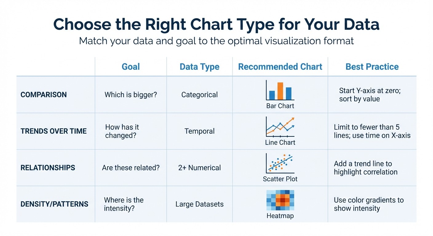
Data Visualization Chart Type Selection Guide
Once you’ve nailed down your audience and purpose, the next step is to pick the chart that best tells your data’s story.
Using the wrong chart is like trying to fix a screw with a hammer - it just doesn’t work. A good chart makes insights jump off the page, while a bad one leaves your audience squinting in confusion. Worse yet, a poorly chosen or misleading chart can damage trust in your data and your team [6].
The key? Match your chart to the question you’re answering. For example:
Want to know "Which is bigger?" Go with a bar chart.
Exploring "How has it changed?" A line chart is your friend.
Asking "Are these related?" Try a scatter plot.
Curious about "Where is the intensity?" Heatmaps are the way to go.
Before you dive into chart selection, classify your data. Is it quantitative (numbers like revenue), categorical (labels like product names), temporal (time-based), or spatial (location-based)? Pair this with your communication goal, and you’ll land on the chart that delivers your message most effectively.
Here’s a quick guide to some common chart types and when to use them:
Goal | Data Type | Recommended Chart | Best Practice |
|---|---|---|---|
Comparison | Categorical | Bar Chart | Start Y-axis at zero; sort by value. |
Trends Over Time | Temporal | Line Chart | Limit to fewer than 5 lines; use time on X-axis. |
Relationships | 2+ Numerical | Scatter Plot | Add a trend line to highlight correlation. |
Density/Patterns | Large Datasets | Heatmap | Use color gradients to show intensity. |
Bar Charts for Comparisons
Bar charts are the MVP for answering "Which is bigger?" They’re perfect for comparing categories like sales by product or revenue by region. Their simplicity makes them one of the easiest chart types to interpret.
For accurate comparisons, always start the Y-axis at zero. For instance, if you’re comparing quarterly sales of $98,000 and $102,000, starting the axis at $95,000 can exaggerate the difference and mislead your audience.
Organize your bars logically - either by value (highest to lowest) or in a meaningful sequence like alphabetical order. If your category names are long, consider horizontal bars for better readability. And skip the 3D effects; they can distort perception and make comparisons harder.
Line Charts for Trends Over Time
When it comes to showing trends, line charts are hard to beat. They’re ideal for illustrating patterns, spikes, or gradual changes over time - think monthly website traffic, daily stock prices, or annual revenue growth.
For clarity, limit your chart to five lines. If you have more data series, consider breaking them into separate charts or using small multiples.
Scatter Plots for Relationships
Scatter plots are your go-to for showing relationships between two numerical variables. They’re great for questions like "Does ad spend drive revenue?" or "Is there a link between customer age and purchase frequency?" Each point represents one observation, making trends, clusters, and outliers easy to spot.
Adding a trend line helps your audience quickly see whether the relationship is positive, negative, or nonexistent. For example, a scatter plot might show that customers engaging more with email campaigns tend to have higher lifetime values.
Heatmaps for Density and Patterns
Heatmaps use color to represent data intensity, making them perfect for spotting patterns or anomalies in large datasets. They’re great for visualizing things like customer activity by hour and day, website click behavior, or sales distribution across regions.
Design Clear and Clutter-Free Visualizations
Once you've chosen the right chart, the next step is to simplify your visualization. Overloaded visuals make it harder for your audience to understand the key insights, slowing down decision-making and increasing the chances of confusion.
The goal? Maximize clarity, minimize distractions.
A well-designed chart keeps the focus on the data, not the noise.
"Data graphics should draw the viewer's attention to the sense and substance of the data, not to something else." - Edward Tufte [7]
Edward Tufte’s advice highlights the importance of avoiding "chartjunk" - unnecessary elements like excessive gridlines, shadows, textures, or 3D effects that add no real value. These distractions dilute the message your data is trying to convey.
How to Declutter Your Charts
A simple technique to streamline your visuals is the "Remove One Element" Test. Look at every component of your chart and ask: Does this contribute to the message? If the answer is no, take it out. For example:
Label bars or data points directly with exact values (e.g., $45,000 or $62,000) instead of relying on gridlines.
Replace legends with direct labels placed near the data series to eliminate unnecessary back-and-forth eye movement.
Use thin, light gray gridlines sparingly for precision, but avoid making them dominate the design.
Stick to a flat design style and avoid 3D effects, which can distort perceptions of value. A muted color palette with 5–7 shades works well, with one vibrant accent color to draw attention to the most important data point.
Use Color, Labels, and Accessibility Principles
To make your data visualizations clear and effective, incorporate color, labels, and accessibility principles. These elements help ensure your audience can quickly grasp the insights without unnecessary effort, which is essential for driving actionable decisions.
Use Color Strategically
Color is a powerful tool to guide attention, but it needs to be used thoughtfully. Stick to a palette of 5–7 distinct colors, using one bold hue for emphasis while keeping secondary elements neutral [9][11]. This approach prevents distractions and keeps the focus on the key data points.
Consistency is key. Assign the same color to categories across all visuals. For example, if blue represents "Q1 sales" in one chart, it should not represent "customer churn" in another. When colors are inconsistent, viewers have to relearn the visual language, which increases confusion and cognitive load [8].
"Color is a cornerstone of nearly every data visualization dashboard. A well-designed data visualization color palette enhances readability, ensures accessibility, and reinforces brand identity."
– Jeff Pettiross, Principal Designer, Observable [8]
Start with blue and orange for categorical colors, as their contrast works well even for those with color vision deficiencies [8]. For heatmaps or similar visuals, normalize the data (e.g., activity per capita) to prevent misleading interpretations. Studies show that 55% of analysts misread heatmaps when this step is skipped [10].
Once your colors capture attention, clear labeling ensures the message is understood.
Label Clearly and Concisely
Labels should provide answers before viewers even think to ask. For example, instead of a generic title like "Monthly Revenue", use something more direct like "Revenue Increased 15% in Q4 2025." This declarative style ensures your chart communicates the main takeaway at a glance [11].
Axis labels should clearly define the scale and units, such as "Height of Central Stem (in)." Always write these horizontally for better readability [12]. To reduce effort, place labels directly on chart elements whenever possible [9][11].
Don’t forget context. Include details like data sources and date ranges so that your visualizations can stand alone [9][13][14]. If acronyms are used, redefine them within the chart area since viewers might not have access to the original context.
Clear labels are just the beginning - accessibility ensures your visualizations are effective for all users.
Design for Accessibility
Color alone should never carry the full weight of your message, especially since red-green color blindness is common. Add secondary cues like patterns, textures, line styles (e.g., solid, dashed, dotted), or marker shapes (e.g., circles, squares, triangles) to differentiate data points [15][16][17].
Maintain proper contrast ratios to ensure visibility. Chart elements should have a minimum contrast ratio of 3:1, while text requires at least 4.5:1 [16][17][18]. Use tested palettes, such as the IBM Color Blind Safe palette or Paul Tol's Vibrant palette, to maximize color distinction [19].
For users relying on screen readers, provide a clear text summary of trends first, followed by an accessible data table, and then the chart itself [15][17]. Use attributes like aria-label or aria-describedby for charts, and make interactive elements - like tooltips, filters, and zoom - navigable via the Tab key and usable with Enter or Space [15][17][18].
In September 2022, Fitbit revamped its heart rate zone chart by using dotted lines spaced according to the Fibonacci Sequence. This created distinct visual rhythms for each threshold, which tested well with colorblind users [16].
Element Type | Minimum Contrast Ratio | WCAG Requirement |
|---|---|---|
Standard Text | 4.5:1 | 1.4.3 (Level AA) |
Large Text (>18pt) | 3:1 | 1.4.3 (Level AA) |
UI Components / Graphics | 3:1 | 1.4.11 (Level AA) |
Focus Indicators | 3:1 (Highly Visible) | 2.4.7 (Level AA) |
Accessible design doesn’t just meet guidelines - it improves everyone’s experience. One team reduced chart interpretation time by 36% by simplifying visuals to three key series, adding marker shapes, and including a text summary above each chart [15].
Make Visualizations Interactive and Actionable
Clear, accessible visuals are just the beginning - interactivity takes them to the next level, turning static charts into tools for exploration and decision-making. While static charts can tell a story, interactive visualizations invite users to dive deeper, shifting them from passive observers to active participants in analyzing data.
Features like drill-down capabilities and cross-filtering make it easy to move from broad overviews to detailed insights. For instance, a regional sales chart could allow users to click on the "Northeast" region to see state-by-state performance and then drill down further to individual store data. This kind of interaction bridges the gap between high-level summaries and granular details.
Hover-over details are another way to enhance understanding without overloading the visual. Tooltips can clarify complex metrics, such as displaying "ARR = monthly recurring revenue × 12" when users hover over a data point. For multi-series line charts, grouped tooltips that display all values for a specific date simultaneously simplify comparisons. However, critical information should never be hidden exclusively in tooltips - some users may miss it if they don’t interact with the chart.
Time-series analysis becomes much more intuitive with tools like date range selectors and sliders. These features allow users to zoom into specific time periods, such as a particular quarter, or compare year-over-year trends with just a quick adjustment. Clickable anomalies, like sudden spikes or drops in data, can lead users directly to the underlying records or segments that explain the change. And don’t forget a "Reset to Default" button - it gives users the freedom to experiment with filters while knowing they can always return to the original view.
Interactive dashboards are game-changers for real-time KPI analysis, helping teams respond faster to market changes. With visual data being processed by the brain up to 60,000 times faster than text, it’s no surprise that 67% of data analysts in the U.S. rely on visualization platforms daily [20][22]. Combining speed with interactivity turns data into a powerful tool for immediate insights and confident decision-making.
Apply Best Practices in Querio Dashboards
Querio makes it easier for your team to create clear, precise, and interactive dashboards by combining AI-driven queries, a reactive notebook, and a governed semantic layer. This combination ensures your visualizations are accurate and consistent while keeping the process fast and adaptable.
Use Querio's Notebook Environment
Querio's notebook environment is designed to keep your workflow smooth and efficient. It automatically updates cells when dependencies change, so you can see real-time changes as you refine your visualizations [23]. Plus, notebooks are stored as plain text .py files, making them simple to version control with Git and more reliable for AI-assisted edits [23][24].
The platform supports both SQL and Python, giving you the flexibility to choose the best language for your analysis [23]. Visualizations use the Altair library, which employs a declarative grammar of graphics. This means you focus on describing what to display - like marks, encodings, and transformations - instead of coding every detail [21]. Built-in interactive features, such as tooltips, pan/zoom, and legend filtering, come ready to use without requiring additional coding [21]. To get the most out of the AI agent for chart creation, be specific in your prompts. For instance, mention the chart type (e.g., "stacked area chart"), axes, colors, and sorting preferences to ensure the output aligns with your needs [21].
This notebook environment simplifies real-time data exploration, making it easier to iterate and refine your insights.
Build Consistent Dashboards with Governed Metrics
Consistency is key when it comes to dashboards, and Querio’s semantic layer ensures metrics and business definitions stay uniform across all visualizations. Whether you're working on ad-hoc queries, notebooks, or dashboards, defining joins, calculations, and terms just once ensures the same definitions are applied everywhere. This eliminates the confusion caused by having multiple versions of the same metric floating around.
For added transparency, document your calculations with embedded annotations, so users can see exactly how numbers are derived [1][4]. When placing charts side-by-side for comparison, standardizing the y-axis scale ensures viewers get an accurate, at-a-glance understanding of performance [4]. Querio also simplifies design with default color-blind-safe palettes and minimalist themes, so your dashboards look clean and professional without extra effort [1].
Embed Visualizations for Broader Reach
Querio’s SDK makes embedding visualizations effortless, automatically scaling and adjusting for both desktop and mobile users [1]. You can choose from public embedding to share data openly, private embedding for internal use, or signed embedding for secure, SSO-enabled customer applications. For mobile users, ensure interactive elements include touch-friendly targets of at least 44x44 pixels [1]. This flexibility allows you to extend governed analytics beyond internal teams by building self-serve analytics for customers that are accurate and accessible for both internal and external audiences.
Key Takeaways
To create visualizations that truly drive action, it all starts with knowing your audience. Executives often need high-level summaries, like a bar chart showing quarterly revenue growth from $1.2M to $1.5M. Analysts, on the other hand, benefit from more detailed views, such as scatter plots for correlation analysis. By tailoring your visuals to the right audience, you ensure they inspire the intended actions.
Simplicity always wins. Strip away unnecessary elements like excessive gridlines, keep your color palette to 5–7 shades, and make good use of white space. For instance, simplifying a line chart from 10 trend lines to just 3 key ones can enhance readability by 40% [26].
"Perfection is achieved, not when there is nothing more to add, but when there is nothing left to take away" [25].
Match your chart type to your story. Whether it's bar, line, scatter, or heatmap charts, choose the format that best conveys your data's narrative [27].
Make accessibility a priority. Use color-blind-friendly palettes, maintain a 4.5:1 contrast ratio, and design interactive elements with adequate hit areas. These changes can boost user engagement by 15%, especially across varied audiences [28].
To bring these ideas to life, start small: audit one chart, remove 20% of non-essential elements, gather feedback from three colleagues, learn how to create a scatter plot to practice these steps, and tweak the chart type or interactivity as needed. These adjustments can improve how well your audience understands the insights by up to 30% [29].
Finally, tools like Querio can help you take your visualizations to the next level. With features like governed metrics and interactive notebooks, you can create dashboards that are not just visually appealing but also accurate and ready to share across your organization. These strategies can transform your charts into dynamic tools for better decision-making.
FAQs
How do I pick the best chart for my data?
When deciding on a chart, match it to your data type and the message you want to convey:
For showing trends over time, go with a line chart or an area chart.
To compare categories, use a bar chart or column chart.
If you're exploring relationships between variables, scatter plots or bubble charts are ideal.
When illustrating proportions, stick to pie charts or stacked bar charts.
Always prioritize clarity and simplicity to make your data easy to grasp for your audience.
How can I simplify a chart without losing meaning?
To make a chart easier to understand without sacrificing its meaning, focus on reducing unnecessary elements and emphasizing the most important data. Start by identifying the main message you want the chart to convey, and only include data that supports that message. Simplify by removing extra gridlines, duplicate labels, or overly bright and distracting colors. Opt for a neutral background, use clear and concise axis labels, and highlight key points strategically. This way, the chart remains focused on its purpose while staying visually clean and effective.
How do I make dashboards accessible for everyone?
To create dashboards that everyone can use, focus on simplicity and clarity. Avoid overwhelming users with clutter, excessive colors, or too much text. Organize information with a clear hierarchy so users can easily find what they need.
For visuals, always provide text alternatives and make sure labels are easy to read and distinguish. Usability is key, so ensure your dashboard works seamlessly with keyboard navigation and assistive technologies. Features like screen reader support can go a long way in making dashboards inclusive and easier to understand for all users.
Related Blog Posts


