A Guide to Data Visualization Dashboards
Explore our guide to data visualization dashboards. Learn design principles, discover dashboard types, and turn your raw data into actionable business insights.
https://www.youtube.com/watch?v=romW5dsG2gQ
published
Outrank AI
data visualization dashboards, business intelligence, dashboard design, data analytics, embedded analytics
565960fa-cca4-4088-b265-dd2adaf1707e

A data visualization dashboard takes raw, complex data and translates it into an easy-to-understand visual summary. By pulling key metrics from different places into one screen, it uses charts, graphs, and maps to show you what’s happening in your business right now.
What Are Data Visualization Dashboards Anyway?
Imagine trying to fly a modern airplane with nothing but a giant spreadsheet. Thousands of rows of numbers for altitude, speed, and fuel. It’s impossible, right? Pilots have a cockpit—a dashboard that turns all that complex information into simple, visual gauges. They get instant clarity, allowing them to see what’s going on and make critical decisions in a split second.
A data visualization dashboard is your business's cockpit. Instead of digging through dense reports or trying to connect the dots between different data sources, you get one clear, interactive command center for your company's health.

From Raw Numbers to Actionable Stories
The real magic of a dashboard is its ability to turn abstract numbers into a story you can actually follow. A great dashboard doesn't just show you data; it gives you context and empowers you to ask better questions. You can see not just what happened, but start to figure out why.
Here’s where they really shine:
Instant Comprehension: Our brains are wired to process visuals way faster than text. Charts and graphs make complicated data digestible in seconds.
Trend Identification: It's much easier to spot a sales spike or a dip in customer engagement on a line chart than it is by comparing rows of numbers.
Improved Decision-Making: When your key performance indicators (KPIs) are updated in real time, your team can make smart, data-backed decisions with confidence.
Enhanced Collaboration: When everyone from the CEO to the marketing team is looking at the same trusted information, alignment happens naturally.
A well-crafted dashboard consists of several core elements working together to provide clarity. Each component plays a specific role in transforming raw data into meaningful insights.
Core Components of a Data Visualization Dashboard
Component | Purpose and Function |
|---|---|
Data Sources | The foundation of the dashboard. This is the raw information pulled from databases, APIs, spreadsheets, or other platforms that feeds all the visualizations. |
KPIs and Metrics | Key Performance Indicators (KPIs) are the specific, high-level metrics you're tracking (e.g., Monthly Recurring Revenue, Customer Churn Rate) to measure progress toward goals. |
Visualizations | The charts, graphs, maps, and tables that actually display the data. The goal is to choose the right visualization to tell the clearest story for each metric. |
Filters & Controls | Interactive elements like drop-down menus, sliders, or date pickers that allow users to drill down, segment data, and explore the information from different angles. |
Layout & Design | The overall structure and aesthetic. A good layout prioritizes the most important information and guides the user's eye logically through the dashboard. |
Refresh Rate | Determines how often the data is updated. This can range from real-time for operational dashboards to daily or weekly for strategic ones. |
These components come together to create a powerful tool that moves beyond simple data presentation and into the realm of true business intelligence.
The Growing Need for Visual Data
The move toward visual data tools isn't just a fleeting trend. It’s a necessary response to the absolute explosion of data we're all dealing with. For a deeper look at the core ideas, check out our complete guide on data visualization and dashboards.
A dashboard is a visual display of the most important information needed to achieve one or more objectives; consolidated and arranged on a single screen so the information can be monitored at a glance.
The market reflects this need. Valued at around USD 4.2 billion, the global data visualization market is expected to more than double to USD 8.2 billion by 2033. This surge is fueled by real-world results—organizations are reporting up to a 35% increase in employee productivity and 65% faster data analysis times. You can read more about the data visualization market's significant growth to see what's driving this expansion.
At the end of the day, data visualization dashboards close the gap between having data and actually understanding it. They make analytics accessible to everyone, helping even non-technical folks explore information, find insights, and build a smarter, more data-aware culture.
Choosing the Right Dashboard for Your Goals
Not all data visualization dashboards are created equal. Think of them like different kinds of maps for a journey. A simple road map is perfect for a drive across the country, but if you're hiking a mountain, you'll want a detailed topographical map. In the same way, the right dashboard depends entirely on what you want to achieve and who needs to see the data.
Picking the wrong type is like handing a pilot a submarine's sonar display. The information might be technically correct, but it’s completely useless for their job. To avoid that mismatch, we need to break dashboards down into three main categories: strategic, analytical, and operational. Each one serves a different purpose and a different audience, making sure the right information gets to the right people when they need it most.
This distinction has never been more important, especially as the demand for these tools is exploding. The global market for data visualization tools was valued at around USD 7.87 billion and is expected to blow past USD 20.45 billion by 2032. That growth is being fueled by an ever-increasing hunger for real-time analytics, particularly in data-heavy fields like IT and telecom. You can find more details about the booming data visualization tools market and the trends behind its expansion.
Strategic Dashboards for the Big Picture
Strategic dashboards are the 30,000-foot view. They’re built for the C-suite and leadership teams who need a quick, at-a-glance summary of the company's health against its most important key performance indicators (KPIs). The goal here isn't to get lost in the weeds but to track progress toward long-term goals.
Because they focus on major, slow-moving metrics, these dashboards are typically updated less often—maybe daily, weekly, or even monthly.
Who uses them: C-suite executives, board members, and department heads.
What they track: Year-over-year revenue growth, market share, customer lifetime value, and overall profitability.
Example in action: A CEO pulls up a strategic dashboard every Monday morning. They review quarterly revenue targets and compare current performance to last year's numbers, all to confirm the company is on track to hit its annual goals.
Analytical Dashboards for Deep Dives
If a strategic dashboard shows you what is happening, an analytical dashboard helps you figure out why. These are the playgrounds for data analysts, marketers, and business intelligence pros who need to explore the data, spot trends, and dig for insights.
They are highly interactive by design, loaded with filters, drill-down options, and ways to segment the data. This flexibility lets users slice and dice information to answer complex questions that don't have an obvious answer. A structured approach is key to building one effectively, which is something our guide on creating a KPI dashboard planner covers in detail.
Analytical dashboards are the magnifying glass for your data. They empower teams to move past surface-level numbers and investigate the root causes behind trends, anomalies, and hidden opportunities.
Imagine a marketing team using an analytical dashboard to dissect a recent campaign's performance. They could filter results by demographics, location, and traffic source to see which audiences responded best, helping them get more bang for their buck on the next ad spend.
Operational Dashboards for Real-Time Action
Operational dashboards are all about the here and now. They monitor business processes as they happen, giving teams the information they need to take immediate action. Think of a factory floor manager keeping an eye on production line output or a customer support team tracking incoming ticket times.
Speed and clarity are everything for these dashboards. The data has to be live, and the charts must be simple enough to understand in a heartbeat.
Who uses them: Operations managers, support teams, logistics coordinators, and IT staff.
What they track: Website uptime, support tickets in the queue, inventory levels, or server response times.
Example in action: An e-commerce logistics manager watches an operational dashboard showing a world map with live shipment tracking. If a major shipping route suddenly shows a delay, they can instantly reroute packages to avoid the bottleneck and proactively notify customers.
Dashboard Design That Actually Works
A great data visualization dashboard does more than just throw numbers on a screen; it tells a story. It has to guide a user from a high-level "what's happening?" down to the specific "why is it happening?" without a single moment of confusion. The line between a dashboard that becomes a daily habit and one that collects digital dust is almost always drawn by design that puts the user first.
When a dashboard is designed well, you don't even notice the design. The colors, the layout, the chart choices—they all just fade into the background. All you see are the answers you need, and you get them fast. This all starts way before you pick your first bar chart. It begins with a simple, critical question: who is this for, and what do they need to know?
Start With Your Audience
You can't build a useful tool without knowing who's going to use it. A dashboard for a CEO tracking quarterly revenue goals has to look and feel completely different from one for an operations manager monitoring live inventory.
Before you design anything, get answers to these questions:
Who's the main user? Are they a data analyst who loves digging into the weeds, or an executive who needs the big picture in five seconds?
What are their top 3-5 questions? A dashboard isn't for everything. It's for answering the most important questions quickly.
What action will this data drive? The whole point is to help someone make a better decision. The design has to support that.
Nailing these down ensures you're building a functional tool that solves a real problem, not just a pretty-looking data art project.
Build a Logical Narrative
Once you know your audience, it's time to arrange the information in a way that makes sense. In the West, we read from top-left to bottom-right, and a good dashboard should follow that natural flow. Put the most critical, high-level number—your main KPI—right in that top-left corner. It’s where the eye goes first.
From there, the dashboard should feel like a guided tour. Start broad with the big summaries, then let the user drill down into more specific details as they move across or down the page. This creates a narrative that prevents people from feeling like they've been thrown into a sea of disconnected charts.
A well-designed dashboard is a storyteller. It introduces the main characters (your KPIs), sets the scene (the overall summary), and then unfolds the plot (the trends and details) in a logical order.
This structure is what turns a random collection of metrics into an experience that feels intuitive. A brand-new user should be able to grasp the main takeaways in seconds.
Choose the Right Visual for the Job
This is where so many dashboards go wrong. Picking the wrong chart for your data is like trying to hammer in a screw—it just doesn't work and creates a mess. For example, using a pie chart to show how something has changed over time is a classic mistake. A simple line chart tells that story a thousand times better.
If you want to go deeper on this, we've put together a full guide on data visualization best practices that covers this in detail.
But for a quick reference, here are a few go-tos:
Line Charts: The absolute best way to show trends over time. Think monthly website traffic or daily sales.
Bar Charts: Perfect for comparing different categories. How do sales stack up across your different products? Bar chart.
Heat Maps: Great for showing density or intensity. Think of visualizing where users are clicking most on a webpage.
Scatter Plots: Use these when you want to see if there's a relationship between two different things.
The golden rule is simple: let the story you're trying to tell with the data pick the chart type for you, not the other way around. And remember, a clean, simple bar chart almost always beats a fancy 3D explosion that just makes the data harder to read.
Dashboard Design Dos and Don'ts
Putting it all together can feel like a lot, but a few simple rules of thumb can keep you on the right track. Sticking to these guidelines will help you create dashboards that are not only nice to look at but are genuinely useful.
Do | Don't |
|---|---|
Prioritize Clarity and Simplicity Keep the layout clean and make sure every single element has a clear purpose. If it's not essential, cut it. | Overload the Dashboard with Too Much Information Don't cram dozens of charts onto one screen. It's a recipe for analysis paralysis. |
Use Color with Intention Use color to draw attention to what's important or to group related information. Stick to a limited, consistent color palette. | Use a "Rainbow" Palette Splashing bright, competing colors everywhere is distracting and makes the dashboard hard to read. |
Provide Context for Your Data Always include comparisons (like vs. last month) and clear labels. Users need to know what the numbers actually mean. | Assume the Numbers Speak for Themselves "1,500 new users" is meaningless on its own. Is that good? Bad? Compared to what? |
Ensure Mobile Responsiveness Design your dashboard so it works and looks great on any screen, from a big monitor to a phone. | Design Only for a Desktop View People need their data on the go. A dashboard that's a mess on a phone will get ignored. |
When you really focus on who the user is, build a logical flow, pick the right visuals, and stick to these core principles, you can turn your data visualization dashboards from static reports into tools that people genuinely rely on to make better decisions.
Bringing Your Dashboards to Life
https://www.youtube.com/embed/romW5dsG2gQ
Creating a stunning, insightful dashboard is a huge win. But the real magic happens when you bring it directly into your team's daily workflow. The best way to do that? Move beyond standalone platforms and embed your analytics right into the apps your teams or customers are already using. This isn't about adding another chore; it's about making data a seamless part of their world.
This approach is called embedded analytics, and it’s all about closing the gap between seeing an insight and taking action on it.
Think about a customer success manager seeing a client's health score pop up right inside their CRM, or a product manager tracking user engagement metrics from within their project management tool. By putting the data right at the point of decision, you remove all the friction and empower people to act on what they see, instantly.
Of course, none of this works without a solid foundation. You have to start with clean, accurate, and up-to-date data. If the data isn't trustworthy, even the most beautiful dashboard is just a pretty picture.
Navigating the Challenges of Embedded Analytics
Embedding dashboards isn't as simple as just dropping a chart into an app. It introduces a whole new set of technical hurdles that go way beyond design. You're not just showing data; you're delivering a secure, high-performance data product, and your users have to trust it completely.
Three major challenges tend to trip people up: security, performance, and multi-tenancy.
Robust Security: When you embed data, you have to be absolutely certain that users only see the information they're authorized to see. This means having granular control over data access, often right down to the row level.
Fast Performance: Nobody has patience for a slow dashboard. If a chart takes too long to load or refresh, users will get frustrated and just stop using it. Performance can't be an afterthought.
Multi-Tenant Needs: This is a big one for SaaS companies. If you're embedding analytics for your customers, you must keep each client's data completely separate and secure. Your system has to be built from the ground up to handle permissions and data segregation across all your tenants without a single slip-up.
These challenges are exactly why building an embedded analytics solution from scratch can quickly become a massive engineering project—one that's often far more complex than it first seems.
The whole point of embedding analytics is to make data feel like a native feature of your application. The user shouldn't have to think about where the insights are coming from; they should just be there when needed.
This infographic breaks down the core elements of designing an effective data visualization dashboard.
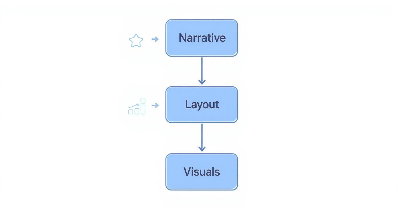
It’s a great reminder that a strong narrative should always guide your layout, which in turn helps you choose the most powerful visuals.
Accelerating Implementation with Purpose-Built Solutions
Given how tricky this can get, many companies choose to work with solutions built specifically for embedded analytics. Platforms like Querio are engineered to handle all the heavy lifting—the security, performance, and multi-tenancy—so your product teams can stay focused on your core application instead of reinventing the analytics wheel. This approach can slash development time and delivers a much more reliable and scalable result.
The market is clearly moving in this direction. Recent data shows that 83% of organizations rely on dashboards for decision-making, and cloud deployments make up 68% of new projects. On top of that, AI-driven features are now found in roughly 76% of advanced visualization dashboards, pointing to a future of smarter, more automated analytics. You can dig deeper into the trends shaping data visualization tool adoption to see where things are headed.
In the end, choosing to embed analytics with a specialized platform is about getting powerful data capabilities to your users faster and more securely. It's the most direct path to bringing your dashboards to life right where they'll make the biggest difference.
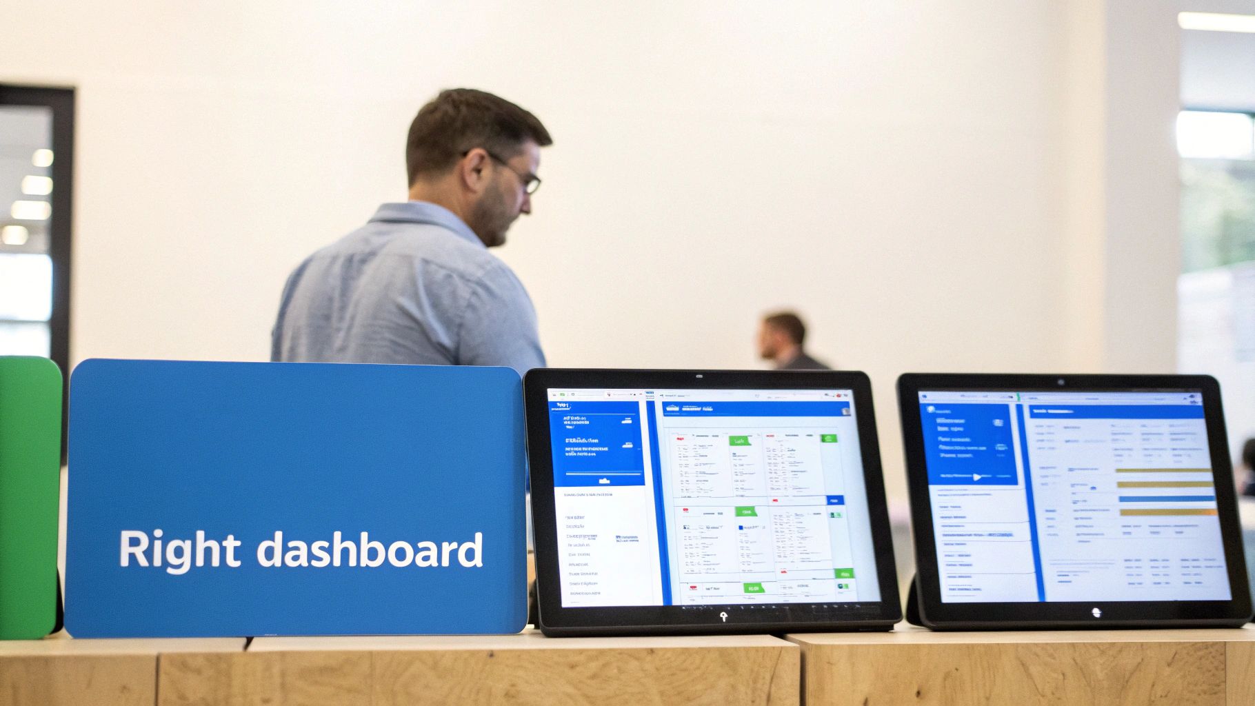
Inspiring Dashboard Examples in Action
It’s one thing to talk about theory and best practices, but it’s seeing a well-built data visualization dashboard in the wild that really makes its value click. The best dashboards don't just throw numbers on a screen; they tell a compelling story and guide you toward a specific action.
Let's look at a few powerful examples from different industries to see how they turn mountains of complex data into a real competitive edge.
Notice how each one is built for a specific audience with a clear mission. They’re all about solving unique business problems, not just looking pretty.
The Marketing Analytics Dashboard
Today's marketing teams are constantly juggling campaigns across a dozen channels—SEO, social media, email, you name it. A marketing analytics dashboard is the only sane way to pull all that fragmented data into one place and focus on what actually matters: return on investment (ROI).
This dashboard gives the team an immediate, high-level read on how all their efforts are paying off.
Its Mission: To unify all marketing performance data and draw a straight line from campaign spending to real business results like new leads and closed deals.
Key Metrics to Watch: It highlights metrics like Cost Per Acquisition (CPA), Customer Lifetime Value (CLV), and Channel-Specific ROI. You can see in seconds which campaigns are winners and which ones are just burning cash.
Smart Design: A great marketing dashboard puts the most important KPIs, like overall marketing ROI, right at the top. It also includes interactive filters, so a manager can drill down by a specific campaign, time frame, or channel. This turns a simple summary into a sharp tool for optimizing every dollar of ad spend.
The Financial Performance Dashboard
For a Chief Financial Officer (CFO), a financial dashboard is their mission control. It pulls critical numbers from accounting software, ERPs, and payroll systems to give a live pulse on the company's fiscal health. This is a huge leap from waiting around for static, month-end reports.
A financial dashboard is all about strategic oversight. It translates dense spreadsheets into simple visuals that flag profitability, cash flow, and operational efficiency at a glance.
This centralized view empowers leadership to make smarter, faster decisions about where to put their capital. It’s about spotting financial trends as they happen, not weeks after the fact.
Its Mission: To keep a close watch on key financial indicators, check performance against forecasts, and spot potential risks or opportunities before anyone else.
Key Metrics to Watch: The dashboard is laser-focused on numbers like Gross Profit Margin, Operating Cash Flow, Accounts Receivable/Payable turnover, and EBITDA.
Smart Design: Clarity is king here. Simple bar charts and line graphs are used to show trends, with big, bold numbers calling out the current performance. Some advanced versions even include "what-if" sliders, allowing the CFO to model how different business decisions might impact the bottom line.
The Real-Time Logistics Dashboard
In the world of logistics and supply chain management, every second counts. A logistics dashboard offers a live, operational view of the entire chain—from inventory sitting in a warehouse to the delivery trucks currently on the road. It brings a chaotic network of moving parts under control.
This kind of dashboard is essential for getting ahead of problems. Think of it like the AI Observability Monitoring dashboards that track the health of machine learning models in real-time; a logistics dashboard does the same for physical operations.
It visualizes the complete flow of goods, pinpointing bottlenecks before they cause a massive delay. By tracking shipments, warehouse capacity, and carrier performance all in one place, managers can optimize routes on the fly and ensure deliveries arrive on time. That has a direct impact on both customer happiness and the company's bottom line.
How to Choose the Right Dashboard Solution
Picking the right platform for your data visualization dashboards is a massive decision. It sets the foundation for your entire analytics strategy. Think of it less like choosing software and more like hiring a key team member; the right fit empowers everyone, while the wrong one creates bottlenecks and frustration. This isn't just about a flashy feature list—it's about finding a tool that genuinely clicks with your team's skills, your business goals, and your existing tech stack.
A great tool should feel natural, making data exploration easy and intuitive. A bad one? It just adds friction, slows down critical decisions, and often ends up as expensive, abandoned "shelfware." You need a clear-headed way to evaluate your options.
Key Criteria for Evaluating Dashboard Tools
When you're sitting through demos, try to look past the slick presentations and focus on the practical, day-to-day realities of using the tool. These are the things that will make or break your data initiatives down the road.
Ease of Use: How steep is the learning curve for the people who will actually use it? If your non-technical teams need weeks of training just to build a basic report, user adoption will stall. Look for intuitive drag-and-drop builders and maybe even natural language querying.
Data Source Connectivity: Can this tool actually talk to all your data? A beautiful dashboard is completely useless if it can't pull information from your databases, marketing platforms, and other critical systems. Check for native connectors to everything you use.
Customization and Flexibility: Your business isn't a generic template, and your dashboards shouldn't be either. The right tool gives you the freedom to customize everything—from the chart types to the branding—so you can tell your data story, your way.
Scalability and Performance: Will this thing keep up as you grow? As you pump more data and add more users, the platform has to stay snappy and reliable. Nothing kills a dashboard's credibility faster than a perpetually spinning loading wheel.
Security Protocols: Your data is a core business asset. The solution you choose must have iron-clad security, including role-based access controls, data encryption, and compliance certifications like SOC 2.
The Build Versus Buy Dilemma
Sooner or later, every company faces this classic fork in the road, especially when it comes to embedding analytics into a product. Do you build it yourself from the ground up, or do you buy a specialized platform?
Building it in-house gives you total control, which is tempting. But that control comes with a hefty, often hidden, price tag. You're not just paying for the initial development; you're on the hook for constant maintenance, bug fixes, and the salaries of the specialized engineers needed to keep it running.
Deciding to "buy" a dashboard solution isn't about cutting corners; it's a strategic move to accelerate your time-to-market. It frees your engineering team to focus on your core product while leveraging a battle-tested, secure, and scalable analytics engine.
For most companies, buying is simply the more pragmatic choice. This is especially true if you're planning to offer embedded analytics to your own customers. A solution like Querio is specifically designed to handle the messy complexities of multi-tenancy, security, and performance right out of the box. What would be a massive internal engineering headache becomes a much more straightforward integration.
For a deeper dive into the options out there, our breakdown of the best dashboard software can help you compare the top players.
At the end of the day, the goal is to find a tool that empowers your team without burying them in complexity. Whether you're a startup needing to embed dashboards fast or a finance team looking into enhancing Excel with Power BI, weighing these factors carefully will help you pick a platform that doesn't just show you data—it helps you drive the business forward.
Common Dashboard Questions Answered
Even the most thoughtfully designed dashboard will spark questions. That's a good thing—it means people are using it. But if you don't have good answers, that engagement can quickly turn into frustration. Let's walk through some of the most common questions that pop up once a dashboard goes live.
How Do You Ensure Data Accuracy?
Nothing will kill a dashboard faster than bad data. The moment a user spots a number that feels wrong, they’ll lose trust in the entire thing. That trust, once lost, is incredibly hard to win back. Keeping the data accurate isn't a one-time task; it's an ongoing commitment.
Here’s how you build that foundation of trust:
Set up automated guardrails: Implement validation rules that automatically flag data that just doesn’t make sense—like a sudden 1,000% jump in daily sign-ups or a negative number for inventory.
Create a clear data trail: You need to be able to trace every number back to its source. This "data lineage" should show where the data originated, what transformations were applied, and the last time it was refreshed. This transparency is your best friend when you’re hunting down a discrepancy.
Conduct regular spot-checks: Every so often, manually compare a few key dashboard metrics against their original source systems. This simple audit is a great way to catch issues before your users do.
When you treat data integrity as a core part of the process, you're not just building a dashboard; you're building a tool people can rely on.
What Are The Biggest Maintenance Challenges?
Getting a dashboard out the door is one challenge. Keeping it useful and running smoothly over the long term is a completely different ballgame. One of the biggest culprits is "scope creep." It always starts with a simple request for "just one more chart," but soon enough, the dashboard becomes a cluttered mess that’s lost its original focus.
Another headache is dealing with changes to the underlying data. An API gets updated, a database schema changes, and suddenly, your connections break and charts go blank.
The best dashboards are treated like living products, not static reports. They need regular check-ups to trim what's no longer needed and to make sure they still answer the right business questions.
The best defense is a good governance plan. Create a clear process for handling change requests, making sure every new addition aligns with the dashboard's core purpose. This stops it from becoming a disorganized free-for-all.
How Can You Measure Dashboard ROI?
So, how do you justify all this work? Proving the return on investment (ROI) for a dashboard isn't always about tying it to a specific dollar amount. It's often more about the impact it has on how the business operates.
Think about measuring its value in these terms:
Time Saved: How much time are you giving back to your team? Survey users to find out how long they used to spend pulling numbers manually. A 20% reduction in time spent wrangling data across a department is a massive productivity gain.
Faster, Smarter Decisions: Look for concrete examples. Was there a time when having instant access to data allowed someone to jump on an opportunity or fix a problem before it got worse? Those stories are powerful.
Improved Data Fluency: Are more people in the organization using data to back up their decisions? An increase in the number of team members actively engaging with the dashboard is a clear sign that you’re building a more data-driven culture.
By focusing on these tangible outcomes, you can paint a clear picture of how your data visualization dashboards are delivering real, measurable value.
Ready to deliver fast, reliable, and beautiful analytics to your users without the engineering headache? Querio makes it easy to embed stunning dashboards, charts, and AI-powered "Ask your data" features directly into your application. Learn more and get started with Querio.

