When to Use a Line Graph A Guide to Visualizing Trends
Discover when to use a line graph to track trends, compare changes over time, and forecast results. Learn how to create clear and effective line charts.
https://www.youtube.com/watch?v=WclentuXr_s
published
Outrank AI
when to use a line graph, line charts, data visualization, tracking trends, data analysis
9c7a802b-c190-4c4b-88c4-a12954ee1788

If you're wondering when to pull a line graph out of your data visualization toolbox, the answer is simple: use it to show continuous data over time. It's the go-to chart for visualizing trends, seeing how quickly things are speeding up or slowing down, and spotting patterns as they emerge.
The Best Way to Visualize Change Over Time
A line graph is the ultimate storyteller for data that unfolds over a continuous period. Think of it like tracking a plant's growth by measuring its height each day. When you plot those points and connect them, the resulting line tells the entire growth story at a glance—showing you periods of rapid growth, plateaus, or even decline.
That continuous line is the graph's superpower. It connects individual data points into a cohesive narrative, making it incredibly effective for spotting momentum and shifts. The whole point of a line graph is to reveal the relationship between two variables. The horizontal x-axis almost always represents time (days, months, quarters), while the vertical y-axis represents the quantity you're measuring (revenue, users, temperature).
Understanding The Core Use Case
Line graphs are perfectly built for a few key analytical jobs, helping teams turn raw numbers into real insights. Their primary responsibilities are:
Tracking Trends: Are sales climbing month-over-month? Is user engagement on the decline? A line graph makes the overall direction of your data immediately obvious.
Identifying Patterns: You can easily spot seasonality, like a spike in e-commerce sales every November, or cyclical business patterns that repeat over several years.
Visualizing Acceleration: The steepness of the line instantly communicates the rate of change. A sharp upward slope means rapid growth, while a flattening curve signals that momentum is slowing.
This decision tree nails the fundamental choice: if your data is measured over time, a line graph is almost always your best bet.
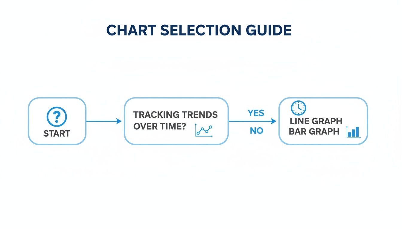
As the flowchart shows, the selection process often comes down to a simple question. A line graph is your champion for time-series data, while a bar graph is better for comparing distinct categories.
Line Graph vs Bar Graph: When to Use Each
Deciding between a line and a bar graph can be tricky, but it usually comes down to what you're trying to show. Here's a quick comparison to help you choose the right chart for your data.
Characteristic | Line Graph (Best For) | Bar Graph (Best For) |
|---|---|---|
Data Type | Continuous data that changes over time (e.g., stock prices). | Categorical data or discrete items (e.g., sales per country). |
Primary Goal | Showing trends, acceleration, and patterns over a period. | Comparing the magnitude of different groups or items. |
X-Axis | Represents a continuous scale, usually time. | Represents distinct, separate categories. |
Visual Story | Tells a story of progression or change. | Provides a snapshot comparison at a single point in time. |
Example Question | "How did our user base grow over the last year?" | "Which product category generated the most revenue last quarter?" |
Ultimately, a line graph connects the dots to show a journey, while a bar graph puts items side-by-side to declare a winner.
Line graphs truly shine when you're tracking metrics in a fast-moving business environment. For a startup founder using a tool like Querio, asking ‘Show me user engagement trends over the last 24 months’ is all it takes. The AI can instantly generate a line graph from CRM data, highlighting a 35% MoM growth in daily active users during Q3 after a feature launch, versus a 12% dip in Q2 from churn.
A classic real-world example is the S&P 500's performance chart from 1950-2020. That iconic line graph shows an average annual return of 10.2% while clearly visualizing every bull run and market crash along the way.
A line graph transforms individual data points into a compelling narrative about progress, decline, or stability. It connects the dots, allowing you to see not just what happened, but how it happened over a specific interval.
For a deeper dive, our guide on which type of chart is preferable when you are dealing with a timeframe explains this concept in more detail. In short, while other charts show snapshots, line graphs give you the full motion picture.
Comparing Multiple Trends in One View
A single line on a graph can tell a story, but the real magic happens when you bring several lines together. This is where you graduate from simply tracking a metric to performing a full-blown comparative analysis. Suddenly, you can spot hidden relationships, see competing trends play out in real-time, and identify performance gaps that were invisible before.
Imagine you're a product manager who just pushed three new features live. A multi-line graph gives you an instant, at-a-glance report card. You can see which feature is getting traction, which one is falling flat, and even whether one's growth is cannibalizing another's. Each feature gets its own line, but they all run along the same timeline, creating a shared stage to compare their individual journeys.
Telling a Comparative Story
With multiple lines, you're no longer just looking at isolated data points; you're watching a narrative unfold. Instead of just noting, "Feature A grew," you can now see the bigger picture: "Feature A grew faster than B and C," or "Feature B's growth took off right after we launched Feature C." This context is everything when it comes to making smart, strategic decisions.
Executives live and breathe this kind of comparative data. For Querio users, a product manager can simply ask, 'Compare retention across different user cohorts,' and instantly visualize how each group is performing over time. You might discover that your January 2025 cohort has a 65% retention rate after 90 days, while the February group is trailing at 58%. That's an immediate red flag, pointing to a potential issue in that month's onboarding flow. This kind of visualization makes it dead simple to spot problems and, just as importantly, measure the impact of your fixes, like seeing a 22% uplift from a successful A/B test.
The real power of a multi-line graph is its ability to reveal the interplay between different variables. It turns isolated metrics into a dynamic ecosystem where you can see how each part affects the whole.
This isn't just for product teams, either. Finance departments rely on this to break down revenue streams. A classic example is tracking Apple's financials. A line graph comparing iPhone versus Services revenue from 2018 to 2025 would tell a fascinating story. You’d see Services revenue exploding from $37B to $96B—a massive 160% jump—and becoming a stabilizing force for the company as the iPhone’s growth settled to a more modest 5% compound annual rate in a saturated market. For more on this, discover the insights available when you compare multiple time-series datasets with Tableau.
Keeping Your Comparisons Clean
The biggest pitfall with adding more lines is creating a "spaghetti chart"—a tangled, unreadable mess of overlapping colors. To make sure your chart actually communicates instead of confuses, stick to a few ground rules.
Limit Your Lines: Try to stick to 4-6 lines maximum. Any more than that, and you're asking your audience to do way too much work.
Use Distinct Colors: Give each line its own unique, high-contrast color. The goal is to make each trend instantly distinguishable.
Provide a Clear Legend: Don't make people guess. Always include a legend that clearly labels what each line represents.
Following these simple tips will help you create a chart that tells a clear and compelling story. If you want a deeper dive into the fundamentals, check out our complete data visualization guide on choosing the right charts.
How to Track Relationships Beyond Time
While time is the undisputed champion of the x-axis, a line graph’s power doesn’t stop at the calendar. You can use this versatile chart to visualize the relationship between any two continuous variables, which unlocks a powerful way to spot cause-and-effect patterns.
The reason this works is that the core principle remains the same: the x-axis must represent a logical, ordered sequence. Time is just the most common example of that. Think of it like a storybook—the pages have to be in order for the narrative to make sense, but the story isn't always about the passage of time.

Uncovering Hidden Connections
Moving beyond time lets you answer much more complex operational and strategic questions. You can start exploring how one metric directly influences another, giving you a clearer picture of your business's inner workings. This simple shift in thinking turns the line graph into a flexible tool for understanding all kinds of relationships in your data.
Here are a few practical examples to get you started:
Product Teams: How do website conversion rates change as page load speed increases? A line graph can reveal the exact tipping point where a slow site starts costing you customers.
Operations Teams: How does the number of manufacturing defects change as factory temperatures rise? Plotting this relationship helps you pinpoint the optimal operating conditions for quality control.
Finance Teams: What’s the relationship between marketing spend and new customer acquisition? This visualization can expose diminishing returns once your ad budget gets too high.
In each of these cases, the x-axis isn't time. It's another continuous variable—page speed, temperature, or marketing spend. But the connected line still tells a crucial story, highlighting trends and correlations that a simple table or bar chart would completely miss.
Using a line graph for non-time data is like switching your camera lens. Instead of capturing the evolution of a single metric over time, you’re capturing the reaction of one metric to changes in another.
This flexibility makes the line graph an essential skill for any data-driven professional. Once you master this concept, you'll start finding actionable insights that have nothing to do with a schedule.
Using Line Graphs to Forecast the Future
One of the most powerful reasons to use a line graph isn’t just about looking backward—it’s about making educated guesses about the future. When you spot a clear historical trend, you can extend that line forward to forecast critical business outcomes. It's the closest thing we have to a crystal ball in data visualization.
This shifts your team from a reactive mindset, where you’re just responding to what already happened, to a proactive one. You start planning for what’s likely coming next.
Imagine plotting your monthly user growth on a line graph. If you see a steady upward climb for the last twelve months, it's reasonable to extend that line to set realistic growth targets for the next quarter. This gives your strategic planning a solid, data-backed foundation, helping you decide where to put your resources.
From Historical Data to Strategic Foresight
Forecasting with a line graph all comes down to the trend line—a line that smooths out the day-to-day noise to show the general direction of your data. Once you have that trend, you can extend it past your current data points to estimate what might happen next. It's a surprisingly simple yet effective technique for all sorts of teams:
Finance Teams can forecast future revenue to get a better handle on cash flow and budgets.
Operations Teams can predict inventory needs to avoid running out of stock or tying up cash in oversupply.
Product Teams can estimate future user adoption to make sure server capacity can handle the load.
A line graph’s ability to forecast turns it from a simple reporting tool into a strategic asset. You’re no longer just looking at a picture of where you’ve been; you’re looking at a map of where you’re likely going.
This gets even more powerful in modern analytics tools. For example, a data leader using a platform like Querio can simply ask, "Forecast our MRR based on current trends." The tool can generate a line graph projecting Monthly Recurring Revenue to hit $5 million by year-end, up from its current $3.8 million, by automatically factoring in a 15% seasonal spike it identified in previous Q4 data.
This isn't just theory. A recent McKinsey report found that companies using trend visualizations saw a 23% improvement in their forecast accuracy. That, in turn, helped them cut inventory mistakes by 15%. For product teams, this means embedding charts that show how a recent feature launch that drove 40% DAU growth is projected to get them to 2 million users by the end of the year. You can read more about how line graphs are used for predictions at clusterdesign.io.
By getting good at this, you're not just reporting on the story your data has told so far—you're helping to write the next chapter. If you want to dive deeper into the statistical methods behind all this, our guide on how to do time series analysis breaks down the mechanics of forecasting.
Best Practices for Clear and Honest Line Graphs
Putting together an effective line graph goes way beyond just plotting points correctly; it's about building trust with your audience. A clear, honest chart opens the door to productive conversations. On the other hand, a misleading one can quickly destroy confidence and steer your team toward bad decisions.
Following a few core design principles ensures your graph tells its story with integrity.
Start With an Honest Foundation: The Y-Axis
The single most important rule is to start your y-axis at zero. Seriously. When you chop off the bottom of the axis—a practice called truncation—you can make tiny, insignificant fluctuations look like dramatic swings. This one simple choice is the bedrock of an honest chart.
Design for Clarity, Not Confusion
Beyond the y-axis, a few other elements are crucial for making your graph easy to read. First up: clear labeling is absolutely non-negotiable. Make sure your axes have descriptive titles that include the units you're measuring, like "Monthly Recurring Revenue ($)" or "Daily Active Users."
The chart's title should act like a newspaper headline, giving a quick summary of the main insight. Think "Q3 User Growth Accelerates After Mobile App Launch" instead of just "User Growth."
Annotations are what separate a good graph from a great one. Use them to call out key events right on the timeline, adding that all-important context.
A major product feature release
The launch of a new marketing campaign
A big market event or a competitor's move
These markers help your audience connect the dots between your team's actions and the results they see in the data. For a deeper dive into making your charts and dashboards more effective, it's worth exploring broader dashboard design best practices.
Line Graph Design Do's and Don'ts
Seeing good and bad practices side-by-side really makes the concepts click. The goal is to make it as easy as possible for someone to understand the information without having to squint or guess.
An honest graph prioritizes clarity over drama. Its purpose is to inform, not to persuade with visual tricks. By adhering to best practices, you build credibility and ensure your data tells its true story.
Follow these best practices to create line graphs that are both clear and trustworthy.
Best Practice (Do) | Common Mistake (Don't) |
|---|---|
Start Y-Axis at Zero | Truncate the Y-axis, which exaggerates changes. |
Use Clear, Descriptive Labels | Use vague or missing labels, forcing guesswork. |
Limit to 4-6 Lines | Create a "spaghetti chart" with too many lines. |
Add Contextual Annotations | Leave important events unexplained. |
Choose High-Contrast Colors | Use similar colors that are hard to distinguish. |
By keeping these simple rules in mind, you can avoid common pitfalls and create visualizations that people trust. For an even more detailed guide, check out our complete AI chart building best practices checklist.
Common Mistakes and How to Avoid Them
A line graph is a powerful storytelling tool, but a poorly designed one can tell the wrong story entirely. It can create confusion, obscure the truth, and lead your team to make bad decisions based on flawed insights. Knowing when to use a line graph is just as important as knowing how not to use one.
Let's walk through a few common pitfalls. Steering clear of these will ensure your charts are always clear, accurate, and trustworthy.
Trying to Connect Unrelated Things
The most common mistake I see is using a line graph for categorical data. It's an easy trap to fall into. The line connecting the dots on a graph is powerful—it implies a continuous, flowing relationship between those points. That's perfect for time, but it's completely wrong for distinct categories.
Plotting something like "Sales by Country" or "Revenue by Product" with a line creates a false narrative. It suggests a progression from "Product A" to "Product B" that simply doesn't exist. For this kind of data, a bar chart is your best friend. It treats each category as its own separate entity, which is exactly what they are.
Creating a Tangled Mess
Another classic mistake is what's affectionately known as the "spaghetti chart." This happens when you get a little too ambitious and cram too many lines—usually anything more than six—onto a single graph. The result is a tangled, unreadable mess where individual trends get lost in the noise.
A cluttered graph isn't just ugly; it's useless. If your audience can't easily distinguish between the lines, your message is completely lost. Remember, the goal is always clarity, not complexity.
If you find yourself with a plate of spaghetti, try one of these fixes:
Split it up: Break the data into several smaller, more focused line graphs. Each one can tell a clearer, simpler story.
Highlight what matters: Don't be afraid to use color strategically. Mute all the secondary lines in a light gray and use a bold color for the single series you want to emphasize. This immediately draws the viewer's eye to the most important trend.
Manipulating the Y-Axis
This last one is perhaps the most deceptive mistake, whether it's done intentionally or not. Starting the vertical (y) axis at a value other than zero can dramatically exaggerate small changes, making tiny fluctuations look like massive swings. It's a classic trick for making a small dip look like a crisis or a minor uptick look like a breakthrough.
To maintain trust and analytical integrity, always start your y-axis at zero. It's the most honest way to represent the data. If you absolutely must zoom in on a dataset where all the values are clustered in a high range (like stock prices), you need to be transparent about it. Make it glaringly obvious to your audience that the axis has been truncated. Honesty in data visualization isn't just good practice; it builds credibility and leads to smarter, more productive conversations.
A Few Lingering Questions About Line Graphs
Even after you've got the basics down, a few common questions tend to pop up when you're in the thick of building a line graph. Let's clear up some of the most frequent ones so you can visualize your data with confidence.
How Many Lines is Too Many?
This is a classic question. While there isn't a single "correct" answer, a good rule of thumb is to stick to 4-6 lines maximum on a single graph. Any more than that, and you're heading into what's affectionately known as "spaghetti chart" territory. It becomes a tangled mess where it’s nearly impossible for anyone to follow a single trend.
Remember, the point of a chart is to bring clarity, not to dump all your data in one place. If you find yourself needing to compare more than a half-dozen series, you have better options:
Try Small Multiples: Instead of one cluttered chart, create a grid of smaller, individual line graphs. They all use the same axes, making it clean and easy to compare trends side-by-side.
Highlight What Matters: If one or two lines are the real story, make them pop. Use a bold, bright color for the key series and mute the rest in a light gray. This guides your audience's eye directly to what's important.
Should the Y-Axis Always Start at Zero?
For the most part, yes. Starting the y-axis at zero is your best bet for creating an honest chart. It gives your audience an accurate, proportional sense of the changes you're showing.
When you "truncate" the axis by starting it at a higher number, you risk blowing small fluctuations way out of proportion. A tiny dip can suddenly look like a catastrophic drop-off, which can be seriously misleading.
An honest graph prioritizes clarity over drama. The only time you might bend this rule is if all your data points are clustered in a very high range and the changes are subtle. Even then, you absolutely must call it out so your audience knows what they're looking at.
Can I Use a Line Graph for Data That Isn't Time-Based?
You bet. While we most often see time on the x-axis, a line graph is perfect for any data that has a continuous and ordered sequence. The key is that the progression along the bottom axis has to make logical sense.
For example, you could plot how revenue changes as marketing spend increases, helping you pinpoint the moment you start seeing diminishing returns. Or, you could track a machine's efficiency as its operating temperature rises. As long as there's a logical order to the x-axis, a line graph is a great tool for showing how two variables relate to each other.
Ready to turn your business questions into clear, actionable line graphs in seconds? With Querio, any team member can query data using natural language and get instant visualizations without writing a single line of code. Stop waiting for reports and start exploring your data. Get started with Querio today.

