How to Interpret Charts and Graphs A Guide for Business Leaders
Learn how to interpret charts and graphs to make data-driven decisions. This guide offers practical tips for business leaders to avoid common data pitfalls.
https://www.youtube.com/watch?v=Xj9CP63dd7M
published
Outrank AI
how to interpret charts and graphs, data visualization, business intelligence, chart interpretation, data analysis for leaders
d539e319-2e66-47a0-9c44-cc1346a11031

Look, we've all been there. You're staring at a dashboard full of charts, and your gut tells you something isn't quite right. Is that spike in sales a real trend or just a blip? Is marketing's "engagement" metric actually meaningful?
Making sense of charts isn't some dark art—it’s a skill. And like any skill, it improves with a reliable process. Before you dive into any analysis, I always recommend running through a quick mental checklist. It’s a simple habit that can save you from making some pretty costly mistakes.
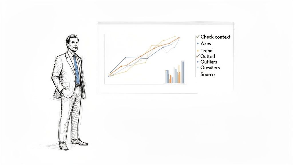
A 5-Point Framework for Chart Interpretation
Use this quick reference table as your first step when analyzing any chart or graph to avoid common errors.
Checklist Point | What to Look For | Why It Matters |
|---|---|---|
1. Check the Context | The chart's title, description, and the time period it covers. What question is it trying to answer? | Context is everything. A chart without it is just a picture; it tells you nothing about the business problem or the story behind the data. |
2. Scrutinize the Axes | The labels on the X and Y-axis, the scale (e.g., does it start at zero?), and the units of measurement (%, $, #). | Manipulated axes are the oldest trick in the book for making small changes look dramatic. This is where most misinterpretations begin. |
3. Identify the Main Trend | The overall direction of the data. Is it going up, down, or staying flat? Are there any recurring patterns or cycles? | This is the main story the chart is telling. Spotting the primary trend gives you the headline before you dig into the details. |
4. Investigate Outliers | Any data points that dramatically differ from the rest. Don't ignore them. | Outliers can be your biggest opportunity or your biggest problem. They could signal a data error, a one-time event, or a new customer behavior worth exploring. |
5. Verify the Source | Where did this data come from? Is it from a reliable system? How was it collected and was it filtered in any way? | Bad data in means bad conclusions out. Always question the source to ensure you're making decisions based on solid ground, not flawed information. |
This framework forces you to pause and think critically before jumping to a conclusion. It’s the foundation for moving from just seeing data to truly understanding it.
The High Cost of Misinterpretation
In business today, reading a chart correctly isn't just for data analysts anymore—it's a fundamental leadership skill. Getting it wrong can derail a strategy, waste an entire budget, and lead you to chase phantom opportunities. Every dashboard you look at is a field of potential insights, but it's also a minefield of potential errors.
Why a "Good" Chart Can Be Bad News
Imagine a product manager sees a line chart showing a sudden spike in "Daily Active Users." The immediate impulse? Celebrate the win and report the good news. But a sharp eye would question it. What if the Y-axis starts at a high number, making a tiny 1% bump look like a massive jump? Or what if an engineering change last week accidentally started counting bot traffic?
This is where a healthy dose of skepticism saves the day. Without it, you might build an entire product strategy on a data artifact.
The danger of poor chart comprehension is very real. While North America led the data visualization market back in 2019, research from around that time revealed that a staggering 74% of executives admitted to making the wrong call because they misunderstood a chart. It's a problem that hasn't gone away. It's projected that by 2026, 40% of data visualization tools will still fall short for users, often due to confusing design choices like unclear legends or deceptive 3D effects.
The goal is to cultivate a healthy skepticism. Every chart is a story someone is telling you—your job is to make sure it's the right story, backed by solid evidence.
This skill, often called data literacy, is what empowers you to use self-serve analytics tools with confidence. It allows you to challenge assumptions, ask smarter questions, and guide your team toward decisions that create real, measurable growth instead of just reacting to noise.
Decoding the Anatomy of Any Chart
Before you can pull any real insight from a chart, you have to learn to read its language. This isn't about a quick glance; it's about breaking down the chart into its core components. Think of it like reading a map—you wouldn't start a journey without first understanding the compass, scale, and legend.
The first place I always look is the axes. The vertical line (Y-axis) and the horizontal line (X-axis) are the foundation of the entire visual. What are they actually measuring? Is it revenue in dollars, user sign-ups in the thousands, or time in months? The units and scale tell the real story.
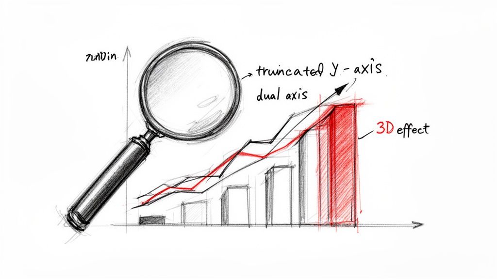
A classic trick here is the truncated Y-axis, where the scale doesn't start at zero. This is a common way to make small changes look massive. A tiny, insignificant bump in a metric can be visually exaggerated into what looks like a monumental spike, all because the designer chopped off the bottom of the axis.
Look Beyond the Obvious
Once you've got a handle on the axes, your next stop is the legend. This is your decoder ring for the colors, shapes, and patterns that distinguish different data series. If you're looking at a line chart comparing user engagement, the legend is what tells you the blue line is your "Pro" users and the green line is your "Free" users.
Color gradients, like those in a heatmap, can be especially misleading. A patch of bright red might scream "problem," but it’s meaningless without context from the scale. Is that red showing 100 daily clicks or 1,000,000? This is where normalization is so important. It ensures you're making a fair comparison.
For example, a heatmap showing raw user activity by country will almost always light up India and the United States. But if you normalize that data to show activity per capita or as a percentage of that country's user base, you might discover that a smaller country like Estonia is actually far more engaged.
The impulse to jump to a conclusion is strong, but bad analysis almost always starts with overlooked details. A five-second check of the axes and legend can save you from building an entire strategy on a visual illusion.
Getting this right is a bigger deal than you might think. The global market for data visualization is projected to hit USD 22.86 billion by 2033, yet basic mistakes are rampant. Studies have found that 55% of analysts misread heatmaps by ignoring normalization, and that almost 28% of charts are misleading because of uncalibrated scales. These aren't just academic slip-ups; they lead to bad business decisions.
I’ve seen this happen firsthand. A product manager once presented a chart showing a sharp, continuous rise in the adoption of a new feature. The problem? He didn't notice the Y-axis was on a logarithmic scale, where the visual distance between 10 and 100 is the same as between 100 and 1,000. It’s a great scale for showing percentage change, but it can completely hide a slowdown in absolute growth. What he celebrated as explosive, sustained growth was actually a sign that the adoption rate was starting to flatten out.
Consistently checking these fundamentals is your best defense against being fooled by a flawed data story. For more tips on building clear, honest visuals from the ground up, check out our guide on effective data visualization and dashboards. This simple, foundational check is the most critical step toward interpreting any chart accurately.
Matching the Chart Type to the Business Story
Every chart that lands on your desk is trying to tell you something. But is it telling the right story? As someone who has sifted through countless dashboards, I can tell you that one of the most critical skills is quickly identifying the type of story being told. Are we looking at change over time, a comparison, a breakdown of the whole, or a hidden relationship?
The type of chart used is the biggest clue. Think of a line chart as the natural choice for tracking a metric’s journey over time. A product manager, for instance, lives and dies by the Monthly Recurring Revenue (MRR) line chart. You can see in an instant whether growth is accelerating, hitting a plateau, or—worst of all—starting to dip. That simple upward or downward slope tells you everything about momentum.
Comparisons, Proportions, and Relationships
Now, when the story is about comparing separate, distinct groups, a bar chart is your best friend. Let's say you're looking at lead generation from three different marketing campaigns. A bar chart makes it immediately obvious which one was the winner, answering the simple question: "Which one is biggest?" It's a no-brainer for deciding where to double down on your budget.
Pie charts, on the other hand, are all about proportion—how a single total is sliced up. They’re a classic for showing the makeup of your customer base by subscription plan (e.g., 45% Basic, 35% Pro, 20% Enterprise). A word of caution, though: once you have more than a handful of slices, pie charts become a cluttered mess. In many cases, a simple bar chart does a much better job of comparing those same parts.
Then you have charts that tell more specific and nuanced stories.
Scatter Plots: I use these to hunt for potential relationships between two different numbers. A powerful example is plotting customer support tickets against customer churn. If you see a cluster of points showing that customers with more support interactions are leaving, you've just uncovered a massive, actionable problem.
Histograms: These are absolutely essential for understanding distribution. A histogram shows you the shape of your data—how often different values occur. You might use one to see that most of your users have a similar level of engagement, which can help you finally put a real number on what a "power user" actually is.
Before you even start digging into the story, though, you have to do a quick sanity check on the chart's construction. This decision tree is a great mental model for the first few seconds of looking at any visual.
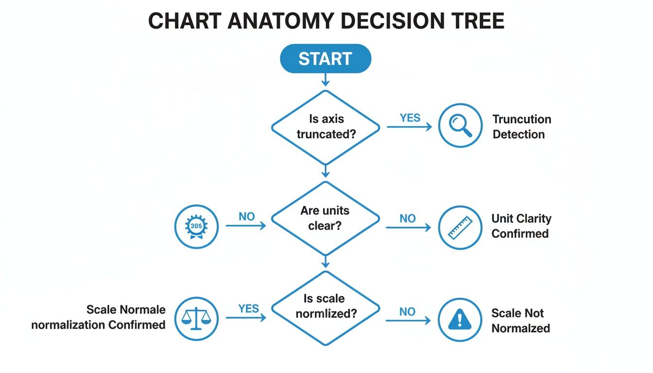
As the flowchart shows, getting the basics right is non-negotiable. A truncated axis or unclear units can completely mislead you, so always start there.
Choosing the Right Visual Narrative
Just as an economist needs to know how to graph supply and demand curves to tell a clear market story, you need to match your internal charts to the business question at hand. Precision is key.
When I look at any chart, the first question I ask myself is, "What decision is this visual pushing me toward?" If it's a pie chart showing market share, the decision is likely about competitive strategy. If it's a line chart tracking website traffic, the decision is about our growth engine.
Recognizing the built-in narrative of each chart type helps you cut through the noise and get straight to the point. It’s a foundational skill for anyone who works with data. To build on this, our guide on the different types of graphs and when to use them offers more examples to help you sharpen that analytical eye. The goal isn't just to see the data; it's to instantly understand the story it's telling.
How to Spot Deception in Data Visualization
Not every chart you see is telling the honest-to-goodness truth. It’s a hard lesson, but a crucial one. Whether it’s done on purpose to mislead or just by accident from a lack of experience, a bad chart can steer your business decisions straight off a cliff. Learning to spot the common tricks of the trade is a skill you have to build to read data correctly.
Let's start with a classic. One of the most common deceptions I see is the truncated Y-axis. This is where the vertical axis starts at a number other than zero, and it’s a sneaky way to make tiny changes look massive. A minor 2% bump in user retention can be blown up to look like a world-changing event. Before you even think about the trend, your first move should always be to check where that Y-axis begins.
Questioning the Narrative
Once you get in the habit of checking the axes, you'll start spotting other red flags. Be very careful with charts that use dual axes—plotting two different metrics with two different scales on one graph. It’s a tool that can be easily abused to imply a relationship that isn’t there.
For instance, by tweaking the scales, someone could make it look like website traffic and company stock price are moving in perfect harmony, suggesting one causes the other. They almost never do. It creates a false narrative that's tough to unsee.
You also have to watch out for purely cosmetic distortions. Things like flashy 3D effects on pie or bar charts might catch the eye, but they're terrible for accurately representing data. The perspective distorts the proportions, making the pieces or bars closest to the viewer seem much larger than they really are.
The Misleading Baseline Trap
Here's another one that can be especially dangerous: the misleading baseline. You might see a headline in a report boasting a 500% increase in new feature adoption. Sounds incredible, right? But what if that "increase" was from just one user to six? The percentage is technically accurate, but the actual business impact is practically zero.
Always ask: "A percentage of what?" A huge percentage of a tiny number is still a tiny number. Context is everything; don't let relative figures distract you from the absolute truth.
These deceptive practices are more common than you’d think. Some analytics audits even predict that misleading baselines could be a problem in as many as 65% of business charts by 2026. Skewed axes can exaggerate changes by 30-50%, and confusing dual axes are known to trip up about 52% of viewers.
Finally, always be skeptical of charts built on a tiny sample size. A survey showing 80% of users love a new feature sounds great, but it means very little if only ten people were asked. Statistically insignificant data can be dressed up to look compelling.
Always ask about the sample size before you buy into the conclusion. The more you train your eye to spot these issues, the better you'll get at demanding the clarity needed for good decisions. To sharpen your skills, it helps to review examples of bad data visualization and see these pitfalls in the wild.
Turning Your Chart Insights into Action
You’ve stared at the chart, you've spotted a trend, and you understand what the data is showing you. Great. Now what? The real work begins when you translate that observation into a decision that can actually move the needle for your business.
An insight is useless until it inspires a question you can test. You have to go from a passive statement like, "User engagement dipped last Tuesday," to an active investigation: "Did our new UI update, which we pushed Tuesday morning, cause that dip in engagement?" One is a fact; the other is a hypothesis you can prove or disprove.
From Observation to Hypothesis
Building a solid hypothesis is how you bridge the gap between seeing something in your data and actually using it. It’s about connecting an effect you spotted on a chart to a potential cause in the real world. This is where you stop being a data reader and start being a data detective.
Let's say your bar chart shows one marketing campaign blew the others out of the water by 30%.
Observation: Campaign C drove way more leads than Campaigns A and B.
Hypothesis: The ad creative in Campaign C resonated better with our audience, which is why the conversion rate was higher.
Now you have a clear next step. You can take the ad creative from Campaign C and A/B test it against the creative from the other campaigns. If you see the same lift, you've just found a repeatable formula for success. This is how data creates a cycle of constant improvement.
Digging Deeper to Find the Root Cause
With a hypothesis in hand, it’s time to start digging. Your goal is to validate what you think is happening by drilling down into the data to find the root cause. This is exactly what modern analytics notebooks are built for—letting you explore your data without limits.
Instead of just staring at that top-level "user engagement dip," you can start segmenting the data to get a clearer picture. You might ask:
Did the drop happen for all users, or was it concentrated in a specific group, like new sign-ups?
Was the dip consistent for people on mobile and desktop?
Which specific features saw the biggest drop-off in clicks or interactions?
By slicing the data this way, you might find that the engagement drop was almost entirely among your Android users. Suddenly, you have a much stronger signal. It’s likely a bug specific to the latest Android app update, not a problem with the new feature itself. This allows for a surgical fix instead of a panicked, full-scale rollback.
The most powerful insights are rarely on the surface. They are found by asking "why" multiple times and using segmentation to peel back the layers of your data until the answer becomes clear.
This investigative process is also your best defense against one of the most common data pitfalls: confusing correlation with causation. Just because two lines on a chart move in the same direction doesn’t mean one is causing the other. For instance, to keep up with the fast-paced market, many businesses are adopting advanced technologies; using dedicated AI tools for financial analysis can automate some of this deep-dive analysis, but the critical thinking still rests with you.
Your objective is always to find hard evidence that supports a causal link before you commit time and money to a solution. Following this disciplined loop—observe, hypothesize, segment, and test—is what turns chart reading from a passive exercise into a powerful engine for making smart, data-driven decisions.
Common Questions (and Straight Answers) About Reading Charts
Even with the best framework, you're going to run into charts that just make you pause. That moment of hesitation is totally normal. Here are some of the most common questions I hear from leaders trying to make sense of their data, along with some no-nonsense advice.
What’s the Biggest Mistake People Make When Reading a Chart?
By far, the most common trap is jumping straight to a conclusion without checking the basics first. We’re all wired to find stories in data, so we see a line going up and immediately think, "Success!" while completely glossing over the foundational details.
I’ve seen it a hundred times: a bar chart shows a massive spike in sales, and the room gets excited. But then you look closer and realize the Y-axis starts at $500,000 instead of zero, and that "massive" spike is actually a tiny, incremental gain. It's a classic visual trick. Before you let your brain write the story, always ground yourself in the fundamentals.
A quick sanity check can save you from a major misstep. Before you interpret anything, ask:
What am I actually looking at? Read the title, axis labels, and legend.
What's the timeframe? Check the X-axis for the date range.
What are the units? Are we talking about dollars, percentages, clicks, or something else?
Nail these three things first, and you’ll sidestep most of the common interpretation errors.
How Can I Tell if It's Correlation or Causation?
Ah, the classic. This one trips up even seasoned pros. The most important thing to remember is that a chart—whether it’s a scatter plot or a line graph with two different scales—can only show you correlation. It shows that two things appear to be moving together. It never, ever proves that one caused the other.
To get from correlation to a reasonable assumption of causation, you have to do some extra homework and apply some critical thinking.
Does a causal link even make sense? Is there a logical, real-world reason why higher marketing spend would lead to more sign-ups? Start there.
Could something else be driving both? Think about the famous example of ice cream sales and shark attacks. They both go up in the summer, but one doesn't cause the other. The hidden factor is the warm weather. Always ask what else might be happening.
Can we test it? The only way to truly get close to proving causation is with a controlled experiment. In business, this is usually an A/B test where you intentionally change one variable (like a button color) and measure the direct impact it has on another (like the click-through rate).
Without that extra investigation, you're just looking at a coincidence.
A Chart on My Dashboard Just Looks Wrong. What Should I Do?
Trust your gut. Seriously. If a number or a trend feels off, it’s a signal to dig deeper, not to second-guess yourself. Your intuition is a data tool that’s been trained on years of business context. When a chart contradicts it, that’s a valuable red flag.
First, go back to the 5-point framework we discussed. Check the axes, the scale, the labels, and especially the data source. Is the chart pulling from the right database? Is there a filter applied that you didn't notice? You'd be surprised how often a dashboard is accidentally filtered for "Last 7 Days" when you think you're looking at the whole quarter.
Next, if you have access to the underlying data, try to re-create a simplified version of the analysis. Modern tools like Tableau or Power BI often let you "view source" or "export data." This “trust but verify” mindset is what separates good leaders from great ones. If the numbers still seem wrong after a quick check, raise it with your data team. You may have just caught a critical data quality issue before it led to a bad decision.
Ready to stop being a bottleneck and empower your entire team with self-serve analytics? Querio deploys AI agents directly on your data warehouse, allowing anyone to build reports and explore data without waiting for an analyst. See how it works at querio.ai.

