How to Create a Scatter Plot to Visualize Data
Learn how to create a scatter plot to reveal hidden trends and relationships in your data. A practical guide with real-world examples and expert tips.
https://www.youtube.com/watch?v=PE_BpXTyKCE
published
Outrank AI
how to create a scatter plot, data visualization, scatter plot guide, data analysis, visualizing data
3949fe59-1250-4df0-9e8b-b4362fda2574

The basic idea behind a scatter plot is simple: you take two numerical variables, plot them on a horizontal and vertical axis, and see what the relationship looks like. You just need to figure out your independent (X) variable and your dependent (Y) variable, plot each pair as a point, and then look for a pattern. It’s one of the most fundamental charts in data analysis for a reason.
What Is a Scatter Plot and Why Use One

Before we jump into the "how," let's talk about the "why." A scatter plot is your go-to tool for visualizing the relationship between two sets of numbers. Each little dot on the graph isn't just a dot; it's a single data observation, a complete story in one point. This visual approach helps you spot patterns that would be completely lost in a wall of spreadsheet numbers.
Let's say you run an e-commerce store. You're probably wondering if your ad budget is actually doing anything. A scatter plot can help. You could map your daily advertising spend on the X-axis against the number of sales on the Y-axis. Each day gets its own dot. After a few weeks, you'll see a cloud of points, and a pattern might just pop out, showing you whether more ad spend actually translates to more sales.
Revealing Hidden Patterns in Data
This is where scatter plots really shine. They instantly bring a few key things into focus:
Correlation: Do your variables have a relationship? As one increases, does the other tend to increase as well (positive correlation)? Or does it decrease (negative correlation)? Or is there no real connection at all (no correlation)?
Outliers: You can immediately spot the oddballs—data points that are way off from the main group. These could be simple data entry errors, or they could be incredibly valuable anomalies worth digging into.
Clustering: Sometimes, the points naturally form distinct groups. This is often a huge clue that you have different segments in your data that behave in completely different ways.
A scatter plot transforms raw numbers into a clear visual story. It's the simplest way to answer the fundamental question: "How does this variable affect that one?"
This isn't some new-fangled technique. The scatter plot's roots are tied to the very beginnings of modern statistics. Back in 1886, Sir Francis Galton created diagrams mapping parents' heights to their children's heights. His work was a breakthrough, using these point plots to visually demonstrate the concepts of correlation and regression. This helped cement the scatter plot as a cornerstone of quantitative analysis, a role it still holds today. You can read more about the history and impact of scatter plots in statistical graphics.
Knowing when a scatter plot is the right choice is half the battle. For more on this, check out our guide on the different types of graphs and when to use them.
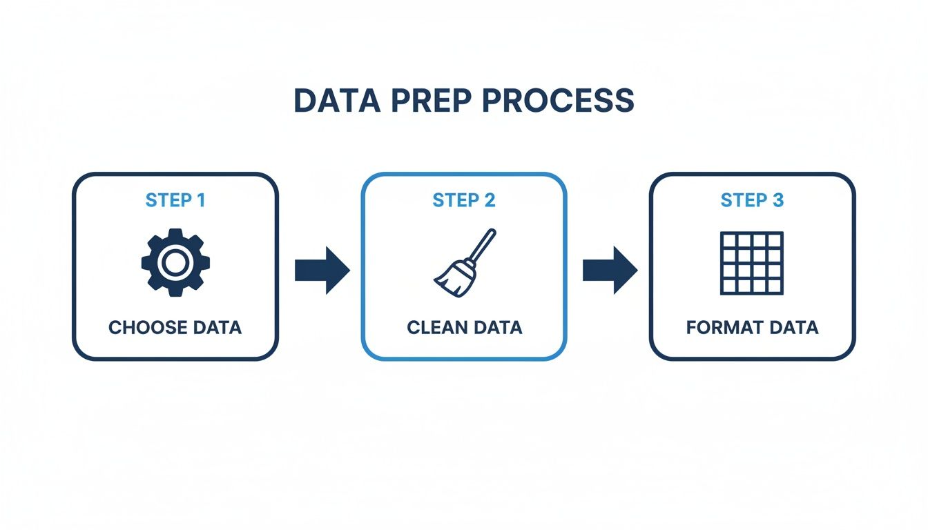
Preparing Your Data for a Powerful Scatter Plot
The insights you pull from a scatter plot are only as reliable as the data you put in. I always think of it like cooking—you can't make a great meal with bad ingredients. Getting your data ready is easily the most important step in building a scatter plot that shows clear, trustworthy patterns.
Doing this prep work upfront saves you from a world of frustration and ensures your chart actually reflects reality. It all starts with picking the right data to plot.
Choosing Your X and Y Variables
First things first, you need to decide which two numerical variables you want to explore. One will be your independent variable (the thing you think is causing a change), which goes on the X-axis. The other is your dependent variable (the outcome you're measuring), which goes on the Y-axis.
Let's say you're a marketing analyst trying to figure out, "Does the amount we spend on ads each month actually lead to more sales?"
X-axis (Independent): Monthly Ad Spend (a number)
Y-axis (Dependent): Monthly Sales Revenue (a number)
The critical thing here is that both variables must be quantitative—they have to be numbers you can measure. You can't plot a customer's name against their purchase amount on a scatter plot; that’s a job for a different kind of chart.
Cleaning and Formatting Your Dataset
With your variables chosen, it's time to get your hands dirty with the data itself. Raw data is almost never perfect. It’s usually riddled with little issues that can completely warp your scatter plot, which is why data cleaning is non-negotiable. For a deep dive, check out our guide on how to clean up data.
When I'm cleaning a dataset for a scatter plot, I focus on a few key tasks:
Handling Missing Values: What do you do when some rows are missing data for your X or Y variable? You have to decide whether to remove those rows completely or try to fill in the gaps with a reasonable estimate. Dropping them is usually the simplest path, but be careful not to shrink your dataset too much.
Addressing Outliers: Outliers are those points that sit way outside the main group of dots. They could be simple typos (like an extra zero on a sale amount) or they could be genuinely interesting, rare events. My advice? Never just delete them on sight. Always investigate first—that one odd point might be the most important story in your data.
Ensuring Correct Formatting: Make sure your spreadsheet or analytics tool sees your data as numbers. It's a classic rookie mistake—sometimes, numbers get imported as text, which will throw an error the second you try to plot them. A quick format check saves a lot of headaches down the line.
A clean, well-structured dataset is the foundation of any good visualization. Spending just 15-20 minutes on preparation can save you hours of confusion and lead to far more accurate insights. It’s the difference between a confusing mess of dots and a clear, actionable story.
Building Your First Scatter Plot
Alright, your data is clean and ready to go. Now for the fun part: actually creating the scatter plot and seeing what stories your data has to tell.
The good news is that the basic process is pretty much the same everywhere, whether you're working in a simple spreadsheet, a powerful BI tool, or even a coding environment. You’ll always follow the same core steps: get your data in, pick the right chart type, and then tell the tool which data goes where.
Let's use a common business scenario. Imagine we want to see if there's a relationship between how long a customer has been with us and how much they've spent over their lifetime. We'll put Tenure (in months) on the X-axis and Total Spend on the Y-axis.
The Universal Workflow Across Tools
No matter which software you open, the first moves are almost always identical. You start by importing or connecting to your prepared dataset. From there, you'll look for the charting menu and select the "Scatter" or "X-Y" chart.
This usually gives you a blank chart and a configuration panel. This is the crucial moment where you assign your variables. You’ll drag or select your independent variable (Tenure) for the horizontal X-axis and your dependent variable (Total Spend) for the vertical Y-axis. As soon as you make that assignment, the software crunches the numbers and your data points will appear on the screen.
It’s a simple process, but it’s entirely dependent on the prep work you did earlier.
This logical flow—choosing the right data, cleaning it up, and then formatting it—is what makes your final visualization trustworthy and insightful.
Choosing Your Platform
The tool you pick really comes down to what you're comfortable with and how deep you need to go with your analysis. Each has its place.
Deciding where to build your chart can feel overwhelming, but it's really about matching the tool to your specific task and skill level.
Choosing the Right Tool for Your Scatter Plot
Tool | Best For | Key Features | Learning Curve |
|---|---|---|---|
Excel & Google Sheets | Quick, simple plots and one-off analyses for smaller datasets. | Widely available, familiar interface, basic chart customization. | Low |
Python (Matplotlib/Seaborn) | Data scientists needing full programmatic control and advanced customization. | Limitless styling, statistical overlays, integration with analysis workflows. | High |
BI Tools (Tableau, Power BI) | Creating interactive dashboards and exploring data visually. | Drag-and-drop interface, filtering, drill-down capabilities. | Medium |
Querio | Business users who need fast answers from complex data without code. | Natural language queries, AI-powered chart creation, easy embedding. | Very Low |
Ultimately, there's no single "best" tool. Excel is fantastic for a quick look, while Python is the gold standard for reproducible, in-depth research. BI tools like Tableau or Power BI are built for creating dynamic, shareable dashboards.
The best tool is the one that gets you from question to insight the fastest. Don't stress about finding the "perfect" software. Start with what you know and build from there.
A couple of quick tips from experience: To get a statistically sound result, especially with bigger datasets, you generally want more than 30 data points. If you have thousands of points and they all blur into a single dense cloud (a classic problem called overplotting), try making the points semi-transparent or using a different plot type like a hexbin plot to see the density. As you can see in this overview of scatter plot principles, these little considerations are what separate a pretty picture from a truly analytical tool.
Customizing Your Scatter Plot for Maximum Clarity
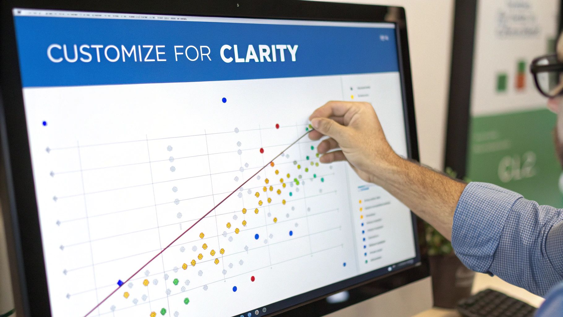
Getting your data onto a chart is the first step, but the real magic happens in the details. A raw, unedited scatter plot just gives you a cloud of dots. A thoughtfully customized one tells a compelling story. It's the small tweaks you make next that turn a simple graphic into a powerful piece of evidence.
The quickest way to lose your audience is with vague or missing labels. So, before anything else, we need to orient them. That means starting with clear, descriptive titles that explain exactly what they’re looking at.
Start With the Fundamentals
Before you get fancy with colors and trendlines, you have to nail the basics. These are the non-negotiable elements that give your audience the context they need to make sense of the plot instantly.
Descriptive Chart Title: Your title should be a headline that summarizes the main takeaway. Instead of a lazy "Sales vs. Ad Spend," try something more insightful like, "Monthly Sales Revenue Increases with Higher Ad Spend."
Clear Axis Titles: Always label your X and Y axes with both the variable's name and its unit of measurement. For instance, "Monthly Advertising Spend (USD)" and "Total Sales Revenue (USD)" leave absolutely no room for misinterpretation.
Getting these fundamentals right provides a solid foundation. If you want your charts to be both informative and well-designed, it helps to keep some basic graphical interface design principles in mind.
Adding Layers of Insight
Once the basics are locked in, you can start adding elements that reveal deeper patterns. Probably the most common and useful addition is a trendline, which you might also hear called a "line of best fit." This single line cuts through the noise to show the general direction of the data, making it immediately obvious whether the relationship is positive, negative, or just not there.
Another powerful move is to bring a third variable into the mix using visual cues like color or size. Let's say you're plotting employee satisfaction against salary. You could use color to show different departments or vary the size of each dot to represent an employee's years of service. This technique, called encoding, adds a rich layer of information without cluttering the chart.
A well-customized scatter plot guides the viewer's eye directly to the most important insight. Every choice—from the title to the color of the dots—should serve the story you're trying to tell with your data.
Adjusting the axis scales is another pro-level move. If you notice all your data points are crammed into one small corner of the plot, you can "zoom in" by changing the minimum and maximum values on your axes. This little trick focuses the viewer's attention on the relevant data range, making the underlying pattern pop.
These thoughtful enhancements are what separate a chart that just shows data from one that truly communicates an insight. To dig deeper, check out our complete guide on data visualization best practices and make every chart you build more effective.
How to Interpret What Your Scatter Plot Is Telling You
You’ve built the visual, and now you have a cloud of dots staring back at you. This is where the real work—and the real fun—begins. A scatter plot isn't just a picture; it's a story waiting to be told, and your job is to translate those dots into actionable insights.
The first thing I always look for is the overall trend. Do the points generally drift upwards as you move from left to right? That's a classic positive correlation. It tells you that as one variable increases, the other tends to follow suit. A great example is the relationship between advertising spend and new customer sign-ups.
If the points slope downwards, you’ve got a negative correlation. As your X-axis value climbs, the Y-axis value tends to drop. Think about employee turnover versus training investment—often, the more you invest in your team, the lower your turnover rate.
And what if the dots just look like a random shotgun blast with no clear direction at all? That's a sign of no correlation. The two variables you're plotting probably don't have a meaningful relationship.
Identifying Relationship Shapes and Strengths
Once you've got the direction down, zoom in on the shape and tightness of the cluster. A straight, compact line of dots points to a strong linear relationship. But real-world data is rarely that clean. You might see a gentle curve instead, which signals a non-linear relationship—maybe the effect of one variable starts strong and then plateaus.
The strength of this relationship comes down to how tightly the points cluster around that imaginary center line. If they’re packed together, you have a strong correlation. If they're spread all over the place, the relationship is weak. This is why scatter plots are such a staple in both business and science. We even have statistical measures like Pearson's r to quantify this, where a score near 1 or -1 confirms a very strong relationship.
What to Do with Outliers
Inevitably, you'll spot them: the outliers. These are the rebels of your dataset, sitting far away from the main group. Your first instinct might be to ignore them or delete them, but that's a mistake. Always investigate them first.
An outlier isn't a problem; it's a question. It could represent your most valuable customer, a fraudulent transaction, or a unique market opportunity. Always ask why it’s there before deciding what to do with it.
Sometimes an outlier is just a typo—a misplaced decimal point. But other times, it's the most important discovery in your entire dataset.
Once you’ve spotted these potential relationships and investigated any outliers, you've essentially formed a visual hypothesis. To take it a step further and confirm what you're seeing with more statistical certainty, you can explore methods like hypothesis testing in statistics. This is how you move from simply exploring your data to making confident, data-backed decisions.
Answering Your Most Common Scatter Plot Questions
Once you start building scatter plots with your own data, you'll inevitably run into some head-scratching moments. The theory is one thing, but the real world is always messier. Let's walk through some of the questions I hear all the time to make sure you're ready for them.
Think of this as the practical, real-world troubleshooting guide. We’ll cover those tricky "what if" scenarios, from wrestling with the wrong data types to dealing with charts that look like a blob of ink.
Can I Use a Scatter Plot for Categorical Data?
This one comes up a lot, and the simple answer is not really. A scatter plot is purpose-built to show you the relationship between two numerical variables—things you can count or measure. It needs a number for the X-axis and a number for the Y-axis to know where to place each dot.
If you try to force categorical data (like product names, countries, or customer segments) onto one of the axes, you don’t really get a scatter plot. What you usually end up with is a bunch of dots stacked in vertical or horizontal lines, which doesn’t tell you much about relationships.
For those other data combinations, you’ll want to reach for a different tool in your charting toolkit:
One categorical and one numerical variable: A box plot or a violin plot is your best friend here. They're perfect for comparing how the numerical data is distributed across your different categories.
Two categorical variables: To see how two sets of categories interact, a heatmap or a mosaic plot will show you the frequency of each combination at a glance.
What Is the Difference Between Correlation and Causation?
Getting this right is probably the single most important concept in data analysis, so lean in. A scatter plot is brilliant at showing you a correlation—that is, two variables appear to be moving in a related way. But it can never, on its own, prove causation.
Causation means a change in one variable directly causes the change in the other. A correlation is just an observation that a relationship seems to exist.
Here's the classic example: ice cream sales are strongly correlated with shark attacks. As one goes up, the other goes up. But does buying a scoop of mint chocolate chip summon a Great White? Of course not. There's a lurking third variable—warm summer weather—that causes both more swimming and more ice cream sales.
So, when your scatter plot reveals a strong relationship, your job isn't done. That's your cue to get skeptical and start asking, "Okay, what's really going on here?"
How Do I Handle Too Many Overlapping Data Points?
Ah, overplotting. If you’re working with a large dataset, you’ve felt this pain. It’s when you have so many data points packed together that your beautiful plot turns into a dense, unreadable mess, completely hiding the actual story in your data.
Don't worry, this is a solvable problem. Here are a few techniques I use all the time:
Adjust Transparency: This is often my first move. By making the points semi-transparent (setting the alpha level), areas with tons of overlapping points become darker, instantly revealing the high-density zones.
Reduce Point Size: Sometimes the simplest fix is the best. Just making the dots smaller can create the breathing room you need to see the underlying structure.
Use Jitter: This sounds technical, but it's simple. You add a tiny amount of random "noise" to the position of each point. It's just enough to spread them apart in dense clusters so you can see individual dots instead of a single blob.
Switch Chart Types: When the dataset is massive, sometimes you have to admit defeat and switch charts. A 2D density plot or a hexbin plot will group points into bins and use color intensity to show density, transforming that messy cloud into a clean, insightful heatmap.
What Does a Trendline Actually Show?
Think of a trendline (or "line of best fit") as the ultimate summary of your scatter plot's story. It's a single line that cuts through all the noise of the individual points to show the general direction of the relationship.
Statistically, this line is calculated to be as close as possible to every point on the plot. Its real job is to make the core pattern instantly obvious to anyone who looks at your chart. With a trendline, you can immediately see if the relationship is positive (sloping up), negative (sloping down), or flat (no real relationship). It also gives you a gut feel for how strong that relationship is—the tighter the points hug the line, the stronger the connection.
Feeling overwhelmed by complex tools and manual data work? Querio lets anyone on your team get instant answers from your data just by asking questions in plain English. Stop waiting for reports and start exploring your data yourself. Discover how Querio can transform your analytics workflow.

