What Are Scatter Plots Used For and How Do They Work
Discover what are scatter plots used for, from uncovering correlations to spotting outliers. Turn raw data into business insights with this practical guide.
https://www.youtube.com/watch?v=NcgRa0uotXs
published
Outrank AI
what are scatter plots used for, scatter plot examples, data visualization, correlation analysis, business analytics
4fc6afd6-b55a-429b-bfea-4846018f233f

Scatter plots are one of the simplest yet most powerful ways to see the relationship between two different things you're tracking. They help you instantly spot correlations, find strange outliers, and see trends you'd never catch just by looking at numbers in a table.
From Spreadsheets to Stories: Why Scatter Plots Matter
Have you ever tried to figure out if your marketing spend is actually leading to more sign-ups just by staring at a giant spreadsheet? It's a jumbled mess of rows and columns. You might squint and scan, but the real story is buried. This is where a scatter plot comes in—it turns that confusing data into a picture that speaks for itself.
Think of it like looking at the night sky. Each star is a single point of light. On its own, it doesn’t mean much. But when you see them all together, you start to pick out constellations and patterns. A scatter plot does the exact same thing for your business data, where each dot represents a single event where two variables meet.
This isn't some new-fangled technique; it's been a secret weapon in business analytics for a century. Henry Ford's teams famously used early scatter plots to compare worker hours against factory output. They discovered that productivity actually peaked around 48 hours per week and then started to drop off. That single insight helped pioneer the 40-hour workweek that over 80% of U.S. companies still use today.
At the end of the day, the goal of any good data visualization and dashboard is to make complex information easy to act on. Scatter plots are brilliant at this, giving you a quick, intuitive way to answer important questions. They aren't just for data scientists; they're for anyone who needs to make smarter decisions without getting lost in the weeds.
So, what are the big-ticket items you can check with a scatter plot? Let's break down the core applications.
Core Uses of Scatter Plots at a Glance
This table sums up the primary ways scatter plots turn data points into business insights. It’s a handy cheat sheet for understanding what to look for.
Use Case | What It Reveals | Business Question It Answers |
|---|---|---|
Correlation | The strength and direction of a relationship between two variables. | Does increasing our ad budget actually lead to more sales? |
Outlier Detection | Data points that fall far outside the main cluster or pattern. | Which customer accounts are behaving unusually compared to others? |
Trend Identification | The general path or pattern that the data points follow. | Are our shipping times getting better or worse as order volume grows? |
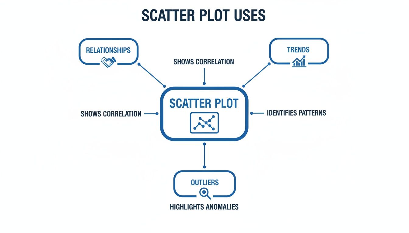
These three use cases—finding correlations, spotting outliers, and seeing trends—form the foundation of why scatter plots are such an essential tool for any data-driven team.
The Four Superpowers of a Scatter Plot
Don't let their simple appearance fool you—scatter plots pack a serious punch. I like to think of them as giving your data four distinct "superpowers" that cut through the noise and show you what’s really going on. These aren’t just abstract statistical ideas; they’re practical tools for answering critical business questions every single day.
To truly understand what scatter plots are for, you need to master these four abilities.
As you can see, each of these functions builds on the others, letting you go from one insight to the next, all within a single chart.
1. Uncovering Relationships and Correlation
At its core, a scatter plot is all about seeing how two variables interact. Are they friends, enemies, or complete strangers? In the world of data, we call this relationship correlation.
Think of it this way: you’re plotting your daily ad spend on the x-axis against the number of new user sign-ups on the y-axis. If the dots drift upwards from left to right, you’ve found a positive correlation. It’s a good sign that as you spend more on ads, you tend to get more sign-ups.
On the flip side, a downward slope reveals a negative correlation. For instance, if you plotted customer support response time against customer satisfaction scores, you’d hope to see this pattern. As response times go up, satisfaction goes down.
And what if the dots look like a random, shapeless cloud? That signals no correlation. The two variables are independent and don’t seem to influence each other at all. This is the first crucial step in any good exploratory data analysis.
2. Spotting Outliers and Anomalies
Within any data set, there are always a few rebels—points that just don't follow the rules. We call these outliers, and scatter plots make them stick out like a sore thumb. They’re the lonely dots floating far away from the main group.
Let's say you plot every sales transaction, with the number of items purchased (x-axis) against the total sale value (y-axis). You’d expect a pretty clear upward trend. But then you spot it: one dot, way off by itself, representing a sale with only two items but an unusually high value.
That single outlier is a breadcrumb. It could point to a simple data entry mistake, a fraudulent transaction, or even a VIP customer who just made a very strategic, high-margin purchase. It’s an immediate signal to dig deeper.
3. Identifying Trends and Patterns
Beyond a simple straight line, scatter plots can show you far more complex patterns. The overall shape of the cloud of points tells a story. Does it form a line? A curve? A wave?
For example, if you plotted an employee's time at the company against their performance metrics, you probably wouldn't see a straight line. Instead, you might see a curve: performance rises sharply in the first year, plateaus for a few years, and then might even gently decline as they settle in.
This "path" helps you understand the entire lifecycle, not just a simple, static connection.
4. Segmenting Data into Groups
Sometimes, instead of one big cloud, your scatter plot will reveal distinct clusters of data. This is segmentation, and it's an incredibly powerful way to discover natural groupings you never knew existed.
Imagine plotting customer session duration against the total amount they’ve spent. You might not see one trend, but three separate "tribes":
Cluster 1: The Browsers. Low session time, low spend. They pop in and out.
Cluster 2: The Researchers. High session time, but still low spend. They’re comparing and planning.
Cluster 3: The Power Buyers. High session time and high spend. These are your most engaged customers.
Suddenly, you’re not looking at one generic "user"—you have three distinct segments. This lets you build targeted marketing, prioritize features for specific groups, and craft much smarter business strategies.
How to Read a Scatter Plot Like an Expert
A scatter plot is a powerful tool, but only if you can translate that cloud of dots into a coherent story. The good news is, it’s a skill that’s easy to pick up and immediately makes your data analysis more insightful.
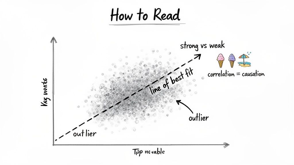
The first thing to do is always get your bearings by looking at the axes. The horizontal line is the X-axis (your independent variable), and the vertical one is the Y-axis (your dependent variable). What exactly are you measuring? If you’re plotting ad spend (X) against website traffic (Y), you’re really asking how one might influence the other.
Look for the Pattern
Once you know what you’re looking at, zoom out. Don't get hung up on any single dot just yet. Instead, look at the overall shape the dots form as a group. A few key questions will guide you:
What’s the direction? If the dots seem to drift upward from left to right, you’re looking at a positive correlation. As one thing goes up, the other tends to go up too. If they drift downward, it’s a negative correlation. When they look like a random spray of points with no clear direction, there's likely no relationship to speak of.
How strong is the trend? Pay attention to how tightly the dots are packed together. A tight, well-defined line of points suggests a strong correlation—these two variables are moving in lockstep. But if the dots are spread out in a loose, fuzzy cloud, the correlation is weak.
To make this even clearer, analysts often draw a line of best fit right through the middle of the data. Think of it as a visual average that instantly highlights the dominant trend, cutting through the noise of individual points.
Beware the Correlation vs. Causation Trap
If you remember one thing, make it this: just because two things move together (correlation) doesn't mean one is causing the other (causation). This is probably the most common mistake in data interpretation, and it can lead to some seriously flawed conclusions.
The classic example is the well-known link between ice cream sales and shark attacks. A scatter plot would reveal a surprisingly strong positive correlation. As ice cream sales climb, so do shark attacks. So, does eating ice cream make you a target for sharks? Absolutely not.
The real story involves a hidden third factor: hot weather. When the temperature rises, more people naturally buy ice cream. At the same time, more people head to the beach to swim, which tragically increases the chances of a shark encounter.
Always ask yourself: what else could be going on here? What unseen factor might be influencing both variables? Getting this right is a cornerstone of solid data visualization best practices. By grounding yourself in the axes, identifying the pattern, and respecting the difference between correlation and causation, you can pull real, reliable insights from your scatter plots.
Scatter Plots in Action: Use Cases for Every Team
Theory is one thing, but the real magic happens when you see scatter plots put to work. This is where their value truly clicks. They aren't just a tool for data scientists; they are practical, everyday problem-solvers for teams all across a company. Let's dig into some concrete examples of how different departments use them to turn raw data into smart decisions.
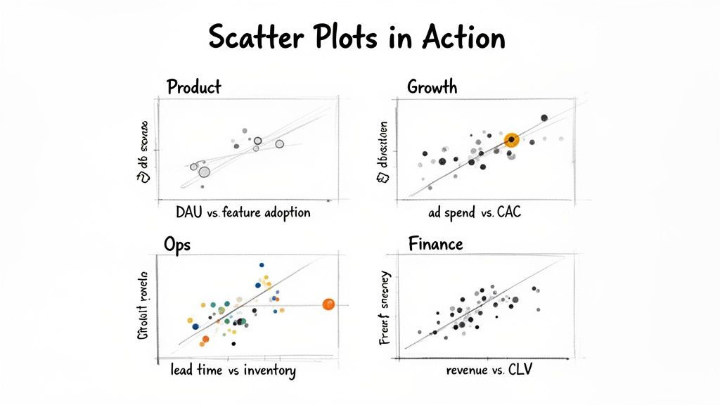
Whether you're looking at product engagement or financial health, the goal is always the same: find the hidden story connecting two different variables.
For Product Teams Boosting Engagement
Imagine a product team trying to figure out what keeps users coming back. They could plot their daily active users (DAUs) on the Y-axis against new feature adoption rates on the X-axis over the last quarter.
Right away, the scatter plot shows a strong positive correlation. On days when more people used the new "collaboration" feature, the DAUs spiked. But they also notice a small, odd cluster of dots where adoption was high but DAUs stayed flat. This clue leads them to a bug affecting a specific group of users—a problem they can now fix before it does more damage to engagement.
For Growth Teams Optimizing Spend
A growth team needs to acquire new customers without breaking the bank. They can create a scatter plot to compare their ad spend per channel (X-axis) against the customer acquisition cost (CAC) for each of those channels (Y-axis).
Their chart reveals that while most channels follow a predictable pattern—more spend equals a higher CAC—one channel stands out. Podcast ads deliver a surprisingly low CAC, even as the team spends more. This outlier is a golden opportunity. The team can confidently double down on their podcast budget, moving money away from less effective channels to get a much better return.
For Operations Teams Preventing Stockouts
For an e-commerce operations team, running out of stock is a nightmare. To get ahead of it, they might plot supplier lead times in days (X-axis) against the current inventory levels for their top 100 products (Y-axis).
The resulting plot shows a clear negative trend: products that take longer to arrive are dangerously close to selling out. The chart also flags two critical outliers—popular items with long lead times and alarmingly low stock. This visual red alert prompts the team to place urgent orders and renegotiate with those suppliers, averting a costly stockout.
This ability to turn complex data into a clear action plan is a huge advantage. In fact, companies that use scatter plots for this kind of analysis have seen 28% higher forecasting accuracy than those just using spreadsheets. For example, when a retail giant plotted daily temperature against ice cream sales, they found sales jumped 150% on days above 75°F. That single insight helped them completely overhaul their inventory algorithms, saving millions. You can learn more about uncovering hidden data patterns with Watershed's blog on visual analytics.
For Finance Teams Identifying Profitability
Finally, picture a finance team trying to identify their most valuable customers. They decide to plot revenue per customer (Y-axis) against customer lifetime value (CLV) on the X-axis.
The scatter plot immediately reveals two distinct groups. One cluster shows high initial revenue but a low CLV, pointing to one-and-done buyers. But a second cluster has moderate initial revenue and an incredibly high CLV—these are the loyal, repeat customers. Armed with this segmentation, the finance team can advise marketing to create loyalty programs specifically designed to turn more of those one-time buyers into high-value, long-term fans.
Create Your First Scatter Plot in Under a Minute
Knowing what a scatter plot is used for is great, but building one yourself shouldn't be a project. In too many companies, getting a simple chart means filing a ticket and waiting days for an overworked data team to get to it. That entire, sluggish process has been turned on its head. With an AI-powered platform like Querio, you can move from a plain business question to a finished scatter plot in seconds.
The old way of doing things meant wrestling with complex code or clicking through an endless maze of menus in a traditional BI tool. Today, it’s as simple as asking a question just like you would ask a colleague. This completely changes the game, allowing anyone on the team to dig into the data without needing to be a technical wizard.
From Question to Insight Instantly
So, what does this actually look like in practice? It’s a simple four-step flow that dissolves the usual friction between having a question and getting an answer. You don't need to know SQL or Python; you just need to be curious.
Here’s a quick walkthrough:
Connect Your Data Source: First, link Querio to where your data lives. It connects directly with major data warehouses like Snowflake, BigQuery, and Databricks.
Ask a Question: Instead of writing code, simply type what you want to know. For instance: "Plot user session duration against churn rate."
Get Your Plot: The AI agent instantly understands your request, runs the query, and builds the right scatter plot for you. There's no manual chart configuration.
Share with Your Team: Once your chart is ready, you can send it to anyone with a simple link, helping build a culture where everyone can find their own answers.
The image below gives you a feel for how Querio takes a natural language query and generates a visualization automatically.
This screenshot shows the platform instantly plotting user engagement metrics, turning a simple question into a powerful insight. The resulting scatter plot makes the relationship between the two variables immediately obvious, ready for analysis.
This kind of speed is a massive advantage for outlier detection, which is one of the core jobs of a scatter plot. In fact, a major analytics survey found that 72% of enterprises using scatter plots spotted 3x more outliers than they did with other charts. This is the same principle that helped shape quality control methods like Lean Six Sigma, which is now used by 90% of Fortune 500 firms to find and fix expensive problems. You can read more about how scatter plots drive business decisions at Business Analyst Techcanvass.
By removing the technical hurdles to data exploration, teams can ask more questions, uncover more insights, and make faster, data-driven decisions. This approach transforms the data team from a bottleneck into a strategic enabler for the entire company.
If you want to get into the nitty-gritty, you can also check out our detailed guide on how to create a scatter plot in Querio. The mission is simple: give every person on your team the power to use data without the frustrating wait times.
Common Questions About Scatter Plots
As you start using scatter plots, a few questions always seem to come up. It's totally normal. Getting these sorted out is key to making sure you're using them correctly and not accidentally misleading yourself or your team. Let's walk through some of the most common ones.
What Is the Difference Between a Scatter Plot and a Line Graph?
This is easily the most frequent point of confusion, but the distinction is actually quite simple—and incredibly important. It all comes down to what you're trying to show.
A line graph connects the dots to show how a single metric changes over a continuous interval, which is almost always time. Think of it as telling a story in chronological order, like tracking your company's revenue month by month. The line shows the journey.
A scatter plot, on the other hand, is all about comparing two separate variables to see if they move in relation to one another. You're not looking at a progression over time; you're looking for a relationship. For instance, you could plot ad spend against new user sign-ups to see if more spending leads to more users.
The simplest way to remember it is:
Line Graph: One variable's journey over time.
Scatter Plot: Two variables' relationship with each other.
How Much Data Do I Need for a Good Scatter Plot?
There’s no magic number here. The real goal is to have enough data points to see a legitimate pattern emerge from the noise.
If you have too few points—say, less than 20 or 30—you're in dangerous territory. Any "trend" you spot is likely just a coincidence. It's easy to draw a line through a handful of dots and fool yourself into thinking you've found a correlation that isn't actually there.
On the flip side, too many data points can cause overplotting, where the dots pile on top of each other and become a dense, unreadable blob. This completely hides the underlying pattern. When this happens, you can often fix it by making the dots semi-transparent or, if you have a massive dataset, by plotting a representative sample of the data.
Can a Scatter Plot Show More Than Two Variables?
Absolutely, and this is where scatter plots really start to shine. While a basic plot lives in two dimensions (X and Y), you can easily layer on more information to tell a much richer story.
Here are the go-to methods for adding more variables:
Size (Bubble Plot): You can map a third variable to the size of each point. For example, imagine plotting ad spend (X) against customer acquisition cost (Y). You could then make the size of each dot represent the number of customers acquired. This transforms your scatter plot into a bubble plot.
Color: You can use color to introduce a fourth, categorical variable. In our marketing example, you could color-code the bubbles by channel: blue for Google Ads, red for Facebook Ads, green for LinkedIn.
Suddenly, a single chart shows the relationship between spend, cost, volume, and channel. This is how you move from simple two-way analysis to a genuinely deep, multi-faceted understanding of what’s going on.
Ready to stop waiting for answers and start exploring your data yourself? Querio deploys AI agents that let anyone on your team build charts, run analyses, and get insights in seconds—no SQL required. See how you can transform your team from a data bottleneck into a strategic powerhouse by trying Querio today.

