Business Intelligence
Top 9 Text-to-Dashboard Tools in 2026
Compare nine text-to-dashboard tools by warehouse fit, governance, editability, and best use cases.

If you want dashboards from plain-English prompts, the short answer is this: pick the tool that matches your data stack, keeps metrics under control, and lets your team check the logic before anyone shares a chart.
I’d narrow this list by 3 things first:
- Where your data lives: Snowflake, BigQuery, Redshift, Databricks, or Postgres
- How much control you need: semantic layer, permissions, audit trail, and source checks
- Who will use it: analysts, business users, executives, or customers in an embedded app
That matters because BI adoption is still only about 29%, while teams using conversational analytics tools report saving about 20 hours per month on routine reporting work. So the win is not just faster dashboard drafts. It’s getting dashboards that people can use and trust.
This article covers 9 tools:
- Querio
- ThoughtSpot
- Power BI Copilot
- Tableau Pulse
- Looker with Gemini
- Hex
- Sigma
- Bold BI Prompt-to-Dashboard
- Databricks Genie
It compares them on the points that matter most:
- Dashboard generation quality
- Warehouse support
- Governance and permissions
- Editability and transparency
- Best use case
The pattern is simple: raw prompts are not enough. The tools that work best usually sit on top of clean metric definitions and live warehouse data.
::: @figure 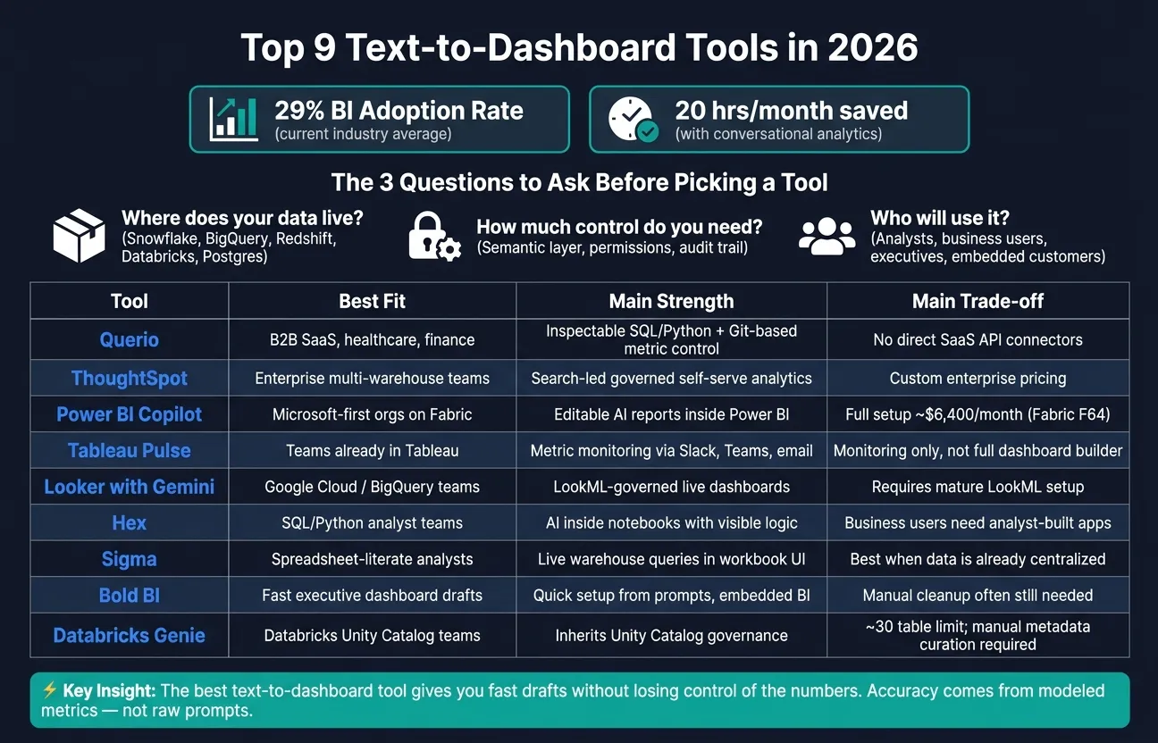 {Top 9 Text-to-Dashboard Tools Compared (2026)}
:::
{Top 9 Text-to-Dashboard Tools Compared (2026)}
:::
Quick Comparison
| Tool | Best fit | Main upside | Main trade-off |
|---|---|---|---|
| Querio | Teams that need audit trails and warehouse-first analytics | Inspectable SQL/Python with Git-based metric control | No direct SaaS API connectors |
| ThoughtSpot | Governed self-serve analytics across many warehouses | Search-led analysis with shared metric logic | Custom enterprise pricing |
| Power BI Copilot | Microsoft-first teams on Fabric | Editable AI-generated reports inside Power BI | Full AI setup can cost about $6,400/month for Fabric capacity |
| Tableau Pulse | Teams that want metric updates and alerts | Plain-language metric summaries in Slack, Teams, email, and app | More monitoring than full dashboard building |
| Looker with Gemini | BigQuery and Google Cloud teams | LookML-based control with live warehouse queries | Works best if LookML is already in good shape |
| Hex | SQL/Python teams publishing analyst-built apps | AI inside notebooks with visible logic | Business users depend on analysts to publish apps |
| Sigma | Spreadsheet-first teams on cloud warehouses | Editable workbook flow on live warehouse data | Best when data is already centralized |
| Bold BI Prompt-to-Dashboard | Fast executive dashboard drafts and embedded BI | Fast setup from prompts | Manual cleanup is often still needed |
| Databricks Genie | Databricks-first teams using Unity Catalog | Inherits Databricks permissions and shows SQL | Needs clean metadata and tight table scope |
If I had to put the whole article into one line, it would be this: the best text-to-dashboard tool is the one that gives you fast drafts without losing control of the numbers.
1. Querio
For teams that want governed dashboard generation without giving up warehouse control, Querio keeps the whole process easy to inspect. It turns plain-English questions into editable SQL and Python notebooks, so every answer stays tied back to the warehouse.
When someone types a prompt in the Querio app, in Slack, in Microsoft Teams, or inside Claude via MCP, an agent writes SQL and Python in an editable notebook. If the SQL changes, the charts update on their own.
The main control point is the semantic layer. Metric definitions, joins, and trusted queries live as plain SQL, Markdown, and Python files in GitHub next to your dbt project. The agent can suggest new definitions based on query patterns, but only a logged-in human can approve and commit them.
Dashboards come from notebooks, which keeps layout, logic, and Slack answers in the same audit trail. That setup works well for scheduled reporting, executive sharing, and embedded analytics tools.
Here’s the shortest way to size up the platform.
| Capability | Detail |
|---|---|
| Warehouse connections | Snowflake, BigQuery, Redshift, ClickHouse, MotherDuck - live, read-only, encrypted |
| Database support | Postgres, MySQL, MariaDB, SQL Server, MongoDB |
| Governance layer | GitHub-synced SQL/Markdown/Python files, dbt repo integration |
| Security | SOC 2 Type II, HIPAA, BAAs, SSO, RBAC, MCP-inherited OAuth permissions |
| Delivery surfaces | App, Slack, Teams, Claude (MCP), embedded via API and iframes |
Querio is a strong fit for B2B SaaS, healthcare, and finance teams that need auditability. The trade-off is pretty clear: its warehouse-first setup means there are no direct SaaS API connectors, and the visual side leans more toward accuracy than pixel-perfect layout control.
2. ThoughtSpot
ThoughtSpot uses a search-first workflow. People build charts step by step, then pull them into dashboards. That setup matters most when teams need controlled metrics, not just fast chart building. In practice, it turns search into governed analysis instead of plain ad hoc reporting.
ThoughtSpot works across multiple warehouses. It connects live to Snowflake, BigQuery, Databricks, Redshift, and Postgres without pushing teams into one vendor’s native analytics stack. Its SpotIQ engine can surface anomalies and trends automatically[6]. That’s useful for teams that want exploratory search while keeping metric definitions consistent.
Governance sits in ThoughtSpot’s semantic layer, where metric definitions are managed in one place. Advanced users can extend forecasts in Python and fine-tune chart formatting[1][5].
Pricing is per user at the lower tiers, while enterprise deployments are usually custom. It’s a good fit for enterprise teams that want governed self-serve analytics across multiple warehouses, especially data leaders and analytics teams working in Snowflake, BigQuery, Databricks, Redshift, or Postgres. In other words, it works well for governed self-service BI best practices in mixed warehouse setups.
3. Power BI Copilot
Power BI Copilot is Microsoft’s AI layer inside Power BI and Microsoft Fabric. Its job is to cut down the last stretch of dashboard work, helping teams go from analysis to executive-ready visuals in minutes instead of weeks [4]. An analyst can type a plain-English prompt into the Copilot pane and get a draft report or chart to work from. That draft is a starting point, not the final dashboard.
What makes it useful in day-to-day work is the visibility it gives you. The generated DAX and visuals are fully visible and editable, so analysts can check the logic, spot mistakes, and fix anything that feels off. That paper trail matters in executive reporting, where every metric may get picked apart.
Governance stays inside the Microsoft stack many teams already use. Microsoft 365 identity controls still sit around the workflow, along with Fabric and Azure AD controls. DAX-based Row-Level Security (RLS) and Azure AD policies still apply, and sensitivity labels from Microsoft’s compliance framework can carry through to AI-generated reports and summaries. In plain terms, access rules and data labels stay in place instead of getting lost once AI enters the picture.
The biggest catch is the semantic model. If that model is clean and well set up, Copilot tends to do a much better job. If it’s messy, the cracks show fast. As Kateryna Kozachenko, Marketing & Growth, Bruin, put it:
"The AI is only as good as the semantic model you have already built." - Kateryna Kozachenko, Marketing & Growth, Bruin [5]
That quote gets to the heart of it. Copilot doesn’t fix weak data structure. It tends to surface those problems. For teams working with live warehouse data, DirectQuery can keep dashboards up to date with sources like Snowflake or BigQuery [4].
Pricing is also part of the story. Power BI Pro costs $14 per user/month, but full Copilot use usually calls for Microsoft Fabric capacity at F64 or higher, which runs about $6,400 per month [1]. Some setups may use Fabric F2+ or Power BI Premium P1+ [5]. Because of that, Copilot makes the most sense for Microsoft-native enterprises that already have mature semantic models.
4. Tableau Pulse
After report drafting, Tableau Pulse moves the focus to metric monitoring. It’s a monitoring layer, not a blank-canvas dashboard builder. Pulse turns governed Tableau metrics into plain-language digests and alerts in Slack, Microsoft Teams, email, or in-app. That distinction matters. Pulse is built for governed metrics, not ad hoc dashboard creation.
Pulse works best when metrics are already modeled in Tableau. It surfaces changes and contributing segments, but it’s made for monitoring defined measures, not exploratory analysis. Governance carries through Tableau Catalog and existing data policies, so user filters and permissions stay in sync. Analysts can inspect the underlying visualizations and calculations, though SQL-level transparency is more limited.
Pulse is a good fit for warehouse-first teams on Snowflake, BigQuery, Redshift, or Postgres, but it still depends on mature metric definitions and a clean semantic layer.
Pricing starts at $75/user/month for Creator, which includes Pulse. Advanced AI features require Tableau+ and sales pricing [1][6].
Tableau Pulse fits best for executive and operational reporting teams already inside the Tableau ecosystem that want proactive metric alerts without building new dashboards. If your semantic layer is clean and your metrics are well defined, Pulse adds clear value. If not, it will surface those gaps fast. Teams that need more interactive dashboard creation should look at tools built for deeper authoring. That makes Pulse a strong monitoring layer, but not a replacement for full dashboard authoring.
5. Looker with Gemini
If Tableau Pulse is made for monitoring, Looker with Gemini is built for governed dashboard creation inside Google Cloud.
Looker with Gemini takes plain-English questions and turns them into queries and visualizations through LookML. The catch is simple: results depend on the quality of the semantic model behind them. That said, because the flow runs through LookML, teams can inspect the logic, test it, and refine it instead of relying on a black box. That makes Looker with Gemini a strong match for Google Cloud teams already working in BigQuery.
Queries run directly against the warehouse, so results stay live. Gemini also adds AI-powered explanations for trends and anomalies next to generated visualizations [6]. Those insights can show up in Sheets, Slides, and Chat too. On the governance side, Google Cloud IAM works with existing LookML access controls [6]. The tradeoff is pretty clear: Gemini-powered features make the most sense inside the Google Cloud stack, so they’re less practical for teams whose data mostly sits elsewhere [5][6].
Looker pricing is custom and aimed at enterprise buyers. Gemini is generally included for existing customers.
Its main edge is straightforward: governed, live dashboards for teams already standardized on Google Cloud.
| Feature | Looker with Gemini |
|---|---|
| Primary Warehouse | BigQuery (Google Cloud) [1][5] |
| Semantic Layer | LookML - required for accuracy [5][6] |
| Query Method | Live against the warehouse, no extracts [5][6] |
| Governance | Google Cloud IAM + LookML access controls [6] |
| Workspace Integration | Google Sheets, Slides, Chat [6] |
6. Hex
For teams that live in SQL and Python notebooks, Hex keeps AI where analysts already work. Instead of bouncing between tools, teams can go from prompt to dashboard inside the notebook. In practice, that means a plain-English prompt can turn into notebook-built work that people can share. Its Notebook Agent scaffolds queries and data apps from natural-language prompts, which makes Hex a strong match for notebook-heavy teams [5].
Hex also lets teams publish notebooks as dashboard-style data apps for business users to view. It connects live to Snowflake, BigQuery, Databricks, Redshift, and Postgres [5][6].
There’s a catch, though: business users can’t just jump in and start asking questions on their own. Analysts need to build and publish the apps first. So Hex works best for curated analytics, not broad self-serve Q&A. The upside is that SQL and Python remain visible and editable in the notebook, which gives analysts a clear way to review the logic before anything goes live. If analysts own the build and stakeholders mainly consume the output, Hex fits that setup well.
| Feature | Hex |
|---|---|
| Primary Interface | Notebook (SQL + Python) [5] |
| AI Capability | Notebook Agent scaffolds queries and data apps [5] |
| Warehouse Connectivity | Snowflake, BigQuery, Databricks, Redshift, Postgres [5][6] |
| Output Format | Published data apps [5] |
| Business-User Self-Serve | Limited - requires analyst to build and publish first [5] |
7. Sigma
Sigma takes a different path for teams that want warehouse-native analytics without leaving a spreadsheet-style workflow. It places a workbook interface on top of live warehouse data, so users can start with a plain-English prompt and then fine-tune the output inside the workbook. In plain terms: it feels familiar to spreadsheet-savvy business users, but the data stays connected to the warehouse [6].
That setup makes Sigma a good fit for people who want editable analysis in a format they already know. Instead of jumping into a rigid dashboard flow, they can work directly in the workbook and shape the analysis as they go [6].
Governance comes through role-based access controls and the security model inherited from the underlying warehouse. Sigma also supports real-time co-editing in shared workbooks, which helps teams work on the same analysis at the same time [6]. Its AI tends to work best when metric definitions and the semantic layer are already governed [1].
Sigma also supports write-back to the warehouse [6].
| Feature | Sigma |
|---|---|
| Primary Interface | Spreadsheet-style workbook |
| AI Capability | Natural language to editable workbook analysis |
| Warehouse Connectivity | Live warehouse connections (Snowflake, BigQuery, Databricks) |
| Editability | Real-time co-editing in collaborative workbooks |
| Governance | Role-based access controls and warehouse security inheritance |
| Write-Back | Yes |
Sigma is best for self-serve analytics and embedded BI on centralized warehouse data. It's less useful when data is scattered across SaaS apps instead of being consolidated in Snowflake, BigQuery, or Databricks [6].
8. Bold BI Prompt-to-Dashboard
Bold BI can spin up an executive dashboard in minutes. That's the big draw.
But in practice, most teams still end up doing some manual cleanup before the dashboard is ready to share. This is a speed-first pick for executive dashboards, not a governed semantic-layer workflow.
Manual cleanup after generation is still common. In most cases, teams need to tidy the layout and reshape charts to get to a KPI-first view[4].
For executive reporting, speed is only part of the story. Source traceability matters just as much. Each KPI should let someone click through to the source[4]. And if your team cares about warehouse-native execution, this detail matters: Bold BI connects to warehouse data over the wire, not in the warehouse[1][2].
| Feature | Bold BI |
|---|---|
| Post-generation editing | Layout cleanup and chart reshaping are often needed[4] |
| Executive trust | KPI-level source traceability matters[4] |
| Data architecture fit | Connects to warehouse data over the wire, not in the warehouse[1][2] |
For teams centered on Databricks, the next thing to look at is how prompt-to-dashboard flows work inside the lakehouse itself.
9. Databricks Genie
Databricks Genie is built for teams that already work in Databricks. If your data lives in the Databricks Lakehouse, Genie can turn plain-English prompts into SQL right inside Databricks [1][2].
One big plus is governance. Genie inherits Unity Catalog access controls automatically [1][2]. That makes it a strong option for regulated teams in healthcare and finance, where access rules can’t be left loose.
There’s a catch, though: metadata quality matters a lot. Genie depends on well-documented Unity Catalog tables, and Databricks does not auto-generate table or column descriptions [2]. So if your metadata is thin or messy, prompt quality can fall off a cliff. In practice, that means teams need to put in the work up front. Databricks also recommends keeping each Genie Space focused on one business domain and limiting it to about 30 tables [1].
You can improve results by adding example queries and custom instructions [2]. That gives Genie more context and helps it return better SQL. It tends to work best when Databricks is already the system of record. For lakehouse-first self-serve analytics, it makes a lot of sense. For multi-warehouse reporting or custom embedded BI, it’s a weaker fit.
Here is the short version.
| Feature | Databricks Genie |
|---|---|
| Governance | Inherits Unity Catalog access controls automatically [1][2] |
| Metadata requirement | Manual curation required; no auto-generated descriptions [2] |
| Table scope per space | About 30 tables recommended [1] |
| SQL inspectability | Yes - underlying SQL is inspectable [1] |
| Best fit | Databricks-first teams focused on self-serve lakehouse analytics; less suited for multi-warehouse reporting or custom embedded BI [1] |
Pros and Cons
This summary makes the trade-offs easy to scan. The right pick comes down to your warehouse setup, governance rules, and how your team likes to work.
After the tool-by-tool breakdown, this table trims the buying call down to the basics.
| Tool | Best For | Main Strength | Main Limitation |
|---|---|---|---|
| Querio | B2B SaaS, healthcare, and finance teams running a real warehouse | Governed semantic layer in GitHub alongside dbt; editable SQL and Python in notebooks; live warehouse connections | No direct SaaS API connectors |
| ThoughtSpot | Large enterprises needing governed self-serve analytics | Search-driven analysis with consistent metric governance | Enterprise pricing is high |
| Power BI Copilot | Microsoft-first organizations on Fabric | Natural fit for Microsoft reporting workflows | Full Copilot requires Fabric F64 or higher (~$6,400/month) [1] |
| Tableau Pulse | Teams already in Tableau needing proactive metric alerts | Governed metric monitoring with Slack and Teams delivery | Value is strongest inside the Tableau ecosystem [6][3] |
| Looker with Gemini | Google Cloud and BigQuery teams | Governed live dashboards via LookML | Requires significant upfront LookML modeling; strongest inside Google Cloud [6][1] |
| Hex | SQL and Python teams building curated data apps | Notebook workflow for SQL/Python teams | Business users can't self-serve without analyst-built apps |
| Sigma | Spreadsheet-literate analysts on cloud warehouses | Live warehouse queries in a familiar workbook interface | Spreadsheet workflow comes first |
| Bold BI Prompt-to-Dashboard | Teams needing embedded BI with fast dashboard generation | Best for embedded delivery | Less mature than larger BI suites |
| Databricks Genie | Databricks-native teams using Unity Catalog [1][2] | Inherits Unity Catalog governance; good fit for regulated teams [1][2] | Limited to ~30 tables per Genie Space; manual metadata curation required [1][2] |
Use this summary to cut your shortlist by stack, governance, and workflow. One pattern shows up across every tool: accuracy comes from modeled metrics, not raw prompts. Teams that get dashboards they can trust usually have clean semantic layers in place before anyone types the first question.
Conclusion
The right tool comes down to three things: where your data lives, how much control your team needs, and whether analysts need to review and edit what the AI produced.
Use the matrix below to line up your warehouse, governance needs, and delivery model with the best fit.
| Scenario | Best Fit | Why |
|---|---|---|
| Single Snowflake warehouse, regulated industry | Querio | Inspectable SQL/Python, governed context, and live warehouse data support auditability |
| Google Cloud / BigQuery stack | Looker with Gemini | LookML governance is inherited natively |
| Microsoft-first org on Fabric | Power BI Copilot | Natural fit for Microsoft workflows |
| Databricks Unity Catalog environment | Databricks Genie | Governance is inherited from Unity Catalog |
| Multi-warehouse team | ThoughtSpot or Querio | Context layers help keep metric definitions consistent across sources |
| Embedded BI in a customer-facing product | Querio or ThoughtSpot | API/iframe delivery and row-level security fit customer-facing use cases |
Across these scenarios, the big divider is simple: does the tool keep metrics governed, inspectable, and connected to live warehouse data?
That matters because metric quality comes from the semantic layer, not the prompt.
Use Querio when you need inspectable SQL/Python, a governed context layer in Git, and live warehouse connections.
FAQs
::: faq
How accurate are AI-built dashboards?
AI-built dashboard accuracy depends less on the model itself and more on the underlying semantic layer and data governance.
With a curated semantic model, accuracy can land in the 85% to 90% range. But that number falls fast when AI has to make sense of raw, undocumented tables on its own.
That’s the catch: a query can run without errors and still give you the wrong answer. So the smart move is pretty simple. Keep humans in the loop, build a governed semantic layer first, and test results against real business questions - not just whether the SQL executes. :::
::: faq
Do I need a semantic layer first?
For business-critical analytics, yes - a semantic layer helps keep metrics consistent and stops different users from getting different answers to the same question.
Some tools, including Querio, can still pull useful insights from a raw schema alone. But a context layer gives data teams one place to define business rules, joins, and metrics. That way, the AI works from trusted logic instead of trying to interpret the schema from scratch every time. :::
::: faq
Which tool fits my data stack?
Pick Querio if your data team works at a 100–500-person U.S. B2B SaaS, healthcare, or finance company, already runs a real warehouse, and needs governed, consistent answers to metric questions before a full semantic layer is in place.
It connects live to Snowflake, BigQuery, and Postgres. It also uses a context layer to standardize terms and metrics, then generates transparent, editable SQL. That means governance and accuracy don’t depend on a black box. :::