Business Intelligence
Top 5 AI Tools for Custom Dashboards
Explore the top five AI tools for creating custom dashboards that simplify data analysis and enhance business insights for all users.
AI-powered dashboard tools are transforming how businesses analyze and act on their data. These tools make data accessible to everyone, not just technical experts, by offering natural language querying, real-time updates, and customization features. Here's a quick rundown of the top five tools:
Querio: Simplifies querying with plain English questions and integrates seamlessly with live data sources like Snowflake and BigQuery. Pricing starts at $14,000/year.
Tableau: Offers advanced visualizations, AI-driven insights, and real-time data connections. Pricing begins at $75/user/month for Creator plans.
Databox: Combines data from multiple platforms into a single dashboard with goal tracking and mobile optimization. Free tier available; paid plans start at $72/month.
Klipfolio: Handles diverse data types with flexible integration and customization options. Pricing starts at $20/user/month.
Zoho Analytics: Features an AI assistant, Ask Zia, for natural language queries and supports multilingual teams. Free tier available; paid plans start at $30/month.
These tools cater to different needs, from marketing teams tracking KPIs with AI tools to enterprises requiring advanced analytics. Below is a comparison to help you decide.
Quick Comparison
Tool | AI Features | Data Integrations | Customization Options | Pricing | Ideal For |
|---|---|---|---|---|---|
Querio | Natural language querying | 300+ sources, live data | Drag-and-drop dashboards | $14,000/year | Non-technical teams |
Tableau | AI insights, predictive modeling | 700+ connectors | Advanced formatting | $75/user/month | Enterprise-level analytics |
Databox | Goal tracking, anomaly detection | 100+ platforms | White-label dashboards | $72/month | Marketing and sales teams |
Klipfolio | Trend analysis, smart alerts | 500+ sources | Custom formulas, layouts | $20/user/month | SMBs needing flexible reporting |
Zoho Analytics | Ask Zia, multilingual support | 250+ integrations | Theme layouts, interactive elements | $30/month | Global teams |
Whether you're looking for simplicity, advanced analytics, or multilingual support, these tools can help turn raw data into actionable insights.
Create Dashboards in Seconds With AI (It's Mind-Blowing 🤩)
1. Querio
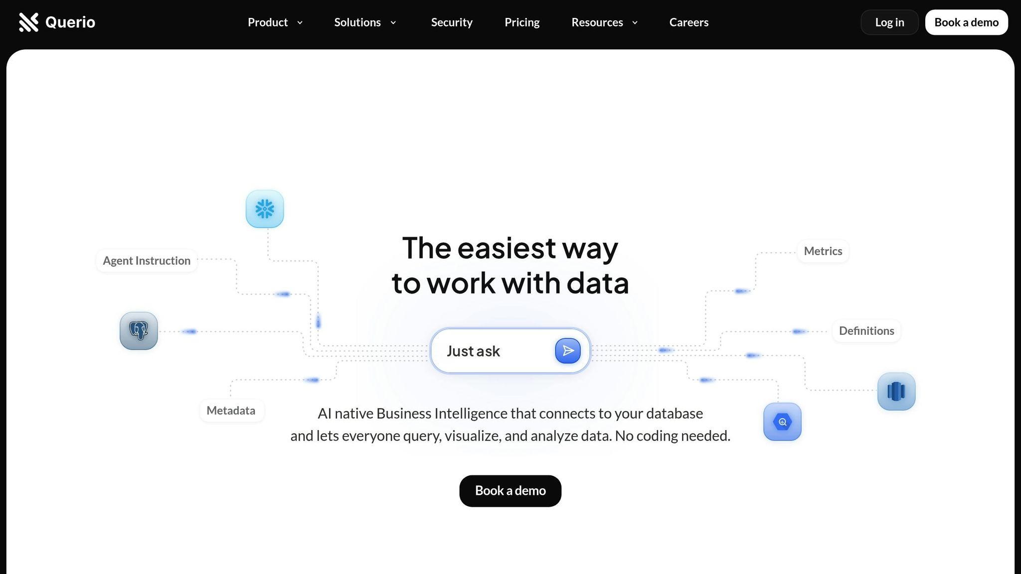
Querio is a business intelligence platform powered by AI, designed to help product managers and finance teams get instant, clear visualizations by simply asking questions in plain English.
Natural Language Querying
Querio shines with its ability to process natural language. Users can type or even speak queries like "What was our revenue growth last quarter?" or "Show me customer acquisition costs by channel." Behind the scenes, Querio translates these questions into SQL, removing the need for technical expertise and making data accessible to everyone.
Interaction Type | Main Advantage | User Benefit |
|---|---|---|
Voice Commands | Hands-free operation | Ideal for multitasking |
Text Queries | Quick data filtering | Speeds up navigation |
Natural Language | Reduces cognitive load | Makes data more approachable |
Jennifer Leidich, Co-Founder & CEO, highlights the platform's impact:
"Querio has revolutionized how we handle data. What used to be a weeks-long process now takes minutes, and our teams feel empowered to make data-driven decisions on their own. The impact on our efficiency and accuracy is unparalleled." [3]
This user-friendly querying approach ensures seamless access to real-time insights.
Real-Time Data Integration
Querio connects directly to enterprise data warehouses like Snowflake and BigQuery, alongside smaller systems such as PostgreSQL, MySQL, and MariaDB - all without creating data copies. This read-only, encrypted connection keeps dashboards up-to-date while avoiding duplication risks.
In addition to these warehouses, Querio integrates with over 300 data sources, including tools like HubSpot, Segment, Mixpanel, Airtable, Google Sheets, and even CSV files [4][5]. This broad compatibility allows teams to consolidate data from various platforms into cohesive dashboards without complex engineering.
Moe, CTO, shares his perspective:
"I've been really surprised with how well Querio works. The team is a lot more self-sufficient, more than I assumed they could be, and our engineering team has a much closer relationship to the business. Querio changed how we work with our data and each other!" [3]
Customization Capabilities
Querio doesn't just provide data - it empowers users to shape it. Teams can create dynamic data visualisation dashboards, apply filters, and track key metrics tailored to their needs [1]. By setting table joins, metrics, and glossaries upfront, data teams ensure consistent definitions across all queries and dashboards. This consistency makes data easier to understand and more reliable for decision-making.
Integration with Data Sources
Querio prioritizes live data connections over static reports, supporting both large-scale warehouses and smaller systems. To get the best insights, users can refine their queries to provide more context, ensuring the platform delivers the most relevant results [2].
With SOC 2 Type II compliance and a 99.9% uptime SLA, Querio guarantees data security and reliability. Scheduled reports and automated dashboards keep stakeholders informed without requiring additional tools.
Enver, Co-founder & CTO, captures the platform’s broader value:
"Querio has transformed our approach to data. It's not just about saving time and money; it's about making data accessible and actionable for every team member." [3]
2. Tableau

Tableau takes raw data and transforms it into interactive dashboards that are easy to navigate, making it a go-to tool for organizations of all kinds. Let’s delve into how its natural language capabilities and real-time data features enhance user experience and engagement.
Natural Language Querying
Tableau’s Ask Data feature allows users to interact with data using plain language. For example, you can type questions like, “What are our sales trends by region?” or “Show me customer retention rates over the past year,” and Tableau will instantly generate visualizations like charts or graphs that answer your query.
This functionality bridges the gap between complex data and actionable business insights. With 91% of leaders anticipating benefits from generative AI [7], tools like this are becoming essential for making data accessible. It’s especially helpful for non-technical users who need quick answers without having to learn complicated query languages.
Real-Time Data Integration
One of Tableau’s standout features is its ability to connect to live data sources, ensuring that dashboards are always up-to-date. Whether you’re tracking website traffic, monitoring sales, or keeping an eye on inventory, Tableau’s live connections query databases in real time.
Adding to this is Tableau Pulse, which sends automated alerts when key metrics change. These notifications, delivered through tools like Slack or Microsoft Teams, help users stay on top of critical updates. Tableau’s research shows that 65% of users found personalized insights from Tableau Pulse helped them focus on more important tasks [7].
Chris McClellan from the Tableau Community explains this functionality:
"LIVE means live, so it will be as soon as the data is available in the database BUT you have to do something with the dashboard (or press refresh)." [6]
For even smoother updates, Tableau’s JavaScript API lets dashboards on Tableau Server refresh automatically. This is crucial in a world where 80% of business leaders say data is key for decision-making, yet nearly 30% feel overwhelmed by the sheer volume of data [7].
Customization Capabilities
Tableau offers a range of customization tools so users can design dashboards that align with their brand and analytical goals using a KPI dashboard layout planner. From tweaking shapes, color palettes, and fonts to creating layouts tailored for desktop, tablet, or mobile, Tableau ensures every report looks polished and professional.
The platform supports both tiled and floating layouts, with layout containers that adjust dynamically for optimal viewing across devices. For those who need specific designs, device-specific layouts provide even greater control.
Aidan Bramel from phData emphasizes the platform’s adaptability:
"Tableau offers freedom and flexibility in customization." [8]
In early 2022, phData showcased Tableau’s potential by creating an Instagram-style grid dashboard using custom shapes. This interactive design allowed users to filter and explore data points while maintaining an engaging visual format [8].
Customization Feature | Business Application | Best Practice |
|---|---|---|
Custom Shapes | Highlight key metrics with icons like arrows or checkmarks | Use sparingly for clarity |
Color Palettes | Ensure brand consistency in reports | Stick to two palettes per dashboard |
Layout Containers | Enable responsive design across devices | Opt for tiled layouts for predictability |
Integration with Data Sources
Tableau seamlessly connects to a variety of data sources, from simple spreadsheets to complex cloud databases. Its native connectors are optimized for widely used platforms like Microsoft Excel, SQL Server, Google Analytics, and major cloud services. For less common systems, users can rely on JDBC, ODBC, or custom Web Data Connectors.
The Connect pane simplifies the process by displaying available data sources as soon as Tableau Desktop is launched. This eliminates the hassle of navigating through menus or remembering connection details. Once a connection is set up, it can be saved for future use, saving time on recurring tasks.
For organizations focused on governance and efficiency, Tableau Catalog (part of the Data Management offering) provides a centralized view of all databases and tables. This ensures data is well-managed while still enabling self-service analytics for users across the company.
3. Databox

Databox brings together data from multiple platforms into a single, streamlined dashboard. This makes it much easier for businesses to monitor performance without constantly switching between tools. With over 22,000 agencies and businesses worldwide relying on Databox, the platform is built to simplify how teams track and analyze their most critical metrics [11].
Real-Time Data Integration
Databox integrates with over 100 platforms, including Google Analytics 4, Facebook Ads, HubSpot, LinkedIn, and Shopify. Its standout feature is the ability to consolidate data from these diverse sources into one dashboard. This eliminates the hassle of checking multiple systems throughout the day.
Peter Caputa, CEO of Databox, explains the company's vision:
"At Databox, we're obsessed with helping businesses more easily monitor, analyze, and report client results. Whether it's the resources we put into building and maintaining integrations with 100+ popular marketing tools, enabling customizability of charts, dashboards, and reports, or building functionality to make analysis, benchmarking, and forecasting easier, we're constantly trying to find ways to help our agency customers save time and deliver better results." [12]
The platform’s real-time data access allows teams to monitor daily activities and detect trends quickly. This means businesses can respond to changes as they happen, rather than waiting for weekly or monthly updates.
Integration with Data Sources
Databox goes beyond just real-time connectivity by offering a wide range of integration options. It connects with over 130 software tools and provides 70+ native integrations for direct access to data [13][15]. Supported databases include MySQL, PostgreSQL, Google BigQuery, Microsoft SQL Server, Amazon Redshift, Snowflake, and MongoDB [13].
For tools without direct integrations, Databox offers flexible workarounds. Users can upload data through Google Sheets, Excel, custom SQL queries, or use the platform's REST API and SDKs [13]. Zapier integration acts as a bridge, ensuring compatibility with tools that lack native connections [14].
Their philosophy is clear, as outlined in their documentation:
"Create a single source of truth for your business. Connect all your data, then use to make better decisions and improve your performance." [13]
Customization Capabilities
Databox’s DIY Dashboard Designer makes it easy to build custom dashboards without any coding or design expertise [9]. Its drag-and-drop interface allows users to quickly arrange and modify dashboard elements, while 200+ pre-built templates provide a head start for common reporting needs [9].
Users can also personalize dashboards with their own branding, including custom color schemes and logos, ensuring reports maintain a professional look [10]. Additionally, Databox supports the creation of custom metrics by combining data from multiple sources, enabling businesses to track KPIs that are unique to their goals [9].
Gabriel Marguglio, CEO at Nextiny, highlights this flexibility:
"I can calculate things. I can not only put the data in one place but now I can put together a specific piece of data, calculate it, and get new data that we never reached before. That's an insight important to our clients and us." [9]
Customization extends to reporting as well. Teams can tailor reports for specific departments, ensuring that everyone receives relevant data without being overwhelmed by unnecessary details [9].
Steve James, Partner at Stream Creative, shares his experience:
"The Dashboard Designer gives teams the flexibility and efficiency to build custom dashboards instantly. It's amazing how easy it is to pull data and top KPIs from multiple data sources into one screen. It's hard to imagine our team ever going back to building reports manually." [10]
Feature | Capability | Business Impact |
|---|---|---|
Drag-and-Drop Builder | Resize and rearrange dashboard elements | Quick adjustments without technical expertise |
Custom Calculations | Combine data from multiple sources | Create unique KPIs tailored to business needs |
Template Library | 200+ pre-built dashboard templates | Faster setup for common reporting scenarios |
Brand Customization | Add logos and custom color schemes | Professional and consistent client-facing reports |
For teams handling complex data, Databox allows comparisons of current metrics against targets or past performance. These visualization tools help businesses not just see the data but act on it as insights develop [10].
4. Klipfolio

Klipfolio handles a whopping 6.7TB of data daily, serving over 25,000 customers across 82 countries [20]. Its standout feature? The ability to work with a wide range of data types while offering extensive customization. This makes it a go-to platform for businesses that need dashboards tailored to their specific needs.
Real-Time Data Integration
Klipfolio’s architecture is designed to connect to data sources wherever they reside - whether on-premise or in the cloud. Users can refresh their data as often as every minute [19]. This means the dashboards always display the most up-to-date information.
As highlighted in the platform’s documentation:
"Klipfolio's open and flexible design enables connections to all types of data, wherever it lives" [19].
Take E-Planning.net, an online advertising company, as an example. In March 2023, they tapped into Klipfolio’s real-time data capabilities to keep a close eye on their revenue. Sebastián P., their Chief Product Officer, shared the impact:
"We upload daily data about our business and it's really helpful to get insights and monitor revenue in real-time." [20]
These real-time features, combined with robust integration options, make Klipfolio a powerful tool for businesses that rely on live data.
Integration with Data Sources
Klipfolio connects seamlessly with over 200 pre-built services, including CRMs, Google Ads, and social media platforms [20]. It also supports major databases like MySQL and PostgreSQL, along with cloud data warehouses such as Amazon Redshift, Snowflake, Amazon Aurora, and Google BigQuery [21][23].
For services without a direct connector, Klipfolio provides a REST/URL connector compatible with most REST APIs [22]. It supports various authentication methods, including API Key, Basic HTTP, 2-Step, and OAuth [22].
Carolyn S. from Formstack.com shared how this flexibility transformed her HR department in Q3 2022:
"Klipfolio connects all of our disparate systems within our HR department. Seeing survey, HRIS, and ATS data in one dashboard is really cool." [20]
This ability to centralize data from multiple systems ensures businesses can view the full picture without juggling multiple tools.
Customization Capabilities
Klipfolio doesn’t just stop at connectivity - it excels in customization. Businesses can craft dashboards that align perfectly with their needs through features like custom visualizations, CSS-based themes, and JavaScript enhancements [17]. The platform offers over 30 pre-designed data visualizations, but users can also tweak dashboards, widgets, and fullscreen displays to fit their requirements [16][18].
Customization options include:
Color schemes: Choose from preset or custom palettes for charts and dashboard elements [16].
Background images: Add images with adjustable opacity, blur, and size settings, plus options to repeat them vertically or horizontally [16].
Consistent styling: Copy dashboard style settings and apply them across multiple dashboards for a cohesive look [16].
These visual adjustments ensure dashboards aren’t just functional but also easy to interpret, helping teams turn data into actionable insights.
Andrew W., Director at IT MOOTI, praised Klipfolio’s customization in Q4 2022:
"I build dashboards for clients across many industries and it is by far the best tool I've come across for building KPI reports that are used daily and motivate teams to make progress on business goals." [20]
Customization Feature | Capability | Business Benefit |
|---|---|---|
Custom Themes | Light, dark, or slate themes with CSS customization | Maintain brand consistency across dashboards |
Chart Color Control | Assign colors by data label or display order | Simplify complex visualizations with clear distinctions |
Widget Styling | Override individual widget colors | Highlight key metrics for quick focus |
Background Images | Adjustable opacity, blur, and size settings | Create professional, branded dashboards |
With 646 product updates over the past year, Klipfolio continues to refine its customization features and overall user experience [20].
5. Zoho Analytics
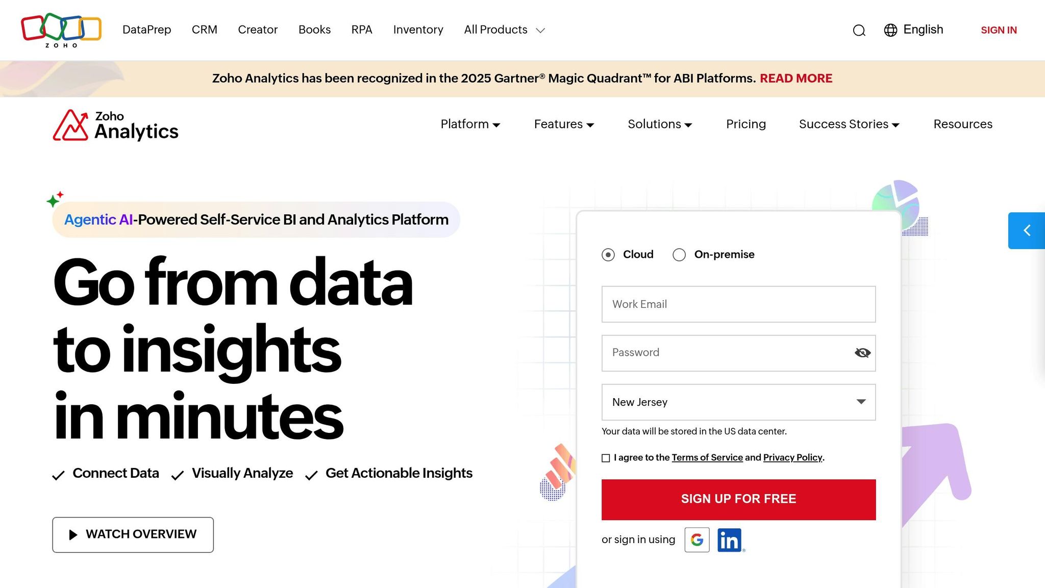
Zoho Analytics stands out with its AI-powered assistant, Ask Zia, offering a fresh way to interact with data using essential features of modern business intelligence tools. This platform merges natural language querying, real-time data updates, and extensive customization to cater to both tech-savvy users and those without technical expertise. With over 50 visualization types and support for up to 10 tabs per dashboard [24][25], Zoho Analytics provides the tools businesses need to craft meaningful, data-driven stories while avoiding common BI dashboard pitfalls.
Natural Language Querying
Ask Zia brings conversational AI into the mix, enabling users to ask questions in plain English and receive instant visualizations. Designed to understand business-specific terms, it can handle complex queries like correlation analysis or trend identification. For instance, a sales manager might ask, "What's the revenue trend in North America this quarter?" and immediately get a detailed graph. Currently, Ask Zia supports three languages - English, Spanish, and French - making it a versatile tool for global teams [31].
Real-Time Data Integration
With its Live Connect feature, Zoho Analytics ensures users work with up-to-the-minute data by directly querying databases, bypassing the need for data imports. It also supports streaming data integration through REST APIs and Google Pub/Sub Push Subscription, making it perfect for monitoring critical, real-time events [29]. Reports refresh every 30 seconds, even handling high-volume data streams [29]. For scheduled updates, the auto-sync feature keeps dashboards and reports aligned with the latest data [27].
"Zoho Analytics integration is very smooth. I found no hindrance while integrating other apps with Zoho Analytics."
Greg Szabo, Co-founder and Operations Manager at Package Mate [27]
Integration with Data Sources
Zoho Analytics excels in connecting to a wide range of data sources. Its Live Connect feature supports major cloud databases like Amazon RDS, Amazon Redshift, Microsoft SQL Azure, Google Cloud SQL, and Heroku PostgreSQL [26][30]. The platform also works with relational and NoSQL databases [27][28]. While Live Connect is exclusive to Premium and Enterprise plans for real-time accuracy, businesses preferring data imports can rely on the auto-sync feature for regular updates.
Customization Capabilities
Zoho Analytics offers a variety of tools to create dashboards that align with a company’s branding and needs. Users can select from six theme layouts - Flat, Border, Top Border, Fill Color, Fill Multicolor, and Top Border Multi-color - and adjust dashboard widths between 797px and 4,000px [24]. Customization extends to interactive features like drill-down charts and filter-enabled reports [24].
Customization Feature | Capability | Business Impact |
|---|---|---|
Theme Options | Solid, gradient, and image themes with custom color schemes | Ensure dashboards reflect brand identity |
Card Styling | Adjust margins, radius, shadow, title, and description | Create polished, professional visuals |
Interactive Elements | Add text, images, and KPI widgets | Highlight important metrics and provide context |
User Filters | Enable dynamic filtering in dashboard view mode | Allow viewers to explore data independently |
Users can also enhance dashboards with contextual elements like text and images, while KPI widgets make key metrics stand out. With 91% of surveyed users recommending Zoho Analytics, its blend of AI-driven querying, real-time updates, and customizable features positions it as a go-to solution for building intelligent dashboards [27].
Feature Comparison Table
Choosing the right AI dashboard tool depends on comparing features like AI capabilities, data integrations, customization options, pricing, and use cases. Here's a breakdown to help you decide:
Tool | Key AI Features | Data Integrations | Customization Options | Pricing (USD) | Ideal Use Cases |
|---|---|---|---|---|---|
Querio | Natural language querying, AI-powered SQL generation, instant visualizations | Snowflake, BigQuery, Postgres (live connections) | Drag-and-drop dashboards, unlimited viewer access, context layering | $14,000/year (Core), +$6,000/year (Dashboards) | Business teams needing plain English data queries without SQL knowledge |
Tableau | AI-powered insights, automated analytics, predictive modeling | 700+ connectors including cloud databases, web services, files | Rich customization with advanced formatting and interactive elements | Creator: $75/user/month, Explorer: $42/user/month, Viewer: $15/user/month | Enterprise users requiring sophisticated data visualization and analysis |
Databox | Automated insight generation, anomaly detection, goal tracking | 100+ integrations with marketing, sales, and analytics platforms | White-label dashboards, custom metrics, mobile optimization | Free tier available, paid plans from $72/month | Marketing and sales teams tracking KPIs across multiple channels |
Klipfolio | Smart alerts, automated reporting, trend analysis | 500+ data sources including APIs, databases, cloud services | Flexible dashboard layouts, custom formulas, branding options | Starting at $20/user/month | Small to medium businesses needing flexible reporting solutions |
Zoho Analytics | Ask Zia AI assistant, natural language queries, automated insights | 250+ integrations, Live Connect for real-time data | 50+ visualization types, theme customization, interactive elements | Free tier, paid plans from $30/month | Global teams requiring multilingual support and comprehensive data analysis |
When selecting a tool, consider your team's technical expertise. Querio and Zoho Analytics are excellent for non-technical users, while Tableau is better suited for advanced needs. Research shows that 73% of businesses face AI solution costs ranging from $25 to $250 per hour for implementation and management, making ease of use a critical factor [32].
The pricing models cater to different markets. For example, Querio's fixed annual pricing appeals to businesses with stable data requirements, whereas Tableau's per-user monthly pricing is ideal for teams with varying access needs.
Customization options also vary widely. Querio simplifies the process with drag-and-drop interfaces, while Tableau and Zoho Analytics offer more advanced formatting and interactive features. Each tool is tailored to specific business needs, whether it's for small teams, global enterprises, or marketing professionals.
This comparison highlights how these tools streamline dashboard creation and empower users to leverage data effectively. Keep reading as we dive deeper into how AI-powered dashboards can transform business operations.
Conclusion
AI-powered dashboard tools have transformed the way businesses turn complex data into meaningful insights. The five tools we’ve explored cater to a variety of business needs, making dashboard data analytics more accessible across different teams.
Here’s a quick recap:
Querio: Makes accessing data easier with plain English queries and live data connections.
Tableau: Speeds up enterprise-level analytics with AI-driven insights, ideal for teams with dedicated data experts [34].
Databox: Brings marketing and sales data together with goal-tracking features and real-time updates [35].
Klipfolio: Helps large companies centralize and standardize metrics for better decision-making.
Zoho Analytics: Delivers multilingual support and advanced BI capabilities through its AI assistant, Ask Zia [34].
Choosing the right AI dashboard tool isn’t just about better visuals - it’s about driving real business impact. Companies that effectively integrate AI into their operations have seen data costs drop by as much as 20% [33]. These dashboards are more than tools; they’re a bridge between raw data and actionable strategies.
FAQs
How do AI-powered tools make dashboards easier to use for non-technical users?
AI-powered tools are making dashboards more accessible for everyone, even those without technical expertise. With features like natural language queries, automated insights, and intuitive visualizations, users can simply type questions in plain English and receive accurate charts or reports instantly - no coding required.
These tools also simplify data analysis by connecting directly to live data sources. This eliminates the hassle of manual data handling or setting up complicated systems. The result? Anyone, no matter their technical background, can dive into data and make informed decisions with ease and speed.
What should I look for when selecting an AI tool to build custom dashboards?
When selecting an AI tool for custom dashboards, it's important to focus on a few key aspects: ease of use, scalability, and integration capabilities. These features ensure the tool aligns with your business requirements. Opt for solutions that seamlessly connect to your existing data sources, offer user-friendly interfaces, and support natural-language queries to deliver quick and actionable insights.
Equally important is prioritizing data security and governance features to safeguard sensitive information and ensure compliance with relevant regulations. Don't overlook the vendor's track record - a reliable provider should offer regular updates and dependable customer support. The right tool should not only simplify complex data analysis but also empower your team to work more effectively.
How do natural language querying features in tools like Querio help business teams?
Tools like Querio make it simple for business teams to uncover insights by using natural language queries. Instead of relying on technical skills like SQL, users can just ask questions in plain English. This removes the technical barrier, opening up data analysis to a much broader audience.
These tools also provide instant visualizations and precise results, enabling teams to make quicker, informed decisions without waiting for help from IT or data specialists. The result? Smoother workflows, better collaboration, and easy access to the insights that matter most.
Related Blog Posts


