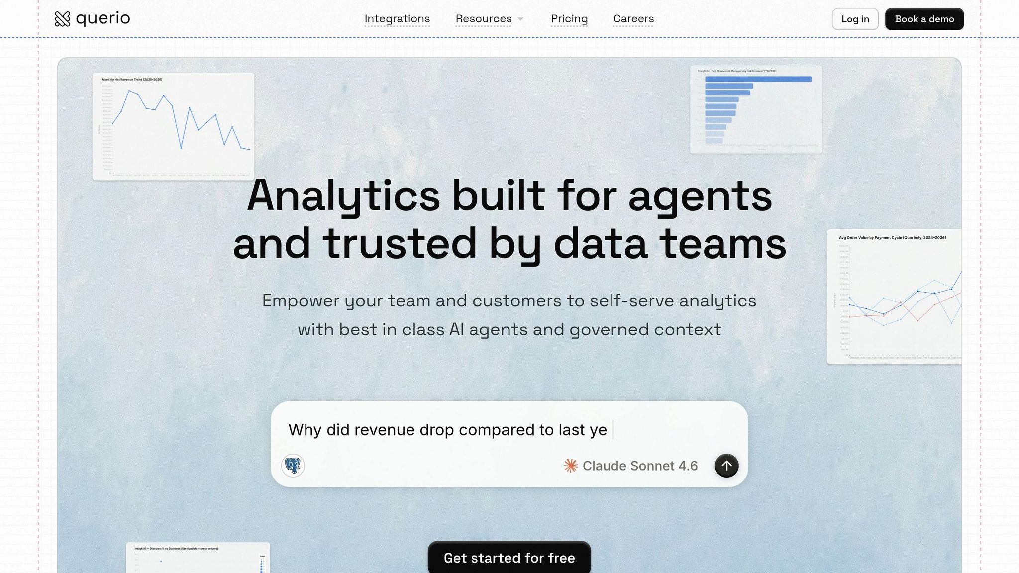
Business Intelligence
Why the best data teams are moving away from centralized dashboards
Static dashboards create delays, inconsistent metrics, and analyst bottlenecks; modern teams use live queries, AI, and semantic layers.
Centralized dashboards were once the go-to solution for tracking metrics, but they’re no longer keeping up with today’s fast-paced business needs. Here’s why data teams are shifting away from them and what they’re using instead:
Outdated Data: Dashboards rely on scheduled refreshes, often showing old information instead of real-time insights.
Rigid Structure: They can’t handle spontaneous questions or adapt quickly to changing business needs.
Bottlenecks: When dashboards fail to provide answers, teams face delays waiting on analysts to create custom solutions.
Inconsistent Metrics: Different dashboards often produce conflicting numbers due to misaligned definitions.
Fragility: Dashboards break when data structures change, slowing down decision-making.
Instead, modern data teams are turning to tools and methods like querying live data directly from your warehouse, AI-powered analytics for instant answers, shared semantic layers to ensure consistent metrics, and collaborative notebooks for deeper analysis. These approaches provide faster, more flexible, and reliable insights, allowing teams to focus on decision-making rather than maintaining outdated systems.
The Core Problems with Centralized Dashboards
They Only Look Backward
Centralized dashboards operate on scheduled refreshes, meaning the data they display is always a step behind. While this works for static reporting, it falls short when real-time insights are needed.
An even bigger limitation is their inability to support open-ended exploration. Dashboards are built to answer the questions you had in mind when creating them - not the spontaneous ones that pop up during, say, a Tuesday product meeting. If someone asks, “Why did conversions drop last Thursday?” the dashboard won’t offer answers. Instead, users are left filing new requests and waiting for updates.
They Create Bottlenecks
When dashboards can’t answer a question, that question turns into a ticket. And those tickets pile up quickly.
"The dashboard along with the analyst (or agency) maintaining it becomes a bottleneck that impedes more discovery. The business folks can point to the dashboard and check off analytics as 'done' while avoiding the deep investment needed to answer second-order questions." - Rajan Desai, CEO/Co-founder, Fulton Ring [5]
Data teams are often stretched thin, juggling demands from multiple stakeholders [6]. This leads to analysts spending their time on repetitive, straightforward requests like, “Can you segment the pipeline data for marketing?” instead of focusing on bigger, strategic goals. The delays that follow force teams to make decisions without the insights they truly need.
They Produce Inconsistent Numbers
If you ask three different teams to define “active users,” you’ll often get three different answers, each tied to its own dashboard. This happens because standardization of data is missing because metric definitions are baked into individual dashboards rather than being standardized in a shared framework. When tools like CRMs, marketing platforms, and data warehouses update at different times or use slightly varied definitions, discrepancies arise [7].
In response, teams create additional dashboards to reconcile the inconsistencies, which only makes matters worse. Over time, trust in the numbers erodes. Executives may even abandon the dashboards altogether, relying instead on gut instincts or personal spreadsheets [8]. As one keynote speaker explained:
"If you don't have good semantics, it's not just three dashboards giving different answers, it's thousands of people getting inconsistent results from LLM queries." - AtScale Product Keynote [1]
These inconsistencies undermine the dashboard’s ability to adapt as the business evolves.
They Break When Business Needs Change
Dashboards are inherently rigid. If the underlying data structure changes - whether it’s a renamed column, a new product line, or a restructured sales territory - dashboards often fail. They either break entirely or silently return incorrect data. Fixing these issues requires developer time, and by the time updates are made, the original business question may no longer be relevant.
This fragility is an often-overlooked downside of relying heavily on dashboards [1]. They’re not just slow to update; they’re unable to keep pace with the rapid changes of today’s business environment. As organizations grow and evolve, dashboards can turn into obstacles rather than assets, making the case for more flexible, real-time analytics tools.
What Modern Data Teams Are Using Instead
Centralized dashboards often highlight structural challenges, but modern data teams have found better solutions. They now rely on live data, AI-powered queries, and shared logic that stays connected to the data itself rather than being locked in a single tool. Let’s dive into these advancements.
Querying Live Data Directly from the Warehouse
Today’s teams access data directly from warehouses like Snowflake, BigQuery, and Amazon Redshift. This method eliminates delays caused by scheduled refreshes and avoids the redundancy of maintaining separate reporting layers. Imagine a scenario where a critical question arises during a Monday meeting - analysts can immediately pull live data for accurate, up-to-date answers. This direct approach solves the lag and duplication issues that plague traditional dashboards.
AI Tools That Answer Questions in Plain English
In the past, traditional BI tools required technical expertise, creating bottlenecks. AI-powered analytics platforms for teams have flipped the script by converting plain-English questions into SQL or Python queries, running them on live data, and delivering clear, inspectable answers - no IT tickets required. Research shows these tools improve end-user efficiency by 27% and data analyst efficiency by 43%, compared to the limited 25% of employees who could access insights in traditional BI systems [9].
"The future of data workflows isn't dashboards. It's decisions." - Michael Hetrick, Director of Product Marketing, Cube [2]
These tools go beyond answering "what happened." They can analyze why metrics shifted and even suggest actionable next steps. Many teams now integrate these tools into platforms like Slack and Microsoft Teams, ensuring insights are delivered where people are already working [4][10].
However, for AI tools to be effective, they need consistent metrics. That’s where shared semantic layers come into play.
Shared Semantic Layers for Consistent Metrics
AI tools are only as reliable as the definitions they rely on. Without a shared semantic layer, different tools or agents can produce conflicting results. For instance, a global logistics company once reported a 6% discrepancy in its on-time delivery metrics (98% vs. 92%) [9]. A shared semantic layer eliminates such inconsistencies by defining key metrics - like revenue, churn, or active users - once and applying those definitions across all tools.
"The semantic layer is the context layer for AI, and putting it inside one BI tool was the original sin." - AtScale [9]
Notebooks for Iterative Analysis
When it comes to complex, exploratory analysis, SQL and Python notebooks provide unmatched flexibility. Unlike dashboards, notebooks allow analysts to test hypotheses, refine their logic, and share findings in a dynamic workspace. Plus, they automatically update as data or logic changes, ensuring insights stay relevant and current.
How Querio Addresses the Dashboard Problem
Querio tackles common issues like outdated data, bottlenecks, inconsistent metrics, and inflexible tools. Its standout features are designed to address these challenges head-on.
Natural Language Analytics with Inspectable Code
Traditional tools often lack transparency, but Querio changes that with natural language analytics. When you type a question in plain English, it generates clear, inspectable SQL or Python code. This approach ensures analysts can verify and trust the numbers they provide. According to Gartner, by 2028, 60% of dashboards will be replaced by AI-powered alternatives [11]. Querio’s transparency builds trust while enabling real-time, secure data connectivity.
Direct Connections to Your Data Warehouse
Querio connects directly to your existing data warehouse - whether it’s Snowflake, BigQuery, Amazon Redshift, ClickHouse, PostgreSQL, or others - using encrypted, read-only credentials. There’s no need to move or copy data. Every query runs on live, up-to-date information, eliminating the need for a separate reporting layer. This ensures your warehouse remains the single source of truth.
A Semantic Layer That Keeps Metrics Consistent
Querio’s semantic layer is where your team can define table joins, business rules, and key terms - just once. These definitions are then applied consistently across all queries, notebooks, and dashboards. For instance, "monthly recurring revenue" will mean the same thing whether it’s being queried by a sales manager or a data scientist. Updates to metric definitions are made centrally and automatically apply across all analyses. Companies using a semantic layer report spending 60% to 70% less time on repetitive data tasks [12], freeing up resources for deeper analysis instead of reconciling spreadsheets.
Reactive Notebooks for Collaborative Analysis
Querio’s notebook environment is built for exploratory, collaborative work - something dashboards can’t easily handle. Analysts can write SQL or Python, test ideas, and refine logic together in a shared workspace. Because these notebooks are reactive, results update automatically whenever the underlying data or logic changes. This ensures findings remain up-to-date during ongoing collaboration. Querio also supports transforming outputs into dashboards or embedded analytics, making it a versatile tool for analysis.
Dashboards and Embedded Analytics as Outputs
In Querio, dashboards are just one of many output options. Governed logic ensures that both live reports and embedded analytics deliver consistent insights. Product teams can use Querio to embed analytics directly into applications via APIs or iframes, extending the same governed logic to customer-facing features. This bridges the gap between internal reporting and external insights, providing flexibility wherever it’s needed.
How to Move Away from Centralized Dashboards
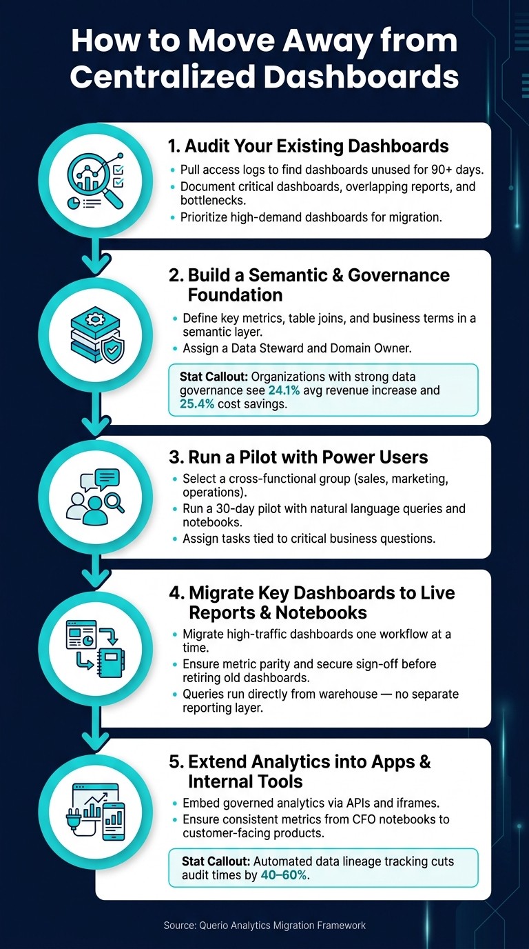
How to Migrate Away from Centralized Dashboards: 5-Step Guide
Transitioning away from centralized dashboards doesn’t have to be an all-at-once transformation. It’s about making deliberate, thoughtful changes that align with the broader move toward AI-driven, real-time analytics. The key is to start with clarity - understand what you already have, establish a strong foundation, and then gradually implement changes.
Step 1: Audit Your Existing Dashboards
Before making any changes, figure out what’s actually being used. Start by pulling access logs from your current BI environment to identify dashboards that haven’t been accessed in 90 days or more. You’ll likely discover that a large portion of your dashboards are outdated or unused. Document the dashboards that are critical for decision-making, note any overlapping reports, and identify those that exist solely because someone once requested them. This process also highlights bottlenecks, such as reports that require constant updates from a single analyst. These high-demand dashboards should be your top priority for migration.
Step 2: Build a Semantic and Governance Foundation
This is where many migrations hit a roadblock. Before moving workflows into Querio, take the time to define key metrics, table joins, and business terms in Querio’s semantic layer. Start small - pick one high-value area like “qualified pipeline” or “signup activation” to keep things manageable. Assign a Data Steward to oversee definitions and a Domain Owner for business accountability. According to research, organizations with strong data governance see an average revenue increase of 24.1% and cost savings of 25.4% [13]. While this step requires upfront effort, it ensures that every query, report, and notebook built on these definitions delivers consistent and reliable results.
Step 3: Run a Pilot with Power Users
Select a small, cross-functional group of users - ideally from sales, marketing, and operations - who regularly face delays waiting for custom reports. Give them 30 days to explore Querio’s natural language BI interface and notebook environment. Assign them tasks tied to critical business questions, such as “What is our win rate by deal size this quarter?” This approach not only showcases the platform’s value but also helps you build internal advocates for the broader rollout.
"For a long time, dashboards were the only place metrics lived. Now that users are asking questions outside dashboards - in Slack, in notebooks, through agents - you need a semantic layer to provide guardrails and scale." - François Lopitaux, SVP, ThoughtSpot [1]
Provide role-specific training to help users frame natural language queries effectively. Restrict view-only access for stakeholders while allowing power users to explore freely. This ensures governance remains intact during the pilot while still allowing progress.
Once the pilot proves successful, the focus shifts to replacing older dashboards.
Step 4: Migrate Key Dashboards to Live Reports and Notebooks
With your semantic foundation established and feedback from the pilot in hand, begin migrating high-traffic dashboards into Querio’s notebooks and scheduled reports. Tackle workflows one by one, ensuring metric parity at every step, and secure sign-off before retiring any old dashboards. This parity check is crucial to avoid any disputes over data discrepancies. Since Querio queries data directly from your warehouse, you won’t have to worry about syncing a separate reporting layer - eliminating a common source of inconsistency.
Once the core workflows are running smoothly, you can expand further.
Step 5: Extend Analytics into Apps and Internal Tools
After migrating your core workflows, take the next step by embedding governed analytics into your apps and tools. Querio’s APIs and embedding capabilities allow you to bring the same trusted metrics into customer-facing products and internal systems. For example, the revenue metric your CFO reviews in a notebook can match the usage chart your customers see in your product - ensuring consistency across the board. Automated data lineage tracking can also cut audit times by 40% to 60% [13], which becomes increasingly valuable as your analytics footprint grows within your applications.
Conclusion: What Analytics Looks Like Without Centralized Dashboards
Centralized dashboards were designed to provide a shared view of key metrics. But as helpful as they seemed, they come with limitations. They focus on past data instead of real-time insights. They create bottlenecks instead of delivering instant answers. And as businesses grow, these dashboards often evolve into a tangled web of conflicting metrics and outdated reports that no one trusts - or even bothers to read.
Modern data teams aren't throwing structure out the window - they're relocating it. As Davorin Gabrovec, Founder and CPO of Databox, explains: "The dashboard is not the product. The semantic layer, the governance, the metric definitions - those are the fundamentals." [3] By centralizing logic within a governed semantic layer, rather than scattering it across countless proprietary files, every tool - whether it's a notebook, an AI agent, or an embedded chart - draws from the same reliable source of truth.
In practice, this shift simplifies workflows. Analysts spend more time on meaningful analysis instead of maintaining outdated reports. Stakeholders get answers in plain, actionable language without having to submit tickets. And metrics remain consistent, whether they're shared in a CFO's notebook, a Slack conversation, or a customer-facing product.
"Dashboards aren't dead, they're evolving. What's dying is the idea that a dashboard is a place you go. In the agentic era, insights come to you." - Southard Jones, Tableau [14]
The five-step migration path discussed earlier isn't about tearing down everything overnight. It’s about making intentional, incremental improvements - auditing existing systems, governing essential metrics, and replacing static reports with dynamic, flexible analytics. Teams embracing this approach aren’t just saving time; they’re creating an analytics system that grows alongside their business and keeps pace with its demands.
FAQs
When should we keep dashboards vs. replace them?
Dashboards are great for offering static, visual summaries of key metrics, making them ideal for operational monitoring and high-level reporting. However, when quick decisions, real-time insights, and agility are priorities, it might be time to rethink your tools.
Dynamic, AI-driven solutions - like Querio - step in to fill this gap. These tools allow for natural language queries, instant access to data, and automated insights, creating workflows that are more flexible and responsive to changing business demands.
What is a semantic layer, and who maintains it?
A semantic layer acts as a contextual bridge for AI, ensuring that data definitions and meanings remain consistent and well-governed. Typically, it's overseen by data teams or professionals specializing in data governance to uphold accuracy and reliability throughout analytics processes.
How do we migrate without breaking current reporting?
To make the migration process seamless, begin by using Querio alongside your current dashboards. This setup lets you keep your existing metrics and reports intact while introducing real-time data connections and natural language queries. Over time, you can gradually shift users to Querio’s more dynamic interface, lessening the dependence on static dashboards. This step-by-step method helps avoid disruptions, maintains workflow continuity, and enriches reporting with AI-powered insights.
Related Blog Posts


