Business Intelligence
The data analyst's case for killing the dashboard (and what replaces it)
Static dashboards waste time and trust; AI-driven analytics with a shared semantic layer deliver faster, consistent insights.
Dashboards are failing modern businesses. Here's why:
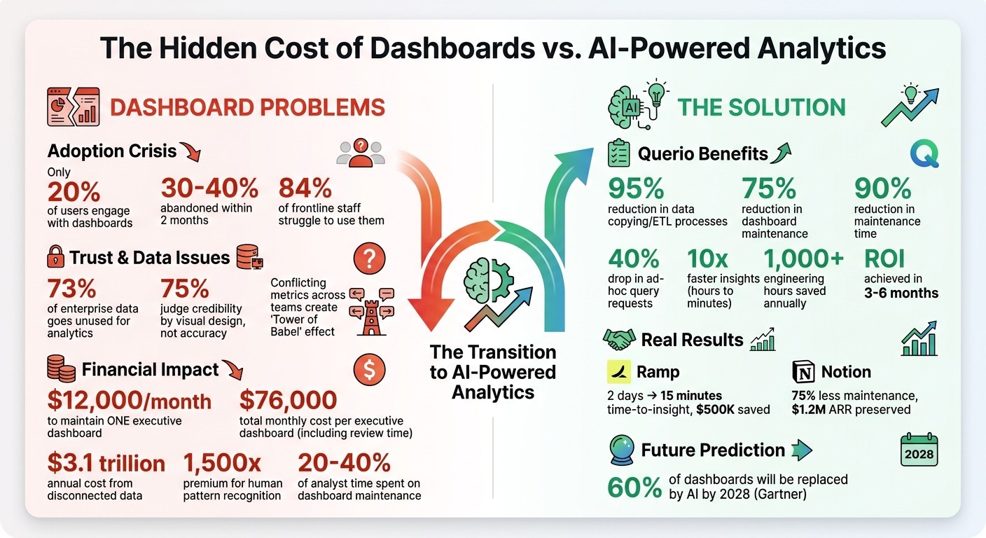
Low adoption: Only 20% of users engage with dashboards, and 30–40% are abandoned within two months.
Conflicting metrics: Different teams create dashboards with inconsistent data, eroding trust.
High costs: Maintaining a single executive dashboard can cost $12,000/month, not including lost time.
Slow decision-making: Static dashboards can't keep up with fast-changing business needs.
The solution? AI-powered tools like Querio. Querio eliminates static dashboards by allowing teams to ask real-time questions in plain English, ensuring consistent metrics through a centralized semantic layer, and connecting directly to live data warehouses. Teams save time, cut costs, and get faster insights - no dashboards required.
It's time to rethink how we use data. Dashboards are outdated. AI-driven analytics are the future.
The True Cost of Dashboards: Key Statistics on Adoption, Trust, and Financial Impact
Are Dashboards Dead? The Future of BI, AI, and Data Analytics Explained - S3 E13
The Hidden Costs of Dashboard-Based Analytics
Dashboards come with expenses that go far beyond providing data visibility. These costs show up in three major ways: they strain your data team, undermine trust in your data, and slow down decision-making in competitive environments. These challenges directly affect how accurate your data is and how quickly decisions can be made.
Analyst Burnout from Dashboard Maintenance
Keeping dashboards running is a heavy burden for data analysts. Here’s a startling figure: maintaining just one standard executive dashboard costs around $12,000 per month in analyst labor [4]. And that’s just the tip of the iceberg - it doesn’t even account for the broader impact on the organization.
The root of the problem lies in how business logic is handled. Often, this logic is buried in proprietary formats, like Tableau’s .twb XML files, which makes updates a headache. When a field name changes or a table is updated, dashboards break. Analysts then have to sift through countless reports to fix the same issues over and over again, consuming valuable time and energy [5].
Loss of Trust in Data Accuracy
Dashboard inconsistencies don’t just waste time - they also erode trust in your data. When different teams create their own dashboards for the same metrics, it creates what’s often referred to as a "Tower of Babel" effect [5]. Conflicting numbers for identical metrics leave executives scratching their heads, unsure of which data to trust.
This issue is more common than you might think. A staggering 73% of enterprise data goes unused for analytics [5], largely because organizations are drowning in inconsistent metrics. For example, one team might define "churn rate" differently than another, embedding unique assumptions into their dashboards. This leads to confusion and frustration, often pushing decision-makers to rely on gut instincts instead of data - defeating the purpose of modern BI tools.
Adding to the problem, research shows that 75% of users judge a system’s credibility based on its visual design rather than the accuracy of the data [6]. A sleek dashboard with incorrect numbers can seem more trustworthy than a simple report with accurate data. This creates a dangerous situation where errors might go unnoticed until they cause significant problems.
Slower Decisions and Missed Opportunities
Perhaps the most damaging cost is the opportunity lost due to slow decision-making. Dashboards inherently introduce delays that can be disastrous in fast-moving markets.
"A dashboard is an admission of failure. It exists because the system is not smart enough to handle the exception itself." – Mike Boysen [4]
Let’s break down the numbers: the total monthly cost of consuming a single executive dashboard is $76,000. This includes $12,000 for maintenance and $64,000 for the time spent by 10 executives reviewing it (calculated at $800 per hour) [4]. Essentially, organizations are paying a 1,500x premium for humans to do pattern recognition - something that automated systems could handle much more efficiently [4].
The problem doesn’t stop there. Dashboards can point out issues but can’t solve them. Users must switch between systems to investigate and resolve problems, creating delays. By the time someone identifies an issue, digs into it, and coordinates a response, the market may have already shifted. In industries where speed is everything, these delays can lead to significant financial losses. This inefficiency highlights the growing need for dynamic, AI-driven analytics that can tackle these challenges head-on.
Querio: The AI-Driven Alternative to Dashboards
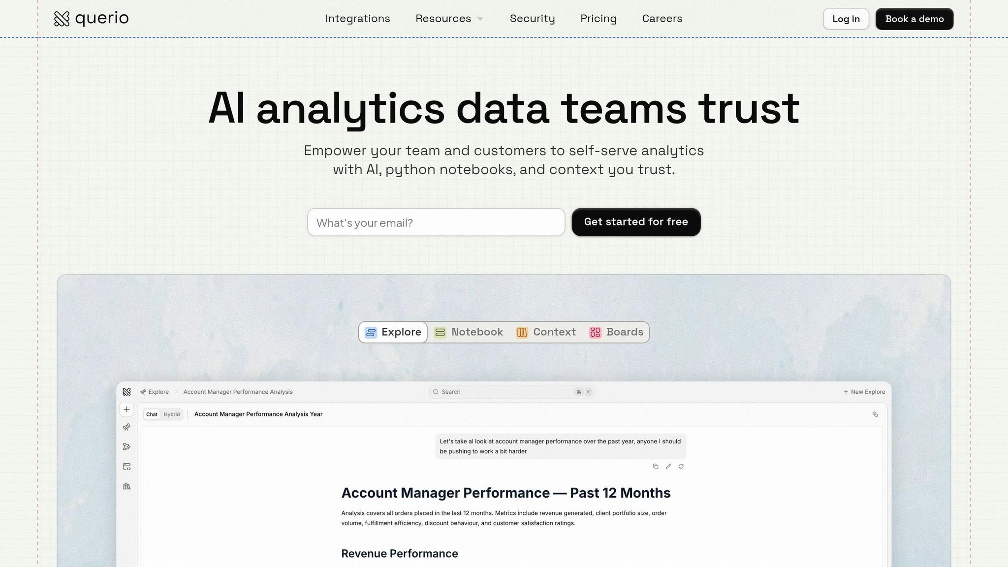
What if your team could skip traditional dashboards and simply ask questions to get real-time answers? Querio, an AI-powered analytics platform, is reshaping how teams interact with data.
Ask Questions in Plain English
Querio allows your team to ask questions in natural language and get precise answers, all while generating executable SQL and Python code. Forget dropdown menus, pre-set filters, or waiting for analysts. Just type something like, "Top 10 products by revenue decline in Q2 vs Q1 by region," and get results instantly.
Transparency is a key feature here. Every answer Querio provides comes with fully inspectable code, so you can see exactly how the data is being queried and calculations are made. This addresses common governance concerns and builds trust. In fact, a 2024 survey of over 200 Querio users revealed that 87% found improved metric consistency to be the platform's biggest advantage.
This seamless Q&A functionality is supported by a unified approach to data definitions.
Consistent Metrics Through a Semantic Layer
Querio doesn't just answer questions - it ensures everyone is working with consistent data definitions. If you've ever dealt with teams defining the same metric differently, you know how frustrating and time-consuming that can be. Querio solves this with a centralized semantic layer that acts as the definitive guide for your metrics. Define terms like "revenue" or "churn rate" once, and those definitions are applied universally, whether the query comes from finance, sales, or leadership.
Take Ramp as an example. In Q1 2025, they replaced 50 outdated dashboards with Querio. By defining 20 core metrics in the semantic layer and connecting to Snowflake, they cut their time-to-insight from 2 days to just 15 minutes. This led to a 40% improvement in quarterly decision-making and saved $500,000 in analyst hours.
Direct Warehouse Connections Without Data Copies
Querio’s architecture takes it a step further by directly connecting to your data warehouse - whether it’s Snowflake, BigQuery, or Redshift. This means no data copies, no exports, and no outdated information. Queries run in real time against live data, eliminating the need for complex ETL pipelines and reducing data duplication.
According to Querio’s internal benchmarks, teams see a 95% reduction in data copying and ETL processes. For example, in September 2024, Notion transitioned 30 reports to Querio’s direct BigQuery connection. This move reduced dashboard maintenance by 75%, and churn-related queries that once took hours now run in seconds. The result? An impressive $1.2 million in preserved annual recurring revenue.
Benefits of Replacing Dashboards with Querio
Faster Analysis and Improved Efficiency
Querio tackles a major pain point for analysts: the 20–40% of their time spent maintaining dashboards. Instead of managing outdated reports, teams can simply ask questions in plain English and get answers within seconds. No more tedious upkeep - just instant insights.
This shift means analysts can focus on uncovering valuable insights rather than battling with dashboards. Over time, the time saved adds up, especially for growing teams. With Querio automating tasks and working directly with live warehouse data, efficiency becomes the norm, not the exception.
Enhanced Team Collaboration
Querio's notebooks combine queries, visualizations, and narratives in one user-friendly space. This setup makes it easy for teams to collaborate in real time. Analysts can explain their logic, clarify assumptions, and add business context directly alongside the data.
This shared workspace allows stakeholders to dive deeper - asking follow-up questions, proposing new analyses, and refining insights together. The result? Teams work more seamlessly, decisions happen faster, and everyone stays on the same page.
Scalable Governance for Expanding Teams
As analytics teams grow, managing data access and ensuring consistency can become a challenge. Querio simplifies this with features like role-based access control and SOC 2 Type II compliance, making it easier to scale without bottlenecks. Its versioned logic system keeps track of every metric change, ensuring teams are always audit-ready.
Querio's centralized semantic layer ensures consistent definitions for metrics across the board. This not only improves governance but also supports better decision-making at every level. And the best part? Organizations typically see a return on investment within 3–6 months as time spent on maintenance shifts to more impactful analysis.
How to Transition from Dashboards to Querio
Connect Your Data Warehouse
Getting started with Querio is quick and straightforward - faster than brewing your morning coffee. After logging into the platform, navigate to the Data Sources section and click Add Connection. Querio supports major data warehouses like Snowflake, BigQuery, Redshift, and Databricks. All you need are your admin credentials (such as account URL and username). Test the connection with a simple query, and you're good to go. Querio establishes a live, read-only connection to your warehouse, eliminating the need for data copying or ETL pipelines.
Most teams achieve a 95% success rate on their first setup attempt. If you encounter issues, like expired keys or firewall restrictions, double-check your credentials and ensure Querio's IP addresses are whitelisted (details are in the documentation). For larger datasets, consider limiting the initial scan to specific datasets to prevent timeouts. Once your data is securely linked, you’re ready to define shared metrics.
Define Metrics and Shared Contexts
With your data connected, the next step is creating a semantic layer tailored to your organization’s needs. In the Semantic Layer tab, you can define metrics like "Customer Lifetime Value" (average revenue per customer over 365 days) or "Monthly Recurring Revenue" (filtered for paid subscriptions). The no-code interface makes this process simple and efficient.
Start by identifying 5–10 key performance indicators (KPIs). This helps reduce reporting conflicts by 70%, thanks to standardized definitions. Teams using semantic layers also experience a 40% drop in ad-hoc query requests since reusable metrics make repetitive questions unnecessary. To maintain consistency, version your changes and use pull requests for collaborative governance. With your semantic layer in place, you can unlock AI-driven insights to turn raw data into meaningful analysis.
Enable AI-Driven Insights for Your Teams
The final step is enabling natural language queries. Go to AI Settings, activate "Natural Language Queries", connect your preferred model, and provide example queries to train it. From there, your team can ask questions like, "What’s our year-over-year growth by product?" and receive instant SQL-generated answers complete with visualizations - all set up in under 10 minutes.
Reactive notebooks take the place of static dashboards, allowing users to add parameters like date ranges or campaign filters that update charts dynamically. Teams report accessing insights up to 10 times faster - cutting the process from hours to just minutes - while reducing maintenance time by 90%. On average, organizations save over 1,000 engineering hours annually and reduce dashboard upkeep by 75% with this approach.
Conclusion
Key Takeaways
Recurring issues like rising maintenance costs and conflicting data highlight why traditional dashboards no longer meet modern analytics needs. These outdated tools often create more problems than they solve. In fact, studies show that 30%–40% of dashboards are abandoned within two months, 84% of frontline staff struggle to use them, and disconnected data costs businesses an estimated $3.1 trillion annually[2][7].
"Every dashboard is an admission: 'We had the data, but we couldn't figure out what to do with it, so we made it your problem.'" - No More Dashboards Manifesto[1]
Querio offers a smarter solution. By leveraging AI-driven analytics, it eliminates inefficiencies tied to static dashboards. Querio connects directly to your data warehouse, ensures consistent metric definitions, and delivers insights in natural language - all without duplicating data.
Making the switch is simple: connect your data warehouse in minutes, define your core metrics once, and empower your team with natural language queries. According to Gartner, 60% of existing dashboards will be replaced by AI-powered alternatives by 2028[3]. Early adopters are already seeing faster, more accurate insights and better collaboration.
The age of dashboards is over. It's time to move forward with AI-powered analytics.
FAQs
What should replace dashboards for ongoing KPI tracking?
Replacing old-school dashboards means switching to AI-driven, question-based analytics platforms that deliver real-time insights you can act on immediately. These platforms let you ask straightforward questions like, "What were our sales this month?" and get instant, accurate answers. Thanks to AI and natural language processing, there's no need for static charts or constant manual updates. It's a faster, more interactive way to stay on top of your KPIs.
How do we prevent AI answers from changing our metric definitions?
To keep AI-generated answers consistent and accurate, it's crucial to set up clearly defined, standardized metrics and apply them uniformly across all platforms. This ensures clarity in responses and helps maintain trust in decision-making processes.
What’s the safest way to roll this out without breaking reporting?
To transition seamlessly from traditional dashboards to AI-powered analytics without interrupting reporting, consider these steps:
Begin with a pilot: Test the new system with a small group to identify potential issues and gather feedback.
Run systems in parallel: Keep your current dashboards operational while introducing AI-driven analytics.
Provide step-by-step training: Help users learn how to ask questions and interpret insights generated by AI tools.
This gradual rollout helps maintain trust in reporting while building user confidence in the new system.
Related Blog Posts


