Business Intelligence
How to Build Customer Dashboards Without a BI Team
Build secure, real-time customer dashboards in minutes with AI — connect live data, standardize metrics, and automate reports without a BI team.
Building customer dashboards without a BI team is simpler than you think. With AI-powered tools, you can create real-time dashboards in minutes using plain English - no coding or IT support required. Here's how to get started:
Define your goals and audience: Focus on 5–7 key metrics tailored to each team's needs (e.g., sales, finance, support).
Connect live data sources: Link directly to platforms like Snowflake or BigQuery for accurate, up-to-date insights.
Ensure data consistency: Use a semantic layer to standardize metrics and avoid confusion.
Leverage AI tools: Generate visualizations by asking questions in natural language and customize charts with drag-and-drop interfaces.
Share and automate: Schedule reports, set alerts, and keep dashboards updated as your business evolves.
AI tools eliminate delays, reduce IT workload, and empower non-technical teams to make data-driven decisions quickly. Ready to transform your approach? Let’s dive into the details!
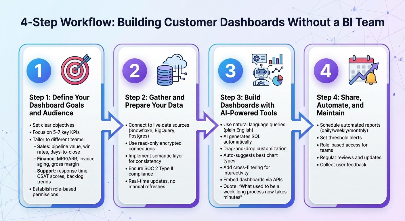
4-Step Process to Build Customer Dashboards Without a BI Team
Create Dashboards in Seconds With AI (It's Mind-Blowing 🤩)
Step 1: Define Your Dashboard Goals and Audience
Start by clarifying what you want your dashboard to achieve. The most effective dashboards address real, actionable questions - like "What is our weekly pipeline by owner?" or "Which customers are at risk of churning?" - instead of just presenting data for its own sake. This focus ensures your dashboard isn't just visually impressive but actually helps teams make informed decisions.
Set Clear Objectives for Your Dashboard
Pinpoint the specific business questions your dashboard needs to answer. Different departments have unique priorities, so tailor your dashboard accordingly. For instance:
Sales teams might track metrics like pipeline value by stage, win rates, and days-to-close.
Finance teams often focus on SaaS metrics like ARR, invoice aging, and gross margin.
Customer support teams care about first response time, CSAT scores, and backlog trends.
Start simple. Your first version should focus on 5–7 key KPIs. You can always expand later with drill-down features that let users explore details without overwhelming the main dashboard. Also, establish role-based permissions early to safeguard sensitive data. This approach creates a single, reliable source of truth, helping teams save time and work more efficiently.
Once your objectives are clear, design the dashboard to meet the specific needs of its users.
Identify the End Users and Their Needs
Different roles require different dashboard views:
Executives need high-level dashboards for quick overviews of business health.
Managers benefit from KPI tracking with filtering options.
Analysts need advanced features to run detailed queries.
For example, a sales rep might need a daily view of their individual pipeline, while the VP of Sales would prefer a weekly summary for the entire team.
Think about how users will engage with the dashboard. Will they check it daily or weekly? Do they need alerts for key metric changes? Are they comfortable with complex data, or would they benefit from simple, clear visualizations? Answering these questions upfront ensures the dashboard becomes a tool for action, not just another unused resource. A great dashboard should seamlessly integrate into your team's decision-making process - not feel like an extra burden.
Next, we’ll dive into how to prepare your data for these dashboards.
Step 2: Gather and Prepare Your Data
Now that you’ve outlined what your dashboard needs to do, it’s time to connect it to your data. Here’s the great news: modern tools make this process a breeze. You can skip tedious CSV exports and avoid relying on IT to set up complex pipelines. Instead, you can link your dashboard directly to your data sources and keep everything updated in real time. This live connection is the backbone of dashboards that are accurate and dynamic.
Connect to Live Data Sources
By using live connections, you’ll always work with the most current data - no manual updates needed. Plus, your original data stays secure. Many AI-powered platforms allow direct connections to cloud data warehouses like Snowflake, BigQuery, or Postgres through secure, read-only links.
The process is straightforward: provide encrypted credentials for read-only access. This approach minimizes security risks and eliminates version-control headaches. With live data, your finance team can monitor revenue as it updates, and your sales team can track deals as they progress - all without waiting for someone to refresh a static report.
Ensure Data Quality and Governance
Connecting to live data is just the first step. If your data isn’t well-governed, you’ll run into problems. For instance, one person’s definition of "active customers" might differ from another’s, leading to conflicting metrics and distrust in the numbers.
This is where a semantic layer comes in. A semantic layer creates consistent business definitions across your organization. It acts as a bridge between raw data and your dashboards, defining how tables relate, what each metric represents, and how calculations are performed. For example, if "Monthly Recurring Revenue" is defined once in the semantic layer, every team - whether sales, finance, or customer success - will use the same formula. This consistency eliminates the frustrating “which number is right?” discussions that waste time and erode confidence in your data.
Accuracy is crucial, but so is security. Choose platforms with SOC 2 Type II compliance and encrypted connections. Role-based access controls are also essential to safeguard sensitive information. Once your data is both connected and governed, you’re ready to create visualizations that turn raw figures into actionable insights.
Step 3: Build Dashboards with AI-Powered Tools
Once your data is connected and properly managed, it's time to start building. AI-powered tools make creating dashboards incredibly fast - what used to take weeks can now be done in minutes. Forget about writing SQL or waiting for developers to interpret your needs. Instead, you can generate visualizations by simply asking questions and arranging them into dashboards that tell a cohesive story. Let’s dive into how simple queries can help you create precise, impactful visualizations.
### Use Natural Language Querying to Create Visualizations
The quickest way to build a dashboard? Just ask for what you need - in plain English. For example, type something like "Show quarterly sales performance by region", and the platform’s AI will handle the heavy lifting, translating your query into SQL behind the scenes. In tools like Querio, fields are highlighted in blue for clarity, while uncertain ones are marked in orange for you to confirm. The system then chooses the best visualization for your data - whether it’s a line chart for trends or a bar chart for comparisons - all without requiring you to configure anything.
Need to tweak the results? No problem. You can refine your data by asking follow-up questions like "Break it down by region" or "Show only the top 5 products." Each query builds on the one before it, letting you explore your data in a conversational, intuitive way.
"What used to be a week-long process now takes minutes." - Jennifer Leidich, Co-Founder & CEO, Mercury
This kind of speed is a game-changer when you need to respond quickly to customer inquiries or make decisions based on up-to-the-minute data. Once your visualizations are ready, you can fine-tune their appearance to match your needs.
Use Drag-and-Drop Interfaces for Customization
Even though AI suggests chart types, you still have complete control over how your visuals look. Want to switch from a bar chart to a pie chart or a scatter plot? It’s as simple as a click. Use the formatting panel to tweak colors, add data labels, adjust axes, or apply filters. Once you’ve created all the charts you need, you can drag and drop them onto a centralized dashboard. The layout automatically adjusts for different screen sizes, ensuring your dashboard looks polished whether it’s viewed on a desktop or a mobile device.
You can also add interactivity to your dashboard with cross-filtering. For example, when someone clicks on a specific data point in one chart, all other charts on the dashboard instantly update to reflect that selection. This dynamic feature allows users to explore data independently, even if they don’t fully understand the underlying structure.
Embed Dashboards for End-User Access
When your dashboard is complete, you can embed it directly into customer-facing applications using embedded analytics tools. This allows you to seamlessly match the dashboard’s colors, fonts, and layout to your existing design system, making the analytics feel like a natural part of your product. To ensure security, use read-only database access, preventing any accidental data changes. This setup gives your customers direct access to insights within your app while keeping strict control over what data they can see.
Step 4: Share, Automate, and Maintain Dashboards
Creating a dashboard is just the first step. To truly make it impactful, you need to share it, automate updates, and keep it relevant as your business evolves. And the best part? You don’t need a dedicated BI team to make this happen.
Automate Reporting and Alerts
Set up automated reports to deliver insights without manual effort. You can schedule dashboards to arrive in your team’s inbox daily, weekly, or monthly - whatever works best for your workflow. Alerts can also be configured to notify you when key metrics hit specific thresholds. This way, your team stays informed in real time without constant oversight. Automation like this streamlines your operations and makes collaboration easier, which leads us to the next point.
Make Dashboards Collaborative
Sharing dashboards across teams is essential for aligning everyone on the same data. Use role-based access to ensure each team sees what’s relevant to them. For example, sales can focus on revenue trends, support can track ticket volumes on a customer experience dashboard, and executives can review high-level summaries - all pulling from the same core data. This kind of tailored access keeps everyone on the same page while respecting data privacy.
Keep Dashboards Up-to-Date
Dashboards aren’t a one-and-done deal. Regular reviews are critical to ensure they still align with your business goals. If you launch a new product feature, for instance, you might want to add metrics to track its adoption. Similarly, if a data source changes, update your connections and double-check your queries for accuracy. Don’t forget to collect feedback from users and make improvements as needed. Keeping your dashboards current ensures that non-technical teams can build a data culture and continue making informed, agile decisions based on reliable data.
Conclusion
Creating customer dashboards without the need for a dedicated BI team is no longer a distant goal - it’s happening now. By following a few key steps, like setting clear objectives, focusing on high-impact KPIs, and automating workflows, you can build dashboards that deliver real-time insights without the usual delays. Clean, well-governed data and tools that support natural language queries allow teams to create visualizations in minutes instead of days, keeping your organization agile and data-focused.
AI-powered platforms like Querio have removed the technical roadblocks that once required skilled analysts. And this newfound speed doesn’t compromise accuracy or security - encrypted connections and read-only access ensure your data stays safe while providing instant access to insights.
The benefits go far beyond just saving time and money. When non-technical teams can create their own dashboards, it transforms your organization into a truly data-driven operation. As Enver Melih Sorkun, Co-founder & CTO of Growdash, puts it:
"It's not just about saving time and money, it's about making data accessible."
This accessibility means sales teams can track revenue trends, support teams can monitor ticket volumes, and executives can review high-level summaries - all without waiting on an overloaded BI team.
Looking ahead, the evolution of smarter, more interactive analytics is changing the game. AI is no longer just visualizing data - it’s offering context, answering follow-up questions, and making dashboards more intuitive. Instead of static charts, you’re engaging in a conversation with your data. This shift is turning analytics into a tool that empowers every team member to make quick, informed decisions, transforming data into a driver of growth.
FAQs
How can AI help create customer dashboards without needing a BI team?
AI-powered tools have made it easier than ever to build customer dashboards, eliminating the need for a specialized Business Intelligence (BI) team. These platforms let users ask straightforward, plain-English questions, instantly understanding the intent and creating clear, actionable visualizations in just seconds. The best part? No coding or advanced technical know-how is required.
These tools also simplify data preparation by automatically spotting and fixing errors, applying governance rules, and keeping dashboards up-to-date in real time. This level of automation not only cuts down on manual work but also ensures that insights remain accurate and reliable. Teams in marketing, sales, and operations can now create and customize their own dashboards, empowering them to make faster, data-driven decisions without having to rely on IT or BI specialists.
How can I ensure my dashboards are accurate and secure?
To build dashboards that are both dependable and secure, start with a solid data governance framework. Assign responsibility for each dataset to specific individuals, ensuring they oversee data quality and approve changes. Maintain consistency by using a centralized data catalog that documents crucial details like metadata, data lineage, and business definitions. This approach ensures everyone relies on a single, shared source of truth. To keep metrics reliable, enforce data-quality rules such as validation checks and standardized formats.
When it comes to security, role-based access controls (RBAC) are a must. Limit user permissions to only what’s necessary, reducing the risk of unauthorized access to sensitive data. Leverage automated tools to monitor compliance, audit data usage, and flag any potential violations. Regularly review access permissions, data quality, and governance policies to identify and resolve issues proactively. Finally, encourage collaboration and educate your teams about consistent data definitions and security protocols. This helps both business and technical users stay aligned and informed.
How can I tailor dashboards for different user roles?
When tailoring dashboards for various user roles, the first step is identifying the specific questions each role needs answered. For instance, a sales manager might focus on pipeline health, while a support lead could prioritize ticket resolution trends. With Querio, creating dashboards for different roles is straightforward. Using drag-and-drop tools, you can add charts, tables, or KPI cards - no coding required. You can even adjust colors, chart types, and labels to match your brand and audience preferences.
Role-based access controls ensure that users only see the data relevant to their role. Permissions can be configured at multiple levels - dashboard, page, or individual widget. For example, a finance analyst might need access to cost details, while a marketer focuses on campaign metrics. You can also save custom views filtered by department, region, or time period, allowing users to switch perspectives instantly. Plus, AI-powered natural language queries make follow-ups a breeze. A user could ask, "What was last month’s churn rate for enterprise customers?" and the dashboard will adjust automatically to provide the answer.
To improve usability, consider embedding role-specific guidance, such as explanatory text, tooltips, or even video snippets. Adding collaboration features like commenting or sharing enables teams to discuss insights directly within the dashboard. With these tools, you can create dashboards that are both personalized and actionable for every stakeholder - no BI team required.
Related Blog Posts