Business Intelligence
Low-Code & No-Code Data Analysis Tools for Non-Engineers
Compare 10 no-code/low-code analytics tools and learn why governance, metric layers, and permissions determine true self-serve.

Most no-code analytics tools are only self-serve after a data team sets the rules. If you work at a 100–500-person B2B SaaS, healthcare, or finance company, the main question is not “Can people click around without SQL?” It’s “Can they get the right answer without breaking metric rules or access rules?”
Here’s the short version:
- I’d judge these tools on governance first, not ease of use.
- The list covers 10 tools: Querio, Sigma, Google Sheets + Connected Sheets, Power BI, Tableau, Looker Studio, Metabase, ThoughtSpot, Qlik Sense, and Zoho Analytics.
- The key checks are simple:
- Business-question coverage: what non-engineers can answer on their own
- Governed metrics: whether revenue, pipeline, churn, and KPIs stay consistent
- Permissions: whether row-level and role-based access stay tied to the warehouse
- Data-team work: how much setup analysts or BI teams still need to do
- The pattern is clear:
- Sigma fits spreadsheet-heavy finance and ops teams
- Power BI fits Microsoft-heavy reporting
- Looker Studio fits Google-heavy marketing teams
- ThoughtSpot fits search-style Q&A on curated data
- Querio fits warehouse-native teams that want governed chat-style analysis with inspectable SQL and Python
In plain English: the tool UI matters less than the metric layer underneath it. If that layer is messy, “self-serve” often turns into analyst cleanup, broken KPIs, and access risk.
Quick Comparison
::: @figure 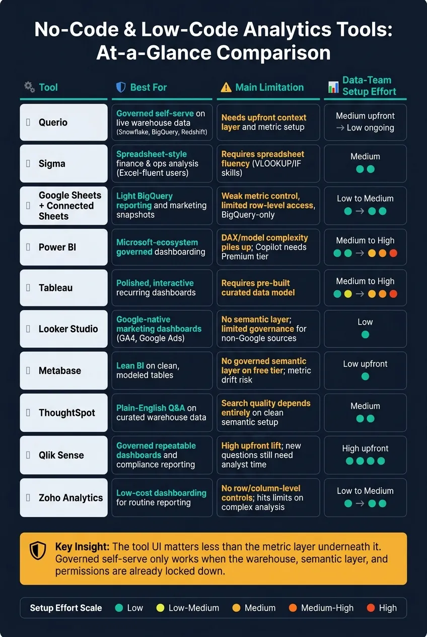 {No-Code Analytics Tools Compared: Governance, Setup & Best Fit}
:::
{No-Code Analytics Tools Compared: Governance, Setup & Best Fit}
:::
| Tool | Best for | Main limit | Data-team work |
|---|---|---|---|
| Querio | Governed self-serve on live warehouse data | Needs setup for context and metrics | Medium upfront, low after |
| Sigma | Spreadsheet-style finance and ops analysis | Works best for Excel-fluent users | Medium |
| Google Sheets + Connected Sheets | Light BigQuery reporting | Weak metric control and limited access control | Low to medium |
| Power BI | Microsoft-based dashboarding | Model and DAX work can pile up | Medium to high |
| Tableau | Polished dashboards | Depends on curated data sources | Medium to high |
| Looker Studio | Google marketing dashboards | Light governance | Low |
| Metabase | Lean BI on clean tables | Free tier lacks governed metric layer | Low upfront |
| ThoughtSpot | Plain-English Q&A | Search quality depends on clean semantic setup | Medium |
| Qlik Sense | Repeat reporting and fixed dashboards | Less suited for open-ended analysis | High upfront |
| Zoho Analytics | Low-cost dashboarding | Hits limits on deeper analysis and access control | Low to medium |
If you want the fastest takeaway, here it is: non-engineers can do more on their own only when data models, KPI definitions, and permissions are already locked down. That’s the thread running through every tool in this guide.
1. Querio
Querio lets non-engineers ask warehouse questions in plain English and get governed answers from live Snowflake, BigQuery, Redshift, Postgres, or ClickHouse data - without exporting CSVs. Every answer comes back with inspectable SQL and Python in a reactive notebook, plus charts that change as the logic changes. [8]
That sounds great on paper. But the part that matters is simple: how far can non-engineers go on their own before the data team has to jump in?
Business-Question Coverage
An operations manager can ask about churn, revenue, or monthly trends in Slack, Teams, or the web app and get a chart or a written answer back. Follow-up questions - like breaking results out by region - stay in the same thread. [8]
So this isn't just a one-shot prompt box. It works more like a running conversation, which makes it easier for business users to keep digging without starting over each time.
Governed Data Access
Querio uses a context layer over live data to keep metric definitions consistent. [7] [8] Trusted queries live as SQL, Markdown, and Python files synced to GitHub alongside dbt. The agent can suggest new definitions based on usage patterns, but a human has to approve and commit them before they go live.
That setup gives teams a clear review step. In plain terms, Querio can suggest, but it doesn't get the final say.
That governance only works if access stays aligned with warehouse roles.
Permissioning and Control
Querio uses warehouse-inherited, role-based permissions, so users only see the data their warehouse access already allows. [8] Slack and Teams queries run under each user's credentials through OAuth. Querio supports SOC 2 Type II and HIPAA with BAAs available.
That's a big deal for teams that don't want a chat tool quietly creating a second access model off to the side. The system sticks to the rules already set in the warehouse.
Even with that control in place, the first rollout still depends on data-team setup.
Data-Team Lift
A data team still connects the warehouse, defines the first metrics, and reviews generated SQL before rollout. After that, routine questions from operations, marketing, and finance can be handled without analyst help.
| Area | What non-engineers can do solo | Where analysts still help |
|---|---|---|
| Ad-hoc questions | Ask in plain English in Slack, Teams, or the web app | Initial context layer setup and metric definitions |
| Answer review | Read the generated SQL and Python | Validate complex logic before it becomes trusted |
| Dashboarding | Build dashboards from notebook output | Define joins and relationships in the context layer |
| Permissions | Use existing warehouse permissions | Configure roles and governance rules |
For smaller teams, price may come into play, but seat limits won't. Querio has a free plan with unlimited users, unlimited data connections, and 500 AI credits a month. Core is $2,499/month (or $25,000 a year billed annually) with 10,000 AI credits a month. The MCP server is included on every plan, and API access comes with Core.
2. Sigma
Sigma takes a spreadsheet-style path to analytics. Business users work in a familiar grid that connects to live warehouse data, so they don't need to write SQL. For finance and operations teams that already spend their day in spreadsheets, that feels far more natural than tools built around more technical logic.
The bigger issue is governance. A spreadsheet-first setup can feel easy at the start, but once several teams depend on the same metrics, the setup has to stay controlled and consistent.
Business-Question Coverage
Sigma lets spreadsheet-fluent users filter, pivot, and calculate straight from live Snowflake, BigQuery, or Databricks data. It tends to work best for finance and operations teams that already know Excel-style logic. If someone is comfortable using formulas like VLOOKUP and IF, they can dig into questions such as "Why did pipeline conversion drop last quarter?" without much friction.
Users who don't have that spreadsheet background usually hit limits much sooner. So while Sigma lowers the barrier for one group, it doesn't remove it for everyone.
Governed Data Access
Its semantic layer keeps revenue, pipeline, and margin definitions consistent across reports and departments. That matters most when sales, marketing, and finance are all using the same warehouse and need confidence that the numbers mean the same thing.
Without that shared layer, two teams can look at the same dashboard topic and still walk away with different answers. Sigma is built to reduce that problem.
Permissioning and Control
Sigma inherits warehouse governance and uses user-attribute row-level security to keep access aligned with Snowflake or BigQuery permissions.
That means teams don't have to rebuild access rules from scratch inside the BI layer. The tool follows the rules already set in the warehouse, which helps keep control tighter as usage grows.
Data-Team Lift
The data team still has real setup work to do. They need to connect sources, model raw data, and define core metrics in the semantic layer before non-technical users can self-serve. That includes standardizing joins, metric definitions, and access rules.
Once that base is in place, business users can build and share workbooks, answer new questions, and maintain exploratory analysis with less day-to-day help. But if the data layer is messy or not modeled well, non-engineers usually can't move forward on their own.
That split - self-serve analysis for business users, analyst-owned modeling underneath - is what decides whether Sigma holds up across teams.
| Area | What non-engineers can do solo | Where analysts still help |
|---|---|---|
| Ad hoc analysis | Filter, pivot, and calculate with Excel-style formulas | Model raw data and shape key datasets |
| Metric consistency | Use certified KPIs from the semantic layer | Define and maintain those KPIs upfront |
| Access control | Work within existing warehouse permissions | Configure row-level security and user attributes |
| Workbooks | Build and share workbooks independently | Set up underlying data connections and metric definitions |
Sigma is a strong fit for finance and operations teams that are already Excel power users. For teams without that background - or without a well-modeled data layer underneath - the no-code promise gets a lot harder to pull off.
3. Google Sheets + Connected Sheets
Google Sheets is often the fastest, most familiar place to start with light analysis. Add Connected Sheets, and you get live access to BigQuery. That setup works well for simple reporting, but it doesn't go far enough for governed BI.
For weekly sales summaries, marketing snapshots, and budget-vs.-actuals tracking, the workflow is smooth when the data already sits in BigQuery, GA4, or Google Ads. That's the appeal: open a spreadsheet, pull in data, and get moving. But that ease starts to fade when metric definitions and access control need to stay locked down.
Business-Question Coverage
Connected Sheets does a solid job with simple reporting. A marketing analyst can pull Google Ads spend, combine it with BigQuery conversion data, and build a weekly performance report without SQL [1].
The cracks show up pretty fast once the work gets more involved. Sheets lives at the spreadsheet layer. It doesn't define joins, metrics, or relationships [2][3]. So if the question is simple, you're fine. If it needs multi-step logic or shared business rules, things can get messy.
Governed Data Access
Google Sheets doesn't have a semantic layer. That means revenue and other KPIs can drift from one sheet to the next. Connected Sheets can pull data from BigQuery, but once the analysis moves into the spreadsheet, governed metric definitions don't come along for the ride [2][3].
So yes, Sheets is useful for analysis. It's just not the place to govern shared business definitions.
There's another catch. If your team runs on Snowflake, Redshift, or Postgres, there's no native connection here without extra tooling [1][3].
Permissioning and Control
Permissions follow Google Workspace sharing rules. That's easy to understand, which helps. But row-level security is limited, and that makes sensitive reporting harder to manage [1][2].
Data-Team Lift
The setup feels light only if the source data is already modeled. If it isn't, the data team still has to prebuild joins, metrics, and clean source tables before business users can do much with it [1][2].
In other words, Sheets works best as the final reporting layer sitting on top of warehouse data that's already been modeled and cleaned.
| Area | Works well | Watch out for |
|---|---|---|
| Ad hoc reporting | Simple filters, pivots, and formulas on clean data | Complex joins or multi-source analysis |
| Metric consistency | Familiar formulas for one-off calculations | No semantic layer; definitions can drift across sheets |
| Access control | Easy sharing within Google Workspace | Limited row-level security |
| Warehouse connection | Live BigQuery access via Connected Sheets | No native support for Snowflake, Redshift, or Postgres |
That makes Sheets a good fit for light reporting. But if your team needs governed metrics, tighter permissions, or support beyond BigQuery, this setup starts to feel a bit like duct tape on a growing system.
4. Power BI
Power BI is a strong fit for Microsoft-first teams that want governed dashboards without leaning on SQL. The interface feels a lot like Excel, so business users can get started faster. But that’s not the hard part. The harder question is what happens after people begin editing reports on their own - and whether the numbers still stay under control.
Business-Question Coverage
Power BI works well for recurring dashboards and standard business questions like MRR, weekly sales, and finance KPIs [6]. Its drag-and-drop builder and Copilot make it easier for non-engineers to create reports and draft DAX.
That said, there’s a line. Once someone needs to go past a set report or dig into a less familiar question, DAX or SQL usually comes into play. And if users want to move beyond certified datasets, they often need an analyst to step in.
Governed Data Access
If your team cares about repeatable numbers, the semantic model matters more than the interface. Power BI is at its best when it sits on top of certified datasets and row-level security. That setup gives business users one source of truth for finance, HR, and executive reporting.
The tradeoff is the setup work. A data or BI engineer still has to connect the source systems, define the core metrics, and keep the DAX logic in shape over time.
Permissioning and Control
Power BI connects with Azure AD, which makes access control pretty straightforward for IT teams [5]. That’s a real plus for companies already standardized on Microsoft Fabric.
Licensing is where things can get messy. Sharing reports outside the organization can add complexity, especially once different license tiers enter the picture [1] [5].
Data-Team Lift
Power BI can support self-serve reporting, but only after a BI engineer defines the model first [1]. In plain terms, business users do better with curated datasets than with direct access to the raw warehouse.
That creates a clear split:
- Business users can build and use reports inside the approved model
- The BI team still owns the data model, metric logic, and DAX upkeep
| Area | Works well | Watch out for |
|---|---|---|
| Recurring dashboards | KPI cards, executive summaries | Exploration beyond certified datasets |
| Governed metrics | Certified datasets, RLS via Azure AD | Requires ongoing DAX maintenance |
| Connectors | Broad connector support (160+) | Requires BI engineering |
| Copilot | Report generation and DAX drafting | Requires Fabric F2+ or Premium P1+ capacity; adds about $30 per user per month [3] [6] |
Without a clean model, Power BI tends to magnify reporting inconsistency.
5. Tableau
Tableau shines when you need polished, interactive dashboards. But the “no-code” pitch can be a bit much unless the data team has already set up a curated warehouse layer. For non-engineers, the real question is simple: can Tableau deliver governed metrics without pulling the data team into every single request?
Business-Question Coverage
Tableau handles recurring reporting well. Pulse can send metric updates to stakeholders, and Einstein AI can help with natural-language exploration. But there’s a catch: answer quality depends on a curated data model.
Governed Access and Permissions
Tableau’s governance model is built around published data sources, certified datasets, RBAC, and row-level security [1][4]. That gives business users a steady view of core metrics, as long as the data team has already defined the KPI logic. In practice, this setup works best when deployment and access rules stay in sync. Tableau supports both Cloud and Server deployments, which gives enterprise teams room to choose how data is accessed and managed. Business users are still working from definitions the data team has already published.
Data-Team Lift
Tableau still needs BI ownership for modeling, SQL, setup, and ongoing maintenance. Without BI support, teams often hit a wall as soon as they need new models or metric changes. So Tableau works well as a consumption layer, but it’s not the best place to start if you want raw-data self-serve analytics.
| Area | Works well | Watch out for |
|---|---|---|
| Recurring dashboards | Executive summaries and operational monitors | Ad-hoc exploration beyond certified datasets |
| Governed metrics | Published sources, certified datasets, RBAC, and RLS | Needs upfront semantic-layer work |
| AI features | Tableau Pulse and Einstein AI | Still depends on a structured data model |
Tableau is a strong fit for teams that already have a mature data function and want a governed consumption layer for business users. It’s a tougher fit for lean teams expecting true self-serve analytics right out of the box.
6. Looker Studio
Looker Studio is a free, browser-based dashboard tool. It works best for teams already using GA4, Google Ads, Search Console, BigQuery, and Google Sheets. You can build a stakeholder dashboard the same day without SQL, which is a big plus for fast reporting. But if your team needs governed analysis by non-engineers, this tool starts to hit a wall.
Business-Question Coverage
Looker Studio is a good match for marketing dashboards. It handles campaign performance, channel reporting, ecommerce snapshots, and weekly traffic summaries well [1][2]. If the question gets more involved, though, things get shaky. Complex joins, multi-source blending, and deeper analysis are where it tends to struggle.
Governed Data Access
Looker Studio is a visualization layer, not a modeling layer [2][4]. That means governance needs to happen upstream in BigQuery or your source warehouse. The tool can’t handle heavy transforms or complex modeling on its own [2][4]. Put simply, the warehouse owns the business logic, and Looker Studio just shows the output.
Permissioning and Control
Sharing is easy and familiar, with link-based access [1][4]. That makes collaboration simple. The trade-off is that access control is pretty basic. Looker Studio does not offer centralized metric definitions, row-level access, or upstream modeling. It’s built for dashboarding. If you need centralized modeling with LookML, that’s what Looker is for [7].
Data-Team Lift
Setup is light when your data is clean and already sits inside Google-native sources [1][4]. That’s where Looker Studio feels almost plug-and-play. The workload climbs fast when data is messy or when you bring in systems like Salesforce or Postgres through paid connectors [1][3].
| Area | Works well | Watch out for |
|---|---|---|
| Google-native reporting | GA4, Google Ads, BigQuery, Google Sheets | Non-Google sources may require paid partner connectors |
| Sharing and access | Simple link-based collaboration | Limited enterprise governance |
| Setup simplicity | Free, browser-based, quick for stakeholder dashboards | Source data must be cleaned upstream |
| Data modeling | Basic dashboards on pre-formatted data | Cannot do heavy modeling or complex transforms in-tool |
Looker Studio fits marketing reporting and lightweight operational reporting well when your stack already leans on Google tools. For warehouse-backed teams, the main limit is governance. It can show the numbers, but it can’t enforce the metric layer behind them [2][4]. The next step is a tool that keeps the ease of use but adds stronger governed self-serve.
7. Metabase
Metabase is an open-source BI tool with a free self-hosted version. Its visual query builder lets non-engineers filter, group, and measure data without writing SQL. It also includes an X-ray auto-insight feature that creates starter insights from a dataset. For lean teams, the big issue isn’t getting the first dashboard live. It’s keeping metrics consistent after that first dashboard starts spreading across the company.
Business-Question Coverage
For routine reporting, Metabase does a solid job. Weekly sales totals, funnel snapshots, and campaign results are all squarely in its comfort zone. If your team mostly needs quick answers from clean tables, it can feel refreshingly simple.
The friction shows up when questions get more layered. Multi-step calculations, joins across sources, or analysis on unmodeled raw tables often push people toward SQL-based saved questions or analyst-built models. That setup can work fine for routine reporting, but the output still depends on the warehouse model underneath.
Governed Data Access
The free tier does not include a governed semantic layer. So if you want KPI consistency, you’ll need dbt or another upstream modeling layer doing that work before the data reaches Metabase.
For teams using Snowflake, BigQuery, Redshift, or Postgres, that means Finance, Sales, and Marketing need the same revenue and pipeline definitions built upstream. Otherwise, “self-serve” can turn into each team reading the same data in a different way.
Permissioning and Control
The free plans include basic access controls. That may be enough for a small group with simple needs.
But row-level and column-level controls are only available on paid plans. That makes Metabase workable for smaller teams, though tougher to govern once more people need shared access to the same warehouse.
Data-Team Lift
Setup is fast when warehouse tables are already clean and modeled. That’s one of Metabase’s main draws: you can get from zero to dashboards without a long setup cycle.
The ongoing lift is less about setup and more about keeping metric definitions aligned across teams. Without steady models upstream, dashboard numbers start to drift. And once that happens, trust drops fast.
| Area | Works well | Watch out for |
|---|---|---|
| Business-question coverage | Routine dashboards, simple filters, quick snapshots | Joins across sources and unmodeled raw tables push users toward SQL |
| Governed data access | Works with Snowflake, BigQuery, Redshift, and Postgres | No governed semantic layer in the free tier; consistency depends on upstream modeling |
| Permissions | Basic access controls available | Row-level and column-level controls require paid plans |
| Data-team lift | Low setup cost for clean, modeled data | Metric drift risk grows without centralized definitions |
8. ThoughtSpot
ThoughtSpot's Sage lets people ask questions in plain English and get back charts or tables. That can cut down on repetitive analyst requests. For operations, finance, and marketing teams, it tends to work best when the warehouse already has trusted definitions and the main goal is fast self-serve Q&A. The tradeoff is simple: search is only as good as the governed model behind it.
Business-Question Coverage
ThoughtSpot fits ad hoc analysis well. Think weekly sales performance, pipeline changes, and campaign ROI. [1]
The weak spot is trust. If field names are vague or KPI definitions vary from one team to another, natural-language search can return answers people hesitate to use. [1]
Governed Data Access
This comes down to the semantic layer. Before non-technical users can dig in on their own, the data team needs to define metrics, standardize field names, and set row-level and column-level access rules. In plain terms, that usually means mapping Snowflake, BigQuery, Redshift, or Postgres tables into business-friendly worksheets. [1] [3]
Permissioning and Control
ThoughtSpot includes enterprise controls like rule-based row-level security and column-level masking. Admins can manage access at the table, row, and column level. [3]
Data-Team Lift
There is real setup work here. Defining worksheets, cleaning schemas, and lining up KPI names takes time. But that's the tradeoff: more work up front, fewer analyst tickets later. Once the setup is done, ThoughtSpot can handle a steady flow of one-off questions that would otherwise land on the data team's desk. [1]
Essentials starts at $25 per user per month, Pro starts at $50 per user per month, and Enterprise uses custom pricing. [6] [8]
| Area | Works well | Watch out for |
|---|---|---|
| Business-question coverage | Ad hoc analysis, recurring KPI questions, slicing metrics by region or time | Result quality drops if metric definitions or field names are inconsistent |
| Governed data access | Consistent answers from curated worksheets mapped to warehouse tables | Needs a clean semantic model before non-technical users can self-serve |
| Permissions | Rule-based row-level security and column-level masking | Governance setup takes time and coordination |
| Data-team lift | Cuts repetitive analyst requests after setup | Initial modeling and cleanup are a meaningful project |
9. Qlik Sense
Qlik Sense is a BI platform built for governed, repeatable dashboards. It fits teams that care more about business intelligence reporting than open-ended analysis. Business users can check approved dashboards on their own, but when they need new metrics or a different view, they’ll still lean on analysts. For non-engineers, that usually means steady access to trusted reports, not free-form digging.
Business-Question Coverage
Qlik works best when the question is already known and needs to be answered the same way every time. It’s a strong choice for executive-summary dashboards, KPI tiles, compliance reports, and weekly operations monitors [6]. If your finance team checks MRR every Monday, or your ops lead looks at pipeline health each morning, a curated Qlik dashboard can handle that with little drama.
It’s less suited to one-off investigations. Those often need analyst support to adjust the data model or build a new view.
Governed Data Access
Qlik’s semantic layer helps keep metric definitions consistent across finance, sales, and operations.
Permissioning and Control
Access controls are set at the report and dashboard level [6]. That makes Qlik a good fit for compliance and audit reporting, where access often needs to stay tightly scoped.
Data-Team Lift
The upfront lift is high. Engineers prep the data, analysts model it, and then they build the dashboards before business users ever log in [6]. That tradeoff can pay off for standing views that people check again and again.
But there’s a catch: new questions still need analyst time. If old dashboards pile up, things can get noisy fast. It helps to remove unused dashboards so people can spot the reports that still matter.
| Area | Works well | Watch out for |
|---|---|---|
| Business-question coverage | Repeating KPI questions, executive summaries, compliance reporting | One-off investigations outside prebuilt dashboards require analyst help |
| Governed data access | Semantic layer keeps metric definitions consistent across the organization | Definitions need to be maintained centrally |
| Permissions | Report- and dashboard-level access controls | Governance is strongest for consumption, not free-form exploration |
| Data-team lift | Reliable once dashboards are built | High upfront effort; new questions still require analyst work |
10. Zoho Analytics
Zoho Analytics is a lower-cost self-service BI tool for teams that want basic dashboards without a lot of BI setup. Its spreadsheet-style interface feels familiar to Excel users, which helps finance, marketing, and operations teams get started with less ramp-up time [2]. In practice, Zoho is a stronger fit for teams that need fast dashboards than for teams that want to dig deeply into the data. The main question is how far business users can get on their own before they need help from an analyst.
Zoho still relies on upstream modeling for shared revenue and pipeline definitions. Without that base, it gets hard to keep metrics aligned across finance, sales, and operations.
Business-Question Coverage
Zoho does a solid job with routine reporting, like weekly sales performance, campaign ROI, and business-health monitoring. That makes it a good match for recurring weekly reporting, but not as strong for open-ended analysis. Once questions get more complex, or the data model needs changes, the tool can feel less flexible. It's a better match for teams with repeatable questions than for teams doing broad investigation.
Governed Data Access
Zoho supports role-based permissions and self-service dashboarding, but its governance model is lighter than what teams with governed metrics layers usually need. It can display dashboards, but shared metric definitions still need to be managed upstream. If a company wants one definition of revenue across finance, sales, and operations, it still needs a governed semantic model.
Permissioning and Control
Role-based access works for department-level sharing, but it doesn't offer the deeper row-level or column-level controls that larger teams often need.
Data-Team Lift
Zoho has a lower upfront modeling burden, but more complex reporting tends to hit its limits sooner. That's the tradeoff at the center of this comparison: light dashboarding is easier to start with, but governed self-serve holds up better as complexity grows.
| Area | Works well | Watch out for |
|---|---|---|
| Business-question coverage | Weekly sales, campaign ROI, pipeline monitoring | Less flexible for exploratory or complex analysis |
| Governed data access | Self-service dashboarding with role-based permissions | Shared metric definitions still need upstream governance |
| Permissions | Department-level access controls | No row- or column-level controls |
| Data-team lift | Low upfront modeling burden | Scaling limits appear as complexity grows |
Pros, Cons, and Limits by Tool Type
No-code analytics usually means less SQL for business users, not zero work for the data team.
That distinction matters. A tool can look easy in a demo, then slow down the moment someone needs a metric definition, row-level permissions, or a join that isn’t already set up. The real test is how far a non-engineer can get alone across weekly sales reporting, marketing analysis, and business-health monitoring before an analyst still has to step in.
The four patterns below make that tradeoff easier to see. Some tools give business users more room to work on their own. Others still depend on the data team to own the metric layer from the start.
Visual builders like Tableau and Power BI are usually the most flexible option for polished, recurring dashboards.
AI chat-to-data tools like ThoughtSpot often look the most self-serve in a demo because users can ask questions in plain English. But that ease depends a lot on what’s happening under the hood.
Spreadsheet-connected tools like Sigma sit in the middle, especially for finance and operations teams that already live in Excel. That said, they still assume spreadsheet fluency, including formulas like VLOOKUP and IF.
Guided analytics and KPI dashboards are the easiest to use for recurring reporting. The catch? They hit a wall fast when someone needs to dig into why a metric moved.
The table below turns those patterns into a quick decision guide.
| Tool | Strengths | Where It Breaks Down | Analyst Support Still Needed |
|---|---|---|---|
| Querio | Governed context layer, inspectable SQL/Python, reactive notebooks, live warehouse connections | Initial context-layer setup | Moderate upfront for context and definitions |
| Sigma | Excel-like interface, live warehouse access, strong for finance/ops | Requires spreadsheet fluency | Warehouse setup and data modeling |
| Google Sheets + Connected Sheets | Familiar for spreadsheet users, live access to warehouse data | Manual sharing controls and limited governance | Connection setup and data prep |
| Power BI | Deep modeling, enterprise governance, strong permissions | Higher learning curve and setup effort | Modeling, semantic setup, ongoing maintenance |
| Tableau | Polished visuals and flexible dashboarding | Requires a pre-built model for dependable ad hoc use | Data source setup, calculated fields, governance |
| Looker Studio | Fast for Google-native data | Less capable for heavier governance and non-Google sources | Connector setup and data prep |
| ThoughtSpot | Fast plain-English querying | Accuracy depends on a strong semantic layer | Semantic curation and SQL verification |
The pattern here is pretty simple: the interface shapes the user experience, but the data foundation decides whether self-serve works safely. That’s what should guide the choice between tool types, especially if your team has different reporting needs, stricter governance, or a low tolerance for analyst hand-holding.
Which Tool Fits Your Team
Choose based on weekly workflow, not feature count. Monthly close and campaign reporting may both sit under “reporting,” but the day-to-day work is different.
Weekly reporting only stays self-serve when the semantic layer vs. traditional data models, permissions, and warehouse connection are already set up.
| Scenario | Best-Fit Tool | Setup Burden | Ongoing Analyst Support |
|---|---|---|---|
| Weekly business health reporting | Power BI | Medium | Low–Moderate (initial model and metric setup) |
| Marketing performance (Google ecosystem) | Looker Studio | Low | Low |
| Sales pipeline review | ThoughtSpot / Power BI | Medium | Moderate (data model and semantic layer) |
| Finance reporting on live warehouse data | Sigma | Medium (warehouse connection) | Low (Excel skills suffice) |
| Governed self-serve on Snowflake, BigQuery, or Redshift | Querio | Medium upfront (context layer) | Low once context is configured |
| Ad hoc questions in Slack or Teams | Querio | Low after setup | Minimal |
The pattern here is pretty clear: pick the tool that matches how your team works each week and how much control your warehouse requires.
Power BI makes sense for Microsoft-heavy teams that need standardized executive reporting. Sigma works well for finance and operations teams when data lives in Snowflake or BigQuery. Looker Studio is often enough for marketing teams working inside GA4 and Google Ads. And sales teams asking, “What changed?” usually get the most out of ThoughtSpot - but only if the semantic layer is clean.
For warehouse-native teams that need governed self-serve, the key question is simple: can business users trust the metric layer without needing an analyst to step in and fix things?
For warehouse-native B2B SaaS, healthcare, and finance teams, Querio is the best fit when governed self-serve is the goal. It connects live to Snowflake, BigQuery, Redshift, or Postgres, and it gives teams inspectable SQL and Python instead of a black box.
That tradeoff leads to the final question: which tool can your team use without pulling analysts into every weekly report?
Conclusion
Non-engineers can only self-serve data analysis when the hard groundwork is already in place. That means the warehouse, semantic layer, permissions, and quality checks are governed. The tool matters less than the data foundation. That idea runs through every tool in this guide.
Different tools fit different jobs. Spreadsheet-connected tools work well for lightweight finance and operations analysis. Dashboard builders make sense for recurring reporting. AI chat-to-data tools are useful for ad hoc questions. Governed warehouse-native platforms fit teams that need consistent metrics across departments. And for warehouse-native teams, the big test is simple: can users trust the answer without analyst cleanup?
Here’s the catch: no-code only works after the data team has already done the hard part. They need to model the data, define metrics, and set up permissions first.
For B2B SaaS, healthcare, and finance teams on Snowflake, BigQuery, Redshift, or Postgres, the target is governed self-serve: live warehouse access, inspectable SQL and Python, and a context layer your team can audit and own.
FAQs
::: faq
What makes a data tool truly self-serve?
A data tool is self-serve when business users can answer questions on their own, directly in the live warehouse, without sending every request to the data team. But there’s a catch: they still need to work from the same governed metrics and permission rules.
It also needs to be auditable. Users should be able to see the SQL behind an answer, then share it or reuse it in dashboards or scheduled views.
That’s the difference between actually self-serve and something that just looks no-code on the surface. If a tool still needs steady connector work or semantic setup behind the scenes, it’s not fully self-serve. :::
::: faq
How much setup does the data team still need to do?
Even with no-code or low-code platforms, the data team still matters a lot. They’re the ones who connect the warehouse, set security and permissions, and put a governed semantic layer in place.
That layer is what defines core metrics like revenue or active users, so every report uses the same logic. Without it, different people can build different reports and end up with conflicting numbers.
Tools like Querio can make parts of this setup easier. But the groundwork still has to be done if you want self-service analytics people can trust. :::
::: faq
How do I choose the right tool for my team?
Choose based on your team’s workflow and the setup you already have, not on a long feature checklist. Start with the main job you need the tool to do: governed self-serve on live data, a tight fit with the Microsoft stack, search-first analysis, executive KPI delivery, or shared notebooks.
If your top need is governed self-serve on live data with inspectable SQL and Python, Querio is a strong match for that use case. Power BI with Copilot, ThoughtSpot, Tableau Pulse, and Hex line up with the other priorities listed above. :::