Business Intelligence
From Dashboard to Diagnosis: Automating Root-Cause Analysis
Turn revenue alerts into validated diagnoses by decomposing drivers, checking data quality, and preserving reproducible evidence.

I use automated root-cause analysis to turn a revenue alert into a checked explanation - not just another notification. I start with the dashboard’s approved metric, check that the data warehouse data modeling is complete, and rank the drivers by dollar impact.
Here’s the process I follow:
- Define the trigger: Use 60–90 days of history, matching comparison periods, and both percentage and dollar thresholds.
- Explain the change: Apply the right revenue equation, compare segments without double-counting, and make driver totals match the overall gap.
- Test the explanation: Check business hypotheses against control groups and rule out missing loads, duplicate records, and faulty joins.
- Make the findings usable: Keep SQL and validation results, label uncertainty, and assign actions, owners, and review dates.
- Check the workflow: Compare manual and automated investigations on time, analyst effort, and warehouse cost before scheduling repeat runs with review controls.
The key distinction: a measured driver is not a proven cause. In the article’s illustrative example, modeled revenue drops 44%, from $1,000,000 to $560,000. The breakdown explains the dollar gap; testing is still needed to explain why it happened.
::: @figure 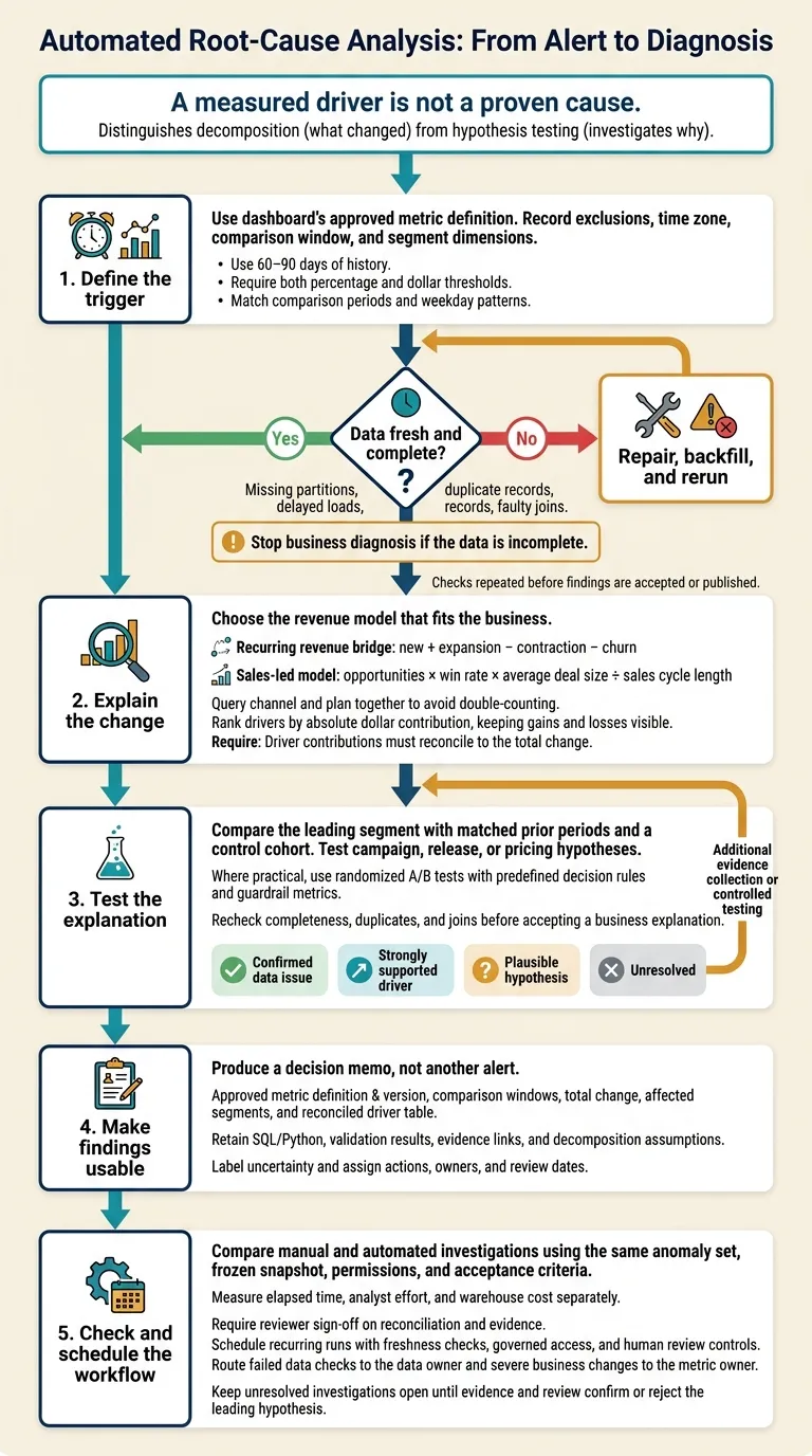 {Automated Root-Cause Analysis: From Alert to Diagnosis}
:::
{Automated Root-Cause Analysis: From Alert to Diagnosis}
:::
Define the metric and investigation trigger
Document the approved metric definition
Use the same approved metric definition as the dashboard. Record the measure, exclusions, reporting time zone, comparison window, and segment dimensions in dbt or Querio’s governed context. This keeps every investigation tied to the same logic.
If the metric is revenue, define whether it means recognized revenue, billings, MRR, or another approved measure.
For subscription analysis, define active subscriptions and exclude test and internal accounts. Keep segment dimensions fixed across runs so revenue decompositions remain comparable.
Set the alert threshold
Require both a percentage decline and a minimum dollar impact. Use 60–90 days of history to set thresholds that account for normal variation and seasonality [7]. Rolling medians and median absolute deviation can help when occasional spikes distort the average.
Compare current performance with equivalent weekday patterns - not a mismatched partial period. Check data freshness before interpreting a breach: delayed loads don't mean zero revenue [6]. Once the threshold is set, verify the warehouse inputs the investigation will use.
Prepare the data and access permissions
Before the investigation runs, make sure the required warehouse tables, segment dimensions, freshness checks, and permissions are available. Reconcile row counts to catch joins that drop records.
With these checks in place, the investigation can break the revenue change into segment drivers.
Break down revenue and rank segment contributions
Once you confirm the alert, split the metric into its likely drivers.
Choose the right revenue equation
Use the revenue model that fits the business. For recurring revenue, use the SaaS bridge: new + expansion − contraction − churn. For sales-led models, use opportunities × win rate × average deal size ÷ sales cycle length[1]. Don’t mix transactional funnel logic with recurring revenue accounting.
Where applicable, break the revenue gap into fewer opportunities, a lower win rate, and smaller deal sizes. Calculate each component’s dollar impact, then rank drivers by that amount. Report percentage changes separately[1].
Query segments and rank their impact
Query channel and plan together, rather than using separate totals that overlap and double-count shared rows.
Use warehouse tables such as
fact_opportunities,fact_subscriptions,dim_customer, anddim_date, with consistent grain and joins.
Keep the time window the same across every query. Rank segments by their absolute dollar contribution to the revenue change, keeping both gains and losses visible[1].
Use the ranking to choose where to drill down next. The top driver is a starting point for hypothesis testing, not proof of a cause.
Preserve the query trail
For each finding, retain the SQL or Python, date bounds, source tables, joins, filters, grain, and decomposition method[1][6]. Store business definitions in dbt rather than dashboard logic[1].
In Querio, keep generated SQL visible as a review artifact so analysts can check the method and assumptions[1][6]. Save these artifacts so each hypothesis test can be reproduced and reviewed.
Test explanations and check data quality
Test the leading business explanations
Start with the top-ranked segment from the decomposition. Compare its decline with matched prior periods and a control cohort. Then test possible explanations, such as a product release, campaign, or pricing change.
Remove internal, test, and duplicate activity. If the decline remains, treat the explanation as a business hypothesis - not a proven cause. When practical, compare exposed and unexposed users through a randomized A/B test. Agree on the decision rule and guardrail metrics before the test starts.[2]
Check data loads, completeness, and joins
If the top segment doesn't fully explain the drop, check data integrity next. Before accepting a business explanation, query daily row counts and the latest load time. Compare them with the expected pipeline schedule, not just yesterday's totals.
This Postgres pattern assumes event and ingestion timestamps. Map them to the fields in your warehouse.
SELECT
    CAST(event_timestamp AS date) AS event_date,
    COUNT(*) AS row_count,
    MAX(loaded_at) AS latest_load_at
FROM fact_events
WHERE event_timestamp >= :window_start
    AND event_timestamp < :window_end
GROUP BY 1
ORDER BY 1;
Check expected partitions separately: a missing day won't appear in these results. Use dbt tests and source freshness checks. Inspect schema changes, and compare row counts before and after joins to catch duplicate rows or dropped records.
Stop business diagnosis if the data is incomplete. A verified missing partition is an ingestion incident, not a revenue drop.[4]
Label evidence strength and unanswered questions
Validate each contribution against complete records and the approved metric before assigning a label. Keep the driver separate from the cause: you can confirm a conversion decline without knowing why it happened.[2][4]
| Label | Evidence needed | Next action |
|---|---|---|
| Confirmed data issue | Verified missing partition, event loss, or faulty join | Repair, backfill, and rerun the investigation |
| Strongly supported driver | Validated segment change with quantified impact | Report the contribution without overstating causality |
| Plausible hypothesis | Timing or exposure suggests a campaign, release, or pricing effect | Test against a suitable control |
| Unresolved | Evidence cannot distinguish competing explanations | Name the missing records or run a controlled experiment |
Make the follow-up specific. Request release-exposure records, campaign assignments, or missing source transactions - not simply “more analysis.” If those records can't separate the explanations, propose a controlled experiment. State which result would justify a rollback or another change.[2]
Use the labels to decide what belongs in the diagnostic report, what needs a control test, and what requires a backfill. Then queue the next investigation.
Report findings, measure results, and schedule investigations
Create the diagnostic report
Once you’ve resolved the strongest hypotheses and completed the data checks, put the findings into a decision memo - the automated investigation’s final output. Report quantified drivers, linked evidence, and unresolved questions rather than another stream of alerts. Include the approved metric definition and version, ensuring you understand the difference between metrics and semantic layers, comparison windows, total change, affected segments, and a driver table. Link each finding to its SQL and validation results. Record confidence, recommended actions, an owner, and the next review time.[1][2][6]
Illustrative sales-led decomposition - not observed results: Opportunities fall from 100 to 80, win rate from 25% to 20%, and average deal size from $40,000 to $35,000. With sales cycle length fixed at one reporting period, modeled revenue falls from $1,000,000 to $560,000.
Driver Baseline value → current value Absolute delta Relative change Contribution to revenue change Share of total decline Fewer opportunities 100 → 80 −20 opportunities −20% −$200,000 45.45% Lower win rate 25% → 20% −5 percentage points −20% −$160,000 36.36% Smaller deal sizes $40,000 → $35,000 −$5,000 −12.5% −$80,000 18.18% Total $1,000,000 → $560,000 −$440,000 −44% −$440,000 100% This example applies changes sequentially: opportunities, win rate, then deal size. Interaction effects are allocated according to that order; displayed shares are rounded.
Use the decomposition method selected earlier and explain how it allocates interaction effects. Driver contributions must reconcile to the total change. In the actual report, attach evidence links and reviewed confidence labels to every driver. If the baseline is zero, mark the relative change as undefined.
Compare manual and automated investigations
Compare speed using the same anomaly set without lowering the evidence standard. Run both workflows against the same frozen snapshot, permissions, and acceptance criteria.[6] Each must produce the reconciliation, evidence links, and unanswered questions required by the earlier investigation steps. Accept the diagnosis only after a reviewer signs off on the reconciliation and evidence.
Alternate which workflow runs first to reduce learning effects. Track elapsed time, analyst effort, and warehouse cost separately.[6]
| Measure | Manual investigation | Automated investigation |
|---|---|---|
| Time to first validated driver | Measure time spent authoring and running queries | Measure time spent running the investigation and validating results |
| Methodology | Analyst applies the approved decomposition | Workflow applies the same approved decomposition |
| Validation coverage | Record completed freshness and data-quality checks | Record completed freshness and data-quality checks |
| Retained evidence | SQL, results, and review notes | Generated SQL/Python, results, and review notes |
| Analyst review time | Measure authoring and checking effort separately | Measure verification and correction effort separately |
| Warehouse cost | Track separately for each incident | Track separately for each incident |
Schedule investigations with review controls
For recurring Querio investigations, store metric definitions in versioned dbt models or warehouse views. Retain SQL/Python that reviewers can inspect, along with the investigation configuration. Send reports through Slack or email using your approved scheduling workflow.[1][6]
Use governed access to Snowflake, BigQuery, or Redshift. Before publishing, run freshness and completeness checks. Send failed checks to the data owner and severe business changes to the metric owner.[1][8] Add release annotations when a product release could explain the change. Require human review before promoting any semantic layer customization or definition change.[1][8]
Record whether contributions reconcile, and document the leading hypothesis. Assign the open question to the relevant owner and state what evidence is missing for confirmation.[2] Keep the investigation open until the owner resolves the missing evidence and the next review confirms or rejects the leading hypothesis.
FAQs
::: faq
How can I test causes without an A/B test?
Use automated root-cause analysis to break metric changes into specific drivers. Compare current performance with historical baselines, then drill down by segment, region, or cohort. Check whether related events happened at the same time as the change.
Keep comparisons consistent with governed metric definitions, so data-quality problems don’t get mistaken for business changes. This workflow quantifies drivers and supports explanations with evidence. But correlation alone doesn’t prove causation. :::
::: faq
How should I handle overlapping revenue drivers?
Break down the revenue change into pipeline coverage, win rate, and average contract value. Measure each factor’s impact against historical baselines. Segment the results by stage and cohort, then drill down by seller, region, or product.
Use governed definitions so calculations stay consistent. Review the SQL or Python for overlapping factors, and don’t treat correlation as proof of causation. Check the results against warehouse source tables to rule out data-quality problems or join mismatches. :::
::: faq
When should automated investigations require human review?
Human review is required for high-stakes decisions, including financial reporting, budget planning, and board-level presentations. It’s also required for trade-offs that rely heavily on judgment and for materials shared with executives [1][2][3].
Teams should manually spot-check source tables in Snowflake, BigQuery, Redshift, or Postgres when metric variance exceeds 0.5–1% [1]. If the system flags data quality issues, such as missing events or schema inconsistencies, reviewers must verify that the data can be trusted [4][5]. :::