Guide
Sales Metrics That Actually Move Revenue: A 2026 Guide
Cut through KPI noise with the sales metrics that explain revenue. Practical formulas, warehouse queries, and dashboarding tips built for modern data teams.

Only 14% of sellers drive 80% of revenue, while average B2B sales cycles have expanded from 4.9 months in 2019 to 6.5 months. Those figures point to a problem deeper than individual performance: leadership is often reading sales metrics with a scorecard built for a simpler buying environment. Recent benchmark coverage also reports that customer expansion accounts for 52% of new revenue in 2025, which makes a new-logo-only view of sales performance increasingly incomplete.
A useful sales dashboard shouldn't merely tell you what happened. It should identify where revenue throughput weakened, which buyer segment exposed the weakness, and what operating change could correct it. That requires a diagnostic system built from consistent warehouse definitions, stage-level conversion logic, and self-serve workflows that let operators investigate without waiting for an analyst.
Table of Contents
- Why Most Sales Metrics Programs Fail in 2026
- The Three Layers Every Sales Metric Falls Into
- The Core Sales Metrics That Explain Revenue
- Calculating Sales Metrics in the Data Warehouse
- Turning Dashboards Into Root-Cause Diagnostics
- Benchmarks That Actually Change How You Read the Numbers
- Dashboarding and Alerting Best Practices
- Where to Go After the Core Sales Metrics
Why Most Sales Metrics Programs Fail in 2026
Sales teams can have extensive dashboard coverage and still lack usable evidence. The failure usually starts when leaders treat sales metrics as a checklist: calls, meetings, opportunities, win rate, quota attainment, and a long tail of activity measures. That approach counts what exists, but it doesn't explain where the revenue process breaks.
A useful counterpoint comes from recent reporting that 79% of SMB respondents haven't created any sales metrics. The benchmark source describes a measurement gap, but the operational lesson is broader. Teams with no instrumentation can't diagnose performance, while teams with too many disconnected metrics can mistake visibility for understanding.
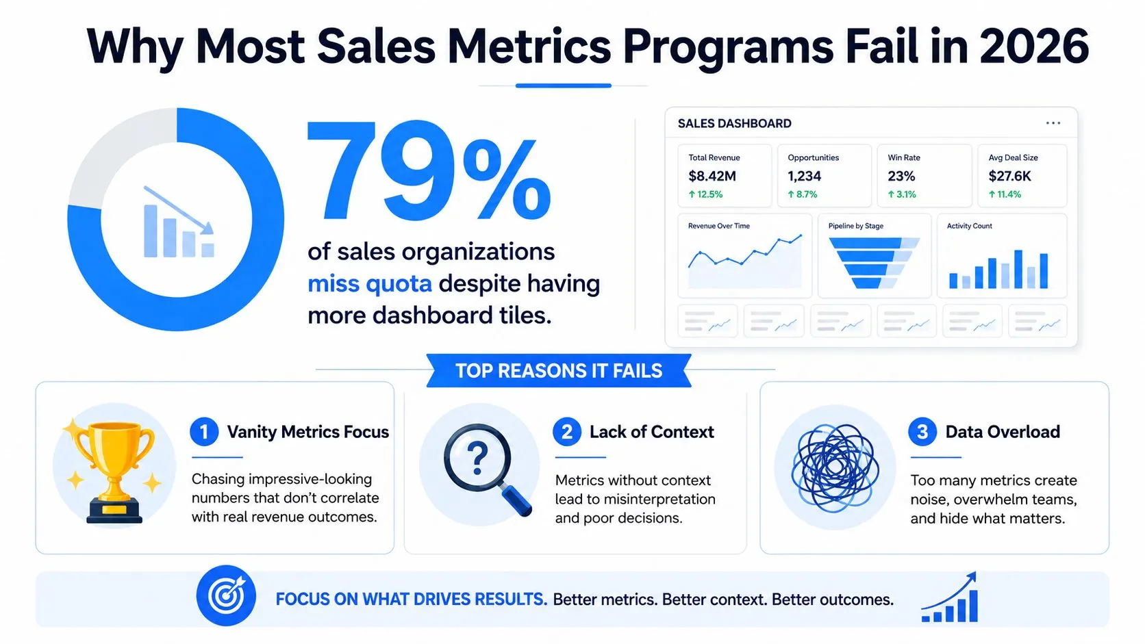
The three structural failures
Duplicated CRM definitions create competing versions of win rate, pipeline, and sales cycle length. One report may use opportunity creation date, another may use qualification date, and neither may document how reopened deals are handled.
BI-layer logic creates a second problem. When calculations live inside individual charts, filters, or analyst-owned extracts, definitions become difficult to review, test, and version. A warehouse model or governed semantic layer gives the metric a durable home. Guidance on analytics change management is relevant here because metric adoption depends on process, ownership, and trust, not only dashboard design.
Activity-first dashboards encourage managers to count inputs instead of inspecting conversion. Calls and emails can signal effort, but they don't establish whether qualification, discovery, pricing, or handoff is failing. Activity becomes useful only when connected to a downstream stage and evaluated against the quality of the resulting opportunities.
Operating principle: Every metric should answer a decision question, identify its source tables, and expose the next diagnostic cut.
Build the program in that order. Start with the revenue question, define the event logic in the warehouse, validate the stage transitions, and then expose a small number of views for executives, managers, and reps. The dashboard is the interface. The diagnostic model underneath is the system.
The Three Layers Every Sales Metric Falls Into
Every number on a revenue dashboard belongs to a layer, whether the team has named that layer or not. Confusing these layers is why leaders often ask an outcome metric to explain a process problem.
Layer one is outcomes. ARR, MRR, net new revenue, and quota attainment confirm the result after the selling motion has already played out. They're essential for financial control, but they're lagging indicators. A decline in ARR tells leadership that revenue underperformed. It doesn't identify whether fewer opportunities entered the funnel, deals became smaller, win rate weakened, or cycle time expanded.
Layer two is pipeline and process efficiency. Stage conversion, win rate, average deal size, pipeline coverage, and sales cycle length describe the mechanism that produces future revenue. These metrics are more actionable because they connect the current pipeline to expected throughput.
Layer three is diagnostic and unit economics. CAC, LTV, LTV:CAC, churn, gross margin, and seller concentration add economic and organizational context. They tell you whether growth is efficient, durable, and resilient, rather than merely present.
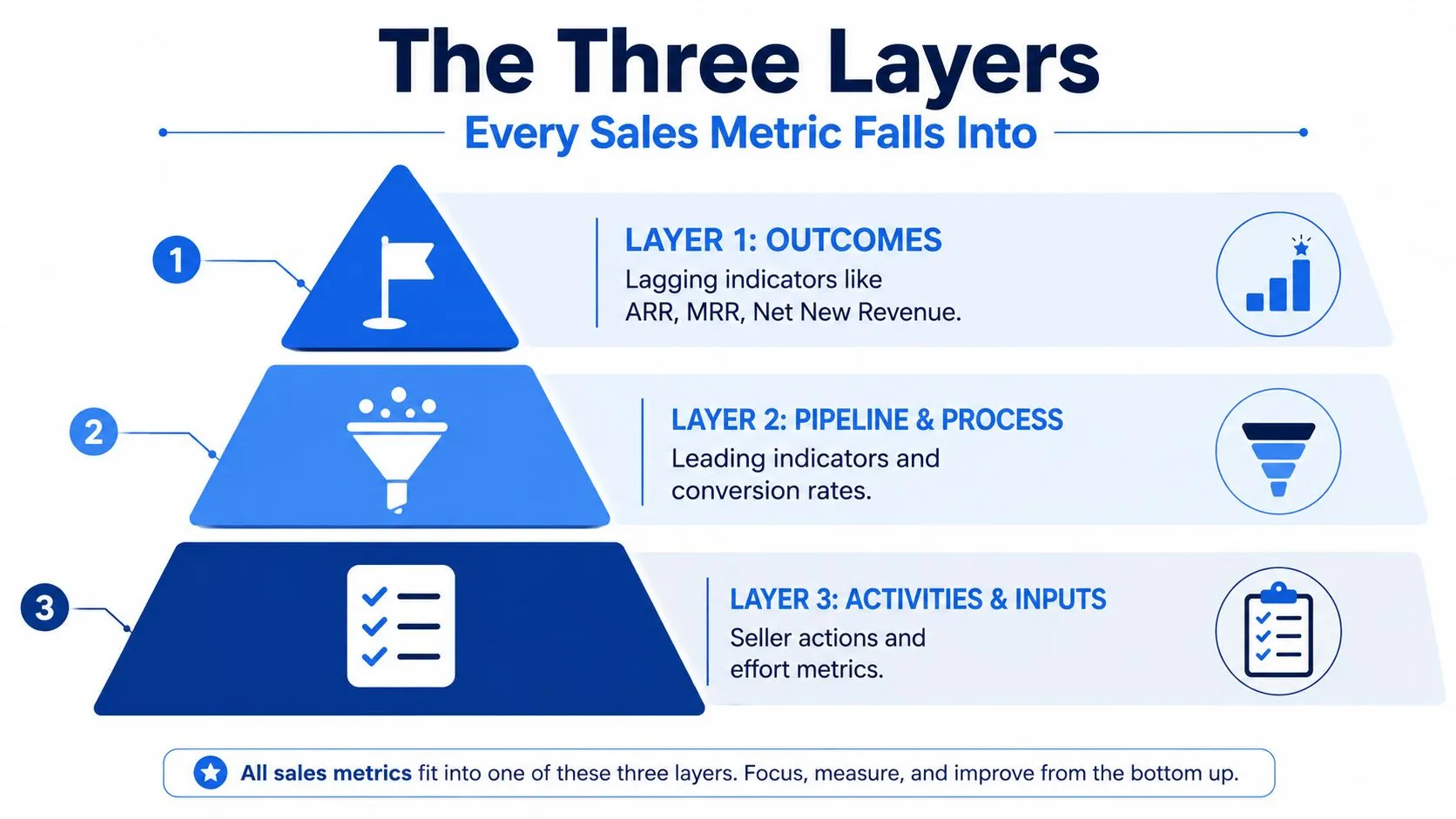
How the layers compose
Pipeline velocity provides the bridge:
Pipeline velocity = opportunities × win rate × average deal size ÷ sales cycle length
Avoma's explanation of pipeline metrics describes this composite structure and notes that stage-level conversion between adjacent stages should be reviewed monthly, with 20% to 30% often used as a starting range. The formula matters because its levers interact multiplicatively. More opportunities won't fully offset a collapsing win rate, and a healthy win rate may still produce weak throughput if cycle length expands or deal size contracts.
Consider the intervention logic:
- Opportunity volume is weak: investigate sourcing, qualification, territory coverage, and lead routing.
- Win rate is weak: inspect stage conversion, competitive loss reasons, discovery quality, and pricing.
- Average deal size is weak: examine segment mix, discounting, product packaging, and expansion.
- Cycle length is rising: isolate time by stage, approval delays, buyer inactivity, and handoff friction.
This taxonomy also clarifies governance. Store business definitions in versioned models rather than hiding them inside visualization logic. A practical comparison of metrics layers and semantic layers helps frame the distinction: a metric needs both a calculation and a reliable context for how users can consume it.
The Core Sales Metrics That Explain Revenue
The right sales metrics are easier to choose when they're grouped by the question they answer. The table below is deliberately compact. It gives a data team enough direction to map source systems to warehouse models without turning the dashboard into a catalog.
Core sales metrics grouped by the revenue question they answer
| Metric | Formula | Primary Source | Question It Answers |
|---|---|---|---|
| ARR | Recurring monthly value × 12 | Subscription fact table | What recurring annualized revenue is active? |
| MRR | Sum of active recurring monthly charges | Subscription events | What recurring revenue is live this month? |
| Net revenue retention | Beginning recurring revenue plus expansion, minus contraction and churn, divided by beginning recurring revenue | Subscription events and customer dimension | Is the installed base growing or shrinking? |
| Gross margin on new logos | New-logo revenue minus direct delivery cost, divided by new-logo revenue | Billing, finance, and customer tables | Is new revenue economically attractive? |
| SQL-to-opportunity conversion | Opportunities created from SQLs divided by eligible SQLs | Lead, opportunity, and date dimensions | Does qualification produce real pipeline? |
| Opportunity-to-close win rate | Closed-won opportunities divided by eligible closed opportunities | Opportunity fact table | How often does qualified pipeline become revenue? |
| Average sales cycle length | Close date minus defined start date | Opportunity history and date dimension | Where is time accumulating in the motion? |
| Pipeline coverage ratio | Eligible pipeline value divided by target | Opportunity fact and quota table | Is future pipeline sufficient for the target? |
| CAC | Sales and marketing acquisition cost divided by new logos | General ledger, marketing spend, and customer dimension | What does it cost to acquire a customer? |
| LTV | Average revenue per customer × gross margin ÷ churn rate | Billing, margin, and retention models | What economic value can acquisition support? |
| LTV:CAC | LTV divided by CAC | Governed LTV and CAC models | Is acquisition efficiency sustainable? |
| Gross churn | Lost recurring revenue divided by beginning recurring revenue | Subscription events | How much recurring revenue disappeared? |
The table separates measurement formula from business interpretation. That distinction prevents a common failure mode: two teams use the same label but answer different questions. For example, “win rate” can mean opportunity-count win rate, revenue-weighted win rate, or a cohort-based rate tied to an opportunity creation period. Choose one primary definition and publish the alternatives explicitly.
Definition discipline: A metric isn't governed because it appears in a dashboard. It's governed when its grain, date logic, filters, and owner are documented and testable.
For teams standardizing transformations in dbt, how consistent metrics work in dbt offers useful context on keeping calculations aligned across models and downstream consumption. The practical requirement is simple: calculate once, test centrally, and let every dashboard inherit the same result.
Calculating Sales Metrics in the Data Warehouse
A dependable sales model starts with a clear star schema:
fact_opportunitiesstores opportunity grain, stage history, value, owner, and close outcome.fact_subscriptionsstores recurring charges and subscription events.dim_customerstores segment, region, acquisition source, and customer status.dim_datesupplies fiscal periods, cohort dates, and reporting calendars.
The exact SQL dialect will vary, but the modeling principles should remain stable. A warehouse-centered approach also makes time-series logic easier to inspect, as illustrated by this discussion of Snowflake time series results.
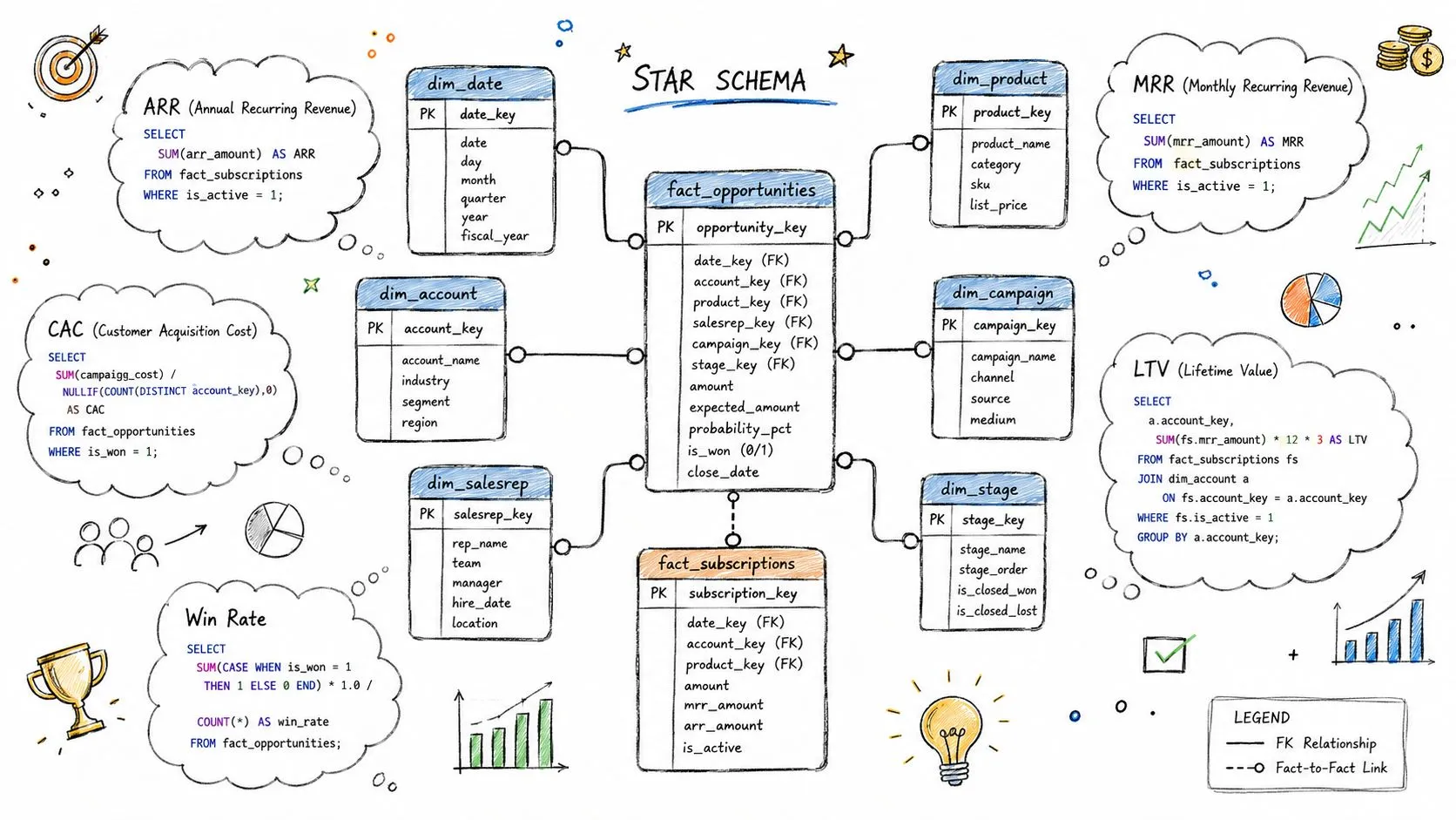
ARR and MRR
For ARR, calculate active recurring value at a defined reporting date, then roll it up by customer, segment, or region:
with active_recurring as (
  select
    customer_id,
    report_date,
    sum(monthly_recurring_value) as mrr
  from fact_subscriptions
  where status = 'active'
  group by customer_id, report_date
)
select
  report_date,
  sum(mrr) * 12 as arr
from active_recurring
group by report_date;
Use window functions to compare each customer's current ARR with its prior period. For MRR movement, classify event rows as new, expansion, contraction, or churn before aggregating. That classification is more reliable than comparing only closed-won records because renewals and downgrades don't pass through the new-business opportunity path.
CAC and LTV
A simple CAC model joins acquisition spend to the customers whose first paid date falls inside the same period:
select
  date_trunc('month', first_paid_date) as month,
  sum(sales_marketing_cost) / nullif(count(distinct customer_id), 0) as cac
from acquisition_costs
join dim_customer using (month)
where is_new_logo = true
group by 1;
LTV should use gross margin and a clearly defined churn basis:
select
  avg_monthly_revenue * gross_margin_rate
  / nullif(monthly_logo_churn_rate, 0) as ltv
from revenue_unit_economics;
Those formulas are only as sound as their period alignment. Currency conversion should use a consistent transaction or invoice date, not whichever date happens to be available in the BI view.
Win rate
For win rate, define the eligible opportunity cohort first. Then calculate both count-weighted and value-weighted results:
select
  stage_bucket,
  sum(case when outcome = 'closed_won' then amount else 0 end)
  / nullif(sum(case when outcome in ('closed_won', 'closed_lost')
                    then amount else 0 end), 0) as value_weighted_win_rate
from fact_opportunities
group by 1;
Don't mix open pipeline with completed outcomes, and don't count MQL-to-SQL movement without a held-out observation window. Otherwise recent records look artificially weak because they haven't had time to progress.
For a practical implementation sequence, use the star schema data modeling guide to keep fact grain and dimensions explicit before building the dashboard layer.
Turning Dashboards Into Root-Cause Diagnostics
A flat funnel summary hides the exact point of failure. If leadership sees that revenue is down, pipeline is stable, and activity is high, the dashboard has described the problem without narrowing it. A diagnostic view decomposes the variance into controllable drivers.
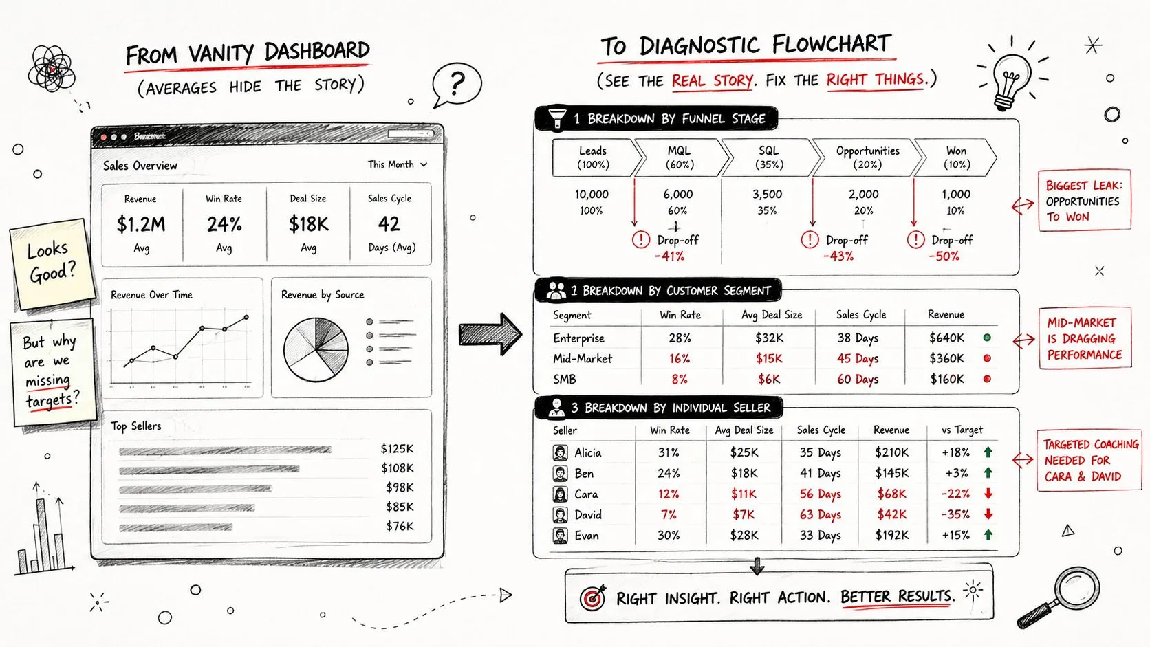
Start with the broken stage
Calculate conversion for every adjacent stage, then segment the result by seller, region, product, source, and cohort. A useful query pattern looks like this:
with stage_rates as (
  select
    segment,
    region,
    stage_from,
    stage_to,
    countif(reached_stage_to) / nullif(countif(reached_stage_from), 0)
      as conversion_rate
  from opportunity_stage_cohorts
  group by 1, 2, 3, 4
)
select *
from stage_rates
where conversion_rate < benchmark_threshold;
The output shouldn't be a leaderboard. It should identify a specific operating question, such as whether mid-market conversion weakened in a region after a qualification change. The dashboard and metrics guidance is useful here because a dashboard should support investigation, not merely display a score.
Decompose missed revenue
A target gap can be represented as three diagnostic components:
- Coverage gap: eligible pipeline is below the amount required for the target.
- Win-rate drag: the observed conversion rate is below the internal benchmark for the same segment and cohort.
- ACV compression: average contract value is below the comparable historical baseline.
A reproducible output might return columns such as segment, region, pipeline_gap, win_rate_delta, acv_delta, and priority_rank. The point isn't to manufacture precision. It's to prevent executives from treating every shortfall as a generic demand-generation problem.
Diagnostic rule: Slice first by stage and cohort, then by seller. Seller-level averages often identify who needs attention, but stage-level patterns explain what to coach.
This approach also changes the meeting conversation. Instead of asking why revenue declined, leaders can ask whether a specific stage weakened, whether the change is isolated or systemic, and whether the affected deals share a source, segment, region, or product characteristic. That is the difference between reporting and operating.
Benchmarks That Actually Change How You Read the Numbers
Benchmarks are useful as anchors, not universal scorecards. A stage conversion rate in the 20% to 30% range is a common starting point for adjacent-stage review, according to Avoma's sales pipeline metrics reference. It doesn't establish that every stage, segment, or selling motion should perform identically.
The same caution applies to win rate and cycle time. Prospeo's sales performance analysis describes commonly cited B2B win-rate ranges around 20% to 35% in many mid-market contexts, with 20% to 30% often used as a broad starting point. It also notes that faster-moving motions may target a sales cycle under 50 days, while 90 or more days can signal stalled progression.
Sales metric benchmarks by segment
| Metric | SMB | Mid-Market | Enterprise |
|---|---|---|---|
| Stage conversion | Interpret against the specific high-volume motion | Compare with the relevant qualification and opportunity stages | Expect buying complexity to affect individual-stage results |
| Win rate | Use lead source and product context | Use segment, seller, and cohort context | Separate opportunity count from value-weighted performance |
| Sales cycle | Monitor for operational friction | Compare against the faster-motion reference point | Isolate time by stage and approval path |
| Seller concentration | Watch dependence on individual producers | Compare concentration with territory design | Treat concentration as a forecast and succession risk |
The table is intentionally qualitative where no universal segment fact exists. A 22% conversion rate could be acceptable in one motion and concerning in another. Internal benchmarks should therefore come from trailing segment cohorts, with rolling p50 and p75 values calculated in the warehouse rather than copied from a static slide.
Seller concentration adds another warning signal. Recent benchmark coverage reports that 14% of sellers drive 80% of revenue. That isn't a performance target. It's evidence that leadership should examine whether forecast quality, customer relationships, and pipeline creation depend too heavily on a small group.
The practical workflow is to compare each current cohort with its own historical distribution, then use external ranges as a reason to investigate. Don't celebrate a metric because it matches an industry range if the underlying stage, segment, or deal mix has changed.
Dashboarding and Alerting Best Practices
A sales dashboard should change depending on who is using it. Executives need a compact view of revenue exposure. Managers need stage and segment diagnostics. Reps need deal-level action context. Putting all three audiences on one screen produces a crowded interface that serves none of them well.
The three operating surfaces
Executive view: Show ARR, net new ARR, pipeline coverage against quota, and material movement in forecast categories. Keep the view focused on exposure and decisions, not individual activity counts.
Manager view: Add stage conversion, win rate, cycle length, deal size, and segment cuts. Managers need to see whether a shortfall is caused by insufficient pipeline, weak progression, or economic compression.
Rep view: Show open deals, age by stage, next-step completeness, buyer activity, and the specific reason an opportunity is at risk. A rep can't act on a company-wide average.
Alerts need severity
Not every change deserves an interrupt. Page only when the signal is urgent, actionable, and tied to a defined owner. For example, an alert can flag a sudden change in a governed metric, but the threshold should come from the company's own historical distribution rather than an invented universal rule.
Send lower-severity changes to a weekly Slack digest:
- Pipeline movement: New, stalled, advanced, and removed opportunities.
- Stage leakage: Cohorts with unusual conversion deterioration.
- Data quality: Missing close dates, stale stages, or duplicate opportunity IDs.
- Economic shifts: Changes in deal size, discounting, or acquisition cost.
Tools such as the CapyScout platform overview can provide useful context when evaluating sales intelligence workflows, but the operating model still depends on governed definitions and ownership.
Store definitions as dbt models or warehouse views, test them against source changes, and expose a visible refresh timestamp. A self-serve interface such as Querio can let technical and non-technical users query warehouse-backed revenue and pipeline metrics in plain language, while the governed model remains the source of truth.
Where to Go After the Core Sales Metrics
Once the core sales metrics are stable, the next analytical layer is cohort and expansion analysis. Aggregate retention can look healthy while newer cohorts shrink faster, older cohorts carry the result, or expansion compensates for weak acquisition. A single NRR value doesn't reveal that composition.
Build the required warehouse foundation before adding another dashboard. You'll need subscription events, expansion and contraction rows, customer acquisition dates, product usage joins, and a consistent relationship between marketing-sourced pipeline and closed revenue. With those tables in place, analysts can calculate cohort revenue retention, gross margin by cohort, and product-qualified lead progression without rebuilding the model.
The most useful next questions are comparative:
- Which acquisition cohorts retain recurring revenue most effectively?
- Which product behaviors precede expansion?
- Does product-qualified pipeline convert into closed revenue at a different rate?
- Are new-logo economics deteriorating while existing-customer economics improve?
After that, territory and quota modeling, pricing experimentation, and AI-assisted forecast calibration become credible extensions rather than disconnected projects. The order matters. Diagnostic sales metrics establish the event definitions and stage logic that those higher-order analyses depend on.
Querio helps data teams turn warehouse models into self-serve analytics, including live dashboards and plain-English questions around revenue, pipeline, win rate, sales cycle, and stage conversion. Visit Querio to evaluate a workflow that lets operators investigate sales performance without routing every question through an analyst.