Business Intelligence
Top 7 Automated Reporting Tools for Data Teams
Compare seven automated reporting platforms by automation, governance, and warehouse fit to find the right BI workflow.
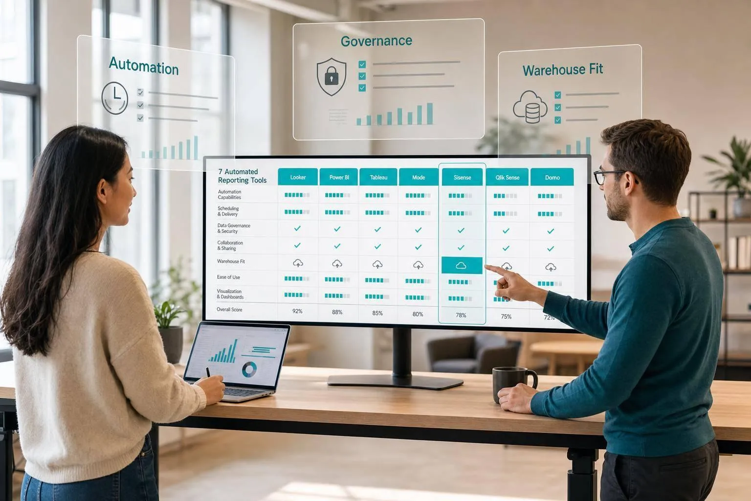
If I had to sum this up in one line: pick the tool based on who owns reporting, how your warehouse is set up, and how much control you need over metrics.
I’m looking at 7 tools here: Querio, Looker, Tableau, Microsoft Power BI, Google Looker Studio, Mode, and ThoughtSpot. The article’s core point is simple: automated reporting is not just scheduled dashboards. It also means alerts, Slack or email delivery, and in some cases follow-up analysis when numbers move.
Here’s the short version:
- Querio fits teams that want live warehouse reporting, inspectable SQL/Python, and Slack or Teams delivery.
- Looker fits teams that want one governed metric layer, often in BigQuery setups.
- Tableau fits teams that care a lot about polished dashboards and stakeholder presentation.
- Power BI fits teams already deep in Microsoft 365, Teams, Excel, and Azure.
- Looker Studio fits simple reporting in Google-first setups.
- Mode fits analyst-led reporting built from SQL and Python notebooks.
- ThoughtSpot fits search-led self-serve analysis more than fixed recurring reports.
A few facts stand out:
- Tableau Viewer starts at $15/user/month, and Explorer starts at $42/user/month.
- Power BI Pro is about $10 to $14/user/month.
- The guide focuses on teams at roughly 100 to 500 employees using warehouses like Snowflake, BigQuery, Redshift, and Postgres, often with dbt upstream.
::: @figure 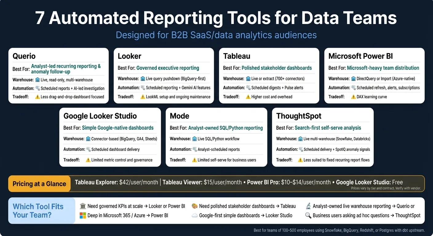 {7 Automated Reporting Tools for Data Teams: Side-by-Side Comparison}
:::
{7 Automated Reporting Tools for Data Teams: Side-by-Side Comparison}
:::
Quick Comparison
| Tool | Best use case | Warehouse style | Automation style | Main tradeoff |
|---|---|---|---|---|
| Querio | Analyst-led recurring reporting and anomaly follow-up | Live, read-only, multi-warehouse | Scheduled reports plus AI-led investigation | Less of a drag-and-drop dashboard tool |
| Looker | Governed executive reporting | Live query pushdown | Scheduled reporting plus Gemini features | Setup and LookML upkeep |
| Tableau | Stakeholder dashboards | Live or extract | Scheduled digests and alerts | More overhead and cost |
| Power BI | Microsoft-heavy distribution | DirectQuery or import | Scheduled refresh, alerts, subscriptions | DAX learning curve |
| Looker Studio | Simple Google-native dashboards | Connector-based | Scheduled delivery | Light metric control |
| Mode | Analyst-owned reporting | Live SQL/Python workflow | Analyst-scheduled reports | Limited self-serve for business users |
| ThoughtSpot | Search-first self-serve | Live multi-warehouse | Scheduled delivery plus anomaly signals | Less suited to fixed reporting flows |
The main takeaway: if you want governed KPIs, focus on tools with a strong metric layer. If you want polished dashboards, Tableau stands out. If you want analyst-owned reporting from live warehouse data, Querio and Mode are the closest fit. And if you want broad Microsoft distribution, Power BI is hard to ignore.
That’s the article in plain English: automation matters, but metric control and live warehouse access matter more.
1. Querio
Querio is built for teams that need answers they can trace, live reports, and self-serve analysis inside Slack or Teams. It brings together a governed context layer, notebooks with inspectable SQL and Python, and AI-led automations in one place.
Automation depth
Querio lets you schedule either a saved notebook analysis or an AI-led investigation to run on a recurring schedule - daily, weekly, or at any custom interval. Results can be sent straight to Slack or email.
That means a daily business health check can watch revenue, margin, and marketing efficiency without someone babysitting it. If a threshold breaks, the agent digs in and sends back its findings on its own.
Warehouse connectivity
Querio connects live, in read-only mode, to Snowflake, BigQuery, Redshift, ClickHouse, MotherDuck, Postgres, MySQL, SQL Server, and MongoDB using encrypted credentials. There are no extracts and no CSV exports in the middle.
Because the connection stays live, scheduled reports and investigations stay tied to current warehouse data instead of stale snapshots.
Governance model
Metric definitions, joins, and trusted queries live as version-controlled SQL, Markdown, and Python in GitHub alongside dbt. The agent can suggest new definitions, but a human still has to approve and commit them.
It also includes role-based access control (RBAC), SSO, sandboxed execution, SOC 2 Type II, and HIPAA/BAA support. That setup makes self-serve reporting workable in teams that need guardrails, not guesswork.
"If AI can answer a question but your team can't inspect the code, you haven't solved analytics governance. You've just moved the bottleneck." [4]
Workflow fit
Querio fits small data teams, usually 1–5 people, at B2B SaaS, healthcare, or fintech companies where reporting requests are piling up faster than the team can handle. It tends to work well when notebooks, BI, Slack, and context management are split across too many tools.
2. Looker
Looker is an enterprise BI platform built on LookML, its proprietary semantic model. It works best for teams that care more about governed reporting than ad hoc exploration.
Automation depth
Looker’s automation is strongest with Gemini. It adds conversational queries, auto-generated charts, and presentation output. But there’s a catch: teams need to mature the LookML model before turning on AI features, because output quality depends on that model.
Warehouse connectivity
That automation relies on live warehouse execution. Looker uses a query-pushdown architecture, which means it sends queries straight to the underlying warehouse instead of copying data into a separate layer.
This setup fits BigQuery especially well. Query pushdown, paired with warehouse scaling, helps support large data volumes and lots of concurrent users.
Governance model
LookML gives teams a single definition for core metrics across dashboards, embedded apps, and AI-generated answers. That matters more than it might seem. If everyone uses the same metric logic, reporting stays consistent instead of turning into a mess of competing numbers.
Looker also includes granular row- and column-level access controls, and it supports SOC 2 Type II, ISO 27001, and HIPAA compliance. The tradeoff is the steady work of maintaining LookML. So while it’s strong for standardized reporting, it’s also heavier to run.
Workflow fit
Looker is a good match for BigQuery-first teams that can handle the overhead of managing LookML and need recurring, governed report delivery for stakeholders.
It’s a weaker fit for smaller teams that want quick self-serve reporting without that overhead. In plain terms, Looker suits teams that put governed metrics ahead of ad hoc exploration.
3. Tableau
Tableau stands out when you need recurring reports that look polished and are ready to share with stakeholders. It works especially well on top of live warehouse data, which is a big deal when reports need to refresh on their own and land in front of people without anyone exporting files by hand.
Automation depth
Tableau Pulse sends anomaly alerts and key updates to Slack or Microsoft Teams. Einstein Copilot helps analysts write formulas and calculations with less manual work. The more advanced AI features, including Tableau Agent and enhanced Pulse, require Tableau+.
Warehouse connectivity
Tableau connects to Snowflake, BigQuery, Redshift, and Postgres. With Live Connect, it queries warehouse data directly.
Governance model
Tableau Catalog covers metadata management and data lineage. Certified data sources and row-level security help keep reporting consistent and trusted across the organization. Tableau Semantics standardizes warehouse data definitions. Workbook version control is still a weak spot.
Workflow fit
Tableau is a strong fit when stakeholder-facing presentation matters more than lightweight self-serve reporting. It also makes more sense when visual quality matters more than cost control. Explorer starts at $42/user/month, and Viewer starts at $15/user/month. Its main edge is presentation quality. The tradeoff is the extra overhead that comes with keeping that level of polish across many reports and teams.
4. Microsoft Power BI
Power BI makes the most sense for teams that already live inside Microsoft 365 and Azure. If your reporting needs to be scheduled, controlled, and kept inside the Microsoft ecosystem, it’s a natural fit.
Automation depth
Power BI comes with built-in support for scheduled refreshes, email subscriptions, and data-driven alerts. That means teams can set reports to update and send on a regular cadence without much extra setup.
Paginated reports work well for recurring executive summaries and operational reports that need to look the same every time they go out. That consistency matters when people expect the same layout month after month.
Copilot can help with charts and summaries. But as data models get larger and DAX measures become more complex, its usefulness tends to drop.
Warehouse connectivity
Power BI connects to Snowflake, BigQuery, Redshift, and Postgres. In most setups, teams choose between DirectQuery and import mode.
- DirectQuery runs live queries against the warehouse. It keeps recurring reports more up to date, but it can put more load on the warehouse.
- Import mode stores data inside Power BI. That usually makes reports faster, though you give up some freshness.
It’s the usual tradeoff: live access versus speed.
Governance model
Power BI’s semantic model layer lets data teams define shared metrics and KPIs in one place. That helps keep numbers lined up across reports, which saves a lot of back-and-forth later.
Row-level security and workspace permissions add another layer of control. On top of that, Microsoft Purview extends governance across the rest of the Microsoft stack.
Workflow fit
Power BI fits best when teams already use Microsoft 365, Teams, Excel, Azure, and SharePoint day to day. Pro seats cost about $10 to $14 per user per month [3][5].
The downside is pretty clear. It’s a weaker match for teams outside Microsoft-heavy setups, and DAX can be tough for analysts who mainly work in SQL. If your team wants a lighter, browser-first reporting layer, Google Looker Studio is often the next place to look.
5. Google Looker Studio
Google Looker Studio, formerly Data Studio, works well for recurring dashboards that need simple delivery. Think of it as a light presentation layer: it shines when data modeling and governance already happen somewhere else.
Automation depth
Looker Studio is good at scheduled, template-based reporting. You can refresh and share recurring dashboards without much fuss, especially when you're using reusable templates.
That makes it a solid pick for stakeholder updates that go out on a regular cadence. But it’s not the place for deep modeling or messy metric logic. Its usefulness comes down to two things: where the data sits and how much metric logic your team needs to control.
Warehouse connectivity
It connects natively with BigQuery, GA4, Google Ads, and Google Sheets. For Snowflake, Redshift, and Postgres, you’ll usually need partner connectors and extra setup.
If your warehouse sits outside Google Cloud, expect more friction and added cost. That’s often where a “simple” dashboard setup starts to feel less simple.
Governance model
Looker Studio is Google’s free reporting layer. Centralized modeling and governed metrics live in Looker, not Looker Studio [3].
So if your data team cares a lot about strict metric definitions, the better setup is to use Looker Studio after the semantic layer is already in place.
Workflow fit
It fits teams that want simple, shareable dashboards and already work inside Google’s ecosystem. It’s most useful when the warehouse setup is straightforward and the report logic doesn’t depend on centralized metric governance.
6. Mode
Mode is a notebook-first workspace built for analyst-heavy teams. If your data team spends most of its time in SQL and Python notebooks and wants a clean way to publish polished work to stakeholders, Mode lines up well with that setup.
Automation depth
Mode is a good fit for teams that want analysts, not business users, to own recurring reporting. It supports recurring reports and dashboards that analysts publish to stakeholders, which keeps the data team in control of what goes out and when [1].
Warehouse connectivity
Mode works best for teams that already use SQL and Python notebooks and want analysts to publish recurring reporting from that same workflow. That setup helps keep reporting controlled. The tradeoff is that it limits open-ended self-service.
Governance model
Governance in Mode is analyst-controlled. The team decides what gets published and keeps reporting consistent [1].
Workflow fit
If you're weighing tools for recurring reporting, Mode makes the most sense when notebook publishing matters more than broad self-serve access. It's a strong match for SQL/Python notebook-centered data teams that want analysts to publish finished reports and keep ownership of recurring distribution [1].
7. ThoughtSpot
ThoughtSpot works best for self-serve analytics on curated data models, with scheduled delivery playing more of a supporting role. For data teams, the main question is simple: does that search-first setup still hold up for repeatable reporting?
Automation depth
ThoughtSpot supports scheduled reports and automated delivery. But that’s not where it shines. Its main strength is ad hoc analysis, not recurring report distribution.
Warehouse connectivity
ThoughtSpot connects directly to Snowflake, BigQuery, Redshift, Databricks, Postgres, and Azure Synapse. It also integrates with Snowflake Cortex through the Model Context Protocol (MCP) [3]. Modeling happens during implementation, so setup tends to take more time than it does with lighter tools. In practice, that means recurring reporting workflows usually take longer to get up and running.
Governance model
ThoughtSpot uses a worksheet-based semantic layer with enterprise row-level security (RLS) and column-level security (CLS). So data teams can control what each user is allowed to see. The tradeoff is that SQL visibility is more limited than in notebook-based tools.
Workflow fit
That tradeoff makes ThoughtSpot a fit when self-serve analysis matters more than fixed report distribution. It works well for teams that want business users to ask ad hoc questions on top of a well-modeled dataset. It’s less suited to fixed, recurring reporting workflows that need tight control over distribution.
Side-by-Side Feature and Fit Comparison
Picking between these seven tools comes down to three plain questions:
- How much can it automate on its own?
- Does it query your warehouse live or rely on extracts?
- Who owns the metric definitions?
Table 1 shows how far each tool goes on automation. Table 2 shows how safely each one fits into a warehouse-native setup.
For recurring reporting, that’s the part that matters. A polished demo is nice, but the bigger test is whether a tool keeps metrics steady when reports run without someone watching every step.
Table 1: Automation Capabilities
| Tool | Scheduling | Alerts/Anomaly Workflows | Delivery Channels | Investigation Depth |
|---|---|---|---|---|
| Querio | Recurring investigations on a schedule | Anomaly investigation | Slack, Microsoft Teams, Email | Deep - inspectable SQL/Python in reactive notebooks |
| Looker | Scheduled dashboards and Looks | AI-driven insights | Google Workspace, Slack | Metric-first via LookML |
| Tableau | Pulse digests on a schedule | Tableau Pulse proactive alerts | Slack, Email | Polished stakeholder summaries |
| Power BI | Scheduled data refresh | Data-driven alerts | Microsoft Teams, Email, Mobile | DAX-based logic |
| Looker Studio | Scheduled dashboard delivery | Limited | Browser links, Email | Limited to pre-built filters/dashboards [2] |
| Mode | Analyst-scheduled reports | Manual follow-up | Email, Slack | SQL-led analysis |
| ThoughtSpot | Scheduled search | SpotIQ anomaly detection | Web app, Slack | Search-driven analysis |
Automation is only part of the story. Warehouse access and metric control are what decide whether the output stays reliable over time.
Table 2: Warehouse and Governance Fit
| Tool | Supported Warehouse Pattern | Live vs. Extract/Import | Semantic or Context Layer | Governance Notes |
|---|---|---|---|---|
| Querio | Multi-warehouse: Snowflake, BigQuery, Redshift, ClickHouse, Postgres | Live, read-only | Shared context layer - plain SQL, Markdown, and Python files synced to GitHub in the same repo as dbt | Inherited RBAC; SOC 2 Type II; HIPAA |
| Looker | BigQuery-first; multi-cloud supported | Live | LookML - code-based, centralized metric definitions | LookML-managed governance |
| Tableau | Multi-source (700+ connectors) | Live or extract | Tableau Data Model | Einstein Trust Layer with PII masking |
| Power BI | Microsoft 365 / Azure-native | DirectQuery or Import | Power BI Semantic Model | Azure AD / Microsoft Purview integration |
| Looker Studio | Google ecosystem-first | Scheduled refresh / connector-based | None native | Minimal - Google account-level sharing |
| Mode | SQL-centric reporting | Live | SQL-driven workflows | Team-based access |
| ThoughtSpot | Multi-warehouse (Snowflake, Databricks) | Live / federated | Worksheets - manually defined | Enterprise RLS and column-level security |
Table 1 separates surface-level automation from actual investigation. That distinction matters. A tool may send reports on schedule, but that doesn’t mean it helps people dig into what changed and why.
Live-query tools also have an edge here. When a report runs, it pulls current warehouse data instead of leaning on an old extract. And when teams share metric definitions in one place, they cut down on the classic mess where two reports claim to show the same KPI but use different logic.
"A tool that is right 85% of the time, with no way to know which 15% is wrong, is slower than the analyst it replaced." - Valiotti Data [3]
The next step is to decide which tradeoffs matter most for your team: automation depth, governance, or self-serve flexibility.
Pros, Cons, and Best-Fit Recommendations
Choose based on ownership, governance, and delivery. Not just feature count.
The table below helps narrow your shortlist by ownership model, governance depth, and delivery style.
| Tool | Pros | Cons | Best For |
|---|---|---|---|
| Querio | Live warehouse reporting, inspectable SQL/Python, and governed context for recurring analysis. | Better suited to warehouse-native workflows than to teams that only want a lightweight drag-and-drop dashboard tool. | Governed executive reporting, analyst-driven recurring analysis, and anomaly follow-up. |
| Looker | Best for governed reporting with consistent metric definitions. | Can require meaningful setup and governance investment. | Governed executive reporting at scale. |
| Tableau | Strong fit for polished stakeholder dashboards and visual presentation. | Can be more than you need for simple recurring reporting. | Dashboard-centric stakeholder sharing. |
| Microsoft Power BI | Low-friction distribution in Microsoft-native environments with built-in scheduling and alerts. | Advanced AI features depend on higher-capacity Fabric setup. | Broad distribution in Microsoft-heavy teams. |
| Google Looker Studio | Lightweight reporting for Google-native teams with simple permissions. | Limited modeling and governance. | Simple reporting in Google-centric environments. |
| Mode | Best for analyst-led recurring analysis. | Less ideal when many business users need a highly managed self-serve experience. | Analyst-driven recurring analysis. |
| ThoughtSpot | Best for search-first self-serve reporting. | Works best when the underlying data model is already well organized. | Search-first self-serve reporting. |
In practice, the tradeoffs come down to who owns the report and who reads it.
Querio and Mode sit closer to the analyst workflow. Looker and Microsoft Power BI make more sense when governance and broad distribution carry more weight. Tableau stands out when presentation quality comes first. ThoughtSpot fits teams that want business users to ask questions directly instead of clicking through a dashboard-first setup.
If your team already knows its main workflow, use these scenarios to get to the closest fit faster:
- Governed executive reporting - Choose a governed semantic layer when leaders need recurring reports built on one trusted KPI definition.
- Dashboard-centric stakeholder sharing - Use Tableau for polished stakeholder dashboards. Use Microsoft Power BI for low-friction distribution in Microsoft-heavy teams.
- Analyst-driven recurring analysis - Querio and Mode both fit teams that want analysts to own the workflow from query to scheduled distribution.
- Search-first self-serve reporting - ThoughtSpot is the better fit when business users want to ask questions directly instead of working through a dashboard-first flow.
- AI- or anomaly-assisted follow-up workflows - Querio can run a scheduled investigation and deliver findings to Slack or email, including root-cause analysis before the team logs in.
Conclusion
The right tool comes down to workflow, governance, and warehouse fit. So the final call usually isn't about who has the longest feature list. It's about who owns reporting, how well the tool fits your warehouse, and whether people can trust the way reports are built.
Among these options, Querio stands out when live warehouse data, inspectable logic, and governed self-serve need to work together in one place. It fits teams that need scheduled reporting, anomaly follow-up, and governed warehouse-native analysis in the same workflow. For teams using Snowflake, BigQuery, or Redshift, that mix is what shifts reporting from a manual chore to a system the team can run again and again.
The best automated reporting tools is the one your team can keep running without friction - and the one your stakeholders can trust.
FAQs
::: faq
How do I choose the right reporting tool for my team?
Start with the job you need the tool to handle: board reporting, ad hoc analysis, or self-serve KPI tracking.
Then size up each option based on three core checks:
- Where your data lives
- Whether the tool supports governance with standard metrics and shared definitions
- Whether it gives you transparency through SQL or Python you can inspect and edit
Last, run a pilot with ten high-value business questions. Compare the code it generates against your trusted queries so you can check accuracy and reliability. :::
::: faq
When should we prioritize live warehouse reporting over extracts?
Prioritize live warehouse reporting when you need real-time accuracy, tighter governance, and fewer security risks from copied data.
It keeps reports current without waiting for batch jobs, cuts the work tied to extraction pipelines, and helps everyone use the same source of truth in the warehouse. :::
::: faq
What level of metric governance do automated reports really need?
Automated reports need a governed semantic layer if you want metrics to stay consistent, accurate, and trusted.
Here’s the problem: if teams don’t share the same definition of terms like revenue or churn, AI tools can each calculate them in their own way. That’s how you end up with conflicting reports, messy handoffs, and long Slack threads about whose number is “right.”
Strong governance usually includes:
- Centralized metric definitions so everyone works from the same source
- Inspectable SQL and Python so teams can review the logic and audit results
- Automated row-level security and access controls so people see only the data they’re allowed to see
This setup gives teams a clear set of rules before reports are generated, which helps cut down on errors and keeps trust from slipping. :::