Guide
Top 10 Data Visualization Companies of 2026
Explore the top 10 data visualization companies for 2026. Our in-depth guide covers features, pricing, and use cases to help you choose the right BI tool.
Your VP of Sales wants a pipeline view changed before the board meeting. Finance needs the same metric defined differently. The data team already has a queue of dashboard fixes, and another reporting tool will not solve the underlying problem. The issue is usually fit. The wrong BI product forces every question through analysts, or it gives self-service to the business without enough control to keep numbers consistent.
That is the core buying decision behind data visualization companies. Some products are built for centralized governance. Others favor analyst speed, SQL fluency, or notebook-based work. A newer group is pushing toward AI-assisted, self-serve analysis. If you are refining your approach to charts, dashboards, and adoption, this guide pairs well with these data visualization best practices.
Buyers now expect more than polished dashboards. They need a tool that matches how their team operates, how the data stack is set up, and what the business is trying to achieve. In my experience, most failed rollouts trace back to a mismatch in one of those three areas, not a missing chart type.
This guide sorts the top vendors by product philosophy, not just feature count. It looks at enterprise BI platforms, analyst-first tools, search-led products, and AI-native options, then sets up a practical selection framework around team skills, warehouse strategy, governance needs, and decision-making speed. It also includes a closer comparison of Querio against competitors that often come up in the same shortlist.
Table of Contents
- 1. Querio
- 2. Tableau (Salesforce)
- 3. Microsoft Power BI
- 4. Looker (Google Cloud)
- 5. ThoughtSpot
- 6. Qlik (Qlik Cloud Analytics)
- 7. Sigma Computing
- 8. Mode
- 9. Hex
- 10. Domo
- Top 10 Data Visualization Companies, Feature Comparison
- How to Choose A Framework for Selecting Your BI Partner
1. Querio
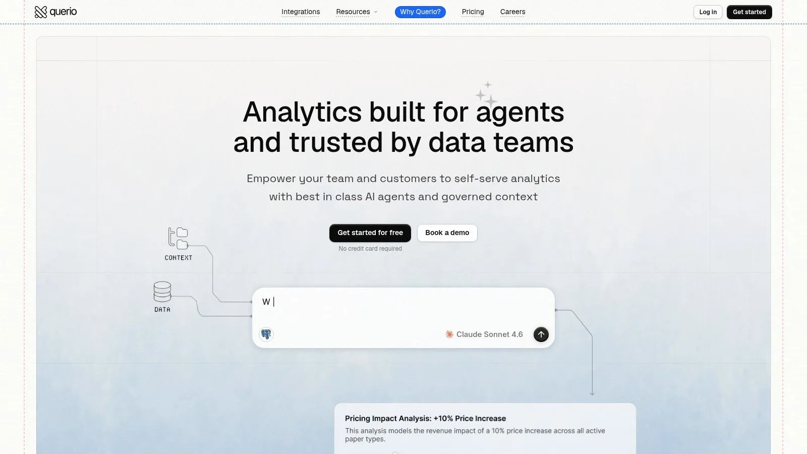
Querio takes a different approach from most data visualization companies. It doesn't start with dashboard canvases or a semantic model that only a few people can maintain. It starts inside the warehouse, then uses AI agents to generate explicit SQL or Python that teams can inspect, edit, reuse, and version.
That matters because opaque AI answers don't scale in a governed environment. If a CFO asks where a number came from, or a product manager wants to tweak a cohort definition, someone has to inspect the logic. Querio keeps that logic visible instead of hiding it behind a polished interface.
Why Querio stands out
Querio is strongest when a company wants self-service without surrendering control. Its file-system-first workflow, lightweight Python notebooks, reactive cells, versioned context, and publishable boards give analysts a maintainable working layer while still letting non-technical users ask questions in plain language.
If you've spent time cleaning up dashboard sprawl, this model is appealing. Analysts can define context and governance once, then let business users explore without turning the data team into a ticket queue.
Practical rule: If AI can answer a question but your team can't inspect the code, you haven't solved analytics governance. You've just moved the bottleneck.
A few practical strengths stand out:
- Transparent AI output: Querio's AI responses are backed by editable SQL or Python, which makes review, reuse, and debugging much easier.
- Notebook plus publishing model: Teams can work in code when needed, then ship verified boards that refresh automatically.
- Embedding support: iFrame and API options make it easier to push analytics into internal tools or customer-facing experiences.
- Broad warehouse connectivity: It supports BigQuery, Snowflake, MotherDuck, Redshift, ClickHouse, Postgres, MySQL, MariaDB, and SQL Server.
Best fit and trade-offs
Querio is a strong fit for mid-market teams that have outgrown static BI workflows but don't want to build a heavy analytics platform around a small group of specialists. It's especially compelling if you're replacing Hex, Looker, or ThoughtSpot and want one environment that can serve both technical and non-technical users.
The trade-off is that this still benefits from analyst or data engineer involvement. Non-technical users can get answers fast, but someone should still own context-building, metric definition, and guardrails. Also, detailed pricing isn't published publicly, so you'll need to evaluate fit through a demo or free tier.
For teams trying to improve chart design and interpretation after rollout, Querio's own guide to data visualization best practices is worth reviewing alongside the product itself.
2. Tableau (Salesforce)
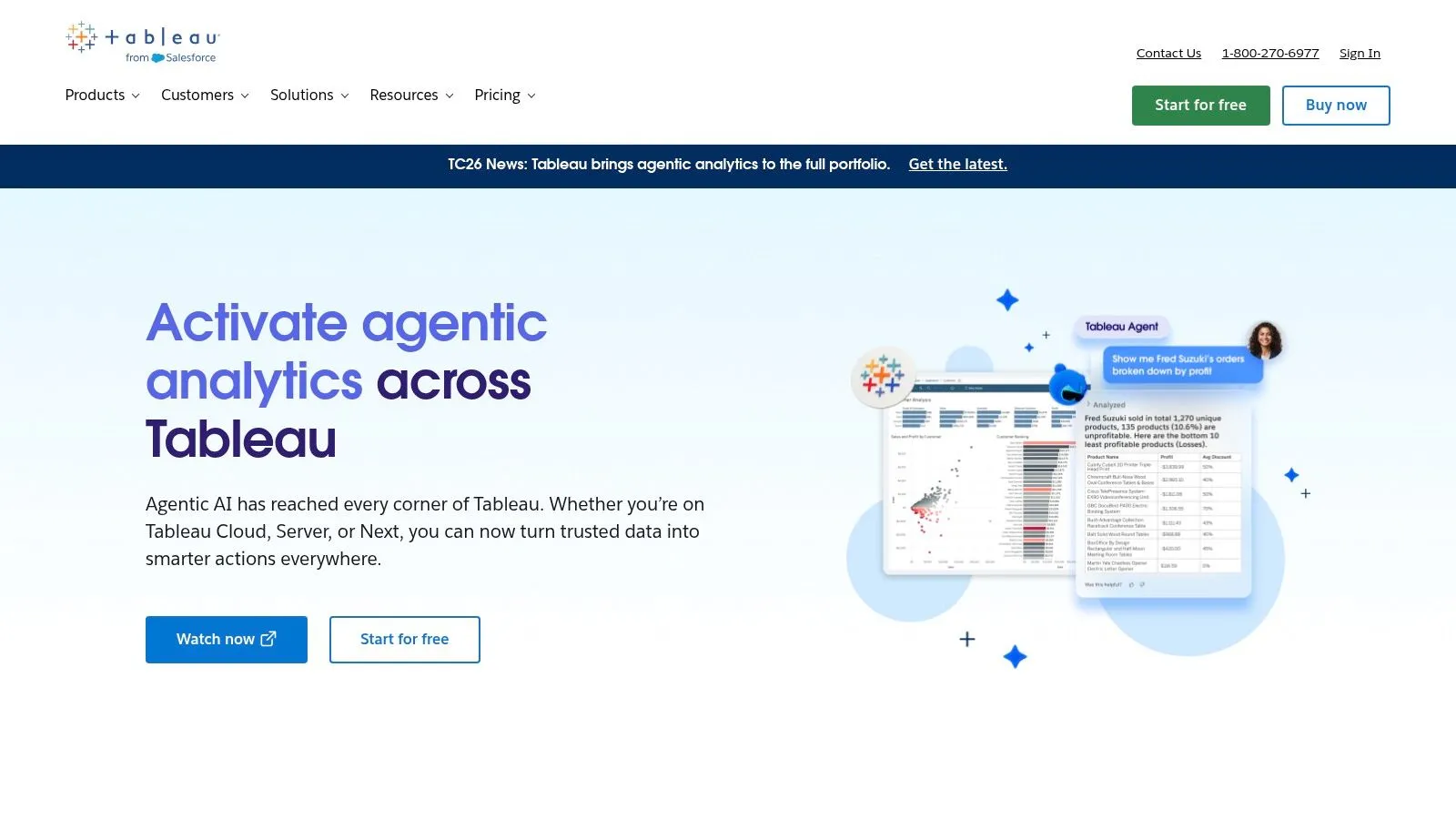
Tableau is still one of the safest choices when an organization needs polished, interactive dashboards at enterprise scale. It has the depth, ecosystem, training base, and governance model that many teams want when standardizing reporting across departments.
Its core philosophy is enterprise visual analytics. Tableau is excellent when the company already knows which metrics matter and wants to distribute trusted dashboards broadly.
Where Tableau still wins
Tableau's biggest strength is dashboard craft. It supports rich visual composition, strong mapping, storytelling, mobile access, cloud and self-managed deployment options, and mature permissioning. For executive reporting, departmental scorecards, and highly interactive drill paths, it's still one of the most complete products in the category.
I usually recommend Tableau when consistency matters more than speed of ad hoc experimentation. It works best when a central team curates data sources and publishes governed assets that business users can explore safely.
There are real trade-offs, though. Tableau authoring can feel heavy for quick iteration, especially when someone just wants to test a hypothesis and move on. Cost can also climb as more users need creation rights or advanced capabilities.
Tableau is strongest when you want a dashboard catalog. It is less elegant when the real job is rapid question answering across messy operational data.
If your short list is narrowing between the two largest BI incumbents, this comparison of Tableau vs. Power BI is a useful practical lens.
3. Microsoft Power BI
Microsoft Power BI is the default answer for a lot of organizations because it fits naturally into the Microsoft ecosystem. If your company already lives in Azure, Microsoft 365, Teams, Excel, and Fabric, Power BI often becomes the practical choice before anyone even runs a formal evaluation.
That default isn't irrational. Power BI covers self-service dashboards, paginated reporting, embedding, workspace governance, lineage, and strong enterprise security patterns.
Best for Microsoft-first organizations
Power BI's philosophy is broad BI standardization by utilizing its ecosystem. It isn't always the most elegant tool, but it is often the easiest one to justify operationally when identity, access control, procurement, and existing skills already sit inside Microsoft.
For many teams, the benefit isn't visual sophistication. It's the fact that finance can export to Excel, leaders can consume reports in Teams, admins can manage access through familiar controls, and data teams can extend into Fabric without changing vendors.
A few caveats matter in practice:
- Licensing gets nuanced: Pro, premium-style user options, and capacity planning can become confusing once usage expands.
- Scale changes the cost profile: What looks inexpensive at the start can become more complex when many users need performance and concurrency.
- Report sprawl is common: Without strong governance, workspaces and duplicate datasets pile up quickly.
Power BI is rarely the best fit for teams that want a notebook-centric, analyst-first workflow. But for broad corporate reporting in a Microsoft-centered environment, it's hard to ignore.
4. Looker (Google Cloud)
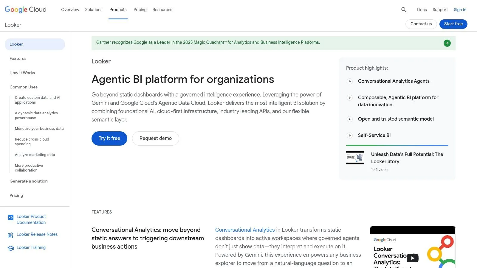
Looker is one of the clearest examples of a vendor with a strong governing philosophy. It prioritizes a central semantic layer, built in LookML, so metrics stay consistent across dashboards, explores, and embedded experiences.
That makes Looker less about pretty dashboarding and more about metric discipline. If you've had repeated arguments over what counts as revenue, retention, or active users, Looker can solve a real organizational problem.
Semantic governance first
Looker works best when a company is willing to invest in modeling up front. The reward is consistency. Analysts, product teams, and business users all pull from the same governed definitions instead of rebuilding logic in scattered reports.
This is why Looker has remained attractive for embedded analytics and productized reporting. Its APIs and developer tooling are strong, and teams on Google Cloud often like how naturally it fits with BigQuery-centric architecture.
The downside is obvious once implementation starts. LookML requires skill, discipline, and maintenance. Companies that want instant self-service often underestimate how much work a strong semantic layer takes before users see the benefit.
For buyers comparing governed dashboard platforms, this roundup of dashboard software options gives useful context on where Looker fits relative to broader BI tools.
5. ThoughtSpot
A common buying scenario looks like this. Leadership wants business users to ask questions in plain English and get answers immediately, without waiting for an analyst to build another dashboard. ThoughtSpot is built for that use case.
ThoughtSpot sits in the search-first category of this market. Its core idea is different from traditional BI platforms that center the experience on dashboard pages, filter panels, and curated drill paths. Users search, refine, and explore from the result, which changes how teams interact with data day to day.
Search-first analytics for fast question answering
ThoughtSpot works well for companies that already know their bottleneck is report consumption, not report production. Sales leaders, operators, and executives can type a question, scan the result, and keep moving. Liveboards, embedded analytics, and AI-assisted exploration make it a strong fit for organizations that want analytics to feel closer to search than classic BI.
The trade-off is practical and often underestimated. Search only works when the underlying data model is clear, trusted, and named in business language people use. If metrics are inconsistent or the semantic layer is thin, users still get answers quickly. They just may not get the right ones.
I have seen this pattern more than once. Fast search creates confidence before it creates understanding.
That is why ThoughtSpot is usually best for teams that have already done some governance work and now want broader business adoption. It is less forgiving in messy environments than buyers expect from the demo. Compared with more analyst-led platforms, the value proposition is speed to answer for business users, not depth of custom analysis.
If you're evaluating the newer AI BI category, this comparison of ThoughtSpot vs. Querio, Sigma, and Julius is useful because the workflow differences matter more than the feature checklist.
6. Qlik (Qlik Cloud Analytics)
Qlik has always stood apart because of its associative exploration model. Most BI tools encourage users down predefined drill paths. Qlik is built for free-form discovery across relationships in the data, which can be extremely powerful when the question isn't known in advance.
That makes Qlik one of the more distinctive data visualization companies on this list. It isn't just another dashboard tool with a slightly different interface.
Associative exploration changes the workflow
When teams learn Qlik well, they can move through data in a way that feels more investigative than report-driven. It's useful for analysts, operations leaders, and business users who need to chase unexpected patterns rather than consume a fixed KPI pack.
Qlik Cloud Analytics also brings enterprise features you'd expect, including governance, alerting, reporting, automation, broad connectivity, and hybrid deployment support. In complex organizations, that mix matters more than the visual layer alone.
The trade-off is user education. The associative model is powerful, but it isn't always intuitive for teams raised on dashboards with standard filter logic. Pricing can also take more work to understand because capacity and entitlement structures don't always map cleanly to how buyers first think about usage.
Qlik is a better fit for organizations that value exploratory analysis over presentation polish. If the buying committee is mainly focused on executive dashboards, other tools are usually easier to adopt.
7. Sigma Computing
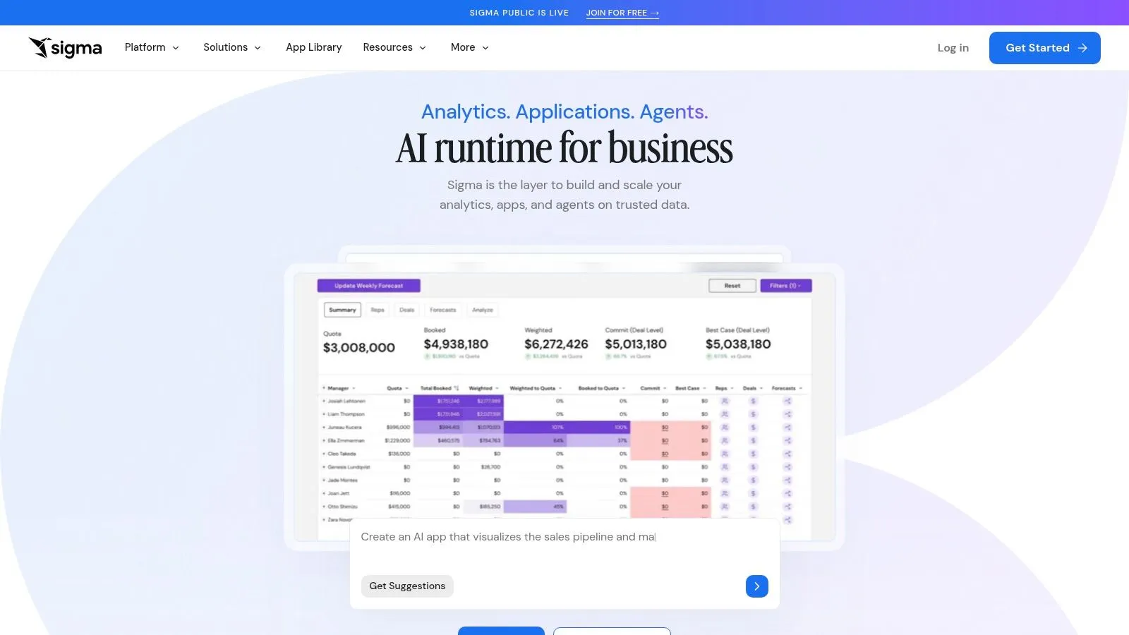
Sigma Computing sits in a category I think of as spreadsheet-first, warehouse-native analytics. It gives business users a familiar interface while pushing computation down to the cloud warehouse.
That philosophy is smart because many business teams don't want to learn BI authoring. They want something that feels close to Excel, but governed and connected to live data.
Spreadsheet logic on top of the warehouse
Sigma is strongest in modern cloud data stacks. If your company runs on Snowflake, BigQuery, or Databricks and wants less data movement, Sigma can be a very practical fit. It also supports write-back style workflows, embedded use cases, and app-like operational experiences.
This aligns with broader market demand. Independent market research cited by MarketsandMarkets estimated the global data visualization tools market at USD 5.9 billion in 2021 and projected USD 10.2 billion by 2026, implying 11.6% CAGR. The practical takeaway is that buyers increasingly want faster decision support over large, complex datasets, and Sigma's warehouse-native model is well suited to that environment.
A few limitations are worth flagging:
- Warehouse performance matters: Sigma works best when the underlying platform is fast and well managed.
- Spreadsheet familiarity can be deceptive: Users still need governance, metric discipline, and data literacy.
- Pricing usually requires a sales process: You'll need a real usage conversation before budgeting accurately.
8. Mode
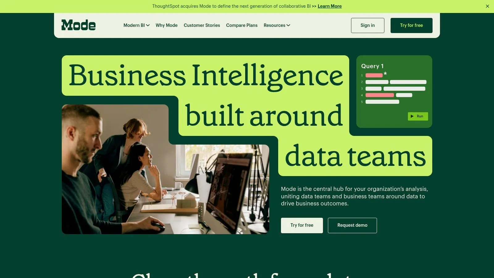
Mode fits a specific operating model. A data team needs analysts to answer messy questions fast, write SQL without constraint, add Python or R where needed, and publish the result without handing work off across three separate tools.
That analyst-first philosophy still has a real place in this market. Not every company needs broad BI adoption across hundreds of business users. Some need a strong environment for technical analysts who own exploration, interpretation, and communication end to end.
Built for analysts who publish
Mode works well in product, growth, lifecycle, and experimentation teams where the question changes every week and canned dashboards are rarely enough. Analysts can move from query to notebook to presentation in one workflow, which reduces friction during investigative work. That matters in practice because context gets lost when teams split analysis across a SQL editor, a notebook, and a separate reporting layer.
I usually place Mode in the same strategic bucket as other analyst-centered platforms, but with a more traditional BI reporting feel than notebook-app products like Hex. Compared with enterprise BI tools such as Tableau, Power BI, or Looker, Mode asks less of business users and more of analysts. Compared with Querio's focus on AI-assisted access for business teams, Mode is the better fit when a company already trusts its analysts to be the main interface to data.
The trade-off is clear. Mode is strong when skilled analysts are available and the business is comfortable routing important questions through them. It is a weaker fit for organizations trying to build a self-service layer for sales, finance, operations, and executives who expect to answer routine questions on their own.
That does not make it narrow. It makes it opinionated.
For the right team, that is an advantage. For the wrong team, it becomes a bottleneck.
9. Hex
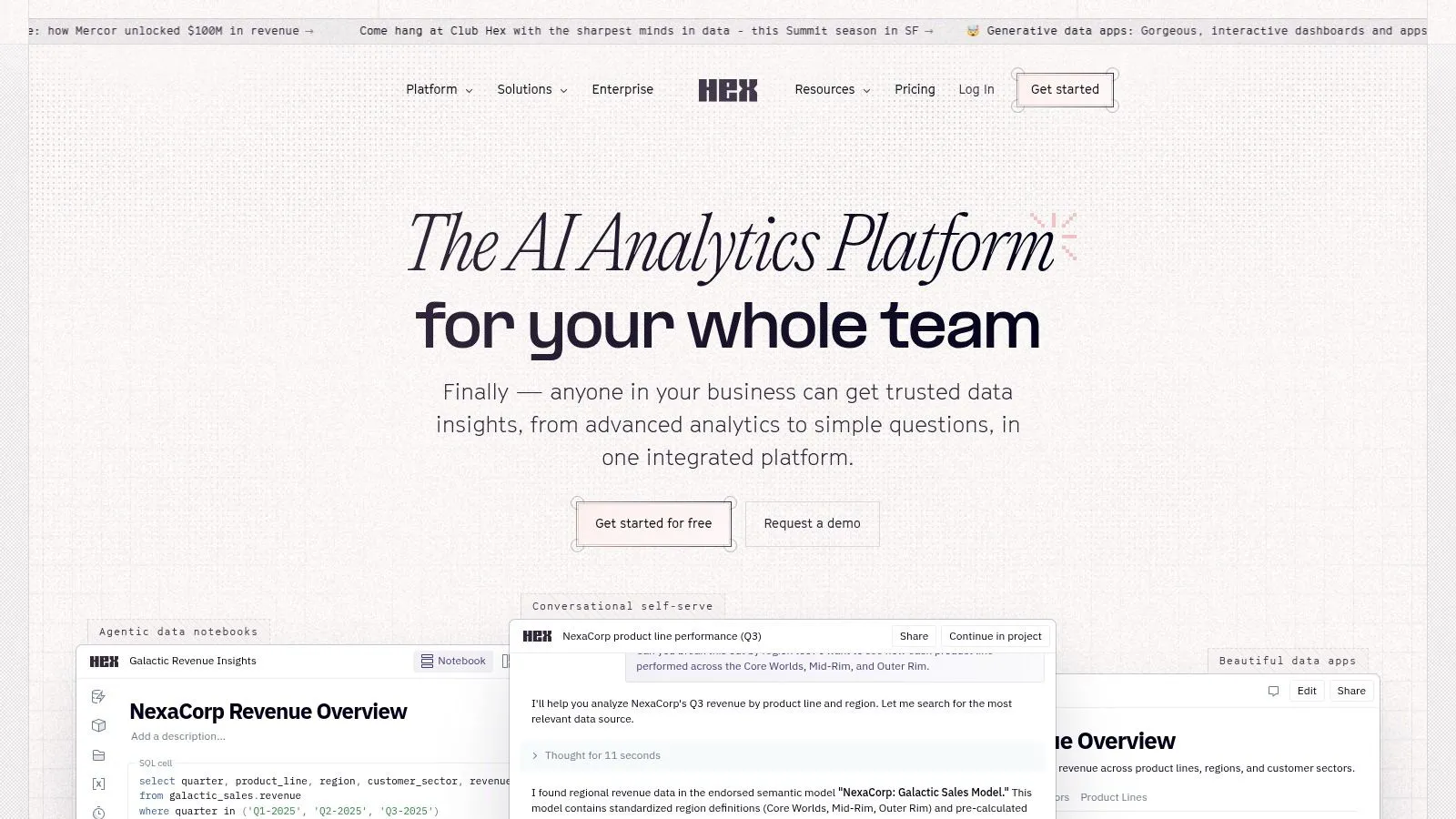
Hex has been one of the more influential notebook-to-app platforms in modern analytics. It blends SQL, Python, collaboration, lightweight app building, and AI-assisted authoring in a way that appeals to data teams that want to ship more than static reports.
Hex's core philosophy is that analysis shouldn't die in the notebook. It should become an interactive data product other people can use.
From notebook to internal app
That makes Hex compelling for teams building internal tools, exploratory apps, or collaborative analytical workflows. It can shorten the handoff from analyst exploration to something a stakeholder can directly interact with.
I like Hex most in organizations with technically fluent analysts who need flexibility and speed. It handles collaborative work well, and it supports a modern workflow where notebooks, dashboards, and apps blur together.
But there are trade-offs. Hex is less optimized for the classic enterprise BI catalog with heavy standardized governance across many business teams. And while AI features help, the platform still rewards people who are comfortable thinking in code and notebook structure.
Hex is excellent when your analysts build products. It is less ideal when your main problem is broad business adoption across non-technical teams.
10. Domo
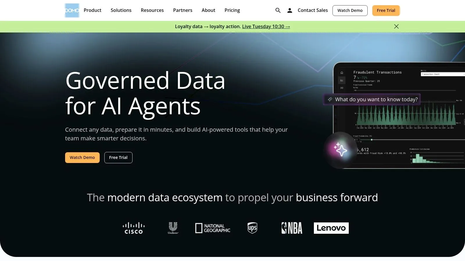
Domo approaches the market as a broad cloud platform rather than a narrow visualization layer. It connects data, supports transformation, enables dashboards and apps, and focuses heavily on distribution.
That all-in-one posture is why some teams love it and others avoid it. Domo tries to solve a lot of problems in one place.
All-in-one delivery over warehouse purity
Domo is a good fit when speed to delivery matters more than architectural minimalism. Companies that want to connect many sources, stand up dashboards quickly, distribute analytics widely, and build low-code experiences often get value from the platform's integrated model.
Its strengths are practical. Broad connectivity, embedded distribution, mobile access, governance, app-building tools, and workflow automation help teams move quickly without stitching together as many separate products.
The trade-off is strategic. Some data leaders prefer a warehouse-first stack and don't want transformation logic or business logic living inside a vendor platform. Forecasting spend can also take more effort when usage or consumption models are involved.
Domo isn't the purest analytics architecture. It is often one of the fastest ways to put working analytics in front of a large audience.
Top 10 Data Visualization Companies, Feature Comparison
| Product | Core approach | Primary users & UX | Key strengths / USP | Governance, integrations & embedding | Pricing & fit |
|---|---|---|---|---|---|
| Querio (Recommended) | AI coding agents + file-system Python notebooks (.py) with reactive cells | Mix of technical & non-technical; AI chat + editable code for quick self-serve insights | Transparent SQL/Python answers; fast time-to-insight; reusable, versioned context layer | Connects to BigQuery/Snowflake/Redshift/Postgres etc.; versioned governance; iFrame/API embedding; Trust Center security | Free get-started tier; demos; targeted at mid-market replacing Hex/Looker/ThoughtSpot |
| Tableau (Salesforce) | Visual analytics & drag‑and‑drop dashboards | Business analysts & dashboard creators; curated reporting UX | Rich visualization library; storytelling & mapping; mature ecosystem | Strong governance, cataloging, embedding; Cloud or Server; Salesforce integrations | Seat-based enterprise pricing; scales with features |
| Microsoft Power BI | Microsoft-integrated dashboards & paginated reports | Organizations standardized on Microsoft stack; business users | Deep MS365/Azure integration; attractive entry-level pricing | AAD security, Fabric capacities, Teams/Excel embedding | Per-user / capacity SKUs; licensing complexity |
| Looker (Google Cloud) | Central semantic model (LookML) + governed Explores | Data teams & cloud-first orgs (BigQuery) | Best-in-class semantic layer for metric consistency; developer tooling | Robust governance; BigQuery/native integrations; strong APIs/embedding | Enterprise-oriented pricing; sales-led |
| ThoughtSpot | Natural-language search + agentic analytics | Non-technical users wanting search-driven insights | Fast NL search time-to-insight; Liveboards; strong embedded AI | Requires curated modeling; embedding SDK; human-in-loop controls | Sales engagement for pricing; enterprise focus |
| Qlik (Cloud Analytics) | Associative engine for free-form exploration | Analysts & power users exploring across datasets | Ad-hoc discovery beyond rigid drill paths; flexible tiers | Capacity-based SaaS; hybrid deployment; governance & alerting | Capacity/entitlement pricing; nuanced planning |
| Sigma Computing | Spreadsheet-like UX with warehouse pushdown | Spreadsheet users and analysts on cloud warehouses | Familiar UX; write-back/materialization; strong cloud pushdown | Multi-tenant governance; optimized for Snowflake/BigQuery/Databricks | Pricing via sales; best with performant warehouse |
| Mode | Analyst-first SQL + Python/R notebooks to dashboards | Analysts & data scientists; code-to-dashboard workflows | Smooth handoff from analysis to reports; notebook support | dbt semantic layer integration; embedding & APIs | Free trial; enterprise pricing via sales |
| Hex | Collaborative Python/SQL notebooks → apps | Data scientists & analysts building interactive apps | Rapid app publishing; AI-assisted authoring; strong collaboration | Notebook versioning, embedding, app builder | Sales-led pricing; less focused on classic dashboard catalogs |
| Domo | End-to-end BI, data prep, low/no-code apps | Teams needing all-in-one stack & broad distribution | 1,000+ connectors; App Studio; rapid executive dashboards | Integrated data prep, governance, mobile & embedding | Consumption/credit-style pricing; enterprise focus |
How to Choose A Framework for Selecting Your BI Partner
A familiar BI buying cycle starts with a polished demo, a broad feature checklist, and a shortlist built around brand recognition. Six months later, the warehouse bill is up, analysts are still fielding basic questions in Slack, and executives have three dashboards that disagree on the same metric. The selection problem was never about chart variety. It was about fit.
The practical way to evaluate data visualization companies is to sort them by product philosophy first, then test that philosophy against your team, data stack, and decision process.
A useful starting model looks like this:
- Enterprise BI: Tableau, Power BI, Looker, Domo, Qlik. These platforms are built for governed reporting, broad dashboard distribution, and standardization across teams.
- Analyst-first: Mode, Hex, Sigma. These work well when analysts or data scientists already drive reporting and need SQL, notebooks, modeling flexibility, or spreadsheet-style exploration.
- AI-native and search-first: Querio and ThoughtSpot. These focus on shortening the path from question to answer for business users, with different levels of transparency and analyst control.
That framing surfaces trade-offs faster than any comparison table.
1. Start with who will actually build and maintain the system
Many teams buy for the viewer and forget the builder. That creates friction immediately.
If analytics is maintained by a central BI team, enterprise BI platforms usually make sense because governance, permissions, certified content, and standardized dashboard delivery matter more than flexibility for one analyst. If the work happens inside a data team that lives in SQL, Python, notebooks, and dbt, analyst-first platforms are often a better fit because they match existing habits instead of forcing a reporting-only workflow.
Querio sits in an interesting middle position. Business users can ask questions in a chat-style interface, but analysts still have access to the SQL and Python underneath. That matters in practice. Teams can move faster without creating a second analytics system that no one trusts or can maintain.
2. Define the job before you evaluate the product
"BI" covers very different jobs, and vendors optimize for different ones.
If the main requirement is board reporting, KPI reviews, and a governed dashboard catalog, Tableau, Power BI, and Looker are usually the right starting points. If the need is exploratory analysis across messy questions, Qlik, Sigma, Hex, or Mode may fit better. If the bottleneck is that operators, sales managers, or finance leads cannot get answers without waiting on analysts, AI-native and search-oriented products deserve closer review.
I usually test this with one blunt question: what happens when a director asks a follow-up question that was not anticipated in the dashboard? Some tools handle that well. Others route the work straight back to the analyst queue.
3. Check stack fit early
Many evaluations go sideways because the demo looks good while the deployment model does not.
Warehouse-native tools are a strong fit when Snowflake, BigQuery, Redshift, or Databricks already serves as the source of truth and the team wants to keep data movement low. Power BI is often attractive in Microsoft-heavy environments because identity, Excel habits, and licensing can work in its favor. Looker tends to make more sense when metric governance and semantic modeling are strategic requirements, not just technical preferences. Domo can be useful when a team wants more of an all-in-one operating layer with connectors, light app building, and broad business distribution.
The wrong stack fit creates hidden work. Queries need tuning, permissions get messy, extracts multiply, and governance starts depending on tribal knowledge.
4. Evaluate adoption risk, not just feature depth
The best product on paper can still fail if the interface is too technical for business users or too opaque for analysts.
Vendor philosophy matters. ThoughtSpot reduces friction for users who prefer search-style discovery. Sigma lowers the learning curve for spreadsheet-heavy teams. Hex and Mode keep analysts in an environment they already understand. Querio's trade-off is different. It aims to give non-technical users a faster path to answers while preserving visibility into the generated work, which can reduce cleanup later.
Adoption usually breaks on one of three points: too much training, too little governance, or a workflow that does not match how decisions are made.
5. Use a short selection framework
A practical buying framework should fit on one page:
- Team skill: Who builds content, who consumes it, and who supports it after launch?
- Data model maturity: Do you already have trusted definitions, or are metrics still being debated?
- Stack fit: Does the product work cleanly with your warehouse, identity setup, and transformation layer?
- Decision speed: Are you optimizing for polished reporting or faster answers to unplanned questions?
- Governance tolerance: How much flexibility can you allow before numbers start drifting?
- Cost shape: Will pricing rise with viewers, query volume, compute usage, or premium features?
That last point deserves more attention than it gets in demos. Some tools look inexpensive until usage broadens. Others are costly up front but easier to predict once governance is established.
Spotlight Querio vs. Hex, Looker, and ThoughtSpot
Hex is a strong choice for technical teams that want notebooks, lightweight apps, and collaboration around code-driven analysis. Looker is strongest when semantic consistency is the core requirement and the company is willing to invest in modeling discipline. ThoughtSpot is attractive when executives and business teams want a search-led experience and quick exploration without living inside dashboards every day.
Querio is best evaluated against a different question: can business users move faster without cutting analysts out of the loop? Its value is not that it replaces the data team. Its value is that it can reduce low-complexity request volume while keeping the underlying logic visible enough for analysts to review, refine, and reuse.
That is the distinction I would focus on after the demo.
If your organization needs governed reporting at scale, choose the platform that enforces consistency well. If your analysts are the product, choose the one that respects technical workflows. If your main problem is decision latency across non-technical teams, examine how each vendor handles transparency, modeling, and reuse before you sign a contract.
If your team is stuck between slow BI workflows and analyst-only notebooks, Querio is worth a serious look. It gives business users faster self-serve answers while keeping the underlying SQL and Python visible, governed, and reusable, which is exactly what most scaling teams need when they want speed without losing control.