Business Intelligence
5 Best AI-Powered Data Analysis Tools for Non-Technical Users in 2026
Compare five AI analytics tools for non-technical teams to query live warehouses, enforce consistent metrics, and build dashboards.
By 2026, tools like Querio, ThoughtSpot, Looker, Tableau, and Microsoft Power BI have transformed how businesses analyze data. These platforms let non-technical users ask plain-English questions and get real-time answers - no SQL or engineering required. Here's a quick breakdown:
Querio: Ask questions in plain English, get live results from your data warehouse, and ensure consistent metrics with its centralized semantic layer.
ThoughtSpot: Search-driven insights with real-time dashboards and AI-powered reasoning.
Looker: A robust tool for enterprise reporting, though it often requires technical support for customizations.
Tableau: Focused on visual storytelling with drag-and-drop features and AI-generated summaries.
Microsoft Power BI: Perfect for teams already using Microsoft 365, with AI tools like Copilot for building reports.
Quick Comparison
Tool | Best For | Key Feature | Starting Price |
|---|---|---|---|
Querio | Mid-size SaaS teams | Governed metrics, live querying | $400/month |
ThoughtSpot | Executives, analysts | Search-driven insights | Varies |
Looker | Enterprise reporting | LookML for custom metrics | Varies |
Tableau | Visual-oriented teams | Drag-and-drop dashboards | Varies |
Microsoft Power BI | Microsoft ecosystem users | AI-assisted report building | Varies |
Each tool has strengths depending on your data setup and team needs. For mid-size B2B SaaS companies, Querio stands out with its focus on live data and consistent metrics. Choose based on where your data lives, who needs access, and how much control you need over metrics.

Best AI Data Analysis Tools for Non-Technical Users 2026
1. Querio

Querio is built for non-technical users who need quick, accurate insights from live warehouse data. It connects directly to platforms like Snowflake, BigQuery, Amazon Redshift, ClickHouse, PostgreSQL, and more using encrypted, read-only credentials. The best part? There's no need for ETL pipelines.
Natural Language Querying
With Querio, you can ask questions in plain English, and its AI will translate them into real SQL or Python, run the query on your live warehouse, and deliver the results. What sets Querio apart is its commitment to transparency: every result includes the exact SQL or Python code behind it. This code is fully editable and can even be passed along to a data engineer for further review.
Governance Controls
Querio features a centralized semantic layer where your data team can define key metrics - like "Monthly Recurring Revenue", "Active Users", or "Churn Rate" - with precise business logic. Once these definitions are in place, every user gets consistent answers based on those approved metrics. This eliminates the risk of inconsistent calculations, like a sales manager and finance analyst interpreting "revenue" differently from the same dataset.
Dashboard Creation
Querio makes visualizing data seamless. Query results are automatically converted into charts through its auto-charting engine, which picks the best chart type for the data. Users can also create reactive dashboards - called Boards - using a simple drag-and-drop interface. These dashboards update automatically as the underlying warehouse data changes.
Querio’s pricing model is straightforward: flat-fee plans start at $400/month for 10 users, with many plans supporting unlimited users. This means a Head of Revenue Operations can share live dashboards with an entire team without worrying about extra licensing fees as the team expands.
Next, we’ll dive into ThoughtSpot, another tool designed to empower business users with interactive data capabilities.
2. ThoughtSpot
ThoughtSpot empowers business users to analyze data without needing SQL expertise. It integrates directly with platforms like Snowflake, BigQuery, and Redshift, using a zero-copy design that avoids duplicating data.
Natural Language Querying
ThoughtSpot's AI-powered querying has come a long way. Starting with the token-based Spotter Classic, it transitioned to Spotter Agent, which introduced explainable formulas and the option to share underlying data values with its large language model (LLM). The latest version, Spotter 3, takes this further by offering analyst-level reasoning with verifiable logic, ensuring more accurate and reliable insights.
Governance Controls
With the Analyst Studio, ThoughtSpot ensures standardized metric definitions across an organization. This feature helps data teams avoid discrepancies, ensuring everyone works with the same numbers - even when pulling data from the same warehouse.
Dashboard Creation
ThoughtSpot provides interactive, real-time Liveboards and a prompt-driven tool called SpotterViz for instant visualizations. Its unified interface and interactive dashboards set a high standard in the field. Unlike tools that hide query details, ThoughtSpot's Querio makes SQL and Python queries fully editable, which is essential for data teams needing transparency and auditability.
Next, we’ll dive into Looker to examine its reactive dashboard features tailored for non-technical users.
3. Looker
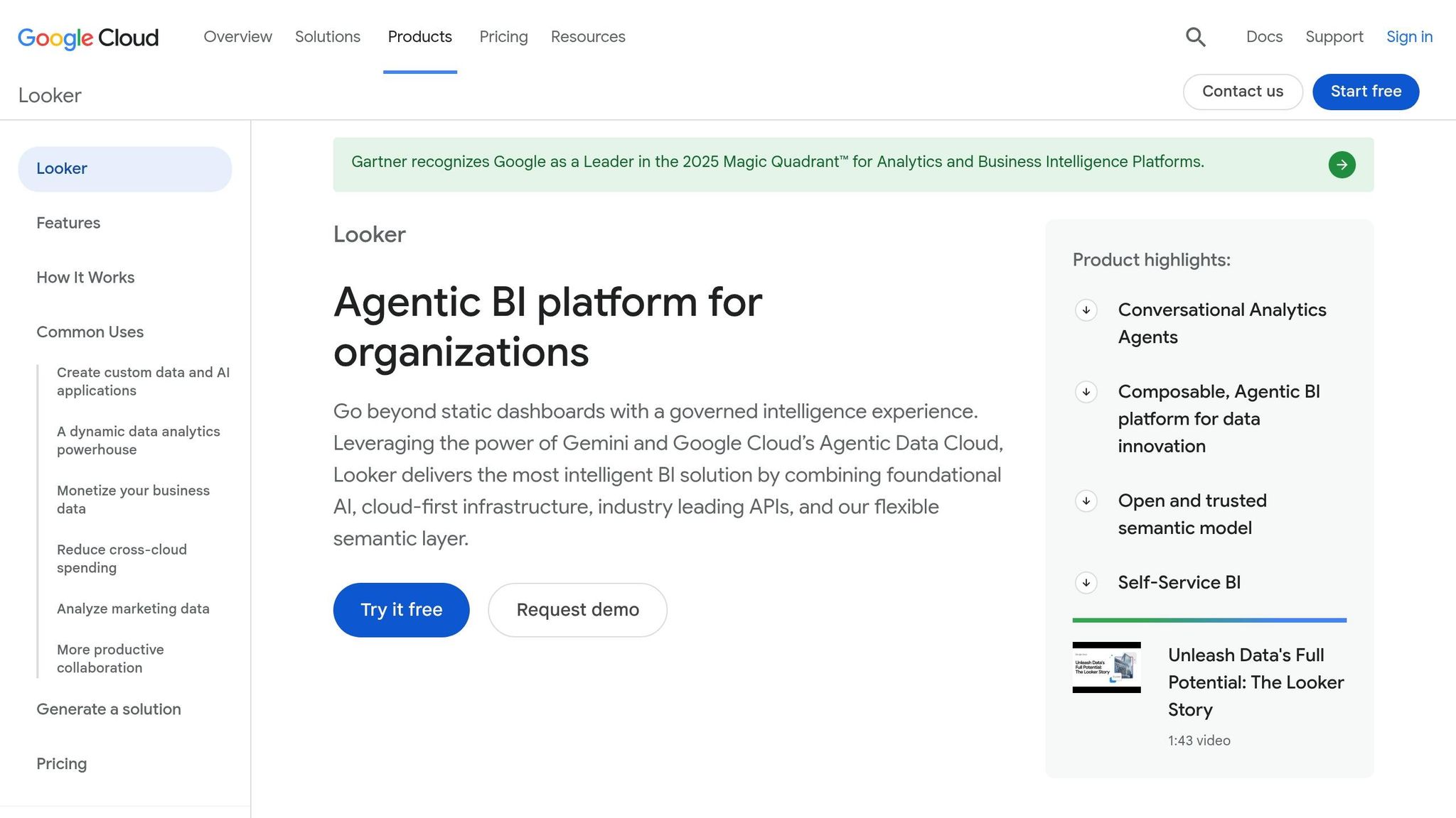
Google Cloud's Looker is a well-established BI platform designed around LookML. It’s particularly suited for B2B SaaS companies that rely on BigQuery, Snowflake, or Redshift, offering pre-built dashboards and self-service exploration. However, advanced customization often requires technical expertise.
Live Warehouse Connections
One of Looker’s standout features is its ability to query your data warehouse directly, ensuring real-time data access. This makes it an excellent choice for teams that depend on up-to-date information for daily decision-making.
Natural Language Querying
Looker’s natural language capabilities are powered by Gemini in BigQuery, which can be a limitation for teams using Redshift or Snowflake. Non-technical users primarily interact with data through pre-defined Explores, rather than crafting their own queries.
Governance Controls
With LookML, metric, dimension, and business logic definitions are centralized, ensuring consistency across all dashboards. However, this system requires technical skills to manage, which can restrict non-technical users from independently exploring data.
Dashboard Creation
Looker’s dashboards are sleek and interactive, offering features like filtering, drill-downs, and easy sharing - all without needing to write code. That said, customization options are limited to what’s pre-built, meaning data teams often need to step in for new or complex requests. Up next, we’ll see how Tableau tackles similar challenges with its own unique approach.
4. Tableau
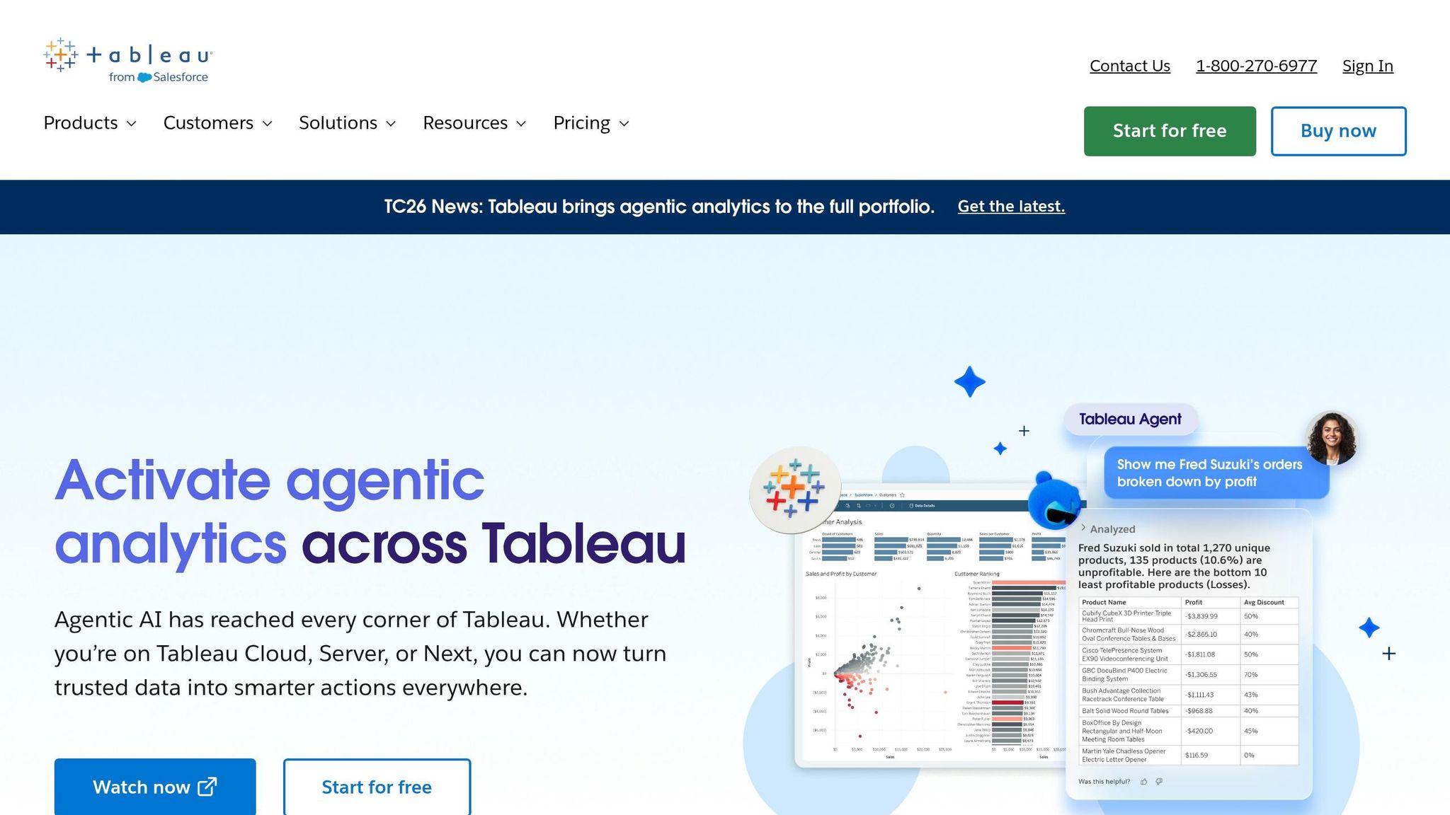
Tableau, a part of Salesforce, takes data visualization to the next level by making analysis accessible to non-technical users. With its drag-and-drop interface, it allows users to explore and interpret data visually - no coding required. By 2026, Tableau has embraced AI to make the leap from raw data to actionable insights even smoother for everyday business users.
Live Warehouse Connections
Tableau integrates seamlessly with data warehouses like Snowflake, BigQuery, and Redshift. This means dashboards are always up-to-date, providing real-time data for faster decision-making.
Natural Language Querying
With Tableau Agent, users can simply type out what they want in plain English, and the tool instantly creates the corresponding visualization. Features like Tableau Pulse keep managers informed of key metric changes, while Data Stories automatically generate easy-to-read summaries of charts, adding context to the visuals.
Governance Controls
To ensure data security and compliance, Tableau uses the Einstein Trust Layer. This feature protects sensitive information by masking personally identifiable information (PII) and managing access permissions.
Dashboard Creation
Tableau’s drag-and-drop builder makes it easy for anyone to create interactive dashboards. Users can filter, drill down, and customize charts to suit their needs. A variety of chart types and formatting options ensure businesses can tailor visualizations to their specific goals.
5. Microsoft Power BI

Microsoft Power BI is an excellent choice for organizations already using the Microsoft 365 suite. It integrates seamlessly with familiar tools like Teams, Excel, and PowerPoint, providing a full analytics platform that feels natural for non-technical users to adopt.
Live Warehouse Connections
Power BI connects directly to data sources like Azure Synapse, Snowflake, Google BigQuery, and SQL Server using DirectQuery. This means data stays in the warehouse, and dashboards always reflect the latest numbers. No need to export CSVs or wait for scheduled updates - queries run live, ensuring real-time accuracy.
Natural Language Querying
Power BI is evolving its Q&A capabilities with Copilot, an AI-powered tool that generates complete report pages from plain-English prompts. Copilot relies on DAX (Data Analysis Expressions) to handle calculations, and users can review its logic through a diagnostic feature called "How Copilot arrived at this". However, troubleshooting DAX formulas can be tricky for non-technical users if something goes wrong. Features like Smart Narratives and Quick Insights further enhance usability by automatically summarizing charts and highlighting trends without requiring manual input.
Governance Controls
Power BI ensures data security with Row-Level Security (RLS) and Object-Level Security (OLS), which determine what data users can access. However, during the Copilot preview phase, RLS may not be fully enforced, so Microsoft advises relying on OLS for protecting sensitive columns. Authors also need to carefully document semantic models, providing clear descriptions (up to 200 characters) for measures, tables, and columns to help Copilot generate accurate outputs.
Dashboard Creation
The platform’s drag-and-drop interface supports over 100 custom visuals from the marketplace, alongside built-in tools like Key Influencers and Decomposition Tree, which help users understand why metrics are changing - not just what the data shows. Once completed, dashboards can be shared directly in Teams or embedded into PowerPoint, streamlining collaboration for teams already working within the Microsoft ecosystem.
Comparison Table
Each tool discussed in this article offers a distinct approach to AI-powered analytics. To make it easier to understand these differences, the table below highlights key features like data connections, AI interaction styles, governance controls, and the ideal user profile for each tool.
Tool | Best Use Case | Supported Data Sources | AI Interaction Style | Governance Controls | Ideal User Profile |
|---|---|---|---|---|---|
Querio | governed self-serve analytics platforms for mid-size B2B SaaS teams | Snowflake, BigQuery, Redshift, PostgreSQL, ClickHouse, MySQL | Conversational chat → fully inspectable and editable SQL/Python | Centralized semantic/context layer; role-based access; query logging | Data leaders & non-technical business teams needing consistent metrics |
ThoughtSpot | Search-driven data discovery at scale | Snowflake, BigQuery, Redshift, Databricks, Starburst | Search bar + AI-generated insights (Spotter) | Row- and column-level security; metadata governance | Business analysts & executives who want instant visual answers |
Looker | Centralized enterprise reporting with a single source of truth | 50+ SQL dialects, BigQuery, Snowflake, Redshift | Natural language via Gemini AI (Looker Duo) | LookML semantic layer; decentralized by team/project | Data-driven organizations with dedicated data engineering support |
Tableau | High-end visual storytelling and executive dashboards | 100+ sources (Salesforce, Excel, cloud DBs, on-prem) | Tableau Pulse (proactive insights) + Tableau Agent | Site-level permissions; Einstein Trust Layer | Visual-oriented analysts and executives |
Microsoft Power BI | Enterprise BI inside the Microsoft 365 ecosystem | 150+ sources (Azure Synapse, Excel, SQL Server, Snowflake) | Copilot (conversational report builder) + Q&A | Row-Level Security; Object-Level Security; Sensitivity labels | Corporate teams already embedded in the Microsoft stack |
Querio stands out for its governed, live self-serve analytics tailored for non-technical users. By offering a centralized semantic layer and live connections to data warehouses, it ensures consistent metric definitions and direct access to accurate, up-to-date data. This is particularly valuable for mid-size B2B SaaS teams aiming to empower business users while maintaining control over metric definitions.
A few patterns emerge across these tools. Some, like Querio and Looker, prioritize querying live data directly from warehouses. Others, such as Tableau and Power BI, support a broader range of data connectors, making them better suited for organizations with legacy systems or mixed environments. Querio’s approach to governance is especially noteworthy - its centralized context layer ensures that metrics are consistently applied across all queries without requiring excessive engineering effort.
In contrast, Looker’s LookML, while powerful, demands significant engineering upkeep. Power BI relies heavily on precise DAX documentation to achieve similar results. These governance models highlight the trade-offs between flexibility, ease of use, and the level of engineering support required. Querio’s design aligns well with the needs of business teams in mid-sized B2B SaaS companies (100–500 employees) working with live data warehouses, offering a balance of usability and control that sets it apart.
Conclusion
When selecting an AI-powered analytics tool, start by considering three key questions: Where is your data stored? Who needs access to it? And how much control do you require over your metrics?
Tableau and Microsoft Power BI are excellent choices for organizations with diverse data sources and established ecosystems. If instant, search-driven insights are a priority, ThoughtSpot stands out. For teams with engineering support, Looker offers a solid option. On the other hand, mid-size B2B SaaS teams leveraging modern data warehouses may need something tailored to their specific setup.
For teams using platforms like Snowflake, BigQuery, or Redshift, Querio is specifically designed to fit that environment. Its governed semantic layer and inspectable SQL/Python provide consistent, real-time insights. Querio users have reported a 50% drop in data-related Slack messages, a clear indicator that the platform enables effective self-service analytics without needing a dedicated data team.
There’s no one-size-fits-all solution - choose a tool that aligns with your team’s most pressing challenges and bottlenecks.
FAQs
Do I need a data warehouse to use these tools?
Yes, Querio relies on a data warehouse or database to function. It integrates directly with live environments such as Snowflake, BigQuery, Amazon Redshift, and PostgreSQL. By using encrypted, read-only credentials, Querio ensures your team has access to accurate, up-to-date data. This approach eliminates the need for ETL pipelines, data duplication, or manual exports, streamlining the entire process.
How do these tools keep metrics consistent across teams?
These tools ensure consistent metrics by leveraging a centralized semantic layer. Here, data teams define key metrics, business terms, and table relationships a single time. This approach guarantees that all dashboards, queries, and analyses use the same approved definitions, avoiding issues like conflicting interpretations of 'revenue.' By establishing a shared and versioned source of truth, organizations can deliver accurate and uniform data for all teams to rely on.
What should I check to keep live querying fast and reliable?
To maintain fast and reliable live querying, it's crucial to connect directly to your data warehouse - whether that's Snowflake, BigQuery, or Redshift. Use encrypted, read-only credentials to eliminate the need for data extracts and avoid sync delays.
A governed semantic layer is key for centralizing metrics and relationships. This ensures queries are consistent and efficient across your team. Additionally, make it a habit to review the generated SQL or Python code for accuracy. Reactive notebooks can also help by keeping your data automatically up-to-date, saving time and reducing manual effort.
Related Blog Posts


