Guide
Analytics Change Management: A Founder's Playbook
Drive real adoption with your analytics change management strategy. This playbook covers readiness, stakeholder buy-in, self-serve rollout, and measuring ROI.
70% of change initiatives fail due to ineffective change management, and only 30% of transformational changes succeed, according to UC Berkeley data summarized here. That should change how founders think about analytics. The risk usually isn't buying the wrong dashboard tool. It's assuming deployment equals adoption.
Many organizations still approach analytics as a software rollout. Pick a stack. Stand up a warehouse. Build a Center of Excellence. Train users once. Then wait for a self-service culture to appear. It rarely does. People keep asking analysts for exports, decisions stay trapped in meetings, and the expensive new layer turns into a nicer-looking bottleneck.
Analytics change management is the work of changing how people make decisions, not just what tools sit on top of the data warehouse. If you get that right, self-service analytics becomes a real operating advantage. If you don't, even strong tools will gather dust.
Table of Contents
- Why Most Analytics Initiatives Fail Before They Start
- Before You Build Your Data Stack Define Your North Star
- Your Stakeholder Map From Skeptics to Champions
- Building Guardrails Not Gatekeepers for Self-Serve Analytics
- Launching a Movement Not Just a Tool
- How to Measure What Matters Adoption and Business Impact
Why Most Analytics Initiatives Fail Before They Start
Up to 70% of change initiatives fall short when change management is weak, according to the Prosci-related figures cited later in this article. Analytics programs are especially exposed because leaders often treat them as software rollouts when they are really behavior-change efforts inside operating teams.
The hardest work starts before anyone logs into a new platform. Companies rarely fail because employees cannot click through a dashboard. They fail because the business still runs on old habits: side spreadsheets, analyst bottlenecks, gut calls in meetings, and metric debates that restart every week.
Failure often happens before launch
Founders usually blame analytics misses on vendor choice, data quality, or an incomplete model. Those problems are real, but they are usually downstream effects. The earlier mistake is treating analytics as a reporting upgrade instead of a change in how decisions get made.
That shows up in the first few planning meetings. Product asks for usage analysis. Finance wants board-ready reporting. Sales wants pipeline visibility. The data team says yes to all three, scope expands, ownership gets blurry, and nobody defines the one or two behaviors that should change after rollout.
Practical rule: If leadership cannot name the decisions that should change after launch, the company is buying software, not changing how it operates.
Teams also underestimate enablement. Vendor onboarding covers features. Adoption requires repetition, role-based learning, and reinforcement inside team routines. That is why it helps to borrow instructional design concepts and models instead of relying on product tours and office hours alone.
The Center of Excellence trap
A common failure pattern is the Center of Excellence trap. The company builds a capable analytics team, gives it ownership of standards, tooling, and metric definitions, and assumes the rest of the business will become data-driven as a result.
What usually happens is more limited. The CoE gets better at producing dashboards and answering requests. Operating teams stay dependent. Managers still ask analysts to interpret every chart. Frontline teams still default to the old workflow because it feels faster and carries less personal risk if they make the wrong call.
I have seen this trade-off firsthand. Centralization improves consistency early on, but if it lasts too long, it trains the business to consume analytics passively instead of using it directly. The tool is live, the dashboards look polished, and adoption stalls because behavior never changed.
Legacy BI environments make the problem worse. Reporting inventory grows, definitions multiply, and trust falls as teams find conflicting answers in different places. That is why many companies eventually run into the hidden costs of traditional BI platforms.
A better approach is narrower and more disciplined:
- Start with one decision loop: Improve one recurring business decision with clear stakes and frequent usage.
- Put adoption in the business: Make the functional leader responsible for using the system in team rituals, not just the data team responsible for publishing it.
- Lower the effort required: The first self-serve workflow needs to be faster than asking an analyst or rebuilding the number in a spreadsheet.
- Reinforce visible use: Review the new metrics in live meetings, tie them to actions, and recognize teams that change how they operate.
Analytics change management succeeds when the new behavior becomes the easier behavior. That is the standard. Not whether the platform shipped on time.
Before You Build Your Data Stack Define Your North Star
Tool selection comes too early in most analytics programs. Teams jump from pain to procurement. They know reporting is slow, so they start demoing platforms. They know metrics are inconsistent, so they start redesigning the stack. That's backwards.
Start with business decisions not dashboards
A useful North Star starts with a simple question. Which decisions are currently too slow, too political, or too dependent on manual analyst work?
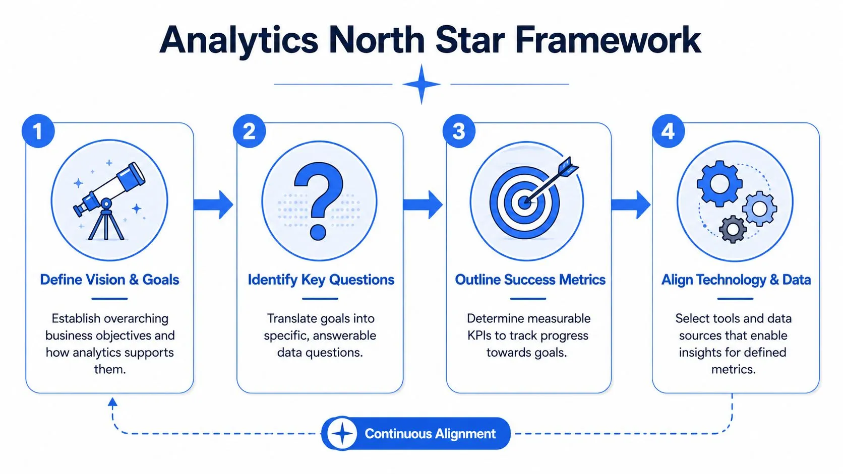
Once you answer that, the rest becomes clearer. You can define what information should be available, who needs it, how often the decision happens, and what behavior should change when the analytics capability is live. That's the foundation of analytics change management.
Teams that use structured change methods perform better than teams that improvise. Organizations employing structured methodologies report effectiveness levels of up to 59%, and when excellent change management is integrated, success rates can surge to 93%, compared with a 60 to 70% baseline failure rate for poorly managed initiatives, according to Prosci-related figures summarized here.
A founder-level North Star usually needs four components:
-
Decision scope
Define the business decisions that must improve. Examples include pricing reviews, weekly growth diagnostics, renewals forecasting, support staffing, or product adoption reviews. -
User scope
Identify which roles should answer which questions themselves. Don't say "the company." Say "PMs should self-serve feature adoption trends" or "regional sales managers should inspect pipeline movement without analyst help." -
Trust scope
Agree which metrics need a single definition and which can remain exploratory. Not everything needs central certification. -
Speed scope
Set an expectation for how quickly a user should get from question to answer. If the target experience still requires opening a ticket, you haven't designed for self-service.
A strong companion read on this point is reporting and metrics, especially if your current pain is less about data availability and more about unclear measurement design.
Write a from-to narrative people can follow
The best North Stars aren't technical. They're operational. They tell the organization what is changing in plain language.
"From analyst-mediated reporting to team-owned exploration."
That kind of statement creates alignment faster than architecture diagrams. It also helps you say no. If a requested feature doesn't support the shift you're trying to create, it can wait.
A practical way to write the narrative is to complete these pairs:
| Current state | Future state |
|---|---|
| Gut-feel reviews | Evidence-backed operating reviews |
| Siloed spreadsheets | Shared metric definitions |
| Slow reporting queues | Faster self-service answers |
| Dashboard consumption | Interactive investigation |
| Reactive analyst work | Reusable data products |
The trade-off is real. A narrower North Star can feel less ambitious at first. But it gives the company something most analytics programs lack: a shared definition of success before the stack is built.
Your Stakeholder Map From Skeptics to Champions
Analytics platforms aren't adopted by org charts. They're adopted by specific people with different incentives, fears, and attention spans. Founders who miss that end up giving the same message to everyone and wondering why nobody changes behavior.
A stakeholder map fixes that by making the rollout personal.
Four groups that shape adoption
Use a simple model. Most companies have four categories that matter in analytics change management.
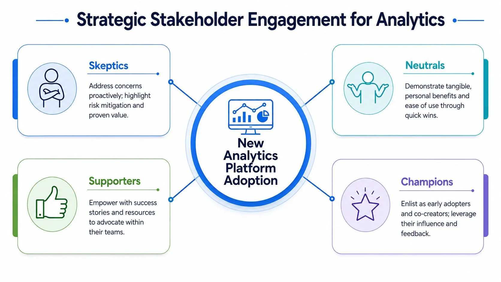
Champions already want the change. They're often PMs, RevOps leads, finance managers, or hands-on functional leaders who are tired of waiting on reporting queues. They care about speed and influence. Give them early access, ask for blunt feedback, and let them shape priority use cases.
Practitioners live in the tool more than executives do. Analysts, operators, and team leads sit here. They care about workflow friction. If the new system makes basic tasks slower, they will revert to the old one.
Executives don't need every feature. They need confidence. They care about whether metrics are trustworthy, whether teams are aligned, and whether this change reduces drag on the business. Their support matters because poor leadership sharply lowers outcomes. Projects with high-quality change management are six times more likely to meet benchmarks, and 31% of CEOs have been fired due to poor change management outcomes, according to this change management summary.
Later in the rollout, this walkthrough is worth using in leadership sessions:
Skeptics are the most useful group if you treat them correctly. They aren't always anti-data. Many are defending something legitimate: local knowledge, metric nuance, workflow stability, or fear of being measured unfairly.
How to engage each group without wasting time
Organizations frequently spend too much time trying to persuade everyone with the same deck. That's inefficient. Tailor the engagement.
-
With champions, co-create instead of announcing: Ask them to pressure-test definitions, workflows, and onboarding materials. They become more credible advocates when they helped build the playbook.
-
With practitioners, remove friction first: Don't lead with vision slides. Lead with the tasks they repeat every week. Show how the new workflow saves context switching and reduces dependency on the data team.
-
With executives, tie adoption to operating rhythm: Put analytics into forecast reviews, product reviews, and business planning. If leadership meetings still rely on exported slides, the rest of the company notices.
-
With skeptics, surface the cost of staying the same: Ask what they don't trust, what could go wrong, and what they would need to see before relying on the new system. Their objections often reveal the governance work you skipped.
Skepticism is often a design review in disguise.
A practical stakeholder map should capture four things for each group:
| Stakeholder group | What they want | What they fear | Best engagement mode |
|---|---|---|---|
| Champions | Faster decisions | Being ignored after feedback | Early access and visibility |
| Practitioners | Lower friction | More manual work | Workflow-based enablement |
| Executives | Trust and alignment | Public metric disputes | Decision-focused reporting |
| Skeptics | Fairness and clarity | Loss of context or control | Small proof points and dialogue |
The goal isn't universal enthusiasm. It's enough trust, relevance, and repetition for each group to change how they work.
Building Guardrails Not Gatekeepers for Self-Serve Analytics
Self-service fails when companies confuse governance with control. They lock everything down, route every change through a central team, and call that quality. What they create is delay. Then business users go around the system and rebuild the same logic in spreadsheets.
Good analytics change management designs for autonomy within boundaries.
What guardrails actually look like
Guardrails are lightweight constraints that help teams move safely. They make self-service easier because users know what they can trust, what they can edit, and where to go when they need something new.
In practice, that usually means:
- Clear ownership: Every core dataset and metric definition has a named owner.
- Certified starting points: Teams begin from trusted models, not raw tables unless their role requires it.
- Reusable logic: Common transformations, metric definitions, and analyses can be reused instead of recreated.
- Visible lineage: Users can inspect how an answer was produced.
- Escalation paths: When a metric looks wrong, people know who adjudicates it.
That model supports self-service without forcing every employee to become a data engineer. It also lets central data teams move from fulfillment work to platform stewardship. If you're redesigning toward that model, this self-service analytics implementation guide is a useful reference for the operating mechanics.
What gatekeeping gets wrong
Gatekeeping feels safe because it limits misuse. But it creates two expensive side effects.
First, it trains the business to wait. Teams stop asking questions directly because they know every answer requires a queue. Second, it turns the data team into a human API. Analysts spend their time recreating slices of known logic instead of improving the underlying system.
A better governance posture asks different questions:
| Gatekeeper question | Guardrail question |
|---|---|
| Who is allowed to touch this? | What level of access is appropriate for this role? |
| How do we prevent all mistakes? | How do we make common mistakes visible and recoverable? |
| How do we centralize every request? | How do we standardize the reusable parts? |
| How do we restrict exploration? | How do we channel exploration through trusted assets? |
Operating principle: Control the definitions. Loosen the exploration.
That's the shift many founders need to drive. The company doesn't become data-driven when the data team answers faster. It becomes data-driven when more teams can answer the right questions safely on their own.
Launching a Movement Not Just a Tool
Many analytics rollouts stall within weeks because the company treats them like software delivery. Access gets provisioned, a training deck gets shared, and leaders assume usage will follow. It rarely does. The hard part is getting teams to change how they make decisions under time pressure.
That is why the launch needs to work like an internal go-to-market motion, not an IT announcement.
Treat the rollout like an internal campaign
Campaigns work because they create repeated exposure, clear relevance, visible proof, and social pressure. Analytics adoption needs the same structure. A single training session does not break old habits, especially in companies where teams already have spreadsheets, Slack shortcuts, and a trusted analyst they can message.
This is also where many Center of Excellence models break down. The central team builds the right assets, but the rest of the business still sees analytics as something handled elsewhere. The tool exists. The behavior does not change. If the launch plan stops at enablement, the company gets shelfware with good intentions.
A stronger rollout sequence has three parts:
-
Pre-launch with role-specific relevance
Tie the rollout to work teams already care about. Product leaders need faster root-cause analysis on feature changes. Finance needs confidence in weekly revenue movement and planning inputs. Sales leaders need clearer pipeline inspection and forecast risk. Generic messaging kills interest early. -
Launch with evidence in a real decision forum
Put the tool into an operating meeting where a real choice gets made. Show one question answered faster or more clearly than the old process. Do not run a feature tour. Executives fund behavior that improves speed and judgment. -
Post-launch with reinforcement and visibility
Hold office hours, function-specific follow-ups, and short recaps of useful wins. Public examples matter. When teams see peers using analytics to get to an answer faster, adoption spreads without constant pushing from the data team.
What durable enablement looks like
Feature training is easy to schedule and easy to forget. Scenario-based training sticks because it starts with the pressure people feel in their jobs.
Use sessions built around questions like these:
- A PM investigating an activation drop after a release
- A finance lead checking whether revenue variance is mix, volume, or timing
- A support manager spotting changes in ticket categories before CSAT drops
- A sales leader reviewing conversion rates by segment before forecast commit
- A content team measuring which episodes retain listeners, using patterns similar to Podmuse's podcast analytics guide
Each session should end with an answer the team can use immediately. That is the moment people start trusting the system.
I have seen this pattern repeatedly. Adoption rises when managers ask for analytics in the meeting itself, not when the data team asks people to log in more often. Usage follows management expectations.
A practical launch also needs a few visible rituals. Ask one team each week to present a decision they made with the new analytics workflow. Give operators credit for good questions, not just polished dashboards. Publish a short internal roundup of wins. If leadership wants the program to last, they need to attach status to the new behavior.
Keep the message simple. The goal is not broad awareness. The goal is repeated proof that the new way is faster, more reliable, and worth changing for.
If leadership wants a tighter way to connect launch activity to business results, use a framework for measuring BI ROI with adoption and impact metrics. It keeps the launch focused on operating outcomes instead of vanity usage.
How to Measure What Matters Adoption and Business Impact
A high login count can still hide a failed rollout. I have seen teams report strong dashboard traffic while business leads still route routine questions back to analysts, which means the operating model has not changed.
Measure analytics change on three levels. If you skip one, you will overstate progress and miss the point where adoption stalls.
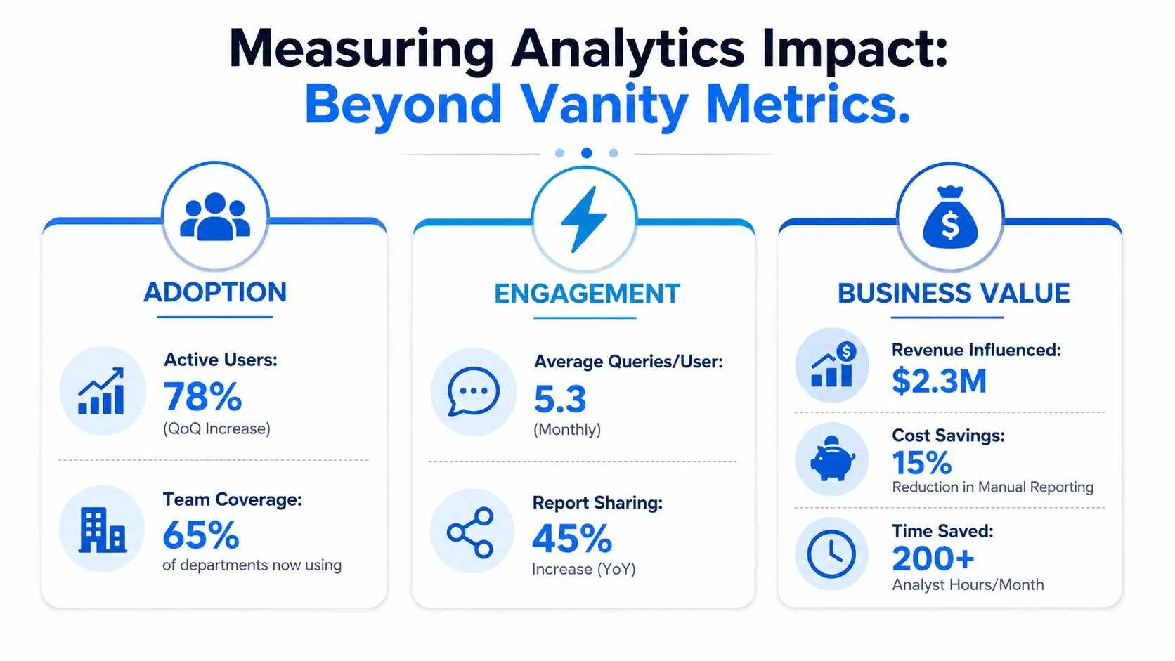
Layer one is adoption. Track whether the right people are using the system for the workflows you intended. Raw activity is a weak signal on its own. Segment by role, function, and use case so you can separate broad awareness from actual workflow change.
Layer two is behavioral change. At this stage, many analytics programs break down, especially when a central team declares success because the tool launched on time. Look for evidence that teams are changing how they prepare for meetings, investigate performance, escalate issues, and make recurring decisions. Useful measures include the share of recurring business reviews that reference the new analytics workflow, the volume of routine requests still sent to analysts, and the percentage of decisions that use standardized definitions instead of ad hoc spreadsheet logic.
Layer three is business impact. Connect the behavior shift to outcomes leaders already care about. That usually means faster decision cycles, fewer reporting bottlenecks, better forecast quality, cleaner handoffs between teams, or more consistent execution in weekly operating rhythms. Use qualitative evidence first if your baseline is weak, but put a date on when you will harden it into quantified reporting.
This three-layer model matters because analytics change management is not a dashboard adoption problem. It is a management system problem. Tool deployment gets you access. New habits, expectations, and review routines get you return.
A useful comparison comes from media teams. They do not stop at downloads or listens. They study retention, drop-off points, and which content patterns lead to repeat engagement. Leaders trying to build better analytics habits can borrow that mindset from Podmuse's podcast analytics guide.
If you need a tighter way to connect usage patterns to financial outcomes, use this framework for measuring BI ROI with adoption and impact metrics.
Common Analytics Adoption Pitfalls and Remediation
| Pitfall | Symptom | Data-Driven Remediation Tactic |
|---|---|---|
| Measuring only logins | Users appear active but still ask analysts for routine answers | Add workflow-level metrics tied to repeated business questions |
| Training without reinforcement | Completion looks fine, usage drops after launch | Measure whether trained teams change their meeting prep, reporting habits, and analyst request volume, then schedule role-based follow-ups |
| One metric set for every team | Adoption looks uneven and nobody agrees why | Segment measurement by stakeholder group and use case |
| No shift from engagement to outcomes | The program reports activity but not business relevance | Report on decision speed, analyst dependency, and operating consistency alongside usage |
| Excluding employees from design | Resistance stays high despite more communication | Involve users in workflow decisions and monitor whether participation and repeat usage improve |
Measure whether work changed. Clicks matter less than changed decisions, shorter cycles, and fewer analyst handoffs.
The best scorecards are usually simple. A small set of adoption metrics, a few behavior indicators, and a short list of business outcomes tied to real operating cadences will tell leadership whether the organization is becoming more self-sufficient or whether the analytics team is still trapped as a reporting help desk.
If your data team is stuck acting like a reporting help desk, Querio is worth a look. It helps companies deploy AI coding agents directly on the data warehouse so technical and non-technical teams can explore, analyze, and build on trusted data without waiting on analysts for every question.