Guide
Dashboards and Metrics: A Practical Guide for Data Teams
Learn how to design dashboards and metrics that drive decisions. Covers metric selection, dashboard governance, common pitfalls, and modern data stack
Only 29% of employees use business intelligence and analytics tools on average, despite analytics and BI usage increasing in 87% of surveyed organizations, according to IBM's summary of business intelligence adoption research. A separate BARC industry summary reports an average of 25% active employee usage, reinforcing an uncomfortable conclusion: many companies don't have a dashboard design problem. They have an adoption problem.
That gap changes how data teams should evaluate dashboards and metrics. A dashboard isn't successful because it was published, looks polished, or connects to a modern warehouse. It succeeds when the right person trusts the metric, understands what changed, and takes an appropriate action. Governance, ownership, and decision context matter more than another chart.
Table of Contents
- Why Most Dashboards Fail to Drive Decisions
- Understanding the Relationship Between Metrics and Dashboards
- Choosing the Right Metrics by Role and Business Goal
- Dashboard Design Principles That Reduce Cognitive Load
- Building Metric Governance to Prevent Drift and Inconsistency
- Real-World Dashboard Examples for Startups and Product Teams
- Implementing Self-Serve Analytics in a Modern Data Stack
Why Most Dashboards Fail to Drive Decisions
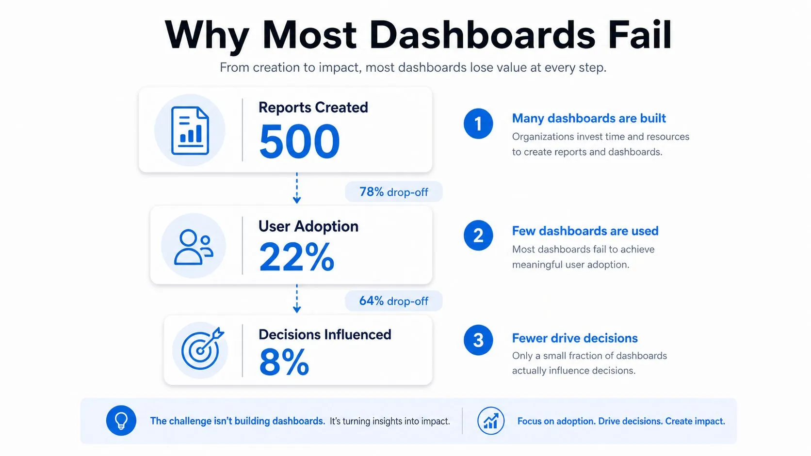
A dashboard can be technically correct and still produce little business value. Teams often add reports faster than they establish ownership, definitions, and decision routines. The result is a larger catalog, not better judgment. Users cannot tell which view applies to their work, question the metric logic, or see what action belongs to a change in the numbers.
The adoption gap has persisted across multiple years rather than appearing as a short-lived response to a particular operating environment, as IBM's adoption analysis describes. That makes adoption a meaningful health measure for an analytics program. Tracking load time without repeat usage, stakeholder retention, or decision outcomes measures the interface while leaving its purpose untested.
The publishing trap
A dashboard can break down at several points:
- Discovery: Users cannot find the relevant view among overlapping reports.
- Interpretation: Labels, filters, or definitions make the numbers hard to understand.
- Trust: Teams report different values for what appears to be the same metric.
- Action: The dashboard shows movement without identifying the next responsible action.
- Maintenance: No owner removes stale content or updates logic as the business changes.
Governance failures often stay hidden because delivery is easier to count than influence. A team may report an on-time launch while nobody changes pricing, investigates retention, or responds to an operational exception because of the dashboard. Conflicting definitions can undermine trust even when the charts and queries run without errors.
Practical rule: Treat recurring use and decision influence as product requirements, not post-launch vanity metrics.
Senior data teams retire dashboards regularly. They remove reports with unclear audiences, duplicate views, and metrics that no longer support an active decision. Keeping every artifact preserves confusion, while a smaller governed portfolio makes ownership and accountability visible. Teams can use this guide to avoiding BI dashboard pitfalls to review common design and implementation risks before publishing another report.
Understanding the Relationship Between Metrics and Dashboards
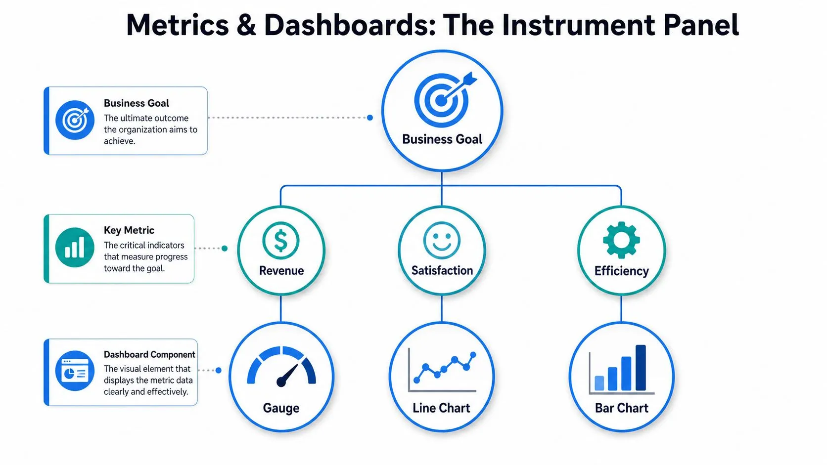
A metric functions like an individual gauge on a car instrument panel, while a dashboard organizes several readings so the driver can decide whether to accelerate, refuel, or stop. A metric is an individual gauge, such as speed, fuel level, or engine temperature. A dashboard is the organized instrument panel that places those readings in context. Several gauges still create a poor decision tool when nobody knows which signal should guide the next action.
Business analytics uses the same hierarchy. Operational systems produce raw records from billing, product events, support platforms, and infrastructure logs. Transformations clean and join those records. A metric applies defined logic to produce a meaningful measurement. A KPI is a metric chosen because it reflects an important business objective. The dashboard then presents a deliberate set of KPIs and supporting measures for a specific audience.
Build from decisions backward
Start with the decision, not the chart.
- Business goal: Identify the outcome the team is responsible for improving.
- Decision: State what the owner might change when the signal moves.
- Metric: Define the measurement, population, time window, and calculation.
- Diagnostic: Add supporting measures that explain movement without competing with the primary KPI.
- Dashboard component: Choose the visual form that makes the relevant comparison easy.
This sequence blocks a common governance failure: treating an available field as a useful metric. A database may contain event counts, timestamps, account attributes, and campaign labels. A chart can display each field, but displayability does not establish a definition, owner, or business use.
Specialized data environments require the same discipline. Teams building competitive gaming or prediction products can consult League statistics for prediction platforms to understand how domain-specific feeds support downstream analysis. The implementation matters only after the team defines the decision the data must inform.
A metric without a business question becomes decoration. A dashboard without a metric contract becomes a set of opinions rendered in software. A contract should record the definition, owner, calculation, and intended use, so teams can identify drift before conflicting values spread across reports. Teams that need a clearer vocabulary can use this business metrics definition guide as a reference, then adapt the definitions to their operating model.
Choosing the Right Metrics by Role and Business Goal
Metric selection should follow accountability. A founder, product manager, growth lead, and data engineer may all need information about the same customer journey, but they make different decisions and therefore need different views. A single company-wide dashboard usually becomes either too abstract for operators or too detailed for executives.
Founders need a compact view of business health. That often means a north-star outcome supported by financial and customer signals, such as recurring revenue movement, cash-related measures, retention behavior, or sales efficiency. A visitor count may look positive while the business weakens. The better question is whether the metric helps the founder allocate capital, change positioning, adjust hiring, or challenge the go-to-market plan.
Product managers need measures tied to user behavior and product outcomes. Feature page views are useful diagnostics, but feature adoption should connect to activation, repeated use, task completion, or another outcome the product team can influence. A dashboard that celebrates clicks without showing whether users receive value encourages activity optimization instead of product improvement.
Data teams need a different operating surface. Pipeline freshness, failed jobs, test results, warehouse consumption, and source reliability help them protect the trust on which every other dashboard depends. For operational and manufacturing contexts, a focused reference to reliability metrics such as MTBF, MTTR, and OEE can help teams distinguish availability signals from broader performance outcomes.
| Role | Primary Decisions | Example Metrics |
|---|---|---|
| Founder or executive | Where to invest, what to change, and which risks require attention | North-star outcome, revenue quality, retention, cash efficiency |
| Product manager | Which experience to improve and whether a release created user value | Activation, feature adoption, task completion, repeat usage |
| Growth leader | Which acquisition and conversion constraints deserve budget or experimentation | Qualified pipeline, conversion stages, channel efficiency |
| Data leader | Whether analytical systems are trustworthy and sustainable | Freshness, failed jobs, test coverage, query performance |
| Operations leader | Where service or process exceptions need intervention | Throughput, backlog, defect rate, response time |
Reject vanity metrics without discarding diagnostics
A vanity metric isn't always useless. Page views, sessions, or raw event volume can explain why an outcome moved. They become harmful when leadership treats them as the outcome itself. Keep diagnostic measures, but place them beneath a primary KPI and document the decision they support.
Metric selection also requires trade-offs. A highly responsive measure may be easy to influence but poorly connected to long-term value. A lagging outcome may be strategically important but arrive too late for daily intervention. Strong systems use both, with leading indicators for action and outcome measures for accountability.
Dashboard Design Principles That Reduce Cognitive Load
A decision dashboard should make the important signal obvious before the user starts exploring. Dashboard design guidance recommends exposing roughly 5 to 9 primary metrics per screen, with the most important measure immediately scannable and supporting metrics grouped by decision purpose. That constraint forces prioritization, which is exactly what a busy operator needs.
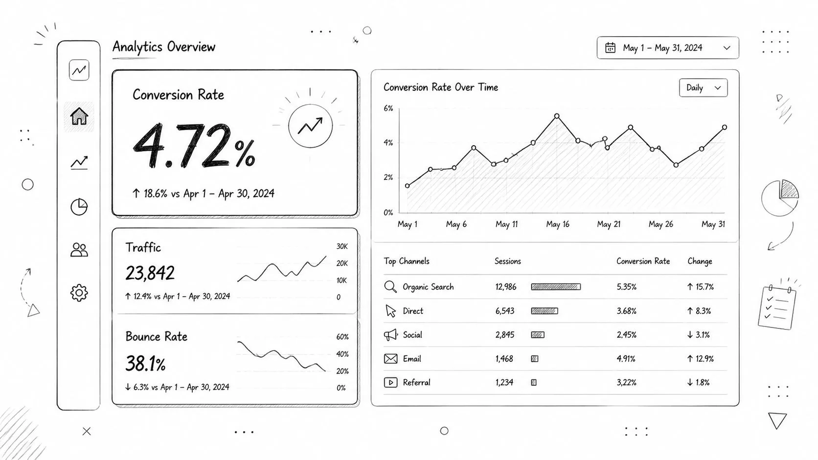
Start with a hierarchy. Put the primary KPI where users naturally begin, give it enough context to show direction or status, and place diagnostic measures beneath it. Group charts by question rather than by data source. A revenue trend, conversion funnel, and retention view may come from different systems but belong together if they support the same growth decision.
Match the visual to the question
Use a single-number KPI when the user needs a current status. Use a line chart when change over time matters. Use a bar chart when comparing categories. Use a table when exact values, sorting, or row-level inspection drive the task. Don't force a chart onto a question that requires detail.
A few design choices have disproportionate impact:
- Consistent scales: Keep comparable charts on comparable axes so users don't mistake visual size for business significance.
- Meaningful labels: Define acronyms, filters, time windows, and denominator logic near the metric.
- Limited decoration: Remove color, borders, and illustrations that don't help the user compare or act.
- Visible exceptions: Surface thresholds, anomalies, and missing data rather than burying them in tooltips.
- Useful defaults: Open the dashboard on the audience's most common time range and organizational scope.
A dashboard should answer the first operational question quickly, then make investigation easy without turning the first screen into an encyclopedia.
The best data visualization practices don't eliminate complexity. They put complexity behind a clear entry point. Executives get a concise status view, while analysts can drill into the underlying dimensions when the decision requires it.
Building Metric Governance to Prevent Drift and Inconsistency
Metric governance isn't a documentation exercise added after dashboard delivery. It's the operating system that keeps dashboards comparable as teams, sources, and reporting methods change. Research on analytics adoption identifies data quality and inconsistent definitions as the most common barrier to successful adoption, as described in this research on analytics adoption barriers.
Without governance, two teams can calculate “active customer” with different inclusion rules, time windows, or source tables. Both dashboards may be internally consistent, yet leadership receives conflicting answers. The result isn't just confusion. Teams spend meetings reconciling definitions instead of deciding what to do.
Create a metric spine
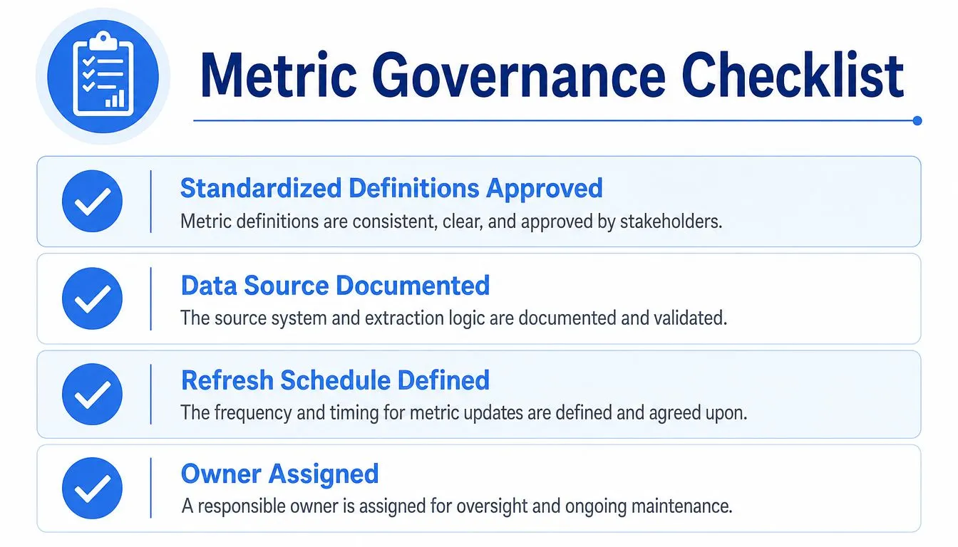
A practical metric spine contains the canonical definitions that other dashboards reuse. Each entry should document:
- Definition: What the metric measures and what it excludes.
- Formula: The calculation, denominator, aggregation, and time grain.
- Source: The authoritative tables, events, or systems.
- Owner: The person or team responsible for correctness and change review.
- Refresh expectation: How current the data should be for its intended decision.
- Known limitations: Late-arriving records, missing segments, or methodological caveats.
Ownership matters more than elaborate process. A definition without an accountable maintainer will drift as soon as an upstream schema changes or a team introduces a new reporting need. Establish a lightweight review path for changes, and make deprecated metrics visibly deprecated instead of allowing old versions to circulate indefinitely.
Manage technical complexity deliberately
High-cardinality dimensions create a separate governance risk. Chronosphere's guidance on reducing cardinality explains that each additional distinct label value increases storage, query cost, and dashboard complexity. Teams should inspect unique values and usage frequency, then drop, roll up, or restrict dimensions that don't support a real decision.
This is a trade-off, not a blanket rule. A dimension may be expensive but essential during an incident or useful for a regulated reporting requirement. The right question is whether its analytical value justifies its operational cost.
Real-time and AI-assisted reporting make semantic discipline more important, not less. Faster generation can multiply inconsistent metrics if the underlying definitions aren't governed. A metric catalog, tested transformation layer, and clear ownership provide the guardrails that let teams explore quickly without creating competing versions of truth.
Real-World Dashboard Examples for Startups and Product Teams
A startup's first useful dashboard is often smaller than its founders expect. A product team might begin with one view for acquisition, activation, retained usage, and revenue quality. The purpose isn't to represent every part of the business. It's to help the team decide whether its current product and distribution choices are working.
That early dashboard should have an explicit audience and meeting or workflow attached to it. If the founder reviews it during a weekly operating discussion, each metric needs a named question. “Are new accounts activating?” leads to a different investigation from “Are customers expanding?” Combining both without context produces a page that looks detailed but supports neither decision well.
A feature launch view
After a feature launch, the product team needs more than an event count. A useful view might connect eligible users, exposure, first use, repeated use, support friction, and an outcome relevant to the feature's purpose. The team can then distinguish poor discoverability from low value and technical failure from weak positioning.
The dashboard should also show the relevant comparison. Depending on the product, that could mean pre-launch behavior, a defined cohort, or a controlled release group. The comparison must be documented so users don't interpret every movement as proof that the feature caused it.
A growth funnel that earned its place
Growth dashboards often fail because they combine every channel, campaign, and conversion event on one screen. A more durable version centers the decision, such as whether to shift acquisition budget, improve a landing experience, or investigate sales qualification. Supporting dimensions should answer why the funnel changed, not merely add more segmentation.
Dashboards get retired when the decision disappears. A campaign dashboard with no active budget choice, a launch view after the adoption window closes, or a duplicate executive summary should leave the catalog. Retirement isn't a loss of data. It protects attention and makes the remaining dashboards easier to trust.
The practical test is simple: ask users what action they took after the last meaningful change in the dashboard. If nobody can answer, the team should revisit the metric, the audience, or the workflow before adding another panel.
Implementing Self-Serve Analytics in a Modern Data Stack
Self-serve analytics works when exploration is flexible but shared metrics remain governed. The warehouse should provide controlled access to reliable models, while the analytics layer should let users ask follow-up questions without turning every request into an analyst ticket.
That requires clear boundaries. Access controls should limit sensitive data, semantic models should expose approved definitions, and exploratory work should remain distinguishable from production reporting. Analysts and engineers can maintain reusable transformations, tests, and metric documentation while product and business users investigate approved data in the context of their decisions.
AI-assisted interfaces can shorten the path from a plain-English question to a query, visualization, or dashboard. They don't remove the need for governance. They make ownership, source transparency, and validation more important because users can generate analytical outputs faster than teams can manually review every one.
Querio deploys AI coding agents directly on a data warehouse and uses a file system approach with custom Python notebooks, allowing technical and non-technical users to query, analyze, and build on company data. Teams evaluating this model should consider self-serve analytics without losing governance alongside warehouse permissions, review workflows, and metric ownership.
The goal isn't to make every employee a dashboard builder. It's to maintain a governed analytical foundation that supports both trusted recurring reporting and responsible exploration. That is how data teams stop acting as a human API and start maintaining infrastructure that scales decision access.
Querio gives teams a governed way to work with live warehouse data through AI coding agents, custom Python notebooks, and self-serve analytical workflows. If your dashboards are underused or your metrics keep drifting across teams, visit Querio to see how the platform can support faster exploration without abandoning metric governance.