Guide
Dashboard vs Report: How to Choose the Right Analytics Tool
Master the dashboard vs report decision with practical criteria, real examples, and a trust framework to choose the right analytics tool for every scenario.
The popular advice is simple: use a dashboard for live monitoring and a report for periodic communication. That distinction is useful, but it's not enough to protect a decision. A polished dashboard can make an unreliable metric look authoritative, while a carefully written report can preserve assumptions and caveats that an interactive view hides.
The harder question is whether either artifact is trustworthy enough for executive action. Recent survey evidence found that only 16% of business leaders rated their data quality as excellent for supporting technology initiatives, while 67% of more than 550 data and analytics professionals said they didn't completely trust the data used for decisions. The data trust findings change the dashboard vs report debate. Format matters, but evidence matters more.
That distinction resembles the difference between a maker and a decision-support network. A maker produces an artifact, while a network gives people the context, ownership, and feedback needed to use it responsibly. The broader idea of a maker versus decision-support network is useful here because analytics value doesn't come from publishing a chart alone. It comes from connecting definitions, investigation, accountability, and action.
Table of Contents
- The Dashboard vs Report Question Most Guides Miss
- Defining Dashboards and Reports by Purpose
- Why Dashboard Adoption Has Not Matched Implementation
- Designing a Two-Stage Analytics System
- The Trust Test Before You Act on Any Artifact
- How Querio's Notebook Approach Fits Both Use Cases
- Making the Choice Without Overcommitting to One Format
The Dashboard vs Report Question Most Guides Miss
Most comparisons assume that dashboards are progressive and reports are outdated. That assumption confuses speed of presentation with quality of judgment. A dashboard can surface an unexpected result quickly, but speed only helps when users understand what the metric means, where it came from, and what to do when it looks wrong.
Reports have the opposite risk. Their slower, more controlled format can encourage review, documentation, and discussion, but a report may arrive after the relevant decision window. It can also summarize performance without giving the reader enough flexibility to investigate the dimensions behind a change.
Trust comes before format
Before choosing a dashboard or report, ask whether the underlying number deserves executive attention. A metric with an unstable definition will remain unstable when placed in a more attractive interface. A report with unclear ownership will still leave nobody responsible for correcting the source data.
The practical sequence is therefore:
- Establish the metric. Define what it measures, what it excludes, and which business question it answers.
- Establish the evidence. Check whether the underlying data is complete, timely, and reconciled.
- Establish inspectability. Give users a way to understand the calculation, filters, and transformation logic.
- Establish ownership. Assign someone to investigate and remediate the metric when it fails.
Decision rule: If users can't explain a number or identify its owner, neither a dashboard nor a report is ready to support executive action.
This is why a dashboard shouldn't automatically replace a report. The dashboard may be better for noticing a change, while the report may be better for preserving the reasoning behind a decision. The right system connects both without asking users to treat either one as automatically authoritative.
Defining Dashboards and Reports by Purpose
Teams often compare dashboards and reports as if the choice were mainly about layout. The actual difference is operational. A dashboard is a monitoring surface. It brings a set of metrics into one interactive view, usually with current or frequently refreshed data, so users can scan, compare, and isolate change. A report is a decision record. It fixes the data at a point in time and gives space for method, assumptions, interpretation, and recommended action. KPMG's executive reporting survey supports that distinction between ongoing oversight and formal executive communication.
That distinction matters because each format fails in a different way when used for the wrong job. A dashboard can show movement without explaining whether the number is reliable enough to act on. A report can explain the logic clearly, yet arrive too slowly for operational response. The better question is not which format looks more modern. It is which artifact matches the decision that follows.
Purpose-Driven Decision Matrix
| Operational Need | Best Artifact | Why |
|---|---|---|
| Monitor stable KPIs during regular operations | Dashboard | Users can review current conditions and recurring trends without waiting for a new document |
| Detect exceptions or changes in performance | Dashboard | Interactive views let users filter, compare, and identify the affected segment |
| Preserve a time-stamped record | Report | A fixed output creates an auditable snapshot of what the organization knew at a given point |
| Explain causes, assumptions, and methodology | Report | Narrative space supports interpretation that a compact monitoring surface may omit |
| Investigate an unfamiliar question | Report or exploratory workspace | Analysts can test segments, document logic, and revise the inquiry |
| Communicate recommendations to executives | Report | The format can connect evidence, context, risks, and proposed action |
| Support compliance or formal distribution | Report | Controlled publication and stable content are usually more important than live interaction |
The boundary is practical, not absolute. Reports can include interactive elements. Dashboards can include notes and commentary. But hybrid formatting does not remove the underlying tradeoff. Monitoring asks, "What changed?" Investigation asks, "Why did it change, and what should we do?" Organizations that treat one artifact as sufficient for both tasks usually get a weak monitor or a shallow explanation.
A useful dashboard definition and overview can help teams align on terms before they design anything. That sounds minor, but it prevents a common governance failure. One team says "dashboard" and means a scheduled PDF with charts. Another means a live interface for operational checks. The dispute then looks like a tooling problem, even though the actual issue is mismatched purpose.
The trust test still sits underneath both. If the number is stable and repeatedly monitored, a dashboard is the right front door. If the number needs explanation, sign-off, or a preserved rationale, a report is stronger. The strongest operating model connects the two: one surface to notice change, another to examine it and document the decision.
Why Dashboard Adoption Has Not Matched Implementation
Organizations often measure dashboard success by deployment. They count published views, connected data sources, or licenses. Those measures describe implementation, not adoption. A dashboard only creates value when people trust its metrics, understand its purpose, and return to it as part of a real workflow.
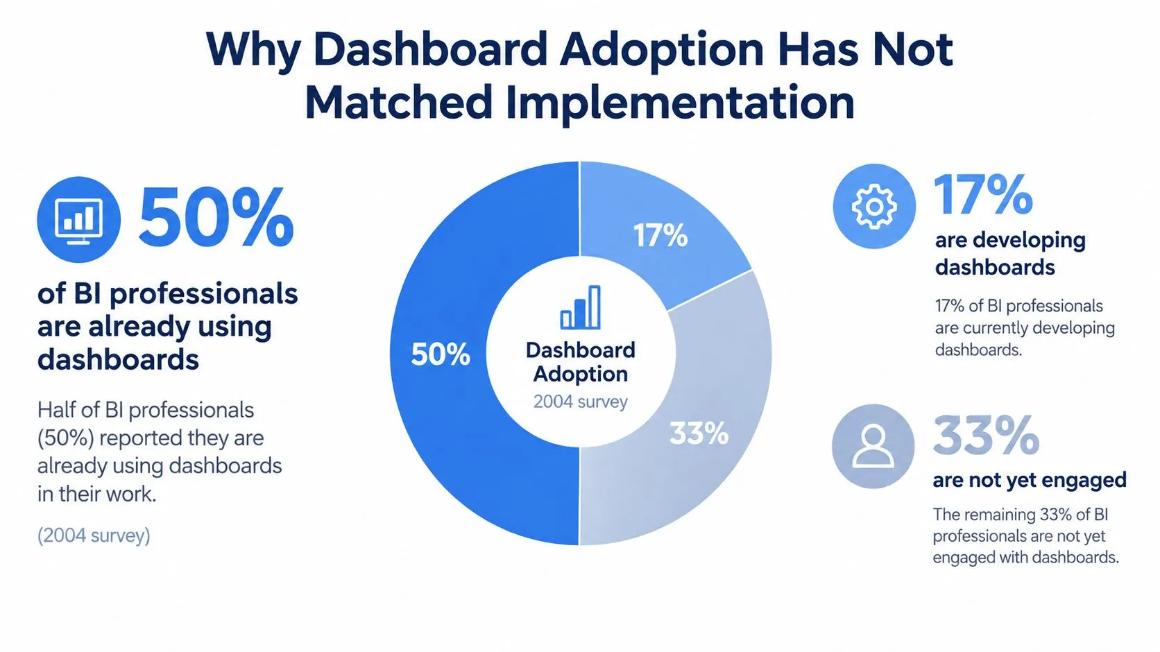
The historical evidence is mixed. A 2004 survey by The Data Warehousing Institute found that approximately half of 473 business-intelligence professionals were already using dashboards, while another 17% were developing a dashboard solution. A later study of Finnish sales managers found that only 24.8% of respondents reported using a dashboard, including seven who had built one in Excel. These figures come from the academic review of dashboard use, and they show why availability shouldn't be confused with adoption.
The operating conditions behind usage
Sales managers may ignore a dashboard for reasons unrelated to visualization quality. The metrics may not match their decisions. The data may arrive too late. The interface may require training that nobody has scheduled. Or the organization may still distribute a familiar report that fits the existing meeting cadence.
Reports often win in these environments because they're easier to standardize and send. A manager can open an attachment, review a known layout, and discuss it in a meeting. A dashboard demands more active behavior, including navigation, filtering, interpretation, and confidence that the displayed state is current.
Technical performance also affects adoption. Government dashboard guidance recommends testing responsiveness under heavy usage, which makes load testing a concrete acceptance criterion when many users query shared data simultaneously. A dashboard that works in a demonstration but slows down during a company-wide review creates a credibility problem, not just a performance problem.
Teams should therefore evaluate four operating conditions:
- Metric fit: Does the dashboard answer a recurring decision question?
- Workflow fit: Does a meeting, alert, or operating ritual direct people to use it?
- User readiness: Can the intended audience interpret filters, targets, and exceptions?
- Technical reliability: Does the system remain responsive when shared usage rises?
A useful guide to avoiding pitfalls in BI dashboards is less about decorating charts and more about preventing these adoption failures. Organizations don't need another unused visualization layer. They need a repeatable habit around trusted information.
Designing a Two-Stage Analytics System
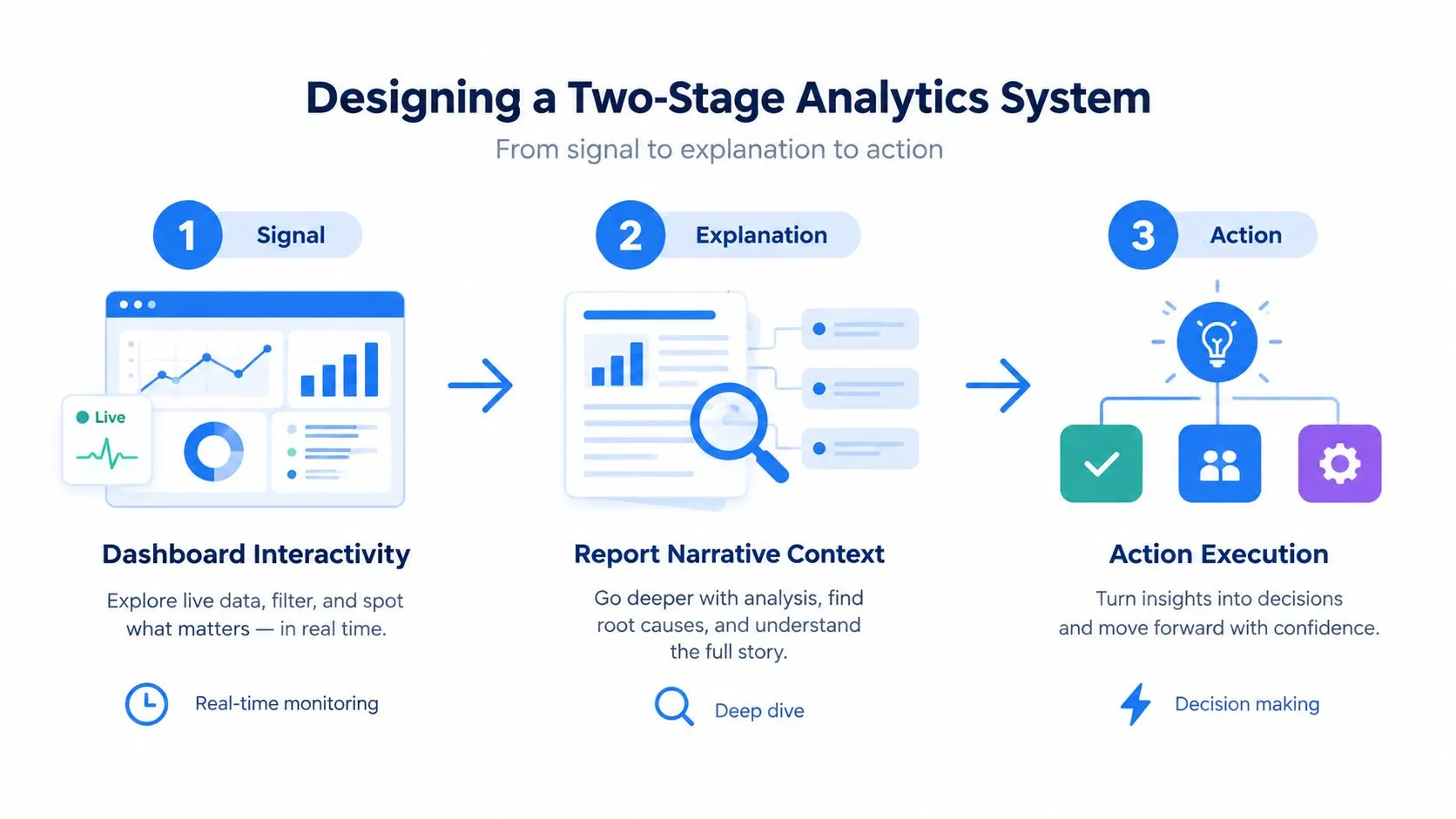
The most effective architecture doesn't force a choice between dashboard and report. It separates detection from investigation.
The first stage is a governed monitoring layer. It contains a deliberately limited set of metrics, consistent definitions, targets, trends, and exception signals. Its job is to tell users that something changed. It shouldn't attempt to answer every possible follow-up question on the same screen.
The second stage is an exploration and explanation layer. Users investigate the signal by changing dimensions, testing hypotheses, reviewing methodology, and documenting what they find. That layer might use a notebook-driven report, an exploratory workspace, or analyst-assisted queries. Its job is to explain the change and make the reasoning reproducible.
From signal to explanation
Consider a product team monitoring activation. The dashboard may show that activation moved away from its expected trend. That observation is valuable, but it isn't an explanation. The team still needs to examine acquisition source, device type, release cohort, geography, and the underlying event logic before deciding whether the change reflects customer behavior or broken instrumentation.
A report or notebook can hold that deeper work. It can record the query, define the cohort, show excluded records, describe caveats, and state which action the team recommends. The dashboard remains the shared place for detecting future changes, while the investigation becomes a durable reference for the people who need to understand the decision.
This design also limits analyst bottlenecks. Non-technical users can begin with a governed signal and explore approved dimensions, while technical users maintain reusable logic and correct the underlying model when necessary. The organization stops treating analysts as a human API for every follow-up question and starts treating analysis as shared infrastructure.
Why the connection matters
Poor-quality data can create errors across dashboards, reports, AI models, and operational systems. In dbt Labs' 2025 survey of 459 practitioners and leaders, poor data quality was the most frequently reported challenge, cited by more than 56% of respondents, as documented in the State of Analytics Engineering report.
That evidence makes the two-stage design more important. A dashboard can detect a problem in the data as well as a problem in the business, but only an investigation path can help users distinguish between them. If the system stops at the visual alert, people may escalate noise, invent explanations, or act on a defective metric.
A notebook-based workflow can connect the alert to the query, the query to the explanation, and the explanation to a recorded action. Guidance on notebooks versus chat for AI data analysis is relevant because conversational access may accelerate discovery, while inspectable notebooks preserve the logic needed for review.
The Trust Test Before You Act on Any Artifact
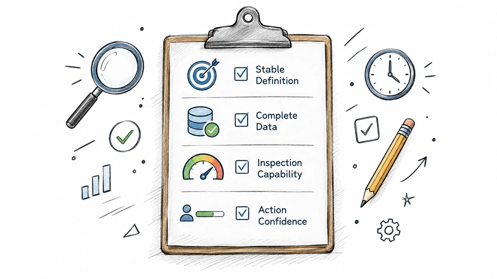
A trustworthy artifact should pass four tests before an executive uses it to approve spending, change priorities, or assess performance. These tests apply equally to dashboards and reports. A fixed PDF isn't trustworthy merely because it doesn't change, and a live dashboard isn't trustworthy merely because it refreshes.
Four questions for decision fitness
Does the metric have a stable definition?
Write down the population, time window, exclusions, and calculation. If two teams use the same label for different calculations, the artifact fails before anyone evaluates its design.
Is the underlying data complete and timely?
A current-looking dashboard may depend on delayed or partial data. A report may faithfully reproduce an incomplete extract. Users need to know whether the latest period is ready for comparison and which sources remain unresolved.
Can users inspect the calculation?
Inspection doesn't mean every executive must read SQL. It means the organization can trace a number to its source, filters, transformations, and assumptions. Without that path, disagreement becomes a debate over authority.
Does someone own remediation?
A metric needs an accountable owner who can investigate a defect, communicate its impact, and restore confidence. Otherwise, users learn to work around bad data instead of correcting it.
Measure quality beyond appearance
Dashboard quality can be assessed systematically. A review of 13 public dashboards used 48 metrics spanning data integrity, completeness, granularity, visualization quality, and interactivity, with adjusted overall performance scores ranging from 2.74 ± 0.11 to 3.93 ± 0.11. A separate review of hospital safety dashboards found an average of 28 metrics per display, with a range from 7 to 84. These findings are reported in the systematic review of dashboard quality.
The lesson isn't that every dashboard should contain the same number of metrics. It's that teams should evaluate the information surface deliberately. A monitoring screen should prioritize decision-critical measures with targets, trends, and benchmarks. Diagnostic detail belongs in linked reports or exploratory analyses where users have enough space to understand it.
A dashboard should tell people where to look. The investigation layer should help them understand what they found.
Metric density creates a specific failure mode. Teams keep adding charts until the dashboard becomes a report without narrative depth, while the report-like volume makes exceptions harder to notice. The trust test helps prevent that drift by asking whether each element improves a defined decision or merely demonstrates that more data is available.
For teams working with AI-assisted analytics, the same discipline applies. A guide to trusted AI analytics should begin with inspectable definitions and ownership, not with confidence in the interface. The artifact is fit for action only when people can verify its evidence and respond when the evidence fails.
How Querio's Notebook Approach Fits Both Use Cases
A notebook-based approach can reduce the gap between governed monitoring and open-ended investigation. Instead of treating dashboards and reports as isolated outputs, the team maintains reusable queries, notebook logic, and lineage that can support both.
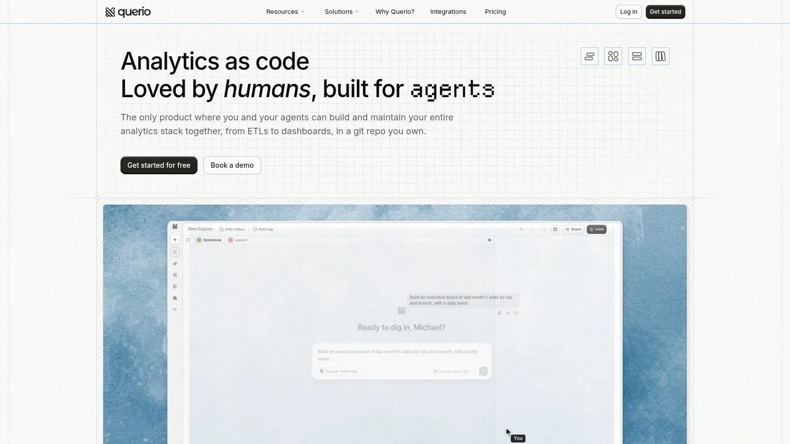
Querio deploys AI coding agents directly on a data warehouse and uses a file-system approach with custom Python notebooks. Technical and non-technical users can query and analyze company data in the same environment, while data teams maintain the underlying infrastructure rather than answering every request manually.
One analytical foundation, different outputs
For dashboard use, reusable queries can feed live monitoring views with logic that users can inspect and edit. That supports the first stage of the system, where teams watch stable KPIs and identify exceptions.
For report use, the same notebooks can support segmentation, ad hoc investigation, and executive narrative. An analyst can preserve the steps behind a conclusion instead of copying a result into a document with no visible path back to the source.
That connection matters because the organization doesn't need to rebuild the metric for every output. A shared analytical foundation can reduce the risk that the dashboard and the report use subtly different definitions. It also gives technical users a place to improve data logic while keeping the resulting analysis accessible to business stakeholders.
Where the approach fits
Traditional BI tools such as Hex, Looker, and ThoughtSpot often organize work around governed reporting surfaces and separate exploration workflows. A notebook approach is relevant for mid-market companies that need self-service exploration but still want inspectable code, lineage, and reusable logic.
The benefit isn't that notebooks make every user an analyst. They give users a clearer route from question to evidence. A product manager can start from a monitoring signal, inspect a prepared analysis, and ask a more specific question. A data engineer can review the transformation and correct the source rather than merely explaining the output. An executive can receive a report that preserves the assumptions behind the recommendation.
Querio fits this model by supporting live dashboards, called Boards, and scheduled reports tied to warehouse data. Its plain-English workflow can produce SQL and Python that users can inspect and edit, which helps connect convenience with auditability. The important design choice is still the same: use the monitoring output to find the issue, then use the notebook or report layer to investigate it.
Making the Choice Without Overcommitting to One Format
Choosing between a dashboard and a report is usually framed as a format decision. In practice, it is a trust decision. If leaders cannot tell which metric definition they are looking at, who owns it, or what evidence sits behind it, neither format is ready for action.
That is why the choice should start with the decision and the failure mode. Ask what people need to notice early, what they need to explain later, what record must be preserved, and who is accountable when the number changes. Some teams need one artifact. Many need both, linked through a monitoring stage and an investigation stage so the first view raises the question and the second can answer it.
A practical selection rule
Use a dashboard when the team:
- Checks the same signals repeatedly: Definitions are stable, and review is part of normal operating rhythm.
- Needs to respond to exceptions: Users need current status, comparison points, filters, and enough context to judge whether a change matters.
- Can maintain the data path: Someone owns refresh reliability, metric logic, and the process for fixing broken inputs.
Use a report when the team:
- Needs an auditable snapshot: The organization has to preserve what was known at a specific moment.
- Must explain a result: Readers need assumptions, causes, method, risks, and a recommended action.
- Communicates formally: The output goes to executives, regulators, boards, or other stakeholders who need a stable record.
Governance still decides whether either format will be used. As noted earlier, many organizations have struggled with common standards, data quality controls, and reporting speed. Those problems are not cosmetic. A dashboard that refreshes quickly but carries disputed definitions creates false confidence. A report that documents context but arrives after the decision window closes becomes institutional memory, not operational guidance.
The better question is not which format wins. It is whether the system gives people a reliable signal, a way to investigate it, and enough documentation to defend the action taken. Even a specialized workflow such as wine margin analysis software has to meet the same test. Users still need clear definitions, traceable logic, and a route from anomaly to explanation.
Querio fits this model in a restrained way. It connects warehouse data to inspectable SQL and Python notebooks, while supporting live monitoring views and scheduled reports for different decision cycles. That setup helps teams avoid a common failure pattern: monitoring in one tool, explanation in another, and no shared logic between them.