What Is a Dashboard and How Does It Drive Decisions?
Discover what is a dashboard and see how it transforms complex data into clear, actionable insights. Learn the types, examples, and strategies to build one.
https://www.youtube.com/watch?v=MIkG1KDb1XI
published
Outrank AI
what is a dashboard, business intelligence, data visualization, kpi dashboard, dashboard design
9b64ba9f-92fc-45a4-b872-6c298751f0b1

Think of a business intelligence dashboard as the cockpit for your company. It’s a single screen that brings together all your critical numbers—your key performance indicators (KPIs) and other important metrics—from all over the business, presenting them in an easy-to-understand visual format. This turns a flood of messy data into clear, immediate insights that help you make smarter decisions, faster.
Your Business Command Center
Trying to run a modern business without a dashboard is like trying to drive a car without a speedometer or fly a plane without an instrument panel. You’re essentially flying blind, reacting to whatever comes your way instead of proactively steering your course. A dashboard gives you the instruments you need to navigate with confidence.
It's a huge leap from relying on static, quickly outdated spreadsheets. Instead of waiting around for a weekly or monthly report to land in your inbox, a dashboard gives you a live, dynamic picture of what’s happening right now. This allows leaders to track progress, catch trends as they emerge, and make decisions based on the latest information, keeping the business agile and responsive.
Turning Data into Actionable Insights
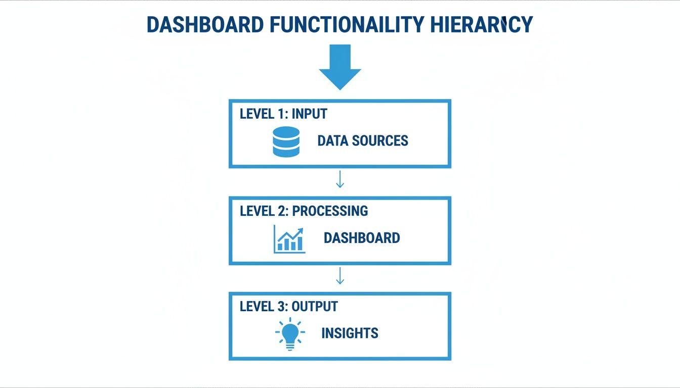
At its heart, a dashboard is designed to visually answer your most pressing business questions. It pulls in data from all your different tools—your CRM, accounting software, website analytics—and presents it through intuitive charts, graphs, and gauges. This is the core of effective data visualization and dashboards; it’s all about turning raw numbers into a story you can understand in seconds.
The goal isn't just to show you the data. It's to help you understand it instantly.
A great dashboard is built for one main reason: to give you a complete, at-a-glance view of the most critical information you need to hit your goals, all on a single screen so you can keep a constant pulse on performance.
This visual-first approach is having a massive impact. The global business intelligence market, which is largely driven by the demand for dashboards, is expected to grow from USD 29.3 billion in 2025 to a staggering USD 54.9 billion by 2029. This boom signals a major shift: companies everywhere are realizing that dashboards aren’t just a nice-to-have, but an essential tool for strategic management. You can find more details about BI trends and market forecasts on Intelegain.
When done right, a dashboard serves as a central hub for the entire organization. It gives everyone, from the C-suite to the front-line teams, the clarity they need to take decisive action and keep the company moving in the right direction.
Exploring the Three Main Types of Dashboards
Not all dashboards are created equal. Just as a pilot needs a different instrument panel than a race car driver, different roles in a business need different views of their data. Trying to use a one-size-fits-all approach is a recipe for a dashboard that no one uses.
To build something truly useful, you first need to understand the three main categories: strategic, analytical, and operational. Each one is designed to answer very different questions for a very specific audience.
At their core, they all do the same thing: turn raw, messy data into clean, understandable insights. This simple flow is the foundation of any good dashboard.
This process is what transforms numbers in a database into a powerful decision-making tool. Now, let’s break down how that plays out for different business needs.
Strategic Dashboards for the Big Picture
Think of a strategic dashboard as the 30,000-foot view of your company's health. It’s designed for the C-suite, board members, and department heads who need to see if the ship is headed in the right direction.
These dashboards steer clear of the day-to-day noise. Instead, they track the slow-moving, high-impact metrics—the Key Performance Indicators (KPIs)—that measure progress against long-term goals. They’re all about the quarterly and annual trends, not what happened this morning.
A CEO would glance at their strategic dashboard to quickly assess:
Market Share Growth: Are we gaining ground on our competitors?
Customer Lifetime Value (CLV): Is the long-term value of our customer base increasing?
Year-over-Year Revenue Growth: How does our performance compare to this time last year?
The purpose here is simple: alignment. It ensures everyone in leadership is working from the same script and pushing toward the same strategic objectives.
Analytical Dashboards for Deep Dives
If a strategic dashboard tells you what happened, an analytical dashboard helps you figure out why. This is the go-to tool for data analysts, product managers, and marketing teams—anyone whose job involves digging into the data to uncover trends, patterns, and the root cause of a problem.
These dashboards are built for interaction. They’re packed with filters, drill-downs, and segmentation options that let you slice and dice the data from every conceivable angle. It’s less of a static report and more of a sandbox for exploration.
For example, a product manager might use an analytical dashboard to investigate why a new feature has low adoption. They could filter by user segment, compare behavior between free and paid users, and drill down into the specific user journey to pinpoint where people are dropping off.
These are the tools that fuel genuine data discovery. To see some of these powerful visualizations in action, take a look at these great data visualization dashboard examples.
Operational Dashboards for Real-Time Action
Finally, we have operational dashboards. These are all about the here and now. They monitor live business activities and are essential for front-line teams that need to make decisions on the fly.
Unlike their strategic cousins, operational dashboards refresh constantly, sometimes every few seconds. They’re designed to help people manage and respond to events as they unfold.
An operational dashboard is like an air traffic control screen for your business, providing the critical, up-to-the-second information needed to keep things running smoothly and efficiently.
You’ll find them everywhere: a logistics team tracking shipments in real time, a support center monitoring call queues and agent availability, or an e-commerce team keeping an eye on server uptime during a Black Friday sale. The goal is to spot problems instantly and act before they become crises.
How Real Teams Use Dashboards to Fuel Growth

It’s one thing to talk about dashboards in theory, but seeing them in action is where their real value clicks. When teams get their hands on curated, live data, they stop guessing and start making decisions that drive real results. A great dashboard is like a specialized lens, giving each department the exact view it needs to excel.
Let's imagine you're a marketing manager. Your dashboard is mission control for every campaign. No more waiting weeks for a report to land on your desk. You can see ad spend vs. conversion rates as they happen. If a campaign's cost-per-acquisition suddenly jumps, you know immediately and can shift budget to a channel that’s actually working.
This shift to instant, visual data has paid off big time. In retail, dashboards that track e-commerce sales and inventory have helped companies see buying patterns early, leading to a 15-20% sales uplift.
A Shared Language for Every Department
The real magic happens when every team has its own dashboard, all pulling from the same central data source. Suddenly, everyone is speaking the same language. You're all working toward the same company goals, just from different angles.
Take a sales manager, for instance. Their dashboard is all about the health of the pipeline. They’re tracking things like:
Pipeline Velocity: How fast are we moving deals through the funnel?
Win Rate by Rep: Who’s crushing it, and who needs a little more coaching?
Deal Size vs. Sales Cycle: Are those huge deals getting stuck in limbo?
This isn't just about looking at numbers; it's about forecasting revenue accurately and giving the team support where it counts.
When every team has a dashboard, you break down data silos. The sales team's pipeline data directly informs the finance team's revenue projections, creating a connected, data-aware organization.
This same thinking applies across the entire business. For startups trying to build this kind of data-first culture from day one, getting the fundamentals right is everything. Our guide on business intelligence for startups is a great place to start.
From Product to Operations and Beyond
Product teams live and breathe this stuff. Their dashboards are crucial for understanding what users are actually doing inside the app. They visualize feature adoption rates, user engagement scores, and churn by cohort to figure out what to build next. If a dashboard shows a sudden drop in daily active users, it’s an all-hands-on-deck signal that a bug might need fixing—fast.
Over in operations, the team is probably watching a dashboard that monitors the entire supply chain, tracking inventory, shipping times, and delivery success rates. And finance? They’re comparing budgeted expenses against actuals, making sure the company stays on solid financial ground.
Each of these dashboards is highly specific, yet they all feed into a complete picture of the business. Teams that embrace this approach for constant growth often find it aligns well with Kaizen principles for continuous improvement. By giving everyone clear, role-specific insights, dashboards give people the power to make smarter decisions that move the needle.
Understanding Dashboards vs Reports
In the world of data, one of the most common mix-ups is the difference between a dashboard and a report. They both wrangle data into a presentable format, but that’s where the similarities end. Their purpose, how you interact with them, and the kind of decisions they drive are fundamentally different.
Nailing this distinction is crucial because it helps you pick the right tool for the right job.
Let’s start with a simple analogy. A report is like a photograph—it’s a static, detailed snapshot of what was happening at a specific moment in time. On the other hand, a dashboard is like a live video feed—it’s dynamic, interactive, and constantly updating to show you what’s happening right now.
Purpose and Interactivity
The biggest difference comes down to what they're built for. Reports are designed for deep, periodic analysis. Think of a thick monthly sales breakdown or a quarterly financial summary. These documents are static on purpose, giving you a thorough look back to inform bigger strategic conversations. They answer the question, "What happened last quarter?"
Dashboards, however, are all about monitoring what's happening in the moment and taking immediate action. They're meant to be poked and prodded. You can filter, drill down, and explore the data in real-time. A dashboard’s job is to answer the question, "What’s going on now, and what do I need to do about it?"
Reports give you a historical record for detailed analysis and formal communication. Dashboards offer a live, interactive view for ongoing monitoring and quick, tactical decisions.
This interactivity is what makes a great dashboard so powerful. You're not just passively reading numbers; you're actively exploring the data, asking questions on the fly, and getting instant answers.
Frequency and Data Freshness
Another key separator is how often the information gets updated. Reports are generated on a schedule—daily, weekly, monthly, you name it. The data is pulled and compiled into a finished document that won't change until the next cycle. This makes them perfect for creating a historical archive and spotting long-term trends.
A dashboard, by contrast, is designed to be as close to real-time as your data allows. It plugs directly into live sources and can refresh automatically, sometimes every few seconds. This constant flow of fresh information is essential for teams that need to react fast—like a customer support team watching ticket queues or a marketing team tracking the first hour of a product launch.
At the end of the day, reports give you depth and detail for reflection, while dashboards deliver the speed and immediacy you need for agile, in-the-moment decisions.
Dashboard vs Report: A Head-to-Head Comparison
To make it even clearer, let's break down the key differences side-by-side. This table highlights how dashboards and reports diverge across the most important attributes.
Attribute | Dashboard | Report |
|---|---|---|
Purpose | To monitor and track KPIs in real-time | To provide a detailed, static snapshot of data |
Data | Dynamic, constantly updating | Static, fixed for a specific time period |
Interactivity | High (filtering, drill-downs, pivoting) | Low (usually read-only) |
Frequency | Real-time or near real-time updates | Periodic (daily, weekly, monthly, quarterly) |
Audience | Operational teams, executives needing a pulse | Analysts, managers, stakeholders needing deep dives |
Scope | Broad overview of multiple key metrics | Focused on a specific topic or question |
Goal | To enable quick, tactical decisions | To support strategic planning and in-depth analysis |
While they serve different functions, dashboards and reports are often complementary. A dashboard might alert you to a problem, and a detailed report can then help you understand the root cause. The key is knowing which one to reach for and when.
The Future of Dashboards Is Conversational AI
For a long time, dashboards have been a one-way street. You look at them, you get information, and that's about it. But what if you could actually talk to your data? The next big step for dashboards is turning them from a static screen into an intelligent, conversational partner powered by AI.
This is where true data democratization really starts. Imagine anyone on your team, regardless of their technical chops, being able to ask a complex question in plain English. Instead of messing with filters or waiting for an analyst, they could just type, "What were our top 5 products by sales in the Midwest last quarter, and how did that compare to the quarter before?" and get an instant, accurate answer with a chart to match.
This shift from static viewing to an active dialogue is a massive change in how we work with data. To dig deeper into this trend, check out our article on the evolution of business intelligence.
From Standalone Tool to Embedded Insights
Another huge leap forward is the rise of embedded analytics. The old way involved making your team leave their primary apps—like a CRM or a project management tool—just to go look at a dashboard somewhere else. This new approach brings the insights directly into their existing workflow.
Think about a SaaS application. With embedded analytics, a product manager sees feature adoption charts right inside their product management software. A sales rep can pull up a customer's usage data directly within their CRM moments before hopping on a call. All that time wasted switching between tabs is gone, making data a seamless part of the job.
This kind of integration is quickly becoming the new standard. By 2026, it's expected that over 60% of organizations will have analytics embedded directly into their applications. In one real-world case, a retailer’s BI tool had a dismal 11% adoption rate because users just didn’t trust the data. After they introduced narrative, AI-driven dashboards, they not only fixed the trust issue but also cut down meeting times by 30%.
Breaking Down the Final Barriers
When you combine conversational AI with embedded analytics, you start to knock down the last few barriers to building a truly data-driven culture. Data stops being the exclusive property of analysts and becomes a resource anyone can tap into.
The future of the dashboard isn't just about showing data better; it's about making data accessible to everyone, everywhere, by allowing them to ask questions in the most natural way possible—through conversation.
This evolution leads to faster, smarter decisions at every level of the company. It gives everyone—from operations to finance to marketing—the power to turn their curiosity into action without needing special training. The dashboard is no longer just a window to look through; it’s a door you can open to have a conversation with your data.
Best Practices for Designing Effective Dashboards

Anyone can drag a few charts onto a canvas and call it a day. The real art, however, is building a dashboard that your team actually wants to use—one that becomes a go-to resource, not just another ignored bookmark. The secret isn't about cramming in every metric imaginable; it’s about providing clear, focused answers to the right questions.
So, where do you start? Always begin with the end in mind. Before you touch a single visualization tool, ask yourself two simple but critical questions: "What core business questions does this need to answer?" and "Who is this for?" A CEO's high-level summary of company health looks completely different from the granular, real-time data an operations manager needs.
This obsession with the end user is what turns a data dump into a genuine decision-making tool.
Design for Clarity and Action
With your audience and purpose locked in, your next priority is absolute clarity. A confusing dashboard is a failed dashboard, no matter how much data it contains. You have to guide the user’s eye intentionally.
Think like a designer and use visual hierarchy. Place the most important KPI in the top-left corner—that's where our eyes naturally start. Then, use plenty of white space to let your charts breathe and create a logical flow that tells a story. Don't just throw charts at the wall and hope something sticks.
To keep your design sharp and functional, hang on to these core principles:
Keep It Simple: Fight the temptation to add "just one more chart." Stick to the essential KPIs that directly inform action. If a visualization doesn't help answer a key question, it's just noise. Get rid of it.
Ensure Data Accuracy: Trust is everything. If your team doubts the numbers, they'll stop using the dashboard. Double-check your data sources, clearly label what each metric represents, and be transparent about where the information comes from.
Prioritize Speed and Access: Performance isn't a "nice-to-have." A dashboard that takes forever to load will be abandoned. The same goes for accessibility. To learn more, check out this great resource on Why Performance and Accessibility Matter for Dashboards.
The ultimate test of a good dashboard is the five-second rule. Can someone look at it and get a clear, actionable insight in five seconds or less? If they have to spend minutes hunting for meaning, the design has already failed.
By sticking to these fundamentals, you’ll create more than just a pretty visualization. You’ll build an indispensable tool that becomes part of your team's DNA.
Got Questions About Dashboards? We've Got Answers.
Even after you've got the basics down, you'll probably have a few practical questions pop up. It’s one thing to know what a dashboard is, but another thing entirely to build one that actually works for your team.
Let's clear up some of the most common questions we hear all the time.
How Do I Pick the Right Metrics?
This is the big one. The trick is to work backward from your goals, not forward from your data. Don't start by asking, "What data do we have?" Instead, ask, "What are we trying to achieve?"
For each major business objective, pinpoint three to five Key Performance Indicators (KPIs) that directly tell you if you're winning or losing. The key is to choose metrics you can actually do something about.
For example, tracking total website visits is interesting, but it doesn't tell you much. A better, more actionable metric is your conversion rate. That number tells you how well your site is doing its job, giving you a clear target to improve.
What's the Biggest Mistake People Make When Building Dashboards?
Hands down, the most common pitfall is information overload. It’s so tempting to throw every single piece of data you can find onto one screen, hoping that more is better. It's not. All that does is create a noisy, confusing mess that nobody wants to look at.
A great dashboard is defined not by what it includes, but by what it leaves out. Its job is to bring focus, answering a few critical questions at a glance.
Always choose clarity over quantity. If a chart doesn't help answer a key question, it doesn't belong there.
Do I Need to Know How to Code to Build a Dashboard?
Nope, not anymore. The days when you needed a developer to build a decent dashboard are long gone. Modern business intelligence (BI) tools are built for everyone, whether you're a founder or a manager on the front lines.
Tools with drag-and-drop interfaces and AI that lets you ask questions in plain English mean you can connect to your data and build powerful, interactive dashboards without writing a single line of code.
Ready to empower your team with analytics they can actually use? With Querio, anyone can ask questions in plain English and get immediate, accurate answers from your data. Build your first dashboard in minutes.

