Business Intelligence
6 Great Examples of User-Facing Analytics
Embedded real-time analytics transform products by giving users instant insights that boost engagement, revenue, and faster decision-making.
User-facing analytics deliver real-time insights directly to users within a product, enabling faster decision-making and deeper engagement. Unlike traditional BI tools, these platforms are designed for speed, scalability, and accessibility, catering to millions of users simultaneously. Below are six standout examples that demonstrate how companies are using embedded analytics tools in their products to enhance user experiences:
Spotify Wrapped: Personalized insights like top artists and listening habits, shared by millions globally.
Shopify Live View: Real-time store performance metrics displayed on interactive maps.
Stripe Dashboard: Instant payment metrics and financial health tracking for businesses.
Square Real-Time Reports: Live sales and operational data for small businesses.
Vercel Analytics: Developer-focused performance tracking with instant updates.
Querio AI Analytics Workspace: AI-powered analytics for non-technical users with natural language queries.
Key takeaway: These platforms showcase how real-time analytics can boost user engagement, improve decision-making, and drive measurable outcomes like increased revenue, customer retention, and operational efficiency.
Quick Comparison
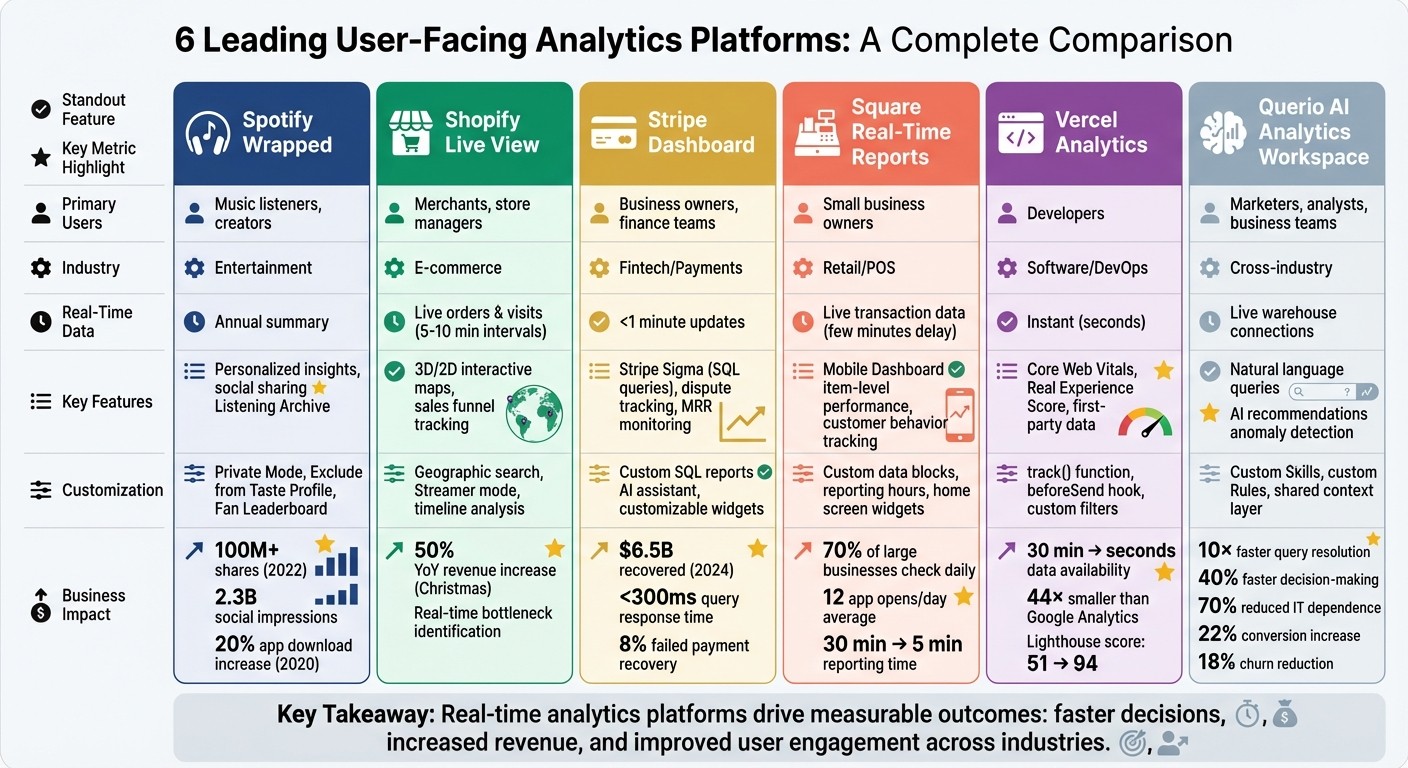
Platform | Primary Users | Real-Time Data | Key Features | Results |
|---|---|---|---|---|
Spotify Wrapped | Music listeners, creators | Annual summary | Personalized insights, social sharing | Viral campaign, app downloads up 20% |
Shopify Live View | Merchants, store managers | Live orders & visits | Interactive 3D/2D maps, sales funnel tracking | Boosted revenue during peak sales events |
Stripe Dashboard | Business owners, finance | Immediate payment metrics | Custom SQL reports, fast dispute resolution | $6.5B recovered via payment tools in 2024 |
Square Real-Time Reports | Small business owners | Live transaction data | Customizable reports, mobile access | Improved promotions & operational decisions |
Vercel Analytics | Developers | Instant performance metrics | Core Web Vitals tracking, low data latency | Faster app optimizations, better performance |
Querio AI Workspace | Marketers, analysts | Live warehouse connections | Natural language queries, AI recommendations | Faster decisions, reduced reliance on IT |
These examples illustrate how embedding analytics into products can transform user experiences and deliver actionable insights.
User-Facing Analytics Platforms Comparison: Features and Business Impact
User-Facing Analytics 101 with Steven Tey
1. Spotify Wrapped
Spotify Wrapped transforms the listening habits of its 574 million users into shareable, engaging stories, all while seamlessly integrating customer-facing analytics tools into the app experience [5]. By analyzing millions of behavioral events - like logins, tracks played, and device types - Spotify creates personalized metrics such as "Listening Personality" and "Top Artists" for each user. Through Reverse ETL, granular data is pulled straight into the app, ensuring a smooth and tailored experience [5].
Customization or Personalization Features
The 2025 edition brought exciting new features like "Top Artist Sprint", which tracks monthly shifts in a user's top five artists [6]. Another standout is the "Fan Leaderboard", where users can see their global percentile ranking among an artist's listeners based on total minutes streamed. To make it even more personal, top artists like Bad Bunny and Chappell Roan sent video thank-you messages directly through the Wrapped interface [6].
Spotify also introduced the "Listening Archive", an AI-driven feature that generates up to five unique daily reports on listening habits, transforming raw data into interactive snapshots [6].
Your Wrapped is designed to be a reflection of your taste, not a historical record of every second you streamed.
Spotify Newsroom [7]
Users have control over their analytics with features like "Private Mode" and "Exclude from Taste Profile", which ensure specific sessions or playlists don’t affect their Wrapped insights [7]. To qualify for a personalized Wrapped, users need to stream at least 30 songs for more than 30 seconds each and listen to at least five different artists [6]. These features not only deepen user engagement but also make the experience more meaningful.
Business Impact or Measurable Outcomes
Spotify Wrapped’s impact goes far beyond just user delight. In 2022, the campaign was shared over 100 million times and generated an estimated 2.3 billion social media impressions worldwide [5][8][9]. Back in 2020, Wrapped drove a 20% increase in Spotify app downloads, proving its effectiveness in boosting both engagement and user acquisition [5].
As Tejas Manohar, Co-founder of Hightouch, explains:
Spotify Wrapped provides inherent value without asking for anything in return. It's a tangible way to see just how much value you received from the app.
Tejas Manohar, Co-founder of Hightouch [5]
2. Shopify Live View
Shopify Live View offers a dynamic, real-time look at your store's performance, showcasing customer activity on either a 3D globe or a 2D map [10]. Blue dots represent recent visitor sessions, while purple dots highlight incoming orders. The tool tracks visitors from the last five minutes and maps the sales funnel over 10-minute intervals [10][12].
Real-time or near-real-time data access
With Live View, merchants can monitor sales as they happen. Key eCommerce KPIs like "Visitors right now", "Active carts", "Checking out", and "Purchased" are updated in five- and ten-minute intervals, resetting at midnight local time [10]. This feature becomes especially useful during high-traffic events like Black Friday or Cyber Monday, where immediate insights are critical [12]. Additionally, the timeline feature allows merchants to analyze the busiest times of the day, helping them better understand traffic trends [11]. This constant flow of data lets merchants quickly identify and address potential issues in their sales funnel.
Actionable insights for end-users
Live View is a powerful tool for spotting and resolving bottlenecks in real time. For instance, if the "Checking out" metric is disproportionately high compared to "Purchased", it might signal a problem with the checkout process [10]. Beyond troubleshooting, the tool highlights top-performing products and identifies geographic regions driving traffic, enabling merchants to make quick adjustments to inventory or focus marketing efforts where they're most effective [10][13]. As Shopify's Jahmal Gittens puts it:
Armed with real-time data, you can identify the strategies, channels, and products that result in different, more effective marketing campaigns.
Jahmal Gittens, Shopify [12]
Business impact or measurable outcomes
The insights from Live View go beyond operational improvements - they can directly boost revenue. Ruby Friel, founder of Still Life Story, leveraged Shopify's analytics to identify her store's best-selling products and track sales trends. This approach helped her achieve a 50% increase in year-over-year revenue during the Christmas season [14]. She explains:
By using Shopify's analytics and reporting to identify best sellers and sales trends using e-commerce data analysis tools, we were able to grow our revenue year over year by 50% at Christmas.
Ruby Friel, Founder, Still Life Story [14]
For merchants who want to share live updates without revealing sensitive financial data, Shopify offers a "Streamer mode." This feature is perfect for social media broadcasts or team displays, enabling merchants to showcase activity while keeping private details secure [10].
3. Stripe Dashboard
Stripe's Dashboard gives businesses a clear, real-time view of their payment operations, thanks to a streaming analytics system. Unlike older batch processing methods that could take up to 24 hours, Stripe updates most data in less than a minute, while subscription metrics refresh within 15 minutes[4]. Even with complex data queries, the system maintains response times under 300 milliseconds[4].
Real-Time Data Access
This speed is made possible by an event-driven pipeline powered by Apache Flink, which efficiently converts updates into analytical events as they happen[4]. This setup allows businesses to track essential metrics like monthly recurring revenue (MRR), payment acceptance rates, and dispute outcomes without waiting for lengthy batch processes.
Insights That Drive Action
Beyond fast data updates, the Dashboard provides insights that help businesses address payment issues immediately. Users can dive into metrics like acceptance rates, authentication results, and dispute trends to refine their checkout processes. Stripe Sigma, an integrated SQL tool, lets finance teams create custom reports using SQL queries or even natural language through an AI assistant[16][19]. In one example, a company used Sigma to identify unpaid invoices and recovered tens of thousands of dollars - 8% of failed payments - within two months[19].
Tailored Features for Businesses
The Dashboard also offers options for customization to suit various business needs. Users can rearrange the home page with specific widgets, set date ranges, and define metrics that align with their goals[20][18]. For instance, Lime, a micro-mobility company, used Stripe Data Pipeline to integrate Stripe data into internal reports, enabling their finance team to monitor refunds in near-real time and maintain accurate cash flow reports[15]. Similarly, ChowNow combined Stripe's transactional data with CRM insights to analyze customer journeys and reduce customer acquisition costs[15]. These personalized tools make the Dashboard a flexible and valuable resource for businesses.
Real Business Results
Stripe's Dashboard doesn’t just offer data; it delivers measurable outcomes. By leveraging real-time insights, businesses have been able to recover significant revenue. Stripe's recovery tools alone helped users reclaim over $6.5 billion in 2024[17].
4. Square Real-Time Reports
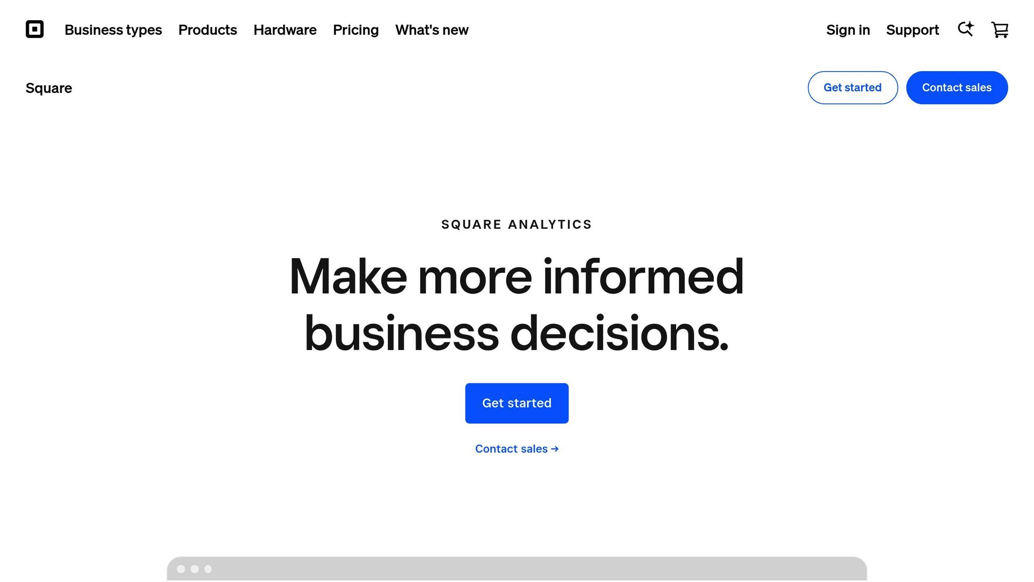
Square has taken customer-facing analytics to the next level, making enterprise-level insights accessible to small and medium-sized businesses. This shift highlights why modern SaaS analytics are becoming a standard requirement. Its real-time reporting system allows users to monitor live sales through the Square Dashboard, available on the web, mobile apps, and the POS app. According to reports, over 70% of larger businesses using Square check their analytics daily. During the beta phase of the mobile Dashboard app, sellers opened it an average of 12 times per day to stay updated on their business performance [22].
Real-Time Data Access
Square gives business owners near-instant access to key metrics, enabling them to make informed decisions quickly. While sales data may experience a slight delay of a few minutes, users can still track essential stats like gross and net sales, average transaction amounts, order counts, and even item-level performance. This level of insight helps businesses identify which products are thriving and which may need attention. Additionally, the platform tracks customer behavior, offering deeper insights into overall performance [22][23].
Insights That Drive Action
Square's real-time analytics empower businesses to act immediately. Andy Fuchtman, owner of Sidecar Coffee, shared how he uses the platform:
If I see sales spiking, I'll add a barista in real time.
Andy Fuchtman, Owner, Sidecar Coffee [22]
Fuchtman also tested a "Cappuccino Happy Hour" promotion. After seeing positive results in the data, he decided to make it a permanent part of his offerings [22]. Beyond promotions, the system helps businesses identify trends, like restocking popular items during peak demand or adjusting hours based on customer traffic patterns. For instance, businesses can prepare for heat waves by increasing ice production for cold drinks [22].
Customization Features
Square allows users to tailor their reports to fit their specific needs. Businesses can create custom data blocks, such as tracking payment methods, category sales, or employee performance [24]. Reporting hours can also be customized to align with operating schedules, ensuring accurate attribution of sales to the correct business day [27]. The mobile Dashboard app adds further flexibility, letting users personalize the bottom navigation bar for quick access to essential tools. For iOS users, home screen widgets can display key metrics like gross sales or transaction counts [26].
Jessica from Son of a Sailor explained how these features have elevated her business:
Our business has been able to operate like a much larger operation with Square. Analytics help us make decisions that were more challenging to calculate with other tools.
Jessica, Son of a Sailor [21]
These customization options make it easier for businesses to adapt and thrive.
Business Impact
The impact of Square’s analytics tools on small businesses has been transformative. Bradley Kaplan from Lion Cub's Cookies highlighted how the platform saves time:
This calculation would typically take me 30 minutes with manual reporting, but with Square AI it took under 5.
Bradley Kaplan, Lion Cub's Cookies [25]
Similarly, Donnie McClanahan from Order Up Cafe, which manages four locations, shared his experience:
Before Square AI, I was pasting data into ChatGPT and asking it to explain trends. Now Square integrates this functionality, and my sales data across four locations is a gold mine.
Donnie McClanahan, Order Up Cafe [25]
What’s even more impressive? These analytics and the Dashboard app come free with a Square account, making it possible for businesses of all sizes to access powerful insights [21][22].
5. Vercel Analytics
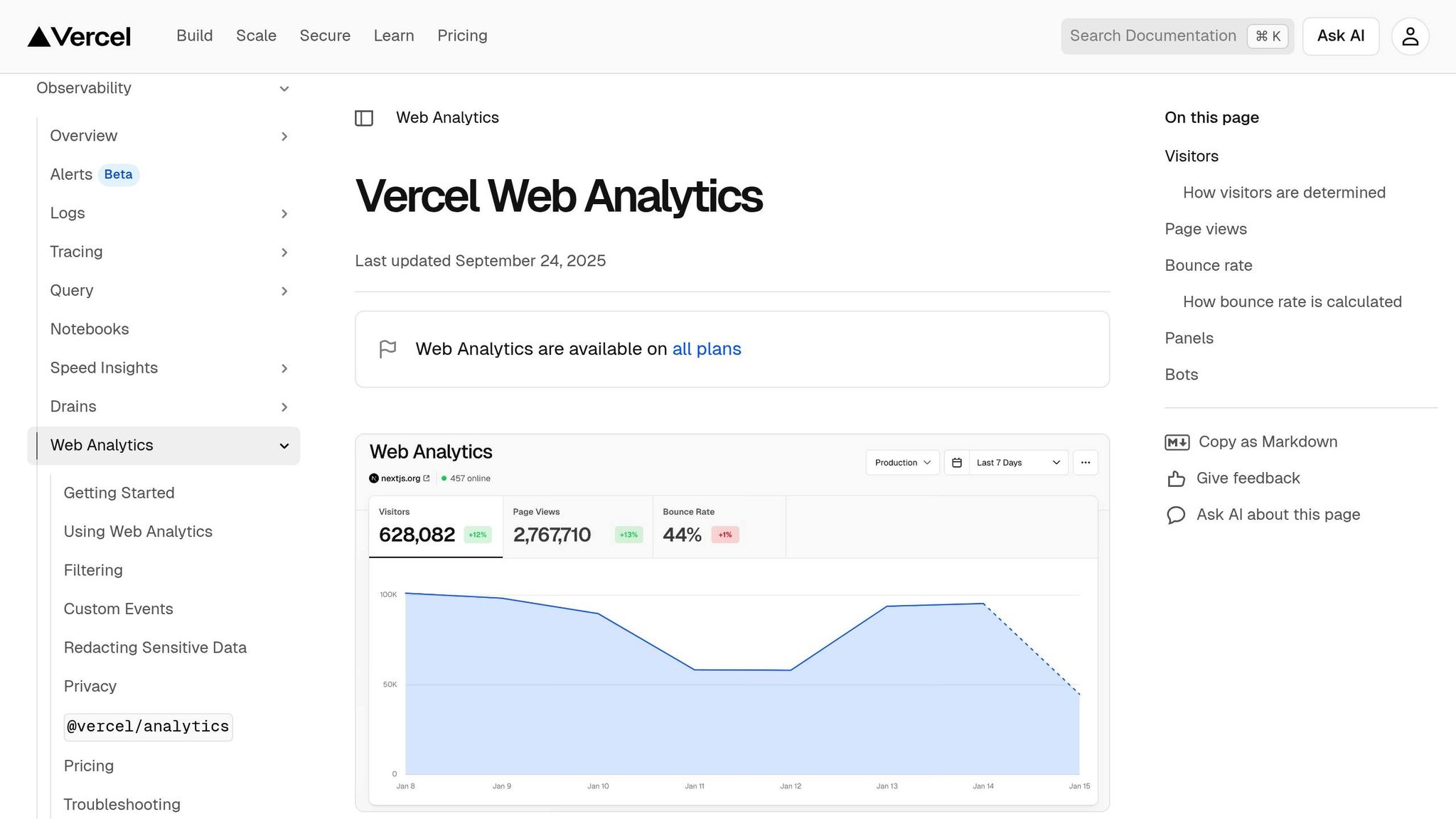
Vercel Analytics takes performance tracking to a new level, offering developers immediate and actionable insights. By cutting data availability time from 30 minutes to mere seconds, it allows post-deployment metrics to be accessed instantly [28]. This rapid feedback loop helps developers quickly identify and resolve performance issues while diving deeper into detailed metrics.
Real-Time Data Access
Vercel Analytics features a reactive dashboard that updates metrics in real-time as visitors interact with the site. This enables developers to analyze performance on a page-by-page basis [28]. Unlike traditional tools, Vercel uses first-party data ingestion. This approach routes analytics through the user’s domain, bypassing ad blockers and improving data accuracy [31]. Additionally, the platform is 44× smaller than Google Analytics, reducing its impact on site performance and page load times [29].
Actionable Insights for End-Users
The platform doesn’t just deliver data - it translates it into meaningful performance scores. One standout feature is the "Real Experience Score", which combines Core Web Vitals like LCP, CLS, and FCP into a single, easy-to-understand metric [31]. For example, in August 2022, Vercel's engineering team used their own analytics to optimize their dashboard. By identifying inefficiencies, such as redundant authentication checks, they reduced render time from 270ms to 90ms and boosted their Lighthouse performance score from 51 to 94 [33].
Michelle Bakels, Co-organizer of React Miami, summed up the platform’s strengths:
Analytics unlocks a treasure trove of application data faster than it would take to write the JIRA ticket to set it up.
Michelle Bakels, Co-organizer of React Miami [29]
Customization Features
Developers can customize Vercel Analytics to meet their specific needs. Pro and Enterprise users gain access to advanced features like the track() function, which allows them to monitor specific interactions. They can also enrich events with custom key-value pairs and filter data by parameters such as pages, routes, hostnames, and visitor demographics. The beforeSend hook offers even more control, enabling developers to modify or filter event data before it’s sent [34][35][36].
Business Impact
In November 2024, Vercel introduced live metrics for deployments, requests, and blocked traffic during the high-demand Black Friday-Cyber Monday period. This was achieved through a modified polling architecture combined with incremental static regeneration [32]. The platform’s privacy-first design also stands out - it anonymizes data by rotating hashes daily instead of relying on cookies, ensuring teams can make quick, data-driven decisions without compromising user privacy [29][30].
6. Querio AI Analytics Workspace
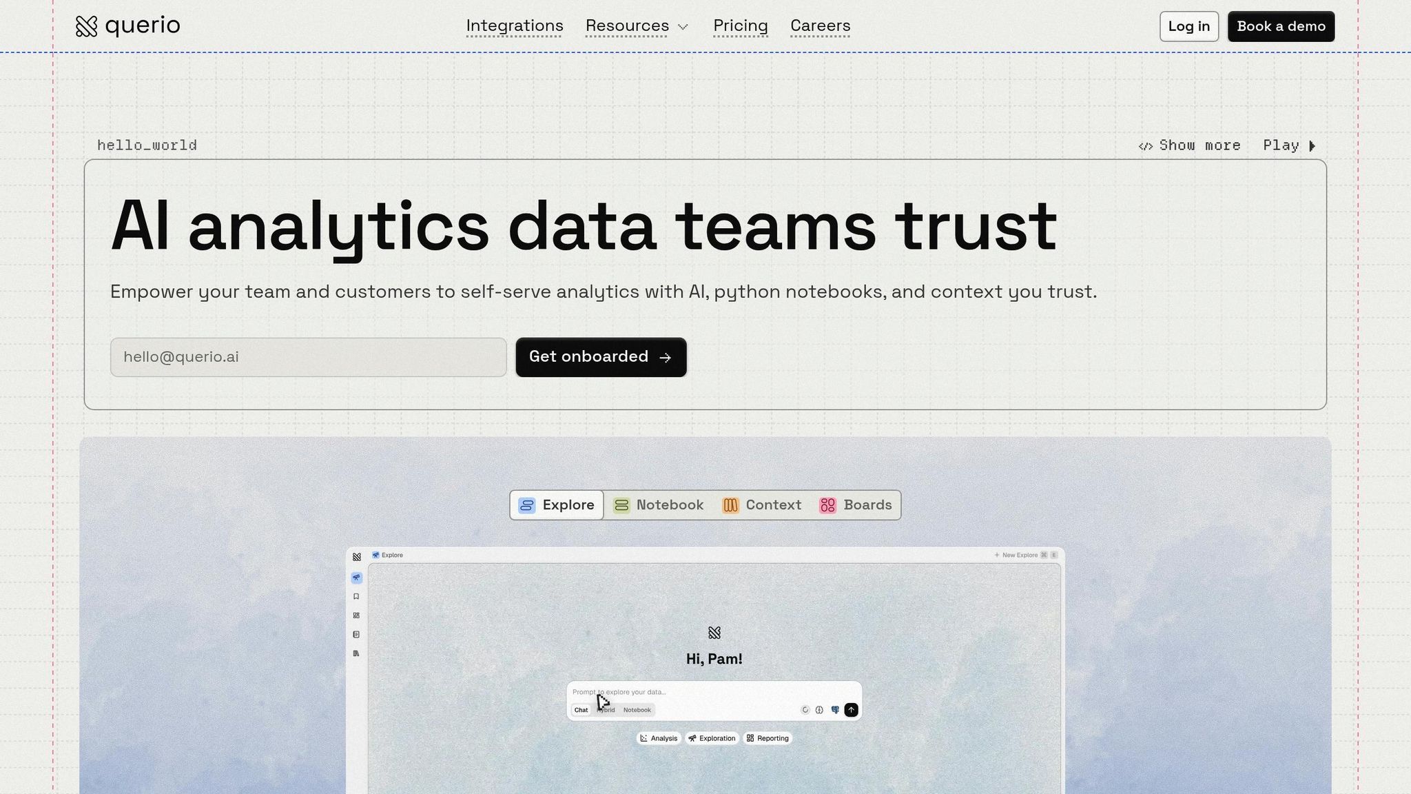
Querio AI Analytics Workspace is designed to make live data accessible to everyone, even those without a technical background. By allowing users to ask questions in plain English, the platform delivers instant answers pulled directly from live data warehouses like Snowflake, BigQuery, Amazon Redshift, and ClickHouse. Behind the scenes, it generates real SQL and Python code, bridging the gap for the 80% of business users who lack SQL expertise. This means marketers, analysts, and business teams can dive into data without waiting for IT support, enabling faster, more informed decisions.
Near-Real-Time Data Access
The platform connects to live data using encrypted, read-only links, ensuring continuous updates for accurate insights. For example, a user can ask, "What were the sales by region in the last hour?" and instantly receive a visual breakdown. This real-time functionality works across datasets, whether you're analyzing customer behavior or tracking operational performance.
Actionable Insights for End-Users
Querio doesn't just answer questions - it also provides AI-powered recommendations, flags anomalies, and forecasts trends. Take this example: a mid-sized e-commerce team used Querio to create a dashboard that tracked campaign ROI in real time. The result? They identified weak-performing ads and increased conversions by 22%. Similarly, a SaaS company used the platform to fine-tune user journeys, cutting churn by 18%. Querio even offers proactive suggestions like, "Increase marketing spend in Region X, where conversion rates are 25% higher."
Customization Features
The platform also allows users to build custom "Skills" tailored to specific needs, such as tracking client retention trends. It includes "Rules" to adjust the AI's tone or analytical approach [37]. Additionally, its shared context layer ensures consistency by letting data teams define joins, metrics, and business terms once, applying them across dashboards, notebooks, and AI responses. This keeps insights aligned across departments.
Business Impact
Organizations using Querio report impressive results, including up to 10× faster query resolution and a 40% improvement in decision-making speed. Many companies have reduced their dependence on data teams by 70%, freeing technical staff for strategic projects instead of routine tasks. In one standout example, a retail client saw a 15% revenue increase thanks to AI-driven optimizations. These outcomes highlight how empowering non-technical users with data tools can directly improve business performance.
Comparison Table
The table below provides a side-by-side look at top user-facing analytics platforms, highlighting their industries, target users, real-time data capabilities, customization options, and key outcomes. These platforms cater to different needs, shaped by the industries they operate in and the challenges they address.
For instance, Spotify Wrapped is designed for music enthusiasts and creators in the entertainment field, offering an annual summary that has become a viral sensation. Shopify Live View, on the other hand, focuses on e-commerce merchants, providing real-time traffic insights via engaging 3D and 2D map visualizations [2]. Similarly, Stripe Dashboard supports fintech and payment companies by delivering instant access to payment metrics, while Square Real-Time Reports aids small business owners in managing point-of-sale operations with live transaction data.
Vercel Analytics caters to developers, offering real-time metrics for monitoring web traffic and app performance [4]. In contrast, Querio AI Analytics Workspace takes a broader approach, serving marketers, analysts, and business teams across various industries. It connects directly to live data warehouses like Snowflake, BigQuery, Amazon Redshift, and ClickHouse, making data accessible even to users without SQL expertise, thanks to its natural language interface.
Customization options vary widely. Shopify Live View allows merchants to zoom into specific geographic regions and toggle between map views [2]. Stripe Dashboard includes Stripe Sigma, enabling advanced users to create custom SQL queries. Querio stands out with its ability to let teams build custom "Skills" for tailored analytics and define "Rules" to adjust the AI's tone and responses. Its shared context layer ensures consistency across dashboards, notebooks, and AI outputs, making it a powerful tool for cross-functional teams.
These platforms demonstrate how analytics can empower users by providing tools tailored to their specific needs.
Platform | Industry | Primary Users | Real-Time Data | Key Customization | Notable Results |
|---|---|---|---|---|---|
Spotify Wrapped | Entertainment | Music listeners, creators | Annual summary | Annual retrospective features | Viral social engagement |
Shopify Live View | E-commerce | Merchants, store managers | Live orders & visits | 3D/2D map views, geographic search [2] | Real-time traffic insights |
Stripe Dashboard | Fintech/Payments | Business owners, finance teams | Immediate payment metrics [2] | Includes Stripe Sigma for custom SQL queries | Financial health monitoring |
Square Real-Time Reports | Retail/POS | Small business owners | Live transaction data | Report filtering by location | Operational visibility |
Vercel Analytics | Software/DevOps | Developers [4] | Real-time metrics [4] | Performance monitoring dashboards | Application optimization |
Querio AI Analytics Workspace | Cross-industry | Marketers, analysts, business teams | Live warehouse connections | Custom Skills, custom Rules, and a shared context layer | Improved analytics performance |
Conclusion
The best user-facing analytics platforms focus on delivering real-time data, intuitive interactions, and seamless integration - as highlighted by the examples above.
These capabilities rest on strong technical foundations. Damian Grech, Senior Director of Engineering at FanDuel, puts it this way:
Real-time data is the new standard. These days, the best way to deliver a differentiated user experience is with live, fresh data to act upon [3].
The impact of purpose-built analytics infrastructure is clear. For instance, Canva was able to ship features 5x faster and reduce costs by 10x after adopting a real-time data platform [3]. Similarly, JobNimbus saw 70% adoption among targeted enterprise users in just a few months [38].
To implement effective user-facing analytics, focus on these key areas:
Achieve sub-100 millisecond query latency [3].
Enable interactive filtering that doesn’t require technical expertise [2][1].
Embed dashboards directly into your product design for a cohesive experience.
Companies that adopt these strategies see impressive results - acquiring customers 23x faster and improving retention by 6x [39]. With mobile devices now accounting for 62.54% of global traffic [38], starting with pilot projects addressing major pain points, empowering power users, and building a data product with scalable systems can set the stage for lasting growth.
FAQs
What counts as user-facing analytics?
User-facing analytics are built right into applications, offering real-time insights directly to end-users like customers or frontline employees. Unlike traditional BI tools designed for analysts, these solutions feature dashboards, visualizations, or AI-powered insights that are easy to understand and act on. The goal? To help non-technical users make informed decisions and work with data effortlessly as part of their everyday tasks, improving both engagement and overall experience.
How real-time does my data need to be?
The frequency of data updates hinges on your specific needs. For scenarios like stock trading or live monitoring, real-time updates are critical to making quick, informed decisions. On the other hand, for applications like trend analysis or periodic reporting, updates at longer intervals might be enough. The goal is to strike a balance between keeping data timely and maintaining system efficiency, ensuring users have access to the most relevant information for their purposes.
How do I add analytics without hurting performance or privacy?
To incorporate analytics without sacrificing performance or privacy, focus on scalable, real-time solutions that emphasize data protection. Techniques such as differential privacy, anonymization, and encryption work to safeguard user information while ensuring compliance with legal standards. Embedding analytics directly into applications with real-time visualizations can reduce system strain and improve the overall user experience. Additionally, giving users control over the data they share adds an extra layer of privacy protection while keeping analytics effective.
Related Blog Posts


