Business Intelligence
How to Build a Data Product Inside Your SaaS App
A practical guide to building in-app data products: centralize data, define metrics with a semantic layer, design usable dashboards, choose a secure stack, and govern access.
A data product is an embedded analytics feature in a SaaS app that helps users make decisions by providing dashboards, reports, and AI-driven insights directly within the app. This eliminates the need for external tools, keeps users engaged, and strengthens app loyalty.
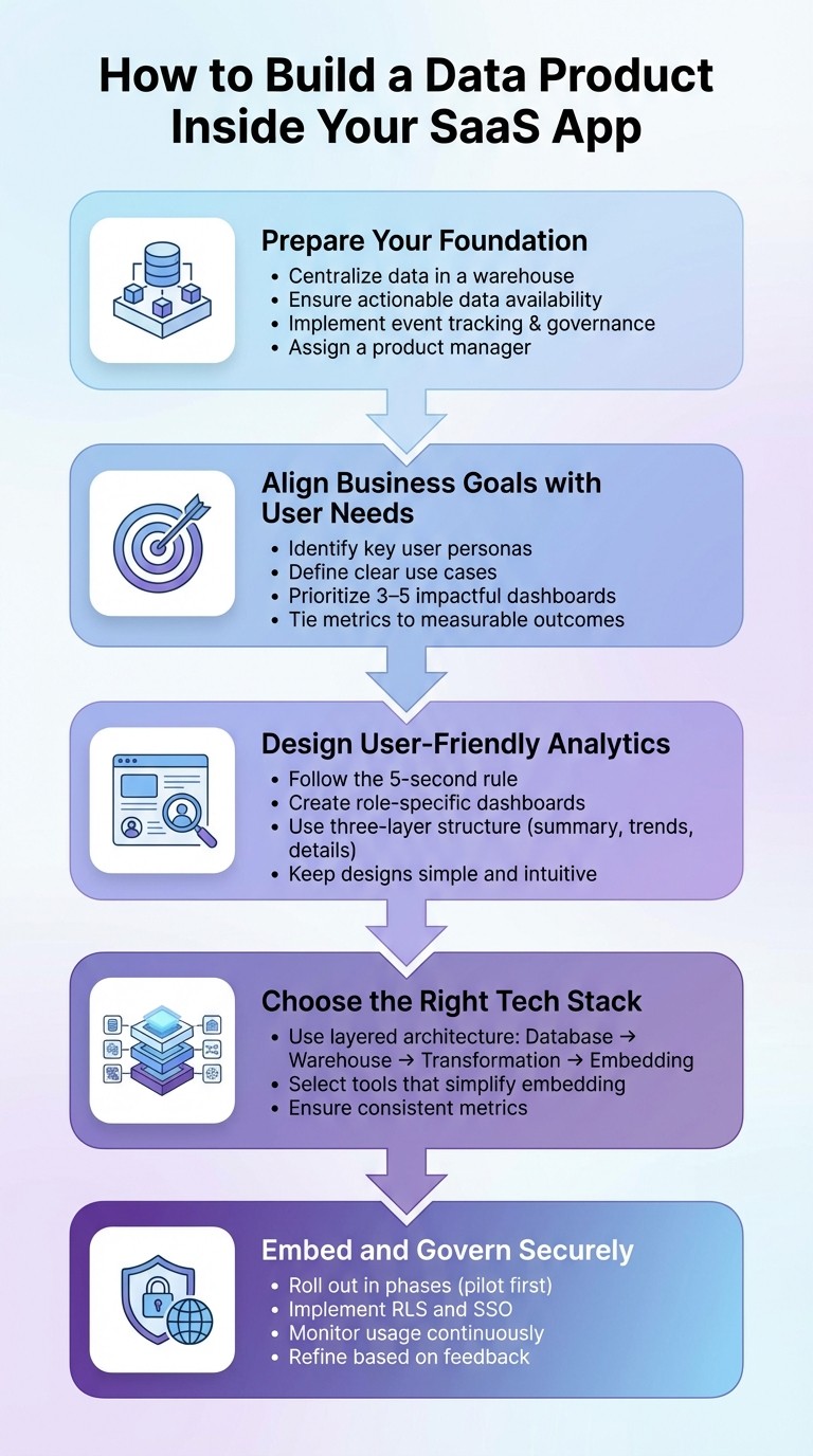
Key Steps to Build a Data Product:
Prepare Your Foundation:
Centralize your data in a warehouse.
Ensure actionable data is available.
Implement event tracking and data governance.
Assign a product manager to oversee the project.
Align Business Goals with User Needs:
Identify key user personas and their analytics needs.
Define clear use cases and prioritize 3–5 impactful dashboards.
Tie metrics to measurable outcomes like revenue or retention.
Design User-Friendly Analytics:
Follow the 5-second rule: users should quickly grasp key insights.
Create role-specific dashboards (e.g., strategic for executives, operational for staff).
Use simple, intuitive designs with clear labels and a three-layer structure (summary, trends, details).
Choose the Right Tech Stack:
Use a layered architecture: database → warehouse → transformation → embedding.
Tools like Querio simplify embedding analytics and ensure consistent metrics.
Embed and Govern Securely:
Roll out dashboards in phases, starting with a pilot group.
Use row-level security (RLS) and single sign-on (SSO) for secure access.
Continuously monitor and refine based on user feedback.
5 Key Steps to Build a Data Product in Your SaaS App
Scaling SaaS Analytics Without Scaling Your Team | Reveal Embedded BI Demo & Strategy
Align Business Goals, Users, and Metrics
Bringing business goals, user needs, and key metrics into alignment is essential for delivering analytics that provide meaningful value. Without this alignment, you risk creating features that may look impressive but fail to deliver results that matter.
Define Use Cases and Target Users
Start by identifying your key user personas and understanding their specific analytics needs. Are you designing for account managers tracking sales performance? Or perhaps admins monitoring usage trends? Each persona comes with its own set of requirements and insights.
To gather these insights, use workshops, focus groups, and interviews to understand user needs better [3]. Take into account factors like job roles, geographic locations, team structures, and the programs they manage.
In 2020, CTSI Global, under the leadership of Development Manager Todd Winton, transitioned its freight audit and payment solution to a cloud-based embedded analytics model. Partnering with Sisense, they managed to cut development times for new analytics features by 20-50% within the first six months [3]. Todd Winton remarked:
"The almost boundless agility of Sisense, combined with an efficient process framework, let us deliver and organically scale a market-differentiating product." [3]
Once you've gathered user requirements, prioritize the most impactful dashboards. Focus on a "starter pack" of three to five high-value dashboards that are technically simple to implement [1]. Roll out a beta version to a small group of customers to gather feedback before tackling more complex features [1].
By defining your use cases and target users upfront, you ensure every metric developed directly supports your business objectives.
Determine Business Outcomes and Key Metrics
With user requirements in hand, the next step is to ensure your analytics features contribute to measurable outcomes like revenue growth or customer retention [3]. Identify your North Star metric - the single number that best represents the value your data product delivers - and define supporting KPIs that align with it.
Collaborate with stakeholders to establish clear, consistent definitions for each metric [4]. Misaligned definitions, such as differing interpretations of "active customer" between teams, can lead to confusion and undermine trust in your data product.
For example, Erea Consulting worked with UniSuper to implement white-labeled analytics tools (EreaBI). This initiative enabled UniSuper to monetize its data by offering suppliers competitive insights, generating an additional $2 million in annual revenue [3].
Once your use cases are clear, tie them to measurable business outcomes that guide your analytics strategy.
Use a Semantic Layer for Consistent Metrics
A semantic layer serves as a bridge between raw data and business language. It ensures that critical metrics like revenue, churn, or customer acquisition cost are defined consistently across all tools, whether internal or customer-facing [4][7].
This approach prevents "metric drift", which can occur when definitions vary across platforms. A 2021 Forrester survey revealed that over 61% of organizations use four or more BI tools, and 25% use 10 or more, often resulting in inconsistent metrics [4]. A semantic layer ensures that any changes to metric definitions are automatically updated across all dashboards, eliminating the need for manual adjustments.
To get started, focus on defining three to five key metrics [4]. Structure your semantic model around three main components:
Entities: Nouns like
customer_idMeasures: Verbs like
order_total
Incorporate a metric_time dimension to ensure all metrics align with the same time series [6].
If your SaaS team already has internal data models and dashboards, you're likely 70% of the way toward creating a customer-facing embedded solution. The remaining work involves securely exposing that data for external use [1].
Design the In-App Analytics Experience
Once your metrics align with your business goals, the next step is creating an interface that makes analytics easy for everyone to understand. A good rule of thumb is the 5-second rule: users should be able to spot the most critical information within five seconds of looking at a dashboard [8]. This approach ensures that your design remains intuitive and aligns with both your business objectives and user needs. Keep things simple and embed insights directly into users' workflows to make the experience seamless.
Choose Analytics Features Based on Use Cases
Different users need different types of analytics. Here’s how you can cater to their needs:
Strategic dashboards: Ideal for executives tracking long-term KPIs and trends.
Operational dashboards: Help frontline staff monitor daily metrics and real-time alerts.
Analytical dashboards: Designed for data analysts who need detailed insights and root cause analysis.
Contextual dashboards: Embed insights directly into workflows for users at all levels [8].
For example, in late 2025, Sensato, a cybersecurity provider, used Reveal’s SDK to roll out customer-facing dashboards offering real-time threat insights. By leveraging a purpose-built SDK instead of building from scratch, they launched white-labeled dashboards 10× faster than initially planned [9]. Similarly, Casebook, serving human services organizations, implemented self-service dashboards that empowered non-technical caseworkers to create and share reports independently, cutting down on developer involvement for routine data requests [9].
Natural language query (NLQ) capabilities are also becoming a must-have. By 2025, it’s predicted that 90% of analytics users will also become content creators, using AI-powered tools built directly into their applications [10]. This means users can ask questions like, "What were my top-selling products last month?" in plain English and get instant visual answers.
Make Analytics Easy to Use
To keep things user-friendly, reduce cognitive overload by limiting dashboards to 5–9 charts. Consistent typography and colors can help guide users’ attention [8]. A three-layer structure works well for a streamlined experience:
Summary layer: Displays top-level KPIs.
Diagnostic layer: Shows trends and comparisons.
Detailed data layer: Provides access to raw records [8].
This structure allows users to grasp the big picture first and dive deeper only when necessary.
Use descriptive labels instead of generic ones. For instance, instead of "Sales", use something like "Store Sales vs. Average Temperature" and add a brief description to provide context [8]. As Yellowfin aptly explains:
"Design should never complicate the experience and get in the way of gaining information, but be an effective vehicle by which the story is best communicated" [8].
Role-based views are another way to simplify things, ensuring each user sees only the metrics relevant to their role. This reduces clutter and makes dashboards more intuitive.
Embedding analytics directly into workflows is key. For example, showing a customer health score on a customer profile page - rather than in a separate reporting tab - keeps the insights actionable and accessible [8][10]. In January 2026, Scriptly, a pharmacy SaaS platform, integrated Reveal’s embedded analytics to surface real-time prescribing trends right within their management system. Within two weeks, users were exploring data and making decisions without needing external BI tools [9]. Once the design is streamlined, the next step is optimizing for performance and localizing for US standards.
Optimize for Performance and US Formats
Fast load times are non-negotiable. Use asynchronous loading and lightweight SDKs to ensure analytics components don’t slow down your app. Whenever possible, opt for SDK-based embedding instead of iframes - SDKs load faster, feel more integrated, and give you full control over styling [9][10]. As Casey Ciniello from Reveal explains:
"Great analytics blend seamlessly into your product" [10].
For US audiences, format currency as $1,234.56, use MM/DD/YYYY for dates, and include commas in large numbers (e.g., 10,000.50). Additionally, make sure your dashboards are responsive across desktop, tablet, and mobile devices to cater to users on the go. Prioritizing inline embedding - placing analytics directly on transaction or account views - reduces friction and keeps users engaged [10].
With the design and performance nailed down, the next step is selecting the best embedded analytics tools and connecting the right data stack to power these analytics.
Choose and Connect Your Data and Analytics Stack
Creating a data product starts with a solid foundation - one that links your SaaS database to a scalable analytics layer without causing bottlenecks or governance issues. The right setup should handle data transformation, support AI-powered queries, and integrate seamlessly into your application. It also needs to ensure your metrics remain consistent and your data stays secure.
Build a Scalable Analytics Architecture
A modern analytics stack typically includes four key layers:
SaaS Database: Stores your transactional data.
Centralized Data Warehouse: Consolidates data for analysis.
Transformation Layer: Cleans and models the data for usability.
Embedding Layer: Delivers analytics directly within your application.
For the transformation layer, tools like dbt are essential for preparing data for analysis. This layered approach ensures your production database isn’t bogged down by heavy queries and allows your team to define metrics once, maintaining consistency across the board. When setting up this architecture, prioritize read-only connections to your data warehouse. This ensures that analytics processes don’t interfere with your app’s performance. With this foundation, you’re ready to explore embedded analytics tools.
Use Querio for Embedded Analytics
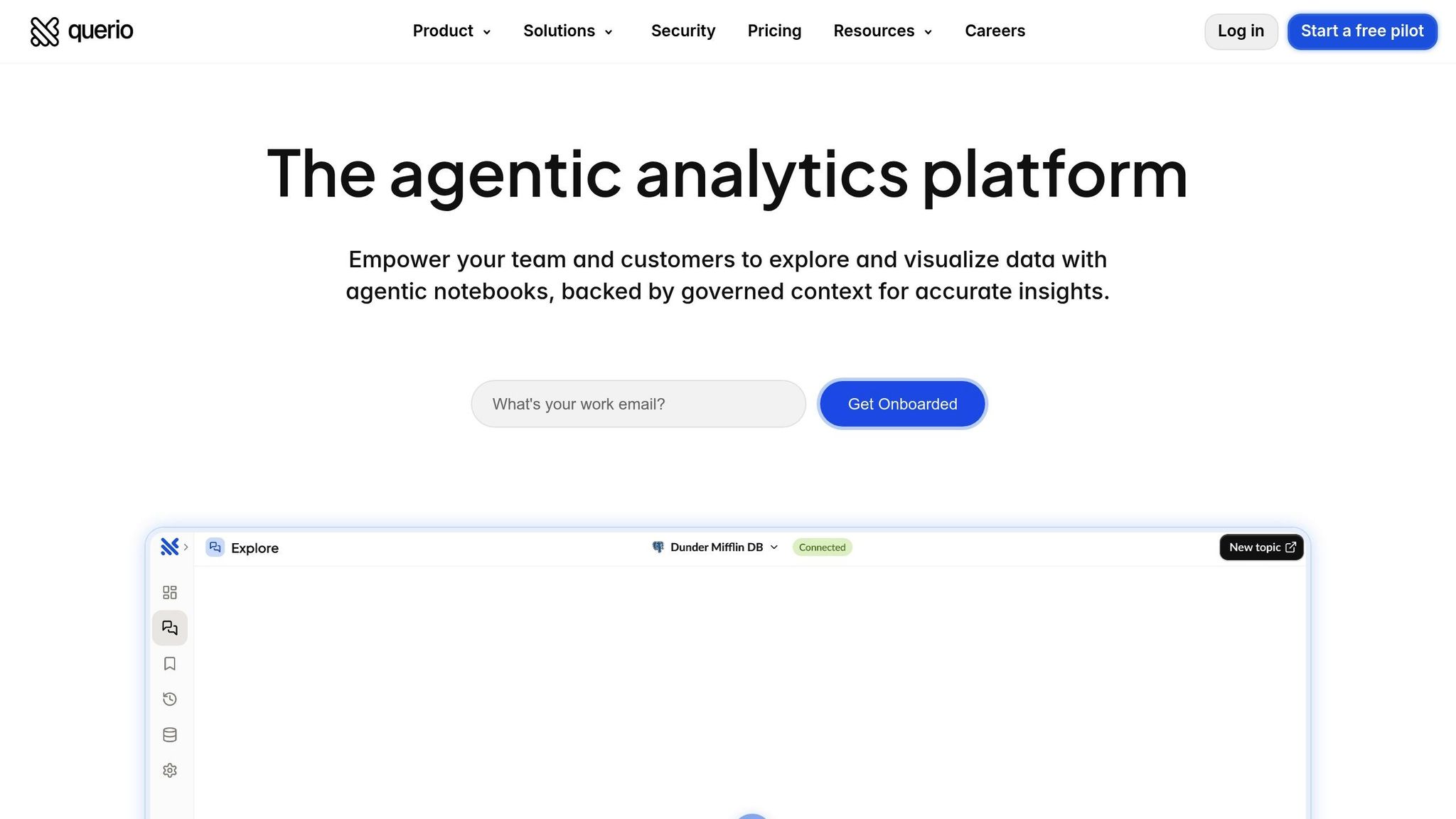
Querio is a powerful tool for embedding analytics, connecting directly to platforms like Snowflake, BigQuery, or Postgres. It allows users to ask questions in plain English, which it then translates into SQL or Python for precise, governed results. Unlike black-box AI systems, Querio generates transparent queries, ensuring that every result is accurate, inspectable, and adheres to your warehouse’s permission settings.
Querio also includes a semantic layer where your data team can define joins, metrics, and business terms once. These definitions are then applied across dashboards, reports, and embedded analytics, ensuring consistency and eliminating discrepancies. This builds trust in your analytics, both internally and externally. Additionally, Querio’s notebook-based environment supports iterative analysis, allowing your team to refine queries and visualizations before embedding them into your SaaS app. With analytics integration streamlined, the next step is to prepare and govern your data effectively.
Prepare and Govern Your Data
Before embedding analytics, your data needs to be clean and well-structured. Start by creating semantic views that simplify raw data into business-friendly formats. Keep each semantic view limited to 50–100 columns to stay within the context window limits of AI components [11]. This helps avoid latency and ensures natural language queries deliver accurate results quickly.
Next, implement Role-Based Access Control (RBAC) to manage data visibility. This is crucial for both internal teams and external users. For example, customers should only see their own data, while your support team may require broader access [11]. When creating time-series visualizations, use a standardized metric_time dimension to ensure metrics align correctly across different time frames [6]. To maintain consistency, store semantic model specifications in Git for easy reviews, rollbacks, and automated synchronization [11].
A quick note for Snowflake users: sample values in semantic views are stored as metadata and aren’t masked by standard data masking policies. Always use representative, non-sensitive values for AI training [11]. With your data cleaned, governed, and ready, you can confidently roll out your data product to users.
Implement, Embed, and Govern the Data Product
Deploy your data product quickly, but don’t compromise on accuracy or security. By leveraging the best embedded analytics tools, you can follow these steps to ensure smooth implementation and effective governance.
Roll Out the Data Product in Phases
Start small by launching 3–5 dashboards that tackle key user questions. This initial phase, spanning 3 to 6 weeks, should target a pilot group of analytics-savvy users who can provide actionable feedback. This gradual rollout not only ensures a smoother adoption process but also opens doors for monetization. For instance, you could introduce a Basic Tier with predefined reports and later expand to a Premium Tier offering ad-hoc exploration and AI-powered insights. Assign a dedicated Data Product Owner to guide the feature roadmap and keep things on track [1].
Embed Analytics Securely in Your SaaS Platform
Security should be a priority when embedding analytics, especially when aligned with earlier recommendations on embedded analytics architecture and consistent metrics. Use Row-Level Security (RLS) to filter data based on user attributes passed through signed URLs or JWT. For seamless and secure access, implement Single Sign-On (SSO) using protocols like SAML 2.0, OpenID, or OAuth.
When embedding Querio dashboards or notebook outputs, generate short-lived, immutable embed URLs through your backend. Connect your BI engine to the data warehouse using read-only service accounts with SELECT-only permissions, secured by RSA key-pair authentication. Store sensitive information like API keys and embed secrets in a secure vault - never in client-side code. For industries with strict compliance requirements, ensure your platform adheres to standards such as SOC 2 Type II, ISO 27001, GDPR, HIPAA, and CCPA.
Ongoing Governance and Continuous Improvement
Governance is an ongoing process. Maintain audit logs to track data access for compliance purposes. Use query caching and pre-aggregated metrics to keep dashboards running smoothly, even under heavy traffic.
Pay attention to dashboard usage patterns and query frequency to spot drop-offs or areas for improvement. Refine metrics using user feedback gathered through the notebook environment. Over time, adapt your semantic layer to reflect your evolving business needs. Tools like Git can help manage version control, enabling easy reviews, rollbacks, and automated updates. This ensures your data product remains accurate, relevant, and reliable as your organization grows.
Conclusion: Key Takeaways for Building a Data Product
Review the Process
Creating a data product for your SaaS app involves four main steps. First, align your business objectives with your users' needs by defining clear use cases and establishing consistent metrics through an AI semantic layer. Second, design an analytics experience that's both user-friendly and high-performing, keeping ease of use front and center. Third, select a scalable tech stack that connects your data warehouse to AI-powered analytics tools like Querio. Fourth, prioritize ongoing governance by continuously refining your product based on user feedback.
"The goal here is to empower your end-users to gain insights from their data sitting in your app." - Rahul Pattamatta, CEO, DataBrain [2]
Security and governance are non-negotiable. Implement row-level security for multi-tenant apps, single sign-on (SSO), and adhere to standards like SOC 2 Type II. Your data product should seamlessly integrate with your SaaS app while delivering reliable and accurate insights.
These steps not only recap the process but also provide a clear path to get started.
Next Steps for SaaS Teams
With the process outlined, it's time to put these insights into action. Start by creating 3–5 high-value dashboards that address your users' most pressing needs [1]. Roll out these dashboards to a pilot group of analytics-savvy users for a trial period of 3 to 6 weeks. This pilot phase will help you gather valuable feedback and validate your data product before expanding it to your entire user base.
Develop a tiered monetization strategy that grows alongside your product [1]. Ensure your tech stack connects seamlessly to your existing data warehouse, defines metrics once in the semantic layer, and embeds governed analytics into your app. Keep a close eye on performance and user feedback to refine and improve as you scale.
FAQs
How can I make sure my data product meets business goals and user needs?
To make sure your data product supports your business goals and meets user needs, start by defining key business metrics - like monthly recurring revenue or churn rate - within a centralized semantic layer. This approach ensures that dashboards, reports, and analytics stay consistent, avoiding confusion and keeping everyone aligned on the numbers that matter most.
Bring key stakeholders and end-users into the process early. Understand the critical questions they need answered and design features that address those needs, such as custom dashboards or tools for natural-language queries. Adding AI-powered, self-service analytics makes it easier for users to find insights quickly, boosting engagement and solving practical challenges.
Don’t overlook security, performance, and governance. Features like row-level security, query caching, and pre-aggregated metrics can help keep your product secure, fast, and dependable as it scales. By blending strategic alignment with user-centered design, your data product can become an essential tool for driving decisions and achieving measurable results.
What are the best practices for creating user-friendly analytics in a SaaS app?
To create user-friendly in-app analytics, start with a solid data structure. Establish a semantic layer to ensure metrics and terminology remain consistent, so users encounter reliable and uniform data across all charts and dashboards. Add AI-powered tools that let users ask questions in plain English and get clear, visual answers - making analytics approachable even for those without technical expertise. Strengthen security and performance by including features like row-level security, query caching, and pre-aggregated metrics. These steps ensure results are both fast and dependable.
A clean and intuitive interface is essential. Design dashboards tailored to specific roles, focusing on the most relevant KPIs. Use responsive layouts to adapt to different devices and ensure real-time data updates for accuracy. Embed analytics directly into your app using APIs or SDKs, and add contextual support like tooltips or guided tours to make onboarding easier. To build trust, maintain governed analytics by securing data access, enabling audit trails, and regularly reviewing metric definitions. These strategies will help create a seamless analytics experience that integrates naturally into your SaaS app.
How can I securely embed analytics into my SaaS app while ensuring proper governance?
To integrate analytics securely into your SaaS app, start by linking your cloud data warehouse (like Snowflake or BigQuery) with a read-only service account. This approach ensures the analytics layer can access your data for queries while preventing any modifications. Add a semantic layer to standardize key metrics - such as monthly recurring revenue or churn rate - and apply row-level security and column masking automatically. This helps maintain consistent calculations and safeguards sensitive information.
For the analytics interface, embed it using APIs or SDKs that support white-labeling and user-specific access controls. To keep performance smooth and protect raw data, leverage query caching and pre-aggregated metrics. Finally, track activity with audit logs and set up alerts for any unusual behavior to stay compliant and maintain governance. These steps allow you to deliver secure, intuitive analytics that add real value to your SaaS platform.
Related Blog Posts


