Business Intelligence
10 Best AI-Powered Data Analysis Tools for Non-Technical Users in 2026
Compare 10 AI data tools that let non-technical teams query live warehouses, inspect generated SQL/Python, and use governed metrics.
In 2026, AI-powered data analysis tools are making it easier than ever for non-technical users to access insights directly from live data warehouses like Snowflake, BigQuery, and Redshift. These tools eliminate the need for SQL or complex dashboards, letting users ask plain-English questions and get instant answers. Key features include natural language querying, transparent query logic, consistent metric definitions, and automated visualizations.
Here’s a quick look at the top tools:
Querio: Focuses on inspectable SQL/Python, live data access, and consistent metrics.
ThoughtSpot: Search-based analytics with live queries and explainable logic.
Looker: Centralized semantic layer with natural language querying.
Power BI with Copilot: Integrates with Microsoft tools, offering DAX-based insights.
Tableau with Einstein AI: AI-assisted visualizations for Salesforce users.
Qlik Sense: Flexible, exploratory analysis with conversational AI.
Zoho Analytics with Zia: Simplified reporting for small businesses.
Domo: Combines dashboards with predictive analytics.
Hex: Analyst-driven notebooks for shareable apps.
Mode Analytics: Collaborative reports built by analysts for stakeholders.
Quick Comparison
Tool | Best For | AI Features | Live Data Access | Governance Strength |
|---|---|---|---|---|
Querio | Teams needing transparency and accuracy | Inspectable SQL/Python | Yes | Strong |
ThoughtSpot | Search-first data exploration | Conversational NLQ | Yes | Strong |
Looker | Enterprise-wide metric consistency | AI-assisted SQL, LookML | Yes | Very strong |
Power BI | Microsoft ecosystem users | DAX-based insights, Copilot | Partial | Moderate |
Tableau | Salesforce integrations | AI-driven visualizations | Partial | Moderate |
Qlik Sense | Flexible, self-serve analysis | Conversational analytics | Partial | Moderate |
Zoho Analytics | SMBs needing quick insights | Zia AI assistant | Partial | Weak |
Domo | Forecasting and dashboards | Predictive analytics | Partial | Moderate |
Hex | Analyst-driven apps | AI-assisted SQL/Python | Yes | Moderate |
Mode Analytics | Analyst-built stakeholder reports | AI-assisted SQL | Yes | Moderate |
These tools cater to different needs, from self-serve analytics to analyst-driven solutions. Querio stands out for its balance of transparency, real-time data access, and governed metrics, making it a strong choice for fast-paced teams.
What Makes an AI Data Analysis Tool Work for Non-Technical Users
For non-technical users, an AI data analysis tool needs to bridge the gap between complex data systems and everyday language. The key? Turning plain language into actionable insights. Here's how it works, step by step:
Natural-language querying is the starting point. Imagine typing a simple question like, "What was our MRR by segment last quarter?" and getting an instant, accurate answer. The tool translates plain-English questions into SQL or Python queries, running them against live data warehouses like Snowflake, BigQuery, or Redshift. This process happens in seconds, making data accessible without requiring technical know-how.
Transparency is equally important. Tools like Querio stand out because they let users inspect the underlying SQL or Python code. Why does this matter? When users can see how the answer was generated, it builds trust. Without this transparency, any answer could be dismissed as unreliable the moment someone challenges it.
Uniform metric definitions are another crucial piece. A shared semantic layer ensures that business metrics are defined consistently across teams. This eliminates the risk of conflicting numbers and prevents poor decisions based on inconsistent data.
Automated visualization wraps it all up. The tool automatically selects the right chart type and connects to live data warehouses, removing the need for outdated data extracts. This feature ensures that insights are presented in a clear, visual format, ready for immediate use [1][2].
When these four features - natural-language querying, transparency, consistent metrics, and automated visualization - come together, they create a tool that non-technical users can rely on and actually use, rather than abandoning it after a flashy demo.
1. Querio

Querio is designed with a straightforward goal: enabling non-technical users to ask questions about their data as if they were talking to a colleague. For instance, you could type something like, "What's our MRR by region for Q1?" and Querio would instantly translate that into SQL or Python, execute the query on your live data warehouse, and deliver the answer - no technical expertise needed. This approach simplifies data analysis and makes insights more accessible across teams.
One of Querio's standout features is its inspectable code. Every result comes with the underlying SQL or Python code fully visible and editable. This transparency is invaluable. Imagine a scenario where a finance lead questions a metric during a board meeting. With Querio, the data team can immediately pull up the exact query, verify its logic, and provide clarity. There's no reliance on opaque processes or guesswork.
Querio also integrates seamlessly with the data warehouses that B2B SaaS companies already use, such as Snowflake, BigQuery, Amazon Redshift, ClickHouse, PostgreSQL, and others. It connects using encrypted, read-only credentials, eliminating the need for outdated workflows like CSV exports or ETL pipelines. By querying data directly from the source, Querio ensures real-time accuracy and eliminates the risks of working with stale data.
Another key feature is Querio's governed semantic layer. This allows data teams to define metrics like CAC, MRR, or churn once within a shared framework. Afterward, all departments - whether it's marketing, finance, or customer success - pull from the same validated definitions. This consistency ensures that everyone is on the same page, avoiding the common issue of teams working with conflicting data.
Pricing for Querio starts at $400/month for 10 users, with most plans offering unlimited users, removing the hassle of per-seat charges.
With its focus on transparency, real-time data access, and consistent metrics, Querio is built to meet the needs of fast-moving SaaS data teams.
2. ThoughtSpot
ThoughtSpot brings a search-first approach to data analysis, making it feel as intuitive as using a search engine. Instead of navigating complex dashboards or crafting detailed queries, users can simply type their questions into a Google-like search bar. For instance, you could ask, "Show me revenue by product line for Q1 2026," and ThoughtSpot will instantly translate that request into a live query against your data warehouse.
The platform's AI assistant, Spotter, has come a long way. The latest version, Spotter 3, goes beyond basic keyword matching. It incorporates advanced reasoning capabilities and generates a verifiable query plan. This means every answer is backed by inspectable SQL or explainable logic, ensuring users can understand how results are derived. This level of transparency is critical for building trust in the tool's live data insights.
ThoughtSpot uses a zero-copy, live query model, which means it connects directly to cloud data warehouses like Snowflake, BigQuery, and Redshift. This ensures that results are based on live data, avoiding duplication or outdated information. However, there’s a trade-off: every search triggers a live query in the warehouse, which could lead to higher compute costs. For teams using platforms like Snowflake or Redshift, it’s important to keep an eye on query volumes to prevent unexpected billing spikes. By default, ThoughtSpot only shares metadata with its language models, keeping actual data values private unless the organization explicitly opts in - an important safeguard for companies managing sensitive data.
Where ThoughtSpot truly shines is in its ability to enable self-service business intelligence. Business users can independently dive into data without relying on the data team to create reports or dashboards. However, this capability comes with some challenges. The platform requires a significant upfront investment in data modeling, as the quality of insights depends heavily on the strength of the underlying semantic model. Organizations with well-structured data warehouses will see the best results right away. This aligns with the increasing demand for tools that empower non-technical users while maintaining a governed approach to analytics.
3. Looker
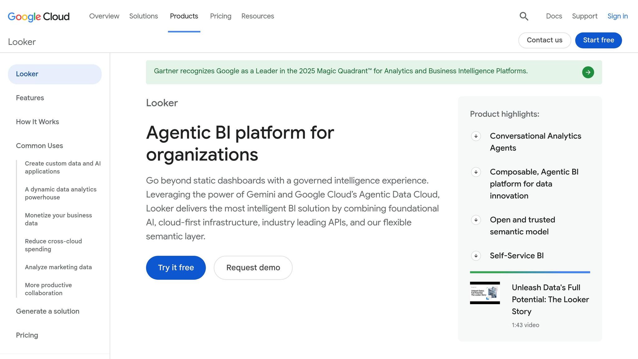
Looker takes a unique approach to self-serve analytics by introducing a centralized semantic layer. This layer ensures that key business metrics, like "Revenue", are standardized across teams. It achieves this through LookML, Looker's proprietary modeling language, which acts as the bridge between your data warehouse and end users. This setup guarantees that teams like finance and marketing are always working with consistent definitions - a critical aspect of governed analytics.
On top of this semantic layer, Looker incorporates AI capabilities through Google Gemini. This integration allows users to perform natural-language-to-sql queries, making it possible to ask questions in plain English and get answers from live data warehouses like BigQuery, Snowflake, and Redshift. Looker Studio further enhances the experience by offering AI-driven chart suggestions, simplifying the process of creating visualizations. The platform's direct connections to live data warehouses ensure access to real-time insights.
However, building and maintaining a strong LookML model requires a solid data engineering effort. For organizations without dedicated data engineering resources, the initial setup can be a hurdle. That said, once established, this framework enables non-technical users to access and analyze data with ease. As with other analytics tools, having a well-structured data model is essential for dependable self-serve analytics.
For B2B SaaS teams relying on BigQuery as their main data warehouse, Looker’s combination of a centralized semantic layer, real-time data connectivity, and AI-powered natural language querying provides a dependable analytics solution. This approach aligns with the increasing need for live, governed, and accessible analytics in the B2B SaaS space.
4. Power BI with Copilot

Microsoft's integration of Copilot into Power BI makes it easier for non-technical users to interact with data by turning plain-English queries into DAX (Data Analysis Expressions) - the calculation language used in Power BI. Essentially, this allows users to ask questions in everyday language without needing to understand the complexities of DAX syntax.
One standout feature is the "How Copilot arrived at this" diagnostic tool, which explains the logic behind each AI-generated response. This added layer of transparency is especially useful when presenting data to decision-makers or justifying budget-related conclusions. Knowing the reasoning behind the numbers builds trust and confidence in the insights provided.
For organizations already using Excel, Teams, and Azure, Copilot integrates seamlessly into existing workflows. For example, analysts can share insights directly in Teams without needing to switch between applications, which streamlines collaboration. However, to make the most of Copilot's capabilities, a well-defined semantic model is crucial. Each measure, table, and column should include clear descriptions (up to 200 characters) to maintain consistency and accuracy. Studies show that AI data analyst tools generally perform with 50–89% accuracy, but for more complicated, multi-table enterprise analytics, accuracy can drop to around 50% without a robust semantic context layer [3].
On the governance front, Microsoft recommends using Object-Level Security (OLS) for sensitive data, as Copilot can sometimes bypass Row-Level Security (RLS). This makes it essential for data teams to carefully configure security settings before enabling broad self-service access.
Here’s a quick summary of how Power BI with Copilot fits into existing workflows:
Feature | Power BI with Copilot |
|---|---|
NLQ Approach | Generative AI (Copilot) |
Primary Language | DAX (Data Analysis Expressions) |
Best Integration | Microsoft 365 / Azure |
Governance | OLS/RLS (with some preview limitations) |
AI Transparency | "How Copilot arrived at this" diagnostic tool |
For teams already invested in Microsoft's ecosystem, Power BI with Copilot offers a natural fit. It also works well for organizations that rely on live connections to data warehouses like Snowflake, BigQuery, or Redshift, enabling direct querying without requiring data extracts. This makes it a practical choice for businesses needing real-time analytics within the Microsoft environment.
5. Tableau with Einstein AI
Tableau continues to hold its place as a top-tier visualization platform, and Salesforce's Einstein AI layer brings a new level of usability, especially for non-technical users. By allowing users to type plain-English questions - like "What were our top-performing regions last quarter?" - it simplifies data exploration. This feature eliminates much of the learning curve that previously made Tableau more approachable for analysts than for everyday business users.
With automated insights, Einstein AI takes the lead in spotting trends, anomalies, and patterns, delivering these findings directly to users. For roles like a sales operations manager or a marketing leader in a B2B SaaS company, this means they no longer need to sift through dashboards to find actionable insights - key signals come straight to them.
Tableau also connects directly to live data sources such as Snowflake, BigQuery, Redshift, and Postgres, ensuring decisions are always based on the most current data. This real-time connection is crucial for time-sensitive decisions where outdated information simply won’t cut it.
That said, Tableau's more advanced features - like calculated fields, Level of Detail (LOD) expressions, and complex data blending - still require technical expertise. While Einstein AI makes the interface friendlier, the platform's full power remains challenging for teams without a dedicated analyst or data engineer. For non-technical users, these complexities might still create roadblocks.
Feature | Tableau with Einstein AI |
|---|---|
NLQ Approach | Einstein AI (natural language queries) |
Automated Insights | Yes - proactive trend and anomaly detection |
Live Warehouse Connections | Snowflake, BigQuery, Redshift, Postgres |
Best Fit | Organizations with Salesforce/Tableau integration |
Technical Barrier | Low for basic queries; higher for complex analysis |
For companies already using Salesforce CRM alongside a cloud data warehouse, Tableau with Einstein AI feels like a natural next step. It’s perfect for creating shareable visualizations and exploring data with AI assistance, as long as a data team is available to manage the underlying models. This combination of user-friendly AI and strong data connectivity highlights the growing trend toward governed, warehouse-native analytics tools - a space where Querio is also making strides.
6. Qlik Sense
Qlik Sense stands out with its associative AI engine, allowing users to explore data in a more natural and intuitive way. Instead of sticking to rigid, pre-defined query paths, users can click through data as if they were browsing, making the experience approachable even for those without technical expertise.
One of its standout features is conversational analytics. This enables users to type plain-language questions and receive insights without needing to dive into SQL. For instance, a revenue operations manager could ask, "Which customer segments had the highest churn last quarter?" and instantly get a clear visual breakdown.
The platform also integrates seamlessly with modern cloud data warehouses like Snowflake, BigQuery, and Redshift. By supporting live queries, Qlik Sense ensures that the data remains current. This is especially important for B2B SaaS teams that rely on real-time metrics to guide decisions around go-to-market strategies and product usage.
However, the platform does come with a challenge: governance. As self-service analytics scale across an organization, ensuring consistent metric definitions can become tricky. Without a governed semantic layer, there’s a risk of inconsistent reporting when different users interpret data differently.
Here’s a quick look at what Qlik Sense offers:
Feature | Qlik Sense |
|---|---|
Core AI Capability | Associative AI engine with conversational analytics |
NLQ Support | Yes - plain-language question input |
Live Warehouse Connections | Snowflake, BigQuery, Redshift |
Best Fit | Teams needing open-ended, exploratory analysis |
Governance Consideration | Requires careful setup to maintain metric consistency |
Qlik Sense is a great option for teams that prioritize flexible, exploratory data analysis over rigid, structured reporting. Its ability to deliver real-time insights in an interactive way makes it a strong contender for dynamic business environments.
7. Zoho Analytics with Zia

Zoho Analytics offers Zia, its AI assistant, as a straightforward tool for business users who need quick insights. Zia understands plain-language questions and instantly delivers visual reports, trend summaries, and detailed breakdowns. For example, if a marketing manager asks, "What were our top-performing campaigns last quarter?", Zia provides the answer directly - no SQL or technical expertise required. This makes it a handy option for non-technical users, especially in fast-moving B2B SaaS environments.
Zia also takes care of repetitive tasks like data cleaning, report formatting, and generating updates. This allows analysts to focus more on interpreting the data rather than managing it. For smaller teams with limited resources, this can be a game-changer.
One of Zia's standout features is its ability to work across multiple connected data sources. It can pull data from spreadsheets, CRMs, and cloud databases. For instance, sales operations teams can integrate Salesforce data with product performance metrics without needing engineering help.
However, Zoho Analytics does have its limitations. It is primarily report-focused, and its governance model relies on connected data sources rather than a centralized semantic layer. This setup can lead to inconsistencies in metric definitions as more users independently create their own reports. Companies that require strict governance and consistent metrics might find tools with centralized semantic layers more suitable.
Feature | Zoho Analytics with Zia |
|---|---|
Core AI Capability | Zia AI assistant with NLQ and automated reporting |
NLQ Support | Yes - plain-language question input |
Live Warehouse Connections | Multiple connected sources; warehouse-native depth varies |
Best Fit | SMB and mid-market teams needing automated, cross-source reports |
Governance | Source-level connections only |
Zoho Analytics with Zia is a great option for teams looking for user-friendly, automated reporting without complex setup. It’s particularly ideal for organizations already using Zoho's suite of tools. While it excels in automation and cross-source reporting, it lacks the robust governance features found in platforms with centralized semantic layers. This trade-off reflects the balance between ease of use and the need for strict metric consistency in enterprise-level reporting.
8. Domo
Domo is a business intelligence (BI) platform designed to go beyond just analyzing past data. With its predictive analytics, it helps teams anticipate future trends, making it easier to plan ahead. One standout feature is its natural language querying (NLQ), which allows users to ask questions in plain language and get instant visual answers. This is particularly useful for teams that need quick, actionable insights without wading through complex data tools. Unlike platforms that mainly focus on historical reporting, Domo empowers business users to create forecasts and trend analyses without needing help from data scientists.
Feature | Domo |
|---|---|
Core AI Capability | Natural language querying, predictive analytics |
NLQ Support | Yes - supports plain-language queries on dashboards |
Live Warehouse Connections | Yes - connects to Snowflake, BigQuery, and others |
Best Fit | Business users needing self-serve dashboards with forecasting |
Domo is a great choice for teams looking for real-time insights paired with forecasting capabilities. It’s ideal for users who want to explore data and generate predictions without requiring advanced technical expertise. This focus on self-serve analytics and forecasting sets the stage for even more advanced solutions in the next section.
9. Hex
Hex is another standout in the world of AI-powered tools, designed to make complex data more accessible. What sets Hex apart is its focus on notebooks - interactive documents where analysts can use SQL or Python to explore data and then transform their findings into shareable apps for non-technical users.
The tool operates on a two-layer system. Analysts work in the notebook layer, where they can query live data warehouses like Snowflake, BigQuery, or Redshift. With AI assistance, they can generate or debug SQL and Python code. On the other hand, non-technical stakeholders interact with a polished app interface, featuring interactive charts and summaries, without ever dealing with raw code or tables.
This setup is especially useful for data teams at B2B SaaS companies. For example, a product manager could analyze a retention chart by cohort without needing to write a single query. Meanwhile, the analyst retains full control over the underlying logic. One of Hex’s defining features is its reactive notebook model - when an input changes, all related cells update automatically. This enables real-time, lightweight data apps that connect directly to your data warehouse, eliminating the need for exporting CSVs or managing separate data copies. Unlike platforms that allow direct self-serve querying, Hex emphasizes a governed semantic layer, balancing transparency with ease of use.
However, Hex is primarily designed for analysts creating shareable apps, which means non-technical users won’t be able to independently perform their own analyses. If empowering self-serve analytics for customers and non-technical users is a priority, this limitation is worth considering.
Feature | Hex |
|---|---|
Core AI Capability | AI-assisted SQL and Python generation in notebooks |
NLQ Support | Limited – focuses more on code assistance than conversational queries |
Live Warehouse Connections | Yes - supports Snowflake, BigQuery, Redshift, and more |
Best Fit | Analysts developing shareable data apps for business stakeholders |
10. Mode Analytics

Mode Analytics uses AI-assisted SQL to create a seamless reporting experience for B2B SaaS teams. Acting as a collaborative layer on top of your existing data warehouse, it empowers analysts to build polished reports and dashboards that non-technical users can easily access - without needing to write any code. Analysts can take query results and turn them into visual reports and charts, including charts, tables, and summaries, while directly connecting to warehouses like Snowflake, BigQuery, and Redshift.
One of Mode's standout features is its ability to share reports effectively. This allows team leaders to track essential metrics without needing direct access to raw data. For example, sales or finance managers can stay informed on performance metrics without navigating the complexities of the data environment.
Mode is specifically tailored for workflows where analysts create and share insights with stakeholders. While non-technical users can filter shared reports, they can't run new queries independently. If your team prioritizes empowering business users to explore data on their own, this limitation is something to consider.
Feature | Mode Analytics |
|---|---|
Core AI Capability | AI-assisted SQL writing and query optimization |
NLQ Support | Limited - not built for conversational querying |
Live Warehouse Connections | Yes - Snowflake, BigQuery, Redshift, and others |
Best Fit | Analyst teams sharing polished reports with non-technical stakeholders |
This table highlights Mode Analytics' features and its niche role in bridging the gap between analysts and non-technical users.
Comparison Table

Top 10 AI Data Analysis Tools for Non-Technical Users 2026
This table breaks down the main differences among popular analytics tools, focusing on their primary use, ease of use for non-technical users, compatibility with live data warehouses, governance capabilities, and AI interaction styles. It emphasizes the importance of governed, warehouse-native analytics that are accessible to non-technical users.
Tool | Primary Use Case | Non-Technical User Fit | Warehouse-Native | Governance Strength | AI Interaction Style |
|---|---|---|---|---|---|
Querio | Self-serve analytics for data teams and business users | ★★★★★ | Yes - Snowflake, BigQuery, Redshift, ClickHouse, Postgres | Strong - shared semantic/context layer, versioned logic, SOC 2 Type II | Conversational NLQ → inspectable SQL/Python |
ThoughtSpot | Search-driven BI for business users at scale | ★★★★☆ | Yes - live warehouse connections | Strong - centralized governance model | Search-bar NLQ → auto-generated visualizations |
Looker | Enterprise BI with a governed semantic layer (LookML) | ★★★☆☆ | Yes - BigQuery-native, others via JDBC | Very strong - LookML model enforces definitions | Looker AI assistant; structured exploration |
Power BI with Copilot | Broad BI with AI-assisted reporting for Microsoft-stack teams | ★★★★☆ | Partial - extracts common; DirectQuery available | Moderate - governance depends on setup | Conversational chat (Copilot side panel) |
Tableau with Einstein AI | Visual analytics and dashboarding for enterprise teams | ★★★☆☆ | Partial - extracts common; live connections available | Moderate - Tableau Catalog adds governance | Conversational AI |
Qlik Sense | Associative data exploration for mid-to-large enterprises | ★★★☆☆ | Partial - in-memory engine; some live options | Moderate - centralized app management | NLQ via Insight Advisor |
Zoho Analytics with Zia | SMB reporting and dashboarding with AI assistance | ★★★★☆ | Partial - file uploads and connectors | Weak - limited enterprise governance | Chatbot-style; Zia AI assistant |
Domo | Cloud BI with broad data connectors and executive dashboards | ★★★★☆ | Partial - connector-based, not purely warehouse-native | Moderate - role-based access controls | Conversational AI; Magic ETL automation |
Hex | Collaborative notebooks for analyst-led data work | ★★☆☆☆ | Yes - Snowflake, BigQuery, Redshift, Postgres | Moderate - analyst-controlled; less centralized | AI-assisted SQL/Python in notebook cells |
Mode Analytics | Analyst-built reports shared with non-technical stakeholders | ★★☆☆☆ | Yes - Snowflake, BigQuery, Redshift | Moderate - analyst-controlled definitions | AI-assisted SQL; limited NLQ for end users |
The comparison highlights how tools differ in their live connection capabilities and governance features. Tools like Querio and Hex stand out by exposing the underlying SQL or Python code after processing a query, giving users the ability to verify, tweak, and trust the results. This approach, supported by a governed semantic layer, ensures reliable and consistent analytics - a key strength of Querio.
Conclusion
For non-technical business users, the ideal AI-powered data analysis tool provides live, self-serve insights directly from your data warehouse while maintaining strong governance. Let’s recap why warehouse-native analytics with governance is a game-changer.
Not all tools are designed to meet the same needs. Hex and Mode excel for technical analysts but are built primarily for those with advanced expertise. Looker ensures strict governance through LookML, but its complexity often leaves business users reliant on data teams. Power BI with Copilot and Tableau with Einstein AI work well for organizations immersed in Microsoft or Salesforce ecosystems, though they frequently depend on data extracts rather than live warehouse queries. While these platforms have their strengths, Querio uniquely combines live data connections with a governed semantic layer, offering unparalleled transparency.
The right tool depends on your team’s data setup. If your data resides in platforms like Snowflake, BigQuery, Redshift, or Postgres - and you need business users to access accurate insights without relying on tickets - the tool’s architecture is just as critical as its user interface.
This is where Querio truly stands out. It connects directly to live data warehouses, generates inspectable SQL or Python, and enforces consistent metric definitions through a shared semantic layer. This ensures precise results while keeping the data team in control. For teams seeking governed, warehouse-native analytics, Querio offers a combination that’s hard to beat. When the goal is scalable, reliable, and governed self-serve analytics, Querio is positioned to deliver unmatched performance in 2026.
FAQs
How do I know the AI’s answer is correct?
Querio gives you the ability to confirm its answers by letting you review the automatically generated SQL or Python code. This feature ensures full code transparency, allowing you to inspect, tweak, and verify the logic as needed. On top of that, its governed semantic layer guarantees consistent metrics and business definitions throughout your organization. This means all insights come from one reliable and trusted source.
Will this run live queries on Snowflake/BigQuery/Redshift and increase costs?
Querio connects directly to data warehouses like Snowflake, BigQuery, and Redshift using encrypted, read-only credentials. This setup eliminates the hassle of building ETL pipelines or duplicating data. By utilizing your warehouse’s processing power and governance policies, Querio avoids additional storage costs. It’s built to scale insights efficiently while keeping costs predictable with a flat annual fee, helping you sidestep surprise expenses.
What do I need to set up to keep metrics consistent across teams?
To keep metrics consistent across teams, implement a shared semantic or context layer. This approach centralizes the definitions of critical metrics like Monthly Recurring Revenue (MRR), churn, or active users. By doing so, these metrics are applied uniformly across all dashboards and reports. It avoids discrepancies, ensures calculations remain consistent, and keeps departments like finance and sales on the same page - eliminating confusion caused by conflicting interpretations.
Related Blog Posts


