Guide
Drill Down Analytics: A Practical Guide for Data Teams
Learn how drill down analytics helps product and data teams move from summary metrics to root insight, with patterns, query examples, and best practices.
Monday morning, a founder opens the revenue dashboard and sees a sharp week-over-week decline. She changes the date range, clicks the plan filter, and switches from a line chart to a table. The headline number keeps changing shape, but it never answers the question: did churn rise in one plan, one region, or one acquisition channel?
She sends a message to an engineer. The engineer sends it to someone on the data team. A ticket enters the queue. By Thursday, the answer arrives as a screenshot that nobody can reproduce or extend. The business question moved faster than the reporting system.
That gap is where drill down analytics should help. A summary is only the starting point. The useful work happens when an analyst can follow a metric through its hierarchy, preserve the filters and definitions, and reach the underlying cause without creating a new report for every question. The interaction matters, but the data model behind it matters more. A broader discussion of why teams are moving beyond fixed dashboard experiences appears in the debate about the end of dashboards.
Table of Contents
- The Moment a Summary Chart Stops Being Enough
- What Drill Down Analytics Really Means
- Where Drill Down Analytics Breaks Down
- SQL, Notebooks, and BI Tools Compared
- Three Query Patterns That Power Real Drill Downs
- Why Notebook and Warehouse Native Workflows Scale Better
- Best Practices for Drill Down That Builds Trust
- Common Questions About Drill Down Analytics
The Moment a Summary Chart Stops Being Enough
A summary chart tells you what changed. It rarely tells you why.
Suppose the founder's revenue line drops. The first useful question may be whether the decline is concentrated in annual subscriptions or self-serve plans. The next may be whether one region contributed most of the change. Then she may need to separate new business from renewals, isolate a campaign cohort, and inspect the customer or invoice records behind the affected segment.
Each question narrows the investigation. If the dashboard only supports a fixed set of filters, the founder has to stop at the boundary designed by someone else. She can look at the dimensions the report author anticipated, but she can't ask the next question when the relevant attribute isn't available.
The distance between a metric and its cause
A proper drill-down path collapses that distance. The user starts with a metric at a broad level, selects a particular slice, and moves into a finer level without losing the context of the original calculation. The parent value remains visible, the selected filters remain clear, and each result gives the user a sensible next question.
That sounds like a small interface detail. In practice, it determines whether self-service analytics is real or merely presentational. A dashboard can contain many charts and still force every unusual question through an analyst. Conversely, a simple summary view can support meaningful investigation when its underlying model exposes the right dimensions and grains.
Practical rule: A drill-down is useful only when the next level helps explain the current level.
The founder doesn't need an endless tree of categories. She needs a reliable path from the revenue movement to the operational event that caused it. That might be a plan, a geography, a campaign, a product event, or a customer record. The path should make the investigation faster without making the result less trustworthy.
What Drill Down Analytics Really Means
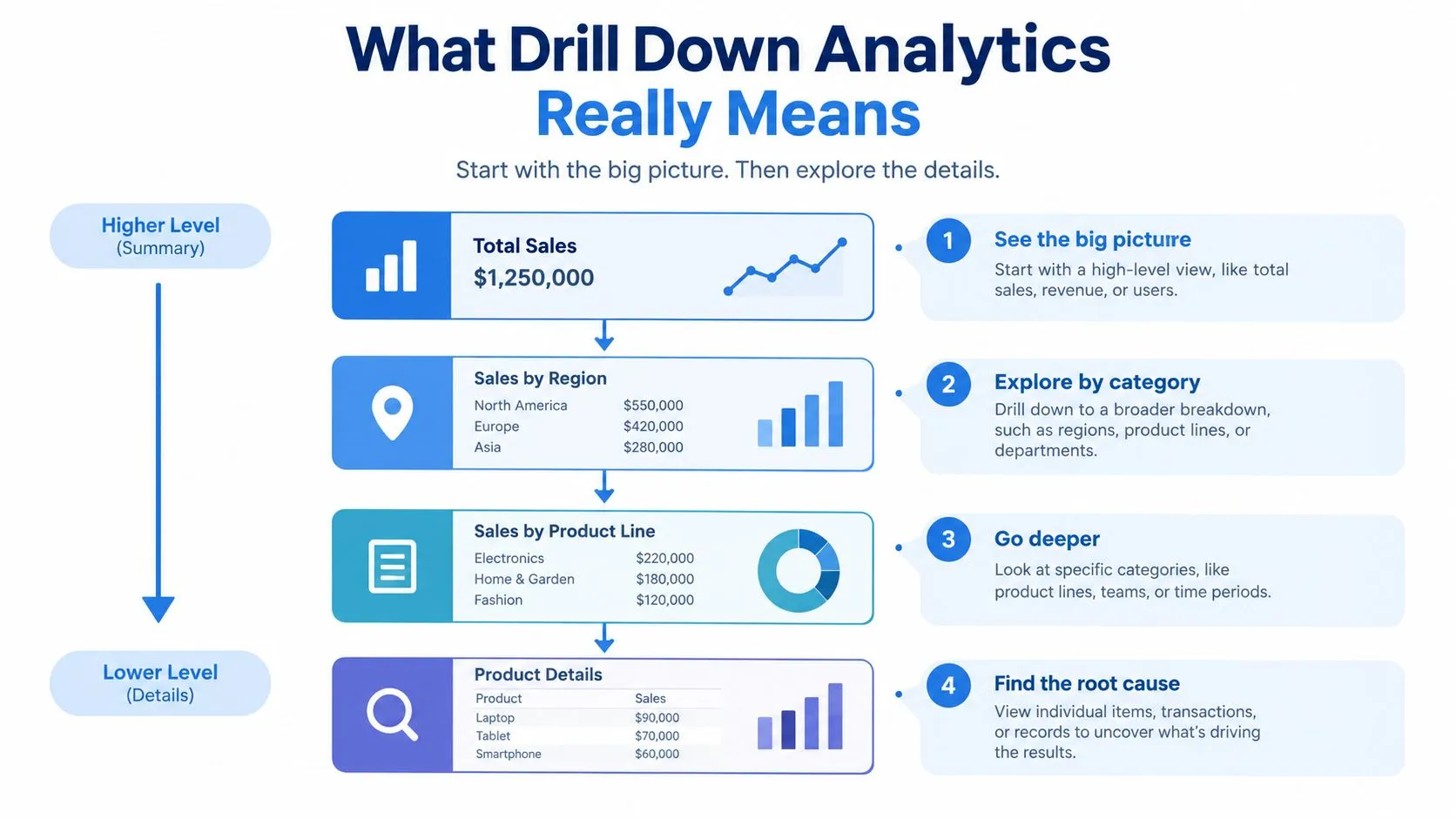
Drill down analytics is a hierarchical query pattern, not a button. The user begins with an aggregated metric and moves through progressively finer groupings, usually along a defined hierarchy such as year to quarter to month to day, or category to subcategory to product. The metric remains semantically consistent while the grouping level changes. This distinction is described clearly in the explanation of drill-down and drill-through in BI.
A daily revenue chart, for example, groups transaction facts by date. Drilling into one day narrows the filter to that date and groups the same underlying facts by plan, region, or customer. Drilling again may group the selected records by invoice or transaction. The query shape changes, but the definition of revenue should not change with it.
The reconciliation test
The basic test is reconciliation. The children produced by a drill should explain the parent value under the same filters and business rules. If a summary reports revenue for a selected period, the drilled rows should add up to that same revenue, unless the metric is non-additive and the interface explicitly explains why.
This is why the warehouse and semantic layer matter. The model must define the fact table's grain, the joins that add dimensions, and the hierarchy metadata that tells users how one level relates to another. Without those definitions, a polished click path can produce numbers that look reasonable but don't belong to the same calculation.
The historical development of hierarchical exploration is part of the broader evolution of business intelligence. The history of data drilling describes how earlier decision-support systems, OLAP, executive information systems, and data warehouses made it possible to explore data through organized levels rather than rewrite every query from scratch.
A short glossary
- Grain: What one row represents, such as one order, one line item, one user event, or one daily account balance.
- Hierarchy: An ordered relationship between levels, such as year, quarter, month, and day.
- Slice: A constrained subset of the data, such as one plan in one region during a selected period.
- Re-aggregation: Grouping the same underlying facts at a different level while preserving the metric definition.
Treating drill-down as a query pattern changes the architecture. The warehouse stores the facts and relationships. A BI chart, notebook, or application then renders a particular level of the path. Treating it as a UI feature reverses that responsibility. The dashboard stores a preselected path, and users can explore only what the configuration permits.
Where Drill Down Analytics Breaks Down
Drill-down usually fails for reasons that have little to do with the click itself. The interface may respond quickly and look intuitive while the underlying path produces incomplete, incompatible, or overly narrow results.
Sampling is the first problem. A summary may use a complete aggregate, while a detailed view uses a sample or a restricted extract. The user drills into a segment and sees rows that don't reconcile with the parent. That discrepancy is especially damaging because the interface gives no obvious reason for it.
Dimension limits create a different failure. A marketing lead sees a customer-acquisition-cost increase and wants to isolate the campaign, creative, or landing page behind it. If the modeled dataset includes channel but not campaign, the request isn't a drill-down. It's a request for a model change, a new extract, or a ticket.
Template lock-in makes the path harder to reuse. A time-series chart may support a configured hierarchy, but the same investigation may need to begin from a margin tile, a retention table, or a customer-level view. If the drill path belongs to one chart template, the user has to start over when the analytical question changes shape.
Grain mismatch is the most deceptive failure. A summary may count orders, while the detailed view groups line items. Both numbers can look plausible. Neither explains the other. A join to a one-to-many table can create the same problem by multiplying rows without making the distortion visible.
| Failure Mode | What Breaks | Typical Symptom |
|---|---|---|
| Sampling | The summary and detail use different populations | Drilled rows don't reconcile with the parent |
| Dimension limits | The model excludes the attribute needed for investigation | A new business question becomes a data-team request |
| Template lock-in | The path is tied to one chart or report structure | Users can't reuse the investigation on another metric |
| Grain mismatches | Parent and child views represent different row meanings | Counts look credible but explain nothing |
The practical response isn't to add more buttons. It is to expose the model's boundaries and make them legible. Users should know whether a result is complete, which grain it represents, and which dimensions are available. Teams working with generated queries should also understand how invalid assumptions enter the workflow, as discussed in common SQL failure modes in AI-assisted analysis.
SQL, Notebooks, and BI Tools Compared
SQL remains the foundation because it gives the analyst control over filters, joins, grouping, window functions, and the definition of the metric. A skilled analyst can move from a broad aggregate to an unusual combination of dimensions without waiting for a dashboard author to add a control.
The cost is iteration. A founder or product manager who can't write SQL still needs help translating each question into a query. Even for an analyst, a sequence of exploratory queries can become difficult to preserve unless the logic, assumptions, and results live together.
Notebook-driven workflows occupy the middle ground. They keep SQL and Python close to the warehouse, but place the reasoning beside the output. A parameterized cell can accept a selected date, plan, or cohort. The analyst can branch the prior query, record why the next filter was chosen, and share the path rather than only the final chart.
Traditional BI tools are strongest at the first interaction. A user can open a dashboard, change a time grain, select a hierarchy, and see a cached result without learning query syntax. That convenience is valuable for recurring questions and governed metrics.
The boundary appears when the question falls outside the model the tool exposes. Fixed dimensions, predefined drill paths, stale caches, and chart-specific logic can turn a short investigation into a request for a new report.
| Dimension | SQL | Notebook-driven | Traditional BI |
|---|---|---|---|
| Expressiveness | Broad control over grain, joins, and logic | Broad control with reusable cells and narrative context | Limited to the modeled fields and supported interactions |
| Reproducibility | Strong when queries are versioned | Strong when cells, parameters, and outputs are preserved | Variable, especially when logic lives inside chart settings |
| First-day usability | Low for non-technical users | Moderate, depending on templates and guidance | High for standard questions |
| Long-tail exploration | Strong, but requires query skill | Strong, with a reusable investigation path | Weak when the requested dimension or grain isn't configured |
| Governance | Requires conventions and review | Can combine code review with certified models | Often strong for approved dashboards, weaker outside them |
The honest choice isn't “BI versus SQL.” Both are often needed. Use a dashboard for stable, repeated questions. Use a notebook or direct warehouse query when the investigation keeps changing. The distinction between conversational interfaces and notebook-based analysis is explored further in where AI data analysis should live.
Three Query Patterns That Power Real Drill Downs
Most useful drill-downs rely on three operations: narrow the filter, change the grouping grain, and add context with a dimension or join. The examples below use illustrative table and column names. The important part is the sequence, not the specific SQL dialect.
Revenue by time and customer
Start with a broad time grouping:
SELECT DATE_TRUNC('day', paid_at) AS day, SUM(amount) AS revenue FROM payments GROUP BY 1 ORDER BY 1;
To investigate a selected day, keep the metric and restrict the slice:
SELECT plan, region, SUM(amount) AS revenue FROM payments WHERE paid_at >= 'selected-day' AND paid_at < 'next-day' GROUP BY plan, region ORDER BY revenue DESC;
The next query adds customer context:
SELECT c.customer_id, c.company_name, p.invoice_id, p.amount FROM payments p JOIN customers c ON p.customer_id = c.customer_id WHERE p.paid_at >= 'selected-day' AND p.paid_at < 'next-day' ORDER BY p.amount DESC;
The first query identifies the unusual day. The second shows which dimensions explain it. The third gives an operator a list of records to inspect.
Funnel by acquisition segment
A funnel summary groups events by step:
SELECT step_name, COUNT(DISTINCT user_id) AS users FROM product_events WHERE occurred_at BETWEEN 'start-time' AND 'end-time' GROUP BY step_name ORDER BY step_name;
Drill into acquisition channel by deriving the channel from the user or attribution table:
SELECT u.acquisition_channel, e.step_name, COUNT(DISTINCT e.user_id) AS users FROM product_events e JOIN users u ON e.user_id = u.user_id WHERE e.occurred_at BETWEEN 'start-time' AND 'end-time' GROUP BY u.acquisition_channel, e.step_name ORDER BY u.acquisition_channel, e.step_name;
Then isolate one channel and inspect event order:
SELECT e.user_id, e.event_name, e.occurred_at FROM product_events e JOIN users u ON e.user_id = u.user_id WHERE u.acquisition_channel = 'selected-channel' ORDER BY e.user_id, e.occurred_at;
This path moves from conversion shape to segment performance to individual sequence. It also makes the required join explicit instead of hiding it in a dashboard configuration.
Cohort retention by activity
First calculate retention at the cohort and follow-up period grain:
SELECT cohort_week, activity_week, COUNT(DISTINCT user_id) AS active_users FROM weekly_user_activity GROUP BY cohort_week, activity_week ORDER BY cohort_week, activity_week;
To investigate one cohort, constrain the parent slice:
SELECT activity_week, COUNT(DISTINCT user_id) AS active_users FROM weekly_user_activity WHERE cohort_week = 'selected-cohort' GROUP BY activity_week ORDER BY activity_week;
Finally, expose the users and their activity:
SELECT a.user_id, a.activity_week, a.activity_type FROM weekly_user_activity a JOIN users u ON a.user_id = u.user_id WHERE a.cohort_week = 'selected-cohort' ORDER BY a.user_id, a.activity_week;
The same structure appears repeatedly. Start with a summary, narrow the selected slice, change the GROUP BY, and add the dimension that helps explain the result. A notebook makes that sequence visible and editable, while a warehouse-native model keeps each level grounded in shared tables.
A short explanation before each query is as important as the query itself. Without that context, users can follow a path mechanically and still miss the assumptions that make the result valid.
Why Notebook and Warehouse Native Workflows Scale Better
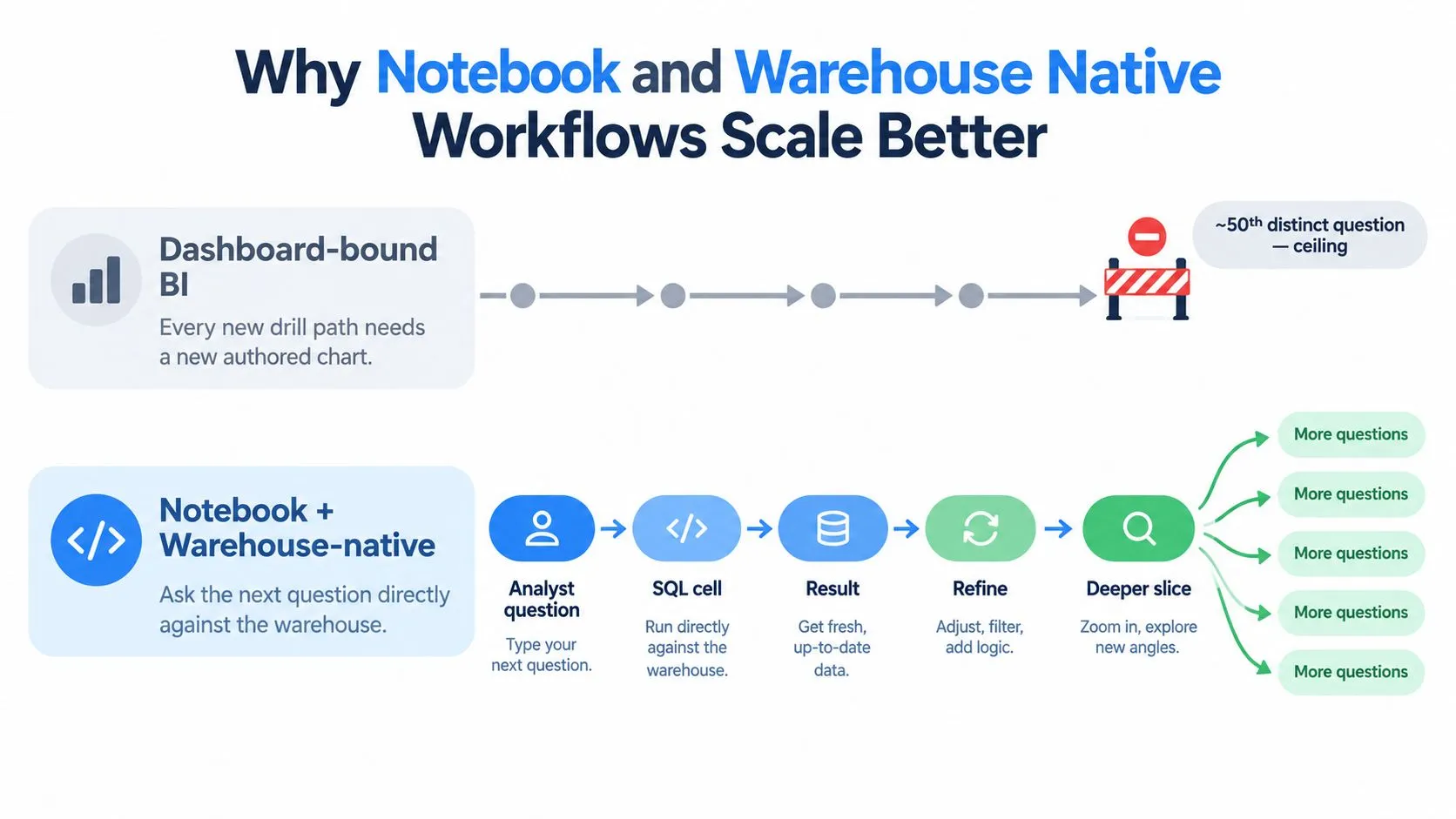
Dashboard-bound BI treats each new question as a design problem. Someone has to decide which chart should host the path, which dimensions should appear, how the filters interact, and whether the result deserves a new saved view. That works for recurring questions. It creates friction when the business keeps asking questions the original author couldn't predict.
A file-based notebook approach treats each investigation as an analytical artifact. The query, parameters, explanation, output, and follow-up branches can live together. An analyst can search for a prior revenue investigation, copy the relevant cell, and adapt it to a new plan or date range instead of rebuilding the logic inside a chart editor.
Removing the human API bottleneck
Many startups don't have a reporting problem first. They have a translation problem. A founder asks, “Why did activation fall?” A data professional translates that into tables, joins, filters, metric definitions, and a visualization. The team then waits for the translation before it can ask the next question.
A reusable notebook reduces that dependency. It doesn't eliminate the need for data expertise. It moves expertise into models, templates, tested queries, and documented conventions that other people can run and refine.
The scalable asset isn't the finished chart. It's the trusted path that lets someone reach the next answer.
The warehouse should remain the source of truth. A dashboard can cache an aggregate or embed logic that later diverges from the governed model. A warehouse-native notebook points back to the same tables and definitions used elsewhere, making it easier to inspect the actual query and its assumptions.
Why this matters to a small team
A small team should not build a separate dashboard for every plausible branch. It should create a small set of certified metrics, document their grain, and give analysts a place to explore beyond the standard views. The result is not unlimited access by default. It is controlled flexibility, with reusable work that can be reviewed and promoted when a question becomes recurring.
For teams evaluating that architecture, warehouse-native data analysis tools for Snowflake, BigQuery, and Databricks provides a relevant comparison point. The key decision is whether the workflow keeps the warehouse logic visible and reusable, or hides it inside a growing collection of dashboard settings.
Best Practices for Drill Down That Builds Trust
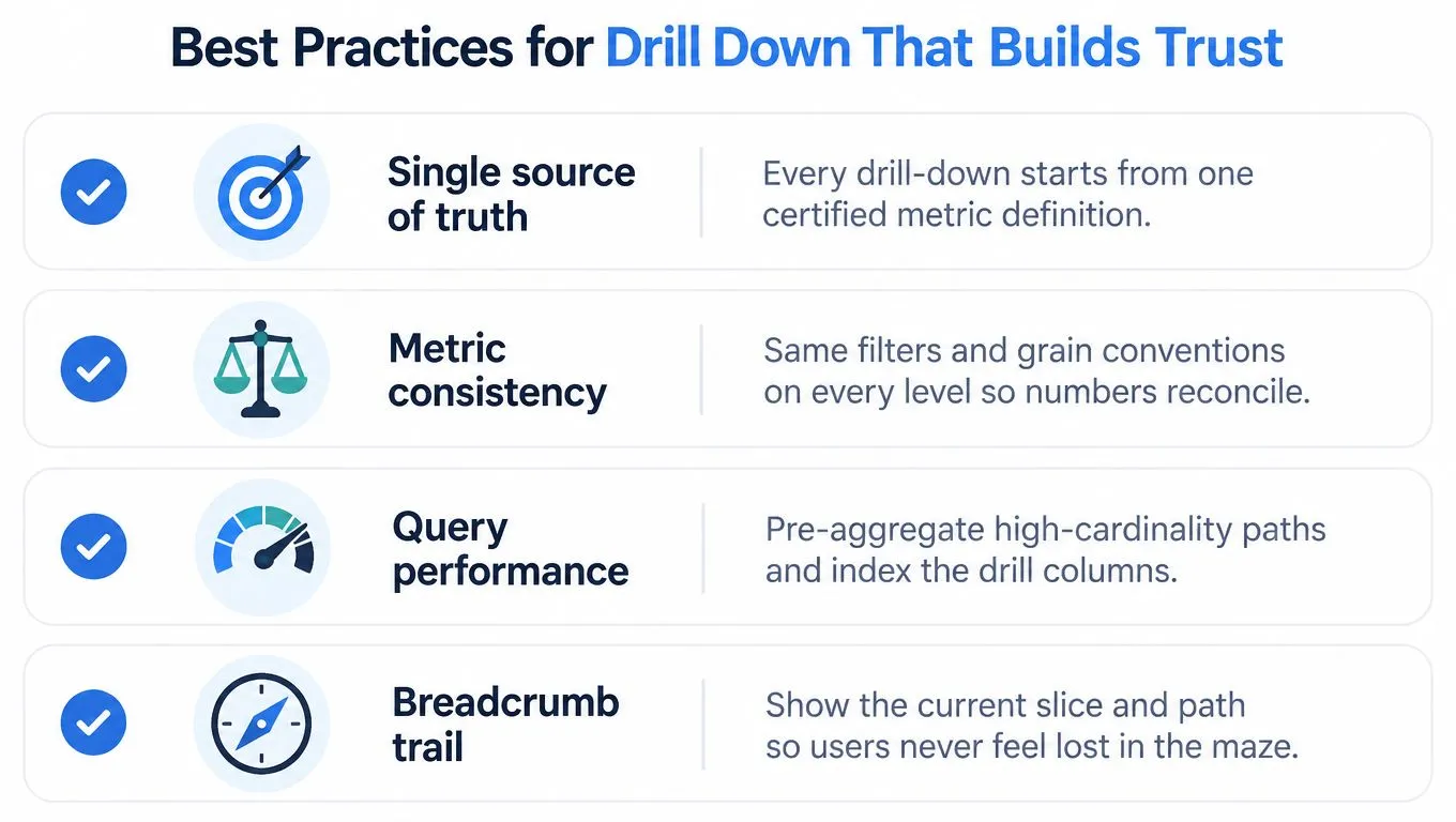
Trust begins before the first click. Every drill-down should point to a single certified metric definition, with clear filters and an explicit row grain. If revenue means collected payments in one view and booked invoices in another, a perfectly consistent hierarchy still produces confusion.
Document what one row represents in every model. A user shouldn't have to infer whether a table contains one row per order, order line, account, or event. This small piece of metadata prevents many apparent contradictions.
Design the path before designing the control
Pre-aggregate the upper levels of a hierarchy when the same summary is queried repeatedly. Keep the raw or highly detailed rows available one level deeper for investigations that genuinely need them. This avoids forcing every click to recompute an expensive result from raw events while preserving a route to detail.
Performance needs a visible contract. Set an acceptable response expectation for each level, restrict unnecessarily broad time ranges, and show enough query context for users to understand what they asked the warehouse to do. If a drill is expensive, say so and offer a narrower starting slice.
Make orientation part of correctness
A breadcrumb is not decoration. It should show the selected metric, filters, hierarchy path, and current grain. Give each reusable drill path a human-readable description and an owner, then review which paths people use and which ones repeatedly mislead them.
The deeper principle is restraint. More paths can create a combinatorial maze, fragment the user's exploration history, and reduce readability. Research on intelligent drill-down identifies these risks, including choice overload, misalignment with user intent, and problems with metrics that don't aggregate cleanly, as discussed in recent research on intelligent drill-down reports.
- Anchor definitions: Start every path from an approved metric layer.
- Preserve grain: State the meaning of a row at every level.
- Protect reconciliation: Apply the same filters and business rules from parent to child.
- Control cost: Pre-aggregate common levels and constrain expensive queries.
- Show orientation: Keep the selected slice and path visible.
- Prune misleading paths: Retire routes that generate confusion without new insight.
Common Questions About Drill Down Analytics
Which metric should a small team make drillable first? Choose a metric that drives a current decision, such as revenue, activation, or retention. Document its definition and grain before adding a hierarchy.
Should we build a notebook or a dashboard view? Save a dashboard for a repeated question. Use a notebook when the next dimension, join, or filter is still unknown.
How deep should the path go? Stop when the next level no longer changes the decision. Detail without action is noise.
What if the drill contradicts the summary? Freeze the result, compare grains and filters, and inspect joins before changing the metric.
When should you retire a path? Remove it when users can't interpret it, it no longer supports a decision, or its underlying model has changed.
Querio provides AI coding agents and custom Python notebooks that work directly with your data warehouse, so teams can investigate a summary, drill into detail, and preserve the reasoning in a reusable workflow. If your dashboards stop at the question your founder cares about, visit Querio to explore a warehouse-native approach to drill-down analysis.