Business Intelligence
Power BI Copilot vs Tableau Pulse: Enterprise AI BI Compared
Choose AI BI based on stack fit, governance, and whether you need pushed KPI digests or in-report authoring.

If I had to boil it down to one line: Power BI Copilot fits Microsoft-first report teams, while Tableau Pulse fits Tableau Cloud teams that want KPI updates sent to people automatically.
Here’s the short version:
- Choose Power BI Copilot if your team already works in Microsoft 365, Azure, Power BI, and Fabric
- Choose Tableau Pulse if your team already uses Tableau Cloud and wants metric alerts and KPI summaries
- Copilot is stronger for report building and DAX help
- Pulse is stronger for executive KPI tracking
- Both depend on a clean semantic or metrics layer
- Neither is a strong fit for ad hoc, cross-source questions that were not modeled first
A few facts stand out right away:
- Power BI Copilot needs Fabric capacity
- Entry pricing in the article puts Fabric F2 at about $9,000/year
- Adding 100 Pro seats at $14/user/month brings the total to about $17,400/year
- Tableau Pulse runs on Tableau Cloud
- The article estimates about $18,000 to $30,000/year for 100 users, based on seat mix
- Legacy Power BI Q&A is set to retire in December 2026
What I think matters most is simple: the tool is only part of the choice. Your stack, security model, KPI definitions, and day-to-day BI habits will decide whether AI answers help or confuse people.
::: @figure 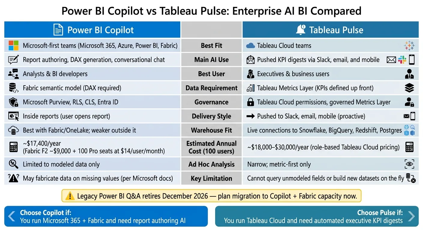 {Power BI Copilot vs Tableau Pulse: Enterprise AI BI Tool Comparison}
:::
{Power BI Copilot vs Tableau Pulse: Enterprise AI BI Tool Comparison}
:::
Tableau AI vs Power BI: The Ultimate AI Battle! 🔥 2025?
::: @iframe https://www.youtube.com/embed/figWtb4OMVY :::
sbb-itb-284a532
Quick Comparison
| Criteria | Power BI Copilot | Tableau Pulse |
|---|---|---|
| Best fit | Microsoft-first teams | Tableau Cloud teams |
| Main use | Report help, DAX, report Q&A | KPI digests, alerts, metric Q&A |
| Best user | Analysts, BI developers | Executives, business users |
| Data requirement | Fabric semantic model | Tableau Metrics Layer |
| Ad hoc analysis | Limited to modeled data | Narrow; metric-first only |
| Governance | Purview, RLS, CLS, Entra ID | Tableau Cloud permissions |
| Delivery style | Inside reports | Slack, email, mobile |
| Estimated cost for 100 users | ~$17,400/year | ~$18,000–$30,000/year |
If you use Fabric and DAX, I’d lean toward Copilot.
If you use Tableau Cloud with governed KPIs, I’d lean toward Pulse.
And if your data still lives across mixed tools without shared metric and semantic definitions, I’d fix that first. Otherwise, the AI layer can sound right while being wrong.
Below, I break down the tradeoffs in stack fit, governance, cost, and daily workflow without repeating the full product docs.
Power BI Copilot: strengths, limits, and enterprise fit
Copilot works best when Power BI and Fabric already sit at the center of reporting, governance, and semantic modeling. If your team already runs on that setup, Copilot adds AI help inside workflows people already use and control.
Best for Microsoft-first analytics and report workflows
The most obvious day-to-day gain is speed. Analysts can turn plain English into DAX, and BI developers can mock up reports in less time. Executives also get Smart Narratives: auto-generated summaries that explain trends and outliers right on the report canvas.
Copilot shines when the semantic model is clean. That means clear measures, solid synonyms, and field names that make sense. It also helps if the data coming in is well shaped, whether it lives in Snowflake on Azure, SQL Server, or dbt-modeled datasets.
Governance and deployment requirements
The tradeoff is control and cost. Copilot inherits Microsoft's enterprise controls, including Row-Level Security (RLS), Column-Level Security (CLS), sensitivity labels through Microsoft Purview, and identity management through Microsoft Entra ID.
For regulated teams, that’s a big part of the appeal. This isn’t just AI help bolted onto reporting. It’s AI help that follows the same permissions and labels as the rest of the Microsoft stack. The catch is licensing. Copilot depends on Fabric capacity, plus per-user Power BI licensing, which can get expensive. Those controls make governance simpler, but they also tie Copilot closely to Microsoft’s data model and capacity rules.
Where Copilot falls short
The biggest limit is scope: Copilot only works inside Fabric-managed models. If your metrics live across several sources or sit outside that model, the answers can be partial or not available at all.
Microsoft is direct about one trust issue:
"Copilot can fabricate data on missing values." - Microsoft Official Documentation [3]
In plain terms, Copilot may fill in gaps with answers that sound right instead of flagging that the data is missing. That means teams still need DAX know-how to check generated measures. It also means Copilot keeps teams tied to DAX and the Microsoft stack, which matters if portability across BI tools is a goal.
Choose Copilot when your semantic layer already lives in Fabric and your teams are comfortable working in DAX. It fits report-heavy Microsoft shops well, while the next section looks at why metric-first teams often go with a different workflow.
Tableau Pulse: strengths, limits, and enterprise fit
Where Copilot leans into report authoring and DAX generation, Tableau Pulse goes in a different direction. It’s a metric-first product built to send the right insight on the right KPI to the right person automatically. In plain terms, Pulse is strongest when you need monitored KPI delivery, not broad, open-ended analysis.
Best for executive KPI monitoring and proactive insights
Pulse works best when teams want KPI updates pushed through Slack, email, or mobile apps instead of asking people to go hunting through dashboards. A business user can get a digest that shows a KPI changed, plus a plain-English note on the likely reason behind the shift. That’s the heart of Pulse: pushed updates, focused on metrics, with little manual work.
This setup fits teams that already run on Tableau Cloud and use a governed warehouse stack. Pulse turns warehouse data into a digest that business users can act on. A statistical service spots trends, outliers, and drivers, while generative AI turns those findings into plain-language summaries without SQL or manual filtering.
Governance model and metric prerequisites
Pulse only works as well as the metrics underneath it. The product is built around a single Metrics Layer, where analysts define KPIs once so the same KPI means the same thing across the company. That helps cut down KPI drift across teams working in Snowflake, BigQuery, Redshift, or Postgres.
When those definitions are tightly governed and the data sources are certified, Pulse can give teams a strong single version of truth. If that work isn’t in place, the digests can point people in the wrong direction or leave out key context.
Admins manage visibility through Tableau Cloud’s permission model, and they can limit Pulse access to specific user groups.
Where Pulse falls short
The tradeoff is range. Pulse is not a free-form analysis tool. It can’t query unmodeled warehouse fields or build new datasets on the fly for ad hoc questions that sit outside the Metrics Layer. If an analyst wants to dig into why a metric changed across dimensions that weren’t mapped ahead of time, Pulse hits a wall pretty fast.
"These copilots work exceptionally well for pre-modeled dashboards but cannot dynamically generate datasets from distributed sources for new questions. Organizations where ad-hoc exploration represents common use cases find this boundary frustrating." - Promethium [2]
Pulse is Tableau Cloud only [1], offers less multi-turn conversational depth, and fits executives who need monitored KPIs more than analysts doing open-ended investigation. That tradeoff stands out even more in the side-by-side comparison below.
Side-by-side comparison: which tool fits which BI job
Comparison table: top AI features, governance, and licensing
These two products handle different BI jobs, and the pricing shows that pretty clearly. Power BI Copilot comes with a real entry cost: Fabric F2 starts at about $9,000/year, and that’s before adding Pro seats at $14/user/month [3]. Tableau Pulse uses role-based pricing on Tableau Cloud, so total spend depends on how many people need each seat type [3].
Here’s the practical tradeoff at a glance: who each tool is for, how it handles governance, and what it expects from your stack.
| Dimension | Power BI Copilot | Tableau Pulse |
|---|---|---|
| Main AI use | Conversational chat, report canvas, DAX generation | Pushed metric digests via Slack, email, mobile |
| Best for | Report authoring and DAX assistance | Executive KPI monitoring and alerts |
| Natural-language querying | Q&A visual + Copilot chat | Q&A on governed metrics plus metric digests |
| Proactive/automated insights | Report summaries, limited automation | Automated trend and outlier digests |
| Report authoring support | Strong | Minimal |
| Semantic layer dependence | Power BI/Fabric semantic model; DAX required | Tableau Metrics Layer; KPIs defined up front |
| Governance and identity | Microsoft Purview, Fabric RLS/CLS, Entra ID | Tableau Cloud permissions, governed Metrics Layer |
| Warehouse fit | Best with Fabric/OneLake; weaker outside it | Live connections to Snowflake, BigQuery, Redshift |
| Required plan | Fabric F2+ or Premium P1+ capacity required | Tableau Cloud (SaaS only) |
| Estimated annual cost for ~100 users | ~$17,400/year for F2 + Pro seats [3] | ~$18,000–$30,000/year, depending on role mix [3] |
One more thing matters here: legacy Power BI Q&A is being retired in December 2026. So if a team still leans on it, they should start planning for Copilot and the Fabric capacity setup that comes with it.
How each product performs for executives, analysts, and business users
Executive KPI monitoring is where Tableau Pulse has the edge. It’s built to send plain-language metric digests and automated trend or outlier alerts straight to people. That lines up with how many executives want to use BI: they don’t want to dig through reports if they can avoid it. Power BI Copilot can write report summaries, but the user still has to open the report. That’s the split in plain English: Pulse pushes metrics, while Copilot helps people work inside reports.
Analyst investigation workflows lean toward Power BI Copilot. If an analyst is digging into a pipeline drop, Copilot can help generate DAX measures, build visuals, and speed up iteration inside the report canvas. That saves a lot of manual work. But there’s a catch: the data already needs to live in the Fabric semantic model. So the upside is tied to setup. If the semantic model is clean, Copilot can help a lot. If it isn’t, things get messy fast.
Business-user self-service is shaky for both products unless the semantic layer is already governed well. If a metric is defined and mapped the right way, Pulse can handle routine KPI questions through digests and Q&A. If that groundwork isn’t there, neither tool can be counted on to guess the business meaning correctly. That’s the part people often skip, and it’s usually where trouble starts.
Stack-based recommendation guide
If you’re running Microsoft 365 + Power BI + Fabric, Copilot is the natural match. When data already sits in OneLake and the team has enough DAX skill to check AI-written code, Copilot can help a lot with report authoring. Just don’t look only at the $14/user/month Pro price. The Fabric capacity floor changes the total cost picture [3].
If your stack is Tableau Cloud + Snowflake or BigQuery, Pulse is the better fit, especially when there’s already a governed Metrics Layer in place. Teams using dbt models on top of Snowflake or BigQuery can surface those metrics in Pulse and send KPI digests to executives without first building new dashboards. But that only works if the metric definition layer is clean and governed.
In mixed BI environments - say, a team split across Power BI and dbt-modeled data in Snowflake or BigQuery - the hard part isn’t picking the tool. It’s getting the semantic layer lined up so answers stay consistent across systems. Until that happens, AI output can drift.
"The tool is the easy part. Trust is the hard part." - Valiotti Data [1]
That foundation decides which tool will work in a way people can rely on.
Bottom line: choose based on stack, governance model, and AI workflow needs
After looking at stack fit, governance, and workflow, the choice gets pretty simple. Pick the tool that matches your stack, your control model, and the kind of AI workflow your team wants.
Power BI Copilot makes sense for Microsoft-first teams that want AI built into report creation and are ready to check AI-written DAX and report logic.
Tableau Pulse fits Tableau Cloud teams that want governed KPI digests sent out to executives and business users.
If neither one handles ad hoc, cross-source questions well enough, a warehouse-native layer can cover that gap. That semantic layer is often the line between AI output you can trust and output that turns into noise.
Use these checks before you buy:
What data leaders should check before deciding
Before making the call, answer these six questions:
- Stack commitment: Is the company standardized on Azure/Fabric or Salesforce/Tableau Cloud, or is it still working in a mixed setup?
- semantic layer maturity: Are metrics already defined and certified in dbt, LookML, or a BI semantic layer, or are analysts still pulling from raw tables?
- Identity and security: Does the tool inherit current row-level security and OAuth permissions, or will the team need to manage a separate access model?
- Executive reporting style: Do leaders want to receive metric digests (Pulse), open reports (Copilot), or ask ad hoc questions across live warehouse data?
- Analyst workflow: Do analysts need help building reports faster, or do they need help investigating questions that haven’t been modeled yet?
- Inspectability: Can the team see and audit the SQL or logic behind each AI answer, or is the output a black box?
Those answers usually point to one tool pretty fast. In some cases, they also show that using a mix of tools makes more sense than forcing a single choice.
FAQs
::: faq
Can either tool answer unmodeled questions?
No. Neither Power BI Copilot nor Tableau Pulse can handle unmodeled questions well, because both depend on pre-configured semantic models and curated datasets.
If someone asks about data that isn't mapped into those BI layers, Power BI Copilot may return partial answers or even make things up. Both tools work best for governed, predefined reporting, not ad hoc analysis of unmodeled data. :::
::: faq
What setup matters most before rollout?
Before rollout, metric governance matters most.
Your semantic layer - whether that’s dbt models, LookML, or approved metric definitions - needs to be clean, well-typed, and curated. If it isn’t, AI may define “revenue” one way in one answer and a different way in the next. And when fields are missing, it can start making things up instead of saying, “I don’t know.”
After that, test readiness with a pilot built around real business questions. Use that pilot to check answer accuracy, then scale only after you’ve confirmed permissions and security are set up the right way. :::
::: faq
Which tool is easier for executives to adopt?
It depends on your stack and how your executives like to work.
Power BI Copilot is often the easier fit if your company already uses Microsoft tools. It slides into existing reports and semantic models, so teams can use what they already have instead of starting from scratch.
Tableau Pulse is often the easier fit for executives who want KPI updates pushed to them. It’s geared toward anomaly alerts and short metric briefings, without making people dig through dashboards first. :::