Business Intelligence
What Is a Data Visualization Tool? Top AI Options for 2026
Compare five AI data visualization tools for 2026—focus on warehouse access, governed metrics, SQL transparency, and delivery options.

If you want the short answer: a data visualization tool turns raw data into charts, dashboards, and answers your team can use. In 2026, the bar is higher. I’d look for essential BI tool features first: live warehouse access, shared metric definitions, AI that shows SQL or logic, easy sharing in Slack or Teams, and support for both analysts and business users.
Here’s the simple breakdown:
- Querio: best if you want warehouse-native analysis with inspectable SQL and Python
- Tableau Pulse: best for KPI updates sent to leaders in Slack, email, and mobile
- Power BI Copilot: best if your company already runs on Microsoft 365, Teams, and Fabric
- Qlik Answers: best if your team needs answers from tables, PDFs, Slack messages, and images
- ThoughtSpot Sage: best if you want search-style analytics on live cloud data
A few facts stand out from the comparison:
- 100+ connectors are available in Tableau
- Power BI Copilot needs Fabric F2+ or Power BI Premium P1+
- Querio, Tableau, Power BI, and ThoughtSpot all support major warehouses like Snowflake, BigQuery, Redshift, and Postgres
- Qlik adds support for structured and unstructured data, which changes what kinds of questions teams can ask
If I were choosing, I wouldn’t start with chart style. I’d start with where the data lives, how metrics are defined, and whether the AI output can be checked. That usually tells you more than a long feature list.
::: @figure 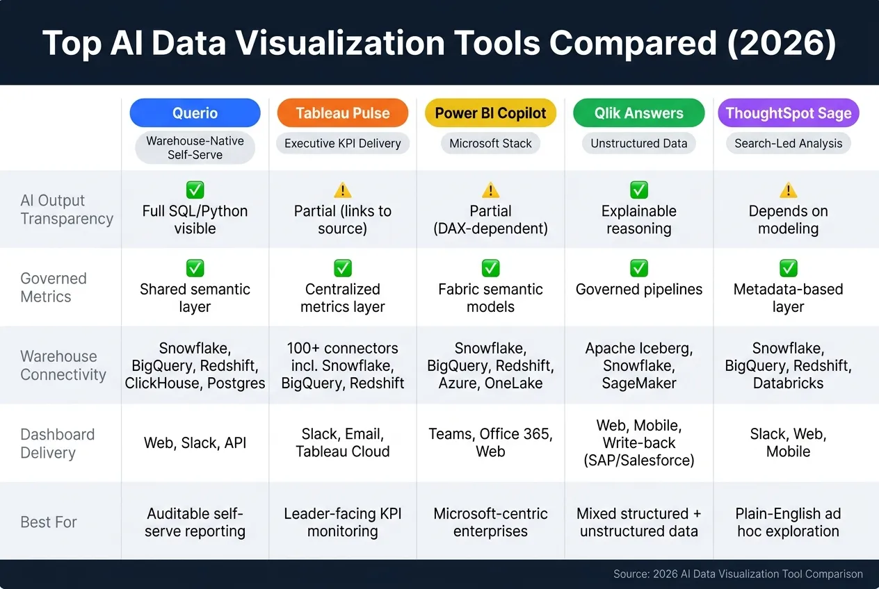 {Top AI Data Visualization Tools Compared (2026)}
:::
{Top AI Data Visualization Tools Compared (2026)}
:::
Quick Comparison
| Tool | Best Use | AI Output Check | Metric Control | Main Delivery |
|---|---|---|---|---|
| Querio | Self-serve analysis on warehouse data | Yes - SQL/Python is visible | Shared semantic layer | Web, Slack, API |
| Tableau Pulse | KPI tracking and updates | Partial - links back to source charts | Central metrics layer | Slack, email, Tableau Cloud |
| Power BI Copilot | Microsoft-based reporting | Partial - based on DAX/model setup | Fabric semantic models | Teams, Office 365, web |
| Qlik Answers | Mixed data analysis | Yes - explainable reasoning flow | Governed pipelines | Web, mobile, write-back |
| ThoughtSpot Sage | Search-led ad hoc analysis | Depends on modeling | Metadata-based semantic layer | Slack, web, mobile |
Bottom line: if you need auditable self-serve reporting and analysis, I’d lean toward Querio. If you need leader-facing KPI delivery, I’d look at Tableau Pulse. If you live in Microsoft’s stack, Power BI Copilot is the clear fit. If your data sits in documents and chats, Qlik Answers stands out. And if you want plain-English search on live warehouse data, ThoughtSpot Sage is the one to check first.
sbb-itb-284a532
What to Expect from a Data Visualization Tool in 2026
A modern data visualization tool needs to do more than turn rows into charts. It should plug straight into your warehouse, keep metrics aligned across teams, and let both analysts and business users answer questions on their own.
Warehouse connectivity is the baseline. In 2026, tools should query Snowflake, BigQuery, Redshift, or Postgres directly. Governed metric definitions matter just as much. If ARR means one thing to sales and another to finance, decision-making starts to wobble. For warehouse-native teams, that gap often marks the line between self-service analytics people trust and reporting no one can fully agree on.
AI query workflow is where the biggest differences show up. What matters most is simple: does the AI show its work? The best tools return SQL or Python that people can inspect. If the logic stays hidden, it gets much harder to check the answer.
Dashboard delivery has changed too. Dashboards don't live only inside a BI app now. More often, they show up in Slack or Microsoft Teams, right where people already work. That shift shapes how these tools stack up.
Here’s how the five tools compare on the criteria that matter most:
| Tool | AI Query Workflow | Governed Metrics | Warehouse Connectivity | Dashboard Delivery |
|---|---|---|---|---|
| Querio | Natural language to inspectable SQL/Python | Shared context layer with semantic automation | Live queries (Snowflake, BigQuery, Redshift, Postgres) | Web UI, Slack, API |
| Tableau Pulse | Natural language Q&A with AI-generated summaries | Centralized metrics layer | Live and extract (100+ connectors) | Slack, email, Tableau Cloud |
| Power BI Copilot | AI-generated DAX and report drafts | Semantic models in Microsoft Fabric | Direct Lake via OneLake, Azure, Snowflake | Teams, Office 365, web |
| Qlik Answers | Multi-step AI reasoning with explainable outputs | Explainable AI governance grid | Open lakehouse data in Apache Iceberg and Snowflake | Web, mobile, write-back to SAP or Salesforce |
| ThoughtSpot Sage | AI-powered search-driven analytics | No-code semantic modeling | Live cloud queries (Snowflake, Databricks) | Slack, Liveboards, mobile |
1. Querio
Querio is built for warehouse-native analytics teams that want self-serve reporting without giving up control of metrics. In practice, that means people can move faster while analysts still keep a close eye on how numbers are defined and used.
AI Query Workflow
When someone asks a question, Querio's AI agents turn that request into SQL or Python and show the code right next to the result. That matters because analysts can inspect the logic, tweak it, and save it in notebooks that update when the data changes. It’s not a black box, which makes self-serve analytics a lot easier to trust.
Governed Metrics
Querio uses a shared semantic layer for joins, business terms, and metric logic. Teams set that logic once, then use it the same way across notebooks, dashboards, and AI answers. If your team already uses dbt, you can import existing metric logic instead of rebuilding it inside Querio.
Warehouse Connectivity
Querio connects live to Snowflake, BigQuery, Amazon Redshift, ClickHouse, and PostgreSQL through encrypted, read-only credentials. So the data stays current, and teams work from the source instead of stale exports.
Sharing Outputs
Teams can share analysis as dashboards, scheduled reports, or Slack answers. The same governed logic carries through each output, so the numbers stay consistent no matter where people see them.
2. Tableau Pulse
Tableau Pulse is built for metric monitoring and proactive delivery, not open-ended data exploration. It sends metric updates to Slack, email, and mobile, so people can spot changes without digging through dashboards.
AI Query Workflow
Pulse uses Einstein Trust Layer to generate natural-language summaries from governed metrics, and each insight links back to source charts for verification. The math stays separate from the AI-written summary, which helps users check what they’re seeing instead of taking it at face value. Suggested follow-up questions also give non-technical users a clear next step, so they’re not left staring at the screen wondering what to ask.
Governed Metrics
Pulse tracks predefined KPIs through a centralized semantic layer. That means users work from governed metrics, not raw columns. In practice, this makes Pulse a strong fit for teams that want standardized KPI tracking delivered inside the tools people already use every day.
Warehouse Connectivity
Tableau supports over 100 native connectors, including Snowflake, BigQuery, Amazon Redshift, and PostgreSQL [1]. Pulse works best when metrics and dimensions are already standardized, so some teams will need to clean and transform source data before deployment. That prep work can feel a bit tedious, but it sets up cleaner reporting once Pulse is live.
Dashboard Delivery
Pulse is exclusively a Tableau Cloud product, and advanced Q&A requires Tableau+. For teams centered on executive KPI monitoring through familiar channels, that’s a pretty direct tradeoff - the next section looks at how Power BI Copilot handles the same job inside the Microsoft ecosystem.
3. Microsoft Power BI Copilot
Power BI Copilot brings self-service business intelligence through conversational reporting into Microsoft 365 and Fabric. If your team already works in Teams, Excel, and PowerPoint, it slides into the tools people use every day.
AI Query Workflow
Copilot turns plain-English prompts into DAX and Power Query, builds charts, and writes narrative summaries. Microsoft is retiring legacy Q&A in December 2026 and pushing users toward Copilot for natural-language analytics.
Governed Metrics
Copilot is only as good as the semantic model behind it. That means owners need to add clear descriptions, synonyms, and relationships so the assistant understands the right metric context.
A few controls help with that:
- Approved for Copilot and Prep data for AI help admins decide which models are ready
- Grounded References lets users attach specific reports or datasets to a query
Without that setup, answers can drift. With it, teams have a much better shot at getting numbers and summaries that match the business logic they expect.
Warehouse Connectivity
Power BI connects to Snowflake, BigQuery, Redshift, Postgres, and Azure Databricks. It also supports Direct Lake, which can query OneLake data without importing it.
Dashboard Delivery
Copilot can build full report pages with visuals and narrative from one prompt. Teams can then share those reports through Teams, Office 365, and the web.
There are a couple of setup notes here. Copilot requires Fabric F2+ or Power BI Premium P1+. It’s also disabled by default in some regions unless an admin turns on cross-region data processing.
Teams that want a different balance between explainability and governed analysis will see that in Qlik Answers.
4. Qlik Answers
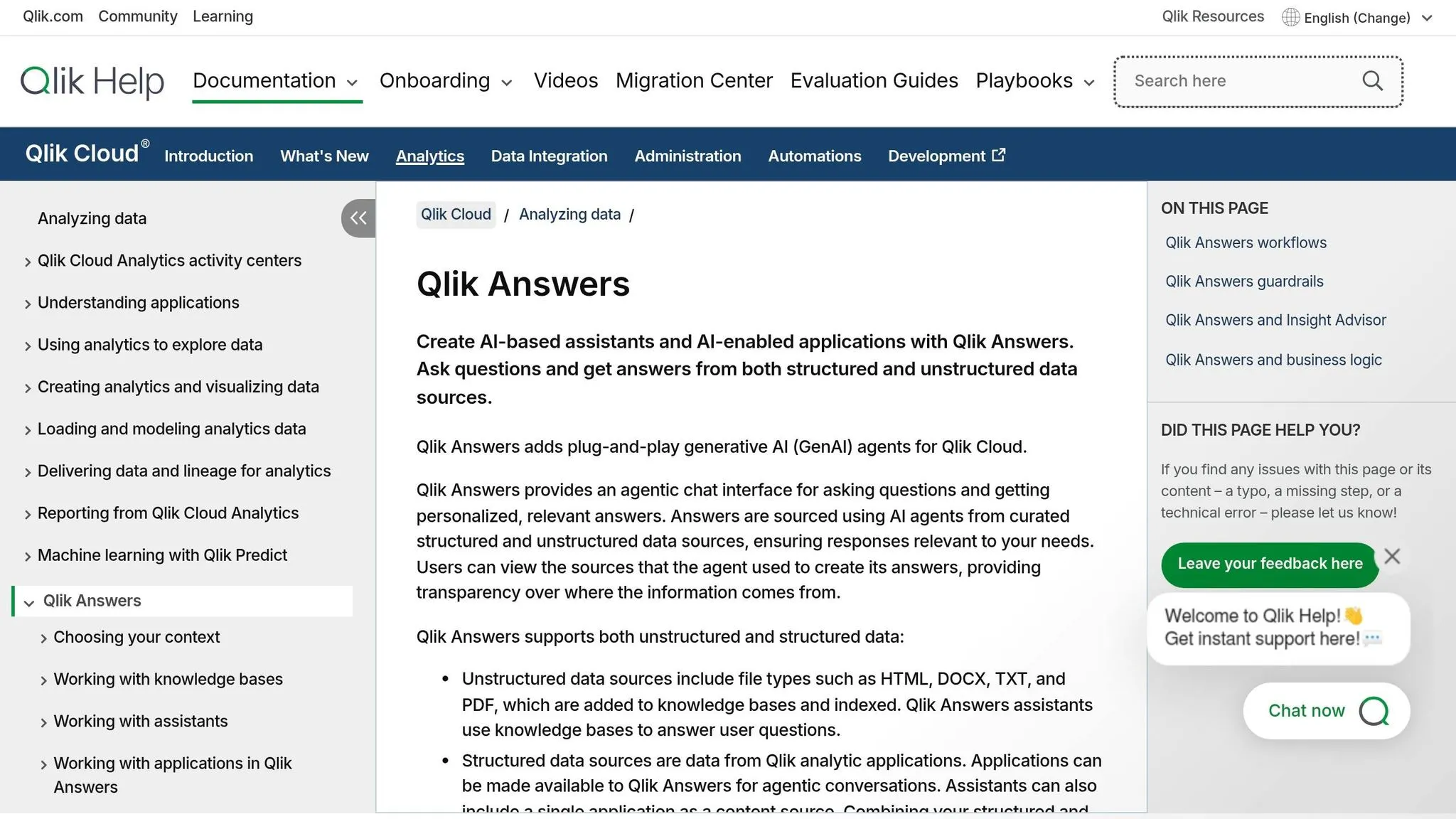
Qlik Answers lets people ask questions across both structured and unstructured data, including PDFs, Slack messages, and images. That makes it a good fit for BI teams that need governed analysis across mixed sources, not just data sitting in warehouse tables.
AI Query Workflow
For AI query workflow, Qlik puts the focus on multi-step reasoning across mixed data sources. It uses the DARE Intelligence Grid framework to work through complex questions, along with a Discovery Agent that scans data for risks and opportunities.
Governed Metrics
Qlik's Associative Engine helps users spot relationships across fields that standard filters can miss. It also lets teams trace how answers were formed through governed pipelines. That can cut down on wrong AI answers by grounding responses in the data model [1].
Warehouse Connectivity
Qlik supports an Open Lakehouse architecture built on Apache Iceberg, with connections for Snowflake and Amazon SageMaker. Its Write Table feature can send insights back into operational systems like SAP and Salesforce.
Dashboard Delivery
Discovery Agent alerts and Write Table help teams move from insight to action inside operational systems. In plain English, Qlik isn't just about showing a dashboard and stopping there. It also helps when a team needs alerts or write-back inside the tools they already use.
For teams that want search-driven analytics instead of associative exploration, the next section covers ThoughtSpot Sage.
5. ThoughtSpot Sage
ThoughtSpot Sage, also called Spotter, lets people ask plain-English questions and get governed answers from live warehouse data without writing SQL. It works best for teams that want ad hoc answers on top of governed warehouse data.
AI Query Workflow
ThoughtSpot uses a natural language-to-SQL (NL2SQL) engine that runs straight against the cloud warehouse. But there’s a catch: answer quality still depends on clean, well-modeled data. If the semantic layer is messy, the output can get messy too.
Governed Metrics
ThoughtSpot uses a metadata-driven semantic layer, which keeps metric definitions consistent across users and views. Once those definitions are in place, teams can share results in the tools they already use.
Warehouse Connectivity
Spotter connects live to Snowflake, BigQuery, Redshift, and Postgres, so answers reflect current warehouse data instead of a stale extract [2].
Dashboard Delivery
ThoughtSpot shares results through its web UI, Slack, and mobile. It also supports embedded analytics through ThoughtSpot Everywhere.
Pros and Cons of Each Tool
Every tool makes a different tradeoff. Some lean into fast self-serve analysis. Others are built more for KPI delivery, search, or Microsoft-heavy setups.
This table compares them across the areas that tend to matter most: query workflow, governed metrics, warehouse connectivity, and delivery.
| Product | Pros | Cons | Best For |
|---|---|---|---|
| Querio | Inspectable SQL/Python, live warehouse-native connections, and fast setup | Fewer integrations than legacy platforms; no native Teams integration; requires an existing warehouse | Governed self-serve analytics for lean data teams needing auditable SQL |
| Tableau Pulse | Proactive KPI digests; Einstein Trust Layer for data security | High cost; best for predefined metrics, not ad hoc raw-data exploration | Executive KPI delivery and visual dashboarding |
| Microsoft Power BI Copilot | Deep Microsoft 365 and Teams integration; generates DAX and full report pages automatically | High infrastructure costs tied to Microsoft Fabric; output quality depends on semantic model quality | Microsoft-centric enterprises already invested in the M365 stack |
| Qlik Answers | Handles unstructured data like PDFs and Slack messages; associative engine surfaces hidden relationships | Steep learning curve; agent features are still developing | Discovering hidden patterns across complex, multi-modal data |
| ThoughtSpot Sage | Search-style UX; strong natural-language search; queries run live against the warehouse | Enterprise pricing; requires significant upfront semantic modeling to get clean answers | Non-technical users who need search-led, ad hoc exploration |
A simple way to think about it: Querio fits teams that want auditable SQL and direct warehouse access. Tableau Pulse is more about getting KPIs in front of leaders without extra digging. Power BI Copilot makes the most sense if your company already lives inside Microsoft 365. Qlik Answers stands out when your data lives in places like PDFs and Slack, not just tables. ThoughtSpot Sage is a good match for people who want a search-first way to analyze data.
Use these tradeoffs to match the tool to your team’s warehouse, governance, and delivery needs. From there, narrow the choice based on your warehouse stack, governance needs, and whether your team needs governed self-service analytics or executive monitoring.
How to Choose the Right Tool for Your Team
Start with your main constraint: governance, stack fit, or exploration. In most cases, that matters more than a long feature checklist.
Then use the comparisons above to match each tool with the problem it handles best.
| Priority | Best Fit | Why |
|---|---|---|
| Executive dashboards | Tableau Pulse | KPI dashboards and alerts. |
| Microsoft-stack alignment | Power BI Copilot | Writes DAX automatically; fits Teams and Azure. |
| Search-led analysis | ThoughtSpot Sage | Search-led ad hoc exploration. |
| Unstructured analysis | Qlik Answers | Associative analysis across structured and unstructured data. |
| Warehouse-native governed self-serve | Querio | Live connections to Snowflake, BigQuery, Redshift, and Postgres; inspectable SQL/Python; shared semantic layer. |
Once you’ve narrowed down the main fit, check the basics: does the tool work with your warehouse, your governance setup, and the way your team delivers work?
For warehouse-native teams, a shared semantic layer should be near the top of the list. That’s what keeps metric definitions, joins, and business logic in sync across questions, dashboards, and AI answers. Without that, two people can ask for the same number and get two different results. That’s where things start to go sideways.
FAQs
::: faq
How do I know if AI answers are trustworthy?
Trustworthy AI answers come from verification, transparency, and governance.
You should be able to inspect, edit, and re-run the underlying SQL so you can check the logic for yourself. That matters because an answer might sound right and still be off. If you can see the query, you can test it, spot mistakes, and understand how the result was produced.
It also helps to have a governed semantic layer that keeps metric definitions consistent across the business. On top of that, data lineage should show where each number came from and how it was calculated. That way, you’re not just looking at an output - you can trace the path behind it. :::
::: faq
Do I need a semantic layer before rollout?
It comes down to what you want most: speed, or consistency and trust.
Schema-first tools can produce answers fast. That’s useful. But if you care about long-term accuracy and keeping metrics lined up across teams, a governed semantic layer is the gold standard.
Tools like dbt Semantic Layer, LookML, and Snowflake Semantic Views help make sure the same metric returns the same result for every user. Without that base, definitions can drift. And once that happens, you end up with black-box outcomes that are hard to explain and even harder to trust. :::
::: faq
What should I evaluate first beyond dashboards?
First, look at how well the tool deals with the long tail of ad hoc, conversational questions - and how clear its logic is.
It should make sense of fuzzy prompts, handle follow-up questions, and keep the thread of the conversation without making you restart from scratch.
Also put SQL transparency and semantic-layer integration near the top of your checklist. If you can inspect, edit, and rerun queries, it’s much easier to check accuracy. And connections to tools like dbt or LookML help keep metric definitions consistent. :::