Business Intelligence
Which AI Can Generate Dashboards from a Question? (2026)
Compare 2026 AI tools that convert plain-English questions into governed, reusable dashboards on live warehouse data.

Yes - a few AI analytics tools can turn a plain-English question into a dashboard in 2026. But most stop at a chart, a report page, or a search answer. If I had to cut through the noise fast, I’d say the shortlist is Power BI Copilot, Tableau, ThoughtSpot, Hex, Snowflake Cortex, and Querio.
What I’d look for is simple:
- Live warehouse data instead of CSV uploads
- More than one visual on the page
- Filters and KPI cards
- A saved asset my team can edit and publish
- Clear metric logic for things like ARR, churn, revenue, and pipeline
That last point matters more than the AI demo. If a tool guesses what “revenue last quarter” means, the dashboard can be wrong from the start. And for many teams, that’s a deal-breaker.
Here’s the short version:
- Power BI Copilot works best when the semantic model is already set up
- Tableau is strong for KPI summaries, but users still do layout work by hand
- ThoughtSpot is better for search-style answers than full dashboard creation
- Hex fits analyst-led workflows more than business-user self-serve
- Snowflake Cortex can help with warehouse-side AI work, but dashboard output depends on the stack around it
- Querio is the clearest fit when you want question-to-dashboard output on live warehouse data with editable SQL and Python
In other words: the main split is not “which tool has AI?” It’s “which tool gives me a governed dashboard instead of a one-off answer?”
Quick Comparison
::: @figure 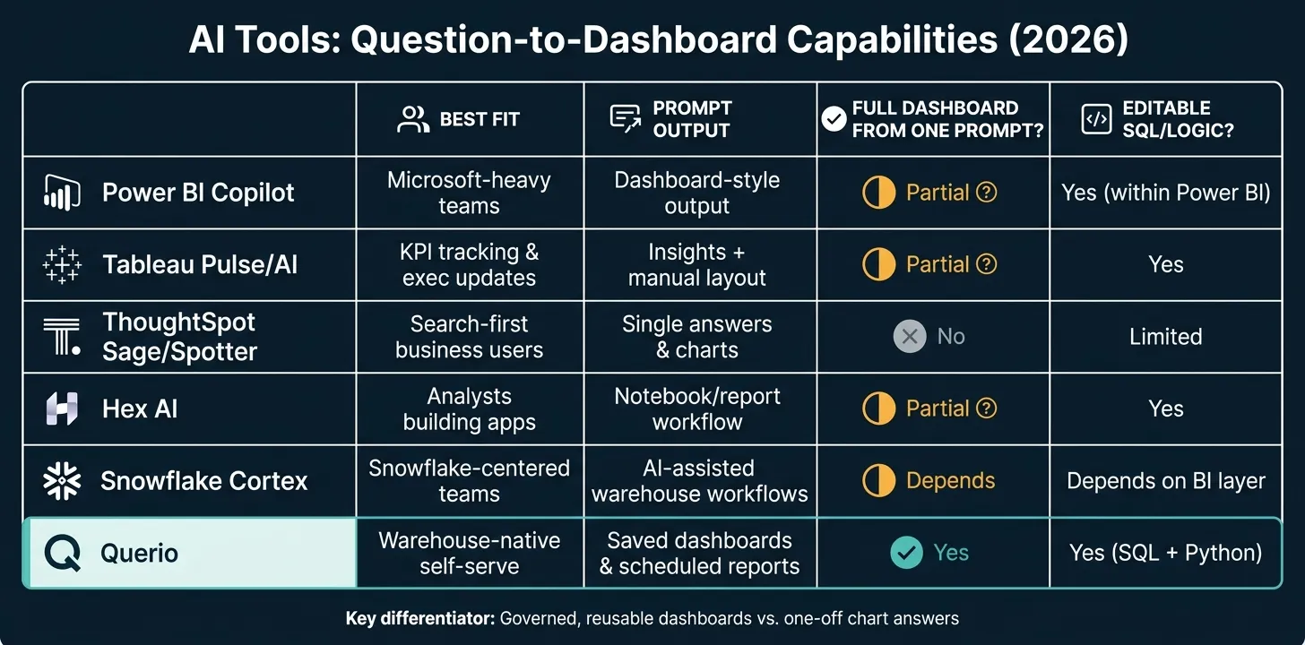 {AI Dashboard Tools Compared: Question-to-Dashboard Capabilities (2026)}
:::
{AI Dashboard Tools Compared: Question-to-Dashboard Capabilities (2026)}
:::
| Tool | Best fit | What you usually get from a prompt | Depends on | Can data teams inspect the logic? |
|---|---|---|---|---|
| Power BI Copilot | Microsoft-heavy teams | Dashboard-style output inside Power BI | Power BI semantic model | Yes, within Power BI |
| Tableau | KPI tracking and exec updates | Insights and pages, with manual dashboard setup | Tableau data model | Yes |
| ThoughtSpot | Search-first business users | Single answers and charts | ThoughtSpot modeling layer | Limited compared with notebook-style editing |
| Hex | Analysts building apps and reports | Notebook/report workflow | Analyst setup and data model | Yes |
| Snowflake Cortex | Snowflake-centered teams | AI help tied to warehouse workflows | Snowflake stack | Depends on the BI layer used |
| Querio | Warehouse-native self-serve | Saved dashboards and scheduled reports | Shared context layer | Yes, with editable SQL/Python |
If you want the short answer: Power BI, Tableau, and ThoughtSpot can help answer questions. Querio is the strongest match when you need that answer to become a saved, editable dashboard tied to live warehouse data. That’s the standard I’d use for the rest of the piece.
sbb-itb-284a532
How the main 2026 tools handle question-to-dashboard workflows
The big difference comes down to what the prompt actually gives you back: a saved dashboard, a report page, or just a single chart.
For questions like revenue drop in EMEA or pipeline by segment, that gap matters a lot. A quick chart might help in the moment. But a dashboard a team can save, trust, and come back to later is a different thing entirely. That’s the point that separates a helpful answer from a governed asset a team can reuse.
Power BI Copilot, Tableau, and ThoughtSpot
Power BI Copilot works best when your metrics and relationships are already set up in the Power BI semantic model. In plain terms, metric consistency depends on the model you built first.
Tableau Pulse and Tableau AI are strongest for metric monitoring and insight summaries. But users still need to build the layout and save the dashboard by hand.
ThoughtSpot Sage and Spotter follow a search-first workflow. They’re better for a one-answer or one-chart response than for producing a finished, multi-chart dashboard in a single step.
The real test isn’t just whether a tool can answer a question, but how it stacks up against essential features of modern business intelligence tools. It’s whether that answer turns into a reusable dashboard with governed definitions.
Hex AI, Snowflake Cortex, and Querio

This distinction matters most for warehouse-native teams that need editable logic, not just fast answers.
Querio connects directly to Snowflake, BigQuery, Redshift, ClickHouse, and Postgres with no exports or data duplication. A plain-English question turns into inspectable and editable SQL and Python, while a shared context layer keeps joins, metrics, and business definitions consistent across dashboards and ad hoc analysis. The output saves as a reusable dashboard or scheduled report, not a one-off answer.
| Product | Primary workflow | Prompt-to-dashboard result | Model / context dependency | Editability / governance |
|---|---|---|---|---|
| Power BI Copilot | Prompting inside the Power BI ecosystem | Works best once the semantic model is in place | Power BI semantic model | Governed within existing Power BI setup |
| Tableau Pulse/AI | Metric monitoring and insight summaries | Users build the layout and save the dashboard manually | Existing Tableau data model | Strong in governed Tableau environments |
| ThoughtSpot Sage/Spotter | Search-first questions against curated data | Better for a single answer than a full dashboard | ThoughtSpot modeling layer | Governed exploration |
| Querio | Plain-English questions on live warehouse data | Yes - dashboards and scheduled reports | Shared context layer with versioned logic | Inspectable and editable SQL/Python; role-based access and SSO |
Accuracy, governance, and editability: what actually determines dashboard quality
A generated dashboard is only as good as the logic underneath it. If that logic isn’t governed and easy to inspect, the dashboard may look right while telling the wrong story. That’s the line between a dashboard people trust and one that just has polished charts.
Why a semantic context layer determines whether AI dashboards can be trusted
"Revenue", "pipeline", and "churn" don’t mean the same thing in every team. They shift based on who’s asking and how the data is modeled. Without a governed layer that defines those terms once and applies them the same way each time, the AI starts guessing. And when that guess touches NRR, ARR, or churn, the mistake lands right in the dashboard an executive is using.
If ARR is already defined in dbt with clear lineage, the tool should use that definition, not make up a new one.
Querio's shared context layer defines joins, metrics, and business terms once, then uses them across questions, dashboards, and scheduled reports.
Why SQL and Python visibility still matter in 2026
Getting the metric definition right is step one. After that, the real issue is whether the generated logic is visible enough to audit.
Speed matters. But board reporting and finance-facing metrics still need query review. Black-box visuals create a simple problem: you can’t fix logic you can’t inspect. When the generated SQL and Python are visible, a data analyst can check the logic before it reaches an executive, adjust the calculation, and save the corrected version as a reusable asset. That turns a one-off answer into a trusted recurring report.
That audit trail is what makes self-serve dashboards safe for non-technical users.
Where Querio fits for warehouse-native self-serve analytics
Querio is a strong match for warehouse-native teams because it gives them governance and room to edit what gets produced. In plain terms, it works well for teams that want self-serve analytics on live warehouse data without giving up control.
From plain-English question to governed dashboard on live warehouse data
The workflow is simple for business users, but still easy for data teams to review.
A business user types a plain-English question, like "Show me revenue by region for Q2". Querio then generates the SQL or Python needed to answer it and runs that logic directly against the live warehouse. It connects to live warehouses like Snowflake, BigQuery, Redshift, ClickHouse, and PostgreSQL, so the analysis uses current data instead of copies or extracts.
An analyst can then open the generated logic in a reactive notebook to review and edit the SQL or Python. They can inspect the query and tighten up joins, filters, or metric definitions before anything gets published. That review step matters. It turns a one-off prompt response into a reusable dashboard.
Which teams and use cases are the best fit
Querio is a strong fit for 100–500-employee B2B SaaS companies that run on a modern warehouse and want self-serve analytics without losing control over shared definitions.
It also works well for data teams that need to move fast for business users while keeping the logic inspectable and governed.
Some of the clearest use cases include:
- Pipeline reviews
- Regional revenue analysis
- Product usage dashboards
- Board-ready KPI pages
For example, a question like "Why did EMEA revenue drop last quarter?" can be answered using a governed revenue definition. And "Show pipeline by segment and rep" can become a reusable dashboard that stays tied to live warehouse data.
Conclusion: Which AI tool should you use for question-to-dashboard analytics?
For questions like "Why did revenue drop in EMEA last quarter?", a bunch of 2026 tools can give you a dashboard-style answer. But the best pick isn't just the one that looks good in a demo. It's the one that can turn a plain-English question into a reusable, governed dashboard running on live warehouse data.
Here’s the side-by-side view:
| Tool | Best For |
|---|---|
| Power BI | Microsoft 365-heavy organizations |
| Tableau | Executive KPI digests and storytelling |
| ThoughtSpot | Non-technical search-first exploration |
| Hex | Analyst-built data apps |
| Querio | Governed warehouse-native self-serve |
That’s where the split starts to matter. Some tools give you a one-off chart or quick visual. Others help you build a dashboard people can come back to, trust, and edit as definitions shift over time.
For warehouse-native teams, governance and editability matter more than demo speed. If your team needs live warehouse analytics with visible, editable logic - tied to steady metric definitions across Snowflake, BigQuery, Redshift, or Postgres - Querio is the strongest fit. That’s what makes question-to-dashboard analytics dependable enough for business teams to use.
FAQs
::: faq
What makes an AI-generated dashboard trustworthy?
An AI-generated dashboard is trustworthy when it runs on a governed semantic layer, applies centralized business logic, and lets people see the SQL, Python, or lineage behind each metric.
Put simply: people trust dashboards when the math isn’t hidden.
If the dashboard feels like a black box, trust drops fast. Users need to inspect the logic, check results against raw data, and work from a single source of truth across reports and dashboards. :::
::: faq
Can I review and edit the SQL behind the dashboard?
Yes. In Querio, you can review and edit the SQL and Python behind any dashboard or visualization.
Every AI-generated answer includes the underlying script, so your team can inspect exactly what's running. Analysts can then refine that logic in reactive notebooks.
When they make a change, it flows through to the related dashboards. That means teams can audit, validate, and adjust metric logic whenever they need to. :::
::: faq
Will the dashboard stay connected to live warehouse data?
Yes. Dashboards built in AI-native platforms like Querio and ThoughtSpot stay connected to live warehouse data through direct, read-only connections to sources like Snowflake, BigQuery, Redshift, and PostgreSQL.
That means no data duplication, no ETL pipelines, and no manual extracts. When you refresh a dashboard or ask a follow-up question, the platform runs new queries against the live warehouse, so you get up-to-date results. :::