Business Intelligence
data visualization dashboard-examples
AI-driven dashboards turn scattered data into clear, role-specific KPIs for faster, smarter decisions.
Data visualization dashboards simplify decision-making by turning raw data into real-time, actionable insights. Whether you're in marketing, sales, customer analytics, executive leadership, or healthcare, these tools save time, improve accuracy, and help focus on what matters most.
Key takeaways:
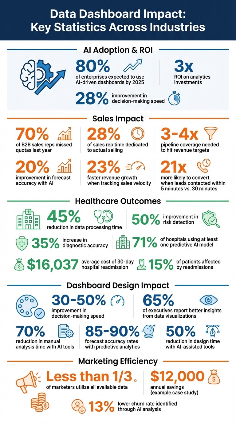
AI-driven dashboards are becoming standard, with 80% of enterprises expected to use them by 2025.
Dashboards improve decision-making speed by up to 28% and deliver 3x ROI on analytics investments.
Best designs prioritize simplicity: key metrics upfront, comparisons for context, and no unnecessary clutter.
Industry-specific examples include marketing dashboards that track ROAS, sales dashboards enhancing pipeline visibility, and healthcare dashboards predicting patient risks, which you can design with a KPI dashboard planner.
Platforms like Querio streamline this process by connecting directly to data warehouses, ensuring up-to-date insights tailored to U.S. business standards (e.g., $ for currency, MM/DD/YYYY dates). Use these tools to reduce manual work and focus on smarter, faster decisions.
Data Dashboard Impact Statistics: ROI, Adoption Rates, and Performance Metrics Across Industries
I created 27+ dashboards. This is what I learned
1. Marketing Dashboards
Marketing dashboards address a common challenge: less than one-third of marketers utilize all available data because it's scattered across multiple platforms [1]. A well-designed marketing dashboard consolidates data from various sources - like social media, email, website analytics, and CRM systems - into one unified view. This eliminates the hassle of manual exports and complex spreadsheets, making it easier to focus on the metrics that matter.
The most effective dashboards follow a straightforward principle: everything should fit on a single 1080p screen, with no scrolling required [2]. Key metrics, such as total spend, leads, cost per lead (CPL), and return on ad spend (ROAS), should be prominently displayed at the top left. To make these numbers meaningful, they should always be accompanied by comparisons to previous periods or specific targets. As MetricNexus explains:
A number in isolation means nothing. '1,247 sessions' could be great or terrible depending on context. Always show comparison: previous period, previous year, or target. The delta tells the story, not the absolute value. [2]
The benefits of AI-driven dashboards are clear. Take Emanuel Cinca, founder of the Stacked Marketer newsletter, as an example. In August 2025, he developed a custom AI-powered dashboard using Python and Google Gemini. Over 30 hours of work, he replaced a $1,000/month analyst role, saving $12,000 annually. The dashboard provided deeper insights, like calculating the true cost-per-lead by factoring in subscriber churn. This led to identifying campaign strategies with a 13% lower churn rate, enabling smarter budget allocation [4]. Cinca noted:
The biggest win is already there: we wanted to cut costs on analytics, while sustaining the quality of insights, and we did it. [4]
Building on this concept, Querio takes it a step further by connecting directly to your data warehouse. This allows for instant dashboard generation formatted specifically for U.S. business standards. Teams can quickly view dollar amounts, dates in MM/DD/YYYY format, and other metrics without waiting for lengthy reports. The AI behind Querio generates real SQL queries, ensuring results are both accurate and transparent.
Modern dashboards are also evolving to track new types of metrics. For instance, in March 2026, Microsoft Advertising introduced an AI Performance dashboard that highlights grounding queries [5]. This reflects a growing trend: dashboards are no longer just about reviewing past performance. They are becoming proactive tools that predict risks and send alerts when metrics, like cost per acquisition (CPA), exceed set thresholds [3].
2. Sales Dashboards
Sales dashboards take the principles of marketing dashboards and apply them to the sales process, offering targeted insights that drive better decisions.
Pipeline Visibility and Forecast Accuracy
Here’s a striking fact: 70% of B2B sales reps missed their quotas last year [6]. Why? Limited pipeline visibility plays a big role, leaving reps with only 28% of their time dedicated to actual selling [6][8].
A well-designed sales dashboard changes that. These dashboards provide role-specific views: sales reps can focus on personal metrics and prioritize their next steps, while executives get a bird’s-eye view of pipeline health [6][9]. Key metrics - like revenue versus quota, average deal size, and win rate - should be front and center, ideally in the top-left corner, with figures rounded for quick readability (e.g., $1.2M) [6].
But raw numbers alone don’t tell the whole story. Context matters. For example, knowing that B2B teams often need 3× to 4× pipeline coverage to hit revenue targets adds clarity to the data [6][9]. Dashboards with conditional formatting, such as red, amber, and green indicators, help flag issues like deals stuck in one stage for over 30 days [7][9]. These features allow sales teams to identify risks and adjust their strategies in real time.
AI takes dashboards to the next level, turning them into predictive tools. One finance provider saw a 20% improvement in forecast accuracy after implementing AI [11]. By analyzing unstructured data - like call transcripts and email threads - AI uncovers patterns, such as recurring objections or signs of budget freezes [10]. In one case, AI revealed that a $13.68M pipeline was 70% early-stage deals, preventing an overly optimistic forecast and enabling the team to refine their quarterly strategy [11].
Using tools like Querio, you can create a dashboard that pulls sales data directly from your warehouse. These dashboards ensure metrics align with U.S. business standards, including accurate dollar amounts, MM/DD/YYYY date formats, and real SQL queries. Leaders can drill down from high-level KPIs to specific deals or individual rep activities [7][9]. Teams tracking sales velocity have seen 23% faster revenue growth compared to those focusing only on pipeline value [6]. And here’s another key insight: leads contacted within five minutes are 21 times more likely to convert than those reached after 30 minutes [9].
3. Customer Analytics Dashboards
Turning Customer Data into Retention Strategies
Customer analytics dashboards do more than just track customer behavior - they help predict trends and improve retention efforts. One way they achieve this is by categorizing customers based on their likelihood of churning. These risk tiers include: Critical (80%+ chance of churn), High (60–79%), Medium (40–59%), and Low (below 40%) [12]. This segmentation allows teams to focus their efforts where they can make the biggest difference. Instead of simply showing a churn score, dashboards often use explainability techniques like SHAP values to highlight the key factors driving that score. For example, a combination of frequent returns and low email engagement might be flagged as contributing to a high churn risk [12].
AI-powered personalization takes this data a step further by turning insights into actionable strategies. These systems can provide tailored recommendations, such as offering a shipping discount or suggesting specific products, based on a customer’s profile [12][13]. Dashboards also include role-based adaptive views, thanks to row-level security. This means that team members only see data relevant to their responsibilities - regional managers might focus on local trends, while executives get a broader, global perspective [12].
Platforms like Querio integrate directly with your data systems, ensuring dashboards deliver live, accurate information in familiar U.S. formats (e.g., dollar amounts, MM/DD/YYYY dates, and precise decimal points). They also generate inspectable SQL queries, providing transparency and reliability for every insight. Additionally, these tools can analyze unstructured text from customer reviews, visualizing sentiment trends over time and across products. This helps teams spot potential issues early and address them before they escalate [14]. With these capabilities, businesses can make informed, real-time decisions to strengthen customer retention.
4. Executive KPI Dashboards
Executive dashboards take raw data and turn it into a clear, strategic snapshot that leaders can use to make informed decisions. These dashboards, like the ones mentioned earlier, focus on presenting key insights in a way that’s easy to grasp at a glance.
### Designing for the Five-Second Rule
An effective executive dashboard should communicate its main message within five seconds of being opened. To achieve this, it relies on elements like large numbers, directional indicators, and a clear hierarchy of priorities [15]. Most executives focus on three core areas: revenue impact (e.g., pipeline, customer acquisition), efficiency (e.g., cost per acquisition, return on ad spend), and trajectory (e.g., growth trends over time) [15]. Keeping this focus ensures that only the most critical data is front and center.
The primary view should include no more than 5–7 high-level KPIs. Including more than seven metrics can overwhelm users and reduce the dashboard’s effectiveness [16]. As Maximilian Fleitmann explains:
The fewer the number of numbers you look at the better [15].
This streamlined approach forces teams to prioritize metrics that genuinely influence decisions, rather than cluttering the dashboard with unnecessary data.
Modern executive dashboards also incorporate alert-driven features, such as traffic light indicators (green, amber, red) that instantly signal areas needing attention [16]. Additional tools like trend arrows, sparklines, and conditional formatting make it easy to spot deviations at a glance [16]. For example, a CEO might focus on metrics like revenue growth and enterprise client retention (aiming for 90%+), while a CFO might monitor operating cash flow and budget variance, keeping it within 3% of the target [16].
Tools like Querio enhance these dashboards by allowing natural language queries in plain English, generating accurate SQL-based insights with automated summaries. All data is presented in familiar U.S. formats - dollar amounts, MM/DD/YYYY dates, and standard decimal notation. Dashboards update daily at 6:00 AM and are optimized for mobile devices, ensuring leaders can check metrics easily, whether between meetings or on the go. Push notifications alert executives when thresholds are breached, ensuring they get timely updates to maintain smooth coordination across teams [16]. This design prioritizes actionable insights, delivered exactly when they’re needed.
5. Healthcare Dashboards
Building on earlier examples, healthcare dashboards are tailored to meet the specific demands of the healthcare sector, a field defined by strict regulations and the need for precise outcomes.
By 2026, these dashboards are designed to juggle real-time operations, stringent privacy rules, and the goal of better patient outcomes. Healthcare analytics face a unique challenge: they must consolidate data from various siloed sources like EHR systems, billing platforms, patient administration tools, and even wearables, creating a unified view of information [17].
AI-Powered Patient Risk Prediction and Operational Efficiency
Predictive AI is at the core of modern healthcare dashboards, helping to identify risks earlier than ever before. In June 2025, Atria Healthcare teamed up with GoML to unify patient data and apply generative AI for uncovering hidden patterns. This collaboration reduced data processing time by 45%, improved risk detection by 50%, and increased diagnostic accuracy by 35% [18]. As Seshasai explained:
"GoML is our strategic partner in building the layer of Generative AI that helps our teams analyze and interact with the broad set of clinical data we collect." [18]
This level of AI integration is no longer a rarity. Currently, 71% of hospitals are using at least one predictive AI model that integrates with their EHR systems for tasks like readmission prediction or risk scoring [17]. Considering that the average 30-day hospital readmission costs $16,037 and impacts roughly 15% of patients, these tools bring both financial relief and better care [17]. Moreover, compliance is becoming a driving factor. The CMS TEAM mandate, which takes effect in January 2026, requires 714 hospitals to monitor post-discharge follow-ups to qualify for bundled reimbursements, making these dashboards indispensable [17].
Successful healthcare dashboards focus on three key areas: clinical quality (e.g., readmission rates), operational efficiency (e.g., average length of stay), and patient experience (e.g., HCAHPS scores) [17]. Tools like Querio allow healthcare teams to interact with live warehouse data in plain English, generating HIPAA-compliant SQL queries with advanced row-level security. By presenting data in familiar U.S. formats, these platforms enable medical staff to dedicate more time to what matters most - caring for patients.
Conclusion
Dashboards across various industries demonstrate that the key to effective data visualization lies in simplicity and clarity, not overcomplication. The best dashboards focus on a clear, structured layout - showcasing one or two main metrics prominently at the top, with three to five supporting metrics for added context [19]. They rely on consistent visual markers, like using green for positive trends and red for negative ones, and keep time series charts concise with only 3–5 key lines to avoid clutter. Geographic heatmaps are normalized to highlight meaningful patterns instead of merely reflecting population density [3,45].
AI-powered tools are reshaping how teams interact with data by incorporating advanced analytics directly into dashboards. For example, predictive analytics in sales dashboards deliver forecast accuracy rates of 85–90%, while anomaly detection in customer data helps identify potential churn risks early [46,47]. These tools can reduce manual analysis time by up to 70%, enabling teams to focus on making strategic decisions [20]. Research also indicates that well-designed dashboards improve decision-making speed by 30–50%, with 65% of executives reporting better insights from data visualizations [47,50].
These principles tie together the examples discussed throughout this article, emphasizing a thoughtful approach to dashboard design. Querio integrates these best practices by offering AI-assisted dashboard creation, real-time connections to data warehouses, and automatic formatting tailored to U.S. conventions (like $ for currency, MM/DD/YYYY for dates, and comma-separated thousands) [5,47]. Its semantic context layer ensures consistent terminology across teams, while interactive drill-downs and real-time updates keep insights actionable and up to date.
To put these strategies into action, review your current dashboards against the guidelines shared here. Import your data into Querio, apply AI-recommended layouts that follow a clear hierarchy, incorporate predictive analytics or automated alerts, and verify proper localization [5,46,49]. This process can cut design time in half, creating dashboards that directly address your business needs [5,46].
Turn raw data into actionable insights - whether you're measuring campaign success, forecasting sales, or tracking patient outcomes.
FAQs
Which KPIs should I put on my dashboard first?
When building a dashboard, begin by selecting KPIs that tackle your most pressing business questions and deliver quick insights into performance. For instance, in sales, focus on metrics like revenue, Customer Acquisition Cost (CAC), and conversion rates. The key is to choose KPIs that align closely with your strategic objectives, provide actionable data, and clearly show progress toward your goals. By prioritizing metrics that are relevant and focused, you’ll create a dashboard that not only drives better decisions but is also straightforward to understand.
How do I connect a dashboard to my data warehouse in real time?
To link a dashboard directly to your data warehouse and access real-time data, tools like Querio can be a game-changer. Querio provides secure, live data access by integrating with popular data warehouses such as Snowflake, BigQuery, and Postgres. It uses read-only credentials to prioritize data security while enabling real-time querying.
What sets Querio apart is its use of natural language processing (NLP). This feature allows you to input plain English commands, which Querio then translates into database queries. As a result, your dashboards can auto-refresh, delivering up-to-the-minute insights without the need for manual updates. It’s a seamless way to keep your data-driven decisions as current as possible.
How can AI dashboards predict issues like churn or missed forecasts?
AI dashboards leverage predictive analytics and anomaly detection to spot potential problems, like customer churn or missed forecasts, before they escalate. By examining real-time data, these tools can uncover patterns and subtle irregularities - like a decline in engagement or purchasing habits - that may signal underlying risks. They also offer root-cause analysis, helping users understand the "why" behind these issues. Plus, as new data flows in, these dashboards get smarter, enabling businesses to make proactive decisions that minimize churn, prevent revenue dips, and improve overall performance.
Related Blog Posts


