Business Intelligence
ai data analytics tools for non technical users
Compare five AI analytics tools that let non-technical users query data in plain English, get visual insights, and connect to live warehouses.
AI analytics tools are transforming how non-technical users interact with data. These platforms simplify complex data processes, enabling users to ask questions in plain English and get actionable insights without needing coding knowledge. This article compares five popular tools - Querio, Tableau, Power BI, ThoughtSpot, and Akkio - designed to make data analysis accessible.
Key Takeaways:
Querio: Translates plain English queries into SQL/Python, offers live data connections, and ensures consistent metrics with a shared context layer.
Tableau: Focuses on visual storytelling with drag-and-drop dashboards and guided exploration but requires more setup for advanced features.
Power BI: Integrates tightly with Microsoft tools, features conversational AI, and offers affordable pricing but is best suited for Microsoft-heavy environments.
ThoughtSpot: Functions like a search engine for data, delivering visual answers instantly but may require effort for advanced customizations.
Akkio: Simplifies data analysis with conversational AI data analyst chatbots and automated data prep but is limited in handling complex analytics.
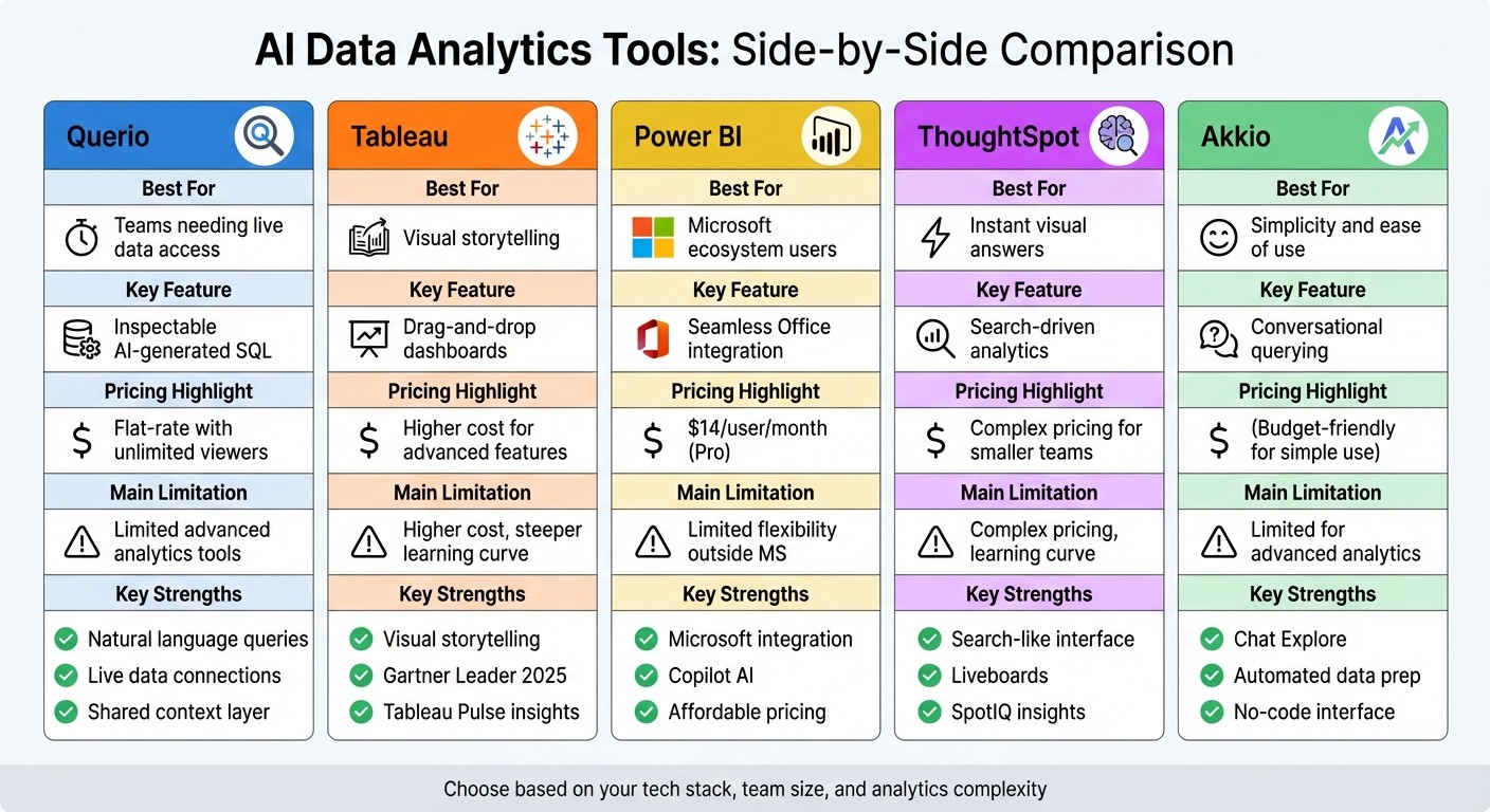
Quick Comparison:
Tool | Best For | Key Feature | Limitation |
|---|---|---|---|
Querio | Teams needing live data access | Inspectable AI-generated SQL | Limited advanced analytics tools |
Tableau | Visual storytelling | Drag-and-drop dashboards | Higher cost for advanced features |
Power BI | Microsoft ecosystem users | Seamless Office integration | Limited flexibility outside MS |
ThoughtSpot | Instant visual answers | Search-driven analytics | Complex pricing for smaller teams |
Akkio | Simplicity and ease of use | Conversational querying | Limited for advanced analytics |
These tools cater to different needs, budgets, and workflows, making it easier for businesses to choose the right fit. The article delves into each tool's features, strengths, and limitations, helping you decide which platform aligns best with your goals.
AI Data Analytics Tools Comparison for Non-Technical Users
Best AI Tools Every Data Analyst Should Know in 2026
1. Querio
Querio is an AI-powered analytics workspace tailored for teams that need easy access to data without sacrificing precision or control. It connects directly to make your data warehouse conversational like Snowflake, BigQuery, and PostgreSQL, allowing users to ask questions in plain English. Behind the scenes, the platform translates these queries into SQL or Python, ensuring accurate, actionable insights while keeping things simple for users.
Natural Language Query
With Querio, querying data feels like using natural language data querying tools. For example, you can type, "What were our top products last quarter?" and the platform's AI will create the SQL query, run it against your live data warehouse, and deliver the results. Transparency is a key feature - Querio lets you view the exact code it used, helping you verify the output and even learn from the process.
Governance & Security
Querio includes a context layer where your data team can define key metrics, table relationships, and glossary terms. This ensures everyone in your organization uses consistent definitions - no more debates about what "revenue" or "active users" mean. The platform is SOC 2 Type II compliant and connects to your data warehouse using encrypted, read-only credentials, so users can explore data confidently without risking changes to the source tables.
Visualization Features
Querio makes visualizing data effortless. It automatically chooses the best chart for your results and offers a drag-and-drop dashboard builder for customization. Dashboards update in real-time as your data warehouse changes, so there’s no need for manual refreshes or outdated snapshots. Plus, Querio offers unlimited viewer access, letting you share insights across your organization without worrying about extra costs for additional users. This way, everyone can base their decisions on the same up-to-date data.
Data Integration
Querio connects directly to your live data warehouse, eliminating the need for data extracts. It supports platforms like Snowflake, BigQuery, Amazon Redshift, ClickHouse, and PostgreSQL, as well as databases such as MySQL, MariaDB, and Microsoft SQL Server. By querying data where it resides, Querio ensures you're always working with the latest information, while your IT team avoids the hassle of managing duplicate data or dealing with synchronization problems.
2. Tableau
Tableau is a powerful analytics platform that simplifies data visualization with its drag-and-drop interface, allowing users to create charts and dashboards without writing a single line of code. Over time, it has incorporated AI-driven features to make data exploration easier for non-technical users, removing the need for expertise in SQL or advanced analysis.
Natural Language Query
Tableau Agent serves as the platform's natural language interface. With it, you can type plain English requests like "show me sales by region for Q4", and Tableau will instantly generate the corresponding visualization. To make things even easier, it offers guided exploration tools that suggest initial questions and prompt follow-ups to help you dive deeper into your data [2][3]. Additionally, Tableau Pulse keeps users informed by sending personalized metric updates through Slack, email, or Microsoft Teams [2][3].
Visualization Features
The platform automatically recommends chart types based on the data you’re working with, whether it’s a heat map, scatter plot, or Gantt chart. For added clarity, Data Stories create narrative summaries to help stakeholders quickly grasp the insights. Story Points further enhance presentations by allowing you to guide decision-makers through your findings in a step-by-step, narrative-driven format.
Automation & Insights
Tableau Agent streamlines tasks like data preparation, calculations, and visualization creation. Its Inspector feature monitors key metrics and sends alerts when significant changes occur, while Concierge digs into the root causes and suggests appropriate visualizations [2]. Meanwhile, Tableau Pulse adds extra context by explaining the drivers behind metric changes.
Data Integration
Tableau seamlessly connects to a variety of data sources, from cloud-based data warehouses to on-premises databases and even spreadsheets. Its visual query language enables you to combine data from multiple sources without needing to write complex join logic. Up next, we’ll explore how Power BI approaches user-friendly data analysis.
3. Power BI

Power BI makes it easy for non-technical users to create reports and analyze data without needing to write a single line of code. Its drag-and-drop interface and AI-powered tools are designed to simplify the process. One standout feature is its Q&A tool, which allows you to ask questions in plain English and instantly generates visualizations based on your query. To make this even easier, Power BI uses a color-coded underline system: blue for recognized terms, orange for unclear phrasing, and red for unrecognized words. This system helps refine your questions to get more accurate results [4].
Visualization Features
Power BI automatically picks the best chart type for your data, whether that's a line graph, bar chart, pie chart, or even a map [4]. If you need more options, the Power BI Visuals Marketplace offers hundreds of additional visuals to suit your needs. Some advanced tools include the Key Influencers visual, which identifies factors driving specific outcomes, and the Decomposition Tree, which lets you explore data across multiple dimensions. Additionally, Smart Narratives provide written summaries of your charts in plain, easy-to-understand language [1].
Automation & Insights
With Power BI, automation takes center stage. The Copilot feature creates visualizations based on conversational prompts, while Quick Insights detects patterns and outliers in your data automatically. In 2024, these automation tools proved to be a game-changer, reducing time spent on manual tasks and freeing up data teams to focus on more strategic projects [1].
Data Integration
Power BI connects seamlessly to over 100 data sources, from cloud services to databases and spreadsheets [5]. This versatility is crucial for organizations like Walmart, where Micah Dail, Director of Finance Data & Analytics, shared:
"At Walmart, we use a myriad of different vendors in our technology stack, so having a tool like Power BI that can bring everything together was critical" [1].
For individual users, Power BI even offers a free account, allowing you to create detailed, interactive reports without spending a dime [1]. Next, we'll take a closer look at how ThoughtSpot is reshaping data analytics for broader accessibility.
4. ThoughtSpot
ThoughtSpot offers a fresh take on data analytics by functioning like a search engine. Instead of navigating complex tools, you simply type a question and instantly get visual answers. Their patented Relational Search technology works similarly to Google, but instead of web pages, it delivers charts and graphs tailored to your business data. This search-first approach aligns with the growing trend of making ai in data analytics more intuitive and accessible.
Natural Language Query
The Spotter AI Analyst serves as your personal data assistant, allowing you to ask questions in plain English - no need to learn SQL or technical terms. Spotter not only provides answers but also explains them with meaningful context. It feels less like using software and more like chatting with a knowledgeable colleague who has all the insights you need.
Visualization Features
ThoughtSpot replaces traditional dashboards with Liveboards, which update interactively in real time. With these, you can explore data from high-level metrics down to the smallest details, all without predefined paths. The SpotterViz feature takes it a step further by automatically creating entire dashboards, complete with layouts and styling, based on a simple prompt. Additionally, SpotIQ identifies anomalies, uncovers root causes, and even generates predictive forecasts, making advanced analytics accessible to everyone.
Governance & Security
ThoughtSpot integrates directly with warehouse-native data analysis tools like Snowflake and BigQuery, ensuring data stays secure within its cloud environment. With Analyst Studio, data teams can define business rules and security protocols once, creating reusable data models. This ensures non-technical users can explore data freely while maintaining a single, secure source of truth. The platform’s built-in security controls simplify scaling across an organization without compromising data integrity.
Data Integration
With ThoughtSpot's mobile app, insights and Liveboards are always within reach, even on the go. The platform’s Change Analysis feature detects trends and anomalies automatically, providing explanations for sudden shifts in your data - saving you the time and effort of sifting through spreadsheets for answers.
5. Akkio
Akkio is a business intelligence platform designed for users without technical expertise. It takes care of the complex backend processes, so you can focus on exploring your data and getting answers. Instead of wrestling with intricate configurations, you simply interact with your data through conversational tools.
Natural Language Query
Akkio’s Chat Explore feature makes querying data as easy as having a conversation. You can ask questions in plain English, like "What is the average price range for Q1 of 2020?" and instantly get a clear answer - no need to understand database structures or learn query languages. This conversational method simplifies data analysis, making it more accessible.
Visualization Features
The platform includes a drag-and-drop interface for building interactive dashboards, charts, and graphs without writing a single line of code. These visualizations come with interactive options, such as drill-downs, filters, and hover-over details, allowing you to examine your data from multiple perspectives. When you use Chat Explore, Akkio automatically creates visualizations like graphs or charts that align with your questions, giving you a clearer picture of your data.
Automation & Insights
With the Chat Data Prep feature, Akkio automates the tedious tasks of cleaning and preparing data. Through its conversational interface, it identifies patterns and trends in your data without requiring manual effort. This means you can skip the grunt work and focus on using the insights to make informed decisions. Akkio turns complex analytics into straightforward, intuitive interactions, saving you time and effort.
Strengths and Weaknesses of Each Tool
Here's a quick overview of the strengths and limitations of each tool.
Tool | Key Strengths | Main Limitations |
|---|---|---|
Querio | AI-powered natural language queries that produce inspectable SQL and Python; shared context layer ensures consistent definitions across analyses; live connections to modern data warehouses without duplication; reactive notebook environment for in-depth analysis. | No notable limitations. |
Tableau | Excellent for visual storytelling with an intuitive drag-and-drop interface; proactive insights through Tableau Pulse; recognized as a 2025 Gartner Magic Quadrant Leader [6]. | AI-generated outputs lack visibility into intermediate reasoning; can't promote AI results to reusable semantic assets; subscription pricing requires contacting sales [7]. |
Power BI | Integrates seamlessly with Microsoft 365 apps like Teams, Excel, and PowerPoint; Copilot creates entire report pages from conversational prompts; affordable pricing at $14.00 per user/month for the Pro version; ranked highest for "Ability to Execute" in the June 2025 Gartner Magic Quadrant [1]. | Copilot doesn’t build data models or define relationships; visuals can feel outdated; limited flexibility outside the Microsoft ecosystem. |
ThoughtSpot | Search-driven analytics with a natural language interface; automated insights surface patterns without manual effort; strong data governance capabilities. | Steeper learning curve for advanced customizations; pricing can be complex for smaller teams. |
Akkio | Conversational querying with Chat Explore; automated data preparation using Chat Data Prep; easy-to-use drag-and-drop interface requiring no coding. | Limited capabilities for advanced analytics or complex scenarios; smaller ecosystem compared to larger enterprise platforms. |
These comparisons reflect the tools' unique approaches to addressing user needs, incorporating essential features of modern business intelligence tools, as detailed in our earlier reviews.
For instance, Tableau has proven its value in large-scale implementations. Jaguar Land Rover reported $250 million in business value through data-driven decisions powered by Tableau, while KeyBank enabled 10,000 employees to access actionable insights using Tableau's AI-driven platform [6].
The best tool for your team will depend on your specific needs. If you're already embedded in the Microsoft ecosystem, Power BI's integration and competitive $14.00 per user/month pricing make it a strong contender. Tableau remains a top choice for visual storytelling and proactive insights, even at a higher cost. Querio is ideal for teams requiring precise, inspectable AI-generated queries with consistent business logic. Lastly, Akkio offers simplicity and ease of use for teams focused on conversational querying without the need for advanced analytics.
Conclusion
The comparisons above highlight how different platforms cater to non-technical analytics needs, helping you decide which AI data analytics tool fits your tech stack, team expertise, and budget. Querio stands out by offering instant insights through natural language queries, live connections to data warehouses, and transparent processes - all without requiring SQL knowledge. Its flat-rate pricing with unlimited viewers becomes especially budget-friendly for teams with 50 or more data users, making it a practical choice for scaling analytics across larger groups.
While Power BI integrates seamlessly with Microsoft apps and Tableau shines in data visualization, both often require more technical expertise and come with steeper learning curves. ThoughtSpot and Akkio provide user-friendly solutions but lack Querio's strong governance features, like its shared context layer, which ensures consistent and reliable business metrics. These differences underline Querio's ability to simplify analytics and drive informed decision-making.
To find the best fit, test the platform with your own data. Evaluate query performance, visualization clarity, and ease of use firsthand. If your priorities include conversational data warehouse connections, avoiding data duplication, and gaining AI-driven insights that are both transparent and reliable, Querio offers a well-rounded solution to empower confident, data-driven decisions.
FAQs
How does Querio protect my data and ensure compliance with regulations?
Querio takes your data security seriously, employing a multi-layered protection system throughout its analytics process. With role-based permissions, it ensures that users can only access the data they need for their specific roles. On top of that, all data is encrypted both at rest and in transit, keeping it safe from unauthorized access.
For added transparency and accountability, Querio includes detailed audit trails. These logs track every query, dashboard update, and data export, making it easier for administrators to meet compliance requirements or conduct forensic investigations if necessary. Plus, Querio meets rigorous governance standards, including SOC 2 Type II certification, so you can feel confident your data is handled securely and responsibly.
How is Querio's natural language query feature different from other tools?
Querio's natural language query feature makes data analysis incredibly user-friendly. By simply typing questions in plain English, users can receive instant AI-driven answers - no need for coding or SQL knowledge. It integrates directly with popular cloud data warehouses like Snowflake and BigQuery, ensuring that every result is based on live, up-to-date information. Plus, with just a few clicks, these insights can be transformed into interactive dashboards, streamlining the process of turning data into actionable insights.
What makes Querio stand out is its ability to provide instant, practical answers. For instance, if you ask, "What were our top-selling products last quarter?", Querio not only pulls the relevant data but also creates a shareable visual report in seconds. Over time, its AI learns from user interactions, improving its accuracy and making it easier to handle even broad or exploratory queries. This means that anyone, regardless of their technical background, can confidently make informed decisions in no time.
How does Querio make data visualization and sharing easy for non-technical users?
Querio makes data visualization effortless by transforming plain-English questions into ready-to-use charts and graphs. For instance, if you ask, “What were last quarter’s sales by region?”, Querio’s AI instantly creates a tailored visualization and places it on a fully customizable, drag-and-drop dashboard - no coding skills needed. These dashboards update automatically in real time as your data evolves and can even send alerts when critical metrics change.
Sharing insights is equally straightforward. Querio incorporates role-based access controls, encryption, and audit trails to ensure secure collaboration. You can share dashboards or charts through secure links, embed live views into other tools, or export visuals as PNG or PDF files. This makes it simple to keep your team, partners, or clients up to speed while meeting U.S. data security standards.
Related Blog Posts