Business Intelligence
Ultimate Guide to AI-Powered Dashboards
AI-powered dashboards simplify data analysis, enabling users to gain insights quickly through natural language querying and predictive analytics.
 Javier BonillaCo-founder & CTO
An AI dashboard is one you build or question in plain English: you describe what you want, and the AI picks the charts, writes the query and adds a short summary. The tools differ in what they read. Some take an uploaded spreadsheet, some only draw a design, and some query your live warehouse. That choice decides whether the numbers match the ones finance reports.
We build Querio, which makes dashboards on your live warehouse from metrics your team defines once. This guide covers the kinds of AI dashboard tools, the features worth paying for, how to roll one out and where each kind fits.
What kinds of AI dashboard tools are there?
Search for an AI dashboard and you'll find four kinds of tool. They solve different problems:
| Kind of tool | What you give it | Examples | Fits |
|---|---|---|---|
| Upload-to-dashboard generators | An Excel or CSV file | ChartGen, Displayr | A quick look at one file |
| Design prototypers | A text prompt | Figma Make | Mocking up a layout before anyone builds it |
| App builders with a coding agent | A prompt, plus a CSV file, database or API | Replit | A custom dashboard app you'll maintain as code |
| BI on your warehouse with AI built in | Live tables and the metrics your team defined | Databricks AI/BI Dashboards, Querio | Dashboards the whole company reads every week |
The first three are fast. The trouble starts when a dashboard has to match a number someone else reports. We asked one question, "What was revenue last month?", of dbt Labs' public jaffle shop sample data and got four defensible answers for March 2018: $622 counting every payment, $477 for shipped or completed orders, $404 for those orders without coupon and gift card payments, and $279 for completed orders only. An AI that profiles your columns has to pick one of those without asking. A dashboard built on a metric your team has defined and reviewed uses the same one every time.
In Querio, that definition is a file in a git repo you own. Dashboards are called Boards. A Board refreshes on a schedule from the notebook that produced it, so when a metric shifts, the Board updates with it.
Key Features of AI-Powered Dashboards
AI-powered dashboards are changing how teams interact with data. By combining advanced technology with intuitive design, they make complex analytics easier to access and understand for everyone in an organization.
Natural Language Querying
One standout feature of AI-powered dashboards is natural language querying. Instead of needing to master SQL or wait for technical teams to generate reports, users can simply type questions in plain English and get instant, clear visualizations.
For example, a finance director could ask, "What are the cash flow trends for the Northeast region?" and immediately view comprehensive charts and graphs. The AI processes these conversational queries, translates them into database commands, and delivers the results in an easy-to-digest format.
This conversational approach encourages deeper exploration. Users can ask follow-up questions, zoom in on specific details, and uncover insights that might not surface in static dashboards or pre-made reports. Right now, about 20% of enterprises have adopted natural language querying in their AI-powered dashboards, signaling a growing shift toward making analytics more accessible [2].
"Business Intelligence with best-in-class AI agents so that your team and customers can query, visualize, and analyze data. Coding optional." - Querio
For organizations embracing natural language querying, it's crucial that the AI understands the business's unique context. Tools like Querio allow data teams to build in layers of context - such as business terms, table relationships, and glossaries - so the AI provides consistent and accurate answers. For instance, when someone asks, "What’s our customer acquisition cost?" the system ensures the response is reliable and aligned with the organization's definitions.
But the benefits don't stop there. Dashboards also take decision-making a step further with predictive and automated analytics.
Predictive and Automated Analytics
AI-powered dashboards don’t just answer questions - they predict trends and automate insights. Predictive and automated analytics use historical and real-time data to forecast outcomes, spot anomalies, and send alerts, helping businesses stay ahead of potential challenges.
For instance, predictive analytics might analyze past data to estimate next quarter's sales or flag unusual patterns, like a sudden spike in product returns. In one case, a financial services firm in 2024 uncovered a previously unnoticed link between customer support interactions and churn risk. By acting on this insight, they reduced customer attrition by 22% [4].
Automated alerts are another game-changer. Instead of manually monitoring dashboards, users receive real-time notifications when metrics cross critical thresholds - like a drop in website traffic, unexpected expense increases, or inventory shortages.
Organizations using these tools report significant improvements. Operations teams can address issues as they arise, and finance teams can focus on strategy rather than getting bogged down in data collection. As Querio puts it, these tools help teams "know what's blocking today, not last week" and allow leaders to make proactive, informed decisions [3].
This proactive approach naturally leads to the next step: embedding analytics directly into everyday tools.
Embedded Analytics
Embedded analytics bring insights right into the tools teams use daily, eliminating the need to switch between platforms. This seamless integration boosts efficiency and ensures that data is always at users' fingertips.
For example, sales teams can access customer data directly within their CRM, while project managers can view performance metrics without leaving their project management tools. For customer-facing applications, embedded analytics provide added convenience - clients can access insights without needing separate logins or extra training.
Modern platforms make this integration smooth with flexible APIs that work with existing tech stacks. Personalization is another key benefit. Dashboards can tailor insights based on user roles - like showing a CFO high-level financial metrics while providing a regional manager with localized sales data. This automatic customization ensures everyone gets relevant, actionable information without the hassle of manual setup [3].
At the same time, governance remains a priority. Data teams can maintain control over security, definitions, and access permissions, ensuring consistency across the organization while still making analytics widely available.
These three features - natural language querying, predictive and automated analytics, and embedded analytics - combine to create a powerful dashboard experience. They break down traditional barriers to business intelligence by making data more accessible, timely, and integrated into daily workflows, enabling users at all levels to make smarter decisions.
Steps to Implement AI-Powered Dashboards
Creating AI-powered dashboards involves three key phases: getting your data ready, ensuring security and compliance, and rolling out the dashboards. A well-organized approach helps ensure your dashboards provide accurate insights, protect sensitive data, and support business goals.
Preparing Your Data
The backbone of any reliable AI dashboard is well-prepared data. Without clean, structured data, your AI insights can fall short.
Start by setting up live connections to your data warehouses instead of duplicating data. Tools like Querio allow direct connections to platforms such as Snowflake, BigQuery, and Postgres, ensuring your dashboards always reflect up-to-date information.
Structure your data for AI analysis. This means defining clear schemas, mapping relationships between tables, and standardizing naming conventions across teams. For instance, ensure that "customer acquisition cost" is calculated consistently, whether it's used by marketing or finance.
The semantic layer plays a crucial role here. Think of it as a translator between technical database structures and user-friendly business terms. By defining joins, metrics, and glossaries at this layer, your organization ensures that everyone - from analysts to executives - gets consistent answers. So, when someone asks, "What’s our quarterly revenue growth?" the AI delivers the same calculation every time, regardless of who’s asking.
Before launching your dashboards, conduct a thorough audit of your data. Check for gaps, inconsistencies, and quality issues. Standardize formats, define data types, and set up validation rules. While this prep work may take 4-6 weeks for mid-sized companies, it’s essential for building trust and ensuring accuracy.
Once your data is in top shape, turn your attention to securing it.
Security and Compliance Setup
Protecting your data should be a top priority when building AI dashboards, especially if you handle sensitive business information.
Choose platforms with SOC 2 Type II certification, which ensures adherence to rigorous standards for security, availability, confidentiality, and more. Querio, for example, highlights its secure, read-only access to databases and external auditing as key features.
Implement role-based access controls (RBAC) to limit data visibility based on user roles. For example, a regional sales manager should only see data for their territory, while a CFO needs access to company-wide financial metrics. This approach safeguards sensitive information while enabling informed decision-making.
Set up controlled, read-only connections for your dashboards. This prevents accidental data manipulation while still allowing AI to query information effectively.
Establish data governance policies to clarify ownership, set access rules, and outline usage guidelines. Audit logs are essential for tracking who accessed what data and when, ensuring accountability and compliance.
For industries with specific regulations, such as healthcare or finance, additional measures like HIPAA compliance or data masking may be necessary. Platforms like Querio also ensure that proprietary data isn’t used for AI model training, offering peace of mind for organizations concerned about privacy.
Deploying and Customizing Dashboards
When rolling out AI dashboards, a phased approach works best to balance technical setup with user adoption.
Start with a pilot program in a single department where AI dashboards can show quick, measurable results. Sales forecasting or marketing campaign analysis are often good starting points. This helps identify and fix technical issues before expanding to other teams.
Tailor dashboards to each user’s needs. For example, a CFO might require high-level financial metrics, while a sales manager needs local pipeline data and lead insights. Role-based templates can automate these customizations, ensuring each user sees the most relevant information.
Leverage AI-powered embedded analytics and natural language capabilities to make dashboards more user-friendly. Show users how they can type simple questions like "What were last quarter’s sales trends by region?" instead of learning complex query languages. Hands-on training and a network of internal champions can boost adoption and support.
Gather feedback from users during the initial rollout to identify what’s working and where improvements are needed. Regular check-ins can uncover unexpected use cases and guide future dashboard enhancements.
Track metrics like adoption rates, report generation time, and decision-making speed to measure success and pinpoint areas for improvement.
Finally, set up governance protocols to standardize dashboard creation, visualization styles, and quality standards across the organization. This avoids dashboard sprawl and ensures consistency.
On average, implementing AI-powered dashboards takes about 8-12 weeks. While the process requires effort, the result is faster decision-making and better data accessibility for your teams.
Optimizing AI-Powered Dashboards for Business Impact
Launching AI dashboards is just the beginning. To truly maximize their potential, you need strategies that drive automation, foster continuous improvement, and ensure reliable governance. These steps help transform your dashboards from simple tools into powerful assets for decision-making. Let’s dive into how automation can turn insights into immediate action.
Automated Reporting and Alerts
One of the essential features of modern BI tools is their ability to automate insights, keeping teams informed without the hassle. Automated reporting can condense what used to take weeks into just minutes, removing delays in decision-making and allowing teams to focus on strategy rather than data wrangling.
For example, you can configure alerts to trigger only when specific conditions are met. Imagine receiving a notification when monthly recurring revenue dips below $500,000 or when pipeline velocity drops by more than 15% week-over-week. These alerts can be tailored to specific roles, ensuring they’re always relevant and actionable.
AI dashboards can also generate weekly performance summaries customized for each team member’s responsibilities. These summaries can then be sent via email or tools like Slack. This kind of automation saves a significant amount of time. Giulia Acchioni Mena, Co-Founder at Zim, shared her experience:
"I immediately started saving 7-10 hours a week!" - Giulia Acchioni Mena, Co-Founder, Zim
Integrating alerts with existing workflows takes efficiency even further. For instance, when a key issue arises, the system can automatically create tasks in your CRM or project management tools, ensuring immediate follow-up.
Feedback Loops and Continuous Improvement
AI dashboards should evolve over time, guided by systematic feedback and usage analysis. By tracking user interactions, you can identify what’s working and where improvements are needed. Pay attention to frequently viewed reports, repeated queries, and areas where users spend the most time - these patterns often reveal opportunities for enhancement.
In-dashboard feedback tools, such as ratings or quick surveys, provide a simple way to gather user input. Regular review cycles - monthly tends to work well - allow you to analyze performance and address issues without overwhelming users with constant changes.
AI can also play a role in suggesting improvements. For instance, if users often drill down from quarterly revenue to monthly breakdowns, the system might recommend adding a monthly view directly to the main dashboard.
To measure the impact of your optimizations, track metrics like adoption rates, time spent on dashboards, and how quickly users find the answers they need. When teams can access insights faster, it’s a clear sign your efforts are paying off. Automation might handle the heavy lifting, but continuous feedback ensures the system stays relevant and effective, all while reinforcing data governance.
Governance and Consistency
Consistency is key to building trust, and trust is essential for widespread dashboard adoption. Strong governance ensures that users get the same answers to the same questions every time. This starts with embedding business context into your AI system by defining metrics, joins, and glossaries by building a semantic layer that understands your business. For example, “quarterly revenue growth” should always be calculated the same way, no matter who’s asking.
As Querio highlights:
"Querio has context on your business and data. Only focus on your question, we make sure the answers are correct."
This eliminates guesswork and ensures your AI dashboards align with your business definitions.
Granular access controls are another critical component. Different roles require different levels of access - a regional manager might see only their territory’s data, while sensitive financial information remains restricted. Read-only access to underlying databases prevents accidental changes while still allowing effective data querying. Platforms with SOC 2 Type II certification provide an extra layer of security, demonstrating that your governance practices meet rigorous standards.
To maintain data quality, establish validation rules that catch issues before they reach the dashboard. Automated checks for missing data, unusual values, or inconsistencies can flag problems early for review. Documenting governance decisions and making them accessible to users builds confidence in the system. Regular audits of user permissions, metric definitions, and data quality rules ensure that your governance evolves alongside your business needs.
Organizations that prioritize governance and consistency see better dashboard adoption and stronger business results. When users trust the information they’re getting, they’re more likely to rely on AI dashboards for critical decisions, leading to more effective outcomes overall.
sbb-itb-284a532
Use Cases for AI-Powered Dashboards
AI-powered dashboards are transforming how businesses operate, offering insights in minutes that once took hours - or even days - to uncover. These tools are making a big impact across departments, helping teams achieve their goals faster and with greater precision. Let’s explore how different teams are using these dashboards to drive results.
Sales and Marketing
For sales and marketing teams, staying ahead means making quick decisions based on reliable data. AI-powered dashboards simplify this by automating complex analyses and delivering insights instantly.
Take lead scoring, for example. With AI, dashboards can analyze customer behavior, engagement history, and demographic data to rank leads more effectively. Meanwhile, tools for tracking customer sentiment can process social media mentions, support tickets, and survey feedback to provide real-time sentiment scores. This allows sales teams to focus on high-potential prospects and helps marketing teams fine-tune their messaging.
These dashboards also enable teams to react faster to market changes. Predictive analytics can forecast pipeline opportunities, identify deals at risk, and even predict monthly recurring revenue. On the marketing side, these tools help allocate budgets more effectively, ensuring campaigns get the funding they need to succeed across the right channels.
Finance
Finance teams are seeing a major shift with AI-powered dashboards, particularly in areas like fraud detection, forecasting, and budget management - where precision and speed are critical.
Fraud detection is faster and more accurate with advanced algorithms that monitor transaction patterns and flag unusual activity in real time. These systems can reduce false positives by up to 40% [5]. Financial forecasting also gets a boost, as dashboards analyze historical trends, market data, and business cycles to predict cash flow needs or model scenarios like, "What happens if we increase marketing spend by 20%?" - all with visualized answers delivered instantly.
Budget optimization is another game-changer. AI dashboards analyze spending trends to spot inefficiencies, predict future expenses, and suggest reallocation strategies. By shifting from manual reporting to strategic analysis, finance teams can focus on activities that directly contribute to growth.
Operations and Strategy
Operations teams need real-time insights to manage processes, while executives rely on high-level overviews to guide strategy. AI-powered dashboards meet both needs with unmatched efficiency.
For operations, these tools improve processes like supply chain management. By integrating data from multiple sources, dashboards can predict inventory needs and flag bottlenecks before they become problems. For instance, one retail company reduced stockouts by 30% using demand forecasting, while a logistics firm improved on-time deliveries by 20% [5].
Workforce productivity tracking is another area where these dashboards shine. Operations managers can identify performance trends, optimize schedules, and allocate resources more efficiently. They can even pinpoint areas where additional training might improve results.
At the executive level, KPI dashboards provide a real-time, bird's-eye view of the business. Instead of waiting for monthly reports, leaders can monitor key metrics continuously, spotting trends and making decisions faster. These dashboards highlight significant changes automatically, ensuring executives stay informed without sifting through endless data.
The benefits don’t stop at individual departments. As Mohamad Ali Baydoun, CTO at LemonadeFashion, put it:
"Querio changed how we work with our data and each other!"
AI-powered dashboards break down silos, enabling teams across finance, sales, marketing, and operations to collaborate seamlessly. They also reduce delays in data requests, freeing up data teams to tackle more strategic projects while empowering other employees to find answers on their own. By providing a consistent and reliable data source, these dashboards ensure every department is aligned and working from the same playbook.
Querio: AI-Powered Dashboard Platform
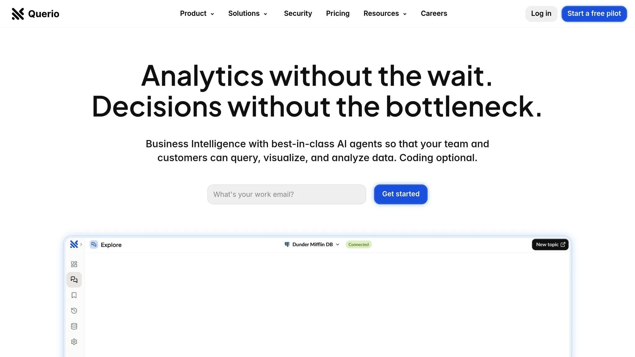
If you're exploring platforms that can effectively deliver the capabilities of AI-powered dashboards, Querio deserves your attention. Querio is an AI-first business intelligence workspace designed to make data accessible to everyone - whether you're a product manager, a finance professional, or an end user. It brings the power of AI-driven dashboards into a single, user-friendly solution tailored to meet the needs of enterprises.
How Querio Works
Querio simplifies data exploration by allowing users to ask questions in plain English and receive instant, accurate visualizations. It connects directly to your existing data warehouses - like Snowflake, BigQuery, and Postgres - without duplicating data. This ensures you’re always working with live, up-to-date information.
Its natural-language agent translates everyday questions into SQL queries on the fly. For example, you could ask, "What was our customer acquisition cost last quarter?" and within seconds, Querio generates charts and tables with the answer. No need to understand database structures or write complex code.
By eliminating technical barriers, Querio empowers teams across departments to explore data independently while maintaining accuracy and consistency. This streamlined data interaction showcases the transformative potential of AI-powered dashboards.
Core Features and Benefits
Querio offers more than just a simple interface - it’s packed with features designed to enable every user. One standout is its governance model, which lets data teams set up context layers - like table joins, metric definitions, and business glossaries - once. These settings persist across all queries and users, ensuring consistent and reliable results every time.
Embedded analytics is another game-changer. Companies can integrate Querio’s natural-language querying directly into their own products, offering self-service analytics to their customers. This is particularly useful for SaaS companies aiming to stand out by delivering powerful analytics capabilities.
The platform also includes built-in dashboards and scheduled reporting tools that keep executives informed without the need for extra software. Giulia Acchioni Mena, Co-Founder at Zim, shared her experience:
"I immediately started saving 7-10 hours a week!"
Querio is also stepping into advanced analytics with the upcoming addition of Python notebooks. This feature will allow users to perform deeper data analysis while still leveraging the same governed data foundation, bridging the gap between everyday business queries and advanced data science needs.
Why Choose Querio
Querio stands out for organizations aiming to democratize data access while maintaining enterprise-grade security. It’s SOC 2 Type II certified, offering controlled, read-only database access and granular permissions. Plus, Querio ensures your data is never used for AI training, addressing privacy concerns that many companies share.
From a cost perspective, Querio consolidates multiple BI functions - querying, visualization, reporting, and embedded analytics - into one platform. This reduces the need for multiple tools, cutting down on overall costs and simplifying your data stack.
The impact on productivity is hard to ignore. Data teams report an 80% reduction in request backlogs, freeing them to focus on strategic initiatives. Mohamad Ali Baydoun, CTO at LemonadeFashion, highlights this shift:
"Querio changed how we work with our data and each other!"
Querio also tackles a major challenge: 78% of companies struggle with the clutter of too many dashboard tools. By offering a single, AI-powered interface that works for both technical and non-technical users, Querio eliminates the complexity and inconsistency that traditional BI tools often create.
With its natural-language querying, live data connections, robust governance, and embedded analytics, Querio transforms how organizations interact with data. It makes insights accessible to all while ensuring the security and precision enterprises demand.
Conclusion: Transforming Business Intelligence with AI-Powered Dashboards
AI-powered dashboards are changing the game for business intelligence. What used to be static, hard-to-access reports are now dynamic tools that deliver insights in real time, empowering teams across an organization. This shift isn’t just about automating tasks - it’s about making data accessible to everyone and enabling smarter, faster decisions across all areas of a business.
With these dashboards, teams can cut down on the time spent wrestling with manual data processes. Features like natural language querying remove technical hurdles, making it easier for anyone in the organization to dive into the data and act on it. The result? A more agile and data-driven approach to decision-making.
But it doesn’t stop there. Predictive analytics and automated reporting push businesses from reacting to problems to proactively addressing them. Instead of waiting weeks to uncover issues, teams can spot trends, anomalies, or opportunities as they happen. This forward-thinking approach helps fuel growth and keeps organizations ahead of the curve.
For companies looking to adopt this technology, platforms like Querio simplify the process while ensuring data governance stays intact. And the benefits aren’t confined to internal operations - these dashboards can also enhance customer experiences. Embedded analytics allow businesses to deliver advanced data insights directly to end users, all without requiring a complex setup.
As Jennifer Leidich, Co-Founder & CEO at Mercury, put it:
"What used to be weeks, now takes minutes!" [1]
This speed transforms how teams operate, giving them the ability to adapt quickly to market shifts, customer demands, or operational challenges.
The organizations that thrive in the future will be the ones that make data actionable - consistently and at every level. AI-powered dashboards are the foundation for this shift, turning business intelligence into a core strength that drives smarter decisions and better outcomes.
FAQs
::: faq
What makes AI-powered dashboards more accessible and functional compared to traditional dashboards?
AI-powered dashboards are transforming how we interact with data, making it easier and more intuitive than ever. Unlike traditional dashboards, these tools let you ask questions in plain English and instantly deliver visualized results - no coding or analyst intervention required.
Take tools like Querio, for example. They connect directly to live data sources such as Snowflake, BigQuery, or Postgres, eliminating the hassle of duplicating data. By using natural-language processing, these dashboards translate your questions into SQL queries on the fly. This means faster access to insights, enabling teams to make quick, informed decisions and stay aligned with the latest, actionable data. :::
::: faq
How can businesses protect data and ensure compliance when using AI-powered dashboards?
To protect sensitive information and comply with regulations, businesses need to make data security and privacy top priorities when using AI-powered dashboards. This means choosing platforms that don’t store or share user data and ensuring data isn’t used for model training without explicit consent.
One essential step is encryption, which keeps sensitive data confidential and secure. It’s also wise to use tools that integrate directly with your existing data warehouses. This approach avoids creating unnecessary copies of data, which helps minimize security risks.
For staying compliant in the long run, businesses should adopt solutions that support the creation of governance frameworks. These frameworks allow data teams to define and manage metrics, joins, and glossaries, ensuring they can adapt to changing regulatory requirements over time. :::
::: faq
How does natural language querying in AI-powered dashboards enhance decision-making across teams?
AI-powered dashboards equipped with natural language querying make decision-making much easier. They allow users to ask questions about live data in plain English and get instant, clear visual insights. No need for complex coding or waiting on data analysts - teams can quickly pull the information they need.
With faster access to data, every department - whether it’s Finance, Product, or others - can make quicker, smarter decisions. This boosts efficiency and leads to better results across the board. :::