Guide
8 Data Exploration Techniques for Better Insights
Explore 8 data exploration techniques with SQL and Python examples, pitfalls, and scaling tips for warehouses, notebooks, and self-service analytics.
The most useful data exploration techniques don't begin with a chart. They begin with a question about whether the data can support a decision at all. Exploratory data analysis became a formal discipline through John Tukey's work in the 1970s, especially his seminal 1977 book, Exploratory Data Analysis, which emphasized graphical methods for uncovering structure, important variables, outliers, and anomalies, as described by the National Institute of Standards and Technology.
That history explains why effective exploration is a sequence of investigative moves, not a disconnected list of visualizations. You first establish data health, then reshape and inspect evidence, test relationships and segments, and finally validate a decision experimentally when causal confidence matters. The workflow below connects warehouse-friendly SQL with Python notebooks, self-serve access, and collaborative tools such as Querio. Each technique includes a practical implementation pattern, a scaling consideration, a real-world analytical use, and a specific interpretation risk.
Table of Contents
- 1. Interactive SQL Querying and Natural Language Querying
- 2. Statistical Profiling and Data Quality Assessment
- 3. Dimensional Analysis and Pivot Tables
- 4. Time Series Analysis and Trend Exploration
- 5. Cohort Analysis and Segmentation
- 6. Correlation and Relationship Analysis
- 7. Visualization and Interactive Dashboarding
- 8. Experimentation and A/B Testing Analysis
- Comparison of 8 Data Exploration Techniques
- Turn Exploration Into a Reusable Workflow
1. Interactive SQL Querying and Natural Language Querying
Interactive querying is the fastest way to turn a business question into a testable slice of warehouse data. SQL gives analysts precise control over joins, filters, windows, and aggregations. Natural language querying gives non-technical users a more accessible starting point, provided the system has enough schema and business context to interpret terms such as “active customer” or “retained account.”
Professional analyst interviews found that 28 of 30 analysts used visualization, while 28 of 30 used programming or command-line tools. Programming was the dominant mode for 18 of 30 analysts, and 13 of 30 mentioned Jupyter notebooks or similar workflows, according to the reported analyst workflow findings. The implication is practical: exploration works best when users can move between direct inspection and reproducible code.
A warehouse query might begin with a deliberately narrow slice:
select
  date_trunc('week', occurred_at) as week,
  plan_type,
  count(*) as events,
  count(distinct user_id) as active_users
from product_events
where occurred_at >= current_date - interval '90 days'
group by 1, 2
order by 1, 2;
A notebook can then extend the same result:
df["events_per_user"] = df["events"] / df["active_users"]
df.pivot(index="week", columns="plan_type", values="events_per_user").plot()
Scale and interpretation risk
Interactive workloads differ from conventional reporting. IDEBench argues that exploratory systems should prioritize low-latency iteration and useful progressive results, because exploration is incremental and often begins with approximate or partial answers rather than a completed query, as described in the IDEBench benchmark paper.
Use query limits, warehouse resource controls, saved templates, role-based access, and documented metric definitions. Natural language output is a hypothesis generator, not an automatically validated conclusion. Before acting, inspect the generated SQL, confirm the grain, and verify that the selected tables represent the intended business concept. For a plain-language explanation of how query languages support this work, see what a query language is.
2. Statistical Profiling and Data Quality Assessment
Data quality determines whether a pattern merits analysis. Before comparing segments, profile the fields that define them: metadata, types, frequency distributions, central tendency, dispersion, missingness, and unusual values. These checks determine whether later patterns deserve investigation or rejection.
A warehouse query can establish the dataset's basic health:
select
  count(*) as rows_seen,
  count(*) - count(customer_id) as missing_customer_ids,
  count(distinct customer_id) as distinct_customers,
  min(created_at) as earliest_record,
  max(created_at) as latest_record,
  avg(order_value) as mean_order_value
from orders;
A notebook can turn the same review into a reproducible artifact:
profile = df.describe(include="all").T
null_rate = df.isna().mean().sort_values(ascending=False)
cardinality = df.nunique().sort_values(ascending=False)
Frequency tables expose unexpected categories, while histograms show distributional shape. Box plots help locate spread and potential outliers. These views answer different questions, so selecting one should follow the decision under review. A customer analysis may require checking identifier completeness and cardinality before any segment comparison.
Scale and interpretation risk
Run profiles automatically on important warehouse tables, then compare each result with documented expectations. Changes in null rates, category values, or date coverage can reflect an upstream pipeline problem, a legitimate product change, or schema evolution. The profile identifies the discrepancy; domain owners must explain it.
For large tables, compute exact counts where the decision requires them and use warehouse-supported sampling or approximate distinct counts for early exploration. Store results by table and run so analysts can distinguish a persistent defect from a one-time ingestion issue. A data quality metrics and examples reference can help define the checks and thresholds.
Practical rule: Treat an outlier as a question, not an error. It may indicate bad ingestion, a genuine high-value event, or a change in business operations.
Create a shared data-health record with definitions, owners, freshness expectations, and links to validation queries. Teams building specialized pipelines can also review this setup pipeline for embodied AI data, where validating inputs before interpreting model or operational output follows the same principle. Profiling supports investigation, not causal proof. A detected relationship still requires domain review and, where decisions depend on it, experimental validation.
3. Dimensional Analysis and Pivot Tables
A pivot table converts an aggregate into decision-relevant comparisons. Revenue may be stable overall while one product category declines and another grows. Comparing product, region, customer type, and period exposes these offsetting movements, but the result depends on the dimensions and grain selected.
Build the warehouse view at the level needed for the decision:
select
  date_trunc('month', order_date) as month,
  region,
  product_category,
  sum(net_revenue) as net_revenue,
  count(distinct customer_id) as customers
from orders
group by 1, 2, 3
order by 1, 2, 3;
Pull the aggregated result into a notebook and reshape it for inspection:
pivot = (
    df.pivot_table(
        index="month",
        columns=["region", "product_category"],
        values="net_revenue",
        aggfunc="sum"
    )
)
Choose dimensions that map to an operational question. Product area and customer plan can support a product review. Region and sales stage can support pipeline investigation. Account type and month can support finance reporting. Adding every available field produces a wide matrix, increases query and notebook costs, and makes the next action less clear.
Drill-down and scaling
Hierarchies let analysts move from a broad signal to records that may explain it. Time can progress from year to quarter to month; geography can progress from region to country to market. Store recurring pivot definitions and filters so teams compare the same measure and grain across runs. For large tables, aggregate in the warehouse first, then load only the summarized result into the notebook.
Use heatmaps or conditional formatting to identify cells for review, then query the underlying records. A lower-converting region may reflect traffic mix, sales process, or recording quality. The pivot identifies where to investigate. It does not establish which factor caused the difference.
A pivot reveals conditional performance: results within the dimensions selected. Omitted dimensions can hide important variation, and cells with different values do not by themselves explain the reason.
Publish the measure definition beside each pivot. “Customers” might mean accounts, paying accounts, unique users, or customers with a completed transaction. State the row grain, aggregation, and denominator so two analysts do not produce different but internally consistent views from the same warehouse. Use the pivot to choose a follow-up query, segment, or experiment, rather than treating a visual comparison as causal evidence.
4. Time Series Analysis and Trend Exploration
Time series analysis turns a change into a sequence of decisions: investigate operations, adjust measurement, forecast demand, or review a product change. The same value can indicate a gradual trend, recurring seasonality, an abrupt break, or a one-time event, so the time grain must match the decision.
Build the series in the warehouse before loading it into a notebook:
select
  date_trunc('day', occurred_at) as day,
  count(*) as signups,
  count(distinct user_id) as users
from signups
group by 1
order by 1;
Then smooth short-term noise while retaining the raw observations:
daily["rolling_7_day"] = daily["signups"].rolling(7, min_periods=1).mean()
daily.set_index("day")[["signups", "rolling_7_day"]].plot()
Graphical inspection can reveal structure that summary values hide. Plot raw observations with a moving summary, then compare periods under similar conditions, such as the same weekday, campaign state, or product-release context. Notebook plots work well for a small or aggregated series. For larger tables, calculate daily or hourly aggregates in the warehouse and transfer only the analytical result.
Autocorrelation and anomaly interpretation
Autocorrelation in time series helps assess whether nearby observations resemble one another. That result affects how analysts interpret persistence and choose a modeling approach.
from statsmodels.graphics.tsaplots import plot_acf

plot_acf(daily["signups"].dropna(), lags=30)
A spike near a product launch does not establish that the launch caused the change. Marketing activity, seasonality, tracking modifications, and traffic composition may overlap on the same date. Mark known events on the chart, check data latency and definition changes, and preserve the raw series so analysts can trace a visible pattern back to source rows.
Interpretation risk: A trend demonstrates temporal alignment, not causal impact.
Automate anomaly flags only after metric definitions and latency are stable. Alerting on every fluctuation creates noise and weakens response. A smaller set of owned metrics, documented event context, and a clear path from chart to source records supports better operational decisions than broad monitoring with unclear thresholds.
5. Cohort Analysis and Segmentation
Cohort analysis changes the question from “how are users performing now?” to “how do groups with a shared starting point behave over their lifecycle?” That distinction helps product teams separate aging effects from acquisition effects. A recent signup cohort may look weaker because it has had less time to activate, not because the product deteriorated.
Define cohorts using a meaningful event, such as signup, activation, or first purchase:
with first_purchase as (
  select
    customer_id,
    min(purchased_at) as first_purchase_at
  from purchases
  group by customer_id
),
activity as (
  select
    customer_id,
    date_trunc('month', purchased_at) as activity_month
  from purchases
)
select
  date_trunc('month', first_purchase_at) as cohort_month,
  activity_month,
  count(distinct activity.customer_id) as active_customers
from first_purchase
join activity using (customer_id)
group by 1, 2
order by 1, 2;
A notebook can convert calendar periods into lifecycle periods:
cohort["months_since_start"] = (
    (cohort["activity_month"].dt.year - cohort["cohort_month"].dt.year) * 12
    + cohort["activity_month"].dt.month
    - cohort["cohort_month"].dt.month
)
Segments that support decisions
Useful segments have a behavioral or operational interpretation. Examples include plan type, acquisition channel, onboarding path, market, or first feature used. Avoid segmenting only because a field exists. Every segment should answer a question such as whether onboarding changes affect activation, or whether a customer group needs a different retention intervention.
Track more than one outcome. Engagement, retention, and revenue can move in different directions, and focusing on a single measure can produce a misleading success story. External events also matter. A campaign, pricing change, or product release may affect every cohort at once.
The main risk is survivorship bias. If you calculate later behavior only among users who remain observable, you may overstate retention or engagement. Define the population at cohort entry, document observation windows, and make the denominator visible in the notebook and dashboard.
Use automated cohort generation for recurring reviews, but keep cohort logic versioned. Changing the activation definition can create an apparent historical improvement that reflects a metric rewrite rather than user behavior.
6. Correlation and Relationship Analysis
Correlation is a prioritization tool, not a causal verdict. It helps identify variables that move together and therefore deserve closer inspection. It can't tell you whether one variable changes the other, whether both respond to a third factor, or whether the relationship exists only because the data was filtered in a particular way.
Start with a controlled warehouse extract:
select
  user_id,
  count_if(event_name = 'project_created') as projects_created,
  count_if(event_name = 'invite_sent') as invites_sent,
  max(retained_next_period) as retained_next_period
from user_events
group by user_id;
Then inspect relationships visually rather than relying on a single coefficient:
import seaborn as sns

sns.pairplot(
    user_metrics[
        ["projects_created", "invites_sent", "retained_next_period"]
    ],
    y_vars=["retained_next_period"]
)
NIST lists scatter plots and residual plots among standard EDA methods, while multivariate references describe principal components analysis, factor analysis, K-means clustering, and hierarchical clustering as ways to simplify complex datasets and locate groups, as summarized in this reference on exploratory data analysis.
From association to decision
A correlation matrix can screen many variables, but it also creates multiple opportunities for accidental patterns. Heatmaps are useful for orientation, not automatic feature selection. Check whether variables share a time trend, a common denominator, or a measurement process. Consider lagged relationships when a behavior might precede an outcome rather than occur simultaneously.
A relationship can justify a better question. It can't, by itself, justify an intervention.
Use regression to adjust for recorded covariates, but don't describe the result as causal unless the design supports that interpretation. A product team might find that feature adoption aligns with retention. The next decision is whether to test an intervention that increases adoption, not whether to declare the feature the cause of retention.
Document exclusions, transformations, and the unit of analysis. Relationships at the user level can differ from relationships at the account, session, or market level. This grain problem can reverse conclusions when data is aggregated.
7. Visualization and Interactive Dashboarding
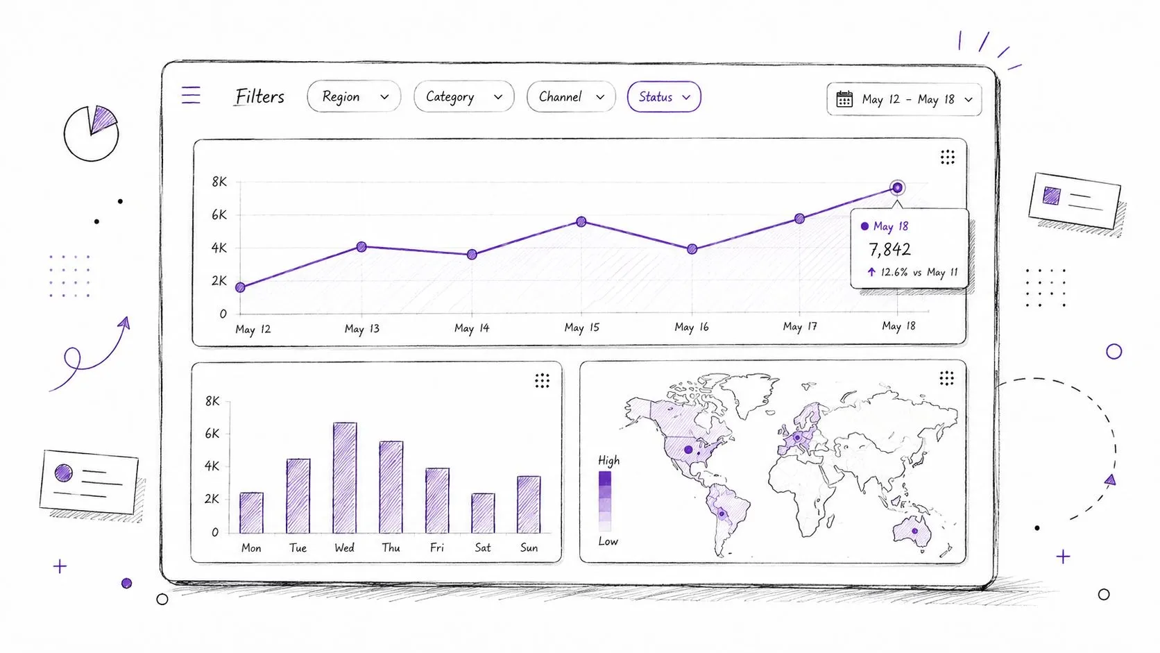
A visualization earns its place by answering a question faster than a table. A line chart supports temporal comparison, a bar chart supports category comparison, a scatter plot supports relationship inspection, and a map supports geographic distribution when location is analytically meaningful. The chart type should follow the decision, not the software's default gallery.
A warehouse query can supply a focused dashboard dataset:
select
  date_trunc('week', event_time) as week,
  market,
  count(distinct account_id) as active_accounts,
  sum(revenue) as revenue
from account_events
group by 1, 2
order by 1, 2;
A Python notebook can test the visual before it becomes a shared asset:
import seaborn as sns
import matplotlib.pyplot as plt

sns.lineplot(data=df, x="week", y="active_accounts", hue="market")
plt.xticks(rotation=45)
plt.tight_layout()
See these data visualization techniques for a broader treatment of choosing visual forms. Keep dashboards focused on the metrics needed for a decision, use color consistently, and provide drill-down paths from summary to records. A dashboard that displays every available metric may increase visibility while reducing attention.
Interactivity and interpretation
Filters should expose meaningful dimensions such as date, plan, market, and lifecycle stage. They shouldn't allow users to create arbitrary denominator changes without showing the resulting population. Add labels for freshness, metric definitions, and the query or model behind each visual.
Interactive dashboards improve access, but they can also encourage repeated slicing until a favorable pattern appears. Preserve saved views and record the question that motivated the exploration. A visual association remains observational unless a stronger design validates it.
A short visual walkthrough can help teams compare dashboard interactions with notebook-based analysis:
For teams standardizing Power BI workflows, this Power BI data visualization guide offers another implementation reference. The tool matters less than the chain from question to data slice, visual encoding, interpretation, and documented decision.
8. Experimentation and A/B Testing Analysis
Exploration generates hypotheses. Experimentation tests whether changing something produces a different outcome. That boundary is essential. A before-and-after chart can show that a metric moved after a release, but random assignment is what helps separate the release effect from concurrent changes.
Start by defining the unit of randomization and the primary outcome before querying results:
select
  variant,
  count(distinct user_id) as assigned_users,
  avg(conversion_flag) as conversion_rate,
  avg(revenue_per_user) as revenue_per_user
from experiment_assignments
group by variant;
In Python, compare treatment and control while preserving the assignment structure:
summary = (
    experiment.groupby("variant")
    .agg(
        users=("user_id", "nunique"),
        conversion_rate=("converted", "mean")
    )
)
The decision isn't only which variant has the larger observed average. Check whether assignment remained balanced, whether users crossed variants, whether exposure occurred, and whether the analysis follows intent to treat. Calculate power requirements before launch so the test can answer the planned question. Monitor multiple testing, document hypotheses and stopping rules, and avoid stopping early because an initial result looks attractive.
Causal confidence and operational discipline
A/B testing can support causal claims when the design, implementation, and analysis preserve the conditions that make treatment and control comparable. It still doesn't answer every business question. A test may measure short-term behavior while missing longer-term effects, operational costs, or harm to a different user group.
Decision rule: Use observational exploration to choose what to test. Use a controlled experiment to decide whether the intervention caused the measured change.
Store experiment definitions, SQL, notebook outputs, eligibility rules, and final interpretations in a central repository. Reproducibility matters because later teams will need to understand not only the result, but also who was included, what was changed, and which outcome was designated in advance.
Comparison of 8 Data Exploration Techniques
| Technique | Implementation complexity | Resource requirements | Expected outcomes | Ideal use cases | Key advantages |
|---|---|---|---|---|---|
| Interactive SQL Querying and Natural Language Querying | Medium, integrate warehouse, auth, NL models; supports advanced SQL | Moderate–High, warehouse compute, LLM/translation models, connectors | Fast ad‑hoc queries; explainable results; reproducible analyses | Ad‑hoc exploration, self‑service analytics, non‑technical querying | Combines full SQL control with NL accessibility; rapid insights; iterative work |
| Statistical Profiling and Data Quality Assessment | Low–Medium, profiling jobs, scheduling, reporting | Low–Moderate, dataset scans, storage for metrics and alerts | Data health reports, null/cardinality metrics, detected anomalies | ETL validation, governance checks, onboarding new datasets | Early detection of quality issues; improves downstream reliability |
| Dimensional Analysis and Pivot Tables | Low, UI or simple code; higher if modelling complex hierarchies | Low–Moderate, memory for pivoting; dimensional models | Multi‑perspective summaries; quick cross‑tab insights | Business reporting, what‑if exploration, cross‑functional analysis | Intuitive for business users; fast slicing and dicing of dimensions |
| Time Series Analysis and Trend Exploration | Medium, requires time‑series tooling and decomposition methods | Moderate, historical data, compute for models and anomaly detection | Trends, seasonality decomposition, forecasts, anomaly signals | Demand forecasting, metric monitoring, seasonal planning | Reveals temporal patterns; supports forecasting and early warnings |
| Cohort Analysis and Segmentation | Medium, cohort definitions, tracking pipelines, cohort retention logic | Moderate, historical records, storage for cohort views | Retention curves, segment performance, LTV by cohort | Retention analysis, product changes, targeted marketing | Isolates effects over time; informs segmentation and interventions |
| Correlation and Relationship Analysis | Medium, statistical modelling, regression and causality tooling | Low–Moderate, compute for correlation matrices and regressions | Identified relationships, feature importance, candidate drivers | Hypothesis generation, feature selection, driver analysis | Prioritizes drivers; supports predictive modeling and deeper analysis |
| Visualization and Interactive Dashboarding | Low–Medium, BI tooling plus design and UX effort | Moderate, BI platforms, live data feeds, frontend resources | Visual summaries, interactive exploration, stakeholder alignment | Executive dashboards, self‑service exploration, real‑time monitoring | Communicates insights clearly; accessible to non‑technical audiences |
| Experimentation and A/B Testing Analysis | High, rigorous experimental design and tracking systems | High, sufficient sample sizes, analytics tooling, statistical compute | Causal impact estimates, significance testing, heterogeneous effects | Product feature tests, pricing experiments, UX optimization | Establishes causation; quantifies effect sizes; reduces rollout risk |
Turn Exploration Into a Reusable Workflow
These eight data exploration techniques work best as an operating sequence. Begin by profiling the source and confirming its grain, freshness, metadata, variable types, distributions, missingness, and unusual values. Then query the relevant slice with SQL, reshape it across the dimensions that match the decision, and inspect distributions before summarizing them.
Time series views add sequence and context. Cohorts show how groups evolve from a meaningful starting event. Segmentation reveals whether an aggregate conceals materially different experiences. Correlation and multivariate methods help prioritize questions, but they don't turn observational evidence into causal proof. When the decision requires a claim about impact, move to experimentation with a defined hypothesis, assignment unit, primary outcome, power plan, and analysis protocol.
This sequence also addresses the bottleneck in exploration: workflow friction. Research on automated cross-domain EDA identifies persistent challenges involving complex schemas, unclear intent, weak cross-domain generalization, and incomplete text-to-visualization support, as discussed in research on automated exploratory data analysis. Better chart selection doesn't solve a missing metric definition, an ambiguous join, or a stakeholder question that changes halfway through the investigation.
Teams should make each investigation reusable. Document assumptions, query logic, metric definitions, filters, access controls, source tables, notebook outputs, and unresolved risks. Save the exploratory query even when it doesn't become a dashboard. Record why a metric was rejected, which denominator was used, and what evidence would change the conclusion. That practice turns one-off analysis into self-service infrastructure rather than another request routed through an overloaded analyst.
Self-serve access also needs governance. Role-based permissions, controlled domains, catalog context, and reviewable SQL help users move quickly without treating generated output as authoritative. The National Institute of Standards and Technology's EDA guidance remains relevant here because graphical exploration is valuable precisely when it exposes unexpected structure. Teams need a process for investigating that structure, not merely displaying it.
Querio can fit this workflow for teams that want AI coding agents and explainable Python notebooks close to warehouse data. Its Explore workspace is designed around asking analytical questions, generating SQL, running Python, creating charts and tables, and reviewing the resulting notebook. That can reduce context-switching between business questions and implementation, while human analysts still need to validate joins, definitions, permissions, and interpretations.
The strongest analytics teams don't choose between SQL, notebooks, dashboards, and experiments. They connect them. They use each technique for the decision it can support, keep exploratory evidence visible, and reserve causal language for designs that justify it.
Querio helps teams explore warehouse data through AI coding agents, SQL, Python notebooks, charts, and explainable results in one workflow. Visit Querio to evaluate whether its Explore workspace can help your team turn recurring data questions into governed, reusable analysis.