Guide
What Is Autocorrelation: Master Time-Series Analysis in 2026
Learn what is autocorrelation and why it matters for time-series analysis. Detect, visualize, & fix it in your business data for better forecasts.
You're probably looking at a trend chart right now. Maybe it's daily active users, checkout conversions, support tickets, or average order value. The line looks smooth enough that your brain starts telling a story. Product changes are working. Marketing is compounding. Demand is stable.
Sometimes that story is right. Sometimes the chart is just showing that yesterday is echoing into today.
That echo is the heart of autocorrelation. If you work with metrics over time, it changes how you interpret growth, forecast demand, and judge whether a model is trustworthy. A lot of teams learn statistical concepts in fragments. They hear terms like “serial correlation,” “lag,” or “ACF plot,” but those ideas often stay trapped in academic language. The useful version is simpler. Your data may have memory, and that memory can fool you if you treat each point as independent.
Table of Contents
- The Hidden Patterns Skewing Your Business Metrics
- What Is Autocorrelation Intuitively
- How to Visualize and Measure Autocorrelation
- Real-World Examples in Product and Analytics
- How to Formally Detect Autocorrelation
- Practical Methods for Handling Autocorrelation
- Key Takeaways for Data and Product Teams
The Hidden Patterns Skewing Your Business Metrics
A product manager checks the DAU dashboard on Monday morning. The line has climbed for days in a row, with only tiny dips. The team starts attributing that rise to a new onboarding flow shipped last week. It feels reasonable. The chart is moving up, and the release happened before the rise.
But time series data has a habit of carrying yesterday forward. A strong acquisition push, a feature launch, a holiday effect, or a weekly usage rhythm can keep influencing the next several observations. If you treat each day as a fresh, independent signal, you can mistake momentum for causation.
Why smooth charts can mislead
A metric that rises for several days in a row often looks convincing because humans are wired to see trends as evidence. In product work, that leads to familiar mistakes:
- Attribution mistakes: A team credits a release for movement that mostly reflects earlier momentum.
- Forecasting mistakes: Analysts project a trend line forward without checking whether the pattern is a temporary carryover.
- Experiment mistakes: Teams compare pre and post periods as if each day were independent, even though adjacent days influence each other.
If you've ever compared a trend line to a histogram, you've already seen that structure matters as much as values. A useful refresher on that broader idea is this guide to data distribution and why shape changes interpretation.
Practical rule: If a metric is recorded over time, don't assume each row behaves like a separate coin flip.
This issue shows up outside product dashboards too. In markets, price and volatility patterns often persist across nearby intervals, which is one reason traders rely on tools built for sequences rather than isolated points. If you want a practical example from that world, advanced trading analysis is a good lens for seeing how pattern persistence changes interpretation.
Why business teams should care
Autocorrelation sounds like a niche statistical concern until it changes a decision. A team may overstaff support because ticket volume looked like a lasting trend. Another may underreact to churn signals because a weekly cycle smoothed the decline. A leadership team may trust a forecast that looked precise on paper but leaned on the wrong independence assumptions.
The business cost isn't just mathematical error. It's misplaced confidence.
What Is Autocorrelation Intuitively
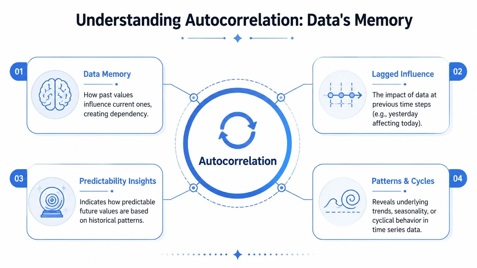
The simplest answer to what is autocorrelation is this. It's the relationship between a variable and its own past values.
If that sounds abstract, think of it as echoes in your data. Today's value doesn't stand alone. It may still carry some imprint of yesterday, last week, or the last business cycle.
Data has memory
Many business metrics are sticky. Weather is the easiest analogy. A hot day is more likely to be followed by another warm day than by a snowstorm. The atmosphere has continuity. Business systems do too.
Daily app usage behaves that way because user habits persist. Server load behaves that way because traffic patterns don't reset each minute. Revenue behaves that way because promotions, seasonality, and customer behavior spill over across time.
That's why autocorrelation is often described as a form of dependence across time. Instead of asking whether one variable predicts another, you're asking whether earlier versions of the same variable influence later ones.
Here's a compact way to explain it to a non-technical stakeholder:
Autocorrelation means a time series remembers where it has just been.
That memory can be short or long. Some series only echo one step back. Others carry structure across many lags, such as weekday cycles, monthly seasonality, or slower trend persistence.
The concept is easier to grasp when you see it drawn out:
Positive and negative echoes
Positive autocorrelation means high values tend to follow high values, and low values tend to follow low values. This is the common case in business data. If signups were higher yesterday because a campaign drove traffic, they may still be higher today because that effect hasn't faded.
Negative autocorrelation means a high value is more likely to be followed by a low one, and vice versa. This sounds less intuitive, but it shows up when activity rebounds in alternating directions. A restaurant may have a packed Saturday and a quiet Monday. A warehouse may clear a backlog one day and then process a lighter load the next.
A helpful way to separate the two:
- Positive autocorrelation: Persistence. The series tends to keep moving in its recent direction.
- Negative autocorrelation: Reversal. The series tends to swing back after an extreme.
- No meaningful autocorrelation: Each observation behaves more like a fresh draw, with little carryover from nearby points.
People often get confused here because they mix up trend and autocorrelation. They're related, but not identical. A trend is a long-run direction. Autocorrelation is dependence between values across time. A trending series often has autocorrelation, but a series can have autocorrelation even when the long-run average stays fairly stable.
How to Visualize and Measure Autocorrelation
You usually spot autocorrelation before you calculate it. A chart shows runs of similar values, repeating cycles, or a tendency for spikes to linger. But visual intuition isn't enough. You need a diagnostic that turns “this looks sticky” into something inspectable.
The core tool is the Autocorrelation Function, usually shortened to ACF.
Start with the shape of the series
Before opening Python, R, or a notebook, inspect the raw time series. Ask simple questions:
- Do values cluster in runs? Several high days in a row often signal dependence.
- Do patterns repeat at regular intervals? Weekly and monthly rhythms create recurring lag structure.
- Do shocks fade slowly? If one event keeps influencing later observations, autocorrelation is likely present.
Analysts who skip this step often jump straight into modeling and only notice trouble when residuals behave badly later. Good charting habits matter here. If you need a broader framework for making patterns visible, this guide to data visualization techniques for analysis is useful context.
How to read an ACF plot
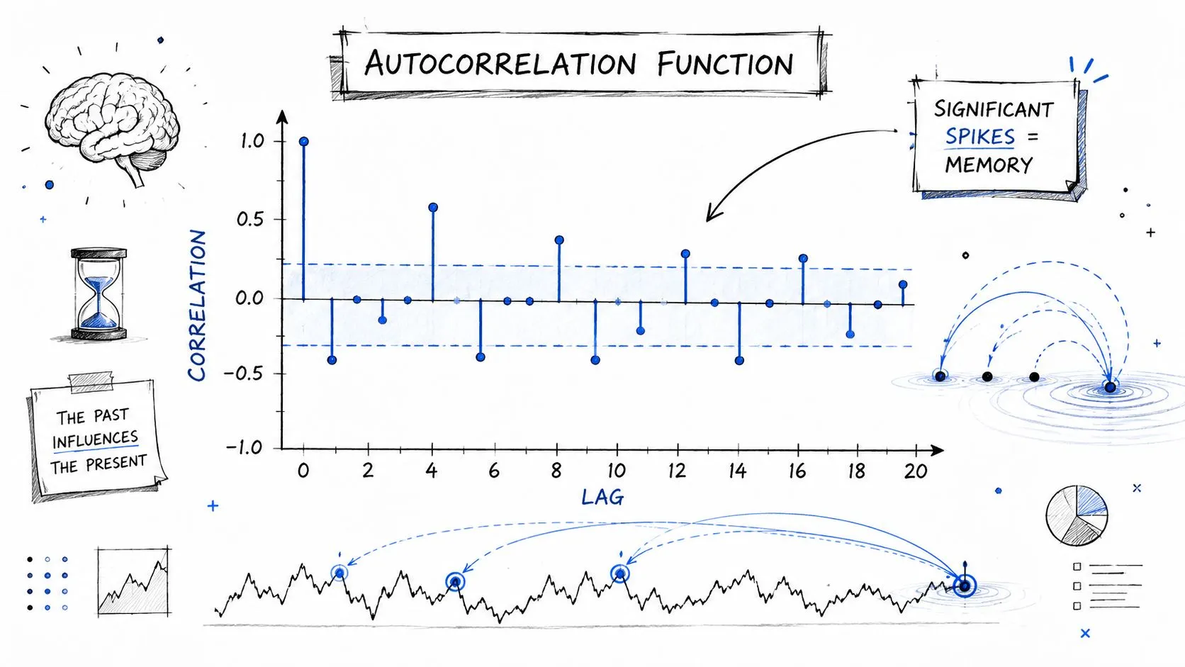
An ACF plot shows how strongly the series is correlated with itself at different lags. Lag 1 compares each value with the one immediately before it. Lag 2 compares each value with the value two steps earlier. And so on.
When you look at an ACF plot, focus on the spikes:
- Large positive spikes at early lags suggest persistence.
- Alternating positive and negative spikes can hint at reversal patterns.
- Repeating spikes at regular intervals often indicate seasonality, such as day-of-week behavior.
- A quick drop toward zero suggests short memory.
- A slow decay suggests longer-lasting dependence.
Many software packages shade a band around zero to show what might plausibly be noise. Spikes well outside that band are the ones analysts pay attention to first.
ACF plots are like fingerprints. They don't just tell you that dependence exists. They hint at what kind of process produced it.
The formula matters less than the pattern
Under the hood, the ACF is calculating correlation between a series and lagged copies of itself. You don't need to memorize the equation to use it well. You do need to know what the output means for decisions.
If your forecast model assumes randomness where the ACF shows persistence, you're building on a shaky foundation. That matters in settings where sequential dependence changes risk interpretation. In financial markets, models that fail to account for autocorrelation can underestimate risk by as much as 60% because they misinterpret persistent trends as random volatility, according to this autocorrelation risk reference.
That same logic applies in business analytics. If your dashboard metric has memory and your model ignores it, confidence intervals, significance tests, and forecasts can all look cleaner than they should.
Real-World Examples in Product and Analytics
Autocorrelation becomes much easier to recognize when you stop thinking about abstract time series and start thinking about the dashboards your team already uses.
Daily active users and habit loops
DAU rarely behaves like a set of isolated daily measurements. Users build habits. They return on similar days, at similar times, through similar channels. If your app is used heavily during the workweek, Tuesday often resembles Monday more than it resembles Sunday.
That has a direct product implication. A product manager may see a rise after a feature launch and assume the feature caused it. But if the series already had strong weekday persistence, the launch may only explain part of the movement. The rest is the system continuing its normal rhythm.
A good next step in that situation is to model the metric explicitly as a time series rather than as a plain regression over calendar dates. Consequently, time series regression analysis becomes more appropriate than a simple before-and-after comparison.
Sales spikes that linger
An e-commerce team runs a promotion on Friday. Sales surge. On Saturday they remain high, and on Sunday they're still above baseline. A quick reading says the weekend itself is strong. A better reading asks whether Saturday and Sunday are partly echoes of Friday's campaign.
This matters for marketing attribution and inventory planning. If the team treats each day's lift as independent, they may over-credit the channel or double-count the effect in reporting. They may also reorder inventory as if demand has permanently shifted when the spike is just decaying gradually.
Here's the practical habit that helps. When a shock happens, don't just ask whether the metric moved. Ask how long the aftereffect lasts.
If one day's event changes the next few days, you're not measuring isolated outcomes. You're measuring a chain reaction.
Operational metrics that stay stuck
Autocorrelation also shows up in systems data. Server response times, queue backlogs, fraud review volume, and support wait times all tend to persist. If latency jumps because infrastructure is under load, the next few intervals may remain high even after traffic softens. The system needs time to recover.
That persistence changes operations decisions. Teams that treat each measurement as independent often overreact to noise or underreact to a genuine state change. In practice, operations metrics often behave more like temperature than like coin flips. Once they move, they don't instantly reset.
A useful mental checklist for business metrics:
- Behavioral metrics often show habit-driven persistence.
- Commercial metrics often carry campaign and seasonality echoes.
- Operational metrics often reflect system inertia.
Once you start seeing those patterns, autocorrelation stops looking like a specialist term and starts looking like a normal property of the business.
How to Formally Detect Autocorrelation
Visual diagnosis gets you far, but critical decisions usually need something more explicit. Analysts often want to know not just whether a chart looks sticky, but whether a model's residuals still contain structure that the model failed to capture.
ACF and PACF for structure
The ACF shows the overall correlation at different lags. The PACF, or partial autocorrelation function, narrows the question. It asks how much a given lag matters after controlling for the shorter lags before it.
That distinction matters when you're trying to identify the shape of a time-series model. If the ACF remains high across several lags, but the PACF has a clearer cutoff, that often suggests direct dependence at early lags with indirect carryover afterward.
You don't need to become a Box-Jenkins purist to use these tools well. In practice:
- Use ACF when you want the broad memory pattern.
- Use PACF when you want to isolate direct lag effects.
- Use both when model selection is on the table.
People in quantitative finance run into these same questions when they try to separate noise from repeatable structure. For a practical adjacent read, Alpha Scala's guide to statistical arbitrage gives useful context on how analysts think about recurring relationships in sequential data.
Durbin-Watson and Ljung-Box for testing
Formal tests become useful when you've fit a regression or forecasting model and need to check whether autocorrelation remains in the residuals.
| Test | Primary Use Case | What It Tests | Simple Interpretation |
|---|---|---|---|
| Durbin-Watson | Regression residual diagnostics | Whether adjacent residuals are serially correlated, especially first-order correlation | A warning sign that your regression errors may not be independent |
| Ljung-Box | General time-series residual checking | Whether autocorrelation remains across a set of lags | A low p-value suggests the model left time-based structure unexplained |
| ACF/PACF plots | Exploratory diagnosis and model identification | Visual lag structure in the series or residuals | Use them to see the pattern before choosing a remedy |
Durbin-Watson is common in regression settings because it directly targets a familiar assumption. If residuals are correlated over time, significance tests from the regression can become unreliable.
Ljung-Box is broader. Instead of focusing only on adjacent residuals, it checks whether a group of lags collectively suggests leftover dependence. If that test comes back with a low p-value, the practical message is simple. Your model didn't finish the job.
A model can fit the average level of a metric and still miss its time structure.
That's the point many teams miss. A decent fit on paper doesn't mean the residuals are behaving the way your inference assumes.
Practical Methods for Handling Autocorrelation
Finding autocorrelation isn't the end of the analysis. It's the moment where you choose whether to transform the data, change the model, or adjust the inference.
Fix the series before fixing the model
A lot of autocorrelation comes from obvious structure in the data. Trend. Seasonality. Delayed effects. Start there.
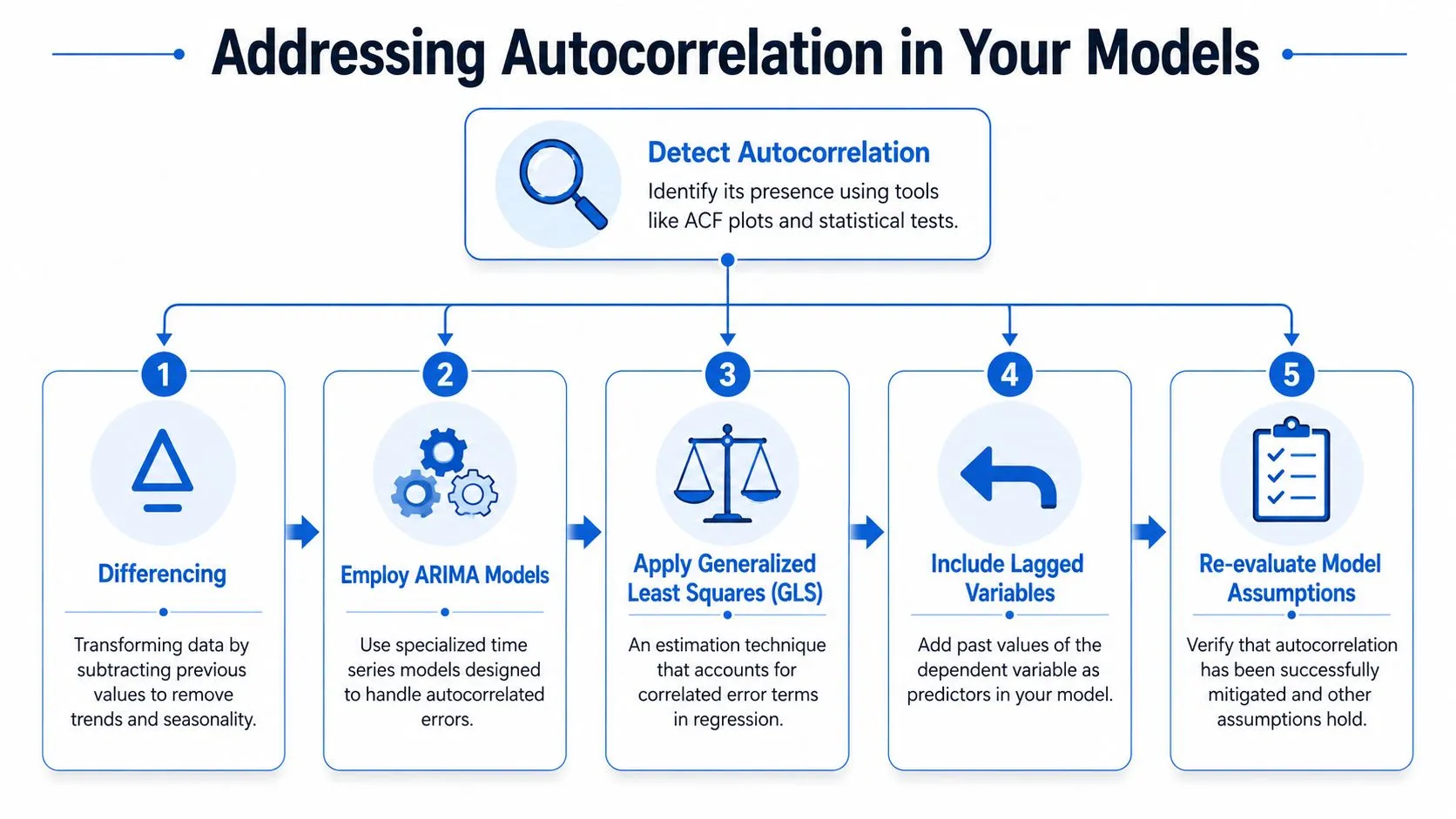
One of the most practical tools is differencing. Instead of modeling the level of a series, you model the change from one period to the next. That can strip out smooth trends and make persistence easier to handle.
For example, if weekly revenue keeps drifting upward, the raw series may show strong autocorrelation because the level is changing over time. The differenced series asks a more focused question: how much did revenue change since the last period?
That shift often makes the problem easier to model, not because the business became simpler, but because the analysis stopped mixing level, trend, and dependence into one signal.
Choose the remedy that matches the problem
Different situations call for different responses.
- Use differencing when the series has trend-like persistence and you care about changes more than absolute level.
- Use ARIMA or related time-series models when the data clearly contains lag structure and forecasting is the goal.
- Include lagged variables when past values are part of the mechanism you're modeling, such as retention, usage habit, or backlog carryover.
- Use generalized least squares when correlation in the errors is the central issue in a regression framework.
- Use standard errors such as Newey-West when you mainly need more reliable inference rather than a new forecasting model.
If you work in Python, this is one of those topics where code helps because you can inspect the raw series, create lagged variables, difference the data, and compare residual diagnostics in one workflow. A practical starting point is this guide to time series analysis in Python.
A simple decision lens can keep teams from overcomplicating the problem:
- If the chart shows trend or seasonality, transform the series first.
- If the business process clearly has memory, use a model that represents that memory.
- If you need trustworthy confidence intervals from regression, adjust the errors when appropriate.
- If residuals still show structure after all that, the model still doesn't match the process.
The biggest mistake is pretending autocorrelation is a nuisance to “clean up” mechanically. Sometimes it's the most interesting part of the system. Habit loops, demand carryover, delayed responses, and operational persistence are not defects in the data. They're features of the business.
That changes the analyst's job. You're not just removing noise. You're deciding whether the memory in the series is a problem to correct for, or a signal to model directly.
Key Takeaways for Data and Product Teams
Autocorrelation matters because business metrics unfold through time, and time creates dependence. Yesterday often leaks into today. If you ignore that, you can overstate certainty, misread momentum, and trust models that haven't earned it.
For data analysts, the practical habit is straightforward. Run a time-series diagnostic before you start interpreting a trend as evidence. Look at the series. Check the ACF. Test residuals when the model matters.
For product leaders, the key question is just as simple. Before you act on a smooth trend line, ask whether the team checked for time-based dependence.
A short working checklist helps:
- Visualize the raw series: Look for runs, cycles, and slow-fading shocks.
- Inspect autocorrelation: Use ACF, and PACF when model structure matters.
- Test formally when stakes are high: Especially for regression residuals and production forecasts.
- Choose the response deliberately: Transform, model, or adjust inference based on the business question.
Autocorrelation isn't an academic side quest. It's part of reading metrics accurately.
If your team is spending too much time manually pulling, checking, and reworking time-series analysis in notebooks and dashboards, Querio helps you build a more reliable self-serve analytics workflow directly on top of your data warehouse. It gives teams a faster way to explore metrics, test assumptions, and move from ad hoc questions to reusable analysis without turning your data team into a bottleneck.