10 Key Data Quality Metrics Examples to Master in 2026
Discover 10 essential data quality metrics examples with formulas, tools, and actionable tips to improve accuracy, completeness, and trust in your analytics.
https://www.youtube.com/watch?v=Jar5Rr_7TOU
published
Outrank AI
data quality metrics examples, data quality, data governance, business intelligence, data analytics
95f2152a-77f4-488b-9f8d-e8e16e796f0c

In a data-driven organization, decisions live and die by the quality of the information behind them. Poor data quality isn't just a technical problem; it's a business crisis waiting to happen. Inaccurate reports, unreliable AI insights, and misguided strategies all stem from foundational data issues. But how do you systematically measure and improve data quality? It starts with defining the right metrics.
This guide breaks down 10 crucial data quality metrics examples, providing not just definitions, but actionable formulas, real-world scenarios, and team-specific applications for Product, Data, Ops, and Finance. We will explore how to measure each dimension, set meaningful thresholds, and use modern tools to turn data quality monitoring from a reactive chore into a proactive, competitive advantage.
The need for verifiable, high-quality data is growing, especially as businesses navigate complex regulatory landscapes. For instance, the complexity of regulations such as the Corporate Sustainability Reporting Directive (CSRD) emphasizes how the integrity of CSRD and ESG Data Collection directly impacts strategic decisions and reporting accuracy. This principle applies across all business functions, from finance to product development.
By the end of this article, you will have a practical framework to build trust in your data and empower every team to make decisions with confidence. We'll cover metrics including:
Completeness
Accuracy
Consistency
Timeliness
Validity
Uniqueness
Conformity
Integrity
Provenance & Lineage
Statistical Distribution & Outlier Detection
1. Completeness
Data completeness is a foundational metric that measures the extent to which all required data is present in a dataset. It quantifies the percentage of non-null values for a given field or record, directly answering the question: "Is the data we expect to be here actually here?" Low completeness can invalidate analyses, skew machine learning models, and lead to poor business decisions.

This metric is essential because missing data creates blind spots. An e-commerce platform with 15% of customer records missing phone numbers, for instance, cannot effectively run SMS marketing campaigns or provide phone support to that segment. Similarly, incomplete product usage data prevents product managers from accurately assessing feature adoption.
How to Measure Completeness
The formula for completeness is straightforward, making it one of the most accessible data quality metrics examples to implement.
Formula: Completeness % = (Number of Non-Null Values / Total Number of Records) * 100
For instance, if a customer_signups table has 10,000 rows and the phone_number column has 8,500 populated values, the completeness is 85%.
Strategic Application by Team
Product Teams: A B2B SaaS company tracks a
company_sizefield for new sign-ups. If completeness drops from 95% to 70%, it signals a potential issue with the sign-up form's UX or an API integration, preventing effective user segmentation.Data Teams: Data engineers monitor completeness at ingestion to validate upstream sources. A sudden drop in a critical field like
transaction_idfrom a payment gateway triggers an immediate alert, preventing corrupted data from entering the data warehouse.Finance Teams: An FP&A analyst requires
department_codefor all expense reports. A completeness score below 99% halts budget allocation reports, as uncategorized expenses cannot be accurately assigned, impacting financial forecasting.
Key Takeaway: Prioritize completeness based on criticality. A missing
user_idis a system-breaking issue deserving a 99.9%+ threshold, while a missingreferral_sourcemight be less critical and can tolerate a 90% threshold. This tiered approach focuses resources where they matter most.
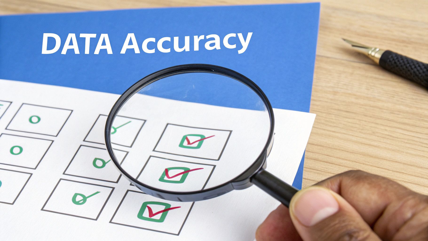
2. Accuracy
Data accuracy measures how well data reflects real-world events or objects it is intended to represent. It directly answers the question: "Is this data correct?" Inaccurate data is particularly dangerous because it can appear complete and valid while leading to fundamentally flawed conclusions, misguided strategies, and significant financial miscalculations.
This metric is critical because decisions made on incorrect information are almost guaranteed to be wrong. For instance, a finance team relying on revenue figures inflated by 12% due to duplicate invoice records will make inaccurate forecasts and poor capital allocation decisions. Likewise, an operations team using misclassified product category codes will struggle with inventory management and supply chain logistics.
How to Measure Accuracy
Measuring accuracy often requires comparing the dataset against a trusted "source of truth," which could be an external system, a manually verified sample, or a set of business rules.
Formula: Accuracy % = (Number of Correct Values / Total Number of Values) * 100
To apply this, one might cross-reference customer addresses in a CRM with a verified postal service database. If 9,800 out of 10,000 addresses match, the accuracy is 98%.
Strategic Application by Team
Product Teams: A product manager discovers that customer acquisition dates are off by several months due to a timestamp conversion bug between UTC and local time zones. This inaccuracy completely invalidates cohort analysis, making it impossible to correctly measure user retention or the impact of feature releases.
Data Teams: Data engineers implement validation rules that check if a
country_codein the users table matches the country derived from the user's IP address. This cross-validation helps identify data entry errors or VPN usage, ensuring more reliable geographic segmentation for marketing and product localization.Operations Teams: An e-commerce operations team finds that 15% of
product_weightentries are incorrect, leading to major shipping cost overruns. They implement an accuracy check by comparing recorded weights against the official manufacturer's specifications, triggering alerts for any discrepancies. Improving data accuracy is a key step in analytics, and AI-powered tools are emerging to make this process more efficient. Learn more about how AI can enhance data accuracy in your analytics workflows.
Key Takeaway: Implement accuracy checks at the point of data entry and ingestion. It is far more efficient to prevent incorrect data from entering your systems than it is to find and correct it later. Use validation rules, dropdowns, and automated cross-referencing to maintain high accuracy from the start.
3. Consistency
Data consistency ensures that data representing the same real-world entity is uniform and synchronized across all systems and datasets within an organization. It addresses the question: "Does the same piece of information, like a customer status or revenue figure, mean the same thing everywhere?" Inconsistencies create distrust in data and lead to conflicting reports, undermining cross-functional decision-making.
This metric is critical for creating a unified business view. For example, if the finance team calculates Monthly Recurring Revenue (MRR) based on invoiced accounts while the product team calculates it based on active subscriptions, their resulting figures will never match. This discrepancy forces teams into unproductive reconciliation meetings instead of focusing on strategic growth, making consistency a cornerstone of reliable analytics.
How to Measure Consistency
Measuring consistency often involves comparing datasets or validating data against a "golden record" or a single source of truth (SSOT). The formula assesses the alignment between different representations of the same data.
Formula: Consistency % = (Number of Records Consistent with SSOT / Total Number of Records) * 100
For example, if a master_customer table is the SSOT and you find that only 9,200 out of 10,000 customer records in the CRM have matching account_status values, the consistency is 92%.
Strategic Application by Team
Product Teams: A product manager notices that user engagement reports from the analytics tool show 5,000 daily active users, while the backend database logs suggest 5,500. This inconsistency signals a potential tracking bug or a difference in how "active user" is defined, preventing an accurate assessment of feature adoption.
Data Teams: Data engineers build a test to compare
customer_idformats between the sales CRM and the marketing automation platform. If the CRM uses an integer ID and the marketing tool uses an alphanumeric string, the inconsistency breaks data joins and prevents the creation of a 360-degree customer view.Finance Teams: A finance analyst compares revenue data from the payment gateway with revenue recognized in the accounting software. A consistency score below 99.5% triggers an audit, as mismatched
transaction_datesorcustomer_names('John Smith' vs. 'J. Smith') can lead to significant compliance risks and inaccurate financial statements.
Key Takeaway: Establish and enforce a single source of truth (SSOT) for critical business entities like customers, products, and revenue. Use data lineage tools to trace inconsistencies back to their source and implement consistent naming conventions across all departments to prevent data conflicts before they start.
4. Timeliness
Timeliness measures how current your data is relative to when it was generated and when you need it for decision-making. It evaluates data latency, or the delay between a real-world event and that event being recorded in your systems. In a fast-paced environment, stale data is often wrong data, leading to missed opportunities and flawed strategies.
This metric is critical because business doesn't wait for batch jobs to finish. An operations team relying on inventory data that is six hours old might sell products it no longer has in stock, leading to customer frustration and logistical chaos. Similarly, a finance team can't close the books if revenue data from a payment processor takes 48 hours to populate after a transaction occurs.
How to Measure Timeliness
Timeliness is measured by calculating the time difference between an event's occurrence and its availability in the target system. This is often tracked as data latency.
Formula: Data Latency = Timestamp of Data Availability - Timestamp of Event Occurrence
For example, if a customer completes a purchase at 14:00:00 UTC and the transaction record appears in the analytics database at 14:05:30 UTC, the data latency is 5 minutes and 30 seconds.
Strategic Application by Team
Operations Teams: A logistics company tracks delivery truck locations. If the GPS data latency exceeds five minutes, the dispatch system cannot re-route drivers effectively to avoid traffic, directly impacting fuel costs and delivery times. The threshold for this data is extremely low.
Data Teams: Data engineers monitor the end-to-end latency of critical ETL/ELT pipelines. A spike in the
customer_eventspipeline from a 15-minute average to a 2-hour average triggers an alert, as it delays data needed for fraud detection and user engagement models.Product Teams: A growth team runs A/B tests on a mobile app. They require user interaction data with a latency of less than one hour to make rapid decisions on test variants. If data is 24 hours late, they lose a full day of optimization, slowing down product improvements. How AI can accelerate this process is a key consideration; for those interested, learn more about how AI enhances real-time KPI monitoring on querio.ai.
Key Takeaway: Define timeliness requirements based on the decision cycle. Operational alerts need real-time data (sub-minute latency), daily stand-ups require hourly freshness, and monthly strategic reviews can use daily-batched data. Not all data needs to be instantaneous; align your data pipeline investments with the business impact of the delay.
5. Validity
Data validity ensures that data values conform to a predefined set of rules, formats, and ranges. This metric answers the question: "Does this data make sense in its given context?" For instance, it checks that an email field contains an "@" symbol, a date of birth is a real calendar date, and a customer age is a positive integer. Invalid data corrupts datasets, causes application errors, and derails analytics.
This metric acts as a crucial gatekeeper, preventing structurally flawed data from entering your systems. An e-commerce platform with a 20% invalid email rate will see its marketing campaigns suffer from high bounce rates and wasted spend. Likewise, an analytics dashboard can crash if an age field, expected to be numeric, contains text strings.
How to Measure Validity
Measuring validity involves checking data against a set of defined rules. This can range from simple format checks to complex, context-specific business logic.
Formula: Validity % = (Number of Conforming Records / Total Number of Records) * 100
For example, if you have a user_profiles table with 5,000 records and a country_code column that must be a 2-character ISO code, and 4,950 records meet this format, the validity is 99%.
Strategic Application by Team
Product Teams: A mobile app requires users to input their date of birth. The product team sets a validity rule that the date must be in
YYYY-MM-DDformat and cannot be a future date. A low validity score indicates a bug in the UI component or a faulty API, preventing accurate age-based user segmentation.Data Teams: Data engineers implement schema validation rules (e.g., JSON Schema, SQL constraints) at the point of ingestion. If a data source starts sending
order_statusas a free-text field instead of one of the five accepted values ('PENDING','SHIPPED', etc.), the invalid records are rejected or quarantined, protecting downstream analytics.Operations Teams: An operations analyst relies on a
priorityfield in a support ticketing system, which must beP1,P2, orP3. If validity drops, it signifies an integration issue or a manual entry error, making it impossible to correctly route high-priority tickets and violating SLAs.
Key Takeaway: Implement validation as far upstream as possible, ideally at the point of data entry. Enforcing rules in the application's user interface or at the initial API endpoint prevents invalid data from ever contaminating your data warehouse, saving significant cleanup effort later.
6. Uniqueness
Uniqueness is a critical metric that measures the absence of duplicate records in a dataset. It answers the question: "Is every record that should be a single, distinct entity actually represented that way?" Unwanted duplicates inflate counts, skew analytics, and can lead to operational waste, such as sending multiple marketing emails to the same person.
This metric is vital for maintaining an accurate single source of truth. For example, if a customer signs up with john.smith@example.com and later with J.Smith@example.com, treating them as two separate users corrupts churn analysis and inflates customer acquisition metrics. Similarly, revenue analytics can be overstated if duplicate order records are created due to failed transaction retries.
How to Measure Uniqueness
Uniqueness is typically calculated by identifying the number of distinct values relative to the total number of records for a specific identifier.
Formula: Uniqueness % = (Number of Distinct Values / Total Number of Records) * 100
If a customers table has 5,000 rows but only 4,950 distinct customer_id values, the uniqueness score is 99%, indicating 50 duplicate entries.
Strategic Application by Team
Marketing Teams: A marketing operations manager relies on a unique list of emails for a campaign. If the uniqueness of the
emailfield is only 90% in a list of 100,000 contacts, it means 10,000 duplicate emails could be sent, wasting budget and harming brand reputation.Data Teams: Data engineers enforce primary key constraints on tables like
ordersorusersto ensureorder_idoruser_idis always 100% unique at the database level. They also build deduplication logic to merge entities that are conceptually the same but have different identifiers.Finance Teams: A finance team analyzing recurring revenue will see skewed metrics if a single subscription is represented by multiple
subscription_ids. A uniqueness score below 100% on this key field triggers an investigation to consolidate records and correct historical revenue reports.
Key Takeaway: Uniqueness rules must be defined by entity. A
customer_idshould be 100% unique, but azip_codewill naturally have duplicates. Use exact matching for primary keys and fuzzy matching algorithms for fields like names or addresses to identify and merge conceptual duplicates.
7. Conformity
Data conformity, also known as schema adherence, measures whether data aligns with a predefined format, structure, and set of rules. It answers the question: "Does this data follow the required pattern?" This metric is crucial for maintaining standardization across the entire data ecosystem, ensuring that data is predictable, interoperable, and interpretable for both humans and machines.
Without conformity, data integration and analysis become chaotic. Imagine a global sales team where the North American division enters dates as MM-DD-YYYY and the European division uses DD-MM-YYYY. This lack of a standard format would break any automated reporting system, requiring manual data cleaning and introducing a high risk of error. Conformity ensures that all parts of the organization speak the same data language.
How to Measure Conformity
Conformity is typically measured by validating data against a set of rules or a schema and calculating the percentage of records that pass.
Formula: Conformity % = (Number of Conforming Records / Total Number of Records) * 100
For example, if a phone_number field must follow the (###) ###-#### format, and 9,850 out of 10,000 records adhere to this pattern, the conformity score is 98.5%.
Strategic Application by Team
Data Teams: Data engineers enforce schema conformity on data ingestion pipelines. If a marketing automation platform suddenly starts sending
user_emailin all caps instead of the required lowercase, a conformity check fails, preventing non-standard data from corrupting the customer-360 view in the data warehouse.Operations Teams: An operations manager requires all
statusfields in the order management system to be one of three approved values:'Pending','Shipped', or'Delivered'. A conformity metric below 100% triggers an investigation into the source application, as rogue values like'In_Transit'could break logistics and fulfillment workflows.Compliance Teams: A healthcare provider must ensure that all patient records containing Protected Health Information (PHI) have specific fields anonymized according to HIPAA standards. A conformity check validates that these fields match a "masked" or "hashed" pattern, ensuring regulatory compliance and preventing data breaches.
Key Takeaway: Use conformity as a gatekeeper. Implement automated schema validation and business rule checks at the point of data entry or ingestion. This proactive approach prevents "bad" data from ever entering your core systems, saving countless hours of downstream data cleaning and reconciliation.
8. Integrity
Data integrity is a structural metric that ensures all data relationships and dependencies are correctly maintained across the entire data ecosystem. It verifies that logical constraints are satisfied, such as ensuring a foreign key in one table correctly points to an existing primary key in another. This metric answers the critical question: "Are the connections between our data points valid and unbroken?"
Without integrity, analytics break down. For example, a revenue report is useless if it includes sales from order_ids linked to product_ids that no longer exist in the products table. This issue, known as an orphaned record, can lead to incorrect financial statements, flawed inventory management, and a fundamental lack of trust in the data.
How to Measure Integrity
Measuring integrity often involves running validation checks to find orphaned records or constraint violations. It’s less of a single formula and more of a validation success rate.
Formula: Integrity % = (Number of Validly Related Records / Total Number of Records) * 100
For example, if an orders table has 50,000 records, but 500 of them reference a customer_id that has been deleted from the customers table, the integrity score is 99%.
Strategic Application by Team
Data Teams: Data engineers enforce foreign key constraints at the database level to prevent orphaned records from being created. They schedule regular audits to scan for any existing relationship failures, especially after large data migrations or deletions.
Product Teams: A product manager analyzing user behavior finds that a churn analysis is unreliable because the
eventstable containsuser_ids that point to deleted user records. Enforcing integrity ensures that analytics only include data from active, valid entities.Finance Teams: A finance analyst’s quarterly report fails because an
invoicestable links tosubscription_plan_ids that have been deprecated without a proper migration path. Maintaining integrity ensures historical financial data remains accurate and reportable. For instance, platforms like Querio rely on this integrity to ensure that when it joins customer, order, and product data, all relationships are valid to produce correct results. You can learn more about how foundational data quality powers advanced analytics in our article on semantic layers and data quality.
Key Takeaway: Implement cascade rules (
ON DELETE CASCADEorON DELETE SET NULL) carefully within your database schema. These rules automate integrity management by defining what happens to related records when a parent record is deleted, preventing orphaned data from the outset.
9. Provenance & Lineage
Data provenance and lineage track the origin, history, and transformation journey of data. It answers critical questions like: "Where did this data come from?", "What changes were made to it?", and "Who made those changes?" This creates a verifiable audit trail, which builds trust, accelerates root cause analysis, and ensures regulatory compliance.
In essence, provenance provides the pedigree of your data. Without it, a sudden spike in revenue could be misinterpreted as business growth when it was actually a data correction. Strong lineage documentation prevents these erroneous conclusions by making the entire data lifecycle transparent and auditable. It's a key component of a robust data quality metrics examples framework.
How to Measure Provenance & Lineage
Unlike a simple formula, provenance is measured by the completeness and accessibility of its documentation. The goal is to create a clear, traceable map from source to consumption for critical data assets.
Metrics:
Lineage Completeness %: The percentage of critical data assets with fully documented end-to-end lineage.
Time to Root Cause: The time it takes for a data team to identify the source of a data quality issue using lineage graphs.
For example, a data team might aim for 95% lineage completeness for all tables powering executive dashboards.
Strategic Application by Team
Data Teams: An engineer discovers customer data is missing in the warehouse. Using a lineage tool, they quickly trace the issue back to a specific API endpoint that failed six hours prior, dramatically reducing the time needed to diagnose and resolve the problem.
Finance Teams: An FP&A analyst notices a sudden 10% increase in reported Monthly Recurring Revenue (MRR). By reviewing the data's provenance, they see the data engineering team applied a backdated correction to properly classify a set of subscriptions the day before, preventing them from reporting phantom growth to stakeholders.
Compliance Teams: During an audit, regulators request proof of how customer consent data is handled. The team presents a complete lineage graph showing exactly where the data is sourced, how it's stored, and which processes access it, satisfying audit requirements in hours instead of weeks.
Key Takeaway: Automate lineage documentation wherever possible. Modern ETL/ELT tools (like dbt) and metadata management platforms (like Collibra or Alation) can automatically generate and visualize lineage, turning a manual documentation nightmare into an automated, strategic asset.
10. Statistical Distribution & Outlier Detection
This metric uses statistical analysis to identify when data values deviate significantly from expected distributions or historical patterns. It detects anomalies, outliers, and unusual patterns that may indicate data quality issues, fraud, or genuine business changes. Rather than checking against a fixed rule, it separates legitimate spikes from data errors by understanding what is "normal" for a dataset.

Statistical distribution monitoring is critical for catching silent, unexpected data failures that other metrics might miss. For example, a finance team identifying a sudden drop in average order value before it cascades into real business impact can investigate the root cause, such as a faulty checkout API, preventing significant revenue loss. It moves data quality from being reactive to proactive.
How to Measure Statistical Distribution
This is less about a single formula and more about applying statistical models to identify data points that fall outside an expected range. Common methods include Z-score, Interquartile Range (IQR), and moving averages.
Example Method (Z-Score): Z-Score = (Data Point - Mean) / Standard Deviation
A Z-score above a certain threshold (e.g., 3 or -3) indicates an outlier. The key is to define what constitutes a "significant" deviation based on historical data and business context. You can learn more about how to leverage AI for anomaly detection in BI dashboards.
Strategic Application by Team
Product Teams: A product manager notices a spike in user sign-up dates all recorded as "January 1, 1970." Anomaly detection flags this as a statistically impossible cluster, revealing a timestamp bug in the logging system that was corrupting user cohort data.
Data Teams: Data engineers implement outlier detection on data pipeline volumes. When the number of
nullvalues in theshipping_addressfield spikes by 10x overnight, an automated alert is triggered, allowing them to fix a failed data transformation job before it impacts fulfillment.Operations Teams: An operations analyst monitoring inventory levels sees a sudden 500% increase in a specific SKU being marked as "out of stock." The outlier alert prompts an investigation that uncovers a faulty sensor in one warehouse, preventing a stockout crisis.
Key Takeaway: Set anomaly thresholds based on business impact, not just statistical significance. A minor deviation in a non-critical metric can be ignored, but a 5% shift in a core revenue metric should trigger an immediate high-priority alert. This context-driven approach ensures your team focuses on genuinely impactful data quality issues.
Comparison of 10 Data Quality Metrics
Metric | 🔄 Implementation Complexity | ⚡ Resource Requirements | ⭐ Expected Effectiveness | 📊 Expected Outcomes | 💡 Ideal Use Cases / Tips |
|---|---|---|---|---|---|
Completeness | Low — simple presence checks | Low — automated at ingestion | ⭐⭐⭐⭐ — critical for coverage | Higher query reliability; fewer blind spots | Automate completeness checks; set field targets |
Accuracy | Medium — validation & external checks | Medium–High — external sources, audits | ⭐⭐⭐⭐⭐ — prevents bad decisions | Trustworthy analytics; fewer incorrect insights | Build business rules; periodic external audits |
Consistency | Medium–High — cross-system alignment | Medium — governance & mapping tools | ⭐⭐⭐⭐ — enables cross-team alignment | Aligned KPIs across teams; fewer conflicts | Establish SSOT & naming conventions |
Timeliness | Medium — pipeline design & scheduling | Medium–High — streaming/ETL infra | ⭐⭐⭐⭐ — boosts decision velocity | Fresher metrics; faster operational responses | Define refresh SLAs by use case (hourly/daily) |
Validity | Low — schema & format validation | Low — validation libraries/schemas | ⭐⭐⭐⭐ — prevents downstream errors | Fewer processing failures; cleaner inputs | Enforce schemas (JSON Schema, DB constraints) |
Uniqueness | Medium — dedupe & fuzzy matching | Medium — compute for fuzzy algorithms | ⭐⭐⭐⭐ — avoids metric inflation | Accurate counts; correct customer 360s | Define uniqueness rules; use PKs + fuzzy match |
Conformity | Medium — governance & standards | Medium — cataloging & enforcement | ⭐⭐⭐ — standardizes interpretation | Reusable data; regulatory alignment | Create data dictionaries; governance council |
Integrity | Medium–High — relational constraints | Medium — DB constraints & audits | ⭐⭐⭐⭐⭐ — ensures reliable joins | Correct multi-table analytics; fewer broken joins | Enforce foreign keys; audit orphaned records |
Provenance & Lineage | High — instrumentation & metadata | High — lineage tools & storage | ⭐⭐⭐⭐ — enables root-cause & trust | Transparent audit trails; faster debugging | Implement lineage in ETL (dbt, metadata tools) |
Statistical Distribution & Outlier Detection | High — modeling & tuning | High — historical data + ML resources | ⭐⭐⭐⭐ — proactive anomaly detection | Early issue alerts; distinguish errors vs events | Use multiple methods; tune thresholds; feedback loops |
From Metrics to Mastery: Building a Culture of Data Quality
We've explored a comprehensive set of ten critical data quality metrics examples, from the foundational pillars of Completeness and Accuracy to the more nuanced dimensions of Provenance and Integrity. Understanding the definitions, formulas, and applications for each is the essential first step. However, true mastery lies not in knowing these metrics, but in embedding them into the very fabric of your organization's operations and culture.
The journey from awareness to mastery is a strategic one. It's not about implementing all ten metrics at once; that's a recipe for overwhelming your teams and achieving very little. The key is to transform these abstract concepts into tangible, automated, and visible components of your daily workflow. This process turns data quality from a reactive, fire-fighting exercise into a proactive, strategic advantage that underpins every decision.
Translating Knowledge into Actionable Strategy
The real value of these data quality metrics examples emerges when you connect them directly to business outcomes. A dip in the Timeliness of sales data isn't just a technical issue; it's a direct inhibitor to your sales team's ability to act on fresh leads. Similarly, poor Uniqueness in your customer database doesn't just create messy records; it inflates marketing costs and skews customer lifetime value calculations.
To begin this transition, follow a prioritized and iterative approach:
Identify the Core Business Pain: Start by isolating the most significant data-related friction in your company. Is the finance team spending weeks reconciling inconsistent revenue figures? Focus on Consistency and Accuracy. Is the product team struggling with unreliable user engagement data? Prioritize Completeness and Validity.
Select a Pilot Metric: Choose one or two metrics that directly address that core pain point. Don't boil the ocean. Your goal is to score an early, visible win that demonstrates the value of this initiative.
Establish Clear Ownership: Assign a clear owner for each metric. While data quality is a shared responsibility, accountability drives action. For example, the Head of Data might own the overall framework, but a Product Manager is responsible for the Completeness of event tracking for a new feature.
Strategic Takeaway: The goal isn't just to measure data quality; it's to create a direct feedback loop between the health of your data and the performance of your business. Frame every metric in the context of a business question or operational bottleneck.
Building a System, Not Just a Dashboard
A static report on data quality is useful, but a dynamic, integrated system is transformational. The ultimate objective is to build a culture where data trust is the default state. This requires visibility, automation, and shared accountability.
Automate and Alert: Manual spot-checks are unsustainable. Use data quality tools and dbt tests to automate the measurement of your chosen metrics. Configure alerts that notify the appropriate teams before poor data propagates through downstream systems like your BI platform or CRM.
Visualize Everything: Create a dedicated data quality dashboard that is accessible to everyone in the company. This transparency demystifies data issues and fosters a collective sense of ownership. When the marketing team can see how their UTM tagging practices impact Conformity metrics, they become active participants in the solution.
Integrate into Workflows: Embed data quality checks directly into your data production pipelines. For instance, implement schema validation (Validity) before new data is loaded into your warehouse. This prevents errors at the source rather than cleaning them up later at a much higher cost.
By moving beyond the theoretical understanding of data quality metrics examples and into this system of continuous monitoring and cultural integration, you empower every team. Your operations teams can trust their automation, your finance team can close the books with confidence, and your product team can make high-stakes decisions based on data they know is reliable. This foundation of trust is what unlocks true self-serve analytics and accelerates your entire organization. The journey begins with one metric, but it leads to a complete transformation in how your company leverages its most valuable asset: its data.
Ready to move from manual checks to automated trust? Monitoring these metrics is the first step, but empowering your team to explore trusted data is the ultimate goal. Querio provides an AI-powered analytics platform that allows anyone on your team to ask questions in plain English and get answers from your data in seconds, all while being built on a foundation that respects data quality and governance. See how you can accelerate decision-making by visiting Querio today.

