How to Turn a Plain-English Question into a Live Dashboard
Map plain-English questions to governed metrics, generate inspectable SQL, validate logic, and publish live, auto-refreshing dashboards.
You can go from a question like “Why did revenue drop last week?” to a live dashboard in minutes - if your metrics, filters, and data rules are already defined. The short version is simple: map the question to one metric, one date range, and a small set of filters; generate SQL or Python against your warehouse; review the logic; then save the result as dashboard tiles that auto-refresh.
Here’s the core idea in plain English:
I start with a clear metric such as revenue, signups, or churn
I lock the scope so everyone is looking at the same data
I set the time grain like daily, weekly, or monthly
I apply filters such as region, segment, or plan tier
I review the generated query before anything goes live
I build the dashboard in the order people use it: answer, trend, driver, detail
I keep every tile tied to the same metric definitions and access rules
A good dashboard for this kind of question usually includes:
A KPI card for the headline number, like $3.4M
A week-over-week change, like -8.2%
A trend chart for the last 4–12 weeks
A breakdown by region, product, or segment
A detail table for record-level checks
Shared filters and a visible Last refreshed time, such as 08/04/2026 10:15 AM PT
The big point: AI can write the first draft of the analysis, but I still need governed metrics, checked joins, and row-level access rules so sales, finance, and product all see the same number.
If I had to sum up the whole workflow in one line, it would be this: turn plain English into governed query logic, check it, and publish it as a live dashboard that stays in sync with the warehouse.
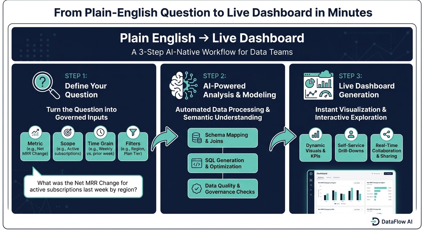
Plain English to Live Dashboard: 3-Step AI-Native Workflow
Step 1: Turn the question into metrics, dimensions, and filters
Start by turning each plain-English question into four clear inputs: metric, scope, time grain, and filters. If even one of those is fuzzy, the dashboard can drift and people stop trusting it.
Break the prompt down into metric, scope, and time grain
Take Why did revenue drop last week? On a B2B SaaS team, revenue needs one fixed definition, like net MRR change. And last week shouldn't stay vague. It should map to an exact date range plus a comparison period, like the prior week.
Now look at How are enterprise signups trending by region? That needs a different breakdown. Signups should point to a specific event, such as new enterprise accounts created. Enterprise should map to one rule, such as an account_tier = 'Enterprise' filter. Trending means a weekly or monthly series across a set window. And region should come from one standard region dimension, such as sales region.
Question component | "Revenue drop" example | "Enterprise signups" example |
|---|---|---|
Metric | Net MRR change (USD) | New enterprise accounts per week |
Scope | Active subscriptions excluding tests |
|
Time grain | Weekly, compared with prior week | Weekly, last 12 weeks |
Dimensions | Sales region, plan type, customer segment | Sales region |
Filters | Exclude test accounts and internal usage | Exclude test accounts, internal domains, and cancelled signups |
Once the question is split into governed parts, the query can be generated without guesswork.
Use a semantic layer to keep metric definitions consistent
Keep metric logic in a semantic layer so MRR, ARR, NRR, churn, and ARPU carry the same meaning everywhere. In dbt, define measures once with clear aggregation rules and filters. In LookML, centralize measures and derived tables so each explore runs on the same logic. In Querio, the context layer stores joins, metric labels, and business definitions once so generated analysis stays governed.
With the definition locked, every chart and filter can reuse the same metric logic.
Confirm source tables and access rules
Before anything goes live, confirm which warehouse tables power the metric, the dimensions, and the filters. For revenue and churn, that usually means starting with subscriptions and invoices.
In dbt, these often appear as cleaned models like dim_accounts, fct_subscriptions, and fct_invoices, where deduplication, standardized keys, and business rules have already been applied. Test key fields. Reconcile totals to finance. Standardize currency and timezone handling. Set row-level security at this stage so region and account access apply on their own.
With data sources and permissions checked, the next move is to generate a query the warehouse can run.
Step 2: Generate the query and choose the right visuals
Once the metric is set, the next job is simple in theory but easy to mess up in practice: turn the prompt into a warehouse query, then pair it with the right chart.
Translate the prompt into inspectable SQL or Python
An AI assistant takes each part of a plain-English prompt and maps it to actual tables, columns, joins, and filters. For example, "Enterprise signups" becomes WHERE accounts.account_tier = 'Enterprise'. "By region" maps to accounts.billing_region. "Trending weekly" means a DATE_TRUNC('week', event_date) group-by. So, "How are enterprise signups trending by region?" turns into a weekly count by region using governed account rules. This mapping relies on building a semantic layer that codifies business logic into the data model. It relies on predefined joins, not guesswork.
This part matters because Snowflake, Redshift, BigQuery, and Postgres all handle dates a bit differently. The SQL needs to match the warehouse dialect. And the output should stay visible. In Querio, AI output remains editable in SQL and Python cells inside a reactive notebook. That means an analyst can change COUNT(*) to COUNT(DISTINCT accounts.account_id) and see the result update right away.
Validate the logic before saving anything
Before a query becomes a dashboard tile, check the logic. AI-generated SQL is fast. It still needs a human review before the dashboard goes live.
Start with the date range. Make sure "last week" maps to the right calendar week or business week in the WHERE clause. Then check the join type. An inner join between events and accounts can quietly remove any event where the account record is missing, so a left join may be the better choice. After that, confirm that the metric formula matches the governed definition: SUM(net_amount) in USD, excluding refunds and taxes, not gross invoice totals. Then spot-check a few known accounts or time periods against a trusted report.
One quick sanity check helps a lot: compare row counts between the dashboard output and the source table. If the source shows 500 rows for the period but the dashboard shows 480, a join key mismatch is likely dropping records without any warning.
Match each question to the right chart type
Pick visuals for clarity, not for show.
Question type | Best visual | Example display |
|---|---|---|
Trend over time | Line chart | Weekly enterprise signups by region, x-axis: week ending 07/31/2026 |
Category comparison | Bar chart | Revenue by region last week, bars labeled |
Headline metric | KPI card | Total revenue: |
Record-level detail | Table | Account name, region, invoice date ( |
Take "Why did revenue drop last week?" as an example. Start with a KPI card showing $3.4M and the -8.2% week-over-week change. Then add a line chart for the last 12 weeks so people can see the drop in context. After that, use a bar chart to break revenue down by region and product line, which makes it easier to see where the decline is concentrated. A sortable table at the bottom gives analysts the record-level detail they need to dig into specific cases.
In most business dashboards, line charts, bar charts, tables, and KPI cards do the job well.
Once the query and visual are checked, package them into governed tiles with refresh, filters, and drill-downs.
Step 3: Build a live dashboard with governance and self-serve controls
Once the query clears review, turn it into a dashboard that answers the business question in the right order. The goal is simple: show the answer first, then show the trend, then show the drivers, then let people inspect the details.
Organize tiles around the original business question
Put the answer in the top row.
If the question is "Why did revenue drop last week?", start with three to five KPI tiles. That usually includes:
Revenue for the last 7 days
Week-over-week change, such as
-8.2%Enterprise vs. SMB share
Right below that, add a line chart for daily revenue over the past 4–8 weeks. Make last week stand out visually so the drop is obvious at a glance.
The next rows should explain why the number moved. A horizontal bar chart can break revenue out by region, like US West, US East, and EMEA. A grouped bar chart can show the plan-tier split across Standard, Pro, and Enterprise. At the bottom, add a sortable detail table with account name, region, plan, revenue in USD, such as $120,500.00, and key usage metrics for every record in the selected period.
That flow matters. Teams usually investigate in this order: answer, trend, driver, detail.
Set live refresh, filters, and drill-down paths
Global filters for date range, customer segment, region, and plan tier should update every tile at the same time. So if a sales manager picks Enterprise and US West, every chart and table should change together.
Tile-level filters are for tighter cuts. For example, you might filter an acquisition chart by channel - web, partner, or direct - without changing the revenue tiles.
Each tile should run SQL against the warehouse through a live, read-only connection. No CSV exports. No manual refreshes. Set the dashboard to refresh after each dbt job, and show a plain "Last refreshed" timestamp, like 08/04/2026 10:15 AM PT.
Drill-down paths need to stay tied to the same metric definitions. If someone clicks the US West bar, the next view should open a regional breakdown with the same date and segment filters already in place. Skip one-off SQL inside single tiles. Every drill step should use the same semantic layer, so Revenue always means SUM(net_amount_usd) net of refunds and discounts, no matter how far down someone drills.
Give business users self-serve access without losing control
After the dashboard goes live, self-serve use can't come at the cost of control. Use role-based access, row-level security, and the shared semantic layer so people can dig in without changing definitions or seeing data they shouldn't see.
For example, a regional sales manager should only see accounts in their own territory. That rule should be enforced at the query level, not just through dashboard setup.
In Querio, metrics like MRR, Active Users, and Enterprise Segment are defined once and reused across every dashboard, notebook, and AI-generated answer. When Enterprise changes, every dependent tile updates from that same definition. Each tile still shows its SQL or Python for inspection.
That gives non-technical users a clean, filter-driven interface, while data teams keep full visibility into the logic behind every number.
Where AI-native dashboard creation fits best
This workflow makes the most sense when your data team is small, your warehouse is already well modeled, and metric requests are piling up faster than the team can build them by hand.
The setup is pretty simple:
Clean warehouse models in Snowflake, BigQuery, Redshift, or Postgres
A dbt project that defines your golden metrics
Access rules mapped to warehouse roles
Without that base, the tool can't apply your business logic in a dependable way. And that's the tradeoff: use manual BI for one-off dashboard builds, or use an AI-native workflow when you want governed self-serve speed.
Manual BI workflow vs. AI-native, semantic-layer workflow
The table below focuses on the differences that matter most for a small B2B SaaS data team.
Step | Manual BI workflow | AI-native, semantic-layer workflow (Querio) |
|---|---|---|
Defining metrics | Defined in ad hoc SQL or modeling files; often duplicated across dashboards. | Defined once in a semantic layer; ARR, NRR, and active seat count are reusable, governed objects. |
Writing queries | Analysts hand-write SQL for each new question or variant. | AI translates plain-English questions into SQL or Python; queries are fully inspectable and editable. |
Building charts | Chart types, axes, and filters are configured manually per dashboard. | AI recommends chart types based on question intent and builds a working layout out of the box. |
Governance | Enforced through code review and BI-tool permissions; metric drift is a real risk as the team grows. | Centralized in the semantic layer; every AI-generated dashboard uses the same governed definitions. |
Time to first dashboard | Hours to weeks depending on modeling complexity and analyst availability. | Minutes for questions that fit existing semantic models. |
Data freshness | Often tied to ETL schedules or manual refresh triggers. | Live, read-only warehouse connections with no extracts or data duplication. |
Manual BI tools are still strong for curated, enterprise-scale reporting. But there's a clear gap: governed self-serve access to trusted metrics. Say a business user needs a slightly different slice of a governed metric today and doesn't want to file a ticket. That's the sweet spot for an AI-native, semantic-layer workflow.
Key takeaways for data leaders and analysts
The choice comes down to speed, governance, and how much of the workflow your team wants to assemble by hand.
When governed self-serve matters more than manual dashboard assembly, this approach works well: tie every question to a semantic layer, inspect the generated SQL before publishing, and publish live dashboards with refresh policies and row-level access enforced at the query level.
That gives your team speed without metric drift.
FAQs
What do I need in place before AI can build a trusted dashboard?
Before AI can build a dashboard your team can trust, you need the basics in place: solid data and clear governance.
Start by connecting your live warehouse - like Snowflake, BigQuery, or Redshift - with secure, read-only access. That gives the AI current data to work with instead of stale exports or one-off spreadsheets.
You’ll also need a governed semantic layer so metrics and joins stay consistent, role-based access control to protect sensitive data, and inspectable SQL or Python so your team can check every AI-generated chart.
How do I verify the generated SQL uses the right metric definition?
Inspect the underlying SQL to make sure it lines up with your metric definitions. Querio shows the SQL and Python behind every answer, so analysts can also copy that code into Snowflake, BigQuery, or Redshift to check the output for themselves.
If something looks off, review the query for missing joins, wrong filters, or logic applied the wrong way. Then check the semantic layer to confirm your metric formulas, table relationships, and glossary definitions match what you intended.
What should a live dashboard include to explain a metric change clearly?
A live dashboard should do two things at once: flag unusual changes on its own and let people dig into segments, regions, or cohorts right away. That way, users can spot what changed fast, then trace the reason without bouncing between tools.
It should also tie back to your governed semantic layer and show the underlying SQL or Python. That gives users a clear way to check the logic, spot edge cases, and confirm the results line up with the warehouse source.
Related Blog Posts