Choosing the Best Charting Library for React in 2026
Discover the best charting library for React. Our expert guide compares D3, Recharts, and Chart.js to help you make a data-driven decision for your project.
https://www.youtube.com/watch?v=U8QtP2bgChM
published
Outrank AI
charting library for react, react charts, data visualization, d3 vs recharts, react development
97c288d0-071e-4ed3-8cbf-67b8e325ccd0

Picking the right charting library for React is one of those early decisions that can quietly shape your entire project. It's about more than just pretty graphs—it affects your app's performance, how quickly your team can ship features, and the quality of the final user experience.
On one hand, you have libraries like Recharts, which are fantastic for getting standard charts up and running fast with a familiar, component-based approach. On the other, you have powerhouse tools like D3.js that give you the raw power to build literally any data visualization you can imagine, but with a much steeper learning curve. The right choice always comes down to a trade-off between speed, control, and performance.
How to Choose Your React Charting Library
Choosing a charting library isn't just a technical task; it's a strategic one that will stick with your team for years. It's easy to get distracted by a library's beautiful demo page, but the real evaluation should focus on the architectural and maintenance implications down the road.
The most critical decision points often boil down to the rendering engine (SVG vs. Canvas), the design of the library's API, how deep customization goes, and the health of its community. Getting these right is the key to picking a tool that won't just solve today's problems but will also scale with you tomorrow.
Core Evaluation Criteria
To cut through the noise, I recommend focusing on these four pillars:
Rendering Engine: Does the library use SVG for crisp, scalable graphics that are easy to inspect, or does it use Canvas for rendering massive datasets without bogging down the DOM? This is often the first and most important fork in the road.
Customization Depth: How much control do you have? Some libraries let you tweak colors and labels with simple props, which is great for speed. Others give you granular access to every single line, shape, and animation, which is essential for matching a strict design system.
Developer Experience: A declarative, component-based API often feels more "React-native" and intuitive. In contrast, an imperative API might feel clunkier but can offer more direct control when you need to break away from the standard patterns.
Community and Maintenance: Is the library actively maintained? A vibrant community means better documentation, a wealth of Stack Overflow answers, and confidence that bugs will actually get fixed.
The incredible adoption of React—now powering 4.8% of websites worldwide with over 22 million weekly NPM downloads—has created a rich ecosystem of charting tools built to fit its component model.
A great charting library isn't just about pretty visuals; it's about finding the right balance between developer velocity and the performance your users demand. The ideal choice minimizes friction and scales with your data.
To help you get started, the table below gives a high-level overview of the top contenders. Think of this as your initial shortlisting tool. As you look it over, see which "Best For" description aligns with your main goal. This quick reference point sets the stage for a deeper dive and helps you start thinking in line with best practices for data visualization.
React Charting Libraries at a Glance
This table provides a high-level summary of leading React charting libraries and their primary strengths to inform your initial decision-making process.
Library | Best For | Rendering Engine | Customization Level |
|---|---|---|---|
Recharts | Rapid Development & Ease of Use | SVG | Medium |
Chart.js | High Performance & General Purpose | Canvas | Low-Medium |
D3.js | Bespoke & Unique Visualizations | SVG | Very High |
Nivo | Beautiful Defaults & SSR | SVG, Canvas, HTML | High |
Victory | Cross-Platform (React & React Native) | SVG | High |
Each library in this table represents a different philosophy on how to handle data visualization in a React app. Your project's unique constraints—be it performance, deadlines, or design requirements—will ultimately point you to the best fit.
Detailed Comparison of Top Charting Libraries
Picking the right charting library for a React project goes way beyond a simple feature checklist. It's about understanding the core philosophy behind each tool and how that aligns with your team's workflow, performance goals, and design ambitions. The library that helps you ship features fast on one project could easily become a technical-debt nightmare on another.
This breakdown cuts through the generic pro/con lists. We're going to dig into the practical trade-offs you'll face, contrasting the component-first, declarative nature of a library like Recharts with the raw, imperative power of D3. My goal is to give you a solid framework for choosing based on your team's skills, your performance budget, and how unique your charts need to be.
The decision really boils down to balancing three key areas: customization, performance, and developer experience.
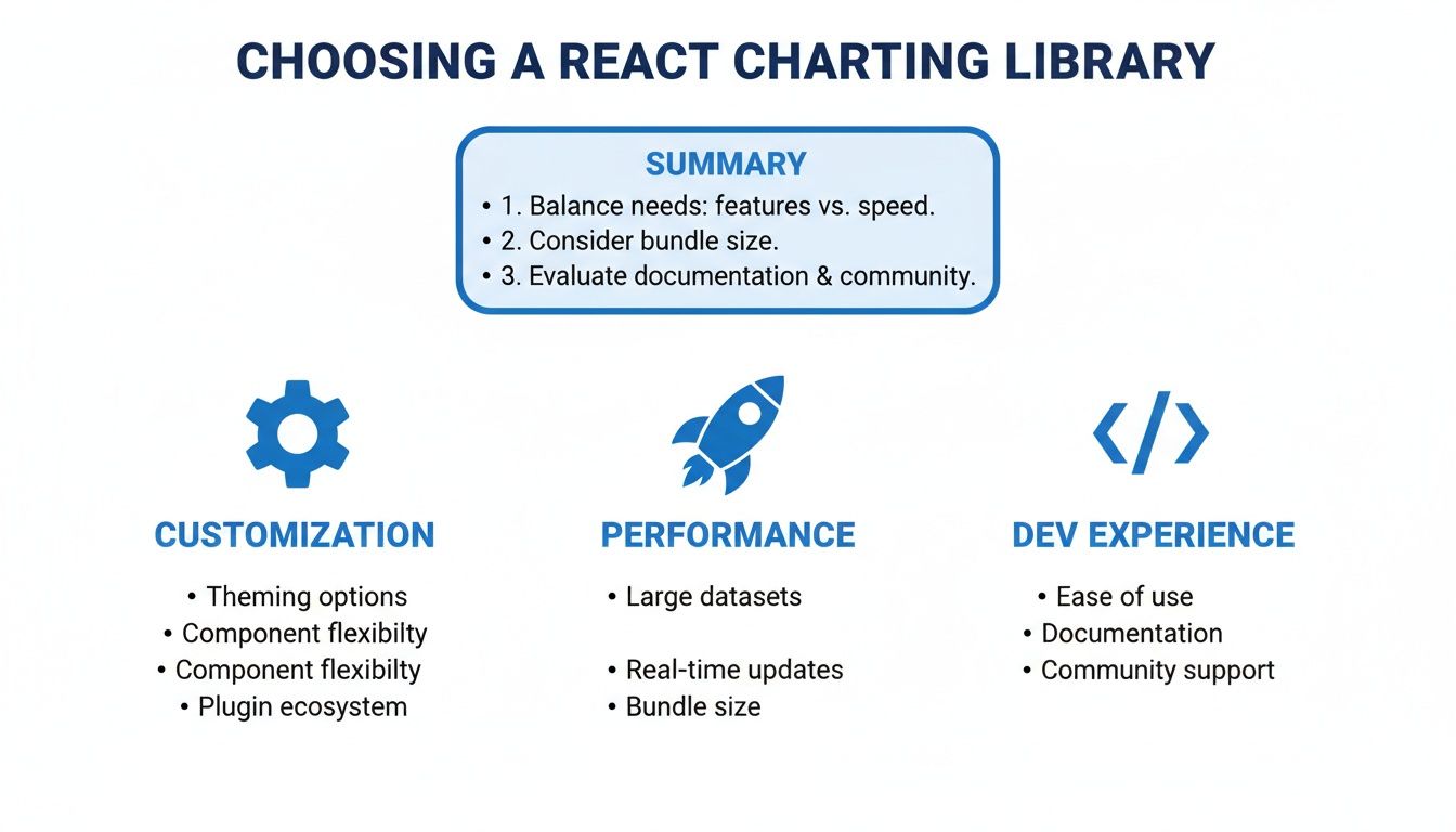
Ultimately, you're looking for the sweet spot between deep customization, speed with large datasets, and a development process that doesn't make your team want to pull their hair out.
Recharts vs. D3: A Tale of Two Philosophies
The classic debate between Recharts and D3 really boils down to "convention over configuration." Recharts is your go-to for speed and simplicity inside the React ecosystem. D3, on the other hand, is a general-purpose visualization toolkit that gives you absolute, granular control.
Recharts is fantastic for teams that need to get standard dashboards up and running quickly. Its declarative API feels incredibly intuitive for any React developer—you build charts by composing components like <LineChart>, <Bar>, and <Tooltip>. This component-first approach makes it a breeze to drop into an existing app and produce a clean-looking chart with very little code.
Key Differentiator: Recharts intentionally hides the complexities of D3. You’re working with React components and props, not wrestling with data joins or manual SVG manipulation. This is its biggest advantage for rapid development but also its main constraint when you need truly custom visuals.
D3.js isn’t really a charting library at all; it’s a powerful tool for manipulating documents based on data. To make it work with React, you have to get your hands dirty, typically managing DOM updates inside useEffect or useLayoutEffect hooks. While this grants you limitless customization, it comes with a much steeper learning curve and significantly more code. You're on the hook for everything, from drawing the axes to orchestrating user interactions.
Choose Recharts when you're building:
Standard business dashboards featuring bar, line, and pie charts.
Projects where speed of development is the highest priority.
Teams that want to stick entirely within the familiar React component model.
Choose D3.js for:
Completely bespoke, novel, or artistic data visualizations.
Projects needing fine-grained control over animations or complex interactions that standard libraries just don't offer.
Situations where performance with extremely complex SVG scenes is critical and demands manual optimization.
For a deeper dive on making Recharts fly, you might want to check out our guide on how to build fast-loading dashboards with Recharts.
Chart.js vs. Nivo: The Balance of Performance and Polish
When your datasets get large and performance becomes a real factor, Canvas-based libraries are the name of the game. Chart.js is the workhorse here, known for its raw speed, while Nivo presents a compelling alternative that prioritizes beautiful defaults and server-side rendering capabilities.
Chart.js has cemented its place as a top choice for performance-critical React charts, typically used via the react-chartjs-2 wrapper. It renders using the HTML5 Canvas, which neatly sidesteps the performance penalty of managing thousands of SVG nodes in the DOM. This makes it a beast for applications displaying hundreds or even thousands of data points. With over 1.6 million weekly downloads on NPM, react-chartjs-2 is a clear indicator of its widespread adoption and proven performance.
Nivo, on the other hand, delivers a different type of value. It's built on top of D3 but provides a huge library of gorgeous, highly configurable charts right out of the box. A standout feature is its ability to handle server-side rendering (SSR), which is great for initial page load performance and SEO. Nivo also gives you the flexibility to render charts using SVG, Canvas, or even plain HTML.
Chart.js excels in scenarios with high-density data where interactions are fairly simple, like a real-time monitoring dashboard.
Nivo shines when you need visually stunning, presentation-ready charts with intricate tooltips and patterns, or when server-side rendering is a firm requirement.
While this guide is centered on React for the web, developers looking at mobile might find good insights in this overview of charting solutions for React Native.
Victory, Highcharts, and ECharts: Enterprise and Cross-Platform Needs
For teams building complex enterprise applications or maintaining codebases across multiple platforms, another tier of powerful libraries comes into focus. Victory, Highcharts, and Apache ECharts each solve specific, advanced problems.
Victory stands out for its consistent API across both React and React Native. This is a massive win for teams trying to share visualization logic between their web and mobile apps. It’s highly modular and composable, similar to Recharts, but often gives you deeper hooks for customizing animations and events.
Highcharts is a veteran commercial library renowned for its rock-solid reliability, exhaustive documentation, and a massive range of chart types, including specialized financial and statistical plots. While it does require a license for commercial projects, that cost is often quickly recouped in saved developer hours and access to dedicated support. Integration is simple with its official highcharts-react-official wrapper.
Apache ECharts is another powerhouse open-source library with an impressive gallery of chart types and rendering features. It supports both Canvas and SVG and is particularly strong at creating interactive, visually rich dashboards. Its animation engine is first-class, enabling sophisticated data storytelling. The only catch is that its API isn't "React-native," so it can feel a bit less integrated than libraries like Recharts or Victory.
In the end, the best charting library for React is the one that fits the unique constraints of your project, whether those are driven by performance, design fidelity, or available developer resources.
Performance Benchmarks for Canvas and SVG
One of the first, and most critical, decisions you'll make when picking a charting library for React comes down to its rendering engine: SVG or Canvas. This isn't a simple case of one being "better" than the other. It's about aligning the technology with the kind of data you're showing and the interactions you need to support. Getting this choice right affects everything from load times to how responsive your charts feel to the end user.
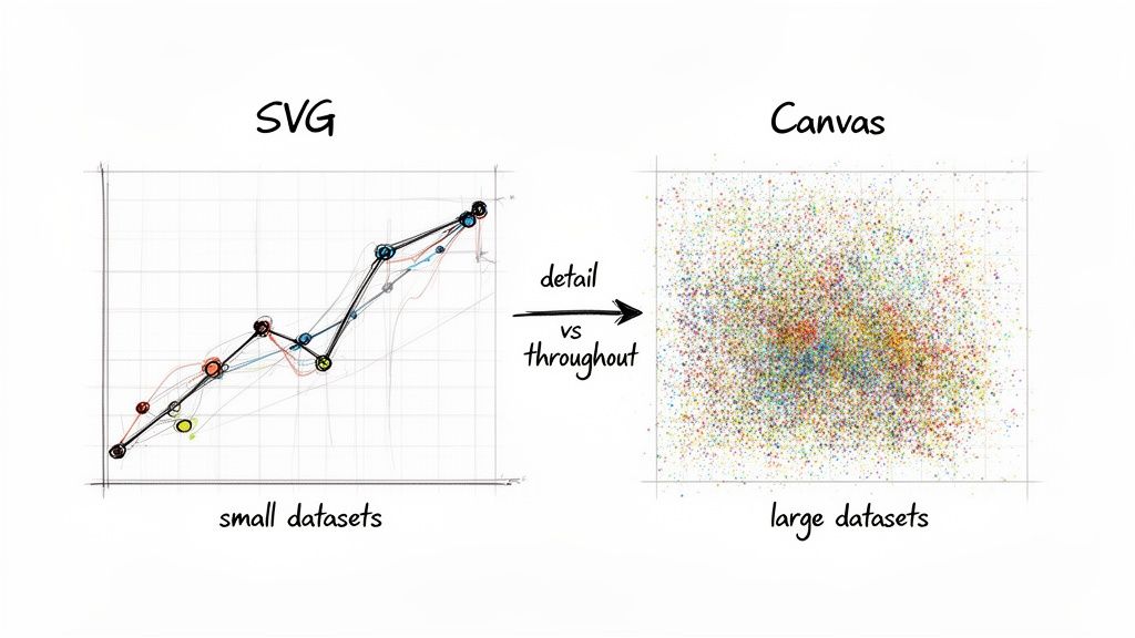
The core difference is simple but has massive implications. SVG builds your chart with individual DOM nodes for every single shape and line. Canvas, on the other hand, paints all the visuals onto one single DOM element. This architectural divide is where the performance story really begins, especially as your datasets grow.
The SVG Advantage: Sharpness and Interactivity
SVG (Scalable Vector Graphics) is a fantastic choice when you're working with a reasonable number of data points—think up to a few thousand. Since every bar, point, or line is its own DOM element, you get a ton of benefits right out of the box. They are naturally interactive and incredibly easy to style or manipulate with standard CSS and JavaScript.
This is why SVG-based libraries like Recharts and Victory are so popular for typical business dashboards. Clarity and direct interaction are king. The graphics scale perfectly, staying razor-sharp on any screen, and you can attach event listeners like onClick or onMouseOver directly to chart elements. It just works.
But this element-by-element approach is also SVG's Achilles' heel. As you start pushing into the tens of thousands of data points, the browser has to manage a bloated DOM tree. This translates directly to high memory usage and painfully slow re-renders, making features like zooming or panning feel laggy.
The Canvas Advantage: Raw Rendering Power
Canvas-based libraries such as Chart.js and Apache ECharts flip the script. They render the entire chart onto a single <canvas> element, much like a game engine drawing a frame. This "fire-and-forget" approach completely bypasses the DOM bottleneck.
Because Canvas isn’t creating thousands of nodes, its memory footprint stays low and its initial rendering is dramatically faster with large datasets. It can happily draw hundreds of thousands of points without breaking a sweat. This makes it the undisputed champion for use cases like real-time data streams, complex scientific plots, or financial time-series charts. For teams diving into this, our guide on building a dashboard in React offers a solid foundation.
The trade-off? Interactivity is more work. Since the chart is essentially a flat image, you can't just attach an event listener to a specific bar. The library has to do the math, using a technique called hit detection to figure out what data point the user's cursor is over based on its coordinates.
Key Takeaway: Go with SVG for polished, highly interactive charts with smaller datasets where you need direct access to each element. Opt for Canvas when your priority is visualizing high-volume data and you need maximum rendering speed and low memory overhead.
A Conceptual Benchmark Comparison
To put it all in perspective, here’s how a typical SVG library (like Recharts) stacks up against a Canvas library (like Chart.js) on key performance metrics.
Metric | SVG (e.g., Recharts) | Canvas (e.g., Chart.js) | Winner for Large Datasets |
|---|---|---|---|
Initial Render Time | Slows down with >5,000 points as DOM nodes multiply. | Stays fast, even with 100,000+ points. | Canvas |
Memory Usage | High. Memory consumption grows directly with data points. | Low. Stays relatively flat regardless of data size. | Canvas |
Interaction Speed | Becomes sluggish as the DOM gets more complex. | Remains quick; hit detection is computationally light. | Canvas |
Visual Sharpness | Vector-based, so it’s perfectly crisp at any resolution. | Resolution-dependent, can appear blurry on high-DPI displays. | SVG |
Ultimately, your choice of a charting library for React hinges on your data's density. For a standard startup dashboard showing a few hundred data points per chart, an SVG library like Recharts gives you a great developer experience and beautiful visuals. But if your product needs to handle thousands of events per second, a Canvas-based library isn't just a nice-to-have—it's essential for delivering a usable application.
Architectural Guidance for Engineering Teams
When you're tasked with adding charts to a React app, it's tempting to just grab a library and start coding. But choosing a charting library isn't just about rendering a pretty bar chart—it's an architectural commitment. This is a dependency that will live in your codebase for years, and the choice you make today will directly affect your bundle size, your app's maintainability, and how easily your team can adapt down the road.
One of the first things you'll run into is the library's impact on your application's bundle size. While modern bundlers do a great job with tree-shaking, not all charting libraries are created equal. Some force you to import the entire package just for a single chart type, adding serious weight to your app and slowing down those critical initial page loads.
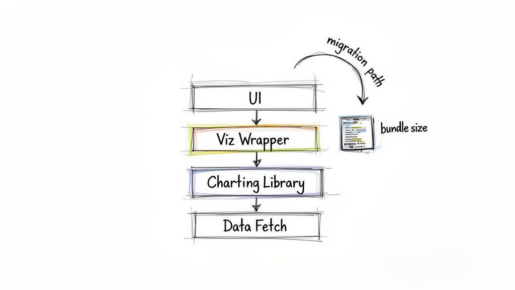
This is a classic problem, and many experienced engineering teams have landed on the same elegant solution: creating wrapper components.
Building a Visualization Design System with Wrappers
So what does this look like in practice? Instead of sprinkling a third-party component like <LineChart> all over your codebase, you build your own, like <OurAppLineChart>. This internal component then becomes the only place that imports and renders the library's chart. In doing so, you've created an abstraction layer—an "anti-corruption layer"—that insulates your application from the third-party library.
This strategy pays off in two huge ways:
You’re not locked in. Your application code isn't tightly coupled to a specific library’s API. If you ever need to migrate from, say, Recharts to Chart.js, you only have to update your handful of wrapper components, not hundreds of files across the app.
You build a consistent experience. This approach naturally creates a "visualization design system." You can enforce consistent styling, data formatting, and interaction logic inside your wrappers, ensuring every chart feels like a cohesive part of your product and brand.
By abstracting the charting library behind your own components, you’re not just writing cleaner code. You’re building a more flexible architecture that can evolve. The charting library stops being a rigid dependency and becomes a swappable implementation detail.
This pattern is your best defense against a library being abandoned, a license suddenly changing, or a new tool emerging that’s a much better fit for your needs. The upfront work of creating these wrappers is a small price to pay for long-term simplicity and maintainability.
Managing Data and State for Complex Charts
Getting the rendering layer right is only half the battle; managing the data that feeds it is just as important. For any chart that displays data from an API, using a modern data-fetching library like React Query or SWR is a game-changer. These tools handle all the tricky parts—caching, background refetching, and loading states—which keeps your chart components clean and focused on one thing: visualization.
Here are a few patterns we've found essential for handling data robustly:
Separate Server State: Use a tool like React Query to own the lifecycle of fetching and caching the chart's dataset. This keeps all that async logic out of your UI components.
Memoize Transformations: Data from your API rarely matches the exact shape a chart needs. Keep this transformation logic close to the chart component (or in a memoized selector) to ensure expensive calculations only re-run when the source data actually changes.
Localize Interaction State: For complex interactions like zooming, panning, or dynamic filters, manage that state locally within your wrapper component. Hooks like
useStateanduseReducerare perfect for this, as they prevent user actions from triggering unnecessary re-renders in parent components.
By carefully separating server state, client-side interaction state, and data transformation logic, you create a scalable architecture that can handle even the most complex charting requirements without sacrificing performance. It’s this thoughtful approach that ensures your data visualizations remain fast, maintainable, and ready for whatever comes next.
The Build vs. Buy Decision for Embedded Analytics
At some point, your product's data needs grow beyond just displaying a few simple visuals. The conversation naturally shifts from how to build a single chart to what kind of analytics experience you want to deliver to your users. This brings every product team to a critical crossroads: do you build it all yourself with a charting library for React, or do you buy a dedicated embedded analytics solution?
On one hand, building with a library like D3.js or even a wrapper like Recharts offers total creative freedom. Every pixel, user interaction, and data pipeline can be tailored to your exact specifications. But that initial appeal can be misleading, as it comes with a massive and ongoing investment that goes far beyond the first few sprints.
Calculating the True Cost of Building
Getting a few charts up and running is often the easy part. The real work—and the real cost—is hidden in the long-term maintenance, security, and endless user requests for new features. The Total Cost of Ownership (TCO) for a homegrown analytics feature is far more than just the initial developer hours.
If you decide to build, your team is on the hook for everything:
Ongoing Maintenance: Every time a library gets an update, a browser changes its rendering engine, or a security vulnerability is found, your engineers have to stop and fix it.
Feature Expansion: Users will always want more. "Can I get this as a pie chart?" "Can we export this to CSV?" "Can I filter by date range?" That all goes straight to your engineering backlog.
Performance Optimization: As your user base and data volumes grow, it’s your responsibility to make sure the analytics don't grind to a halt.
Security and Compliance: You own the entire responsibility for making sure your data visualization layer is secure and compliant with regulations like GDPR or SOC 2.
This constant upkeep pulls your most valuable engineers away from working on your core product. They end up spending their time becoming part-time BI experts instead of building the features that actually set you apart from the competition.
The "build" decision is not a one-time project; it's a commitment to creating and maintaining a new, complex product within your product. This hidden "product debt" can slow down your entire development organization over time.
The Alternative: Buy an Embedded Analytics Platform
The other path is to buy an embedded analytics solution, which offloads this entire burden from your team. Instead of handing your developers a low-level charting library for React and a long list of requirements, you give them a complete platform designed for delivering self-serve analytics inside your app. For any tech leader weighing this option, it's essential to Master B.I. Engineering to guide the technical strategy effectively.
This is exactly where a platform like Querio shines. It's built to skip the heavy lifting of ground-up development, letting you launch powerful, customer-facing analytics in a tiny fraction of the time.
The platform is a collaborative space where your internal teams—or even your customers—can build their own analyses and dashboards. By embedding this functionality directly, you empower your users with genuine self-service tools, which frees up your own support and data teams.
With an embedded platform doing the heavy lifting, your team gets to focus on what they do best: innovating on your core product. We cover this approach from start to finish in our guide on embedding analytics in your React application. The platform takes care of the data connections, querying, visualizations, and security, so you can ship a world-class analytics experience without the huge engineering overhead.
For most product teams, the choice comes down to your ultimate goal. If you just need a few static charts on a dashboard, building with a library is a perfectly fine choice. But if your vision is to give customers a dynamic, self-serve data experience, an embedded solution offers a much faster, more scalable, and cost-effective way to get there.
Frequently Asked Questions
When it comes to picking and implementing a charting library for React, you're bound to run into a few common questions. We've gathered the most frequent ones here to give you direct, practical answers that cut through the noise and help you make a decision you won't regret later.
These are the kinds of things you start wondering about after you've seen the high-level comparisons and are getting ready to commit.
What Is the Best Free Charting Library for React?
There’s no single "best" library, but there are definitely clear winners for specific jobs. It all comes down to your main priority.
If you need to get standard charts built quickly and your team lives and breathes React, Recharts is almost always the right call. Its component-based approach just feels natural, making development fast and intuitive.
On the other hand, if you're dealing with massive datasets and performance is non-negotiable, Chart.js (paired with the react-chartjs-2 wrapper) is a better bet. It renders to a Canvas element, which is built to handle high volumes of data much more efficiently than SVG.
And for those projects where you need something truly unique—think highly custom, interactive, or just plain weird visualizations—nothing beats the power of D3.js. Just be warned: it’s less of a charting library and more of a graphics toolkit. It gives you infinite flexibility, but you'll pay for it in development time.
How Do You Handle Real-Time Data in React Charts?
The trick to handling real-time data is to update the chart's state without forcing the entire component to re-render every time a new data point arrives. Doing that will absolutely kill your app's performance. For this reason, Canvas-based libraries like Chart.js or ECharts are generally your best bet for high-frequency updates.
A solid, battle-tested pattern looks like this:
Stream the data into your app using WebSockets.
Store that incoming data in a component’s state, probably with the
useStatehook.Wrap your chart component in
React.memoand use theuseMemohook for any data transformations you need to run.
The goal is to stop needless re-renders in their tracks. Memoization is your best friend here. It ensures your chart only updates when the data itself actually changes, creating a smooth experience even with data streaming in constantly.
Can I Use Multiple Charting Libraries in One React Project?
Technically, yes. But you really, really shouldn't. Mixing multiple charting libraries in one project is a classic move that almost always leads to regret.
First off, it bloats your application's bundle size. Each library brings its own dependencies, and that extra weight slows down the initial load time for your users. Second, it creates a jarring and inconsistent user experience. Different libraries have their own APIs, design philosophies, and interaction models, leading to a fragmented feel for both your users and your developers.
A much smarter approach is to pick one primary library that handles 95% of your needs. If you run into a corner case that requires a super-specialized chart, consider building just that one component with D3.js and keeping it isolated from the rest of your codebase.
When Should I Use an Embedded Analytics Solution Instead of a Library?
The moment your goal shifts from displaying charts to providing self-service analytics, you should stop thinking about libraries and start looking at embedded analytics solutions.
Think of it this way: a library is a tool for developers to build a specific, predefined chart. An embedded analytics platform is a complete, user-facing product that gives your customers the power to explore data, build their own reports, and create dashboards.
Consider an embedded platform like Querio if your product roadmap has items like:
"Let customers build their own reports."
"We need a customer-facing analytics portal."
"Our non-technical users need to explore data without asking engineering."
Going with an embedded platform from the start will get you to market with a far more powerful and complete feature set in a fraction of the time.
Ready to deliver powerful, self-serve analytics without the heavy lifting? Querio deploys AI agents directly on your data warehouse, allowing your team to bypass the maintenance of charting libraries and focus on core innovation. Explore how Querio can scale your data experiences.

