Business Intelligence
Best AI Analytics Tools for Non-Technical Teams (2026)
Pick AI analytics by governance, live-warehouse access, and team workflows—AI labels alone won't ensure trusted metrics.
If you want the short answer: I’d group the best options into five lanes: Querio for governed self-serve on live warehouse data, ThoughtSpot for search-led analysis, Power BI with Copilot for Microsoft-heavy teams, Tableau Pulse for KPI updates sent to people, and Hex for analyst-built notebook apps.
For most U.S. B2B SaaS teams, the choice comes down to three checks:
Can people ask questions in plain English?
Do metrics stay the same across teams?
Does the tool query live warehouse data instead of stale exports?
If your team tracks things like MRR, ARR, churn, and NRR, this matters fast. One bad metric definition can throw off sales, finance, and board reporting.
Quick comparison
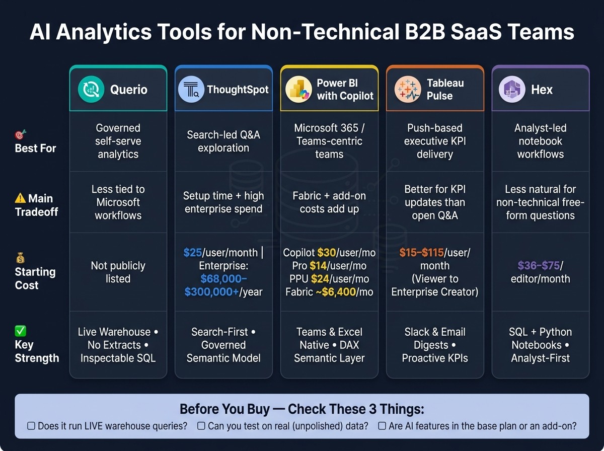
Best AI Analytics Tools for Non-Technical Teams 2026: Side-by-Side Comparison
Tool | Best for | Main tradeoff | Starting cost mentioned |
|---|---|---|---|
Querio | Less tied to Microsoft workflows | Not listed in the article | |
ThoughtSpot | Search-led Q&A | Setup time plus high enterprise spend | $25/user/month; enterprise often $68,000–$300,000+/year |
Power BI with Copilot | Microsoft 365 teams | Fabric + add-on costs add up | Copilot $30/user/month; Pro $14/user/month; PPU $24/user/month; Fabric about $6,400/month |
Tableau Pulse | KPI digests in Slack/email | Better for metric updates than open Q&A | $15–$115/user/month |
Hex | Analyst-led notebook workflows | Less natural for non-technical users asking free-form questions | $36–$75/editor/month |
What I’d take from this article
Querio is the pick if you want plain-English questions, live warehouse access, and SQL/Python that people can inspect.
ThoughtSpot works well when your team wants a Google-like search feel for data, but it still needs modeling work first.
Power BI with Copilot makes the most sense when your company already lives in Teams, Excel, and PowerPoint.
Tableau Pulse is best when leaders want KPIs sent to them instead of logging into a BI tool.
Hex fits teams where analysts build the experience and business users consume apps, not raw notebooks.
Bottom line: I wouldn’t pick based on AI analytics labels alone. I’d pick based on metric control, live data access, setup time, and where your team already works day to day.
1. Querio

Querio helps non-technical teams ask questions in plain English and get answers from live warehouse data, without losing control of metrics or business rules. The big idea is simple: every answer stays tied to the warehouse and the business definitions your team already uses.
Plain-English Questions, Real SQL Under the Hood
Querio turns plain-English questions into SQL or Python that teams can inspect, then runs that code directly on live warehouse data. Every answer is editable, which means analysts can check and adjust the exact logic behind each result.
A Semantic Layer That Keeps Metrics Consistent
Querio also uses a governed semantic layer, so the data team can define joins, metrics, and business terms one time and use them across analysis, dashboards, and reports. That helps keep KPI definitions lined up across teams and cuts down on conflicting answers [3].
Live Warehouse Connections, No Extracts
Querio connects to Snowflake, BigQuery, Redshift, ClickHouse, or PostgreSQL through encrypted, read-only access. It doesn’t move data into CSVs or a separate store, so everyone works from the same data the analytics team maintains.
Collaboration and Self-Serve
That same governance carries into day-to-day work. Querio includes reactive notebooks, dashboards, scheduled reports, role-based access controls, SSO, and built-for-Slack workflows. The result is faster answers for marketing, sales, finance, and exec teams, without waiting in a queue.
2. ThoughtSpot
ThoughtSpot is a search-first analytics tool. People type a question in plain English and get back a chart or table pulled from live warehouse data. That makes it a strong fit for non-technical teams that need fast answers they can trust from a governed model.
Its AI layer is built around Sage for natural-language queries, while Spotter shows how the system reached an answer. That extra visibility matters. Teams can check the logic behind a result without writing SQL [1][3].
Metric Governance and the Setup Trade-Off
ThoughtSpot uses Worksheets and ThoughtSpot Modeling Language (TML) to support governed metric definitions and row-level security. It also works with dbt models, which helps keep metric definitions aligned across the modern analytics stack [10].
The catch is setup time. Teams usually get the best results after a short semantic-modeling phase before rollout. So while the day-to-day experience feels simple, there’s still some upfront work to make sure answers come back clean and accurate [1].
Live Warehouse Connectivity and Collaboration
ThoughtSpot connects live to Snowflake, BigQuery, Redshift, and Databricks. For executive KPI tracking, SpotIQ can flag anomalies and point to likely drivers [1]. Sharing happens through Liveboards, and Slack plus Microsoft Teams integrations are built in.
Pricing starts at $25 per user/month on the Essentials tier. Enterprise contracts usually run from $68,000 to more than $300,000 per year [1]. For a 100–500-person B2B SaaS team, that’s a major spend, so it tends to make the most sense when the data model is already clean.
That puts ThoughtSpot in a strong spot for teams that want search-led analysis with governed metrics. The next tool goes in a different direction with AI-assisted analytics.
3. Power BI with Copilot

For teams already standardized on Microsoft 365, Power BI with Copilot keeps AI analytics inside the tools people already use every day. Users can ask questions in plain English and get a visual, a DAX query, or even a full report page right inside Power BI. That makes it handy for business users who need answers without bouncing between tools like Excel, Teams, or PowerPoint.
The Semantic Layer Dependency
Copilot is only as good as the semantic model underneath it. If metrics, fields, or row-level security rules aren't set up well, natural-language answers can point people in the wrong direction. So there’s some prep work here.
Plan for about a 1–3 week setup phase before rolling Copilot out to business users. Once that work is in place, governance is strong. Metric definitions live in one central semantic model, and row-level security runs through Azure AD.
Live Connections and Collaboration
Power BI supports live connections to Snowflake, BigQuery, Redshift, and PostgreSQL [5]. The Narrative visual can generate plain-English summaries in Copilot mode, which helps when someone wants the takeaway without digging through charts first.
Just as important, the Teams, Excel, and PowerPoint integrations keep self-service analytics platforms inside the workflows that marketing, sales, finance, and executive teams already rely on. In practice, that means people can stay in the Microsoft stack instead of switching tabs all day.
Pricing
Full Copilot functionality requires Microsoft Fabric capacity at F64 or higher, estimated at about $6,400/month, which can get expensive fast at scale [3]. On top of that, the Copilot add-on costs $30/user/month, with Power BI Pro at $14/user/month and Premium Per User at $24/user/month [1][6].
For teams already using Microsoft 365, that spend is often easier to justify.
4. Tableau Pulse

Tableau Pulse changes BI from a pull habit to a push one. Instead of asking people to log in and check dashboards, it sends personalized metric digests straight to Slack or email. Those updates also include plain-English summaries that explain what moved and what likely drove the change.
That makes Pulse a strong fit for non-technical users who need executive KPIs without opening a BI tool every day. In practice, it shines when the goal is proactive KPI delivery, not ad hoc analysis.
Why the Push Model Works
Pulse flags anomalies and creates Data Stories that explain what shifted and why. That simple change matters. People are far more likely to act on a metric when it shows up where they already spend time, instead of sitting in a dashboard they might never open.
Pulse is at its best for teams that want KPIs delivered to them. It is less suited to teams that want open-ended analysis inside the tool.
Governance Still Requires Setup
Tableau Semantics gives Pulse governed metric definitions, but broad rollout still takes careful modeling first. Plan for 1–3 weeks of analyst time to curate the semantic model and publish trusted sources before broad rollout. [1]
Once that semantic layer is in place, Pulse becomes a steady option for warehouse-native KPI reporting.
Warehouse Connections and Salesforce Fit

After the model is governed, Pulse stays useful because it connects live to modern warehouses and fits neatly into Salesforce workflows. It supports live connections to Snowflake, BigQuery, and Redshift [4] and ties into Salesforce through Agentforce, which helps sales and customer success teams use analytics in tools they already work in. [1][3]
Pricing
License Tier | Price (per user/month) |
|---|---|
Viewer | $15 |
Explorer | $42 |
Creator | $75 |
Enterprise Creator | $115 |
Advanced AI features like Tableau Pulse may require the Tableau+ enterprise tier, so check packaging closely before budgeting. [1][6]
5. Hex

Hex is a notebook-first workspace built for analysts. They use SQL and Python to create interactive data apps that business teams can open and use on their own. The big draw is simple: analysts can publish trusted apps, and non-technical teams can get answers without asking someone for SQL every time. [5]
How Plain-English Questions Work
Hex supports natural language with AI cells and a Notebook Agent that helps analysts write SQL and Python faster. [4][5] It also uses its Clarity Engine to send plain-English questions through a governed semantic layer. That setup is meant to cut down on wrong answers and keep metric definitions in sync inside analyst-built workflows. [3]
There’s a catch, though. Hex is less effective for free-form natural-language questions than search-first tools, which makes it a better fit as an analyst helper than a standalone chat interface for business users. [4]
Who Actually Benefits Here
Hex is built for analysts first. In most cases, marketing, sales, and finance teams are the end users of published data apps, not the people building them. [5]
That matters in practice. If you want sales reps or executives to ask ad hoc questions on their own, without analyst help, Hex can feel too technical. [5]
Warehouse Connections and Governance
Hex connects live to Snowflake, BigQuery, Databricks, and Redshift. That means published apps stay tied to warehouse data instead of relying on stale exports. [5]
For teams that care about governed reporting, that setup can work well. Analysts build the app once, then business users explore marketing reports, sales analysis, and internal KPI views on their own through the app. [3][4]
Pricing
Editor seats cost $36 to $75 per month. Enterprise pricing is custom. [5]
That analyst-first model is the main tradeoff in the comparison below.
How These Tools Stack Up on the Criteria That Matter
Four things decide whether these tools are a good fit for marketing, sales, finance, and executive reporting: natural-language answers, metric governance, live warehouse trust, and collaboration fit.
This is where the gap between tools starts to show. Some make it easy for non-technical teams to ask questions in plain English. Others do a better job keeping metric definitions consistent. And some plug more neatly into the tools people already use every day.
Criteria | Querio | ThoughtSpot | Power BI (Copilot) | Tableau Pulse | Hex |
|---|---|---|---|---|---|
Natural-Language Answers | Trusted self-serve answers via plain-English queries; inspectable SQL/Python | Strong natural-language query handling; search-first design [1][8] | Ask questions inside Teams and Excel [1] | Pushes plain-English KPI digests to Slack or email [1] | AI cells help analysts write SQL/Python; less direct for business users [7] |
Metric Governance | Shared semantic/context layer for consistent metric definitions | Curated Worksheets ground AI answers; semantic model required [1] | Relies on DAX and Microsoft Fabric semantic models [7] | Requires admin-modeled data sources before Pulse surfaces insights [1] | dbt-integrated semantic layers [9] |
Warehouse-Native Trust | Live, read-only connections to Snowflake, BigQuery, Redshift, ClickHouse, and Postgres; no extracts | Queries Snowflake, BigQuery, and Redshift without moving data [2][5] | Deeply integrated with Microsoft Fabric [7] | Connects to 75+ sources; strong with Salesforce data [1] | Works with Snowflake, BigQuery, Redshift, and Postgres [9] |
Collaboration Fit | Shared notebooks, dashboards, and versioned logic for analysts and business users | Web-app primary; Slack integration available [5] | Strong Teams and Excel integration [1] | Automated Slack and email digests [1] | Analyst-led exploration via collaborative notebooks [9] |
Where the real differences show up
The biggest tradeoff is governance versus simplicity.
That’s the line that splits these tools most clearly. Querio, ThoughtSpot, and Hex use semantic layers in different ways to keep answers aligned. Power BI and Tableau lean more on well-modeled source definitions. Same goal, different path.
Live warehouse access matters too, because stale data can throw off the whole point of self-serve analytics. Querio, ThoughtSpot, Power BI, Tableau, and Hex all support live access. But Querio is the clearest about read-only, no-export warehouse access, which may matter a lot if your team cares about control and auditability.
Collaboration fit comes down to habit. If your team lives in Microsoft 365, Power BI has a natural edge. If updates need to land in Slack or email, Tableau Pulse makes that easy. If analysts and business users tend to work side by side in shared notebook flows, Querio and Hex make more sense.
Natural-language reliability still needs a hands-on test. On paper, ThoughtSpot stands out for ambiguous or multi-step questions because of its search-first design. Hex leans more toward analysts, since its AI helps write SQL and Python cells instead of acting as a straight business-user Q&A layer. The pros-and-cons section below turns those patterns into day-to-day tradeoffs.
Pros and Cons of Each Tool
Every tool here does one thing well. But each one also comes with a catch. That’s the part that tends to trip teams up, especially when non-technical users need answers without waiting on analysts.
The table below shows where each tool fits best, and where it can create friction.
Tool | Main Advantages | Main Limitations | Best Match |
|---|---|---|---|
Querio | Governed semantic/context layer keeps metrics consistent; inspectable SQL/Python instead of a black box; live read-only connections to Snowflake, BigQuery, Redshift, ClickHouse, and Postgres | No native Microsoft Teams integration; no built-in ETL or transformation layer | Governed self-serve analytics for B2B SaaS teams |
ThoughtSpot | Search-first queries on live warehouse data; governed semantic model keeps answers grounded | Needs 1–3 weeks of upfront data modeling before business users can self-serve; enterprise contracts can reach $68K–$300K+/year [1] | Teams that can invest in setup time and want search-driven exploration |
Power BI with Copilot | Deep Microsoft 365 integration with Teams and Excel; familiar for Microsoft-centric users | Copilot requires Premium Per User or Fabric capacity; DAX and semantic modeling add overhead | Organizations already standardizing on Microsoft 365 |
Tableau Pulse | Push-based KPI digests in Slack or email; strong KPI delivery through digest-style updates | Still needs a Tableau-savvy admin to model the data before Pulse can surface KPIs; Creator licenses run $75/user/month [1] | Executive teams that want KPI updates delivered to them |
Hex | Collaborative notebooks blend SQL and Python; strong for analyst-led exploration | Steep learning curve for non-technical users; best when analysts build the workflows | Data teams building collaborative analysis workflows and data apps |
A simple pattern shows up fast. Querio fits teams that want governed self-serve analytics without hiding the logic. ThoughtSpot and Power BI with Copilot can work well, but they ask for more setup or more platform commitment. Tableau Pulse shines when leaders want KPI updates sent to them instead of pulling reports on their own. Hex is a good fit for analyst-heavy teams that live in SQL and Python.
With those tradeoffs in view, the next step is matching each tool to the team workflow it serves best.
Which Tool Should You Choose?
Choose the tool that fits how your team works day to day.
If you need governed self-serve on live warehouse data, Querio is the best fit. If your team wants search-first exploration, look at ThoughtSpot. If your company already runs on Microsoft 365, Power BI with Copilot makes the most sense. If leaders want KPI updates pushed to Slack or email, Tableau Pulse stands out. And if your team is analyst-led and works in shared SQL and Python notebooks, Hex is a strong match.
The biggest things to weigh are governance, live warehouse access, and how people prefer to get answers.
Querio works well for teams that need governed self-serve on live Snowflake, BigQuery, Redshift, or Postgres data. ThoughtSpot is strongest for search-first exploration, but there’s a catch: it needs clean semantic modeling before a broad rollout. In practice, that means planning for 1–3 weeks of setup before business users can self-serve with confidence [1]. Copilot works best when your team already spends most of its time in Microsoft 365. Tableau Pulse fits teams where executives want KPI updates sent to them in Slack or email instead of pulling dashboards themselves. Hex makes sense for analyst-led teams building shared SQL and Python workflows.
Before you buy, check three things:
Whether the tool runs live warehouse queries
Whether you can test it on real data, like an unmodeled CRM export, not polished vendor demo data
Whether the AI features are part of the base plan or sold as an add-on or locked behind a higher-tier plan
Use the table below to match your main workflow to the best fit:
If your priority is… | Consider |
|---|---|
Governed self-serve on a live warehouse | Querio |
Search-first NLQ exploration | ThoughtSpot |
Microsoft 365 / Teams integration | Power BI with Copilot |
Push-based executive KPI delivery | Tableau Pulse |
Analyst-led collaborative notebooks | Hex |
The best tool is the one your team will use because they trust the answers.
FAQs
How long does setup usually take?
Setup for AI analytics tools can take anywhere from a few hours to several weeks.
For most non-technical platforms, the first round of data connection and modeling usually takes 1–3 weeks. Some enterprise tools need 4–9 weeks, depending on how complex the setup is.
How can I test metric accuracy before rollout?
Run a proof of concept with your actual data, not demo datasets.
Connect the tool to a representative, read-only slice of your warehouse. Then ask questions you already know the answers to, along with messy, ambiguous, or more complex questions that reflect how people will use it day to day.
It also helps to review the generated SQL or other queries. And don’t leave testing only to technical teams. Have non-technical team members check whether the answers are clear, easy to follow, and correct.
Testing against real, messy data is one of the best ways to build trust before full deployment.
Which tool is best for self-serve vs. KPI digests?
For self-serve analytics, ThoughtSpot stands out because people can ask questions in plain language and get fast, governed answers straight from the data warehouse.
For KPI digests, Tableau Pulse is a better fit for AI-generated summaries and proactive updates through Slack or email.
Put simply, ThoughtSpot is stronger for self-serve exploration, while Tableau Pulse fits automated KPI monitoring.
Related Blog Posts


