Statistical Cluster Analysis: A Practical Guide for 2026
Learn statistical cluster analysis from scratch. This guide covers key algorithms (K-Means, Hierarchical), evaluation metrics, and how to apply them at scale.
https://www.youtube.com/watch?v=noCqp5TgeJ8
published
Outrank AI
statistical cluster analysis, unsupervised learning, data mining, customer segmentation, python clustering
5d47b06e-f574-4dc5-90f4-0766e87e3cd4

You have thousands of sign-ups, event logs, and account records. Stakeholders keep asking the same question in different forms: who are these users, how are they different, and which segments deserve attention first?
That's where statistical cluster analysis earns its keep. It helps a team move from a flat table of rows to a working segmentation model that can influence onboarding, lifecycle messaging, pricing research, fraud review, and roadmap prioritization. The hard part isn't running an algorithm. The hard part is choosing the right one, preparing the data so it doesn't mislead you, and turning notebook output into something a product or data team can operationalize.
Table of Contents
What Is Statistical Cluster Analysis
A common product problem looks simple at first. You've got a healthy stream of user sign-ups, but every planning meeting turns into guesswork because “new users” is still one giant bucket. Power users, trial tourists, team evaluators, and one-time visitors all get blended together.
Statistical cluster analysis is one of the standard ways to break that bucket apart. It's a foundational unsupervised learning technique that groups objects so similarity is high within a group and lower between groups, with major method families including hierarchical and nonhierarchical approaches, as described by Britannica's overview of cluster analysis. In practical terms, it helps teams discover structure in the data before they have a firm hypothesis.

Why teams use it
Clustering is useful when labels don't exist yet. You're not predicting churn, conversion, or fraud from known outcomes. You're asking whether the data itself contains meaningful groups.
A simple analogy works well here. Think of a mixed box of Lego bricks dumped onto a table. No one gives you instructions. You sort by shape, size, and color until patterns emerge. Clustering does the same thing with user records, transactions, devices, accounts, or product activity.
That distinction matters because it changes the standard for success. A supervised model wins by predicting correctly. A clustering workflow wins when the segments are interpretable, stable enough to reuse, and connected to an actual decision.
Practical rule: If no one can explain how a discovered cluster would change product, marketing, support, or ops behavior, the analysis isn't finished.
What clustering is actually doing
While clustering is often explored using libraries like scikit-learn, the idea is much older than the current AI wave. Britannica notes that the roots go back to the 1930s, with clustering ideas introduced in anthropology by Driver and Kroeber in 1932 to simplify empirical typologies, making it one of the oldest systematic approaches to pattern discovery in data analysis.
That history is useful because it frames clustering correctly. It's not a novelty feature. It's an exploratory method for finding hidden structure when the categories aren't known in advance.
In product work, that can mean questions like these:
User segmentation: Are there distinct patterns of onboarding behavior?
Account grouping: Do customers naturally separate by usage breadth versus depth?
Operational triage: Are there recurring support or fraud profiles hiding in event data?
Merchandising or content organization: Which items tend to cluster by behavior or attributes?
The method is hypothesis-generating. It often gives a team better questions before it gives them definitive answers.
Choosing Your Clustering Algorithm
Algorithm choice affects what kinds of patterns you can detect and which kinds you'll miss. This isn't a matter of taste. Different clustering methods bake in different assumptions about shape, density, scale, and noise.
How the main families differ
K-Means is usually the starting point because it's easy to run, easy to explain, and computationally efficient. It tries to place records around central points and works best when groups are compact and fairly well separated. If your feature space roughly supports “centers” of behavior, K-Means is often good enough to get a first segmentation into the hands of stakeholders quickly.
DBSCAN behaves differently. It looks for dense regions and treats isolated points as noise. That makes it useful when outliers matter, or when you suspect clusters won't look like neat circles in feature space. It can be much more realistic for messy behavioral data, but it's sensitive to neighborhood settings and can become frustrating if your feature scaling is weak or densities vary a lot across the dataset.
Hierarchical clustering builds a tree of relationships instead of forcing a single flat segmentation from the start. That's useful when the business question isn't “what are the three groups?” but “how do these users relate at different levels of granularity?” Teams often like hierarchical output because it mirrors how they think. You might start with broad user families, then split one branch into more specific subtypes.
Clustering algorithm comparison
Algorithm | Core Idea | Best For | Key Limitation |
|---|---|---|---|
K-Means | Assigns points to nearest centroid | Compact, well-separated groups and fast baseline segmentation | Requires you to choose k and tends to prefer roughly spherical clusters |
DBSCAN | Finds dense neighborhoods and labels sparse points as noise | Irregular shapes, outlier detection, messy behavioral patterns | Sensitive to parameter choice and uneven densities |
Hierarchical | Builds nested clusters through successive merges or splits | Exploratory segmentation and relationship mapping | Can become harder to manage on larger datasets and needs careful interpretation |
A lot of teams get stuck because they ask which algorithm is “best.” The better question is which failure mode you can tolerate.
If you need a fast baseline for a growth or product review, K-Means is often the right operational choice. If bad actors or anomalous accounts matter, DBSCAN deserves a look. If leadership wants a segmentation framework rather than a single hard partition, hierarchical clustering usually produces the richer conversation.
For a broader side-by-side review of practical trade-offs, Querio's comparison of clustering algorithms is a useful reference.
A practical selection rule
Start with the business action, not the algorithm.
Need named segments for campaigns or onboarding? Start with K-Means.
Need to surface suspicious or edge-case behavior? Try DBSCAN early.
Need an interpretable relationship map before choosing segment depth? Use hierarchical clustering.
Don't choose an algorithm because it's popular. Choose it because its assumptions match the shape of your data and the decision you need to make.
Preparing Your Data for Clustering
Clustering quality depends more on feature design and preprocessing than is often realized. If the input space is noisy, skewed, or dominated by a few columns, the algorithm will still return clusters. They just won't mean much.
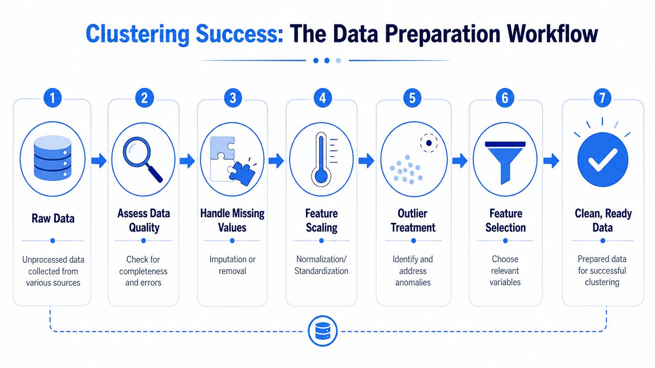
Get the feature space under control
The first issue is usually scale. If one numeric column spans a much larger range than the others, distance-based algorithms will overreact to it. K-Means is especially vulnerable here. A StandardScaler or similar transform keeps one variable from dictating the geometry of the entire solution.
The second issue is categorical data. User plan type, acquisition channel, or industry can be valuable segmentation signals, but most clustering algorithms need numeric input. One-hot encoding is the standard move, though it can create sparse high-dimensional matrices fast. That means you should encode selectively, not mechanically.
A third issue is missingness and bad records. Missing values can be imputed, flagged, or filtered, depending on what they represent. If “missing company size” is itself meaningful, dropping it may remove a real signal.
Later in the workflow, a visual walkthrough helps non-technical teammates understand why prep work matters:
Treat preparation as model design
The biggest mistake is assuming preprocessing is generic housekeeping. In clustering, it's part of the model.
Consider a typical product dataset. You might have event counts, recency metrics, plan metadata, geography, device, and team size. Some of those describe enduring structure. Others reflect temporary noise. If you feed everything in, the algorithm will faithfully cluster on everything, including the junk.
A stronger workflow looks like this:
Start with behavior tied to the decision: For onboarding, use early activation signals. For expansion analysis, use seat growth, feature breadth, and collaboration patterns.
Reduce redundant fields: Highly overlapping variables can overweight one idea in the distance calculation.
Remove obvious leakage from the intended use: If you want general personas, don't include a downstream status field that restates the answer.
Consider dimensionality reduction carefully: PCA can help when feature space gets wide and noisy, but it may reduce interpretability. Use it when stability improves enough to justify the abstraction.
If the raw table itself is messy, fix that before clustering. A lot of segmentation failures are really data quality failures. Querio's guide on how to improve data quality is useful for teams trying to formalize that step.
Clean features beat clever algorithms. Most disappointing cluster output can be traced back to weak variable selection, inconsistent scaling, or unresolved data quality problems.
Evaluating and Validating Your Clusters
A clustering run produces labels. That doesn't mean it produces insight. Validation is where teams separate a convenient partition from a useful segmentation.

Use metrics, but don't stop there
The most common internal metric is the Silhouette Score. It asks whether each point is closer to its own cluster than to neighboring clusters. That makes it a good first check for separation. If the score is weak, the segmentation may be forcing distinctions that aren't really there.
The Davies-Bouldin Index is another useful lens. It compares within-cluster spread to separation between clusters. Lower values are generally preferred, but the practical point is comparison, not perfection. Use it to compare candidate configurations rather than to chase an abstract ideal.
Still, internal metrics only tell part of the story. A mathematically tidy segmentation can be useless if the clusters don't translate into actions. A data team should always inspect profile summaries by cluster, check whether the groups are reasonably balanced for the use case, and ask whether the labels survive basic business scrutiny.
A helpful review sequence is:
Compare internal metrics across several runs
Inspect cluster sizes for lopsided partitions
Read feature distributions by cluster
Ask stakeholders whether the groups are recognizable
Re-run later on fresh data to test stability
Why the cluster heat map still matters
A good visualization turns abstract output into something a product manager can reason about. The cluster heat map is still one of the most effective tools for that job. It combines color-coded matrices with row and column dendrograms, and it has a long methodological history rather than being a recent dashboard trend. A historical review notes that the display draws on sources from the late nineteenth century and wider twentieth-century statistical literature, and that it became the “most widely used of all bioinformatics displays” for revealing data structure in practice, as discussed in this history of the cluster heat map.
That matters for modern analytics teams because the heat map does two jobs at once. It shows which features define each cluster, and it shows how similar clusters are to one another. For business users, that often lands faster than metric tables.
A cluster label like “Segment 3” has no value by itself. A visual profile that shows high collaboration depth, low breadth, and short time-to-activation does.
One more caution belongs here. Clustered data creates dependence within groups. The same historical review notes that observations within a cluster can be “more alike” than observations between clusters, creating intracluster correlation and reducing the effective sample size relative to the raw observation count. In practice, that means teams should be careful when they treat clustered observations as fully independent in downstream analyses.
A Practical Python Clustering Example
The easiest way to make clustering concrete is to run a compact workflow end to end. A mall customer dataset is common for demos because it's small, easy to understand, and sufficient for showing the mechanics. Replace it later with your own warehouse extract.
A simple end-to-end workflow
This template does four important things correctly. It limits the feature set, scales numeric columns, encodes categorical variables, and evaluates the result with a metric rather than trusting the output blindly.
If your team wants notebook patterns that are easier to standardize, interactive notebook templates can help turn one-off analysis into a repeatable workflow.
What to inspect after fitting
The code above is only the start. After fitting, inspect the output in ways stakeholders will care about.
Profile the clusters: Look at means, medians, and categorical distributions.
Name them cautiously: “High-value collaborators” is better than “Cluster 2,” but only if the label matches the data.
Check sensitivity: Refit with adjacent values of
kand see whether the group narratives stay coherent.Plot multiple views: A two-dimensional scatter can help, but it may hide separation that exists in the full feature space.
One practical habit is to keep both a modeling notebook and a decision memo. The notebook documents the pipeline. The memo explains what each cluster is, which actions should differ, and which questions still need follow-up.
Scaling Cluster Analysis in Your Data Warehouse
A notebook proof of concept is useful. A segmentation that only exists on one analyst's laptop is not.
Why local-only workflows break down
The old pattern is familiar. Someone exports a sample from Snowflake, BigQuery, Redshift, or Postgres. They run clustering locally in Python, present a few charts, and the work slowly goes stale because nobody reruns it consistently.

That approach breaks in several ways:
Data movement becomes the bottleneck: Analysts spend time extracting and reshaping instead of iterating on the model.
Segments age quickly: If the run isn't tied to fresh warehouse data, downstream teams lose trust.
Reproducibility suffers: Logic lives in local notebooks, ad hoc CSVs, and undocumented assumptions.
What a production-ready setup looks like
The better pattern is warehouse-native. Keep source data in the warehouse, define feature logic in versioned queries or notebook cells, run clustering on curated datasets, and publish outputs back into tables or views that other teams can consume.
That's where notebook-based workflows fit well. Teams can combine SQL-style feature generation with Python preprocessing, model fitting, and validation in one place, without turning the data team into a ticket queue. Tools differ in implementation, but the architecture matters more than the brand. For teams evaluating warehouse-centric setups, this overview of data warehouse architectures is a useful starting point.
One practical option in that category is Querio, which uses Python notebooks tied directly to the data warehouse so teams can build and rerun analyses without relying on isolated local exports. The relevant advantage for clustering isn't novelty. It's operational continuity. The segmentation logic lives closer to the data, and business users can consume fresher outputs.
If you want cluster analysis to influence decisions every month, the pipeline has to be easier to rerun than to ignore.
A production-ready setup usually includes scheduled feature refreshes, a fixed preprocessing pipeline, explicit model parameters, stored cluster assignments, and a human-readable definition of what each segment means. Without that last piece, you don't have a segmentation system. You have a batch job.
Key Takeaways and Common Pitfalls
What to keep
Statistical cluster analysis is most useful when the business needs structure before it needs prediction. It helps product and data teams discover meaningful groups in behavior, accounts, or items, but only when the workflow connects math to action.
The durable pattern is straightforward. Start with a decision, engineer features around that decision, choose an algorithm whose assumptions match the data, validate with both metrics and visual inspection, and operationalize the result in the warehouse rather than leaving it in a temporary notebook.
What usually goes wrong
A short checklist catches most failures:
Skipping feature scaling: Distance-based methods will overweight large-scale variables.
Using every column available: More features often means more noise.
Accepting default parameters: Reasonable defaults aren't the same as good settings for your dataset.
Picking
kby convenience: Use comparison methods such as the elbow method and internal metrics, then confirm with interpretation.Trusting metrics alone: A clean score doesn't guarantee a useful business segmentation.
Forgetting deployment: If fresh assignments never reach downstream tools, the work won't change decisions.
Leaving clusters unnamed and unexplained: Stakeholders act on personas, not on integer labels.
The teams that get value from clustering don't treat it as a one-time model. They treat it as a repeatable segmentation workflow with documented inputs, explicit trade-offs, and a clear owner.
If your team wants to move cluster analysis out of one-off notebooks and into a repeatable warehouse-native workflow, Querio is built for that model. It lets teams work with Python notebooks directly on warehouse data, standardize feature logic, and make recurring segmentation analyses easier to rerun and share across product, data, and business teams.

