How to Use Python for Data Analysis: A 2026 Guide
Master how to use Python for data analysis. This 2026 guide covers setup, data warehouses, EDA with pandas, visualization, and scaling.
https://www.youtube.com/watch?v=gvn8RIG38CM
published
Outrank AI
how to use python for data analysis, python data analysis, pandas tutorial, data science guide, querio
40933f65-7b8f-43ce-8c8b-07b15f5010c0

You already know the beginner version of Python analysis. Load a CSV. Clean a few nulls. Build a chart in a notebook. That's useful, but it breaks down fast when the question matters and the data changes every day.
Teams often hit the same wall. The dashboard doesn't answer the actual business question. The analyst who can answer it is overloaded. The raw data lives in Snowflake, BigQuery, or Databricks, but the analysis still happens on someone's laptop in a notebook nobody else can reliably rerun.
That's the gap worth fixing. If you want to learn how to use Python for data analysis in a way that holds up in a real company, you need more than pandas syntax. You need a workflow that starts local, gets the basics right, and then moves toward something repeatable, collaborative, and closer to the warehouse.
Table of Contents
Why Python Is the Go-To for Modern Data Analysis
Python became the default language for modern analysis because it gives teams a practical way to go from raw data to a decision. That matters when the dashboard is too rigid, the spreadsheet is too fragile, and the SQL query alone doesn't answer the whole question.
In practice, Python sits in the middle of the workflow. SQL is excellent for extracting and shaping data in the warehouse. BI tools are useful for monitoring stable metrics. Python fills the gap when you need custom segmentation, a one-off investigation, a statistical check, or a reusable analysis pipeline. That's why the debate usually isn't Python versus SQL. It's how they work together, which is where this comparison of SQL vs Python for analysis workflows is useful.
A common failure mode is treating Python as a more complicated spreadsheet. Teams copy CSVs out of a warehouse, do analysis locally, and email screenshots around. That works once. It doesn't work when definitions change, the data refreshes daily, or multiple people need to inspect the logic.
Practical rule: Use Python when the question needs logic that dashboards don't model well, and keep the raw data close to its system of record.
Python also gives you depth that prebuilt tools usually don't. You can write transformations explicitly, inspect every step, test assumptions, and move from simple summaries into statistical analysis without changing languages. That flexibility is the main advantage. Not that Python is fancy, but that it lets a team answer the next question without rebuilding the whole process.
For leaders, that translates into speed. For analysts, it means less waiting. For data teams, it means fewer requests that should never have become tickets in the first place.
Preparing Your Python Data Analysis Environment
A bad setup wastes time in quiet ways. Libraries conflict. One notebook runs on one machine and fails on another. A teammate can't reproduce your output because your environment drifted over time.
The cleanest starting point is Anaconda. It simplifies Python installation, package management, and project isolation. You can use plain pip successfully, but for many teams Anaconda reduces the setup friction enough that it's worth standardizing on.
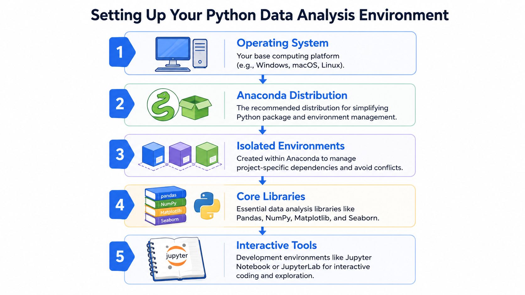
Pick a stable setup first
Install Anaconda, then create a separate environment for analysis work instead of using the base environment for everything. Isolated environments matter because data projects pull in different versions of pandas, plotting libraries, database connectors, and notebook tools.
A simple approach looks like this:
Install Anaconda.
Create a new environment for a project.
Install only the libraries that project needs.
Launch JupyterLab or your preferred notebook interface from that environment.
Save the environment definition so someone else can recreate it.
If your team prefers a notebook-first workflow, that's fine early on. Just don't confuse “easy to start” with “ready for production.” If you're evaluating interfaces, this roundup of Python notebook options for collaborative analysis is a practical place to compare them.
Install the core stack
The standard toolkit exists for a reason. According to Anaconda's overview of Python for data analysis, Python became a core language for analysis because its ecosystem standardized the practical workflow: pandas handles summaries like describe() and grouped aggregation with groupby(), while SciPy and scikit-learn extend that into hypothesis tests, regression, clustering, and dimensionality reduction. The same workflow also supports cleaning with isnull(), dropna(), and drop_duplicates().
That stack usually includes:
Library | What it does well | When you'll use it |
|---|---|---|
pandas | Table-shaped data manipulation | Cleaning, joins, summaries, reshaping |
NumPy | Fast numerical operations | Arrays, vectorized math, under-the-hood speed |
Matplotlib | Low-level plotting control | Custom visual output |
Seaborn | Faster statistical plotting | Exploratory charts with better defaults |
SciPy | Statistical procedures | Hypothesis tests and scientific routines |
scikit-learn | Modeling and preprocessing | Regression, clustering, feature pipelines |
That's the practical reason Python stuck. It isn't just a language. It's an end-to-end workflow that many analysts already understand.
A good local setup also includes a few habits that save pain later:
Name environments by project:
churn-analysisis better thanpython39-final.Pin key libraries: Don't leave critical dependencies floating if multiple people will run the code.
Separate notebooks from reusable code: Put helper functions in
.pyfiles early, not after the notebook turns into a mess.Install database connectors intentionally: Don't wait until the first warehouse query fails to figure out authentication and drivers.
Most setup problems aren't analytical problems. They're environment problems disguised as analytical problems.
Connecting, Cleaning, and Exploring Your Data
A realistic analysis rarely begins with pd.read_csv("data.csv"). More often, someone asks why activation dropped, why a cohort converted differently, or why a key KPI disagrees between tools. The underlying data lives in a warehouse, not on your desktop.
Start from the warehouse when possible
If your company uses Snowflake, BigQuery, Redshift, or Databricks, connect Python to that source directly. A common pattern is to use SQLAlchemy or a warehouse-specific connector to pull a scoped dataset into pandas for inspection. The point isn't to avoid SQL. It's to use SQL for extraction and Python for the analysis layer that follows.
A practical workflow looks like this:
Write the narrowest SQL you can: Filter to the entities, dates, and columns you need.
Pull a meaningful slice first: Enough to inspect distributions and edge cases, not the entire warehouse table.
Keep the extraction query saved: If you can't reproduce the input dataset, you can't reproduce the output either.
For many analysts, data cleaning becomes much easier once the extraction logic is stable. If your team is still wrestling with inconsistent fields and brittle preprocessing, this guide on cleaning up messy data workflows covers the operational side well.
Profile before you transform
Once the data lands in pandas, resist the urge to start mutating columns immediately. Inspect it first.
The first pass usually includes:
Those commands answer basic but important questions. What types did pandas infer? Which columns are mostly missing? Are IDs unique? Did a supposed date come in as a string? Is a category field full of spelling variants?
The fastest way to break an analysis is to transform data before you understand its shape.
pandas remains an excellent choice. In the standard Python analysis workflow, describe() gives summary statistics, and cleaning tools like isnull(), dropna(), and drop_duplicates() help turn raw data into something interpretable, as noted earlier in the Anaconda reference.
After profiling, clean the obvious issues in a deliberate order:
Problem | Typical fix | What to watch for |
|---|---|---|
Missing values |
| Nulls can be meaningful, not just dirty |
Duplicate rows |
| Make sure duplicate business entities aren't valid repeat events |
Wrong data types |
| Silent type coercion can hide errors |
Category inconsistency | Standardize strings or map values | “US”, “U.S.”, and “United States” shouldn't be separate segments |
One habit separates careful analysts from hurried ones. Write down every cleaning assumption in plain language. If you removed rows, explain why. If you filled nulls, explain the rule. If you reclassified categories, keep the mapping visible.
Cleaning isn't a warm-up. It is part of the analysis.
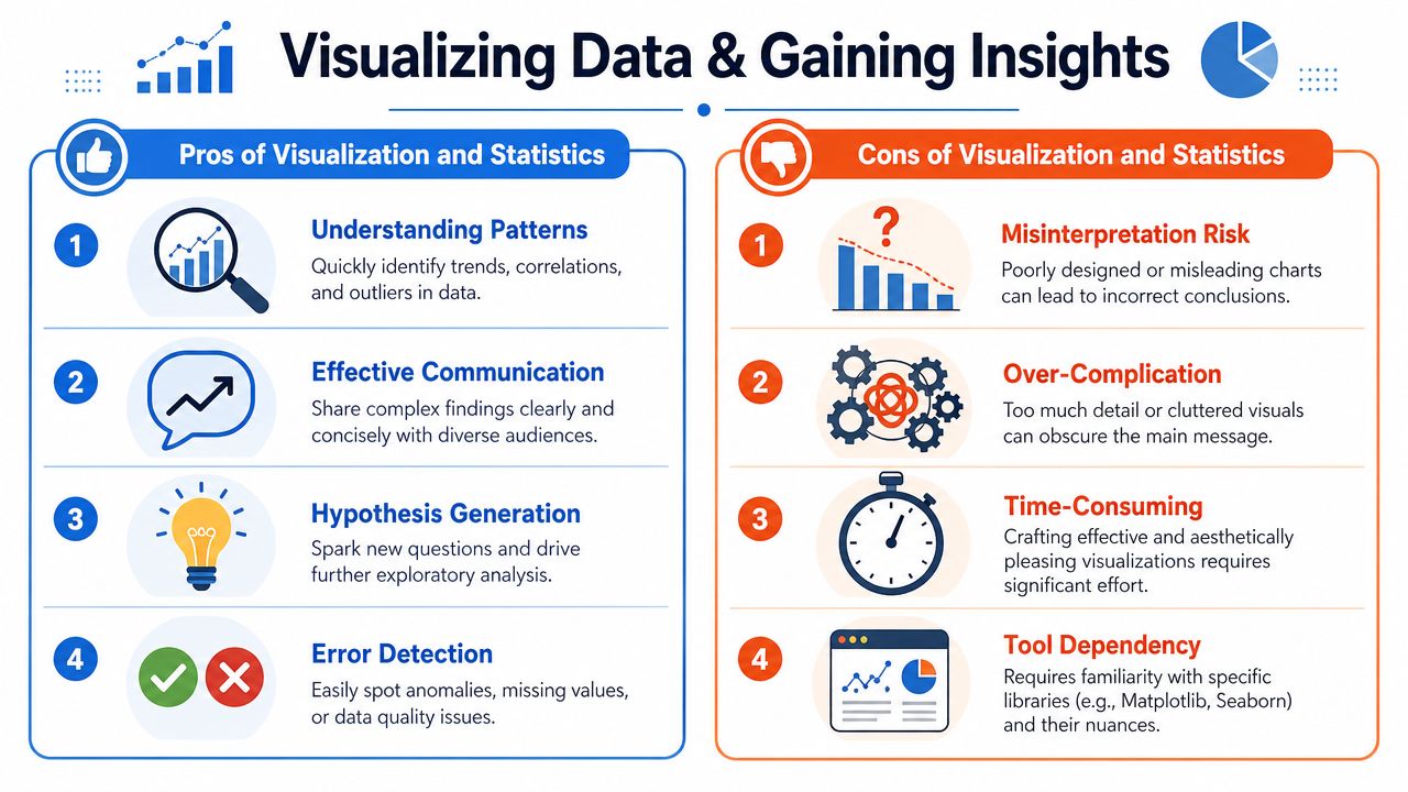
Uncovering Insights with Visualization and Statistics
Once the data is usable, the next step isn't “make a dashboard.” It's to test whether the pattern you think you see is real, relevant, and decision-worthy.
Start with a visual. Not because charts are the end product, but because they expose structure quickly.
Use charts to narrow the question
Different plots answer different business questions:
Histogram: Is this metric tightly clustered, skewed, or split into groups?
Scatter plot: Do two variables move together, or is the relationship weak and noisy?
Box plot: Are outliers driving the result for one segment?
Line chart: Did the change happen gradually or at a clear break point?
Here's a simple example with Seaborn:
These charts are useful because they force sharper questions. If enterprise accounts show a wider spread than self-serve accounts, you don't yet know why. But you do know where to look next.
A short walkthrough can help if you want to see plotting ideas in action:
Then test the claim
A lot of beginner content stops too early. It shows grouping, pivoting, charts, and maybe regression, but often underexplains when correlation is misleading, how to structure A/B tests, and how to quantify uncertainty before acting. That's the key point in this discussion of Python for decision-grade analysis and experimentation.
If a product manager asks, “Did the onboarding change improve conversion?”, a chart alone isn't enough. You need a more disciplined approach:
Define the outcome clearly.
Segment the population if the effect could differ by user type or acquisition channel.
Check whether the comparison is observational or experimental.
Use a statistical method that fits the data and decision.
Decision standard: Don't ship a conclusion because the chart looks persuasive. Ship it because the design, segmentation, and uncertainty are defensible.
Python is strong here because the same environment that produced the exploratory chart can also support hypothesis testing or a simple regression model. SciPy covers common statistical procedures. scikit-learn handles regression and preprocessing when the question moves toward prediction or explanation.
What doesn't work is using stats as decoration. Running a test after the fact on a poorly framed comparison won't rescue weak analysis. The business value comes from using Python to connect raw data, visual evidence, and statistical reasoning into one inspectable workflow.
Writing Performant and Reproducible Analysis
Analysts often treat performance and reproducibility as separate concerns. They aren't. Slow code gets bypassed. Irreproducible code gets distrusted. Either way, the analysis stops being useful.
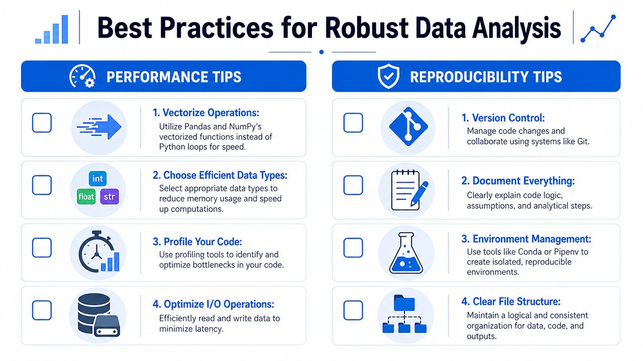
Performance is part of correctness
A notebook that takes forever to run invites bad behavior. People cache stale extracts. They manually edit outputs. They skip reruns after changing logic. That's how analysis drifts from reality.
The first fixes are usually straightforward:
Prefer vectorized operations: pandas and NumPy are built for columnar work. Row-by-row Python loops are usually the wrong tool.
Choose smaller data types where appropriate: Memory use affects speed, especially on laptops.
Push heavy filtering and aggregation down to SQL: Don't drag raw event tables into pandas if the warehouse can reduce them first.
Profile bottlenecks before rewriting everything: Guessing where code is slow wastes time.
If a dataset is too large for comfortable local pandas work, that isn't a signal to write more heroic notebook code. It's often a sign the computation belongs closer to the data.
Reproducibility is what makes analysis usable
A lot of tutorials still frame Python analysis around pandas and Jupyter, but they rarely answer how to make work repeatable, versioned, and shared when data refreshes daily or lives in databases. That gap is called out directly in Real Python's discussion of productionizing Python analysis beyond notebook-based EDA.
In practice, reproducibility means another person can answer three questions without asking you:
Question | What they should find |
|---|---|
Where did the data come from? | Saved queries, source tables, extraction logic |
What assumptions were made? | Documented cleaning rules and business definitions |
Can I rerun this safely? | Versioned code, pinned environment, ordered steps |
A notebook can still be part of a professional workflow. It just can't be the whole workflow. Pull utility functions into modules. Keep configuration separate from logic. Save intermediate outputs deliberately, not randomly. Use Git, even for analysis projects that feel temporary.
A notebook is a good interface for thinking. It's a poor substitute for system design.
The difference between amateur and durable analysis usually isn't statistical sophistication. It's whether the work survives contact with other people, larger datasets, and future reruns.
Scaling Your Analysis with Warehouse-Native Python
Local Python analysis has a ceiling. At first it feels fast because you control everything. Then the dataset grows, refreshes more often, and becomes shared across teams. That's when laptop-first analysis turns into a bottleneck.
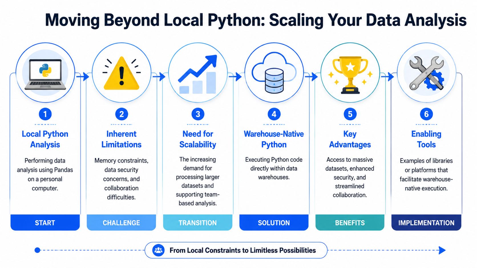
Where local analysis stops working
Three problems show up repeatedly.
First, memory and compute limits. pandas on a laptop is excellent for many tasks, but it's still bounded by local hardware. Pulling large tables out of the warehouse just to slice them locally is usually the wrong direction.
Second, security and governance friction. Local exports multiply fast. Someone downloads a snapshot, someone else uploads a modified version, and now nobody is sure which file fed the board slide.
Third, collaboration drag. A notebook on one machine is not a team workflow. Even if the code is good, the handoff usually isn't.
That's why an increasingly important question in Python analysis isn't just what code to write. It's where the analysis should run and how the team governs it. That operational gap is still underserved in mainstream learning material, which often emphasizes individual notebook workflows over shared analytics infrastructure, as noted in the earlier Real Python reference.
What changes in a warehouse-native workflow
A stronger model is to move computation to the data instead of copying data to the analyst. In warehouse-native Python environments, the warehouse remains the source of truth, and analysis runs against live governed data.
That changes the trade-offs:
Freshness improves: You aren't depending on last week's export.
Scale improves: Large datasets stay in systems built to handle them.
Sharing improves: Teammates review the same logic against the same sources.
Inspection improves: SQL and Python steps are visible instead of hidden inside manual spreadsheet work.
There are several ways teams approach this. Some use warehouse-connected notebook tools. Some build internal patterns around SQL plus scheduled Python jobs. Some adopt platforms designed for warehouse-native analysis. For example, warehouse-native analysis tools for Snowflake, BigQuery, and Databricks describe environments where analysts can work directly on warehouse data instead of relying on local extracts. Querio fits this category by running inspectable SQL and Python workflows against the warehouse so teams can explore and build on company data without treating analysts like a ticket queue.
The practical shift is bigger than tooling. It changes the role of the data team. Instead of answering every question manually, they can maintain the definitions, permissions, and shared infrastructure that let more people answer the right questions safely.
That's the version of Python analysis that scales. Not just better syntax in notebooks, but a workflow that stays trustworthy when the company grows.
If your team has outgrown local notebooks and brittle dashboard workflows, Querio is one way to move Python analysis closer to the warehouse. It lets teams inspect the SQL and Python behind analyses, work against live company data, and build shared analytics workflows without passing CSVs around or waiting on a crowded data backlog.

