Interactive Notebook Templates for Self-Serve Analytics
Build interactive notebook templates in Python to scale self-serve analytics. A step-by-step guide for data teams to empower business users with Querio.
https://www.youtube.com/watch?v=_-cLRVmWxJc
published
Outrank AI
interactive notebook templates, self-serve analytics, python notebooks, querio, data strategy
d23c6a5f-6699-49fa-82f4-67744cc39f5f

Your PM Slacks at 10:12 a.m. asking for one quick query on activation by signup channel. Sales jumps in at 10:19 with a churn slice for enterprise accounts. Finance wants a weekly view that’s almost the same as last week’s, except for one new filter and a different definition of active customer. By lunch, the analyst who was supposed to be fixing your retention model is acting like a routing layer for everyone else’s questions.
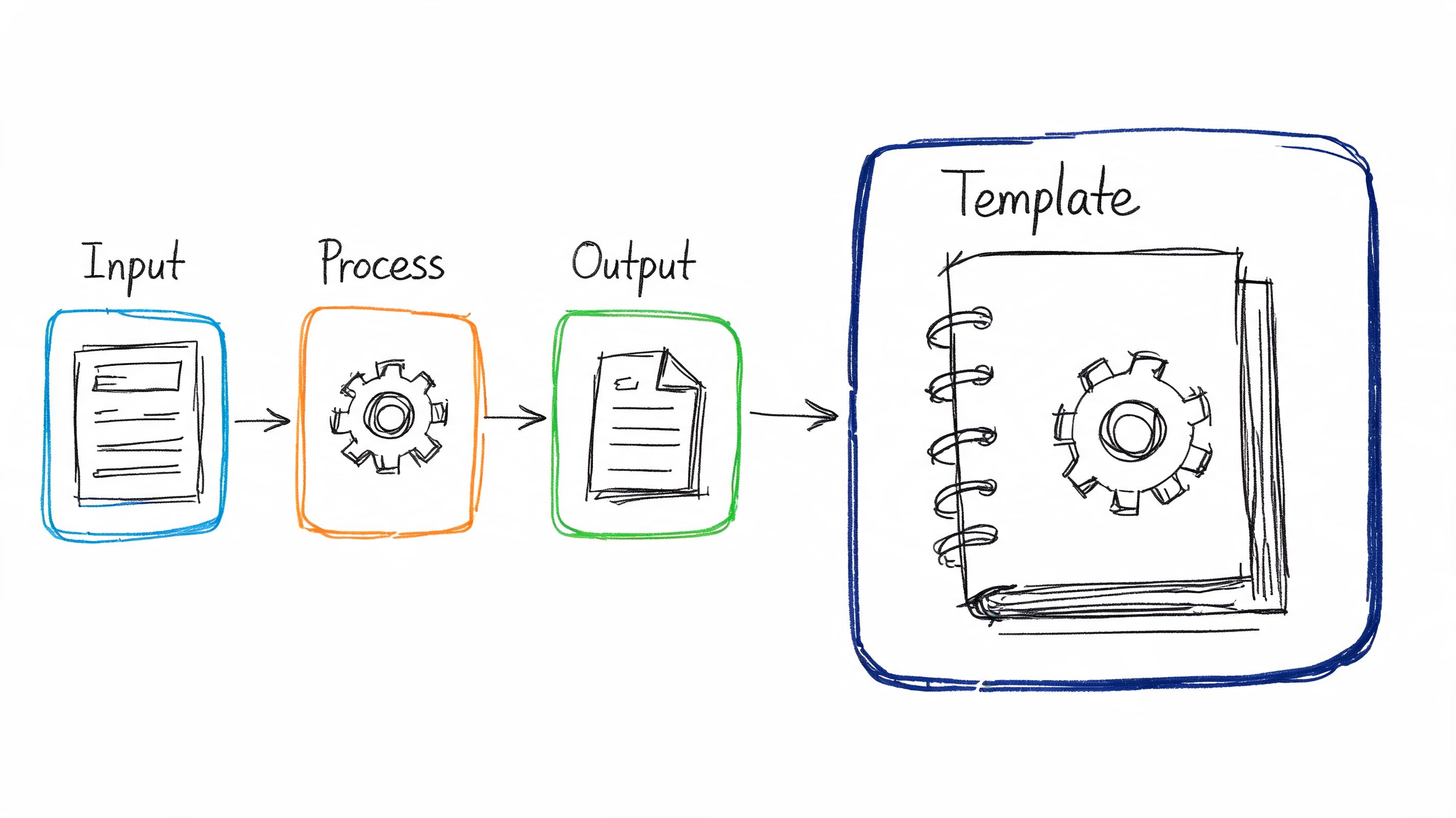
That pattern is common in fast-growing teams because the requests are reasonable. The problem is volume, repetition, and context switching. Traditional dashboards answer fixed questions well, but they struggle when a team needs guided exploration, not just a static chart. That’s where interactive notebook templates become useful. They turn recurring analysis into reusable workflows with inputs, instructions, logic, and outputs in one place.
The idea didn’t start in tech. It came out of education, where structured notebooks helped people organize information and actively work through it. That origin matters because the same design logic works inside a company. A good notebook template gives people enough freedom to investigate, without forcing the data team to handhold every step.
Table of Contents
Ending the Data Team Bottleneck
A data team becomes a bottleneck gradually. It usually starts with success. People trust the team, so they ask more questions. Then they ask for variants of the same question. Then every analysis becomes a custom job, even when the underlying logic barely changes.

I’ve seen this most clearly with product and growth teams. They don’t want a BI backlog. They want to change a date range, swap a segment, inspect a cohort, and move on. If the only path is “ask an analyst,” the company slows down in places that don’t look dramatic on paper but kill momentum in practice.
Why dashboards aren't enough
Dashboards are good at broadcasting stable metrics. They’re weaker at guided investigation. A PM often needs a sequence: define a segment, inspect users, compare time windows, read the caveats, export a table, then annotate what changed. That’s not one chart. It’s a workflow.
Interactive notebook templates fit that workflow better because they combine explanation, parameters, code, and outputs. They can act like a governed workspace instead of a blank technical notebook. That distinction matters if you want non-technical teams to use them responsibly.
A self-serve system fails when the user has either too much freedom or too little context.
There’s a clear market gap here. Existing content on interactive notebook templates mostly lives in K-12 education, while a projected 68% of professionals in data roles request more hands-on, notebook-style training modules, and projected AI-assisted notebook usage in Jupyter surged 45% according to the future-dated figures summarized in this teaching-focused overview. The numbers are forward-looking, but the underlying need is already familiar to anyone running analytics in a growing company.
Turning recurring requests into reusable assets
The shift happens when the data team stops answering every repeated question manually and starts packaging common analyses into templates. Instead of “Can you rerun the funnel for EMEA users?” the PM opens a notebook, changes region, checks the assumptions, and gets the updated view.
That approach works especially well in domains with messy definitions and regulated context. Teams working with clinical or observational data often need more guidance than a dashboard can provide. If that’s your world, OMOPHub's health data guide is a useful reference for thinking through data model complexity before you expose self-serve workflows to broader teams.
What doesn’t work is handing people a raw Jupyter notebook with hidden dependencies and vague comments. That just moves the bottleneck from “ask data” to “ask who wrote this notebook six months ago.”
Designing User-Centric Notebook Templates
The biggest mistake in notebook design is starting from code. The right starting point is the user who needs an answer but doesn’t want to become a data engineer to get it.
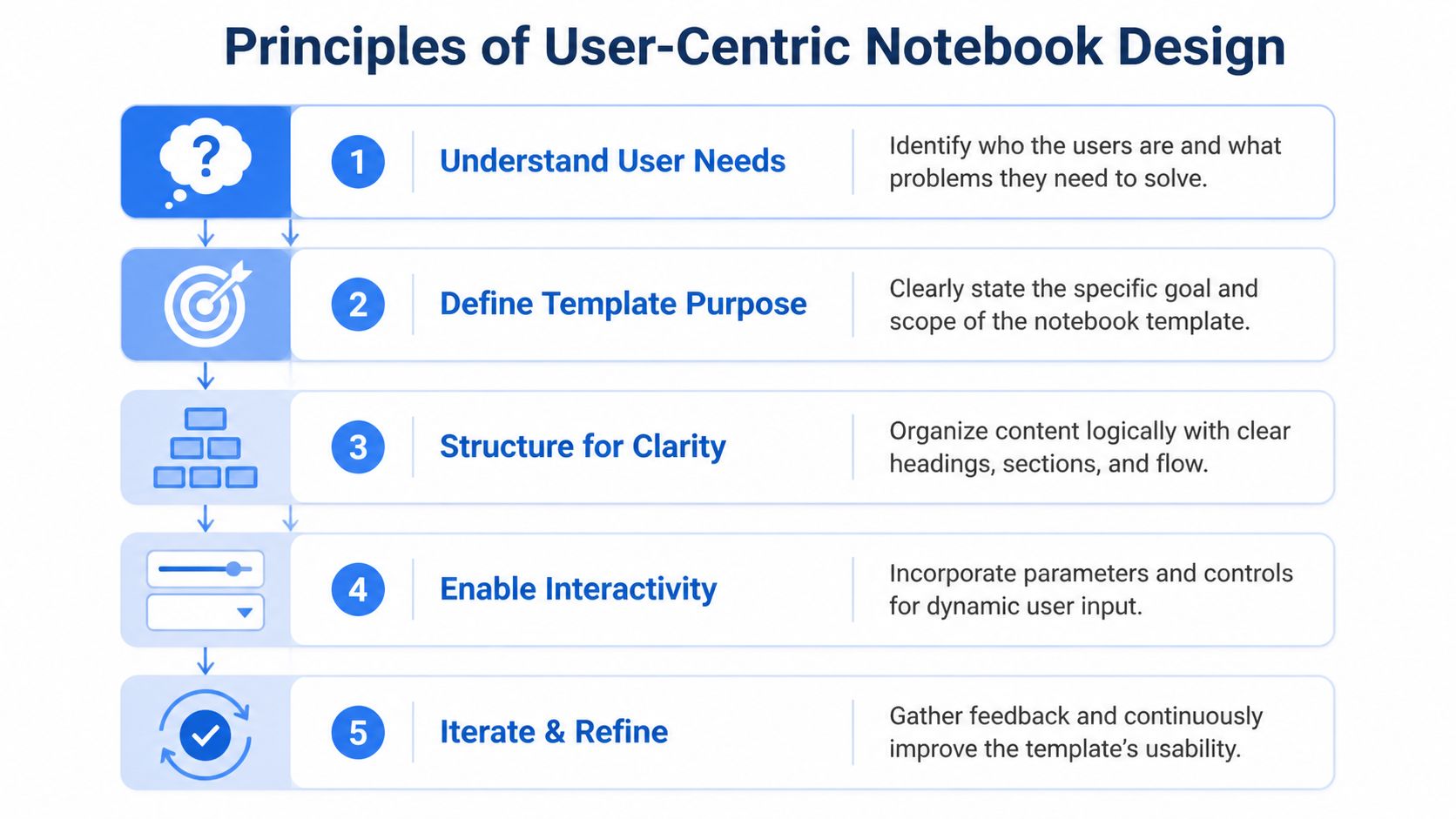
A template is a product. It has an audience, a scope, and a failure mode. If you design it like an internal script, people will use it once, get confused, and go back to filing tickets.
Start with one real user
Pick a single role first. Not “the business.” A PM investigating onboarding friction is different from a lifecycle marketer checking campaign cohorts. They use different vocabulary, they tolerate different levels of ambiguity, and they need different outputs.
When I’m reviewing a candidate template, I ask three blunt questions:
Who opens this first: Name the role and the typical scenario. “Growth PM after a launch” is specific enough. “Anyone analyzing funnel performance” isn’t.
What decision follows: A template should lead to action. Pause the campaign, revise onboarding, escalate an anomaly, or prep a team review.
What can confuse this user: Definitions, grain, filters, or timing windows usually cause more trouble than the code itself.
A lot of good UX work in analytics is really language work. Labels like “active,” “retained,” or “qualified” look harmless until two teams use them differently. Put plain-English definitions in the notebook where the user needs them.
Scope the job, not the entire domain
Most first templates fail because they try to solve everything. A growth review notebook becomes a growth platform. An onboarding notebook becomes a warehouse browser. Then nobody trusts the outputs because the logic sprawls.
A better rule is to build for one recurring job:
Job | Good template scope | Bad template scope |
|---|---|---|
Funnel review | Track one funnel with a few approved cuts | Explore every event table in product analytics |
Campaign analysis | Compare channels, time ranges, and conversion outcomes | General marketing data workbench |
Customer health | Summarize account usage, support activity, and flags | Full customer 360 with freeform joins |
The educational roots of interactive notebooks are useful here. Studies Weekly describes frameworks with up to 12 key elements, including graphic organizers, data/graphs, and text chunks, and also notes strong interest in structured notebook resources, including a 2020 statistics notebook newsletter that drew over 200 sign-ups in 3 days in related educator demand signals summarized at Studies Weekly’s interactive notebook overview. In a business setting, the lesson isn’t to copy classroom foldables. It’s to use a limited set of recurring components so people learn the pattern quickly.
Practical rule: Every template should answer one primary question well and support a small set of adjacent follow-ups.
For non-technical audiences, the UI matters as much as the math. Teams trying to simplify that layer should think carefully about labels, defaults, and task flow, which is exactly the kind of problem covered in this guide to simplifying analytics UX for non-technical users.
Plan inputs and outputs before code
Before writing SQL or Python, sketch the interaction. What does the user enter? What should stay fixed? What comes back as a chart, a table, or a short narrative summary?
Use this simple planning frame:
Inputs the user can safely change
Date range, region, plan type, acquisition source, account owner, experiment variant.Logic the data team owns
Metric definitions, joins, event cleaning, exclusions, windowing rules, benchmark logic.Outputs that support action
Trend chart, segment table, anomaly callout, CSV export, and a small note field for interpretation.
That separation is what keeps a template useful. Users get control over business context, but not over the fragile parts that break trust.
What usually works best is a small parameter block at the top, a short explanation of what each field changes, and visible defaults. What usually fails is burying parameters across several cells, forcing users to hunt through notebook code, or returning a huge raw table without interpretation.
Building Parameterized Python Notebooks
Once the design is clear, the build should be boring. That’s a compliment. A production-ready notebook template shouldn’t feel like an improvised analysis artifact. It should feel like a repeatable internal tool.
The pattern I’ve found most durable is simple: consistent file structure, one visible parameter area, modular query logic, then opinionated outputs. Educational deployment guidance maps surprisingly well here. The approach of selecting a base structure, customizing inputs, and separating input from output has been associated with 70% fewer organizational errors and 40% less lookup time in parallel benchmarks summarized by TCEA’s digital interactive notebook guidance. You don’t need to mimic a classroom notebook exactly, but the structure translates well.
Use a file structure people can navigate
A notebook becomes maintainable when the surrounding files are predictable. Don’t put everything in one monolithic document. Split the template into components your team can update independently.
A practical layout looks like this:
/templates/onboarding_funnel/README.md
Purpose, owner, business definitions, known caveats./templates/onboarding_funnel/notebook.ipynb
User-facing notebook with inputs, analysis flow, outputs./templates/onboarding_funnel/sql/
Reusable query files or query fragments./templates/onboarding_funnel/config.yaml
Approved defaults, labels, filter options, environment settings./templates/onboarding_funnel/tests/
Lightweight checks for metric logic or expected schema.
If you’re using a file-system-driven analytics environment, this becomes much easier to govern because notebooks, configs, and helper files live together instead of being scattered across separate tools. One example is Querio’s guide to Python notebooks, which aligns with this style of reusable notebook workflow.
Parameterize the notebook, not just the query
Many teams say they have reusable notebooks, but what they really have is a SQL file with a few hardcoded replacements. That’s not enough. The notebook itself should surface a controlled set of inputs and explain what they do.
A simple pattern looks like this:
Then pass those parameters into a validated query layer:
Two things matter here. First, the user edits a tiny set of business parameters, not the SQL. Second, the notebook enforces guardrails. Approved values, safe defaults, and explicit validation do more for self-serve reliability than another dashboard tab ever will.
Write code for maintenance
Templates age. Definitions change, tables move, and one-off exceptions pile up. If the notebook only works because its original author remembers the hidden assumptions, it isn’t a template. It’s a trap.
I prefer a few strict rules:
Keep transformation logic modular: Put repeated logic in helper functions or SQL files instead of duplicating it across cells.
Separate metric definitions from display code: A chart cell shouldn’t also contain the business logic for retention.
Name cells by purpose: “Load inputs,” “Validate filters,” “Run funnel query,” “Render segment table” is better than a series of anonymous code blocks.
Fail loudly: If required inputs are missing or the result set is empty for a known-bad reason, say so in plain language.
A notebook used by non-technical teams needs markdown as much as code. Add short instruction blocks before actions that commonly fail.
If a user has to ask what cell to run next, the template isn't finished.
Add instructions where users get stuck
Most support requests come from avoidable friction points. Users don’t know what a parameter means. They don’t know whether a notebook is scoped to event time or reporting time. They don’t know if a blank result means “no data” or “something broke.”
Use markdown cells to answer those questions inline. Keep them short:
What this notebook is for
Who owns the definitions
Which parameters users can edit
Which fields are fixed on purpose
What the outputs mean
What to do if the results look wrong
A useful pattern is to pair every chart with a short interpretation prompt. For example: “If activation rate drops after launch week, compare by signup channel before escalating to engineering.” That gives the user a next step instead of a dead end.
Later in the notebook, a short walkthrough video can help teams who prefer demonstration over documentation.
One final implementation trade-off matters. Don’t over-automate the first version. A small, explicit notebook with visible inputs usually gets adopted faster than a polished but opaque system. People trust what they can inspect.
Four Production-Ready Template Examples
The easiest way to judge interactive notebook templates is to look at the work they replace. If a template saves people from reopening the same conversation every week, it’s doing its job.
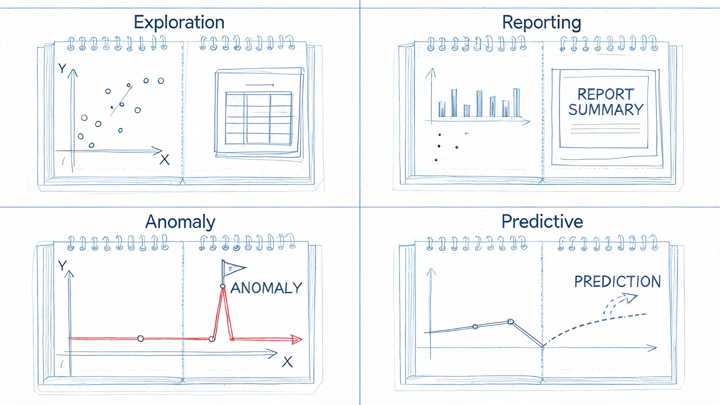
Below are four templates I’d prioritize in a startup or mid-market environment. They’re different enough to prove the model, but common enough that teams can use them quickly.
New user onboarding funnel review
A PM launches a new signup flow and wants to know whether more users are reaching activation. A dashboard can show the topline funnel. It usually can’t package the context around exclusions, variants, or channel-level cuts cleanly.
This template works well when it includes:
Editable inputs: Date range, signup channel, region, experiment cohort.
Fixed logic: Event definitions for signup, verify, first value, and activation.
Outputs: Step conversion table, trend chart, drop-off comparison by segment, and a small table of representative users for QA.
The reason this template gets used is that it supports investigation, not just monitoring. A PM can move from “activation dipped” to “activation dipped for paid social users on the new mobile flow” without waiting for a custom analyst pass.
Product metrics weekly review
This one is for product leadership. The user often isn’t asking a single question. They’re trying to prepare for a metrics review without assembling ten charts from three tools.
A solid weekly review notebook has sections, not just plots:
Notebook section | What the user does |
|---|---|
KPI summary | Checks core movement against recent periods |
Segment cuts | Compares plan type, device, geography, or lifecycle stage |
Drill-down notes | Captures suspected drivers and follow-up questions |
Export block | Pulls a clean table for a doc or slide |
The notebook format matters because the meeting artifact and the analysis artifact become the same thing. Comments, caveats, and outputs live together. For teams building more polished presentation layers around these outputs, it helps to study examples of how visuals should support decisions, not just aesthetics, such as these dashboard examples for business reporting.
Ad hoc exploration starter
This template is for the business user who has a real question but doesn’t know where to begin. Sales ops wants to inspect expansion patterns. Customer success wants to compare accounts by product usage. Strategy wants to slice a market segment without writing SQL.
The starter template should be constrained on purpose. Give the user a curated set of dimensions, a few pre-approved metrics, and a sequence of prompts like:
Choose the population.
Pick a time window.
Select one grouping dimension.
Review the default summary.
Add one comparison cut.
That sounds basic, but it’s the difference between usable exploration and warehouse tourism.
The best ad hoc template doesn't expose the whole warehouse. It exposes the part that can be explored safely.
Customer health report
This template usually replaces a painful weekly ritual where someone manually pulls product usage, billing context, support activity, and risk notes into one summary. The audience is often account managers, support leads, or customer success.
The parameters are straightforward: account, owner, time window, and sometimes a region or segment. The value comes from the packaging. A good health notebook returns a compact report with usage trends, missing-product warnings, recent support activity, and a notes section for the account team.
What doesn’t work is pretending this is a predictive model if it isn’t. Keep the language honest. Show the evidence, show the thresholds, and make the business rule visible. Teams will trust a clear rule-based report faster than a mysterious risk score nobody can explain.
Governance and Performance Best Practices
Teams often frame governance as the thing that slows self-serve analytics down. In practice, the opposite is usually true. Without structure, users stop trusting what they see, analysts spend more time debugging other people’s work, and every reusable template turns into a one-off fork.
The historical lesson is useful here. Interactive notebooks gained traction in education around 2012, and the right-page and left-page structure was used to keep work organized and prevent chaos, with neuroscience-based reasoning about engaging different modes of processing captured in this early Algebra 2 interactive notebook example. Corporate analytics has the same problem in a different form. People need room to work, but they also need a standard layout that keeps the work interpretable.
Standardization creates freedom
Good governance starts with conventions that remove ambiguity:
Naming conventions: Use consistent names for templates, parameters, outputs, and folders.
Visible ownership: Every template needs an owner, a backup owner, and a review date.
Approved definitions: Put metric definitions close to the notebook, not in a separate tribal-knowledge doc.
Versioning discipline: Archive old variants. Don’t leave “final_v3_actual_final” copies lying around.
If you want a broader operating model for this, these data governance practices are a useful complement to notebook-specific rules.
Performance discipline matters early
A self-serve notebook that runs slowly trains users to abandon it. One that hits the warehouse irresponsibly trains engineering and finance to hate the whole program.
Use a few practical controls:
Limit scan-heavy defaults: Don’t default to all time if the common use case is recent activity.
Pre-aggregate where it helps: Some templates should read from curated mart tables, not raw event streams.
Show query scope clearly: Users should know whether they’re running an account view or a broad segment analysis.
Cache stable reference data: Dimension tables and lookup logic don’t need to be recomputed every run.
Permissions and ownership can't be optional
Not every user should see every model, and not every user should edit every template. Self-serve doesn’t mean unrestricted.
A sensible split is:
Layer | Who can change it |
|---|---|
Business parameters | Broad user group |
Metric logic | Data team |
Source models | Data engineering or analytics engineering |
Access controls | Platform owner or admin |
Guardrails aren't there to protect the data team from users. They're there to protect users from accidental misuse.
That’s the part many rollouts miss. Governance isn’t gatekeeping when it makes outputs trustworthy and reusable.
Frequently Asked Questions
How is this different from a dashboard
A dashboard is ideal when the question is stable and the audience is broad. A notebook template works better when the user needs a guided path through an analysis with a few controlled decisions along the way.
Dashboards answer, “What’s happening?” Notebooks are better at, “Why did this change for this segment under these conditions, and what should I check next?” If your team keeps exporting dashboard data into spreadsheets to continue with further analysis, that’s a sign the dashboard is only the first step.
How much Python do business users need
Very little, if the template is designed correctly. Most users shouldn’t be editing logic cells at all. They should change a small number of visible inputs, run the notebook, inspect outputs, and add notes where appropriate.
The Python burden belongs with the data team that authored the template. The business user’s job is to supply context, not to maintain code.
How do you stop bad queries and bad logic
You don’t rely on training alone. You constrain the surface area users can change.
That means approved parameter values, fixed metric logic, validated inputs, scoped data access, and templates that make unsupported paths hard to take. If users can accidentally rewrite joins or change denominator definitions, the template hasn’t been productized.
Won't this become another mess to maintain
It will if every analyst builds their own style and nobody owns the lifecycle. It won’t if templates are treated like internal products with clear ownership, versioning, and review rules.
A useful litmus test is whether a new analyst can understand a template quickly from its files, labels, and notes. If they need the original author on a call, maintenance debt is already building.
Why not just buy another BI layer
Because the main problem often isn’t visualization. It’s the gap between a fixed dashboard and a bespoke analyst workflow.
A new BI layer can add polish, but it won’t automatically turn repeated exploratory requests into reusable analysis products. Interactive notebook templates fill that middle ground. They preserve flexibility without making every request a custom engagement.
From Data Bottleneck to Analytics Engine
A healthy data team doesn’t spend its week replaying the same analysis with slightly different filters. It builds systems that let other teams answer recurring questions safely, quickly, and with shared definitions.
That’s why interactive notebook templates are worth adopting. They borrow the discipline of structured learning tools and apply it to a modern analytics stack. Done well, they give product, growth, finance, and customer teams a way to explore data without turning your analysts into a help desk.
The trade-off is real. You have to invest in design, guardrails, naming, and maintenance. You have to say no to overly broad first versions. You have to build with the user’s decision in mind, not just the elegance of the code. But that work compounds. Each good template removes repeat load from the team and raises the company’s baseline data fluency.
If you’re rolling this out, start small. Pick one recurring request. Turn it into a template with clear inputs, fixed logic, and outputs that drive action. Then do it again.
If your team is stuck acting like a human API, Querio is one way to operationalize this model. It deploys AI coding agents on top of the data warehouse and uses a file-system approach for reusable Python notebooks, so teams can standardize self-serve analysis without forcing every question through an analyst queue.

